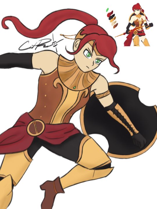
thecollectibles:

Bloodborne board game – official art by

Adrián Prado

Can we all appreciate how entirely gender-neutral all of those costume designs are?

~ Ozzie

Perhaps one of the biggest keys to the success of Bloodborne and Dark Souls is the incredible focus they have on the goals of their games.

It really shows what you can accomplish.

And it really shows that ridiculous female armor is not something enhances fantasy horror or cosmic horror.

Who knew!?

– wincenworks

otherwindow:

otherwindow:

Concept: A typical baggy robed male mage but his behind is exposed like a modern backless dress.

Can  we get all the overheated wizards dress like that from now on? I wouldn’t need to dress Ezren down if he had party in the back like that! 

~Ozzie 

PS: Completely BTW, the wild mix of fandoms in the notes of this post is delightful. Everyone sees their best boys in him. ?

caitsketches:

Daytime reblog and also I’m gonna tag @bikiniarmorbattledamage

caitsketches:

I wanted to do one from the front so it’s easier to see what I did with her chest plate! I just made it a lil more protective while keeping with the design

What do you think?

I think she would not get an arrow through her cleavage if she wore this armor!* 

image

Good job in fixing Pyrrha, @caitsketches​! I appreciate how much difference such a simple change can make. 

Personally, as a big opposer of Sameface Syndrome, I have a huge beef with RWBY’s character and costume designs in general. I welcome any fix to their absurd double standards and obsession with making everything look gratuitously “cool” and anime-like without questioning how much it fits the characters and worldbuilding. Especially the casual sexualization of teenage girls. Uuugh. ?

~Ozzie 

Comparing between this and the original honestly points out how embarrassingly close the creators were to a good design. 

Literally connect the neck thing to the chest piece, and give her pants, and we wouldn’t need a redesign. 

-Icy 

*Sorry not sorry for spoiling ancient seasons. 
Also, while plate armor isn’t considered a fool-proof protection against arrows, it’s obviously better than no protection at all

redtallin:

An Aasimar Cleric for a friend of mine! Painting the gauntlets and flames was so much fun!

Oh, I really like how her outfit is overall uncomplicated, so the eye is drawn to the flaming gauntlet and her golden eyes. The choice to break up the shapes in this way, with the big central shape surrounded (and bisected) by smaller ones, also helps the eye take in the entire design. It’s also just a nice way to “casually” wear armor.

Even though this design is made up of “simple” clothes, it’s still interesting and pleasing to look at, and I really like the color scheme. And the rendering is just so crisp and nice!

-Icy

maispace:

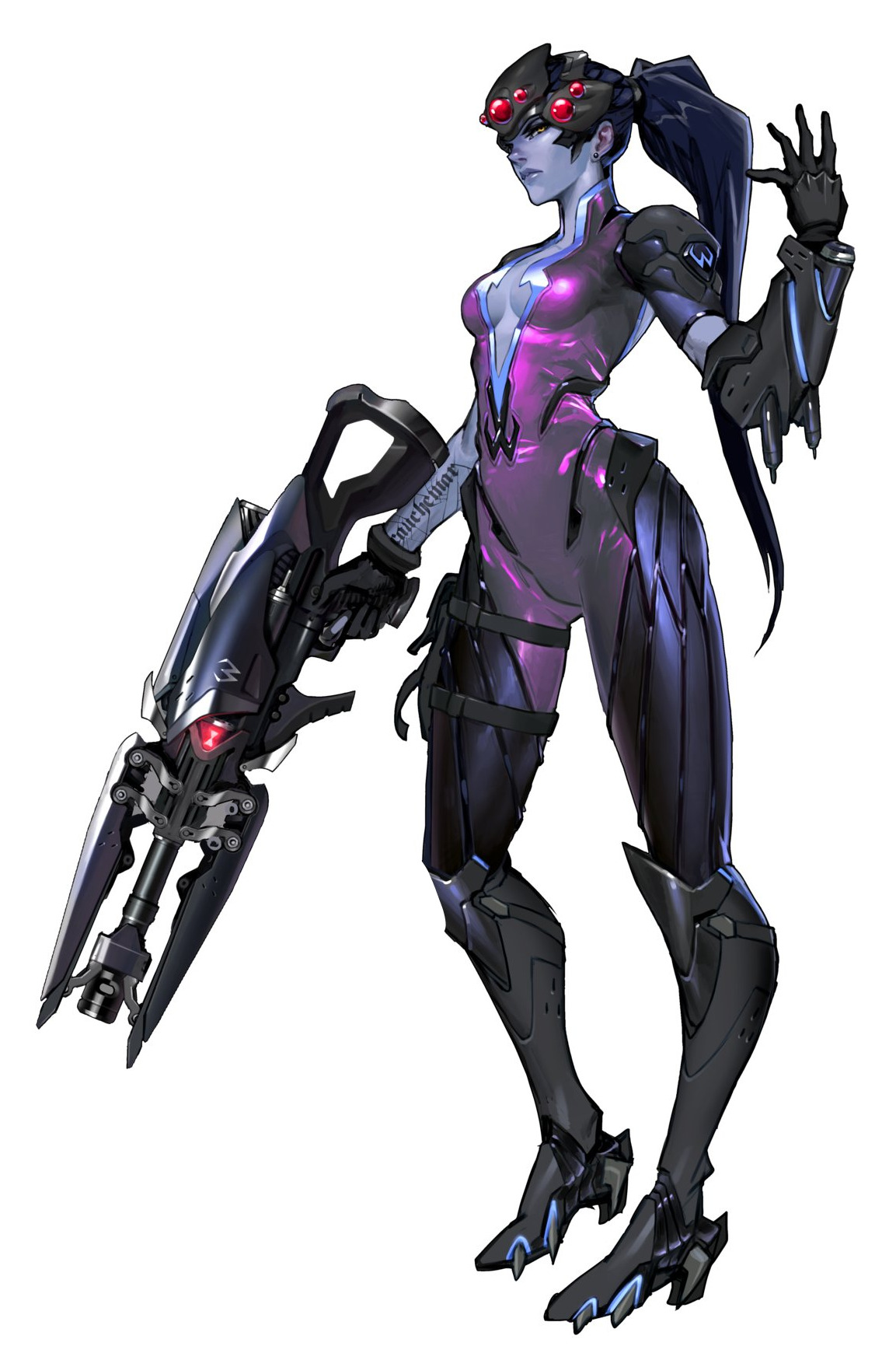
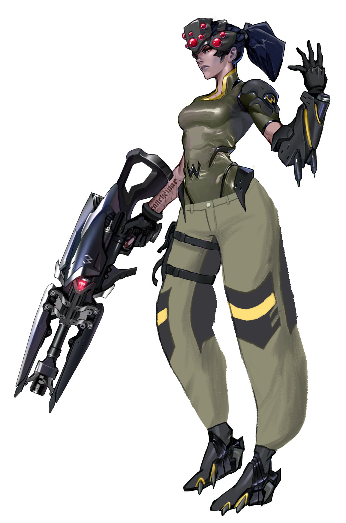
Inspired by going on one of my classic Overwatch character design rants the other day and binging @bikiniarmorbattledamage yesterday, I took it upon myself to try to make Widowmaker’s design… less worse. Here’s what I changed:

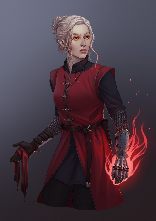
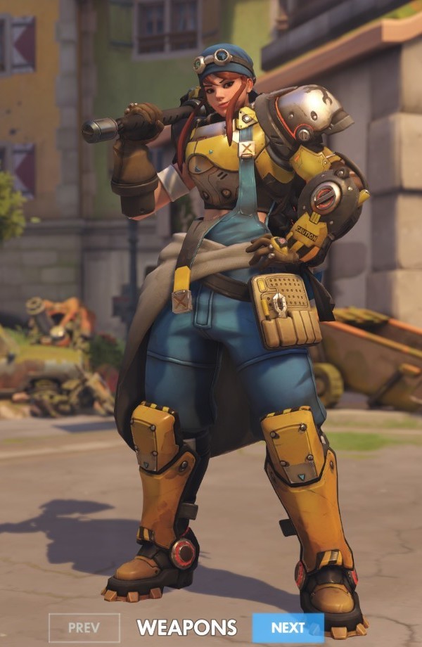
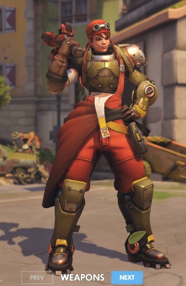
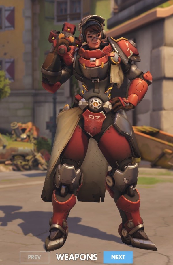
  • I gave her pants. Widowmaker is a victim of the weirdly common Overwatch character design trope of “armor from the knees down, skin-tight from the knees up”. (Well, the armor is also somehow skin-tight, but.) Since Widowmaker is a sniper and Talon is supposed to be paramilitary, I decided to put her in some actual tactical pants. …Of course, I still forgot to draw pockets. Pretend they’re there.
  • I decided not to shorten her legs or widen her waist, despite how ridiculous both of those features are, because Widowmaker actually has a reason to look like that – her spider motif. On any other character, I wouldn’t stand for it.
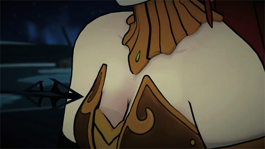
  • I closed up her ridiculous cleavage window. Again, she’s a sniper. Lay down on a roof in that and you’ll get your chest absolutely cut up. While I was in the area, I gave her bodysuit some subtle segmentation for a “carapace” look.
  • I think the way I changed her shoes she’d still have her feet in the high-heel position, but I at least wanted to made them flat on the bottom so Widow doesn’t catch her foot on a gutter and faceplant into an alley while doing her whole parkour thing.
  • Purple isn’t a very “spidery” color, so I changed her to a dull greenish-brown with yellow accents to evoke an orb weaver’s color scheme.
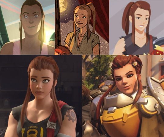
  • I shortened her hair so it doesn’t get in the way while she’s fighting, and so it’s the almost exact shape of a spider abdomen, thus making her whole head a big spider design.
  • I made her skin a normal human color, with some subtle purplish tones on her nose, lips, ears, and cheeks. I also removed her earring.
  • I made her visor boxier both to look like a jumping spider and for a more realistic “tactical” look, which also gave me room to pop some more eyes on there. Plus I think it just looks better; the original looks like they were going for Giger and gave up.
  • Black widows are overplayed. I changed the hourglass light on her gun to the Talon logo, so she’s actually representing her organization somewhere on her design.

Thank you for @-ing us, @maispace​! 

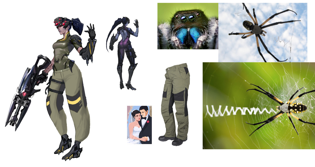
It’s a second fan redesign of Widowmaker we share that adds roomy pants to her costume, so it probably tell us something about what’s the next most glaringly inadequate part of her design, right after the navel-deep cleavage. 

Not sure if I’m personally into the proposed color scheme, at least without invoking orb weaver’s interesting patterns in some ways. That would also add some much needed segmentation and contrast in her outfit. 
I agree, though, that the original colors were completely out of nowhere and should be revised. 

The ponytail combined with helmet creating a spider-like shape is definitely much better evoked than in Blizzard’s design and shoes being somewhat wearable are appreciated. 

All in all, good reminder that Overwatch, while it comes with many interesting ideas and motifs for character designs, seems to abandon committing to them halfway through, to sell something more generic and palatable to their presumed audience, as per Creepy Marketing Guy’s request. Same reason it often fits the “concept art POC turns into a pale white Barbie in the final product” problem that @otherwindow noted.

~Ozzie 

bikiniarmorbattledamage:

Brigitte and Overwatch’s continous female design problem

We talked already about Brigitte’s costume, but there’s a whole lot of other issues about her character design that shouldn’t be overlooked. Again, it’s a nice idea to have a new lady in actual armor in the game, though we wouldn’t be BABD if we didn’t point out some obvious and less obvious problems that can be spotted with her. 

She’s, after Moira, another white European lady in a row, while still the closest to black female representation among playable heroes is Orisa, a robot (and before anyone says it – nope, none of the dark-skinned female characters are black).
For a game that prides itself in having diverse international cast, Overwatch can not imagine people of color color coming from places that wouldn’t be POC-dominant already (also lots of their heroes of color somehow happen to be morally dubious compared to white ones). And just because Brigitte is a pre-established character doesn’t yet excuse prioritizing adding her to the game over someone with different background. 

It’s kind of funny how after being unnamed for no reason in her last major media appearance, the Reinhardt animated short, now Brigitte got elevated from a supporting lore character to one of main heroes. This, paired with ridiculous lack of consistency in her cross-media appearances gives us a strong feeling that no-one at Blizzard is overseeing writing and art direction of Overwatch as a franchise. Fans who spot constant retcons in the story would agree.

Speaking of no visual consistency, seems like from comics to the animated short to the actual game Brigitte finished her long journey from a unique-looking person to another standard issue pretty face. 

image

And no, different artists working on each of those appearances isn’t an excuse for how only her hair and skintone remain relatively consistent. Her crucial features like jawline, freckles, nose shape and size, how big her eyes are and how strong her chin is shouldn’t alter so widely just because of art style change. Blizzard is perfectly capable of making and using style guides – and when they don’t, it’s either by choice or negligence.

And if you wondered what we meant by “standard issue pretty face”, this pic, for obvious reasons, has gained some major mileage around the Internet: 

image

Congrats, Blizzard! You officially care about diverse female appearances as little Disney does! (image sources: [x] & [x]) 

image
image

Or maybe the jokes are true and the (weak) excuse for looking like clones is the same as for the Frozen ladies? Mercy is Brigitte’s real mom!

Not to mention that Blizzard can’t make up their mind on what Brigitte’s body type is supposed to be. Is she thin and curvy as virtually every other Overwatch lady? Is she almost as buff as Zarya? Something inbetween? Who knows.

I saw some fans trying to excuse her twig arms from Christmas comic as being possibly earliest in the timeline, but no official channel would confirm or deny any speculation. Overwatch is pretty satisfied with fans using their headcanons to justify whatever information the story canon won’t commit to. Why make an effort when fans can do your job for you? 

~Ozzie

“Brigitte Lindholm, squire to Reinhardt Wilhelm, is a former mechanical engineer who has decided to take up arms and fight on the front lines to protect those in need.”

If I didn’t know anything about this character and was just reading her background blurb, I would be imagining a character design more akin to this:

image

Why build a regular armor and shield when I can pilot a 12-foot-tall exoskeleton? Her father builds turrets during combat, it would have been cool if she had skills related to building and adjusting her own armor in-combat.

Her design doesn’t inform me of her character at all, which is a problem with several of the Overwatch cast (mostly ladies, I wonder why that is). She wears armor, but so does Pharah; is she also a soldier? She has no welding mask or a tool belt that would indicate that she’s a mechanic type. I get that she doesn’t want to just fix things on the sidelines, but she does throw out armor for her allies. It isn’t a stretch to flavor it as her fixing her team’s equipment in the heat of battle, and she does get a welding mask in a different skin but not the primary one?

Her color scheme is almost the same as Mercy’s, with silver (instead of white), yellow and black being the core, which really isn’t helping that same-face problem, Blizzard. Not to mention the shapes are very similar to Pharah’s. There’s just nothing new here design-wise, and I am disappointed.

-Icy

So since the screaming baby rage machine is still going full throttle, it’s probably worth bringing this back to highlight how this issue goes and the general expectations regarding fictional buff ladies.

After decades of pandering, capital-G gamers will accept buff ladies if:

  • They’re clearly in the service of a manly (cishet) man
  • They have some cute costuming to make them non-threatening
  • They are easily Disneyfied

They will lose their shit if the lady:

It’s never really about what they say it is – it’s always about “does this clearly prioritize me above everyone else, to the extent of excluding others”.

– wincenworks

kainissoable:

I tried giving Umah from Blood Omen 2 some proper armour, design based broadly off the single piece of armour to her name – that weird double pauldron thing. Edited the bottom half of her bikini into a fantasy tabard, and if I’d thought to use a fuller screenshot I’d have put the dragon from her Defiance concept art on there, but thought of that way too late. Come up with your own reason for why she has the Soul Reaver, preferably one more interesting than the fact that it’s hiding some lop sided hip armour that would have been a pain to fix. Another case of not as good as I was hoping for but automatically an improvement on the bare skin chafing nightmare of the original.

Personally I ascribe to @bikiniarmorbattledamage‘s tongue in cheek philosophy that women in fantasy should be fully armoured while men should wear something tastefully revealing. Legacy of Kain at least gets halfway there with the well muscled men in leather pants, just a shame about the prevalence of bikini armour.

Wow, the original is a yikes, especially the huge boob part made from unidentifiable material. I guess it counts as better than most booplates we’ve  seen on BABD because there’s no boob window/exposed cleavage, but that’s one low bar to clear. Also, one huge grey boob blob on her chest is somehow extremely distracting and boring at the same time. At least put some symbol on it or something! 

I like your simplistic redesign, @kainissoable. If me or Icy were doing it we’d probably put some design (likely sampled from other part of the costume) on the breastplate, to break up this huge shape, which was also the original’s problem. It still works objectively better than the generic garbage the original was. 

~Ozzie