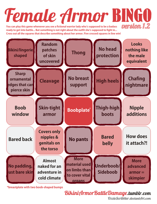
The hilarious front line in the tragic war against ridiculous female armor
Month: June 2020
Posted on
Posted on
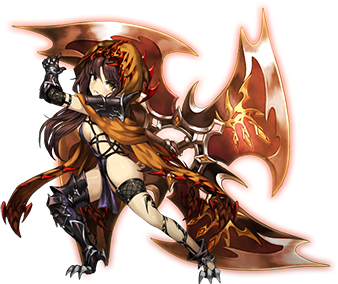
‘Brown Dust’s (now renamed to Brave Nine) Kiria. Hope you didn’t think the other bingos we did for this game were the worst they got!
Based on her description blurb, I think she is an ex-patrol guard in an empire, turned…. assassin? Which her design definitely communicates. Um. She’s the “black scorpion” which is on her scarf. And her entire ass being out I guess communicates her… desire for justice being loud and clear. Or something. I’m also not super sure how her ass is turned 90 without the rest of her leg rotating also… We’ll chalk it up to ninja powers.
And this is the less ridiculous (though not by much) version of her. Behold, the “improved” version!
The only thing that got an upgrade is that scorpion hood, and it doesn’t even look that good.
if your female character doesn’t look like she has lived the life she leads and you can’t get a sense for her actual personality by looking at her because you’re too focused on making her pretty and perfect and palatable it’s bad character design and you should feel bad
It’s worth noting that, generally speaking – this is why concept artists want to be concept artists. They want to convey feelings, story and inspire the imagination. It’s not uncommon for concept artists to do staggering amounts of research in order to find ways to convey a type of character in a type of time period.
So, if you come across a product created by a major studio where they have extensive executive and production staff – it’s safe to say that any aggressively boring female character designs are done at the behest of a particular type of individual pushing a ridiculous myth to try to seem like a genius.
It is important to call out this kind of absurdity, not just to try to reduce the amount of gratuitous objectification in media – but to also spare these poor artists the indignity of having a guy try to convince them he invented anime tiddy.
– wincenworks
Also to note, some creators try to “justify” their boring, pandering designs. Character design should speak for itself. You shouldn’t need someone there to explain it, unless there’s worldly lore the viewer needs to know (like family crests, or magic stuff, etc).
Does the character look nothing like a sniper, while the creator insists that she is? Probably a bad design. Is the character’s backstory strangely convoluted, while also not impacting the character at all besides making an excuse for her to look hot? Probably a bad design. Is the character wearing clothes anachronistic with the setting, just to look hot? Definitely a bad design, unless she sneaked in some stockings from a parallel future universe. (Looking at you, Witcher 1.)
This week we are streaming one hour later than usual! Which means we’ll be starting on Saturday at 11:30 AM PT / 8:30 PM CEST. This isn’t a new schedule, just for this one week!
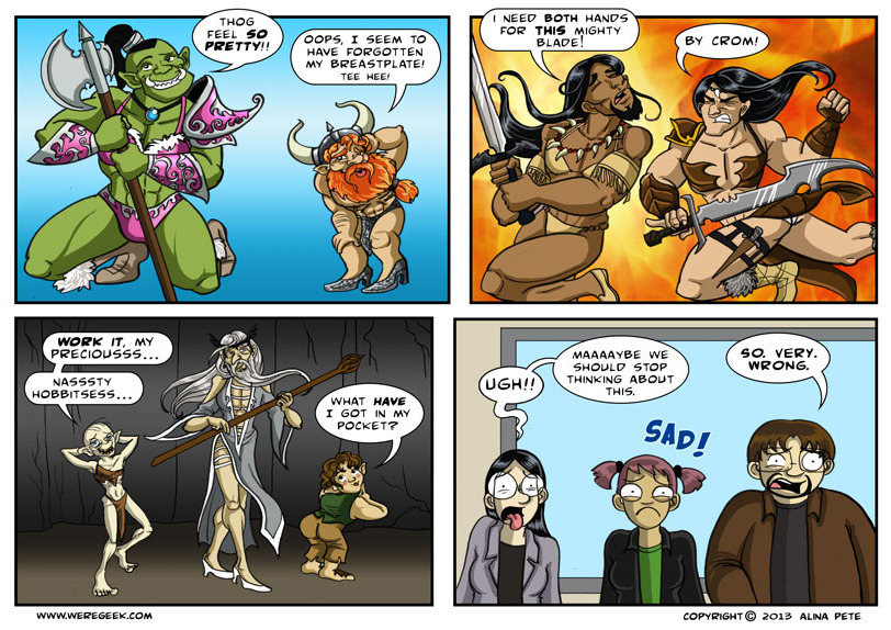
Personally I am one hundred percent supportive of orcs being allowed to feel pretty whenever they want. I don’t understand the final panel, surely it should be full of celebration!
While the sexy Hawkeye and Manfire blogs are largely archival (and marked NSFW, because Tumblr is a hellsite) these days, there’s always @magicmeatmarch every year 🙂
this is all fun and games folks, don’t get upsetti!
a while back, @bikiniarmorbattledamage reblogged my pink-overhaul doomguy illustration, and they’ve been on my radar ever since. I’ve always wanted to try my hand at a redesign, and one of their newer posts caught my eye!
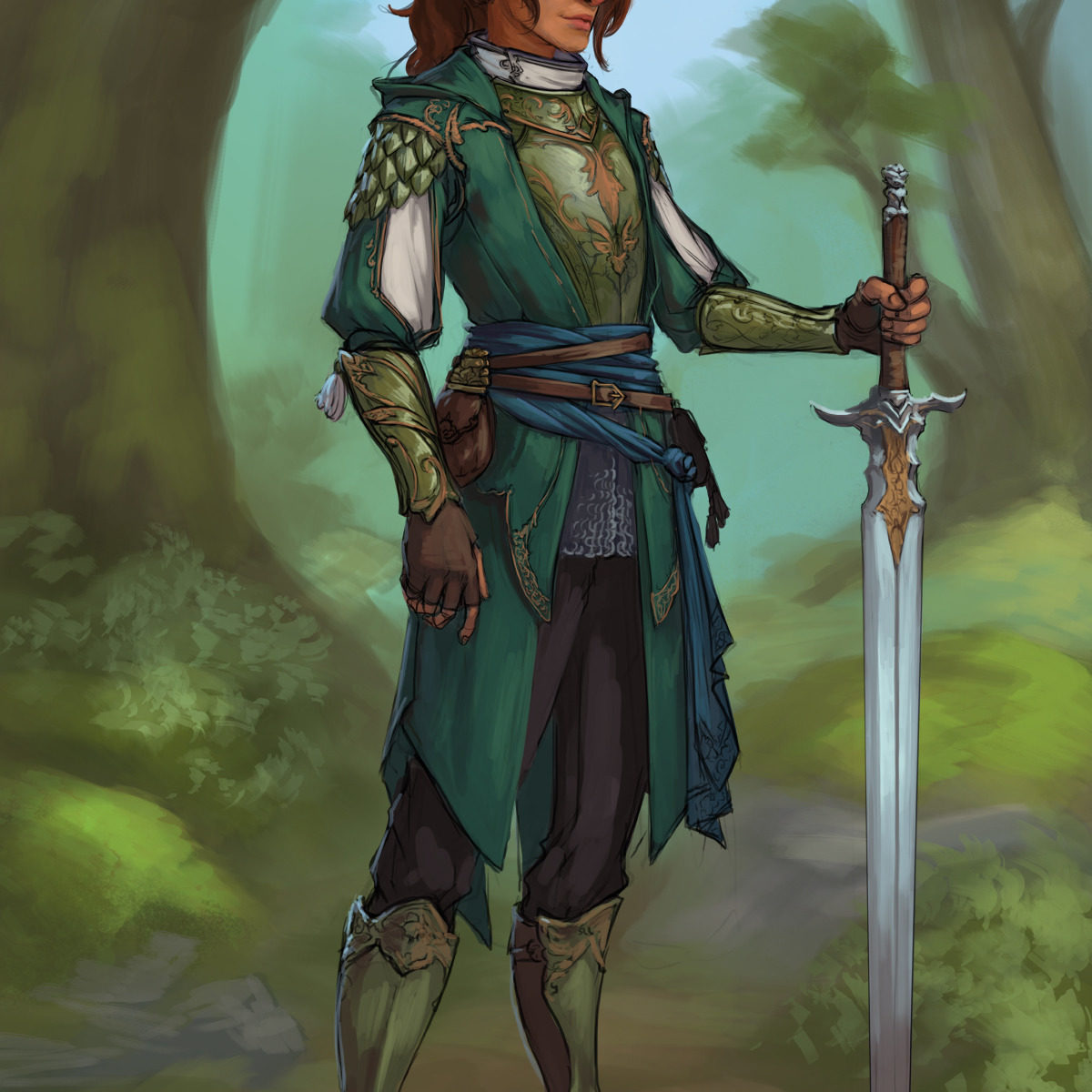
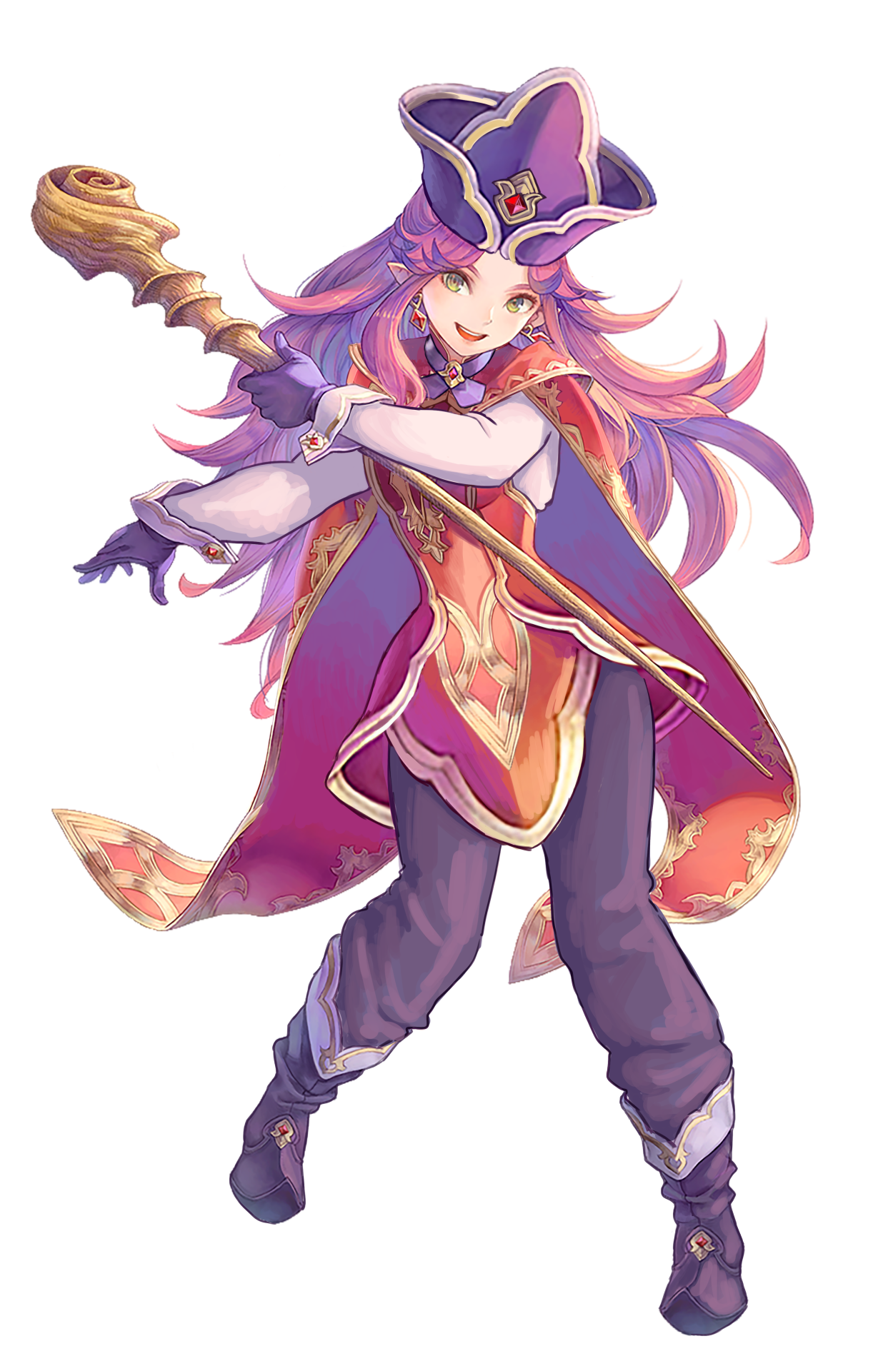
Angela, from the game Trials of Mana, has so many awesome motifs in her design, and she’s absolutely adorable. I wanted to keep a lot of that, but also cover up them lovely legs and put the cloak in it’s rightful place, making her seem more like a magician from a colder place, rather than an attractive swimsuit model.
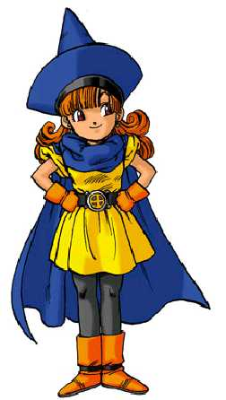
I took a lot of inspiration from Alena from the Dragon Quest series with this design, especially with the hat. It was so tiny on her original design, so I gave it a little growth spurt.
I think the biggest change I implemented for this design was her dress. I kept the slim waist, because hey, it’s cute as hell, but I added a lovely skirt that mimicked the design of her hat and her cape, which was rightfully relocated to her shoulders.
I really hope words can contain how impressive this redesign is, @mintyeggs! You brought out all the potential poor Angela had that Trials of Mana’s artists refused to take the advantage of! I especially like changing the butt cape into a regular cape while maintaining all the shapes where they belong. Also a big fan of the tunic you designed for her from scratch.
If there’s one thing I’d reconsider, it would be whether the inside of the cape’s color blends too much with her hair (maybe the lining should be dark
at the top
like her pants?), but that’s really a minor nitpick.
~Ozzie
Ohh, I absolutely love what you did with the shirt! I didn’t even notice those cuff things on her wrists until I looked at your redesign and saw that you turned them into a blouse. Well done! She definitely looks more like a magician now, and she won’t be freezing her buns off in her own house. And you still maintained the shape language and color scheme, too, what an inspiration for our own future redesigns.