

Heroes of Newerth – SEXYFIED EDITION! (NSFW)
We redesigned female Heroes of Newerth characters so many times at this point that we figured it’s the gentlemens’ turn!
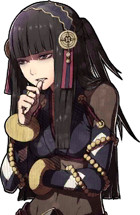
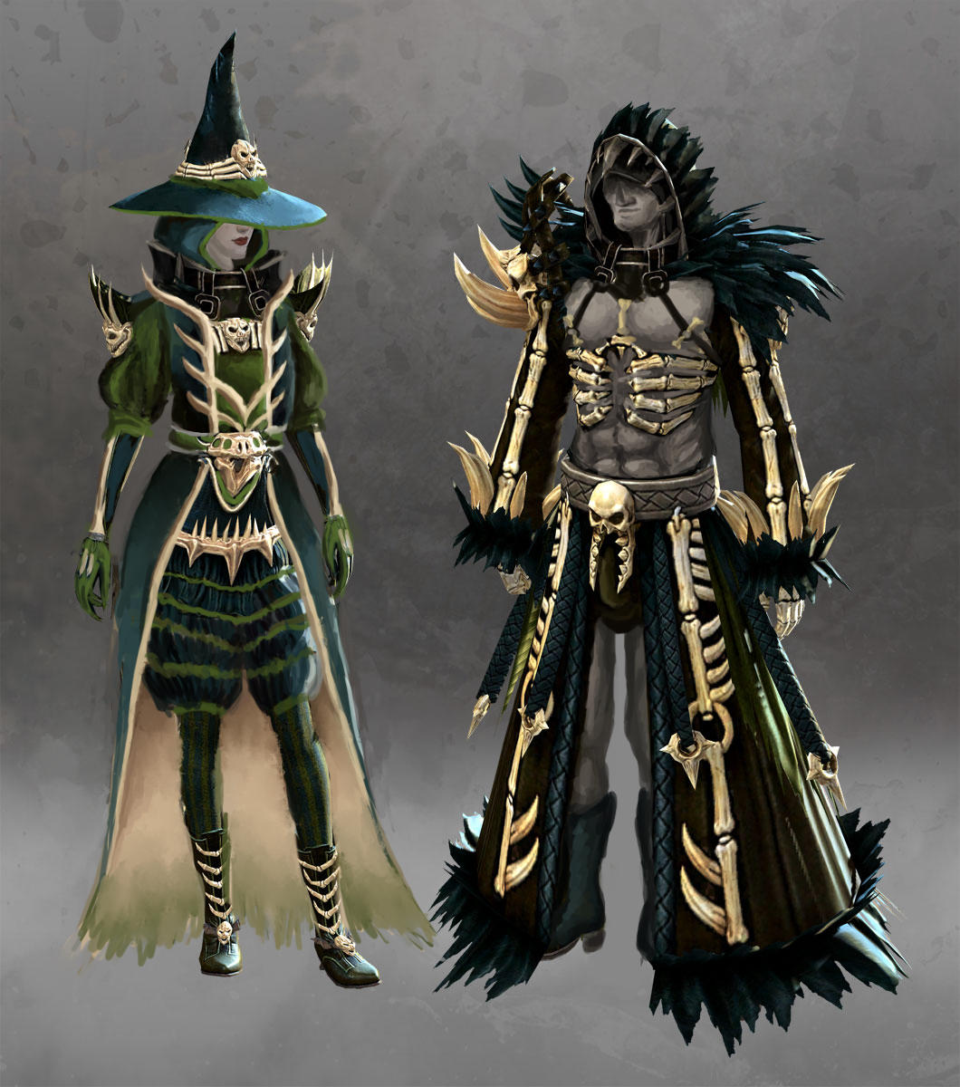
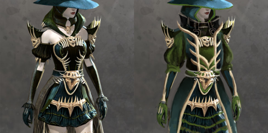
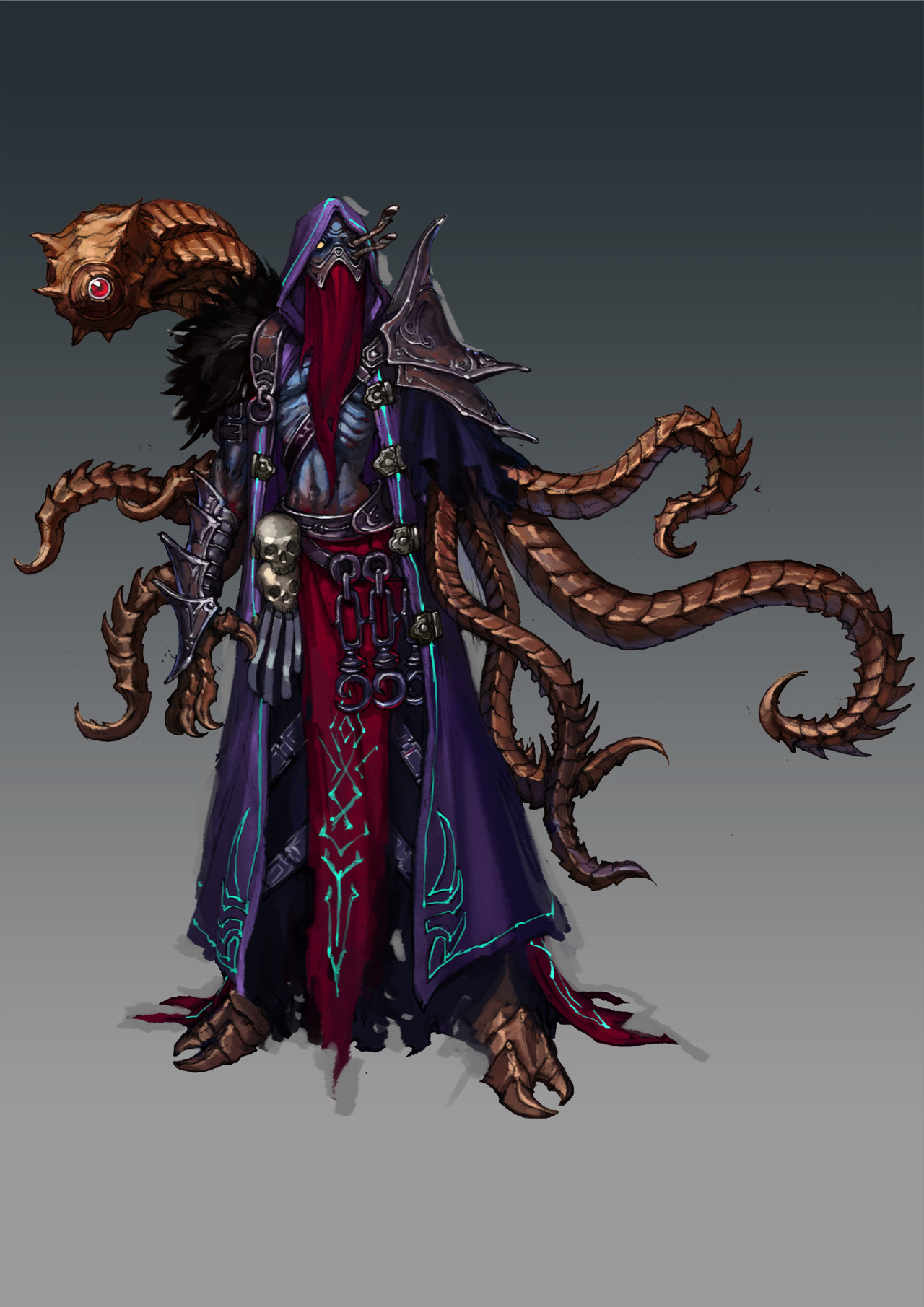
Warlock dude and Tentacle-kun
Previously compared to his female counterpart’s bingo here
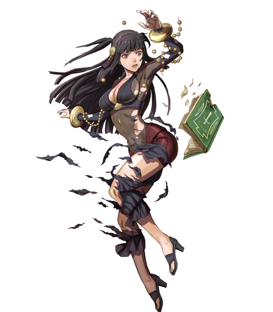
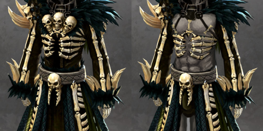
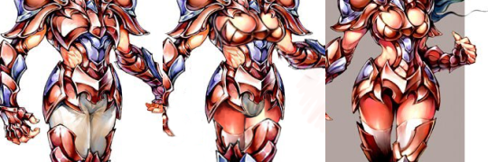
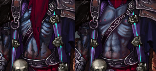
I decided I wanted to make a monster-y guy Hot, cause that’s what the people want, so I chose this nameless tentacle-y spellcaster(?) dude. He already wasn’t wearing a shirt, so I expanded upon that by shortening his veil and giving him some rocking abs. I left the ribs despite the muscles because who needs to know how anatomy works when they’re drawing Sexy Things?
I gave him 4 male-presenting nipples, since he is a Monster Boi, as well as a smoother face with a bit of a blush. I also made all of his pointy tentacles rounded, so that he doesn’t have to worry about scratching people when he’s hugging them.
And, of course, I gave him a visible dick that’s only covered by one of his belt chains. No close-ups of that for this post.
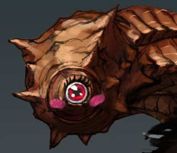
Finally, I made his other one-eyed monster, nicknamed Tentacle-kun on the stream, cuter and innocent-looking. After all, this is now a friendly duo of warlock and tentacle.
-Icy
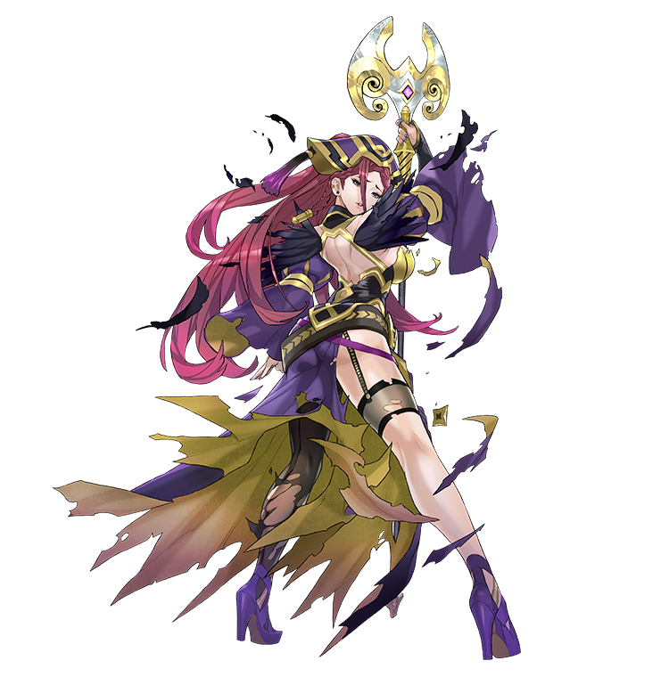
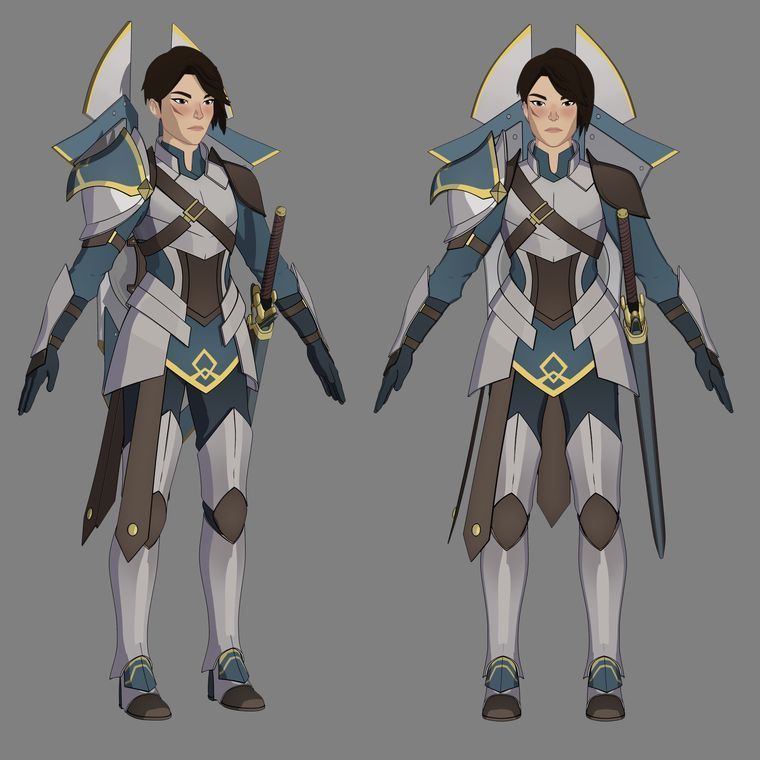
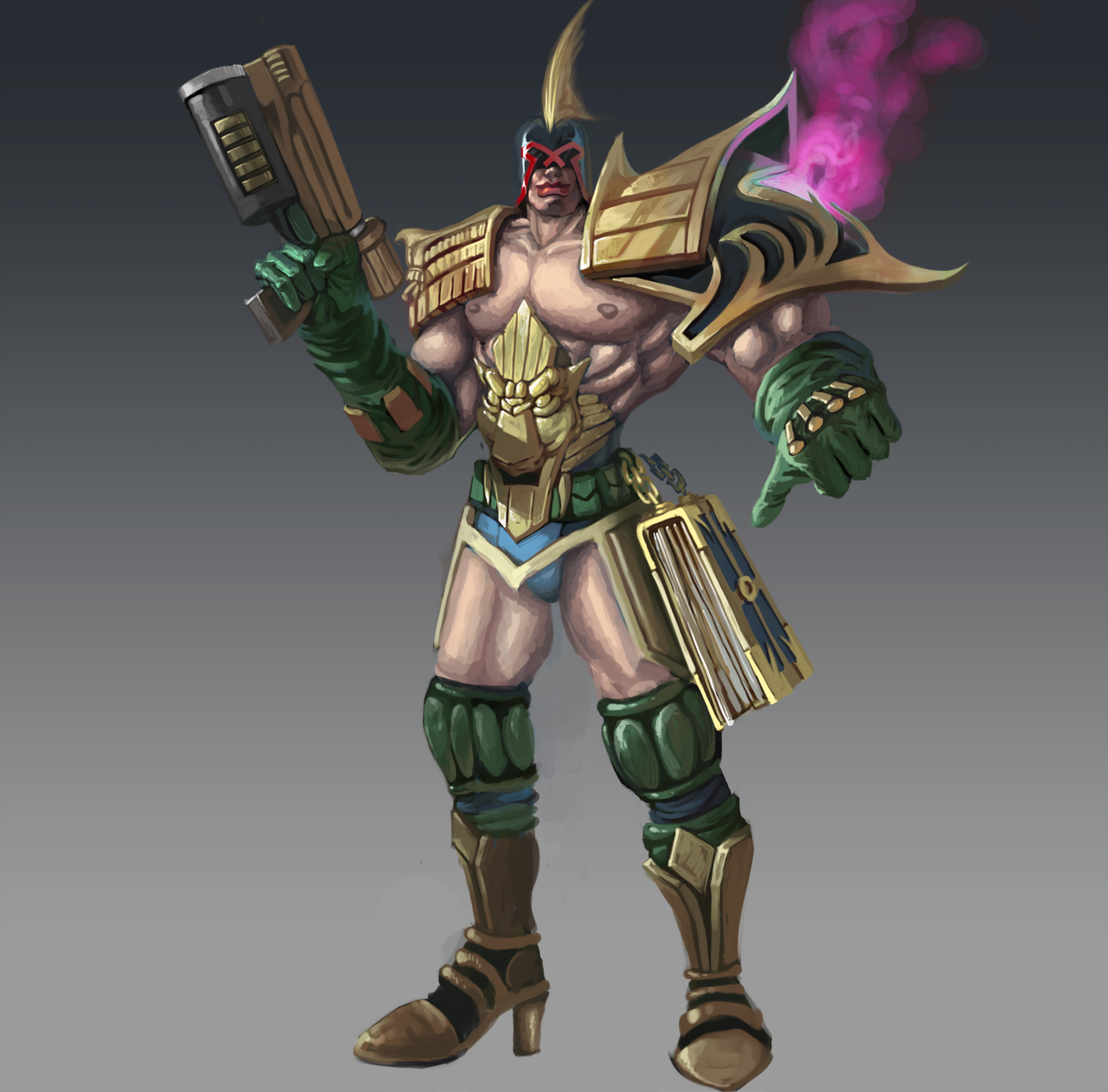
Judge NON-Dredd
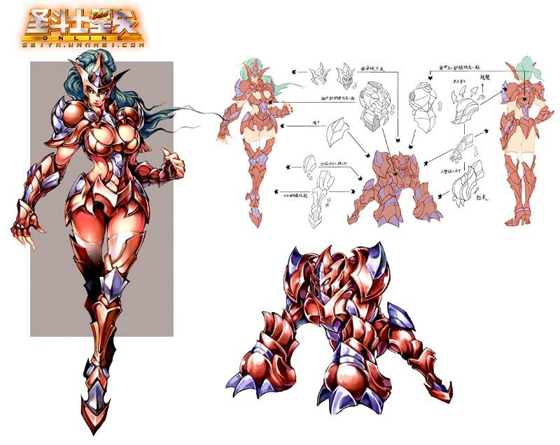
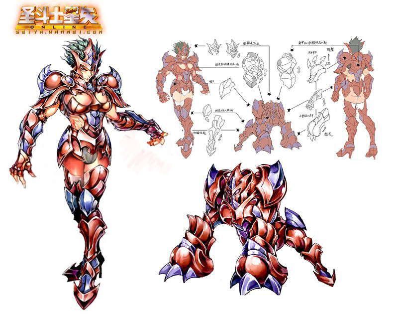
If anyone forgot, casual reminder that HoN’s concept art gallery is a cesspool of plagiarism. How they haven’t yet been stricken with cease and desist requests by multiple IP owners is a mystery to me.
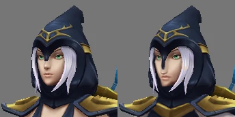
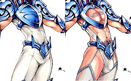
Case in point, this character is so overtly ripped off from Judge Dredd that they couldn’t be arsed to even change his helmet’s visor design – only added a tacky fin-shaped piece on top.
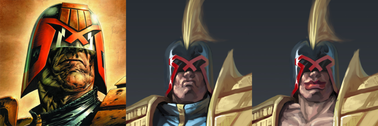
My fixed version got his dreadful (no regrets ( ͡~ ͜ʖ ͡°)) expression replaced by a friendly smile. His lips are also now much bigger, softer and made-up with red lipstick, so that the smile reads clearly on such a small head in the scale of the whole image.
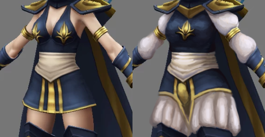
Also because he’s just secure in his masculinity – I mean, look how he flaunts his body!
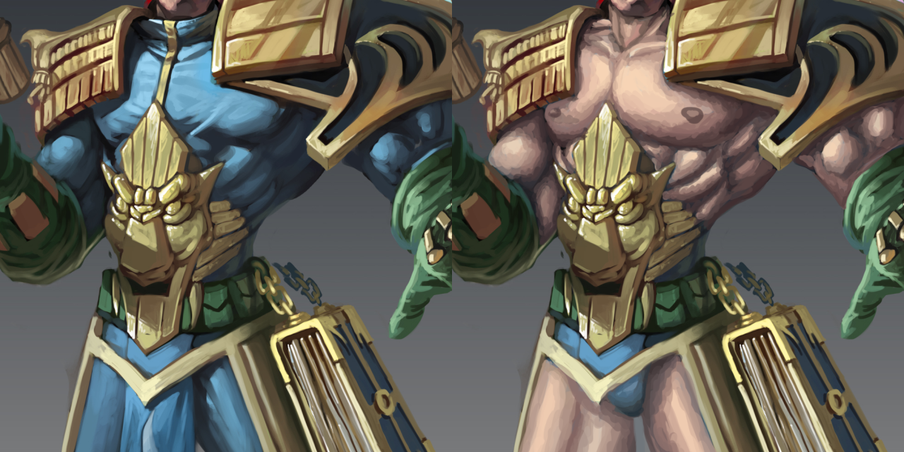
NON-Dredd’s original clothes were already borderline bodypaint thin, so it only took repainting them in his skin tone and adding the male-presenting nipples to make him truly empowered. Also, he’s not shy about his junk, therefore no more loincloth – you can see the crotch in all its undetailed glory.
For an added touch, his shoes gained some high heels and the weird smoke coming off his left pauldron is now hot pink – again communicating that he doesn’t need to drown in shades of blue to remember his gender.
One thing I regret is that I haven’t used the giant book chained to his waist to recreate Magilou’s book skirt! That would have been a great throwback to my first stream redesign.
~Ozzie