The hilarious front line in the tragic war against ridiculous female armor
Tag: costume design
Posted on
Posted on
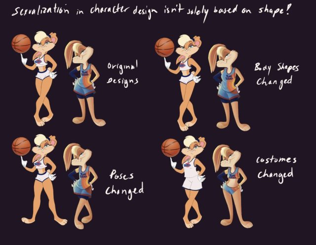
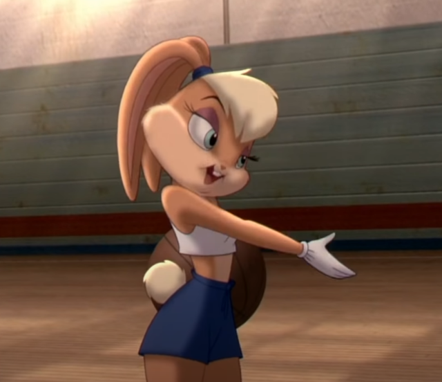
So, as you or may not have seen the hilarity of brodudes shitting themselves in anger that the new iteration of Lola Bunny which is going to appear in Ready PlayerSpace Jam was designed to be family friendly and appeal to young girls, rather than be a recreation of porny fan art of the character. (They literally claimed a fan art by a smut artist was the “original”) (VICE article here)
This magnificent tweet by InspectorNerd highlights why what we talk about on Bikini Armor Battle Damage is an important and often overlooked aspect of design for female characters (never male characters) and also another brief point I want to cover first.
Every now and again we do get people spamming us with out of context links to quotes from large busted women who, generally speaking, enjoy been seen as attractive but are sick of being reduced down to their bust size. They supply these as though it is absolute proof that the male gaze is perfect, and if you critique the design of fictional characters – you’re attacking these real women.
Thus creating the perception that women’s sports are not as “serious” as men’s sports, even when female teams outperform their male colleagues.
And how do we feel about?
– wincenworks
Posted on
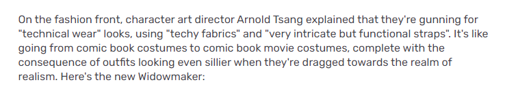
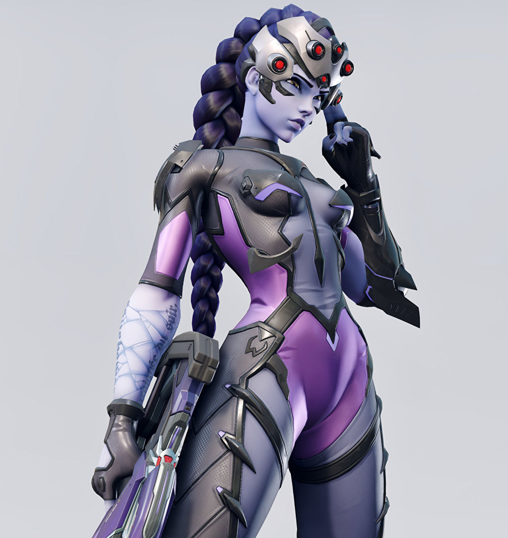
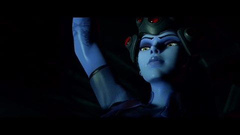
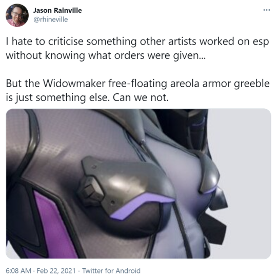
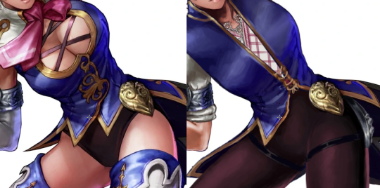
So, incredibly, Blizzard has managed to come up for yet another outfit for Widowmaker that makes less sense than her original outfit – and it works as a pretty iconic example of a costume as the sort of complete nonsense when you get cis men trying to design sexy lady fashion without taking the time to study actual fashion and clothing design.
Bayonetta is beloved by many women, because while her outfits are ridiculous they also scream “fashion” and thus convey a sort of narrative that she looks like that because she wants to has the power to. It’s not unlike how Duke Nukem runs around in an ultra manly sleeveless top… except that well, it only got signed off on because it appealed to horny cishet men.
This outfit conveys that the artist likes naked (skinny, conventionally attractive) women and has tried to obfuscate it by adding random accessories and design quirks until it looks “unique” (in the same way a randomly generated hash code is unique). How it fits into fashion or even just clothing is secondary to how many extra polygons it has.
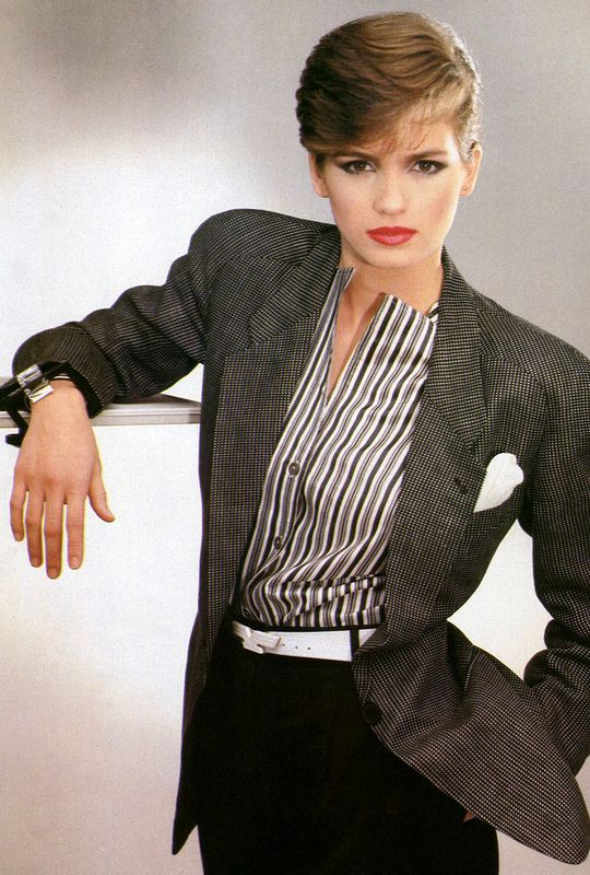
Now I know what you’re thinking, “Kim, you just want her to wear a suit.” and that is not incorrect, but more importantly I want Blizzard to look at how real fashion designers make real woman look powerful. More like, say, how Giorgio Armani dressed Gia Carangi:
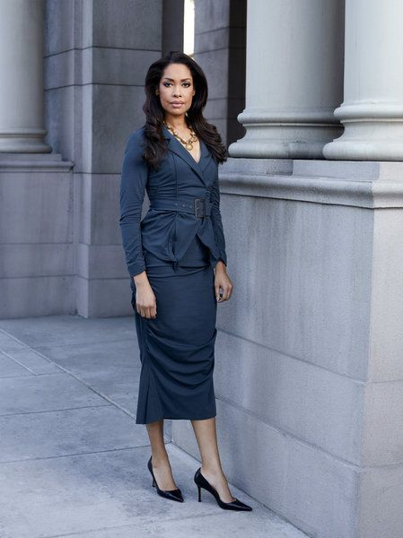
Or Gina Torres was dressed in suits:
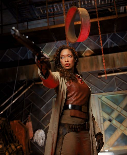
And how Gina Torres was dressed in Firefly:
And learn how to mix it up into functional, aesthetically pleasing designs that convey power and story and character.
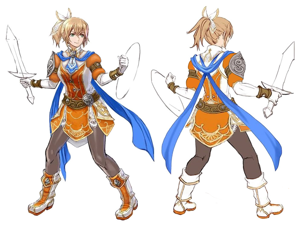
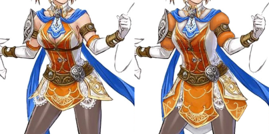
Pathfinder: Kingmaker may not have the most inspiring splash art…
But it did produce some fantastic positive examples of female warriors and spellcasters, art by Valeriy Vegera! It’s just a shame that the Pathfinder property seems to have such a tendency to bounce up and down when it comes to this kind of thing.
– wincenworks
Posted on
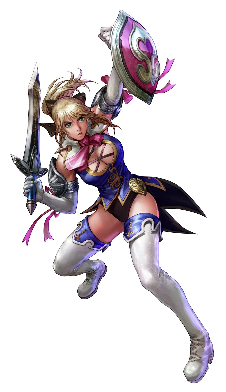
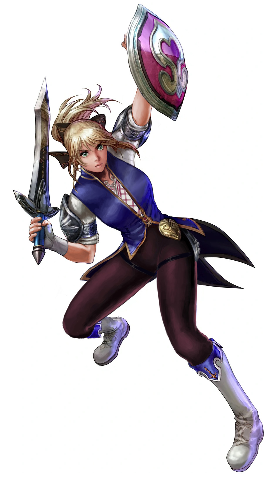
Return to Soul Calibur: Cassandra, Part 2
Soul Calibur IV/V: The Worst One
I don’t know why I do this to myself, but I decided to tackle the worst out of Cassandra’s outfits. The design started kind of silly at first, with me giving her a butt armor plating pretty much immediately. If she’s going to have a bunch of butt attacks, she might as well pack a real punch with those cheeks.
But as I was trying to figure out how to redo her entire upper half, which I hated all of, I ended up looking up some traditional Greek clothing for inspiration. Even though this is a while after Cass left home, I still wanted to include something that tied her back there. As I was explaining during a stream, SC has all these varied characters from all over the world, all with their own motivations, and yet their designs (especially in the later games) are so focused on the fan-service that any actual storytelling is lost.
In the end, I maintained the color scheme, and even the overall shape spread, with the legs being the biggest shapes (although reversed), and the small shapes breaking up the larger shape of the jacket. I guess the only shape I really broke up were in the arms, because I hate her stupid gloves lol.
I got rid of all of her pink ribbons because they just seem out-of-place no matter how you look at it. Guess they were tying the pink of the shield into her outfit, but they were too stupid. Rest in Pieces, ribbons.
This design would probably suit an earlier game, but whatevs. Overall, it’s pretty passable, if I do say so myself.
Concept: A typical baggy robed male mage but his behind is exposed like a modern backless dress.
Can we get all the overheated wizards dress like that from now on? I wouldn’t need to dress Ezren down if he had party in the back like that!
~Ozzie
PS: Completely BTW, the wild mix of fandoms in the notes of this post is delightful. Everyone sees their best boys in him. ?
Posted on
Return to Soul Calibur: Cassandra, Part 1
Soul Calibur’sCassandra, much like her Greek mythology namesake, is cursed. But instead of no-one believing her accurate prophecies, no-one ever gives her adequate costume! And, as per usual in the franchise, designs basically only get worse over time. So we agreed to do a double-Cassandra stream and fix two different outfits of hers.
Soul Calibur 6: Orange-white minidress
While this is her latest iteration, I wouldn’t call the SC6 Cassandra dress the worst by a long shot. Still plenty shitty, though! See its bingo here.
It is rather surprising that after years of her main color scheme being blue and pink with white details, latest game changed it to orange and white with blue detail. The new, complimentary, colors look nice together. I don’t think the palette change was necessary, but unlike many designs we comment on, this one’s artists have their basic color theory in check.
Obviously, first thing to change was the boob window. I decided to color in that whole part white (not orange) and connect it with her collar, to give the remaining orange part a vest-like look. Moved its hem a bit higher, too, so that it stops implying low cut cleavage. Some subtler, but still annoyingly sexualized parts, like sideboobs and the belt on her chest, also had to go. I usually don’t mind bare shoulders, but this design looked better with some poofy sleeves, in lieu of our stream redesign staple, the poofy pants.
I decided to extend the front and back flap on her dress, and to add two side flaps under the tassets, as an additional splash of color and some padding. And while I appreciate how comfortable her shoes looked, I turned them into longer boots that look much better with this cut of costume.
Rather than a massive overhaul, it was the kind of redesign that consists of many small changes that add up. And I’m quite happy with the whole thing. Hope you enjoy it!
I wanted to do one from the front so it’s easier to see what I did with her chest plate! I just made it a lil more protective while keeping with the design
What do you think?
I think she would not get an arrow through her cleavage if she wore this armor!*
Good job in fixing Pyrrha, @caitsketches! I appreciate how much difference such a simple change can make.
Personally, as a big opposer of Sameface Syndrome, I have a huge beef with RWBY’s character and costume designs in general. I welcome any fix to their absurd double standards and obsession with making everything look gratuitously “cool” and anime-like without questioning how much it fits the characters and worldbuilding. Especially the casual sexualization of teenage girls. Uuugh. ?
~Ozzie
Comparing between this and the original honestly points out how embarrassingly close the creators were to a good design.
Literally connect the neck thing to the chest piece, and give her pants, and we wouldn’t need a redesign.
-Icy
*Sorry not sorry for spoiling ancient seasons. Also, while plate armor isn’t considered a fool-proof protection against arrows, it’s obviously better than no protection at all.
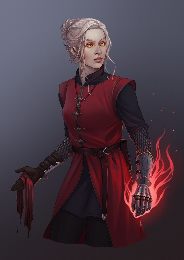
An Aasimar Cleric for a friend of mine! Painting the gauntlets and flames was so much fun!
Oh, I really like how her outfit is overall uncomplicated, so the eye is drawn to the flaming gauntlet and her golden eyes. The choice to break up the shapes in this way, with the big central shape surrounded (and bisected) by smaller ones, also helps the eye take in the entire design. It’s also just a nice way to “casually” wear armor.
Even though this design is made up of “simple” clothes, it’s still interesting and pleasing to look at, and I really like the color scheme. And the rendering is just so crisp and nice!
-Icy
Posted on
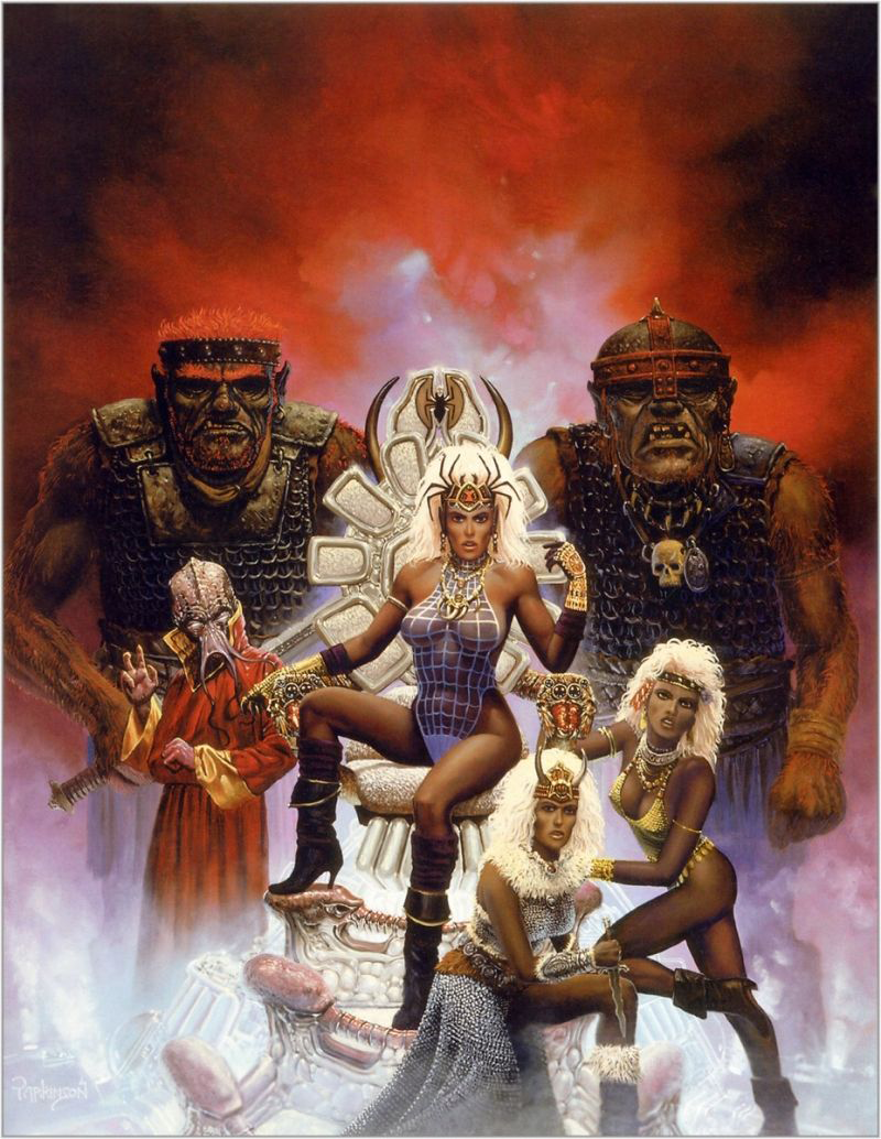
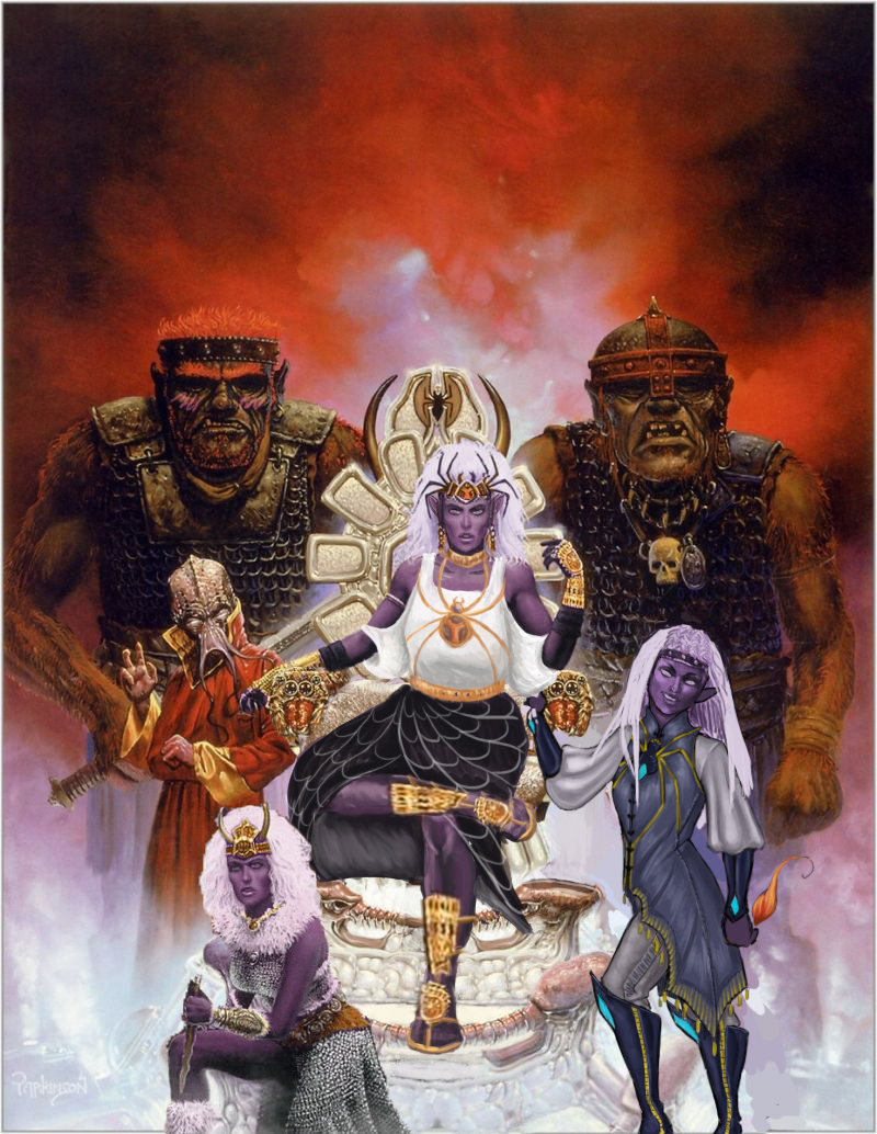
Queen of the Spiders Re-Covered
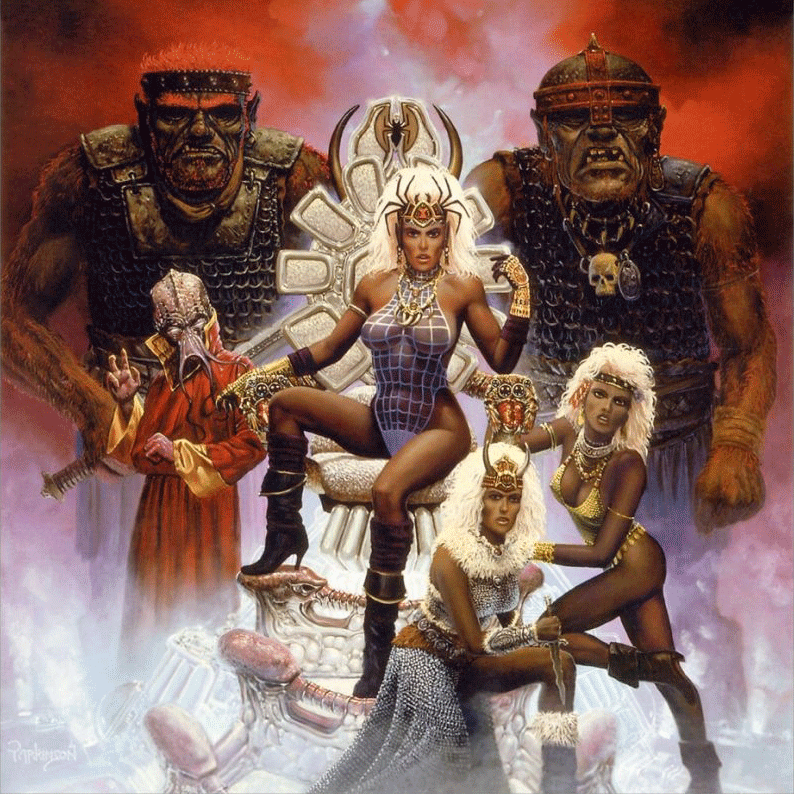
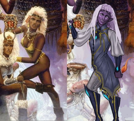
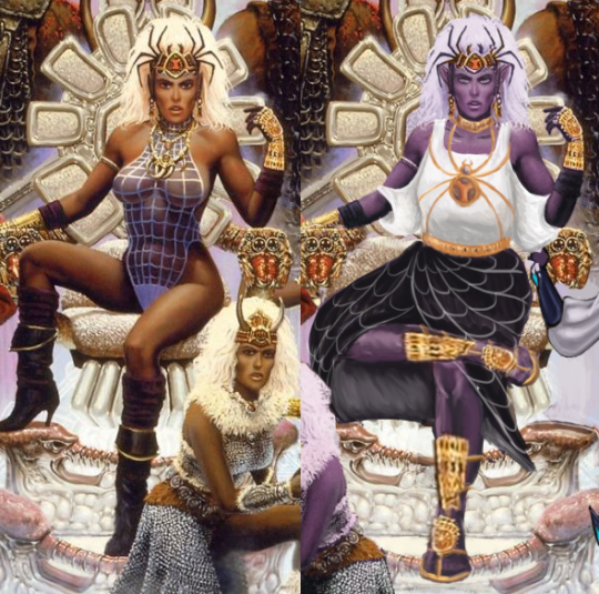
We decided to try our hand at a combined redesign, where each of us picked a character in the same picture and redesigned them. And we thought this image, the cover of an old Dungeons and Dragons adventure called “Queen of the Spiders” would be a good candidate (blame for throwing it at us goes to @theoldhack).
This is where the infamous drow race is introduced, where I guess they were just… evilwomen of color. ? Unfortunate. We decided to make them purple-skinned like they are in more modern lore.
At first, Icy thought the “queen” in the title referenced the lady in the middle there, but it’s actually one of the names for Lolth, the spider goddess whom the drow venerate, so…. We’re sure the drow on the cover are important mini-bosses somewhere in the adventure, probably, maybe.
Full write-up and close-up images under the cut.
What’s-her-Face on the Right
Just gotta say that it’s a huge pet peeve of mine when (usually male) writers write a matriarchal society as, air quotes, “sexually liberated,” otherwise known as “an excuse to draw them in lingerie because I can’t imagine women’s bodies not catering to me personally in any scenario, while still drawing men in full body armor.” Thanks for coming to my TED talk.
Okay, so…. I’m not sure what she’s supposed to be… besides a swimsuit model, which maybe the drow do have. Is there a quest where the players go to the underground beach to play underground beach volleyball? Cause if not, why is she like that???
I decided to make her a mage (this was a 1st edition book, so that’s all we got). I ended up changing…. everything, really. I think the only thing I didn’t change was her nose shape. It’s not my fault though, the redline for her original pose was an unsalvageable eldrich nightmare.
I gave her a more confident pose, more comfortable magic-user-friendly clothes (with the spider motif, cause spider god), and even different hair. The original hairdo just wasn’t doing it for me. I wanted her to look cool enough to have her own illustration in the book. She even has a little magic flame (mostly cause I didn’t know what to do with her hand lol)!
Her hair didn’t quite turn out how I wanted it to, but overall, I think it’s a good redraw. She’s got lots of fun shapes, an actual color scheme, and an attitude. What else do we need?
-Icy
Queen/High Priestess Crotchleg
The composition was so awful that I had to actually largely re-do it by changing the third lady’s position from right to left and recreating large parts of the throne… some of which ended up covered by the main drow’s dress anyway (probably for the better).
Speaking of which, boy was she hard to fix without just throwing everything away and starting over! First of all, the way she sits on the throne seems like a product of an alien who never experienced what a chair is… which might also explain the throne’s uncomfortable-looking design. I actually ended up giving it a bigger seat and more lumbar support.
The pose, of course, got changed to something less concerned with showing off her immaculate Brazilian and more with looking comfortable and intimidating in the authority position. I also noticed her neck was disturbingly short, so I moved her face a tiny bit up. Now her spider crown is more of a tiara than a hat. And she got a golden choker to match.
A lot of questionable physics of how she actually sits got covered up by roomy, relatively simplistic clothes I gave her. Maybe I’d consider something more elaborate if the rest of the painting didn’t require so much fixing. What matters is that it’s not a painted-on swimming suit anymore. I’m overall satisfied with the design of her top and the spiderweb skirt. Hopefully the golden spider jewelry (the legs are thin chains!) gives it some regal feel.
The original shoes were quite stylish, but looked neither comfortable nor matched the fashion sense I went with for the character (also didn’t match the angles at which I redrew legs). So I ended up giving her sandals with golden ornamentation, matching her gauntlets. Sorry not sorry for half-assing the legs. One has to prioritize while on a deadline*.
I’m generally happy with the results, considering the sheer scale of changes we had to apply to have it meet BABD standards for positive example.