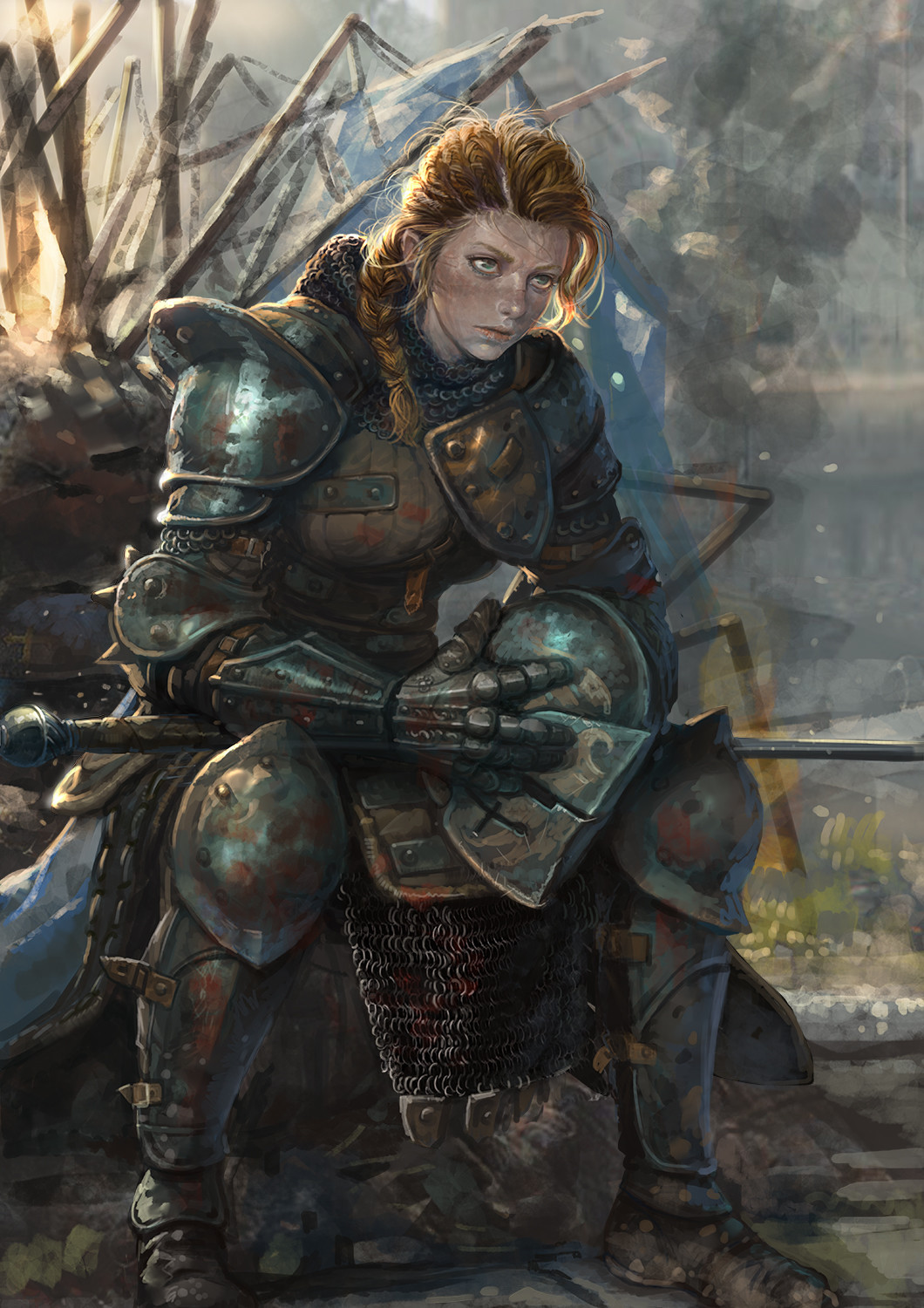
Two lovely knight designs that are instill a strong sense of realness. The armor the ladies are wearing is tarnished with dirt and blood, which is great to see, since so much art of women in armor tries to still make them look harmless (can’t fuck em if they can kill you, I guess). Despite both designs being so limited in their color palettes, they don’t feel like they need more. These definitely feel like they were drawn from real life references, and isn’t that nice.
Do note that the artist’s gallery is a mixed bag when it comes to how the ladies are designed, even in non-fanart work.
-Icy
Posted on
Okay so, when this got it’s first E3 announcement I expressed concern that Bloodstained: Ritual of the Night was:
Seems to be drifting away from being a gender-flipped love letter to the Castlevania and looking more and more like a cheap game hacked together with generic store-bought assets and all the creative focus on sexy outfits and sexy scenarios for the female characters.
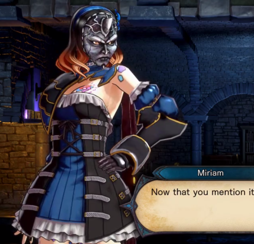
Apparently we were not alone in concerns about the appearance of this game, because Igarashi was so upset by the feedback on social media that he promised to prove people wrong:
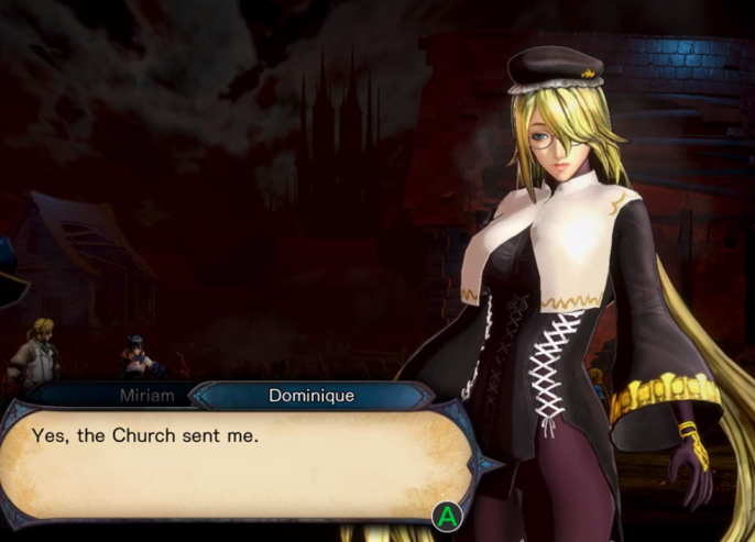
So um… clearly this didn’t include fixing anything about the costume or general design. One interesting factor is the game now has items that change Miriam’s appearance, which implies that thing on her head is a headband, not horns…
Unfortunately the one item that doesn’t seem to change, is that hideous, unflattering dress which is sadly, far from the worst outfit on a female character in the game.
That um… those aren’t real clothes… nobody wear that. Shame that during the entire development process they couldn’t consult with someone who actually wears dresses and other feminine items – particularly if this is going to be the first boss in the game…
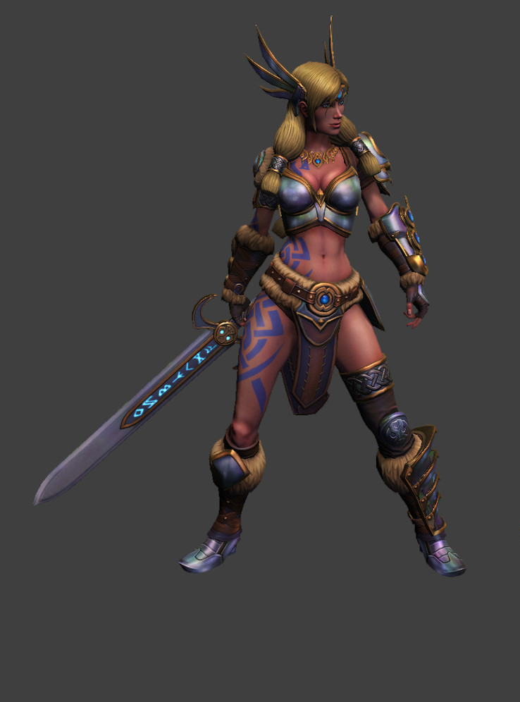
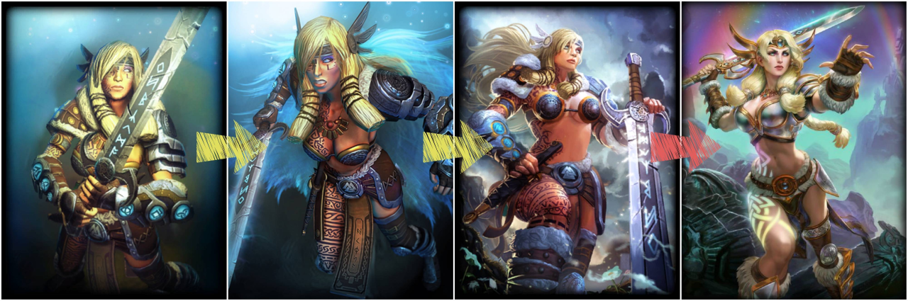
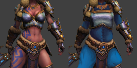
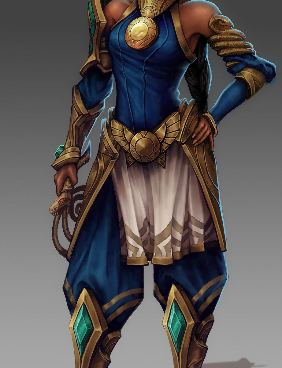
This is the second character named Freya which I fixed, and this one also got a questionable update between getting bingo’d and redesigned on our platform. I swear it’s a total coincidence.
SMITE’s standards are below the bottom, so of course while she no longer had gravity-defying metal pasties for a top, it’s still a skin-tight boobplate.
I didn’t go particularly wild with fixes this time. I liked the ornamentation and accessories well enough to leave them be, so the changes are limited to the shape of the breastplate and big blue gambeson under all of it. Thanks to it her pretty necklace suddenly popped out, since color theory is still a thing. ¯_(ツ)_/¯ Blue because it matched her existing color scheme, including those tacky Pict-like tattoos, which are alreadya cliche on many Norse/Viking characters, for some reason.
Not my most creative or labour-heavy redo, but I hope you guys like it!
We’re taking a break from streaming this week. We’ll be back next week!
~Ozzie and Icy
Posted on
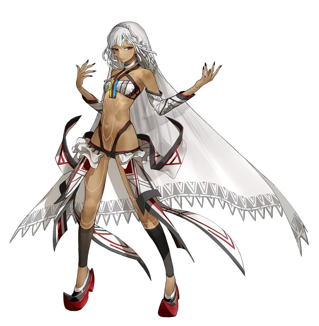
Fate Extella: Saber Attila, but not the same as the Earth one apparently
I know nothing about Fate lore and I honestly don’t have the time in my life to get into it all, but the wiki page on this character says she is Saber class, and also “different from the Altera of Earth,” (even though they look the same, even down to the clothes) so I’m taking their word for it. Don’t let me down now, fandom wiki!
We sometimes get mail from fans telling us that we’re just offended by the skin-showing, and we should get over it, but we’re honestly not like that. Just take my word for it. However. The original design for this one definitely offended me. A lot. So that’s why I picked it for our Saber redesign stream.
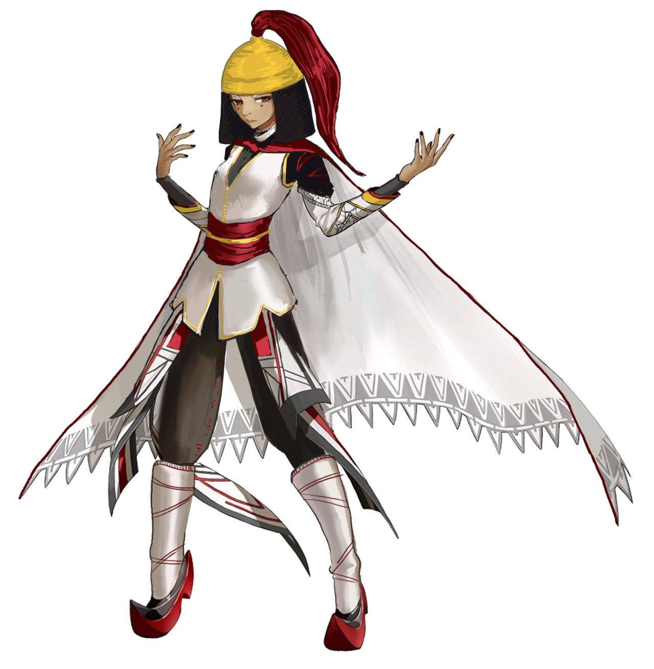
This is another case of me having to go back and finish what I started, at which point I just… started from scratch… I definitely do not have a problem. Here was my first attempt, based on a historical estimate of what Attila might have looked like (the records are less certain than for Nero, from what I found):
I ended up doing another Google search (when I went back to finish it) and found an interpretation with the helmet/coif combo that basically looked like her existing bangs and hair shape; so I decided to start over, this time trying to work more with the existing design elements.
There’s probably too much white in the final redraw, but I can’t be bothered at this point. #ITried. At least it’s actually wearable! This is now a Callout Post. Yikes.