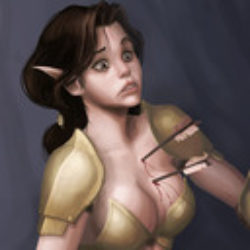
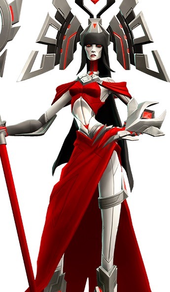
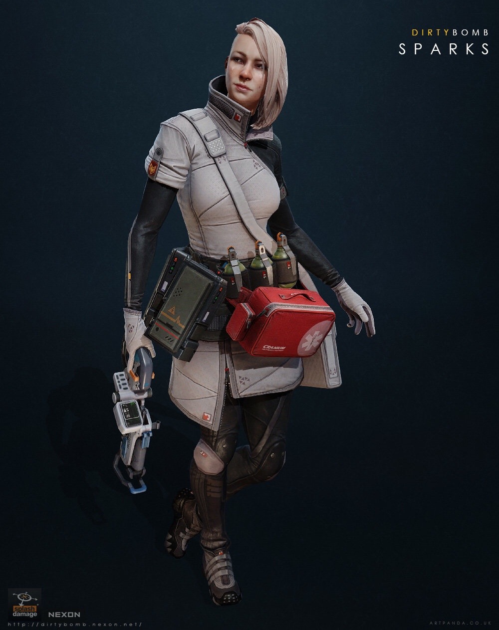
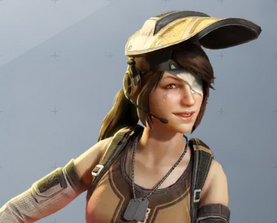
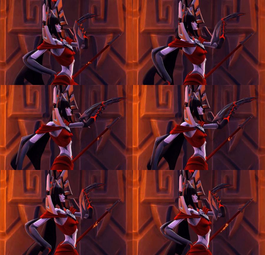
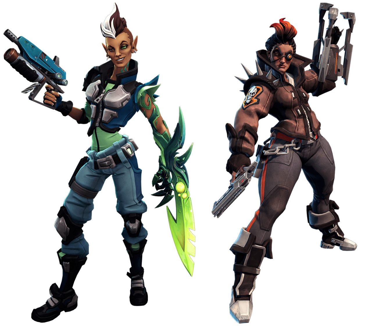
Same character class, same style of game, three different takes on it.
Stylistic choices don’t exist in a vacuum.
Dirty Bomb really doesn’t get enough credit for it’s walking the walk when it comes to egalitarian character designs and commitment to diversity. Every mercenary has a story, a personality and gear that is suitable to them – on top of that, they’re not afraid to let things get ugly. Have a look at how Proxy (basically their equivalent of Tracer in terms of personality) looks lately:
Needless to say Sparks as a white-clad medic who’s only thoughts on her profession is “Call me Sparks. I heal. I kill. Is ironic paradox. Yadda Yadda.” is a wonderful breath of fresh air in games.
Ambra from Battleborn is certainly not ideal, but as we’ve discussed before her design reeks of the Creepy Marketing Guy influence – but they at least made her a unique character and worked in no small amount of entertaining quirk.
Mercy… oh Mercy.
– wincenworks
Before anyone comes to say we’re taking things out of context or comparing apples to oranges, yes, all those games have their own aesthetic and we should should judge how each character looks within it. Dirty Bomb is quite realistic, Battleborn is very cartoony and Overwatch lies somewhere in the middle.
And we’re still not okay with boobplate on Galilea, even though Battleborn is more heavily stylized.
Speaking of ensemble games with cartoony aesthetic, let’s not forget about Gigantic, which while not boobplate-free (on their healer character, no less), does really good with gender and age balance among their cast.
~Ozzie
This week’s throwback: a reminder that Blizzard’s bland approach to female character design really pales in comparison to competition.
Also that Battleborn never had to be asked to deliver Black (or Black-coded, considering the sci-fi fantasy setting) playable women.
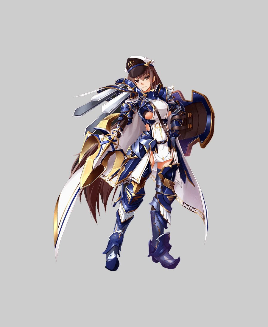
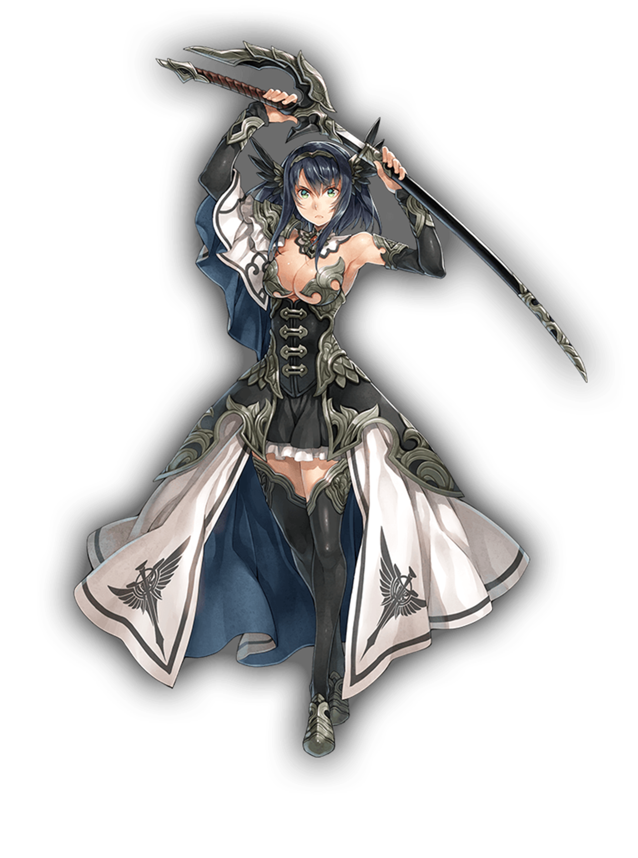
So this character is supposed to be the highest ranking soldier among the Holy Knights (whatever they are in the game) and basically is supposed to be perfect leader and fighter, including über-pretentious part in character description:
There’s not a single hole in her fighting technique. The spear is actually a perfect metaphor for her existence itself. She very rarely takes center stage.
Mary-Sue-ish description aside, I gotta admit that Elmina’s stance and *parts* of uniform do inform what a confident authority figure she is. Then there are ridiculous patches of bare skin, schoolgirl face and ridiculously busy costume shape.
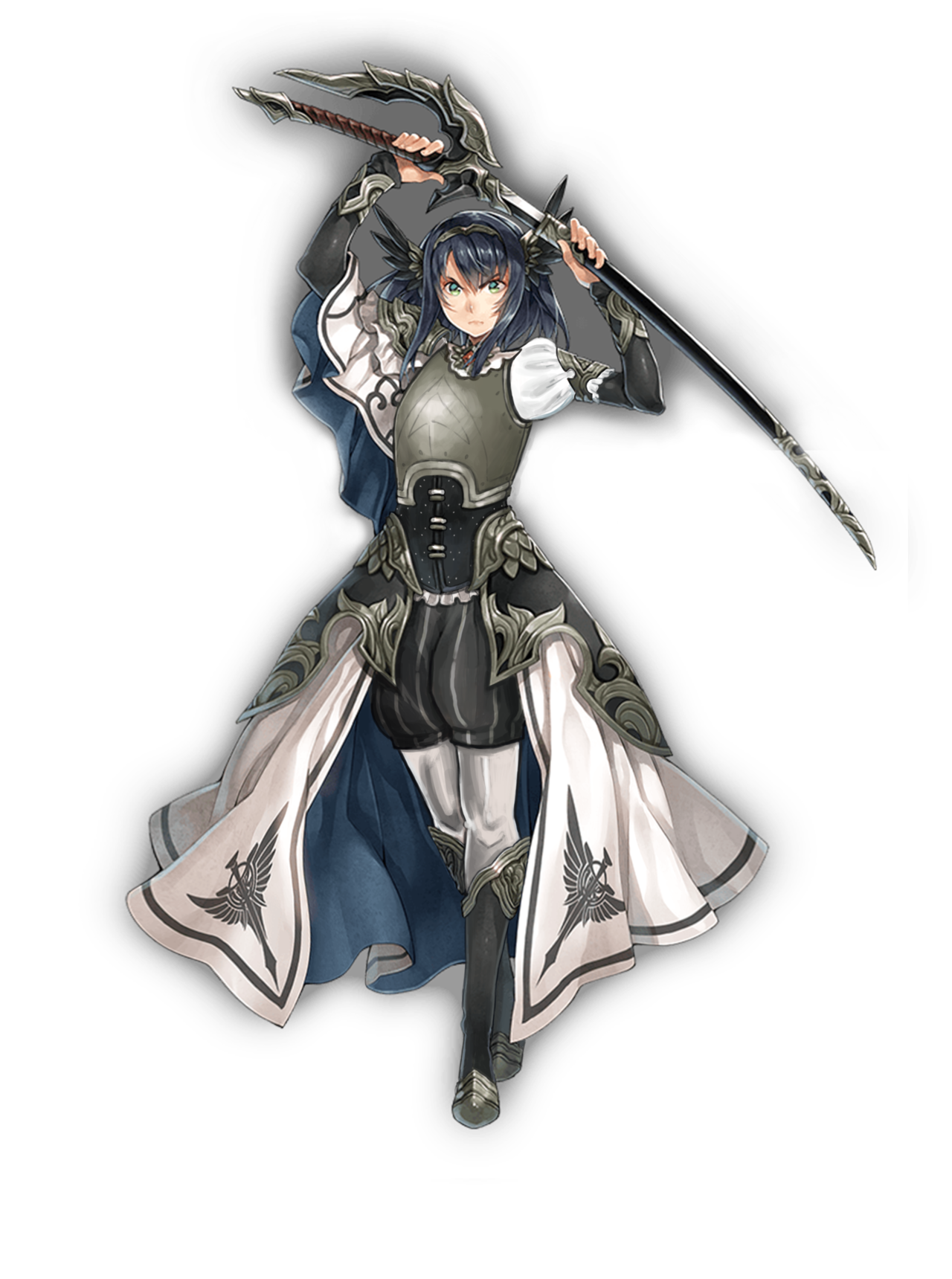
First, obvious thing to fix were the random cutouts. Then I decided that whatever that giant pauldron thingy on her right arm is supposed to be looks just too absurd and uncomfortable to leave it as it is. Instead I recreated her left pauldron best as I could, to make it a simple symmetrical uniform.
Next thing was to give her face conveying the experience and age you’d expect from a high ranking officer. I made her look older with a bigger nose, some minor wrinkles and a tiny bit more detailed lips and jawline. Crossing scars over the bridge of her nose communicate that she acquired her mastery of the spear at a cost – no real badass warrior authority should go scarless. Also she got a haircut. Her cape is epic enough to blow in the wind and the long hair just asked to get stuck in her weapons or armor.
The rest of the stream I spent reversing all those tiny little ornamental shapes from her uniform into simpler, bigger shapes that don’t tire the eye so quickly. Most such changes can be observed on her greaves, as her legs were the least exposed part of the costume.
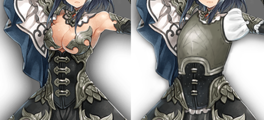
I decided to tackle the lovingly-rendered but very unfortunately dressed Helga. She has no backstory that I found, so nothing was stopping me from doing whatever I wanted. Insert evil redesigner laugh!
I started by giving her an actual breastplate to replace the…. um. I’m not actually sure what she was supposed to be wearing in the original? It’s not pasties, but there’s not enough coverage to call it a bra… anyway. I got it outta there fast. I also gave her a sleeve while I was at it.
I used the same breastplate design as I used for my other Kanpani Girl redraw, because the metal bits under her breasts lead easily into it. I just moved it down to that it’s an actual armor. And thanks to feedback on the previous design, I knew to give her a brigandine under that breastplate: that’s what the metal rivets are.
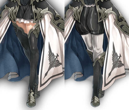
Next, I debated over what to do with her legs. At first, I wanted to give her a tabbard and get rid of her massive skirt almost entirely, but I actually like the skirt. It goes well with her flowy sleeve, and I decided that she was a noblewoman who learned sword-fighting. No backstory, no rules!! It wouldn’t be the most practical, but I decided she still held onto vain nobility ideals and thus kept the skirt. I just made it a little less wide.
I also noticed that her short inside skirt had the beginning shapes of pants, and I ran with that. The trademark Poofy Pants™
make an appearance again, with white tights underneath for contrast. I moved her stocking decorations to her shins and made shoes out of them.
And finally, I made her actually look determined. She feels like a person who only recently picked up the sword, so no scars for her yet.
I definitely had fun rendering this out, though having to switch to a different idea part-way through once again meant that I didn’t finish this during the stream. I’m better about it now, I swear!
if your female character doesn’t look like she has lived the life she leads and you can’t get a sense for her actual personality by looking at her because you’re too focused on making her pretty and perfect and palatable it’s bad character design and you should feel bad
It’s worth noting that, generally speaking – this is why concept artists want to be concept artists. They want to convey feelings, story and inspire the imagination. It’s not uncommon for concept artists to do staggering amounts of research in order to find ways to convey a type of character in a type of time period.
So, if you come across a product created by a major studio where they have extensive executive and production staff – it’s safe to say that any aggressively boring female character designs are done at the behest of a particular type of individual pushing a ridiculous myth to try to seem like a genius.
It is important to call out this kind of absurdity, not just to try to reduce the amount of gratuitous objectification in media – but to also spare these poor artists the indignity of having a guy try to convince them he invented anime tiddy.
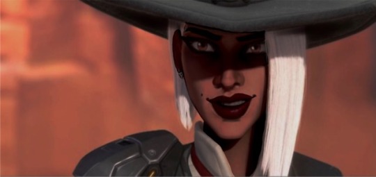
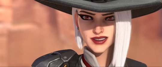
Arguing over whether she’s a “true” albino or not completely misses the point of the whole discussion. Even if Ashe was (and her design, even when accounted for makeup, makes a shitty job of conveying albinism in person of any ethnicity), this changes absolutely nothing about Blizzard electing to give another pale, thin conventionally attractive woman spot in the cast rather than finally creating a playable Black woman. Especially since she’s clearly not a PoC albino, as many rebloggers pointed out.
People claiming that racebending a supposed albino to be Black is somehow taking away from albino representation are concern trolls.
Literally all “arguments” about Overwatch “already having” playable Black female representation are neatly listed and debunkedin this handy masterpost by @geegee-wellplayed. Please go read it and hand the link to anyone who claims that Symmetra/theAmaris/Sombra/Efi/Lucio is all that Black women need to identify with in the game.
“Ashe is a gang leader, so making her black would be a bad look” rhetoric makes as much sense as any Thermian argument – she doesn’t have to be made as an antagonistic gang leader or to be (extremely) white. It was entirely Blizzard’s choice to release a character like that instead of literally anyone else.
If you actually think that @darthputa or anyone (particularly PoC) doing race-bent redesigns of white characters from predominantly white media is the real racist and you still follow this blog, please unfollow immediately. Or at the very least tell us, so we can block you.
Since it wasn’t the first time we discussed the matter, with the Ashe post we introduced the representation and diversity tags. We’re still working on re-tagging old posts with them, so if you guys spot in our archives something related to those topics and not yet tagged, please drop us a note!
A while back, I found the Female Armor Bingo Card by @bikiniarmorbattledamage and I remember seeing a particular candidate for that while binge watching Anime America. So I went ahead and did the bingo card with Dragon Half’s main character, Mink! Afterwards, I thought it would be fun to do a redesign of her, and even if it took me a while to finish, here she is! I love her color pallette, btw. ;D
Now this is a legit bingo contender! I think we could also mark “Boob window” and “Sharp ornamental pieces” too, scoring another row.
And just in case we get responses from people claiming that it’s ecchi comedy series, so any sort of non-porn sexualization goes… NOPE. Armor bikinis don’t start making more sense just because the series is made mostly of slapstic and fanservice.
I really enjoy the redesign, it’s cute and simple. Amazingly, giving her pants and a shirt doesn’t make this half-dragon heroine look any less like a fantasy character. And golden greaves, bracers, pauldrons and ornamentation still communicate both fantasy aesthetic and that she has a capacity to fight.
Thank you for the bingo contribution, @geistaku0719!
By far the most common certain demographic response seems to have been to claim that it’s fine that literally none of Overwatch’s 25 playable characters is a black woman because line up includes robots, an ape and a hamster… so naturally is the most diverse range possible.
That of course, is not even vaguely what “diversity” is about and even Blizzard executives Chris Metzen (now retired) and Jeff Kaplan (definitely not retired) understand that:
The problem is: Overwatch got prematurely rubber stamped for “good diversity” primarily for having higher than the (abysmal) industry standard for female, brown and old lady characters. (ie, some characters exist).
Now they’ve got that kudos, they’re not interested in actually delivering on promises or even maintaining the baseline.
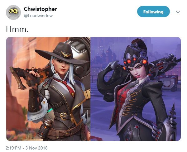
Well it’s either that, or they decided that a key demographic who needs over representation is conventionally sexually attractive white women. Specifically ones who are almost identical to Widowmaker. [link]
Blizzard already has a bad track record for disregarding concepts of characters of color in favor of making them white and blonde (specifically Mercy and Junkrat) and otherwise ignored concepts for characters of color that they’ve showcased for PR but apparently will never develop
There is seriously no way that anyone can believe that Blizzard, as a company, have any interest in good representation and making everyone feel welcome beyond sound bytes and quick stunts they can do to seek publicity boosts.
“Women should be respected and accepted as they are, don’t shame them regardless of what they look like and what they wear. Do whatever you want, ladies!”
*virtual ladies in bikinis*
“Um, this is infringing on my rights. How dare you? Keep this misogynistic filth away from me.”
Do you not understand the difference between a fictional character, created by men, to be seen as sexually pleasing for men in fiction and…like…REAL WOMEN who are ALIVE and are able to make CHOICES for themselves?
Like, women have some key differences with fictional depictions of women.
Thanks to @giantpurplecat we now have new and exciting insight into just how some creators assume women do choose their outfits [big image here].
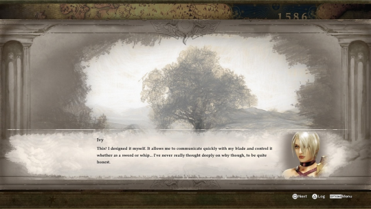
“This? I designed it myself. It allows me to communicate quickly with my blade and control it whether sword or whip… I’ve never really thought deeply on why though, to be quite honest.” – Ivy in the latest Soul Calibur
Even the new game’s character creator classifies her outfit as underwear – her underwear lets her control her weapon better… so she doesn’t wear anything on top… even though it’s underwear.
Ultimately the most insulting part about the people who rush to support this kind of double standard is that they have so little respect for women that they will accept nonsense like this (or worse) as great writing.
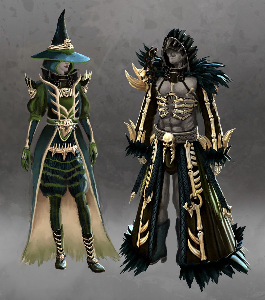
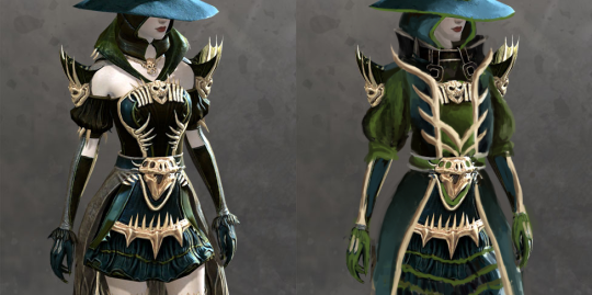
So, what does the original give us? Amazingly washed out monochromatic color palette, generic witch hat, bare thighs and shoulders, majorly over-designed bone ornamentation that looks super stabby (not to mention, frames her boobs)… and, of course, male version which looks nothing alike.
After covering the gratuitous bare skin parts with poofy pants and sleeves, I decided to stick to two priorities:
Make her color scheme more balanced (original, especially model sheet version I found on GW2 Wiki, is basically all just one shade of emerald!). Hope that dark teal, moss green and ebony compliment each other better when not so washed out.
Turn those needless small ornamental shapes into bigger, less distracting and less likely to stab her if she leans down. Obviously most of what was on her chest had to go in favor of something that doesn’t focus on the bebws.
All the actual design details and shapes were mostly incidental, as I was changing everything as I moved along, over two or three separate streaming sessions.
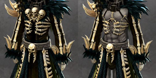
I guess I could have gone the path of whatwe did to Saint Seiya Online and change the lady’s design to that of her spooky (warlock? lich?) skeleton male version, but I don’t like his design either, just for reasons different than overt sexism. His bone motif is somehow even more overdone than hers (three little skulls on chest, one on right arm, another one on his… crotch?) and there’s the vague “witch doctor” vibe to him that puts this in exotification category.
I decided to go with the traditional sexified male armor path of stripping him down to as little clothing as possible without changing the silhouette. And gave him face skin, because if lady witch doesn’t have a skull head, why should he?
Also made that weirdly suggestive crotch skull actually frame his package with its scary jaw, because we would never miss such opportunity.
You might have noticed that lately, especially two weeks ago, we neglected to post on our regular schedule. Some personal issues fell on us and took more attention than we could spare for the blog. Hopefully we’ll be able to keep the queue going now.
Unfortunately though, our schedules still do not permit to come back to weekly redesign streams. If anything about that changes, we’ll announce it as soon as possible!
use search function to check if we posted on your subject matter already.
We’re grateful for all submissions, messages and mentions BABD gets from readers, however the amount of repeats we’re sent makes it exponentially harder to sift through all of them and preparing posts with new topics.