
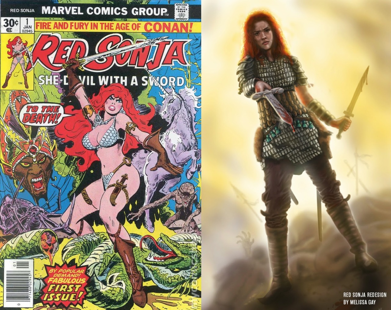
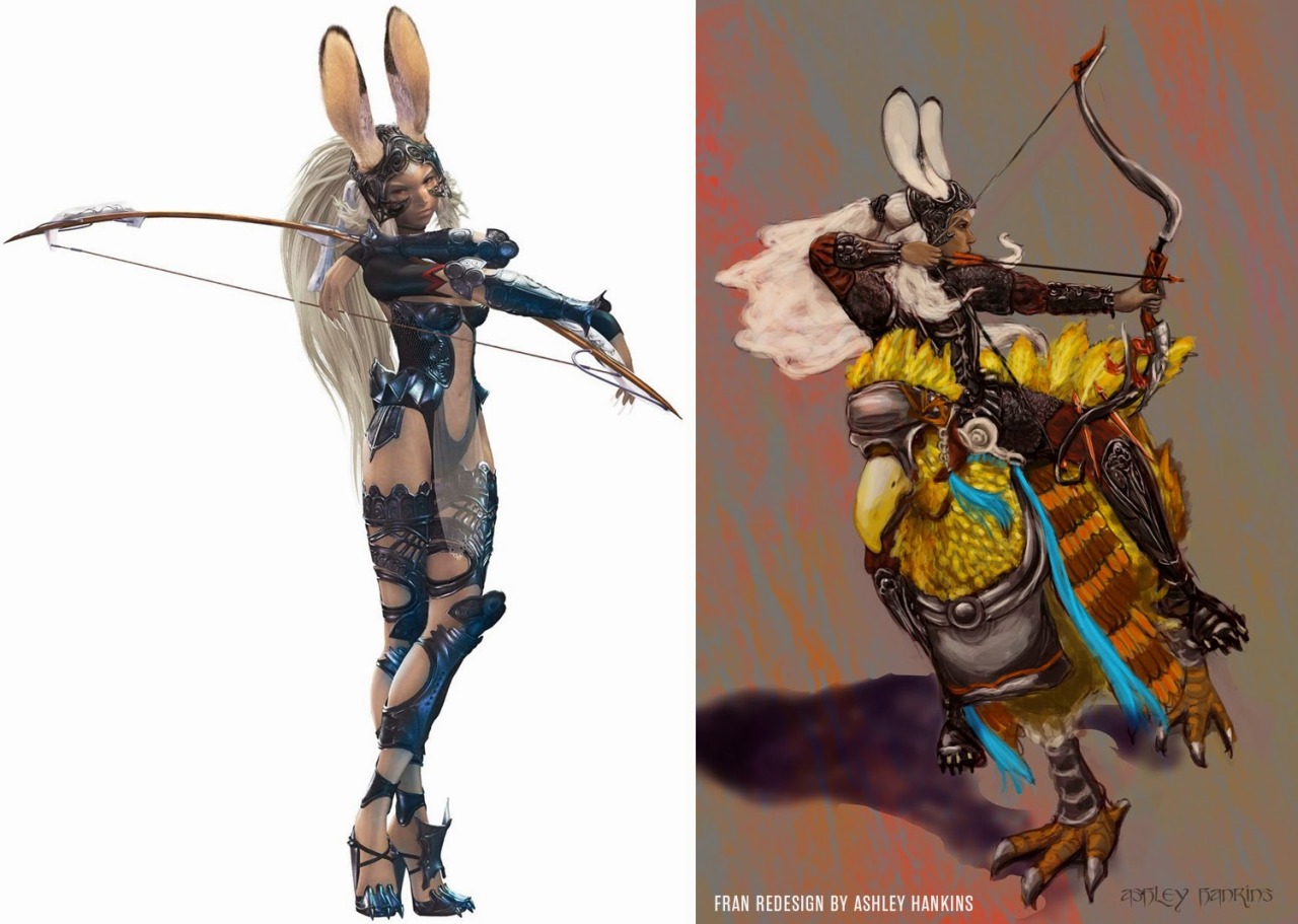
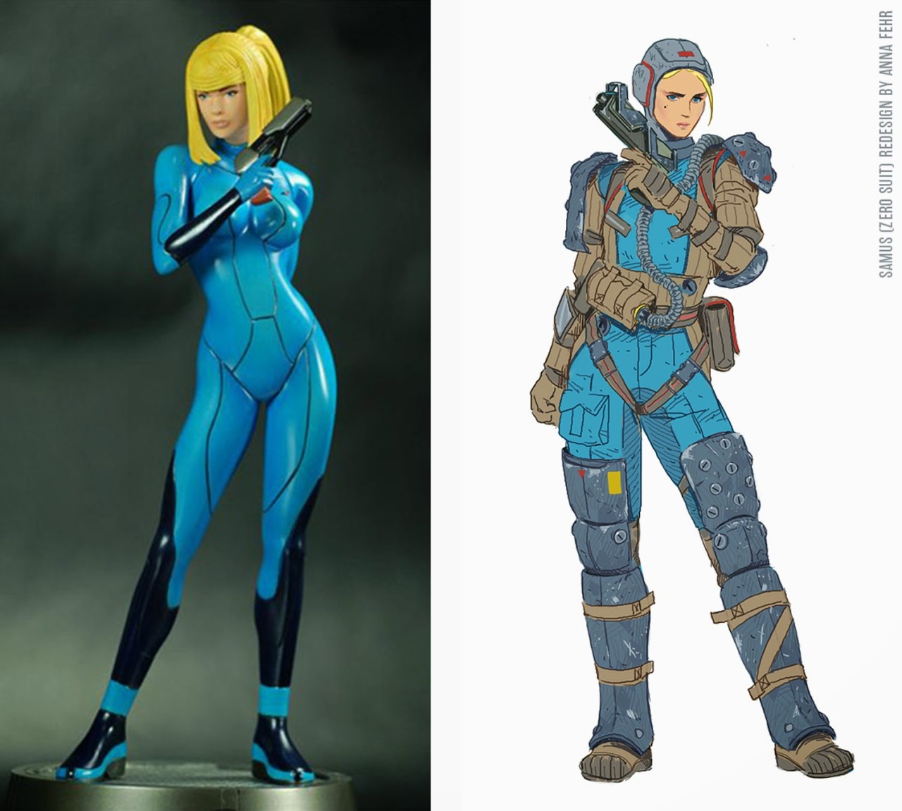
Original post with the full gallery available here.
I think it’s worth emphasizing that not only do cheesecake designs on serious characters insult the audience – they represent massive missed opportunities. Every time a company decides to go with “sex sells” instead of a solid design it means that all kinds of great potential is flushed away sight unseen.
– wincenworks
A quick reality check on the fact that every lazy “sex sells” female* character design accounts for another wasted chance for greatness.
~Ozzie
*Not to say that male characters don’t fall victims to creative bankruptcy in their own right, but they still manage to have A LOT more cliches and archetypes to choose from and not be reduced to fap fodder by default.
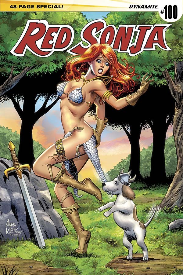
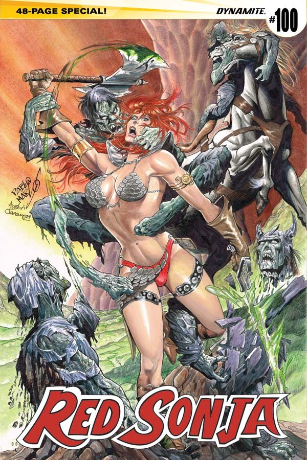
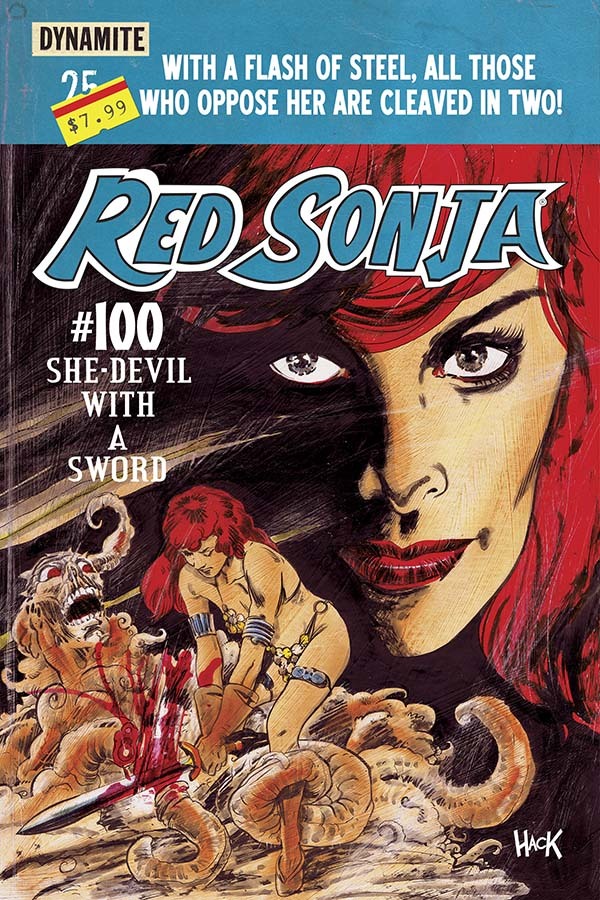
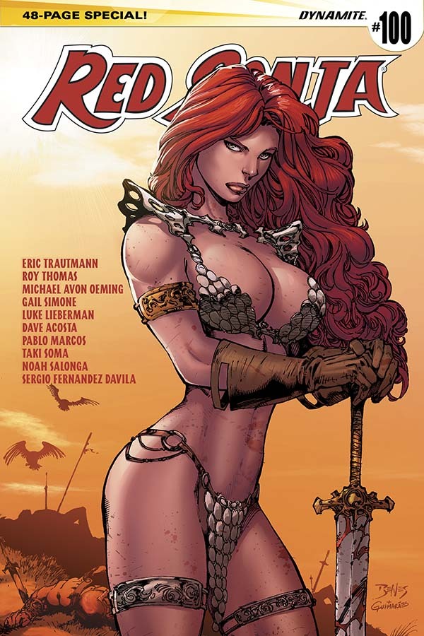

Dynamite comics has got to their #100th issue of Red Sonja… and apparently feel the best way to celebrate this is with multiple covers.
- Two of which depict Sonja being undressed against her will, with one looking so disturbingly suggestive it warranted us to put a trigger warning tag on this post
- One shows her battling something indistinct with fluff text to suggest she’s badass
- One with a boringly generic pose and awkwardly-placed list of the creators of the stories from the issue
- One shows her looking cartoonishly child-like
Dynamite Comics totally respects the character guys! It’s just keeping this ridiculous outfit for branding and nostalgia! Honest!
– wincenworks
It shouldn’t be surprising how the cutesy cover is the least terrible of them all. It’s by far the best drawn of the bunch and the only one where “can I fap to this?” clearly wasn’t a design consideration.
~Ozzie
More on Red Sonja


