


The hilarious front line in the tragic war against ridiculous female armor
ihearducksaregoingquackers submitted:
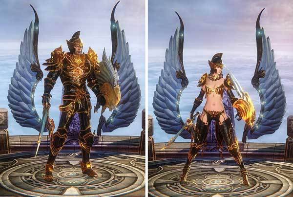
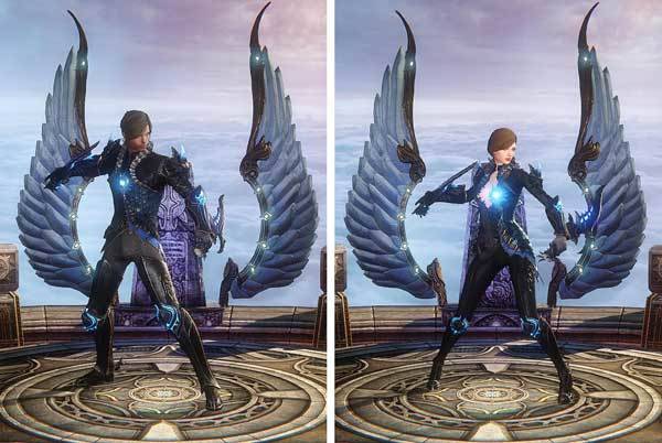
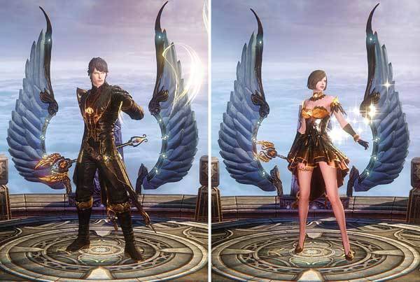
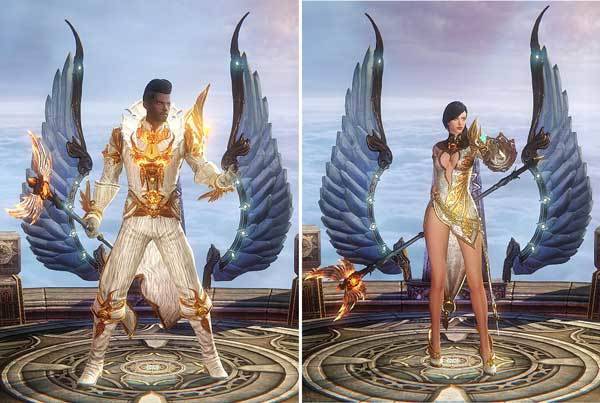
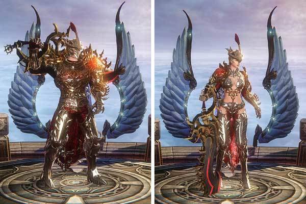
This is from a real video game called “Riders of Icarus” and this is what you see during the character select screen. Viewable on many Riders of Icarus review videos that go through character selection screens. These images were obtained from https://www.tentonhammer.com/guides/riders-of-icarus-choosing-a-class
Not only is the double standard very apparent, it’s also extremely inconsistent as well (and of course, 100% illogical because why would a woman wearing full plate reveal MORE than the assassin class??? On top of the, you know, why reveal anything dilemma).
Also, literal bikini armour. LITERAL bikini armour. I can’t…
(Order of classes from top to bottom in captions:
Guardian,
Assassin, Priest, Wizard, Berserker.)
This is the textbookiest of texbook examples of double standard in armor we’ve seen in ages. Amazingly creative!
~Ozzie
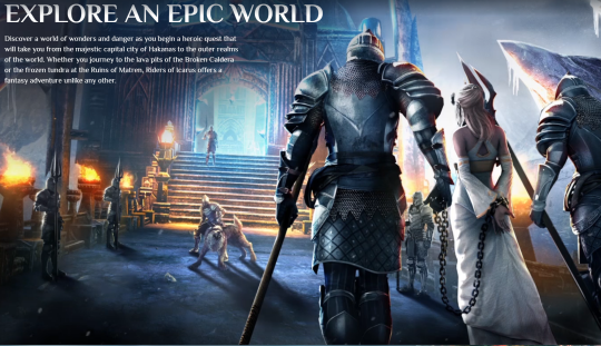
I remember how Riders of Icarus released it’s trailer it almost looked like it wasn’t going to this nonsense… for a literal minute.
You have to love their commitment to the novel idea of wings combing out of the lower legs… then going with the most generically awful female costumes…. short skirts don’t really seem compatible with dragon riding.
For bonus points, this is the first female character you’ll come across on their site if you scroll down through the promo images from the top:
– wincenworks


giantpurplecat submitted:
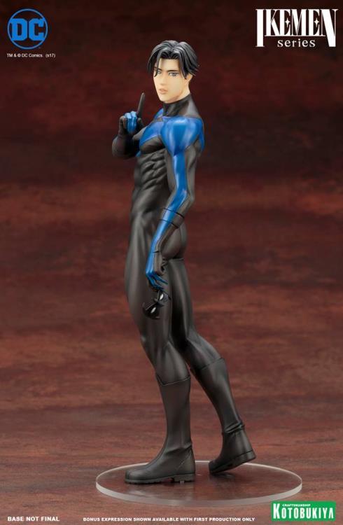
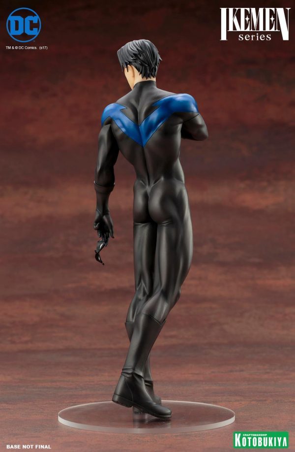
I don’t know if this has been submitted yet, but I remembered this PVC statue while I was browsing the Nightwing tag on this site. This is the DC Comics Ikemen Nightwing statue; and for those of you who don’t know, Ikemen means “handsome men”. They also made sure to put in some extra detail on this statue.
Oh, the detail on this statue is quite good indeed. Lovingly sculpted, even.
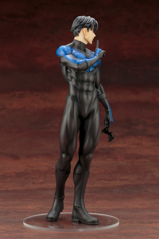
And although this isn’t quite the comfortable, confident pose Nightwing deserves, the classic empowered T&A pose is a good effort.
-Icy


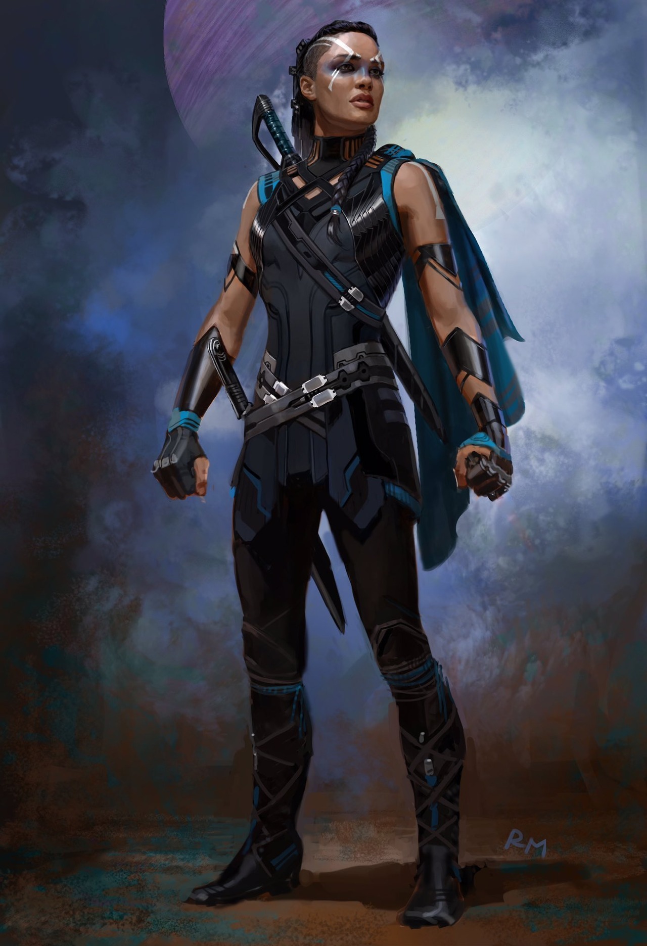
Art by Andy Park (top), and Ryan Meinerding (bottom)
These are just 2 of the various Valkyrie concept designs that were drawn up for the movie Thor: Ragnarok, and instead they went with a very bland, ugly, and boobtastic design. Even if the producers were worried that the color palette was too close to Hela’s, you can still take the armor itself and adjust the colors a bit. Just… what a shame we didn’t get to see this Valkyrie on the big screen. Hopefully, future movies will give her the kickass design she deserves.
-Icy
h/t: @grossujin

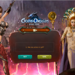
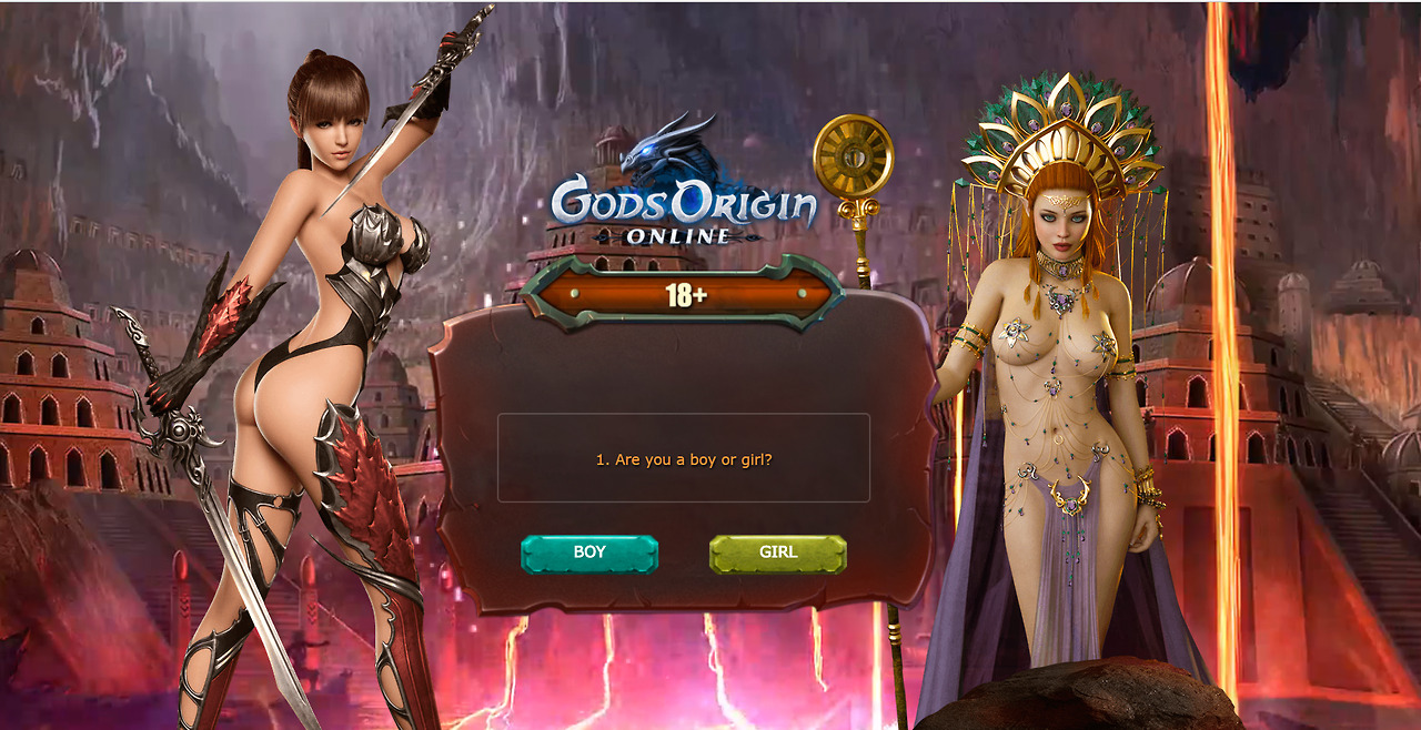

iiphides submitted:
Found in a pop up while I was trying to watch something.
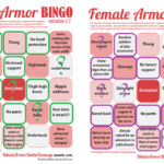
Plus bingo cards! The gal on the left is the green board, while the right is purple.
Wow are those extremely awful (with @eschergirls anatomy on the left one, to boot!), I’d say your scores are very lenient.
Sorry to do a rare bingo correction, but those two are SO over the top physically impossible and ultrasexualized I think they deserve cards as fully crossed out as possible:
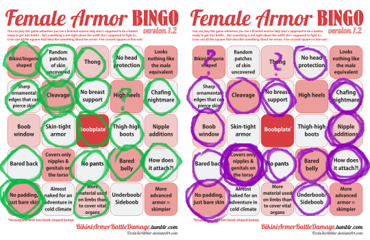
(Also, I’m using the most recent bingo card design (1.2), we grew quite tired of the “No underwear” square and discussions on what it means).
Okay, so the left one, with her “Hot Chick With a Sword” aesthetic has a pretense of being a warrior. What the other one’s supposed to be, aside from, well…

…a sorceress? …a cleric? …a double sided tape commercial cleverly disguised as a burlesque strip tease?
~Ozzie
This game’s apparently supposed to be a “Greek Mythology Browser Game.” I don’t think it’s physically possible to squint hard enough to make that come across in any way.
Also, is it just me, or do those 2 ladies look like they were made for 2 different art styles? Not to mention, this “promotional material” is orders of magnitude more shameless about the sexy girls than any other art on their website.
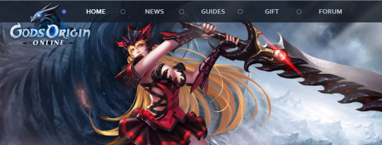
Although the “clothes” are still as confusing, so… at least that’s consistent??
-Icy
edit: Readers informed us that art in that web art is stolen. Surprising no-one, game with porny marketing is an asset stealer.