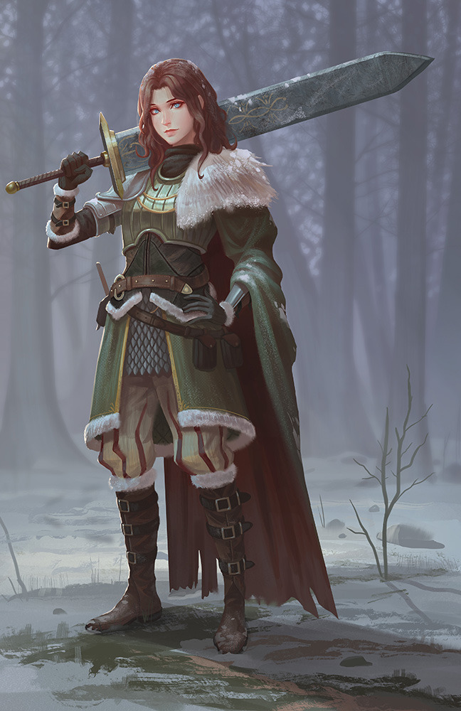
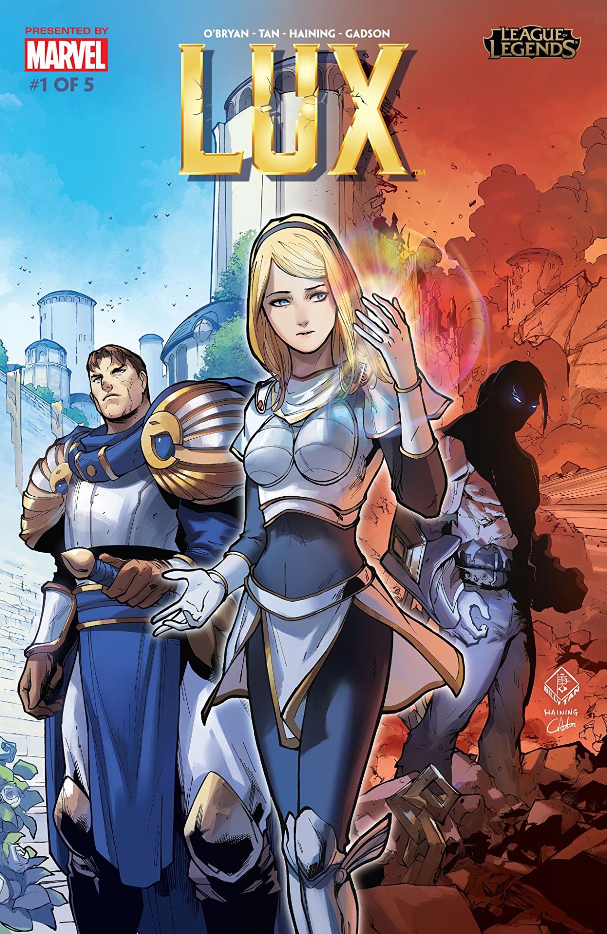
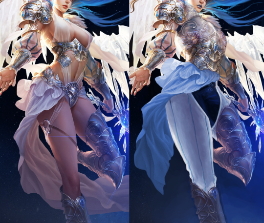
So, recently League of Legends decided to release this origin story for Lux, which has really helped showcase how terrible her design is in comparison to that of… well the rest of her culture. Right off the cover makes it look like she’s the princess to be rescued, not the heroine to reach her potential.
The best thing that can be said about this comic is that they’re depicting her within the society she supposedly came from: it’s now well illustrated how tacky and impeding that shitty boobplate would be.
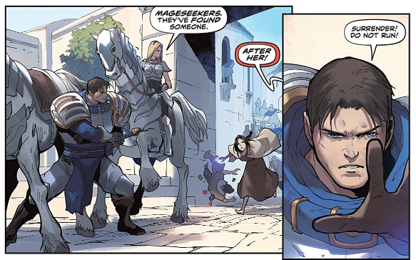
If it wasn’t for the title, you’d assume this was actually a story where Garen was the hero for baby sitting a generic damsel in distress… Which is kind of horrifying when you realize Lux has been in the game for eight years, and somehow fixing her design or evolving her default into something better has never occurred to the folks in charge.
– wincenworks
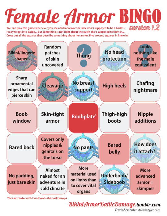
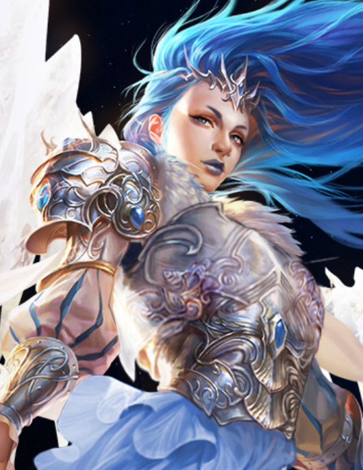
The design process for this definitely not sexualized, because not skimpy (?) “armor”:
- Draw a naked chick, make sure her (obviously nipple-less) breasts have an amazingly implausible shape.
- Add the tiniest hint of texture (and little to no volume) on parts that you think might need to pass as armored (hence the boobplate).
- Loincloth/buttflap for modesty.
- Literally everything else: fill in with non-flesh colors!
- Profit?????
~Ozzie


One of these things is not like the other~
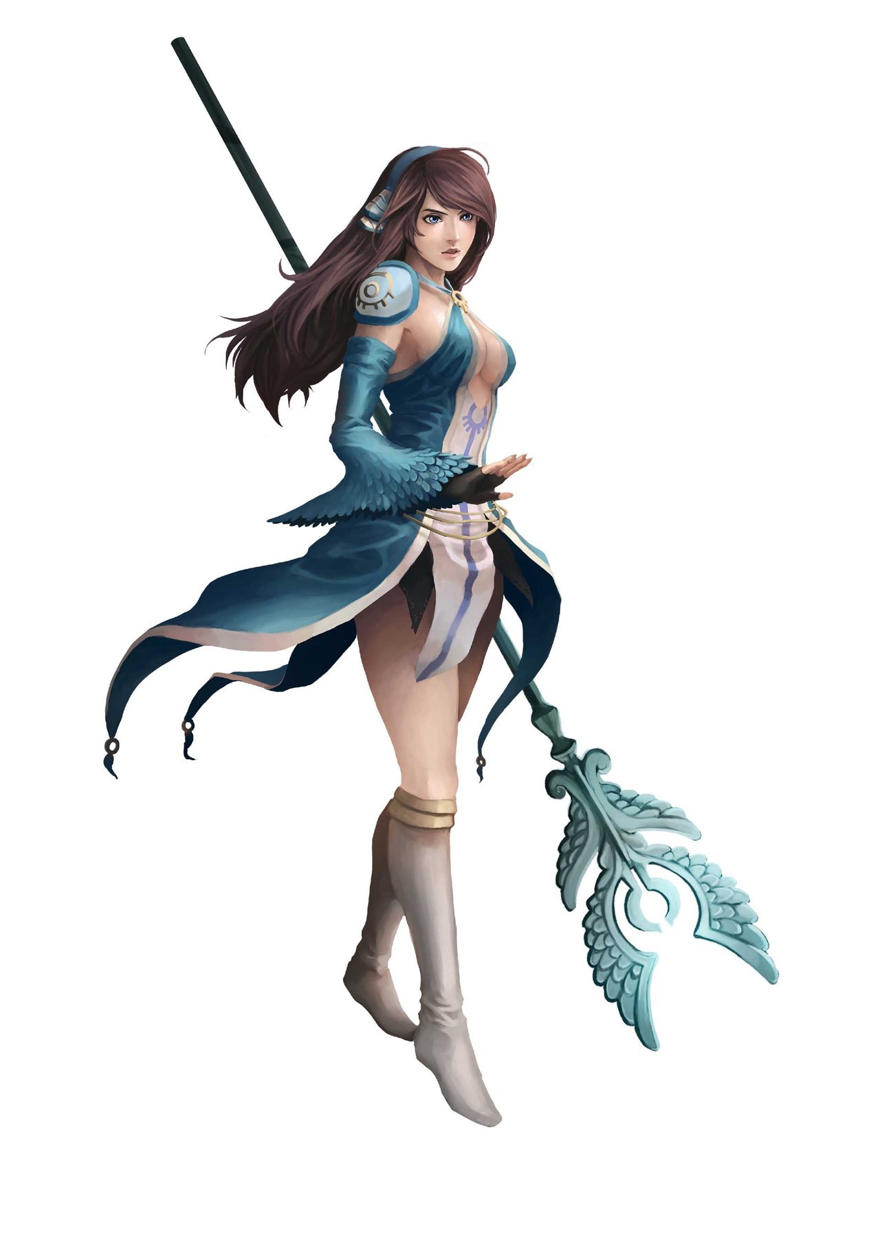
Definitely not a high-scoring design, but it’s still baffling enough that I wanted to showcase it. This is Clery the cleric high priestess from a recently-released JRPG named Azure Saga: Pathfinder (as the logo says).
Besides the lack of pants, or even a skirt really, and the top ripped off from another franchise with Pathfinder in the name… it’s just not cohesive as a design? It isn’t even an aesthetically-pleasing excuse for cleavage.
We seem to have feathers as a motif, but it’s like it got forgotten halfway through. There’s no consistent shapes aside from the (apparently) holy symbol, except then there is a different symbol on her shoulder. And the “how does it attach” square is marked specifically for that pauldron being hot-glued to her skin, presumably. (In her in-game sprite, her sleeve is attached to it and it looks better, even though it still wouldn’t be useful as armor without further support.)
At least she’s not wearing heels, but her boots look like the last thing to be designed, when they had no ideas left.
On a positive note, this might make good livestream material, along with one of the other lady characters in this game:
Oh no, is that a Green Archer Lady??
-Icy
Gamers are blaming socialism for making the women in Mortal Kombat ‘ugly’
Gamers are blaming socialism for making the women in Mortal Kombat ‘ugly’
(Article does link to some tweets that, unsurprisingly, contain particularly sexist, racist and islamaphobic statements)
That’s right bros, the Red Menace is back and it’s already taken your fighting fucktoys from Mortal Kombat. Though if you’re wondering how, I’ll save you time – none of them have any theory on the how or why beyond buzzword salad.
If there was ever a moment that highlighted just how much a particular demographic loves to wallow in ignorance and choose literally anything they’ve been led to believe is good for others must be to blame for them not be pandered to literally 24/7.
As the article states itself:
Companies making or localizing games in a way that does not cater to the way a particular (insensitive, misogynistic) audience demands are not engaging in censorship; they are simply marketing to wider audiences. Ironically, the same people who claim to be fighting for free speech in video games are now trying to punish NetherRealm Studios for making a game they’ve deemed offensive. But what they consider “offensive” is reducing a character’s visible cleavage and slightly changing her facial structure.
Ironically, as the article points out – it seems that Netherrealm did make some backsliding in terms of their (minimal) LGBT+ representation.
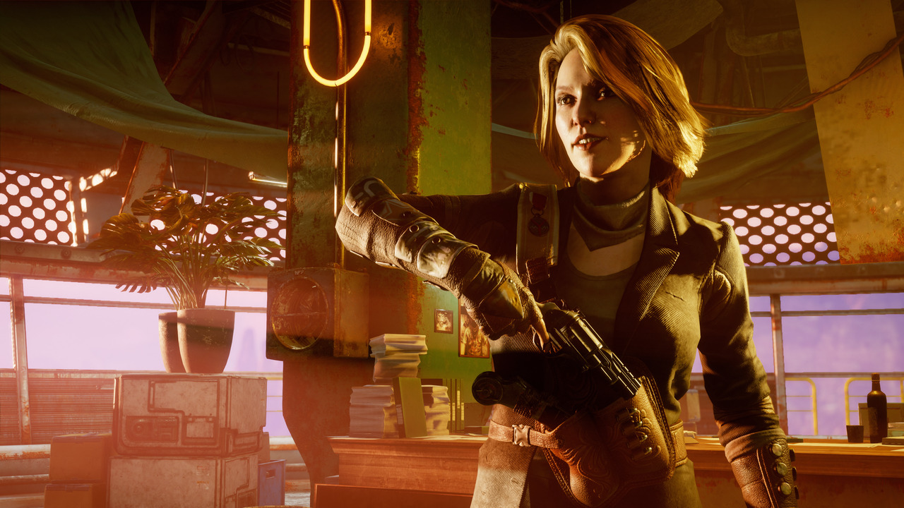
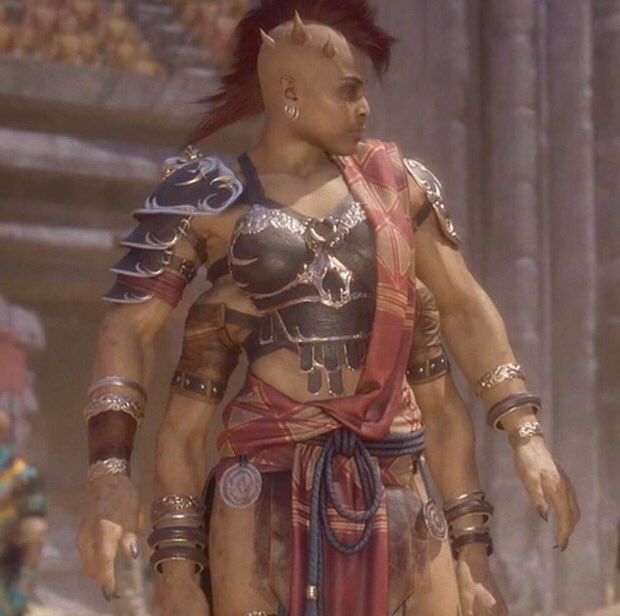
But to finish on a positive note, finally Sheeva actually looks like a demon warrior who could break you in half:
– wincenworks

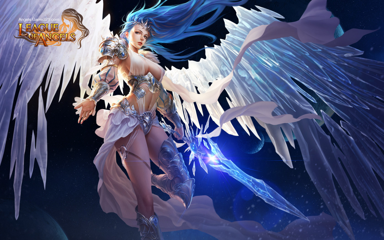

De-failing League of Angels Part 2: The Angel of my Personal Hell
You’d think I would have learned my lesson, regarding picking The Worst Things for redesigns, but not before I had to fix this!! I didn’t even have alcohol to keep me company while I worked on it.
I’ll start by briefly noting that every redesigned element, besides the face, took up to 4 tries to figure out, just in terms of shapes alone! I wanted to keep certain elements from the original, such as that belt motif, so I spent a lot of time just trying to figure out what the hell I could do with them. At least one ended up in a weird place.
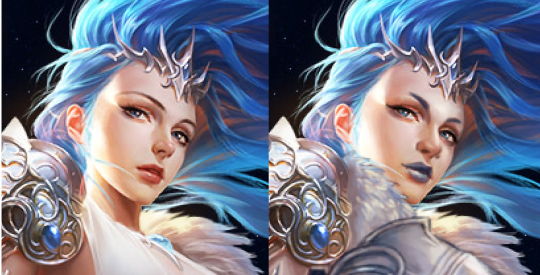
I will also say that while working on this piece, I decided that this character feels more like an agender rather than a woman angel, so they’re agender now. On that note, let’s begin with what I loved working on the most: the face. I made the eyebrows and nose more interesting, made the makeup more gender-neutral, and changed the palette. Definitely one of my favorite and least painful edits.
After doing that… I just changed everything else about the design! Oh, except I did keep the foorwear and the arms. The under-boobs belt became a breastplate, with the crotch armor (?) belt thing incorporated into it. The cloth thingie hanging off the crotch armor (?) got moved up to probably be part of some shirt under the breastplate.
Everything besides that is me exercising my painting and suffering skills, so y’all better appreciate it. I decided to go with some gambeson for the legs, instead of our regular poofy pants, because the cloth thingie was conflicting with the poof. I added black pants and a similar undershirt visible in the armpit to tie the design to the background a bit. Also, I needed another color besides light grey, sky blue, and white. The original palette is pretty limited when you’re not distracted by the tiddy.
My rendering skills are obviously not as good as the artist for the original, but I tried (Oh my God, did I try). And I do believe that at least in the design aspect, my reworking is an improvement.
Bonus closeup of the breastplate because it sucked to work on.
-Icy
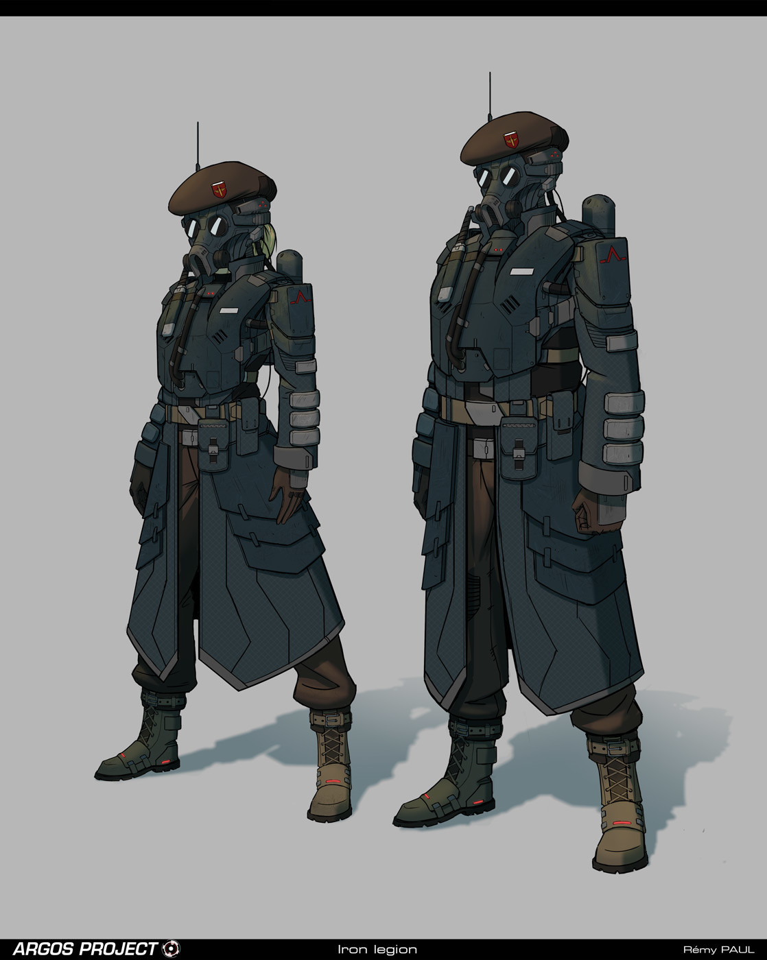
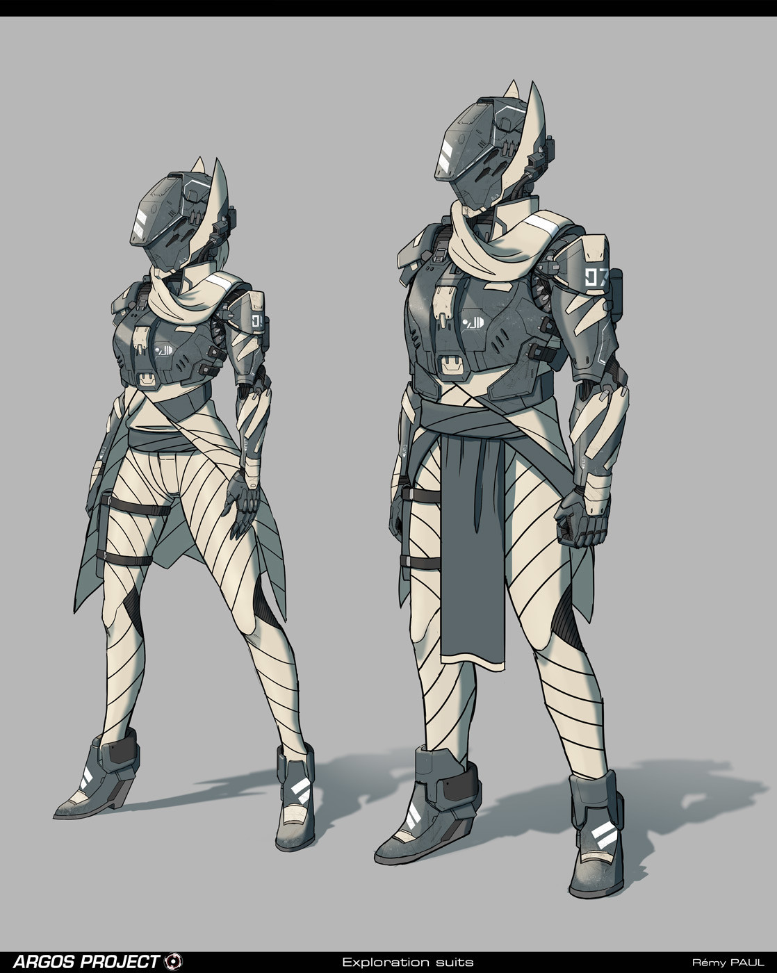
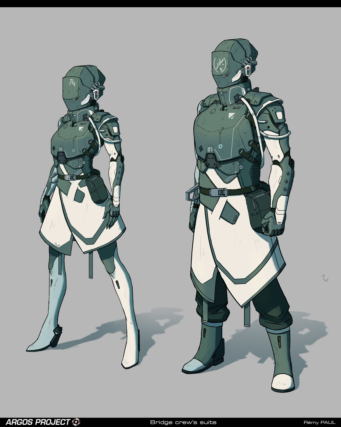
What’s this? Organizational uniforms that are not illogically altered for the women to be hot? The exploration suit even gives both the women and the men a slight heel, probably for that much-needed rocket boost.
I am sad that the bridge crew lady gets tights instead of pants, and the artist is definitely hit-and-miss when it comes to their lady characters, but I still like these designs overall. The iron legion is, of course, my favorite. I just can’t say ‘no’ to a woman in combat boots and a gas mask.
-Icy