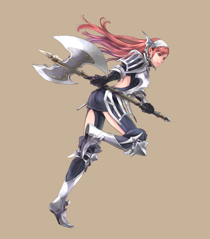
Her shoes looks stylish and comfy, I’ll give her that. Other parts not only serve zero protection against weather and battle damage, they also look like they’d slip off from her body within minutes of moving around.
Fantasy does NOT have to follow real world rules. Fantasy does NOT have to relate to some real world event, country, concept, law, or history. Fantasy does NOT have to mirror any particular time period or country, even if you’re basing your world on a real world one. There is NO SUCH THING as “historical accuracy” in fantasy as it relates to the real world.
THE ONLY THING Fantasy has to do to be believable is follow the established rules OF ITS OWN WORLD. Fantasy can literally be anything you imagine it to be.
If your fantasy world excludes people of color or those belonging to the LGBT+ community, if it’s grossly misogynistic and white cis-male centric, that’s because YOU made it that way. Stop blaming “historical accuracy” or “believability”. It’s not the genre; it’s YOU.
@bikiniarmorbattledamage I believe this is highly relevant to the rhetoric you guys often combat.
Indeed all of this relates to all the stuff we talk about on BABD.
Ultimately, no matter the justifying rhetoric, it’s the creative decisions that will be under scrutiny, not some superficially “objective” rules regarding a fictional setting.
~Ozzie
The cool thing (that people sometimes forget), is that a fantasy setting, rather than being historical fiction (somehow), instead illuminates the values of its creator. Sure, it feels bad to be called out, but it really does make you a better creator if you ask yourself: why are all my characters light skinned/skinny/cis/straight/male/etc?
Sometimes, there are good reasons, like if the story is about (to use a basic example) race-based oppression, and all the characters are on one side of that. But sometimes the reason is just “cause that’s what i like.” And honestly, besides being a bad reason, that’s just boring.
If I hadn’t gone through this process myself, I wouldn’t have my favorite Pathfinder OCs! Just sayin’.
-Icy
Posted on
Simplifying the Diablo Ladies, Part 2
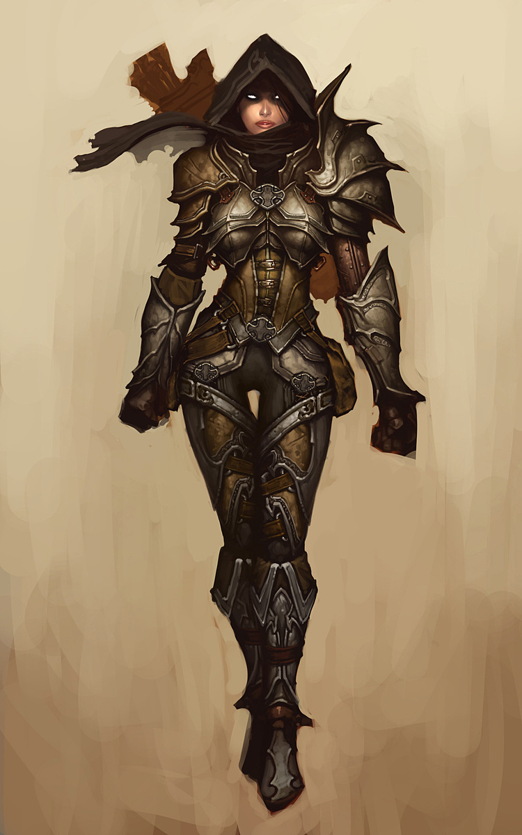
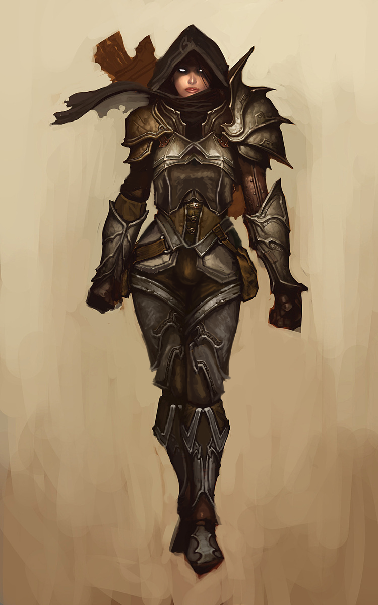
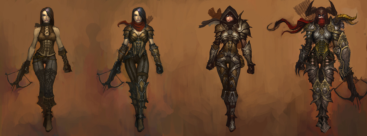
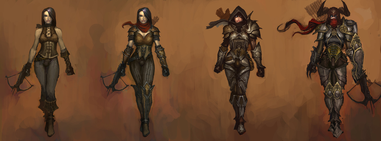
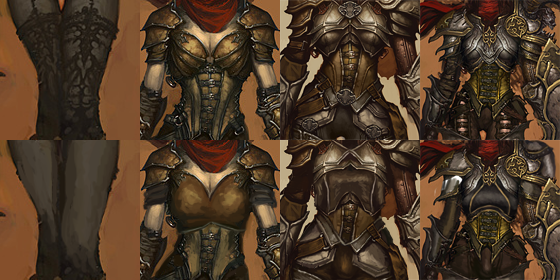
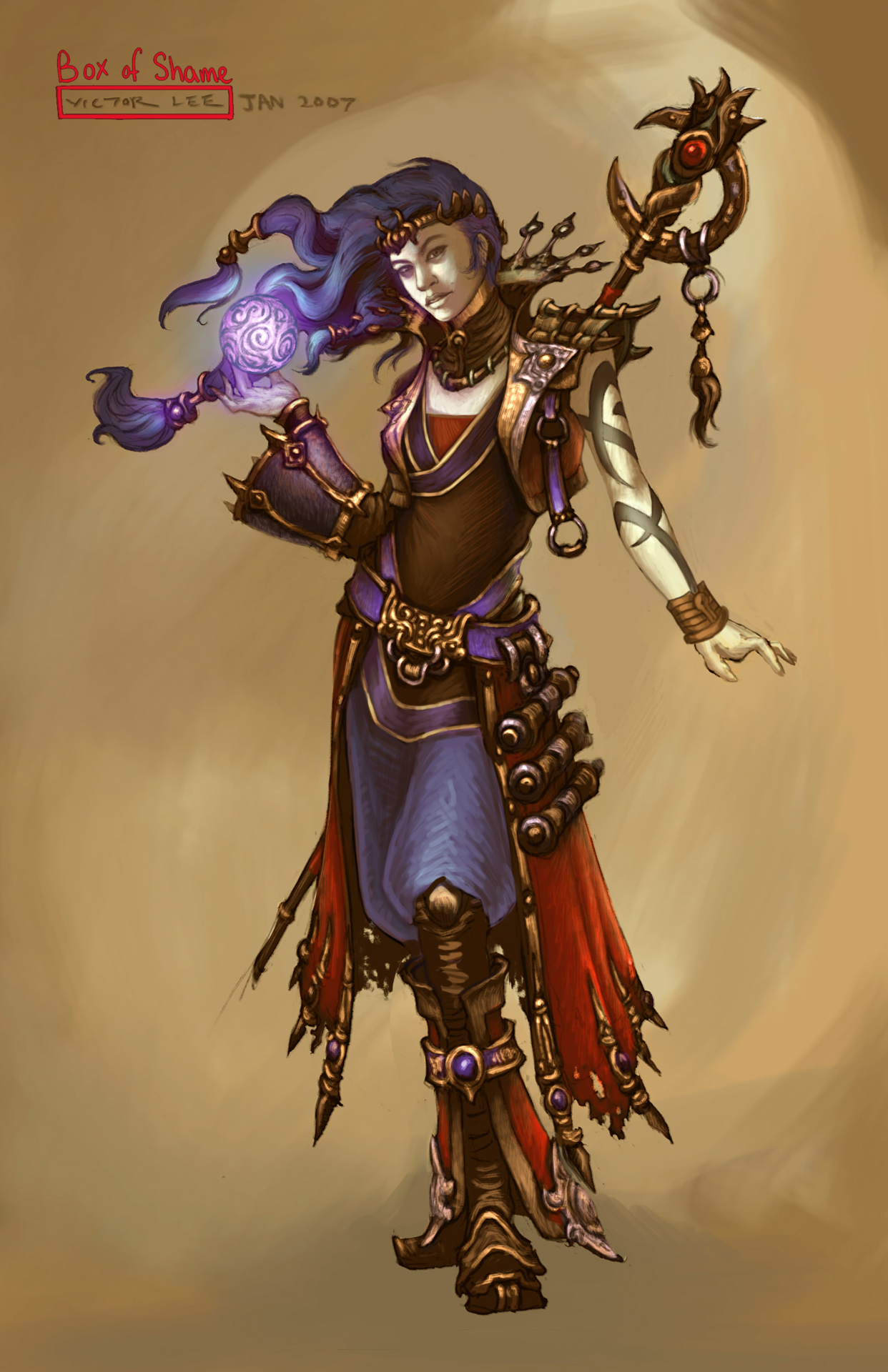
Demon Hunter from Diablo 3 was… a challenge, to say the least. Mainly because I couldn’t decide where to even start with that ridiculousness! Not only is she super sexualized via the enforced “feminine” silhouette of skin-tight armor, boobplate and giant thigh gap, including a cameltoe… she’s also the most overdesigned thing I ever tried my Photoshop skill on.
Apparently to work as an artist at Blizzard, you have to willfully forget the most basic rule any design school worth its salt teaches: Less is more. For concept art of what would ultimately be a small character model in-game, all those pieces have SO. MUCH. NEEDLESS. DETAIL!Teeny tiny little shapes of distracting ornamentation, basically nothing to rest your eye upon.
I feel really sorry for anyone who ever attempted cosplaying this shitshow – so much work added into recreating all those arbitrary seams, textures and spikes, sheesh.
I was so busy simplifying the shape language that I overlooked some stuff I do pretty routinely, like getting rid of the cleavage in the first and second levels, and modifying the hourglass silhouette (I did add some bulk in higher levels, just not much).
Preparation for posting this redesign is why I threw back this post lately (also, you know, it’s just a good post to resurface) – because those level ups convey neither a better set of armor, nor more protective layers, except for pauldrons. The shape of her boobs and thin waist remain a constant, no matter how much more “armored up” she’s supposed to be.
Like with Ashe before, I decided that my version is a trans lady, with a noticeable crotch bulge
in the place of the creepy thigh gap. Though I discarded my initial gag related to its size, as it was just in poor taste and not my joke to make.
Overall, this thing took two or three weeks to finish (last level seemed unsalvagable at first), but hopefully I managed to put some actual design thought into this hot mess.
~Ozzie
Posted on
Posted on
Posted on
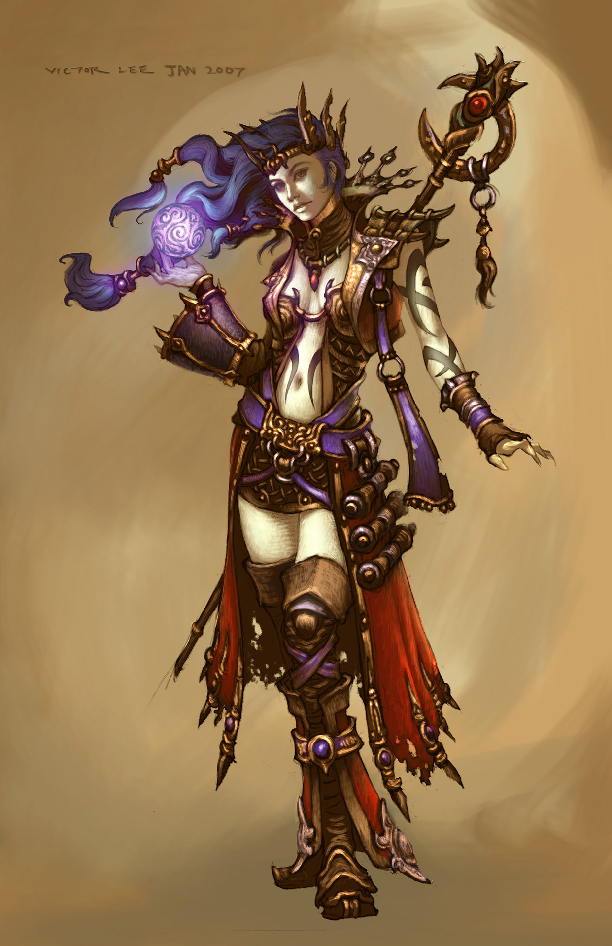
Simplifying the Diablo Ladies, Part 1
We’ve talked about how Diablo makes such an effort to make very disappointing characters. So, it was finally time to take on some of those designs and try to make them less overdone and less….
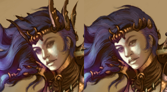
Anyway, I went for a concept art of the Wizard from Diablo 3. I stayed in the color scheme because I was more distracted by…. everything else that was happening. All the tiny details that only highlighted how little she was wearing… it had to go. I ended up giving her a simple tunic and pants, in order to have some grounded large shapes in the middle of all the small ones. I do like the shoes (below the knee, anyway) and the jacket, so I left them alone.
I did remove some weird-looking accessories, like the not-glove and the awful crown sharps, and I changed her face as I always do.
Definitely a simpler redesign, but it was still not easy to work around all the things that I wanted to keep in the design. I probably should have made her tunic a different color, but it’s still way easier to look at than the original. Hope y’all enjoy!
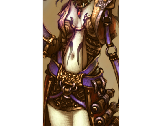
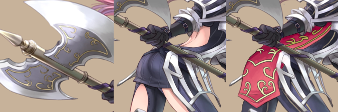
So the character I worked with is Cherche, the wyvern rider. You can totally tell that this lady mounts a big scaly monster by the all the protection her legs get against the chafing, right?
And then there’s the very practical bare back.
It’s one of those very frustrating designs which you can tell were referenced from some real armor and had some interesting shape language incorporated, then at some point someone just went “FUCK IT, WE NEED TO SEE SOME SKIN!” and cut out a huge chunk of fabric in a few vital places.
It’s a shame, because while I doubt the practicality of her perforated pauldrons and tassets, they’re very interesting visually and make her costume stand out so much better than the shmexy back and thigh cutouts do.
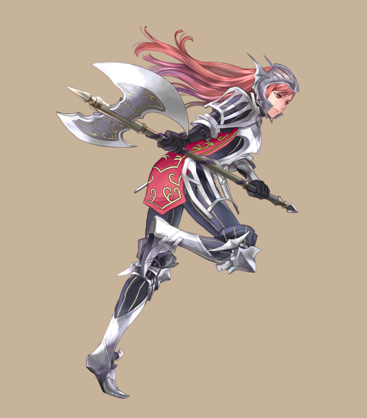
So, of course, my main goal was to get rid of those holes and make it look like a full set of armor. While the pants demanded only to patch those holes with the color of the fabric, I figured that doing the same for the back would be boooring. So I decided to add a tabard, which would also be a splash of color this grey-navy design so desperately needs. I went for rosy pinkish color similar to her hair and lined with golden detailing based on the design on her axe. I’m quite proud of how it came out.
The shape of the tabard also helped to mask the @eschergirls anatomy and not to make this picture all about her butt.
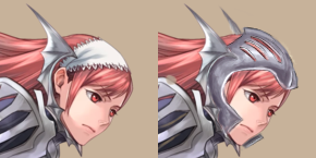
Smaller, but still relevant change was turning her weird batwing gorget (?) into a full helmet (with grilling similar to that on her shoulders and hips). It’s not supposed to be realistic of fully protective, but counts for something. She, as an axe wielder, should really know that a lacy kerchief won’t protect her cranium from getting split open.