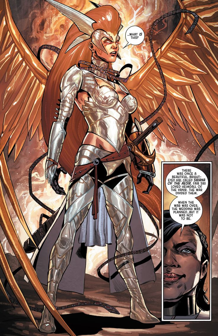
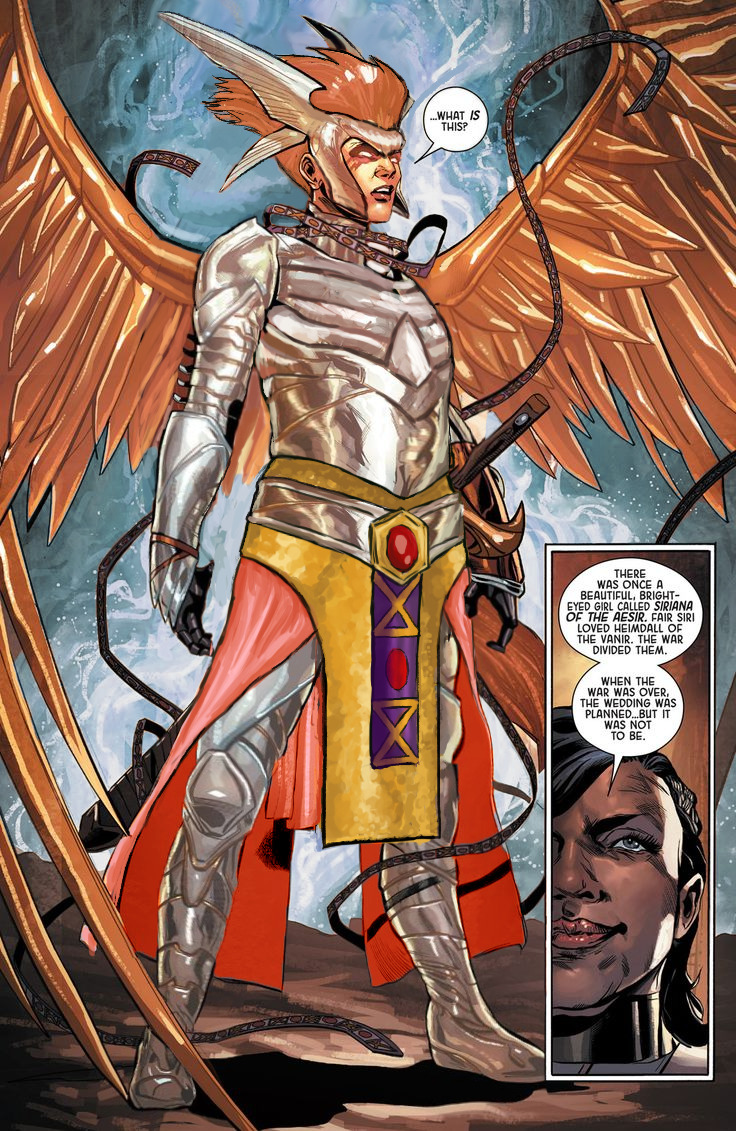
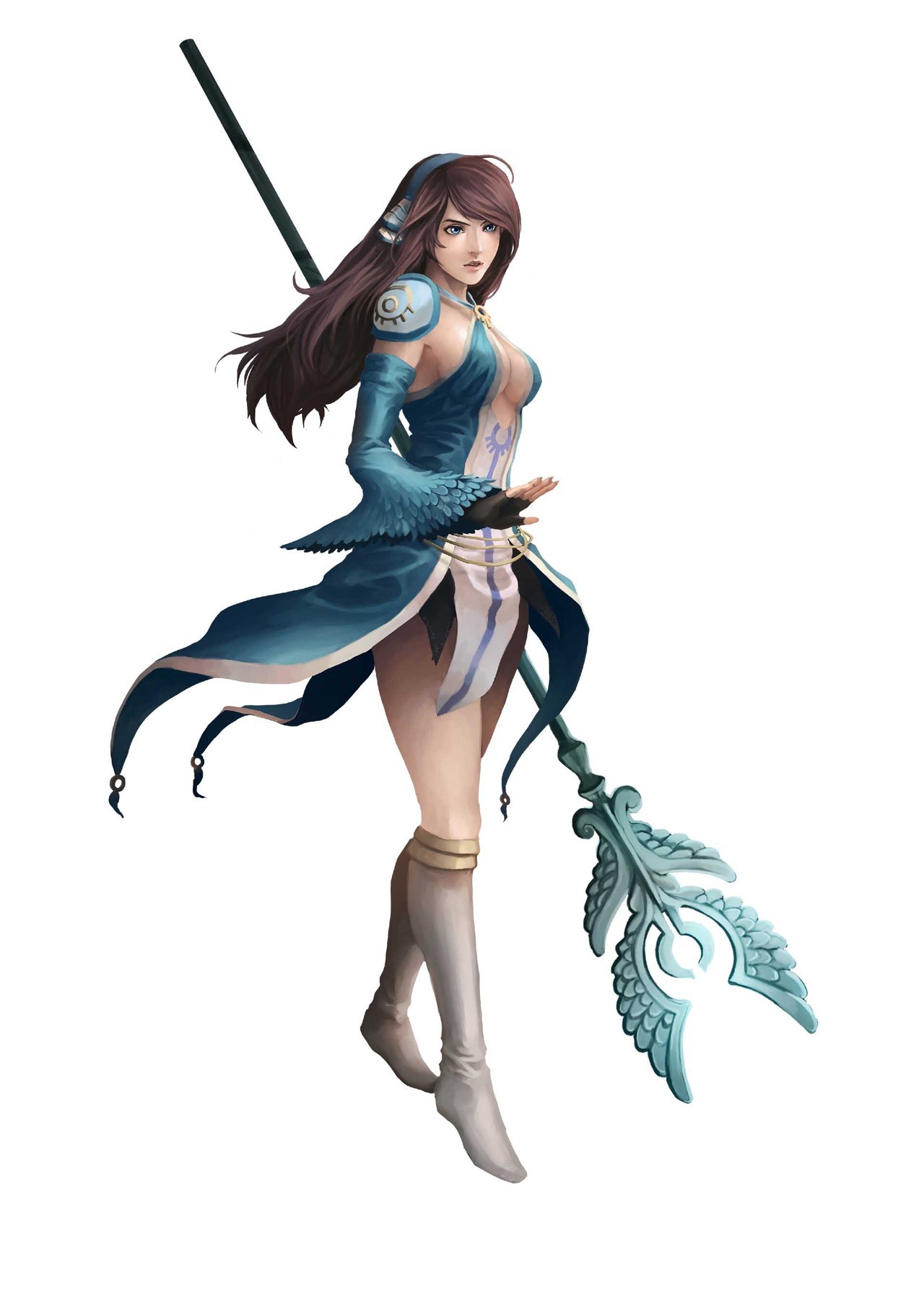
Leveling up with Angela
Trying to recapture lightning in the bottle that was my original Angela redesign, I decided to have a take on her upgraded armor… And it was beyond me, really.
This thing was so bad to begin with that it should have been remade from scratch, not by modifying the unsalvagable original. I did my best, though.
Before doing anything to the costume, though, I had to take care of the ABSOLUTE GARBAGE color composition on this whole splash page. What genius thought that orange background was optimal way to present a character with big orange hair and even bigger orange wings?
Fixing it required all the sophistication of the easiest color theory trick in the book – I recolored the background. Wow, amazing! What do you mean orange pops out from blue better than from more orange? What even is complimentary colors?
?
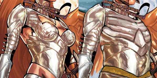
Only then I could start working on the armor itself. Boobplate proved to be much less inspiring than Angela’s normal golden bikini top, as the shape language and colors in the original gave me much more to work of off. This I could only change into actual, rather boring, breastplate.
I had no idea what was happening to the leg region, so to cover the nonsensical crotch area and to give the design some consistency with my previous one, I recreated the mail tabard (just in gold this time) and gave her an updated version of the belt I was so proud of the last time. This time not only I let her keep the butt cape, I made it bigger and recolored it to light red, for another splash of color. and also to recreate the look her gambeson tassets.
The lesser changes include: fixing the giraffe neck, getting rid of the 90s comic hair (which also seemed to be clipping into her wings?), making her headpiece bigger and connected in the middle, giving her a bit smaller wedge heels and stockier built.
I’m afraid this really isn’t half as good as my previous Angela redo, but I hope you guys like it anyway!
~Ozzie
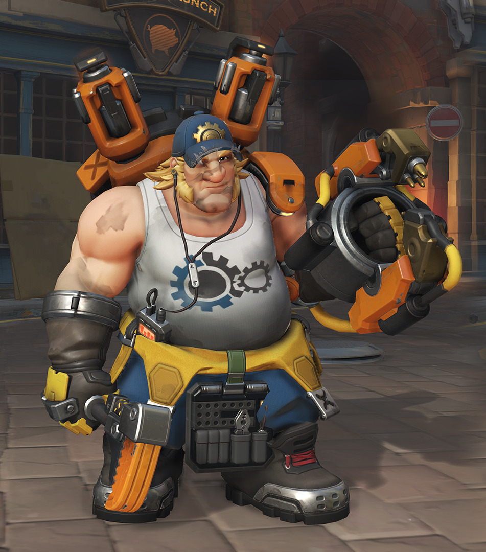

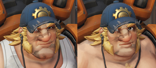
Sexy Overwatch Guys Part 2: Hard Daddy Torbjörn
For our Overwatch man meat week, I decided to empower Torbjörn, whom Blizzard has kind of been ignoring in the sexiness department. I thought this skin was a good start, and gave me some fun elements to work with.
Although as time went on during the stream, I decided that I actually just wanted to make a male character version of this comic (series is NSFW):
So here we are.
The biggest changes I did are to his face and his now-phallic mechanical accessories. I wanted to make him look like the loving daddy we all want him to be (probably?) so I gave him a more gentle gaze and slightly smaller chin. I also gave him the soft, loving lips he deserved.
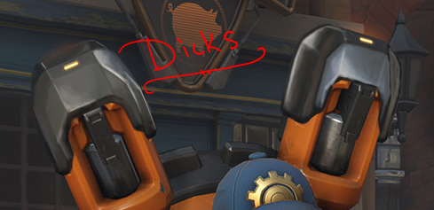
I made him shirtless, added some male-presenting nipples with piercing, and some chest hair. And then I spent an obscene amount of time rendering out some phallic machinery. You might notice the one on the left is much more in-line with the original art style, and that’s cause I ran out of time! As I always do.
I also gave him a bottle of lube in his tool belt (from Google images). I’m surprised the original design didn’t have that, actually, since keeping your equipment lubed is very important.
What was I talking about again?
-Icy
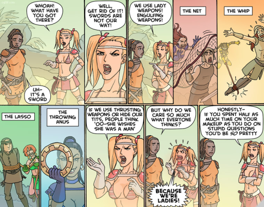
Idea for artists designing female superhero costumes.
Start with a sports bra. Any sports bra.
If your design cannot incorporate that underneath or including it, you’re probably fucking it up.
@bikiniarmorbattledamage I’m sure someone else probably tagged you in this already but hey. This sounds like a really good piece of advice !
Amazingly, no-one before sent this our way. Thank you for doing this, because this is an AMAZING rule of thumb!
Love how simple and on-point it is! PREACH
~Ozzie
Bringing this back as a reminder that if more women were to design superhero costumes, we’d definitely get to see things actually referenced from athletic wear, including, but not limited to, sports bras.
~Ozzie


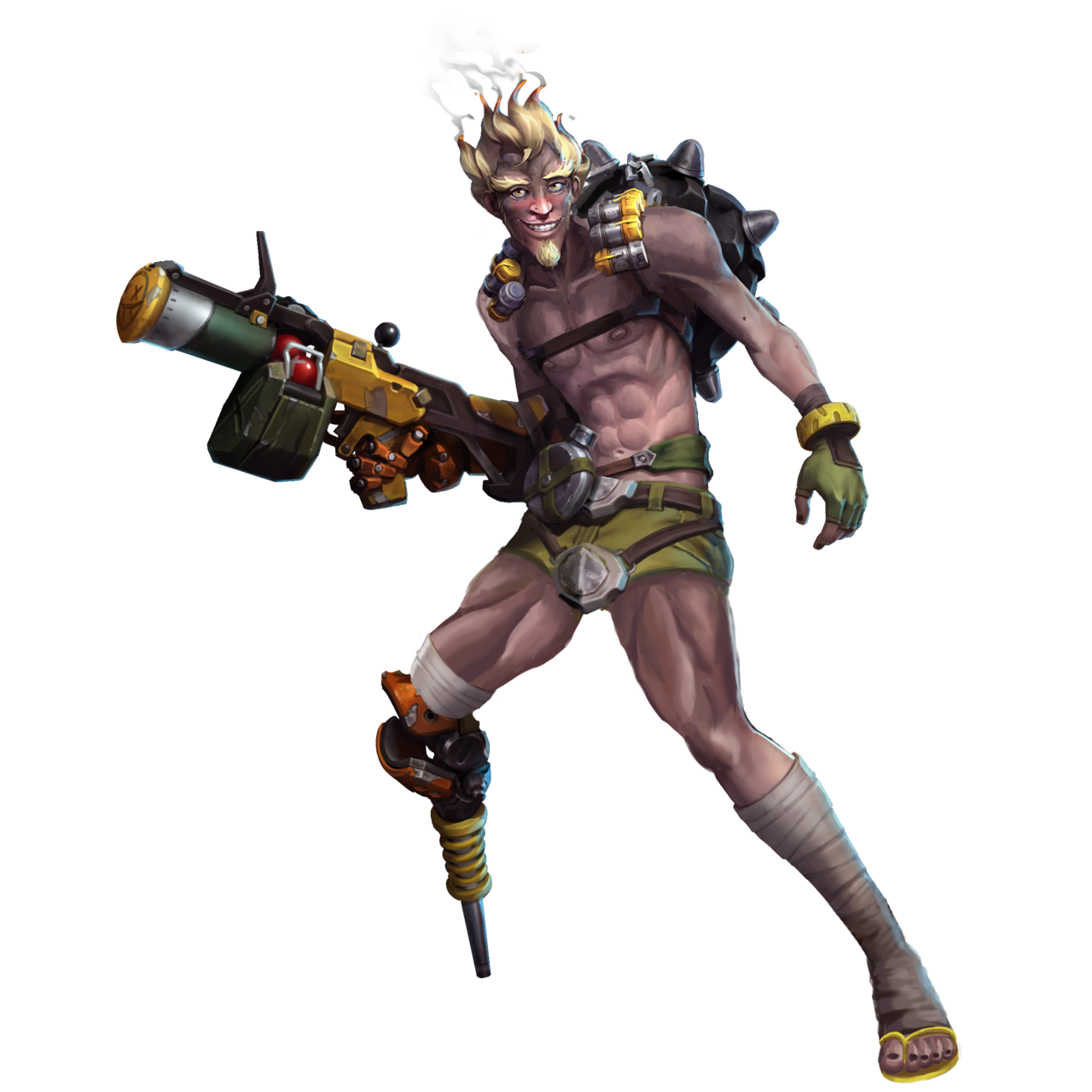
Sexy Overwatch Guys Part 1: Soft Boi Junkrat
Time for a sexy male redesign post and this week it’s prooobably my hunky magnum opus so far: shamelessly stripping Overwatch’s Junkrat of almost anything quirky, fun and interesting about him for the sake of maximizing TEH SEXY.
While he definitely has a cult following among the fandom (have you seen the last week’s reblog?), Junkrat is clearly not designed with sexual/romantic appeal in mind. He’s one of many examples of male characters in the game with pretty extreme appearance and out-there personality. You know, those features which none of the female characters* are allowed to have. So I decided to remedy that and redesign him into a more conventionally attractive boyfriend material. Hope Roadhog doesn’t mind!
Of course the most important part was the face. The sharp jawline, wicked smile, receding hairline and bulging eyes couldn’t stay! With more or less subtle edits I changed them, most importantly giving him a dreamy gaze of a romantic interest. I let him keep his bushy eyebrows, just changed the expression. Also added some attractive facial hair, to soften the face shape.
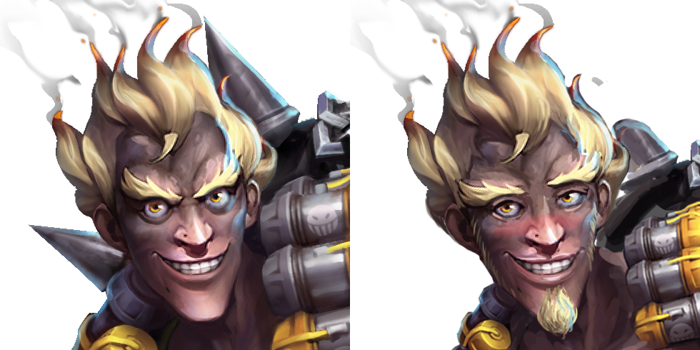
The cherry on top, which I’m pretty sure Icy suggested, was the blushing, which nicely ties everything together.
The body went through some changes too. Most importantly, those shapeless raggy pants are out, making place for short shorts with a codpiece that matches his belt buckle! Now he can show off those amazing muscular thighs that happen to match the newly sculpted abs!
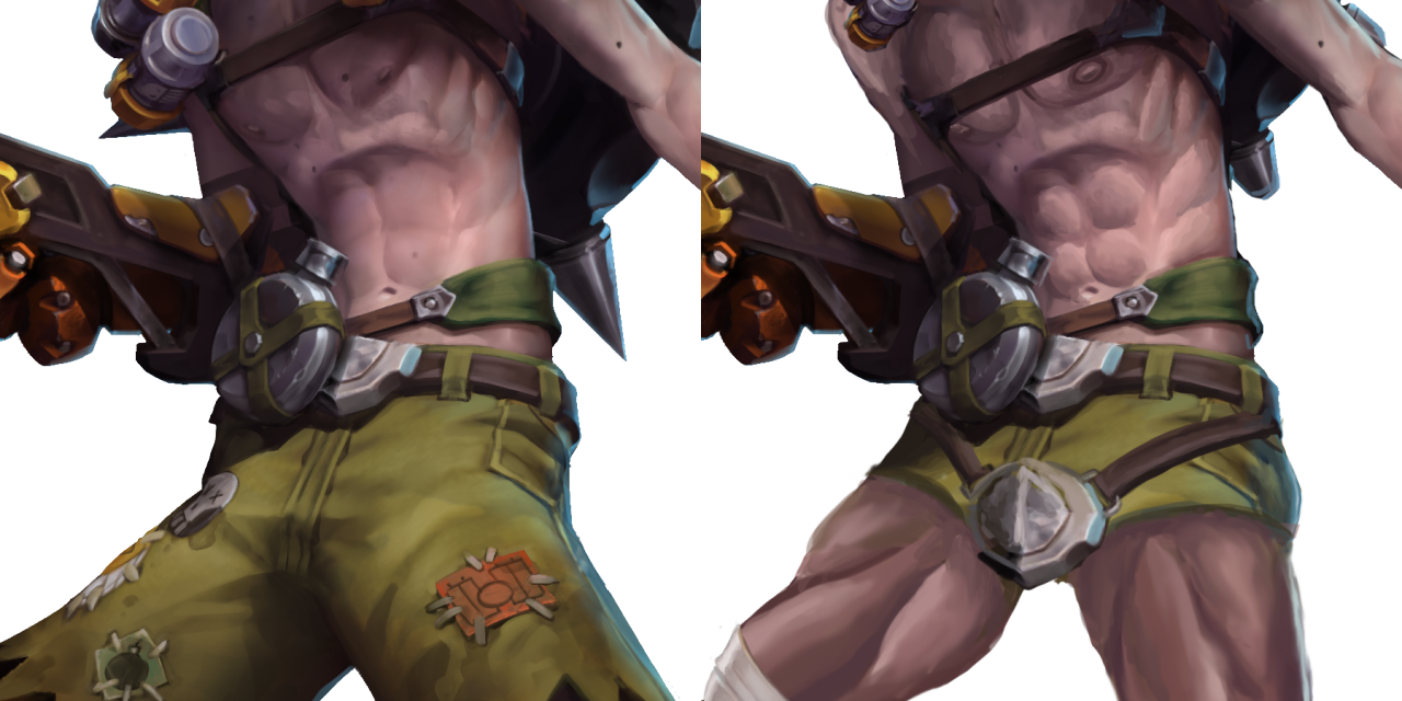
Also, bonus enlarged male-presenting nipples!
Final, less important changes were to his left leg (the position and a stereotypically Australian flip-flop instead of an ugly shoe) and the RIP-Tire on his back, which now instead of being big and sharp is small and soft, matching his new aesthetic.
I kinda regret not repainting his lower half in a boobs-and-butt pose, but otherwise I’m very pleased with the results, especially the expression. Hope now he’ll enter some of our readers’ fantasies… And also Roadhog’s. You’re welcome!
~Ozzie
*Yes, it’s an old is post and doesn’t feature Ana, Sombra, Orisa, Moira, Brigitte and Ashe who were introduced since and who collectively changed little to nothing about the narrow conventional beauty standards in OW’s female design.


A fun concept for a queen’s variety in wardrobe, horns included! Besides the idea of designing headwear around the horns, I just love the designs themselves. This is also a good opportunity to reiterate that here at BABD, we’re not against lady characters wearing dresses, or even revealing clothes, for the right occasion. The Queen has a dress to wear to fancy events, but she also has a cool suit of armor to wear when she’s among her knights, as well as a more casual riding outfit. It’s when a fictional lady wears a ballgown or swimsuit to the battlefield that we have words.
Anyway, check out the artist’s gallery for some pretty cool concepts and illustrations.
-Icy

One of these things is not like the other~
Definitely not a high-scoring design, but it’s still baffling enough that I wanted to showcase it. This is Clery the cleric high priestess from a recently-released JRPG named Azure Saga: Pathfinder (as the logo says).
Besides the lack of pants, or even a skirt really, and the top ripped off from another franchise with Pathfinder in the name… it’s just not cohesive as a design? It isn’t even an aesthetically-pleasing excuse for cleavage.
We seem to have feathers as a motif, but it’s like it got forgotten halfway through. There’s no consistent shapes aside from the (apparently) holy symbol, except then there is a different symbol on her shoulder. And the “how does it attach” square is marked specifically for that pauldron being hot-glued to her skin, presumably. (In her in-game sprite, her sleeve is attached to it and it looks better, even though it still wouldn’t be useful as armor without further support.)
At least she’s not wearing heels, but her boots look like the last thing to be designed, when they had no ideas left.
On a positive note, this might make good livestream material, along with one of the other lady characters in this game:
Oh no, is that a Green Archer Lady??
-Icy
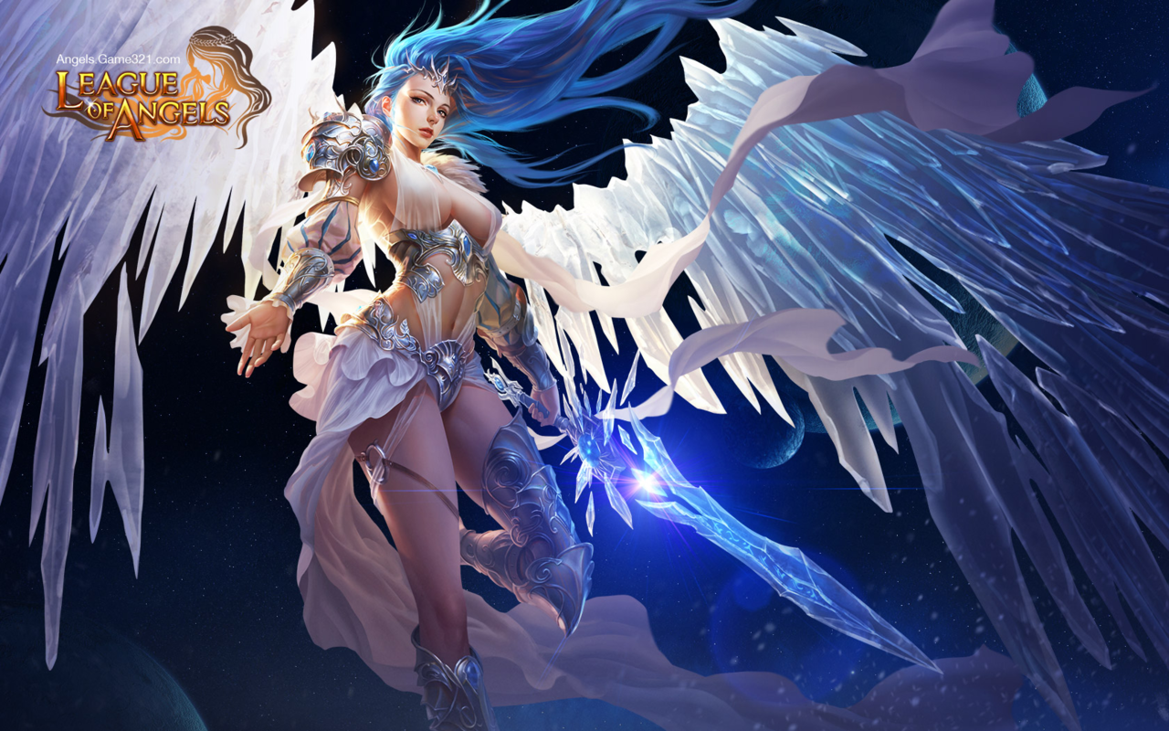

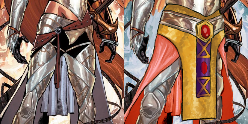
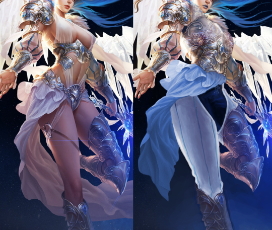
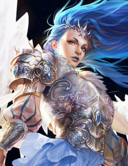
De-failing League of Angels Part 2: The Angel of my Personal Hell
You’d think I would have learned my lesson, regarding picking The Worst Things for redesigns, but not before I had to fix this!! I didn’t even have alcohol to keep me company while I worked on it.
I’ll start by briefly noting that every redesigned element, besides the face, took up to 4 tries to figure out, just in terms of shapes alone! I wanted to keep certain elements from the original, such as that belt motif, so I spent a lot of time just trying to figure out what the hell I could do with them. At least one ended up in a weird place.
I will also say that while working on this piece, I decided that this character feels more like an agender rather than a woman angel, so they’re agender now. On that note, let’s begin with what I loved working on the most: the face. I made the eyebrows and nose more interesting, made the makeup more gender-neutral, and changed the palette. Definitely one of my favorite and least painful edits.
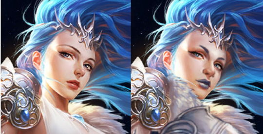
After doing that… I just changed everything else about the design! Oh, except I did keep the foorwear and the arms. The under-boobs belt became a breastplate, with the crotch armor (?) belt thing incorporated into it. The cloth thingie hanging off the crotch armor (?) got moved up to probably be part of some shirt under the breastplate.
Everything besides that is me exercising my painting and suffering skills, so y’all better appreciate it. I decided to go with some gambeson for the legs, instead of our regular poofy pants, because the cloth thingie was conflicting with the poof. I added black pants and a similar undershirt visible in the armpit to tie the design to the background a bit. Also, I needed another color besides light grey, sky blue, and white. The original palette is pretty limited when you’re not distracted by the tiddy.
My rendering skills are obviously not as good as the artist for the original, but I tried (Oh my God, did I try). And I do believe that at least in the design aspect, my reworking is an improvement.
Bonus closeup of the breastplate because it sucked to work on.
-Icy