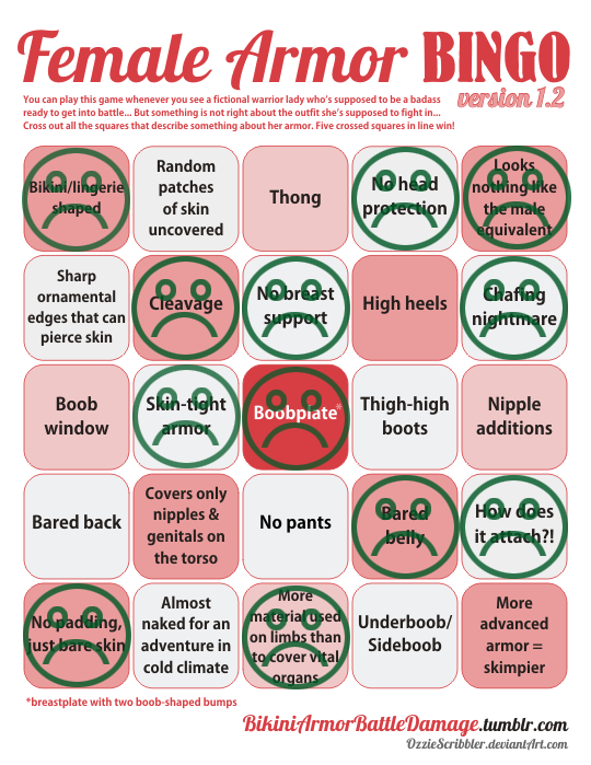
The hilarious front line in the tragic war against ridiculous female armor
Tag: costume design
Posted on
Old Redesign Switcheroo Part 2
Why did I pick this concept art with this pose…….
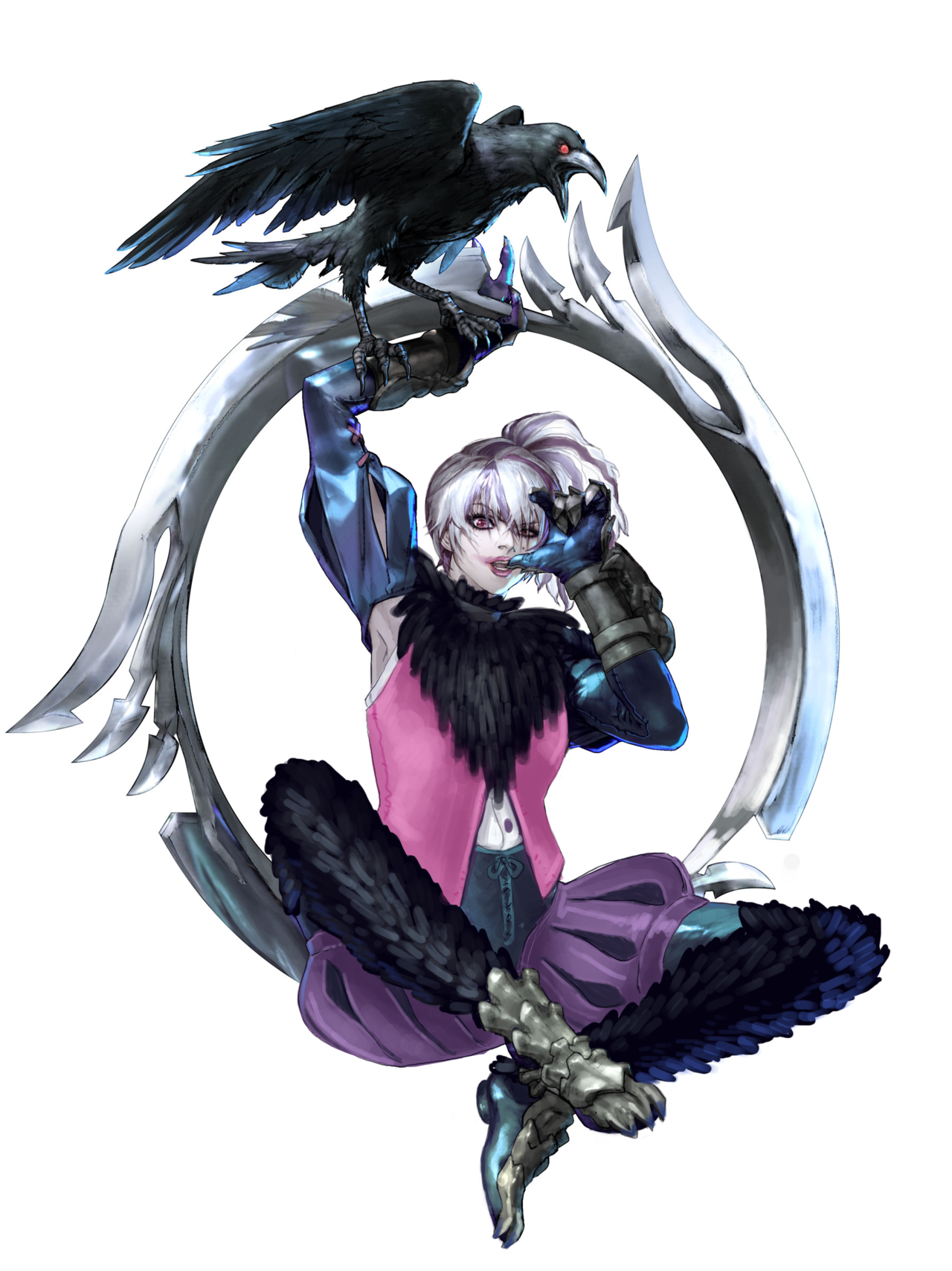
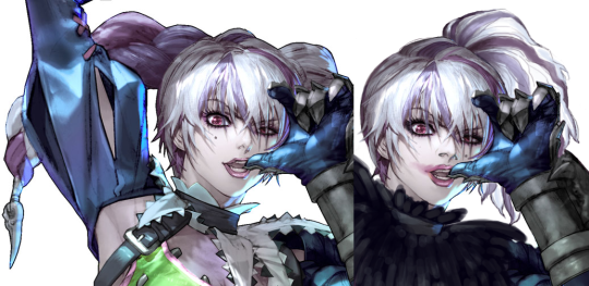
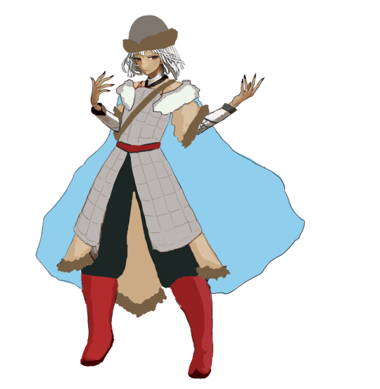
As a person who used to actually play Soul Calibur once upon a time, I wanted to try my hand at redesigning Tira. As Ozzie pointed out in her own redesign, she is definitely the poor woman’s Harley Quinn, so I went on the fan wiki to scour for any material I can use to make her unique. I discovered that she has a connection with crows, apparently, which is presumably why there’s one in this concept art. So I ran with that as far as I could!
I started by changing her hair and face, as usual. I smeared her lipstick also, cause I feel like she’d the type to put on makeup and then forget she has it on. Basically, mood.
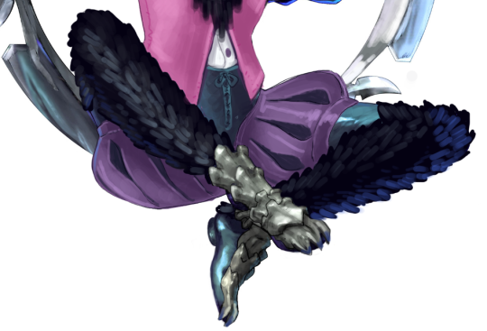
I then incorporated an actual crow motif by giving her a feathered collar and feathered tights, sort of. And yeah, she’s now wearing tights with the legs from some poofy pants and feathers. It’s a definitely a Look. She’s supposed to be very eccentric, is my excuse.
As for her shirt, I honestly had 0 ideas, so I did a simple white sleeveless shirt with a vest, to at least add some good lines that would lead toward the poofy and feathered legs.
My rendering for this ended up being sooo basic. I blame the pose. Painting is my passion.
Ozzie and I agree that the original design is pretty much unsalvageable, unless we’re given like 2 weeks to do research and thumbnails to redo her from scratch. I did end up going way over the time limit for this, cause I kept redrawing various elements, but at least I put some thought into it.
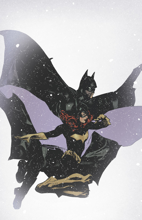
Okay, see now what I don’t get is people who say they love Babs’ redesign because “finally a practical female costume in comics!!”
Because it’s absolutely true that impractical costumes are a problem that plague superheroines, but this is what Babs’ New 52 costume looked like before they redesigned it:
I’m purposefully using a picture that has her next to Batman – her costume was just as “practical” as his. Full body suit, sturdy-looking flat-heeled boots, no unnecessary details beyond the Bat symbol and cape (both of which Batman has too) – what exactly was so “impractical” about this?
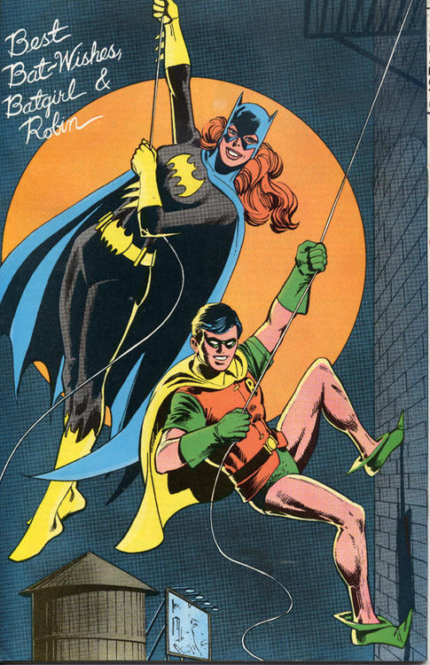
For that matter, this is what Babs’ original Batgirl costume looked like:
That’s from the 1970’s, and her costume looks as practical as can be. Actually, I’d argue that Dick’s the one with the impractical costume, here.
So why are we acting like this is such a big deal that Babs “finally” has a practical costume?! She’s had one since practically the very beginning (once they stopped drawing her original costume with high heels, anyway).
Superheroine costumes are certainly lacking practicality on the whole, but Babs was never really an issue there. So giving her a practical redesign doesn’t really do anything to change the status quo – it just “fixes” what wasn’t broken to start with. Why not give Starfire a redesign where I don’t have to wonder how her top stays on, instead?
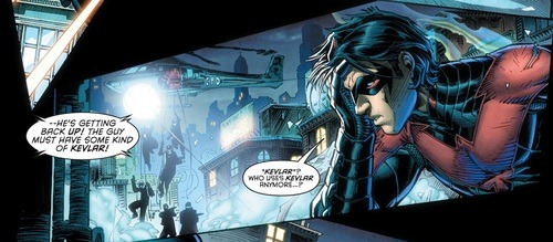
Also they made a huge deal about her new costume not being spandex, but I thought the whole batfam wore kevlar.
It’s not, it was never identified by name, but it’s apparently some sort of next gen bulletproof material, even BETTER than kevlar.
why they would choose to replace that with a cheap $20 leather jacket is beyond me
I don’t think anyone argued Barbara’s current costume was specifically one in a desperate need of redesign (let’s face it, she’s always been the one DC superheroine with consistently full body-covering suit: no cleavage, no 5-inch heels, not even bared midriff).
Her new costume is a breath of fresh air compared to the DC/Marvel female design STANDARDS, not compared to what she wore before.
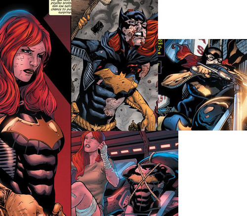
But as far as the kevlar (or rather “batkevlar”) argument goes, it doesn’t really hold ground when the artist’s attempts at conveying her suit to be armor are so half-assed and inconsistent that the chest piece looks either painted on or too small to wear, let alone breathe in (see: middle images here).
Also, what Batgirl’s new outfit is praised for is how it’s not sexualized and how it actually resembles the materials it’s supposed to be made of, not how objectively good in combat those customized boutique clothes will be compared to Wayne Industry’s patented armor.
Does it make sense that after losing her old costume she assembles a new, cheap one, instead of asking Bruce to give her another armor? Yeah, probably not. Especially since she’s a regular human, not a superpowered alien or an Amazon or a magic user that can wear even a skimpy costume without caring for consequences. But that’s the issue of pulling it off with writing, no different than pulling of the existence of miraculous better-than-kevlar material.
For what it’s supposed to be, the new costume is designed awesomely.
~Ozzie
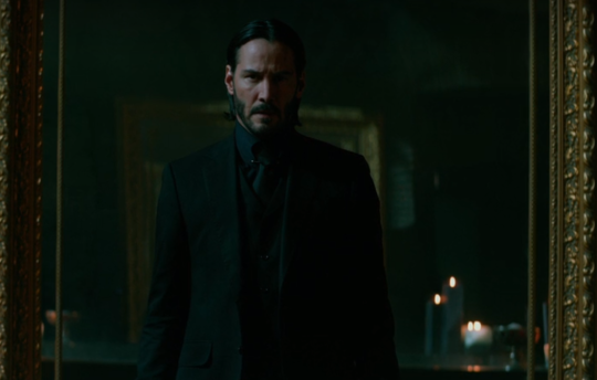
Since by now it’s confirmed that we are all trapped in Keanu fever, including his John Wick title – it’s probably a good time talk about super-fabrics like batkevlar and how they tend to be presented differently on men and women. Above we have how it tends to be presented for women: an excuse to always have them in sexy spandex that is vacuum sealed for freshness.
In John Wick 2, the titular character stops to obtain an outfit made entirely out of a remarkably similar fabric – bulletproof beyond anything real technology can do but not enough to stop bruising damage from the impact. How does his outfit look when he’s fully protected?
And yes, there are male characters who are known for wearing spandex type outfits, but you know what all of them get without a fuss? Alternative costumes.
Batman has gone through more designs than one can count, the Snake family from Metal Gear get everything from standard BDUs to tuxedos, Sam Fisher’s gear was always tailored to be not too body clingy and got to do a whole game in civvies with a bullet vest.
My point is: If your fictional world is developing wonder technology to prevent battle damage – the first and foremost application of it should not be for women to wear body hugging outfits (that then get torn and don’t stop all the damage anyway) – but probably to augment existing combat outfits.
You should probably also consider the “rules” of it – and whether someone would prioritize showing off their body over not being covered in bruises all day every day – because bruises are not fun and you probably want your characters to display at least vaguely relate able judgement. Let them get hurt but, don’t make it an hourly thing they could easily avoid.
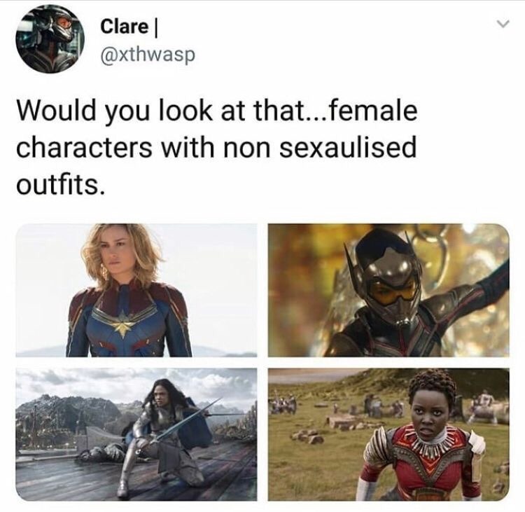
Yes! …and no. While not overtly sexualized, they all have femminizing features that…become impractical. If I remember right the WASP suit had heels instead of flats. Valkyrie’s outfit is, just bad? It doesn’t seem to fit her and is guilty of boobplate and worse. I agree that these are great steps in a direction, like holy hell it used to be worse, but these are not without their faults.
We touched on Marvel and their love of boobplate before, as well as the fact that coverage of skin does not mean nonsexualized by default. Now, we’re not saying that all femininizing aspects of costuming are bad. However, for a warrior to wear heels, or clothes so tight that they can’t properly move (to get that perfect Ass and Legs look, etc)… that’s just not practical, and will probably lead to injury.
Of course some of these costumes have positives; it’s not often we see a lady character wearing a helmet, for example. But we can definitely do better, and we should! And hopefully, we will.
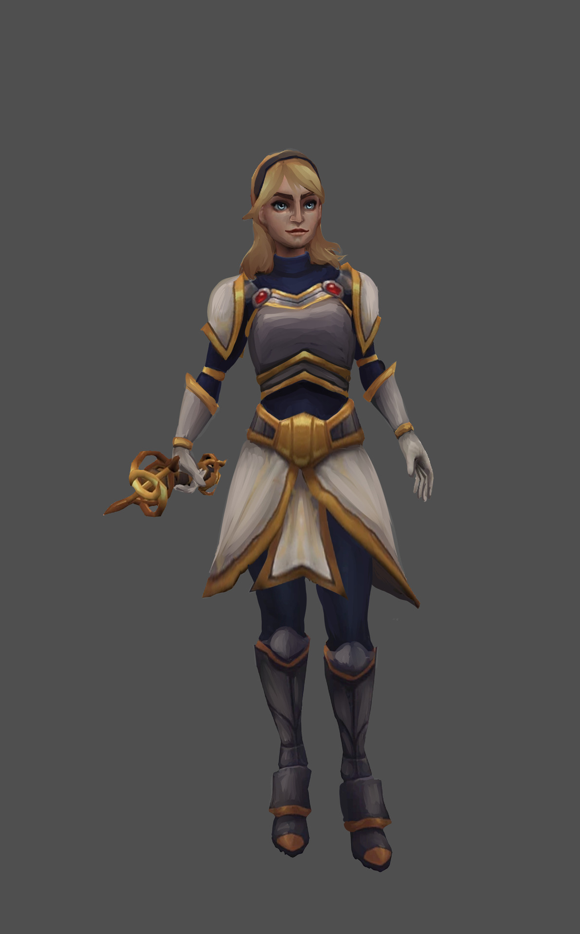
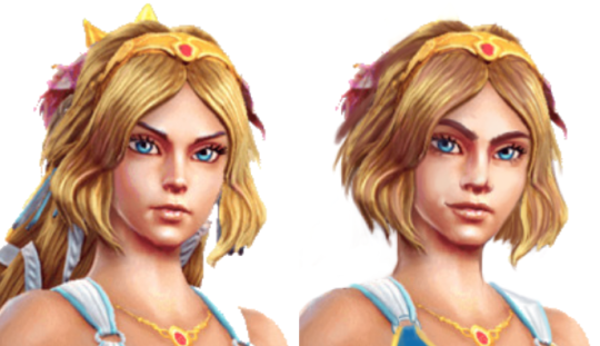
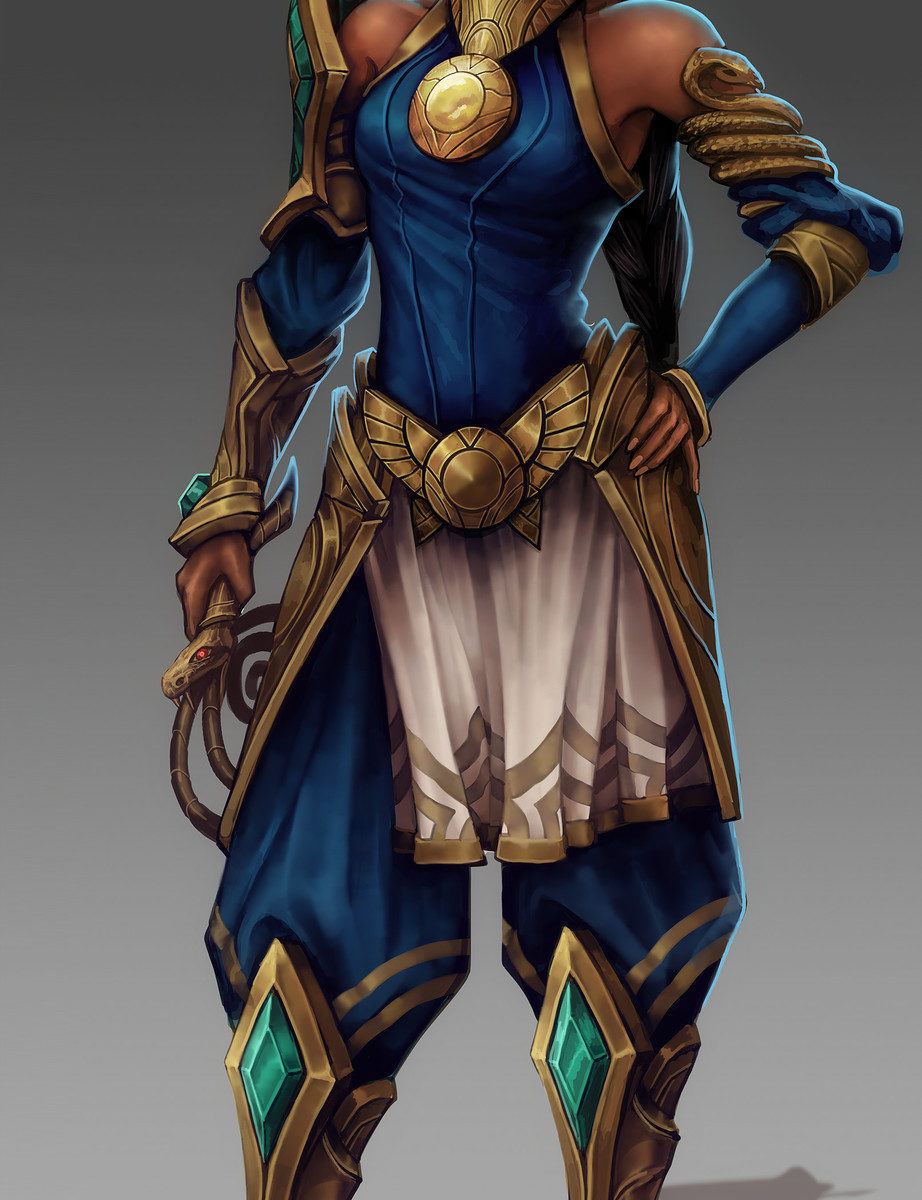
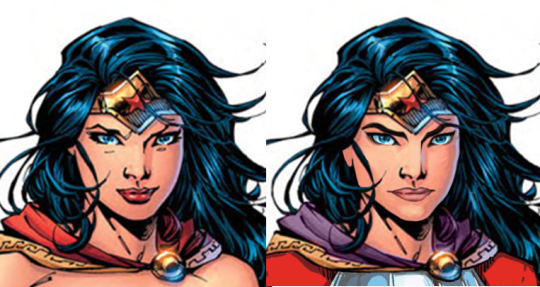
What a nice redesign! And I feel like you made her face resemble her brother’s more, which I appreciate. Is it me, or does it seem like LoL has some sibling issues… I like the changes to the breastplate and boots, and of course the fact that she actually has mass now. And her armor isn’t a painted-on afterthought! I also find it interesting how just the shape of her belt can make her look that much more like she knows what she’s doing. Or maybe it’s just me.
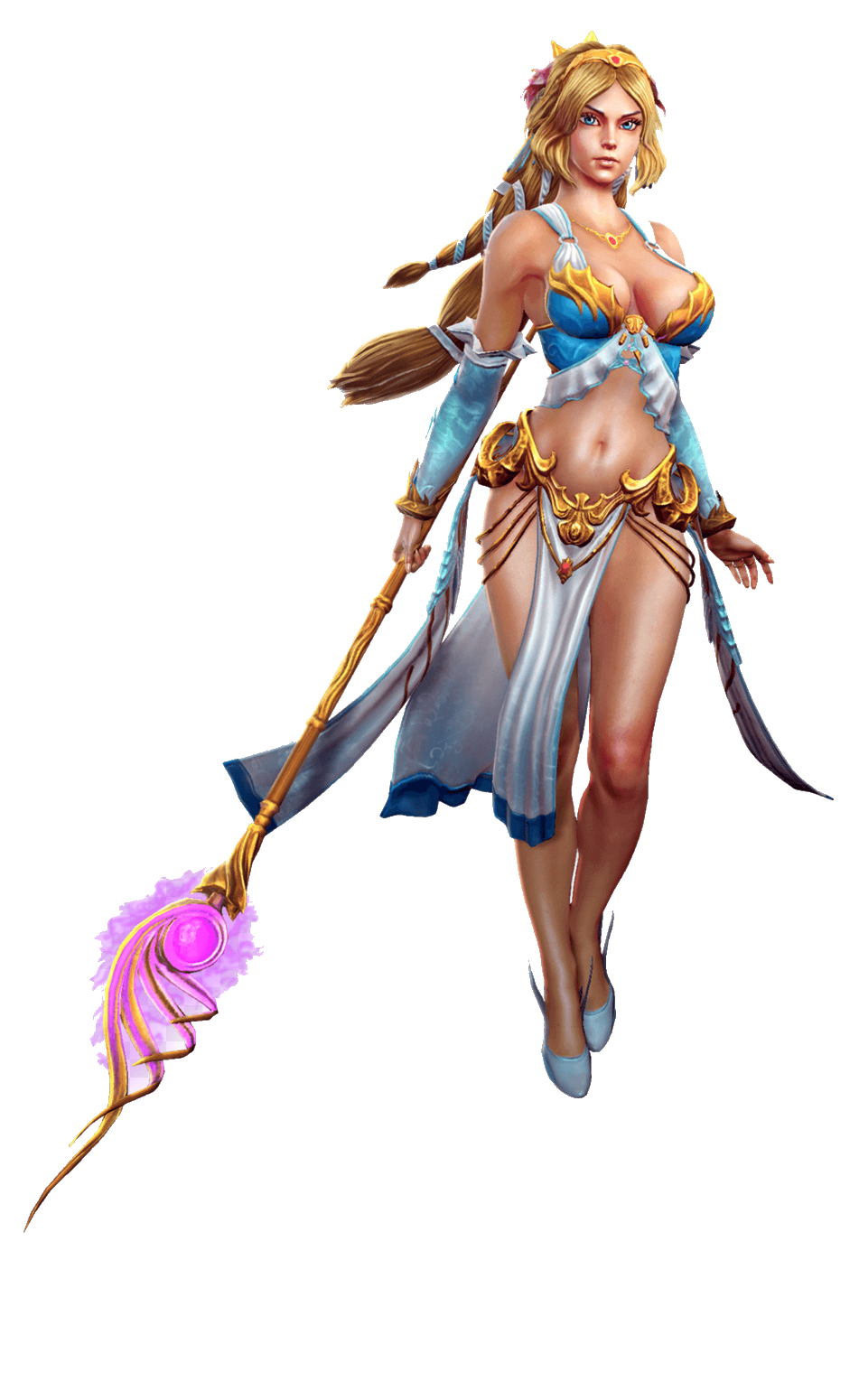
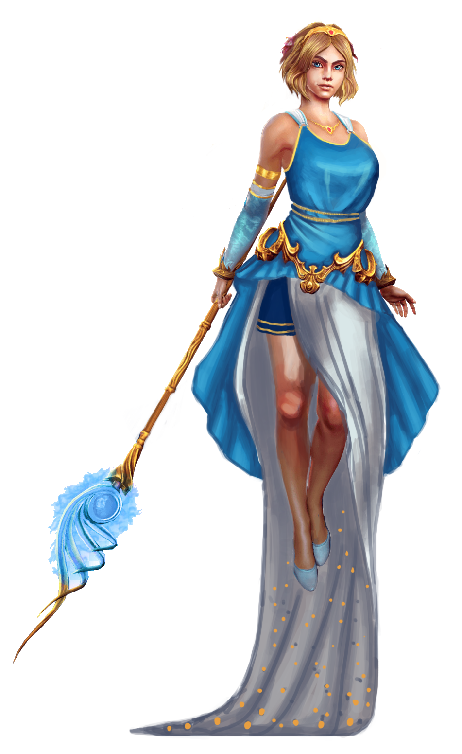
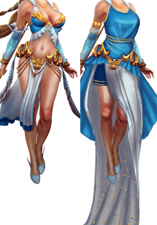
When picking out a goddess out of the SMITE pantheon to redo this time, I decided I wanted to try to make a “sexy” design that doesn’t rely on the Victoria’s Secret catalog. So here we are.
I didn’t change her body proportions at all, I only took the “in bra cup” shape out of her boobs. I gave her a draping shirt that’s more similar to ancient Greek attire. Isn’t it weird that the male Greek gods are designed to look more inspired by ancient Greek styles…. hmmmmm.
I did not give her pants, due to the ancient Greek influences, but I decided to make something out of the fact that she floats (for whatever reason). I ended up giving her a weighted skirt that would drag behind her when she moves. I imagine she could use it to great effect to look sexy or intimidating.
I left the belt in-place mostly because I didn’t have anything better to replace it with, but it’s definitely a bit much for the redesigned version. I think my shapes ended up being all over the place, but it’s still more interesting than the original. And I didn’t have to rely on lingerie for my design, what a shocker.
And last but not least, I changed her face to have more of an attitude and confidence.
Being beautiful and sexy doesn’t mean only having a specific type of face.
-Icy
Posted on
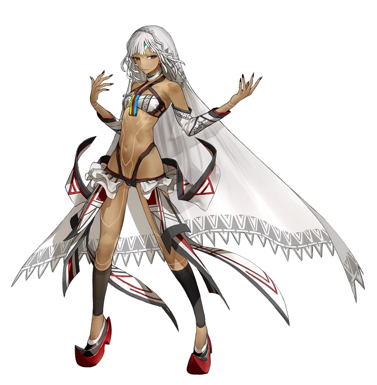
Fate Extella: Saber Attila, but not the same as the Earth one apparently
I know nothing about Fate lore and I honestly don’t have the time in my life to get into it all, but the wiki page on this character says she is Saber class, and also “different from the Altera of Earth,” (even though they look the same, even down to the clothes) so I’m taking their word for it. Don’t let me down now, fandom wiki!
We sometimes get mail from fans telling us that we’re just offended by the skin-showing, and we should get over it, but we’re honestly not like that. Just take my word for it. However. The original design for this one definitely offended me. A lot. So that’s why I picked it for our Saber redesign stream.
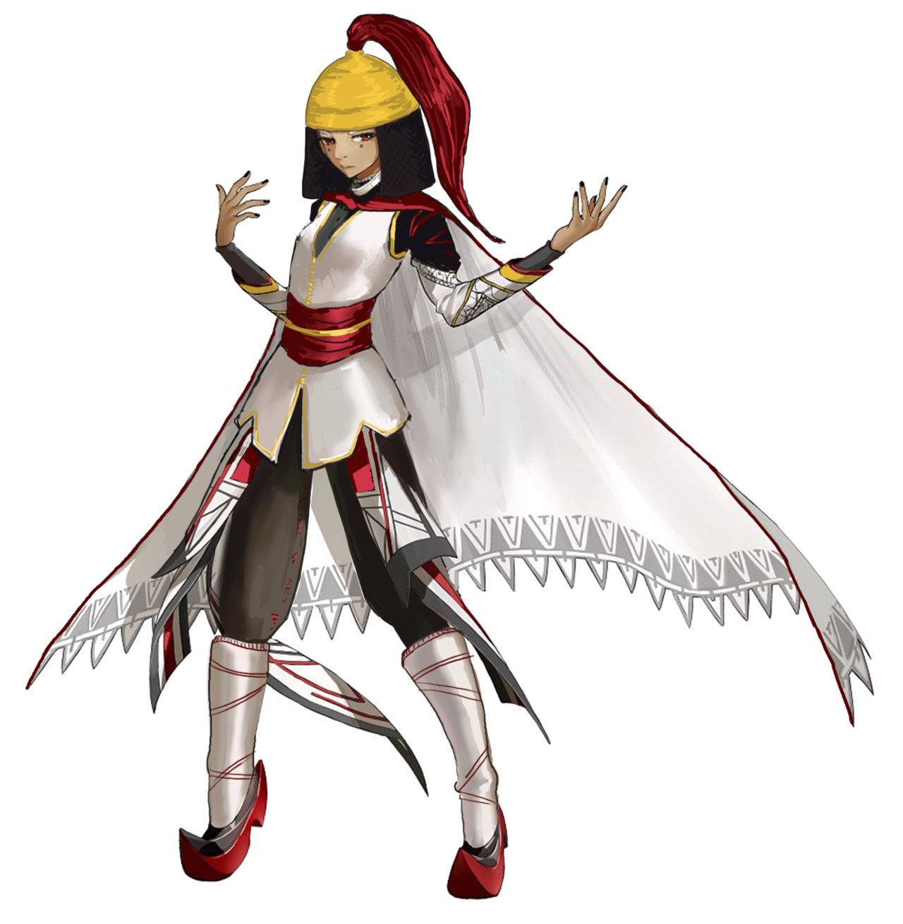
This is another case of me having to go back and finish what I started, at which point I just… started from scratch… I definitely do not have a problem. Here was my first attempt, based on a historical estimate of what Attila might have looked like (the records are less certain than for Nero, from what I found):
I ended up doing another Google search (when I went back to finish it) and found an interpretation with the helmet/coif combo that basically looked like her existing bangs and hair shape; so I decided to start over, this time trying to work more with the existing design elements.
There’s probably too much white in the final redraw, but I can’t be bothered at this point. #ITried. At least it’s actually wearable! This is now a Callout Post. Yikes.
-Icy
Posted on
Posted on
Posted on
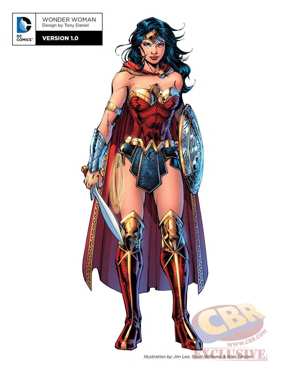
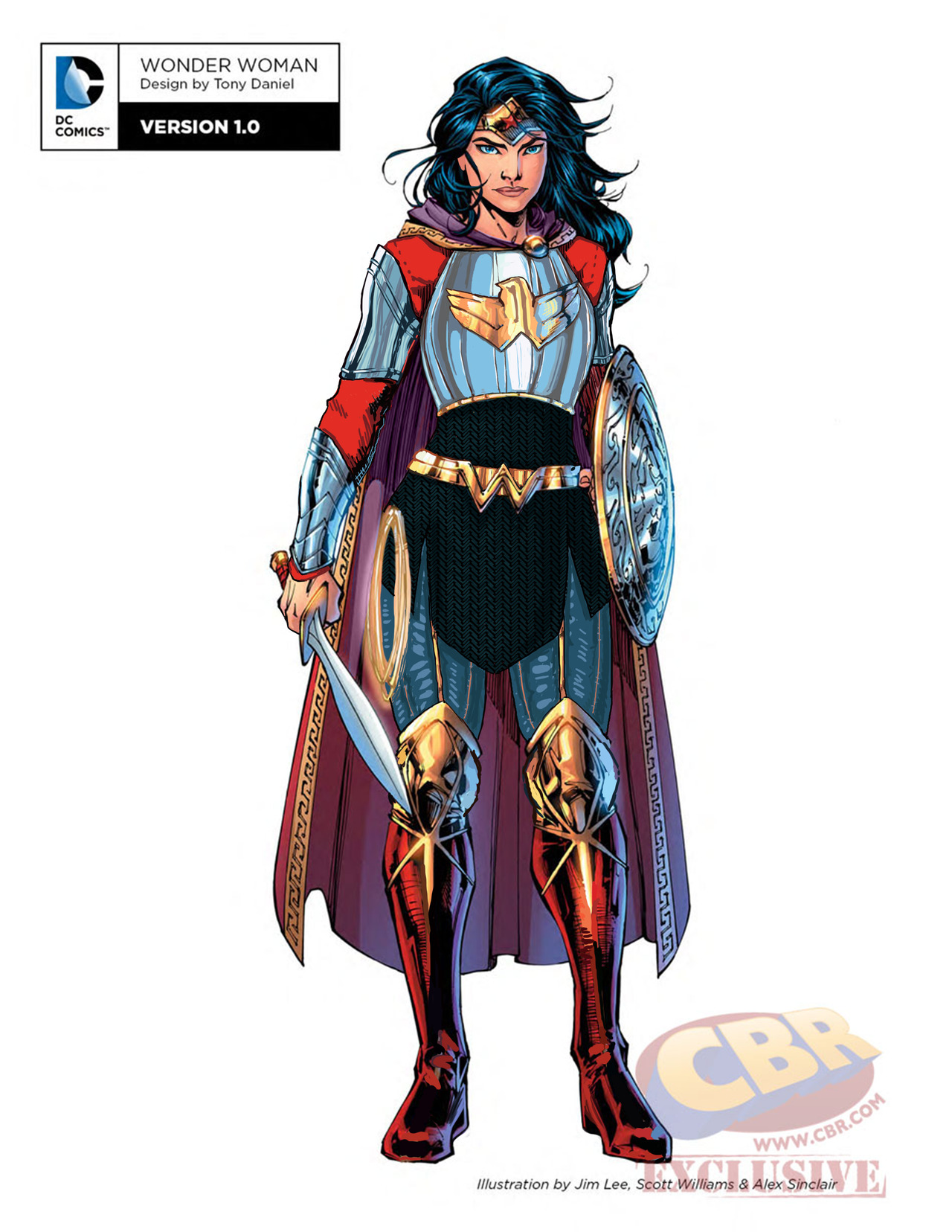
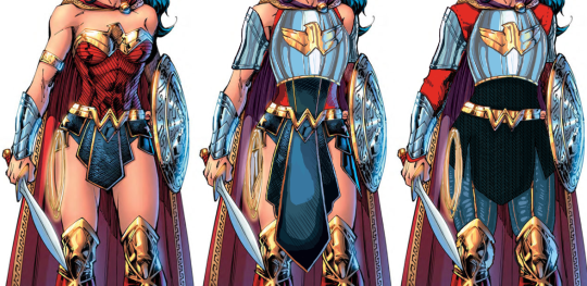
Another Wonder Woman, Why Not
Ozzie made a great Wonder Woman redesign waaaay back, but I wanted to try my hand at something more akin to the movie design. I enjoyed the Wonder Woman movie a lot, but that outfit of hers was such an eyesore. Also had to deal with constant second-hand cringe at imagining what it was like wearing it.
Sooo…. I ended up changing almost everything, obviously. I didn’t really have a specific theme or time period I was taking inspiration from; I just knew I wanted to give her a nice breastplate, and then worked around it for everything else. I gave her chainmail in a similar shape to her uhh… skirt? And then the gambeson makes a comback for the leggies.
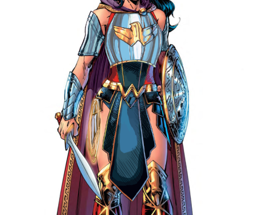
Since the design is pretty clear and simple, let’s instead show my first attempt at a redesign, where I was trying to make the skirt work… somehow.
After coming back to this later, I realized that I was just doing the redesign equivalent of this gif:
Sooooo I got rid of that tabbard and redid it all.
I also changed her face. I gave her thicker, more natural (but still fun) eyebrows, and a stronger nose. I also cut back on her makeup, and changed her expression to look more determined, rather than “awkwardly chuckling at someone’s joke on a first meeting.”
Overall, I think I gave it a good try. I feel like it’s missing something in some spots, but I can’t think of anything else to add besides like… some colored ribbon in her chainmail, but I don’t think that’s characteristic for her.
Would still have preferred my design over the original for the movie.
-Icy
Posted on
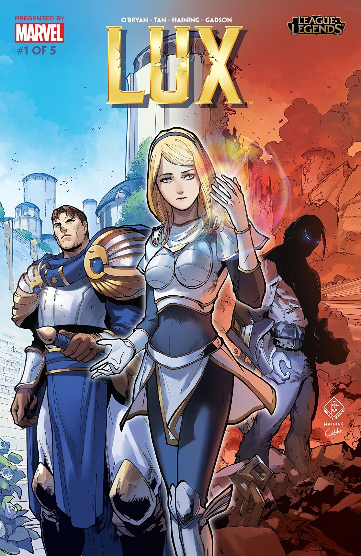
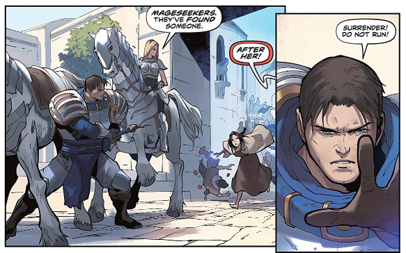
So, recently League of Legends decided to release this origin story for Lux, which has really helped showcase how terrible her design is in comparison to that of… well the rest of her culture. Right off the cover makes it look like she’s the princess to be rescued, not the heroine to reach her potential.
The best thing that can be said about this comic is that they’re depicting her within the society she supposedly came from: it’s now well illustrated how tacky and impeding that shitty boobplate would be.
If it wasn’t for the title, you’d assume this was actually a story where Garen was the hero for baby sitting a generic damsel in distress… Which is kind of horrifying when you realize Lux has been in the game for eight years, and somehow fixing her design or evolving her default into something better has never occurred to the folks in charge.