This week, we’re continuing drawing our sexy Witcher men. Hopefully, our hardware will cooperate this time around.
We’ll be starting at our regular BABD time on Saturday at 10 AM PST / 7 PM CET.
See you there~
-Ozzie and Icy
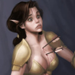
The hilarious front line in the tragic war against ridiculous female armor
This week, we’re continuing drawing our sexy Witcher men. Hopefully, our hardware will cooperate this time around.
We’ll be starting at our regular BABD time on Saturday at 10 AM PST / 7 PM CET.
See you there~
-Ozzie and Icy


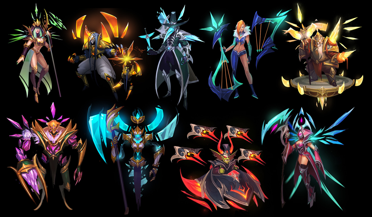
While Icy was working on her list of WIPs (some judgment, mostly from Icy herself), Ozzie trekked beyond the usual Heroes of Newerth gallery and found some officially posted concepts on Art Station. And they were all great, right? …. Right?
Looking at this set of character concepts I noticed certain… discrepancy between male and female-coded ones. It seems that the designs are pretty nice and geometrical, and work pretty well overall. Until a woman is being designed, where the priorities seemed to be cleavage and leg over a cohesive overall look.
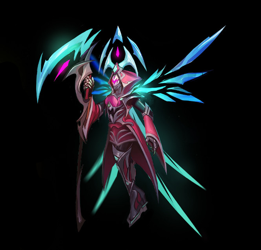
I believe it was one of the technical difficulty/limited time streams (also the pics were relatively low-res), so I opted to do very simple, minimal changes – just by covering up this pink/teal Grim Reaper-y (?) lady’s bare skin and giving her wearable shoes.
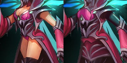
Bonus for no more “eye” designs on her boobs. I kinda like the skirt I gave her. Not much to say beyond that.
~Ozzie

exoplaneeet submitted:
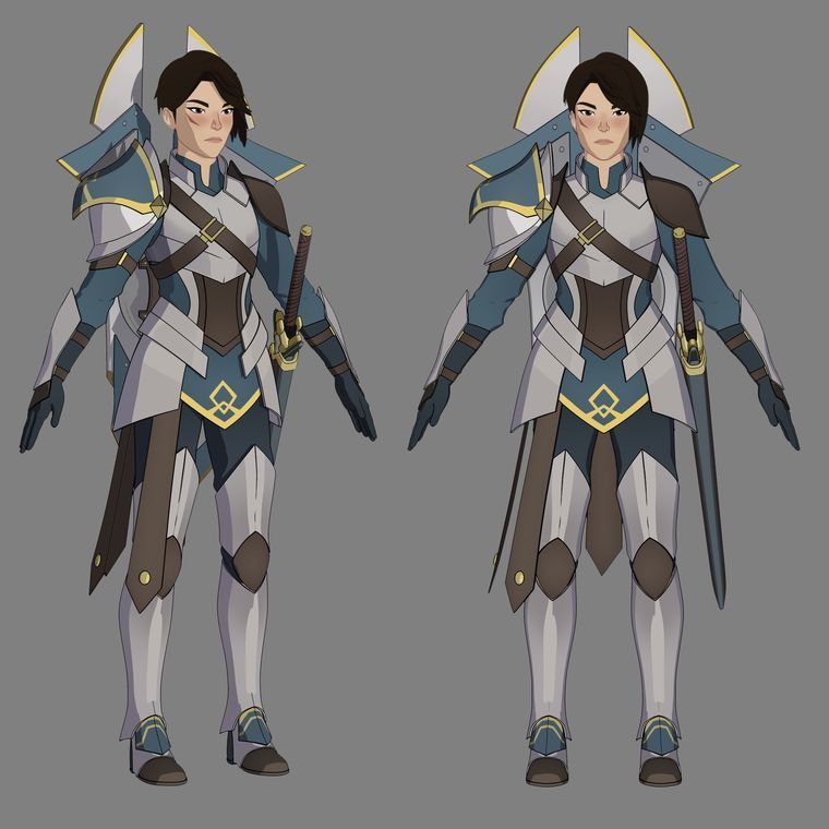
general amaya from the dragon prince is a good example of female armor done right
@adhdkirabraginsky submitted:
Here’s a positive example from “The Dragon Prince” on Netflix! On the left is General Amaya (who is also deaf, v cool!), and on the right is Lieutentant Gren, her second-in-command (and sign language interpreter). This scene in particular is from s1e5, about four minutes in.
Took us too long to finally post this positive example. General Amaya is basically best character in the whole show: high-ranking soldier woman in great armor, reasonable authority figure, nonapologetic representation of disability and, last but not least, caring aunt for the main characters.
~Ozzie
@dinopasta33 submitted:
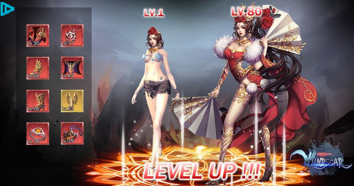
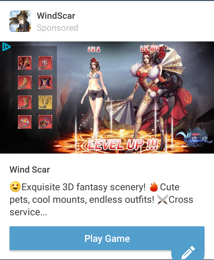
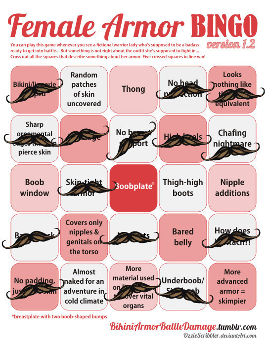
The designs used in Windscar’s advertisement are an absolute travesty. Like, I’m pretty sure she needs more than a chiropractor with her back bent like that
Wow, good find for BABD and for @eschergirls! The closest to this contorted promo pic I found from this game was this:
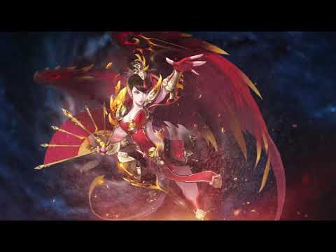
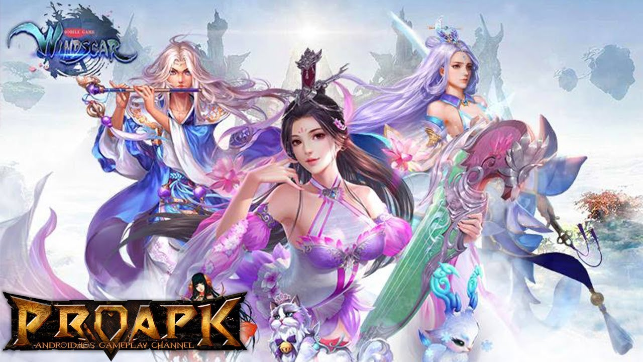
And generally WindScar seems to be very satisfied with looking like every other generically boobastic shit in our web ads tag.
~Ozzie
What I find amusing about these designs is they are made by an Chinese company – but there’s almost no link to Chinese fashions, clothing, designs, etc.
These are basically Chinese artists looking at how Western artists have tried to imagine these costumes, then trying to make them kind of like the weird western fantasy designs they see in western video games.
Thus creating a cycle of terrible where some guy in a western company is now going to look at these and go try to outdo them….
*sigh*
– wincenworks
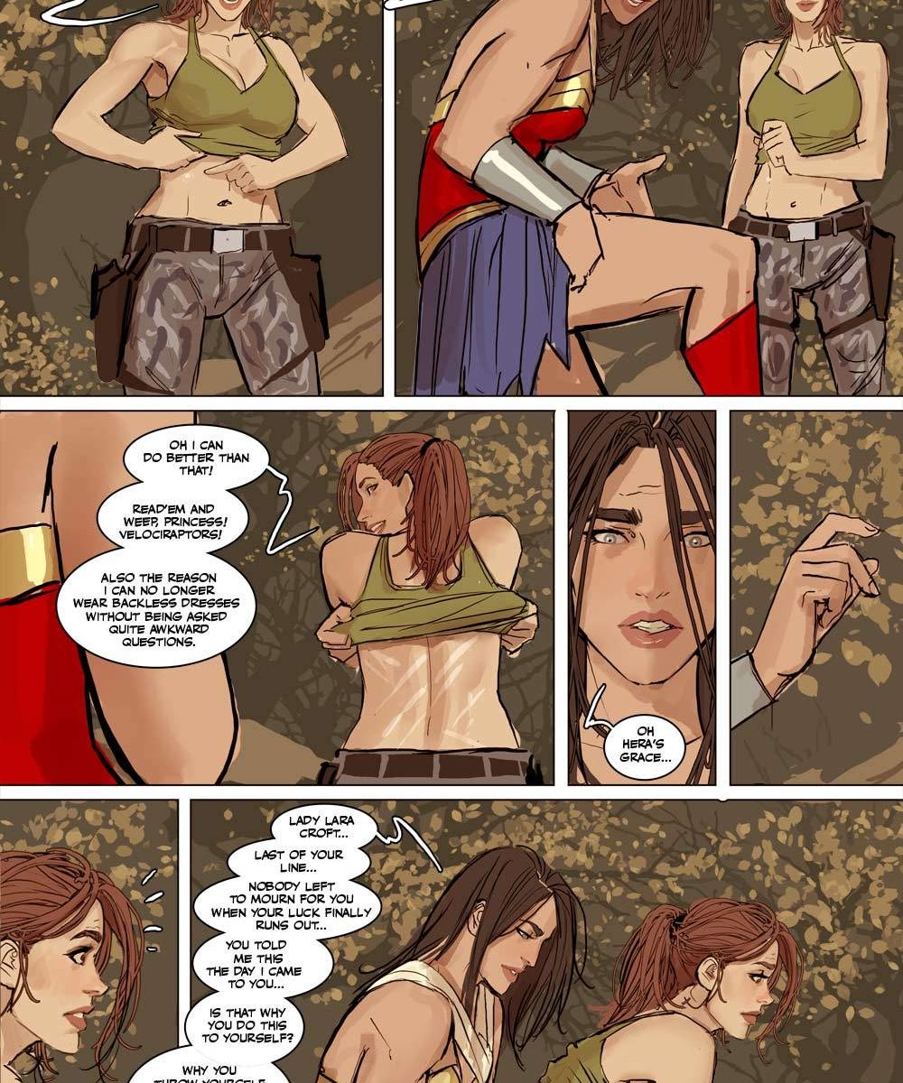
We’re back! This week, we’ll be redesigning some sexy dudes. Don’t let the witches scare you off~ 😉
We’ll be starting at our regular time on Saturday at 10 AM PST / 7 PM CST.
See you there!
~Ozzie and Icy


hey if anyone tells you art goal is something serious remember i learned how to draw like actual western comics art style just to shove batman into high heels and titty window
Petition for DC to have Bruce go out on patrol like this after losing a bet to Jason
Oh goddess yes! I’m sure you can buy this in a sex shop in Gotham.
What a great empowered outfit! And it shows so much of his brooding character; the bat-shaped cleavage window is clearly to show his internal struggle to maintain the image of Batman as he’s known, versus the Batman he wants to be (as opposed to if he just had the bat symbol sewn into the fabric, which would obviously denote he embodied that Batman ideal). And the cut-out above his butt is obviously a distraction tactic if any bad guy tries to attack from behind.
Brilliant design!
-Icy


Battlerite’s a bit of a disappointment in its character design. They seem to have cool ideas (for the male characters and Iva), and their art style is cute and colorful… and yet. So why not try to fix some of their more uninspired designs?
Blossom
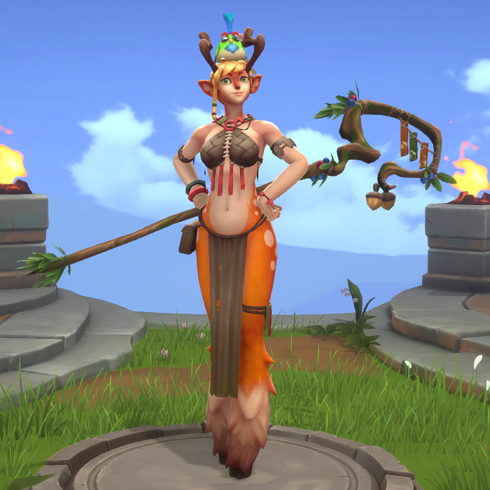
To be honest, my desire to redesign Blossom was from my deep-seated frustration with animal-looking characters having a humanoid body shape. Why couldn’t she just be like Puss in Boots from the Shrek movies? Just a deer that stands on her back legs, without breasts and a skinny waist and hips. I realize that she’s a “faun” according to the wiki, which means human/animal hybrid, but the fact that she has both hair and fur on her head/face makes it look like they just slapped some tits on an upright deer. Maybe they were going for something new, but boy did it not work.
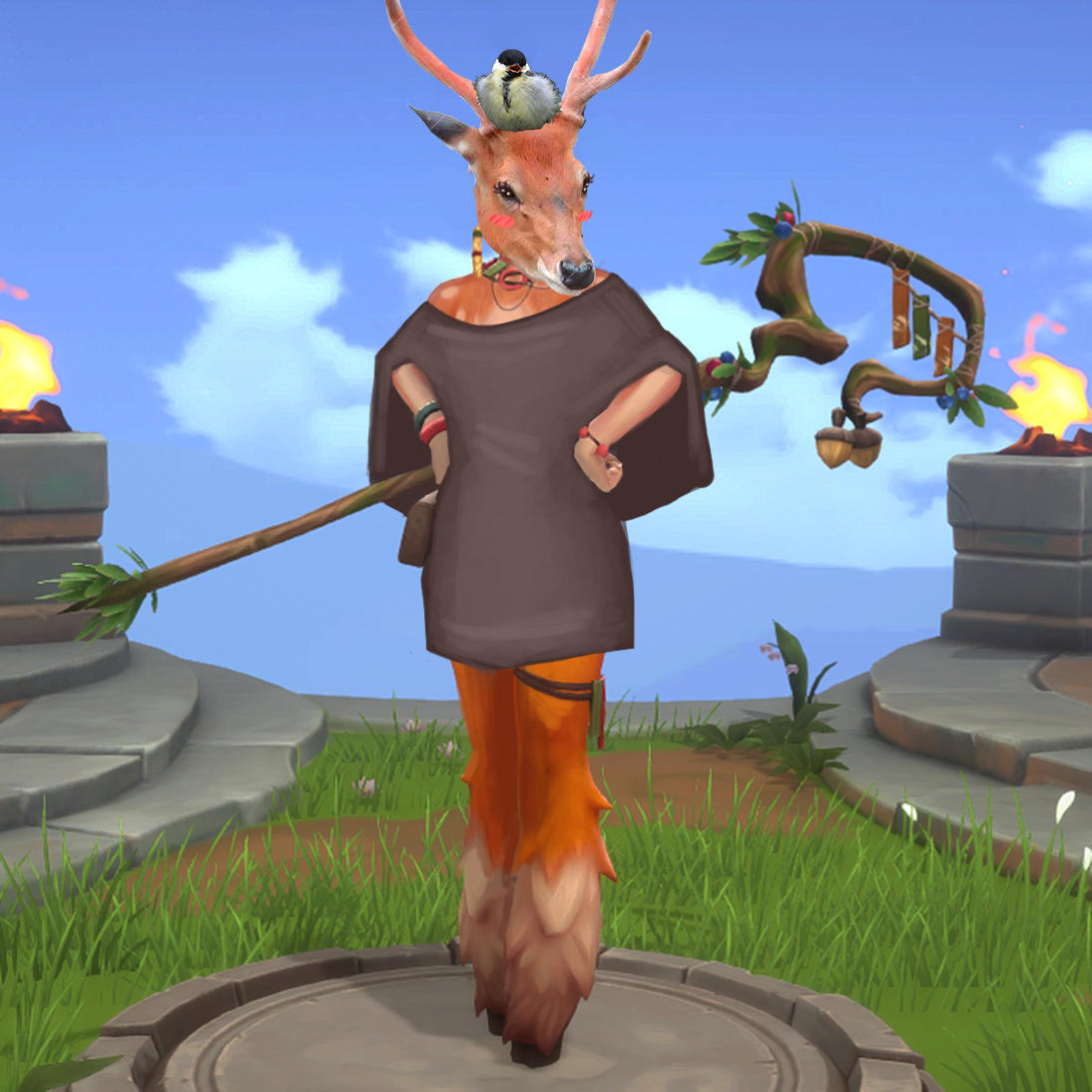
I tried to give her more clothes at first, but then decided…. screw it. She’s a deer now. Why does she wear clothes? So in the end, I just gave her a simple poncho. I did want to show off her deer-ness, so I left her shoulders uncovered and gave her upper body some fur, so it’s not weird that she has the same on her face.
I also changed her face to be less Generic Cute Girl.
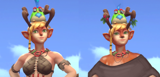
After I finished the edits, we started making jokes about just Photoshopping a deer head on her instead, so I did that. Got some images of a deer and a birb off the internet, and so Blossom’s True Form came to be. (You can still see the lines from the stock image watermark.)
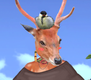
[She’s beauty, she’s grace, she’ll throw an acorn at your face.]
The result is fairly simple and could probably use some embroidery or patches of different-colored cloth, and some people might say this was an easy cop-out on my part. But I just want her to be a deer, not a deer with boobs; is that too much to ask for?
-Icy
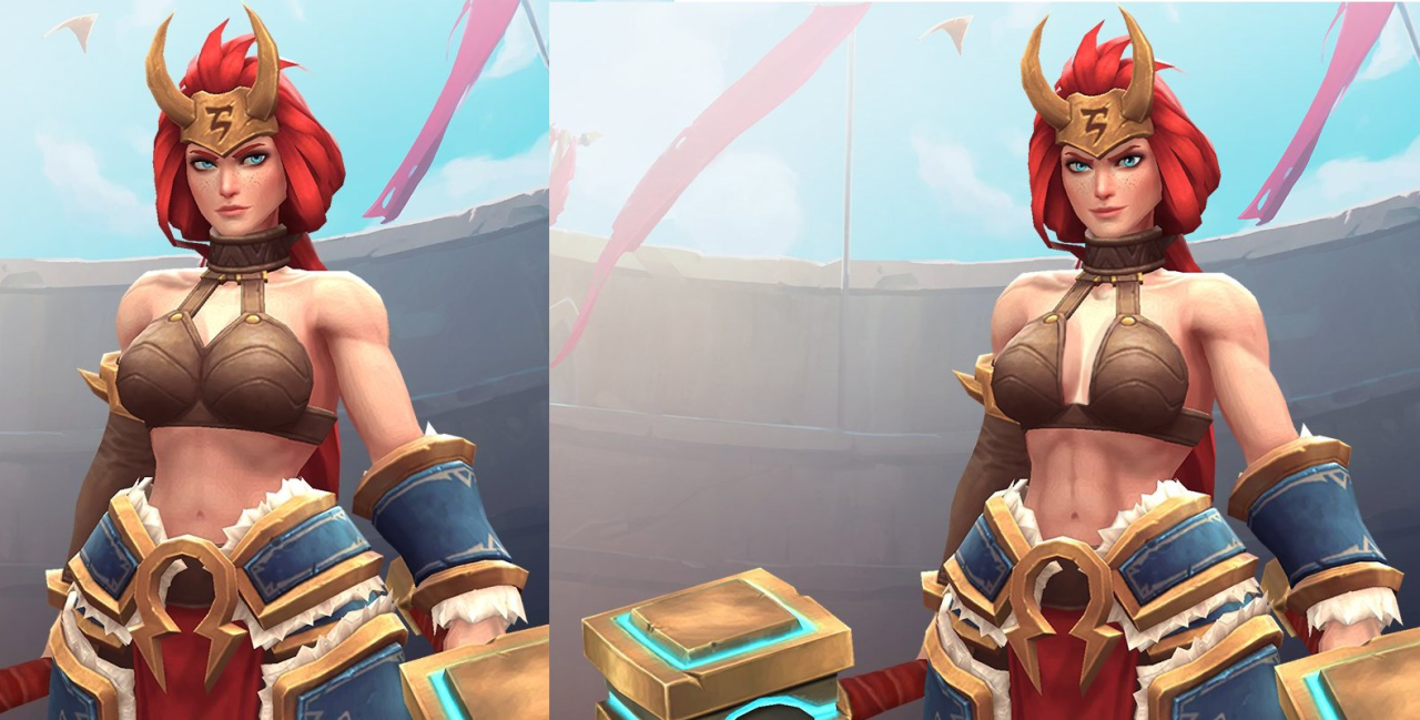
Freya
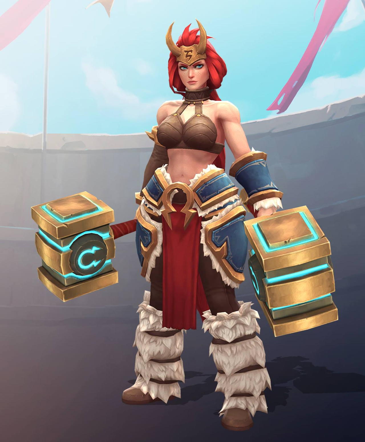
Thing about Freya’s original design is that I don’t actually find it overall bad – the random bikini top that looks like coconut shells strapped to a choker is the only thing that ruins it.
As mentioned back when we bingo’d her pre-update design (with even worse, sideboob-y bikini top!), she looks pretty great from waist down. Also, while far from unique, her face shape is allowed to be a tiny bit more angular… when viewed from certain angles, at least.
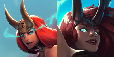
(basically it’s Zarya level of safe approach to diversity in female facial features – still conveniently attractive and wears makeup, but allowed to have square-ish jawline, given that you tilt your head and squint)
But since I couldn’t spend 2 hours of stream only painting her a decent top, I decided to build upon what’s there and add some more actually distinct features.
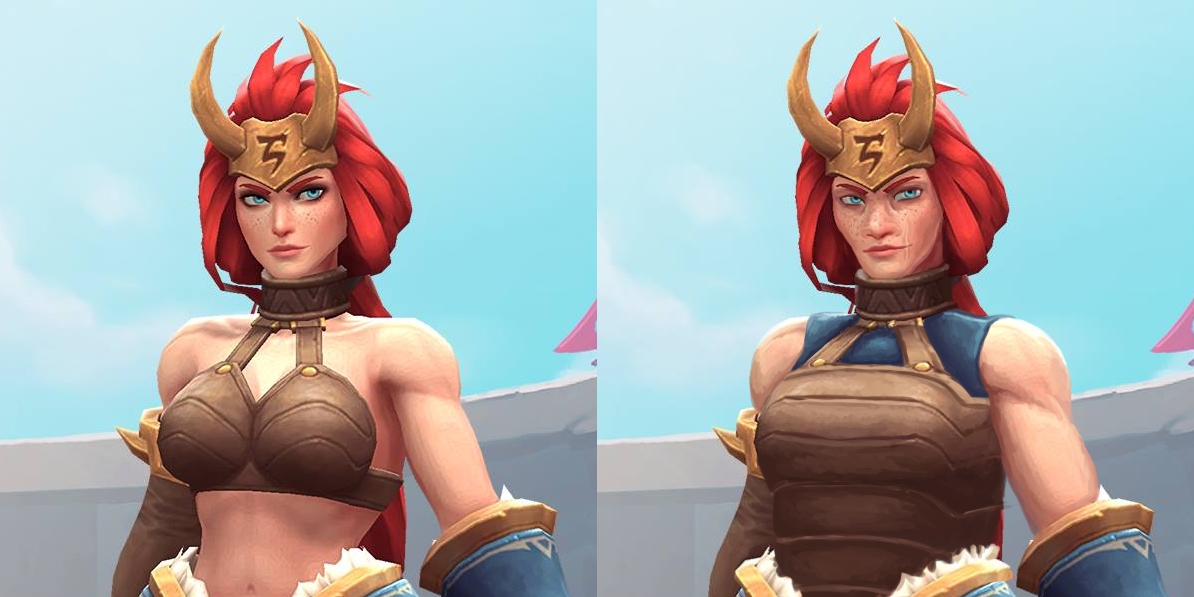
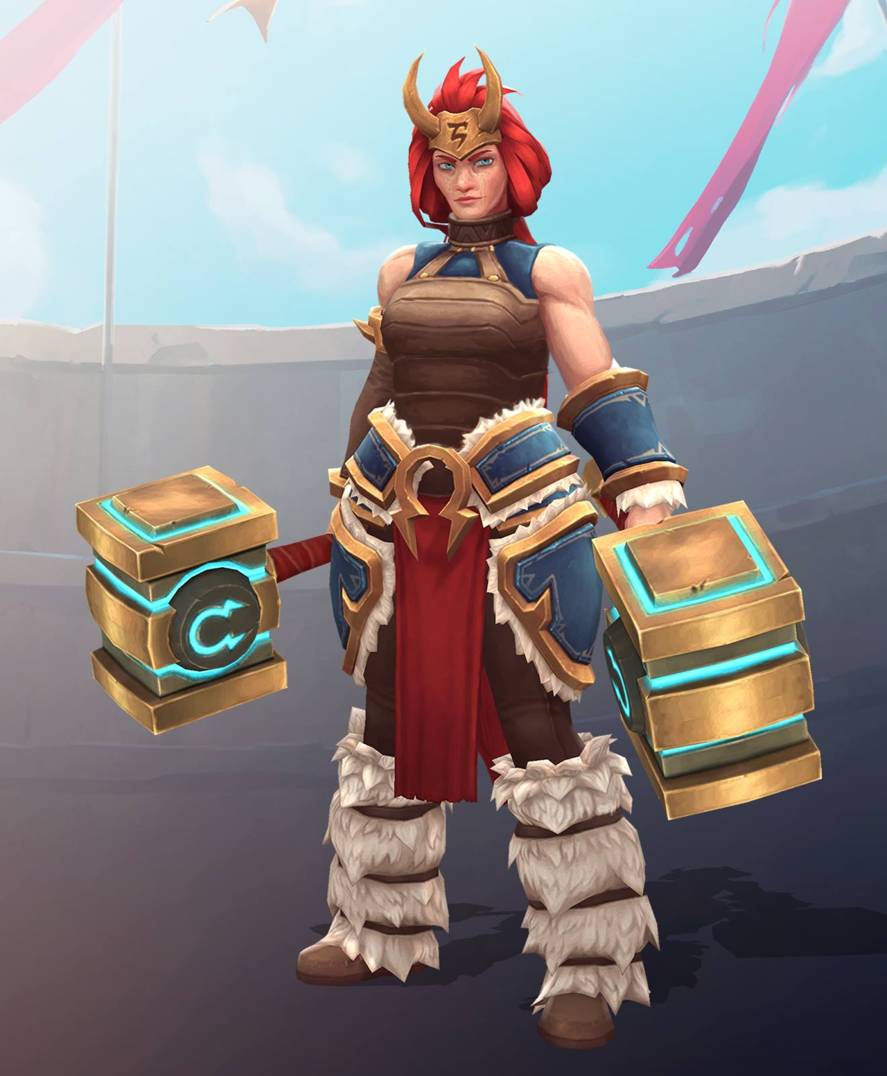
Of course, the boobplate had to go first. Since it bore some resemblance to Angela’s (coincidentally, also character associated with Norse mythology), I decided to base Freya’s new breastplate on my earlier Angela redesign. Also a blue tank top matching her bracer and tassets, for minimal layering. Left her shoulders bare, just gave them a tiny bit more heft.
I approached tweaking her face to create a more believable character. No makeup (which, unfortunately made her blue eyes with orange eyebrows stand out less), more prominent freckles, bigger nose, more sunken cheeks… All to create an image of a warrior who’s more concerned with surviving battles than spending hours in front of the mirror.
I’m rather pleased with the subtle changes to this design and my painting technique in this piece. Hope you guys like it too.
~Ozzie
PS: I didn’t know that while doing this redesign, but apparently some genius on Reddit, upon seeing slightly more boob coverage on Freya’s official updated design decided to “fix” her back to her original bikini. (╯°□°)╯︵ ┻━┻