kainissoable:

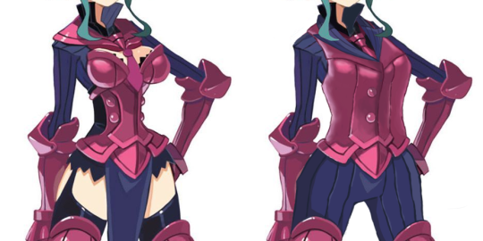
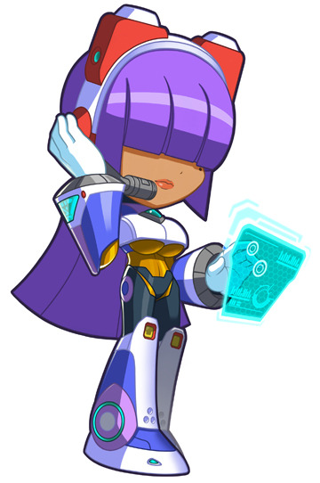
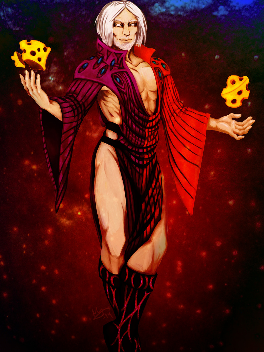
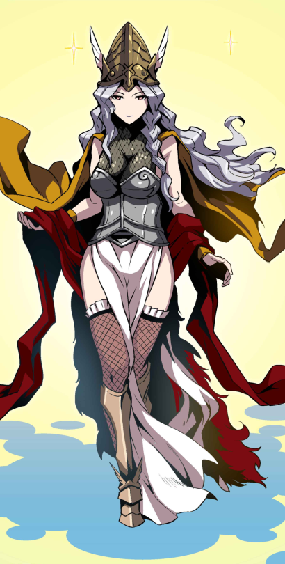
I tried giving Umah from Blood Omen 2 some proper armour, design based broadly off the single piece of armour to her name – that weird double pauldron thing. Edited the bottom half of her bikini into a fantasy tabard, and if I’d thought to use a fuller screenshot I’d have put the dragon from her Defiance concept art on there, but thought of that way too late. Come up with your own reason for why she has the Soul Reaver, preferably one more interesting than the fact that it’s hiding some lop sided hip armour that would have been a pain to fix. Another case of not as good as I was hoping for but automatically an improvement on the bare skin chafing nightmare of the original.

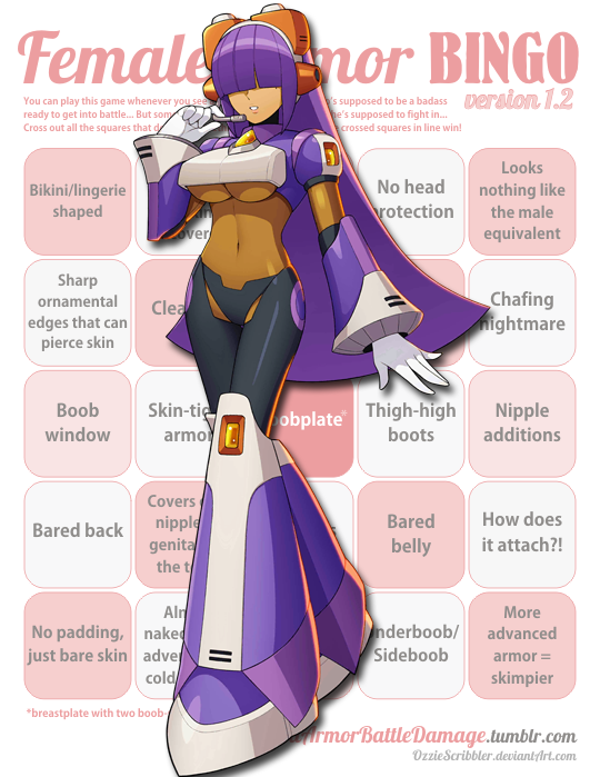
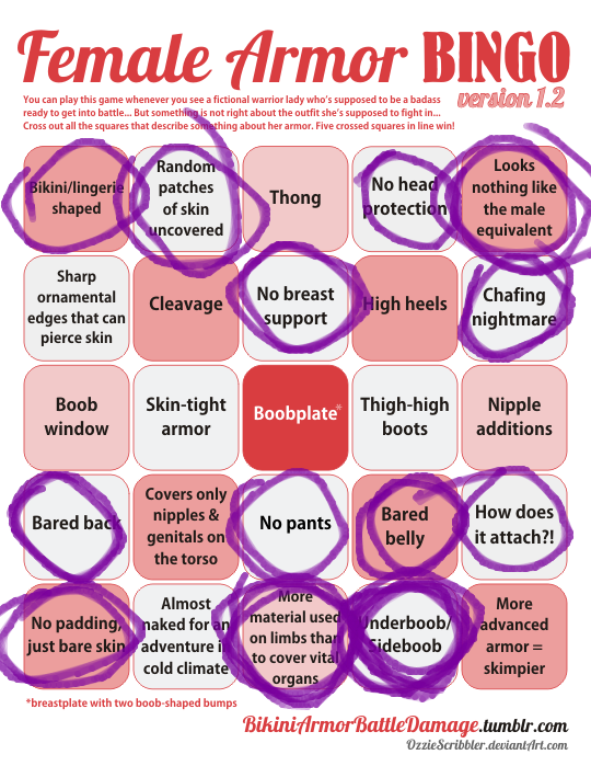
Personally I ascribe to @bikiniarmorbattledamage‘s tongue in cheek philosophy that women in fantasy should be fully armoured while men should wear something tastefully revealing. Legacy of Kain at least gets halfway there with the well muscled men in leather pants, just a shame about the prevalence of bikini armour.

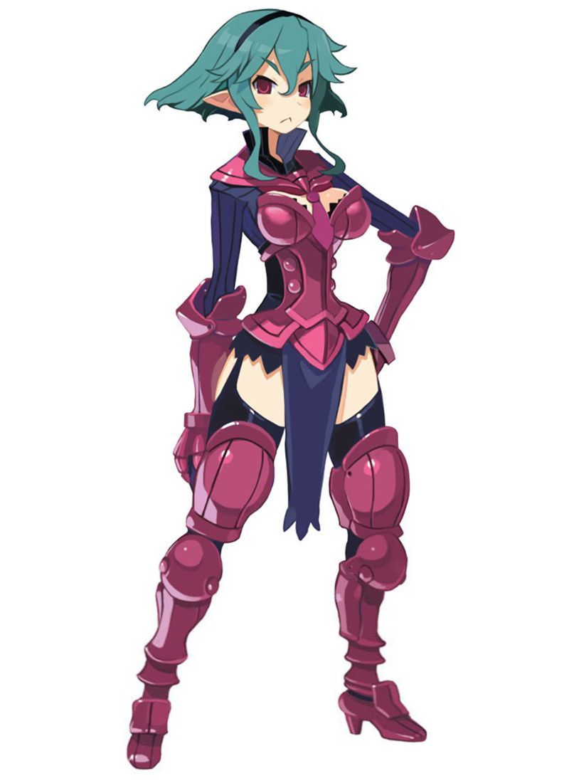
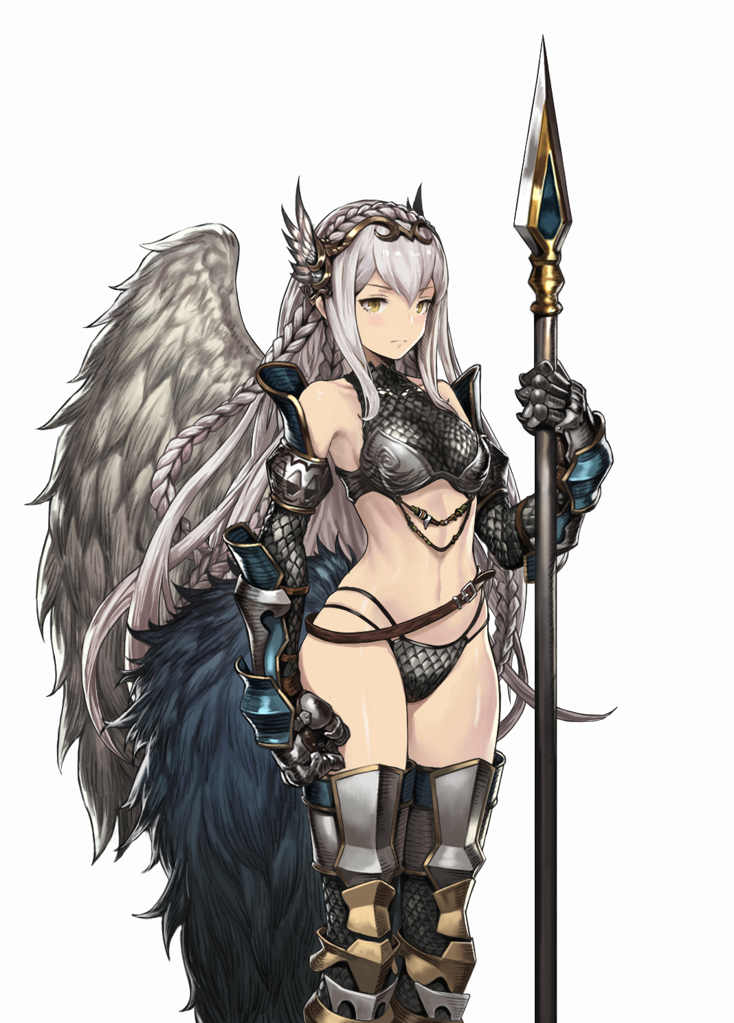
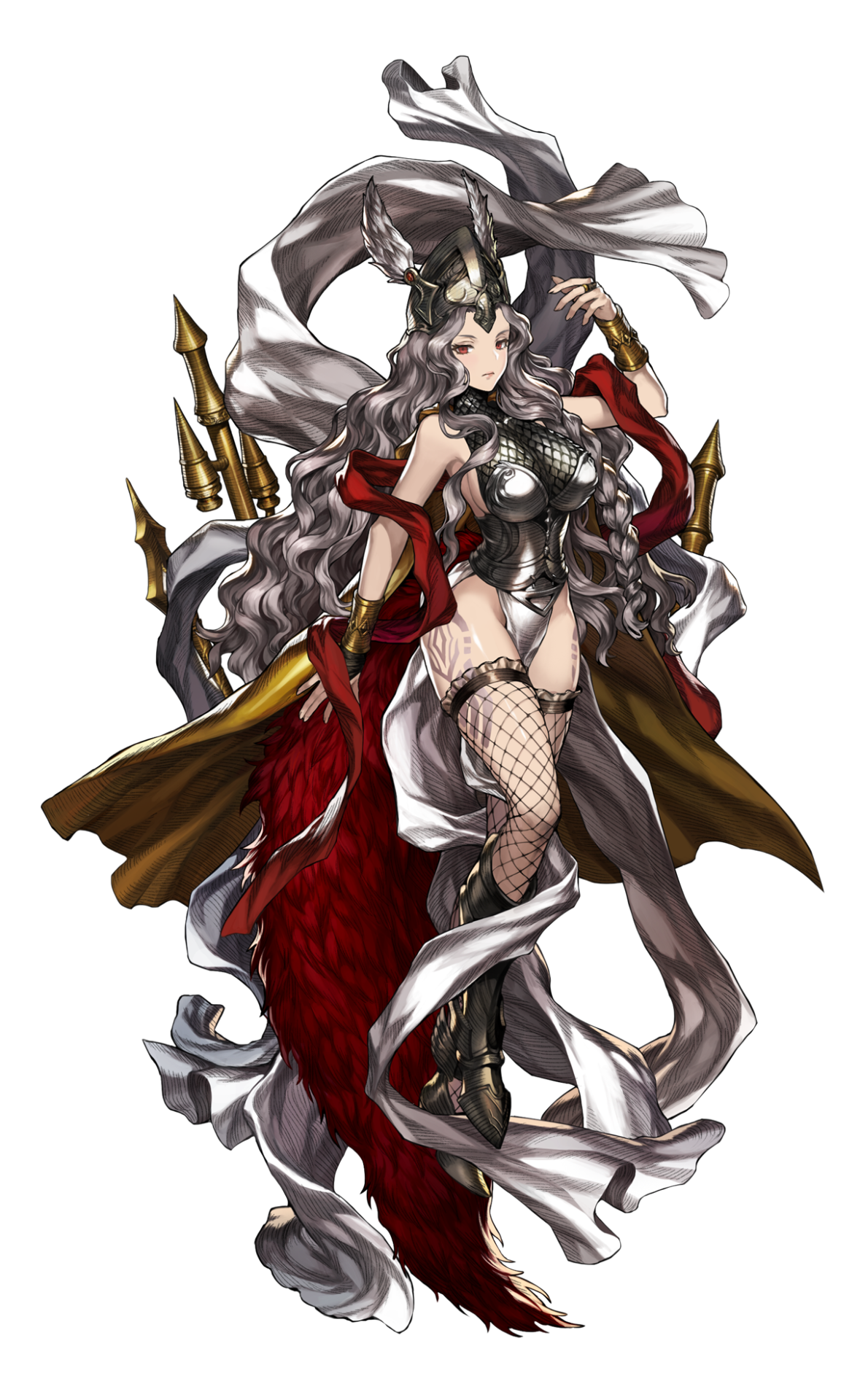
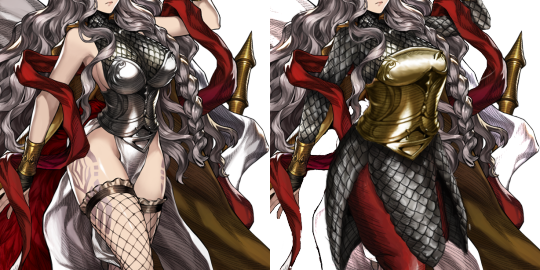
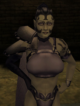
Wow, the original is a yikes, especially the huge boob part made from unidentifiable material. I guess it counts as better than most booplates we’ve  seen on BABD because there’s no boob window/exposed cleavage, but that’s one low bar to clear. Also, one huge grey boob blob on her chest is somehow extremely distracting and boring at the same time. At least put some symbol on it or something! 

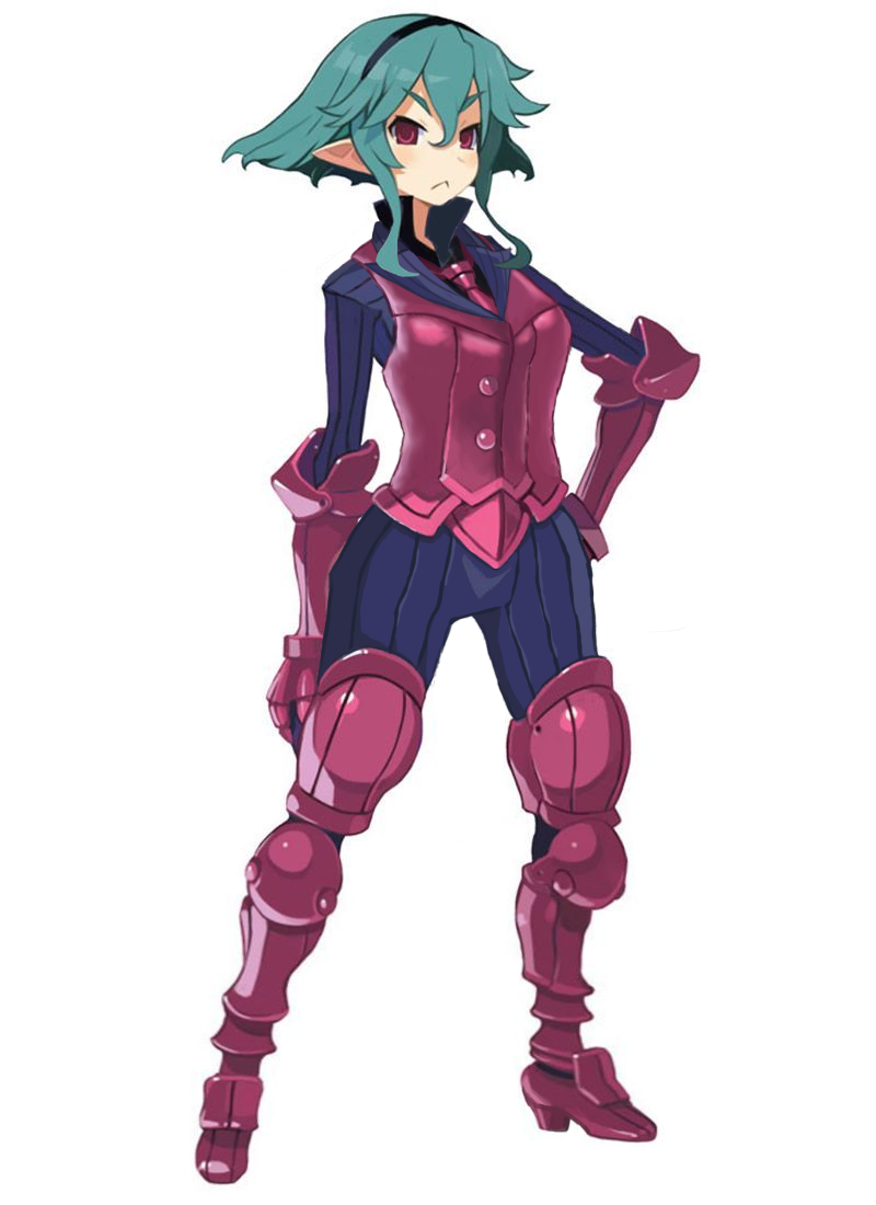
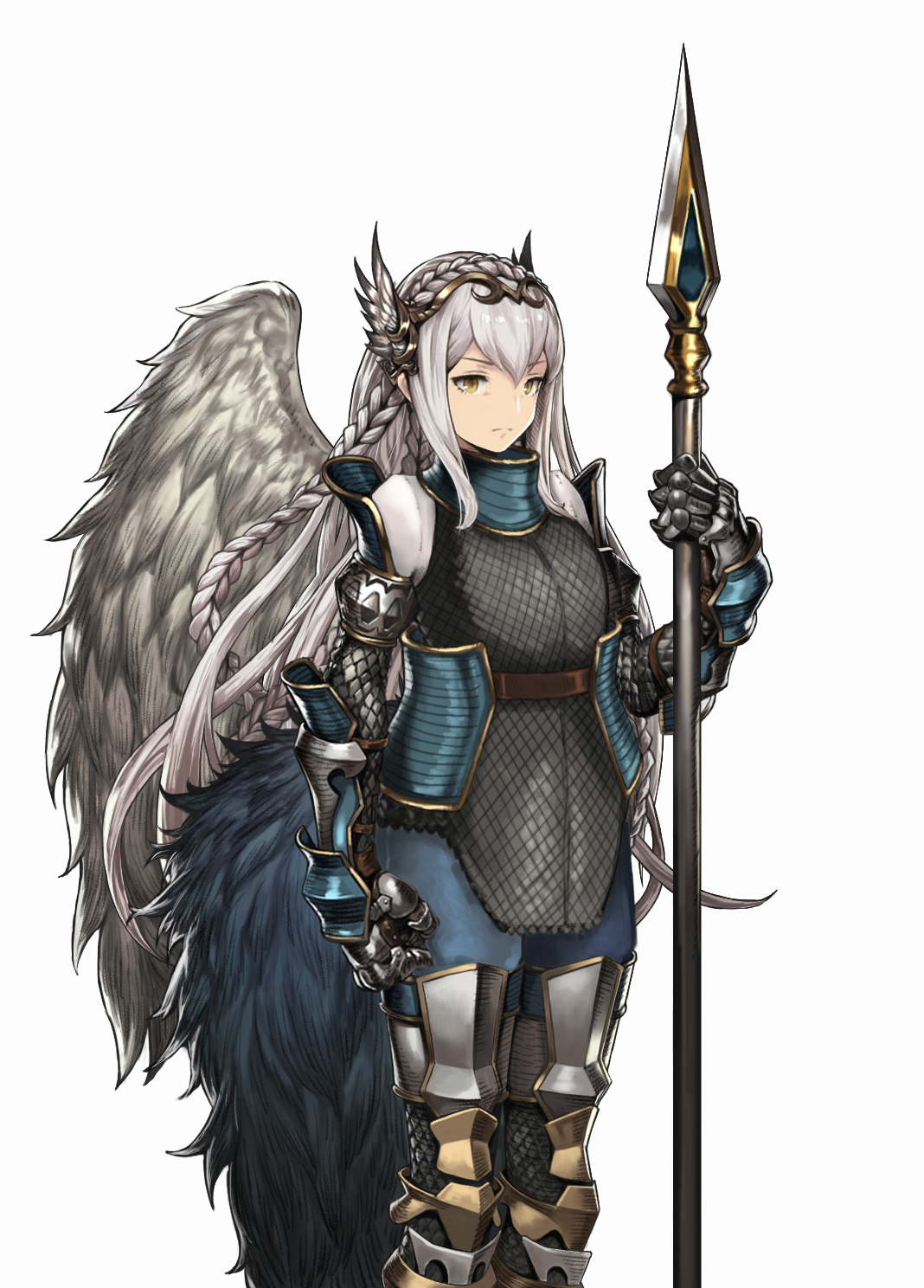
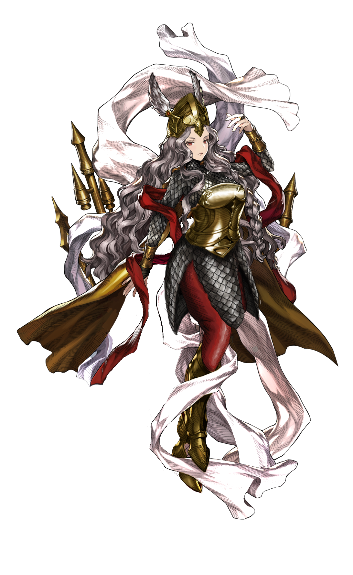
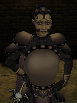
I like your simplistic redesign, @kainissoable. If me or Icy were doing it we’d probably put some design (likely sampled from other part of the costume) on the breastplate, to break up this huge shape, which was also the original’s problem. It still works objectively better than the generic garbage the original was. 

~Ozzie 

bikiniarmorbattledamage:

baddreamslimbo:

poisonivyys:

@bikiniarmorbattledamage

Speaking of boobs in fighting games

@pointandclickbait as usual has a really great take on the case

image

Remember that time when dudebros declared that Fury in Darkseiders III, sporting a (vaguely jiggly) metal boobplate, was “unfeminine and almost no more clearly recognized as woman”

Well, now we have a version of that devoted to sexualization of the undead. How… precious. 

Bonus fun fact based only on what some people in reblogs claim: those OneAngryGamer tweets are supposed to be “satire”. Riiight. ( ͡° ͜ʖ ͡°) 

image

If this is that dude’s idea of “satire”, I prescribe him reading more Point and Clickbait before attempting again to commit his comedic genius to a keyboard. 

~Ozzie 

Throwing this post back not because sexyfying the undead is particularly topical* right now, but because of the point it’s making about satire at the end. 

As I explained in the comments under the original copy of this post, “Political Correctness Gone Mad: I Barely Want To Fuck This Zombie” is clearly satire. 
“For the sake of boner culture, hopefully the sexy outfits are still viable option via the gear customization” is really not. 

Believe me, I would not be able to make a whole rhetoric bingo if I haven’t seen a big deal of people unironically defending stuff along the lines of “boner culture”. 

~Ozzie 

* Sadly, it’s always topical to some degree 

Disagreeing with Disgaea’s Designs, Part 2: Flonne

I feel like I’m going to get flack for this but oh well lol. So Flonne here, in her initial appearance, is an angel, assassin, otaku, ditz, and believer in love and justice. Hashtag relatable, am I right? I’m not sure why an assassin would have annoying detachable sleeves and hotpants. The color contrast between her pale-ass skin and white shirt isn’t even strong enough to make her shoulder an interesting standout shape. Maybe all the angels wear pajamas, which honestly, I can relate to. But not for assassinating.

For the redesign, I took inspiration from the lolita fashion style and gave her some fun shorts and a little cape. I was trying to maintain a lot of circles/rectangles in the redesign, since she is a force for good, even though the original had those bow triangles.. I guess they’re supposed to foreshadow her role in the sequel games? I’m not sure. I kept the color scheme, and I moved around some of the bows for balance in the design.

I think she could benefit from some socks, maybe, but I decided to forgo them cause I feel like even if she wore them, she’d forget to. She’s supposed to be an airhead, after all!

I’m not sure how I feel about the final product, this is the result of like 3 different tries, as usual. The only thing I’m really sure of is that cape. ?

-Icy

Disagreeing with Disgaea’s Designs, Part 1: Barbara’s Suit of Armor 

After the Beastmaster bingo, we agreed to do some character redesigns for Disgaea

The game’s wiki lists Barbara’s costume as a minor edit of the female Armor Knight, a rather inaptly named character class. Though yes, this is basically just recolor of their “armor”. 

image

Other than reshaping the ugly AF boobplate and patching up all the random skin showing I didn’t have a concept for this until @filipfatalattractionrblog​ suggested using the pin-stripe suit-like elements, which was a stroke of genius.
It ended up being a mix of 3-piece business suit with plate armor, with breastplate as the vest worn on top. 

image

While I didn’t manage to keep her proportions stylized like in the original (because, obviously, it was stylized in a very sexualized way),  I am really happy with how Barbara turned out. Hope you enjoy it.

~Ozzie

Found that character in a Twitter thread about suspicious dimorphism… because of course that problem also refers to characters who are robots/AI, not only animals and fantasy humanoid races. 

Her name is Layer, she’s a Megaman X character and apparently the worst-designed member of an all-female team in which at least one other lady robot (Alia) sports a boobplate

While the color of her torso, including the boobs, is slightly different from her face’s skin tone, I am still marking that as an underboob (it doesn’t have to be skin to count). This chest design is pretty damn egregious, no matter how much lore would justify it with her not being human. 

Needless to say, anyone familiar with how Megaman characters look knows there are no male equivalents to whatever the hell is happening to Layer’s breasts. 

Also, no, designers, you weren’t clever by giving her panties and weird pant legs that do not actually connect to form real bottom outfit. It’s just gross.

~Ozzie 

So, what Noelle is referring to is the silver lining to various shitbags crying that an imaginary woman had bigger guns than them – their meltdown a week or so ago leading to a glorious trend for real life buff women to share photos of their beautiful physiques.  Including this viral tweet debunking the claims that a woman couldn’t get swole within a few years

Now, the Last of Us 2 is (assume spoilers in all the links)

a very contentious piece of art  – with a wide spectrum of opinions about the role of violence (1,2), depictions of a trans character (1, 2) and so much more. However, there are some parts are indisputably positive: the graphics are amazingly beautiful, the accessibility is leaps and bounds ahead of so many AAA titles, and the outfits for the female characters are excellent. 

Someone is frantically typing a comment about how “they’re just clothes” but they’re really so much more, these are outfits specifically chosen and tweaked to reflect the world the characters live in, and the demands of their lifestyles. 

image

The outfits and the way they change to reflect the changes in the mood and the characters – all without distracting from the rest of the narrative.  It’s a great example of how much story telling potential you can get out of clothes when you’re not limiting yourself to the most T&A possible. 

– wincenworks 

edit: fixed first Polygon link (right after spoiler warning)

Powdered Shit Brown Dust Brave Nine, Part 2: Granhildr

This is the official illustration of Granhildr (whom we bingo’d in her “awakened” appearance), and she’s a one-winged valkyrie. Apparently she’s as good at making tea as she is at fighting, in a lazy attempt at fleshing out a personality, and I use the term “fleshing out” loosely.

This is definitely not my best work, but there was so little I could work with from the original, save from the shape motifs and colors of the arm armor. I wanted to keep the scale mail aspect of the original, and since I always do a plate armor breastplate, I decided to try something else. Clearly I need more practice at this kind of design.

I was taking so long trying to come up with any ideas that my rendering didn’t come close to the original, but at least she’s no longer suffering from a chafing nightmare.

I’d be interested in redoing this some time in the future. I think I’d want to turn that fur… whatever it is… into a cloak, or big fluffy collar or something, maybe to offset the single wing.

-Icy

Powdered Shit Brown Dust Brave Nine, Part 1: Frellea 

Speaking of Brown D… I mean Brave Nine, whatever the changes to the game’s name, story and character roster, it still remains a confusing mess, seemingly made only for the sake of its exploitative waifu art. So of course I proposed to Icy that we stream redesigns from it! We’re definitely alright after staring at them for hours ? 

This character is Frellea, older sister to the backstory comic’s protagonist demigoddess Eda and, I guess, from how well-endowed she is, a very powerful deity. I think, judging by character names (is Frellea a corrupted take on Freya?), they’re Norse mythology-inspired, like Odin’s Sphere’s butt-wing Valkyrie
And of course, literally nothing else about the designs communicates that. 

It was SO HARD to decide what should take priority in fixing this mess, but the mix of boobplate and scalemail boobsocks went first. I reshaped her breastplate into something plausible and decided to extend the scalemail into a long-sleeved tunic (though that one’s tight fit is mostly my artistic license). 

image

Next step was to tidy up the messy design composition, including the color scheme. Both me and Icy concluded those huge feathery… trains? tails? were purely decorative, so we got rid of them. 
I decided to balance out the contrast by making that ribbon white (instead of the shade shade of grey as her hair), reusing redness of the other ribbon (and the feathers) on new pants and, most of all, recoloring her non-mail armor to brass color of her bracers.* 

Easily one of my favorite redesigns, but also one of the most work-intensive ones, too. Hope you enjoy it!

~Ozzie 

PS: *In the comic the helmet and greaves are slightly different metal shade from the rest of armor, so it seems like different artists couldn’t agree on the color. Pic below, for the interested. 

image