

15 slimy frogs submitted (and Ozzie bingoed):
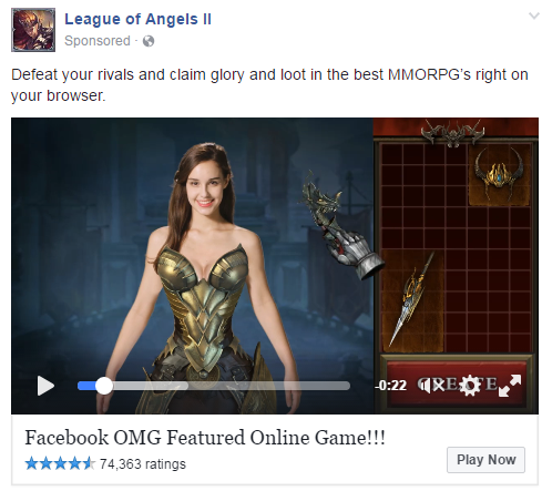
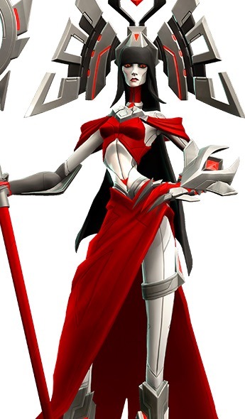
So this is an ad for the game Heroes of Incredible Tales on the App Store, and I noticed some differences in the attire of the male and female characters. The Lady in the front and centre seems like she’s quite eligible for the bingo.
Wow, another design that makes me regret not having a “(Only) random patches of skin COVERED” square on the card. Also, bingo breaker missing three bingos only by the virtue of neither her heels or back of her panties being shown in here (though I’m 99% certain it’s supposed to be thong).
The amount of thought artist spent on how that costume is supposed to physically work would be conveyed only in negative numbers, I believe.
~Ozzie
edit: This thing actually got a bingo and I didn’t notice (the joys of late night bingoing). Thanks to @ thenerdygirly123 for the heads up!
Gate – Thus The JSDF Fought There!
@the-hittite submitted:
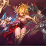
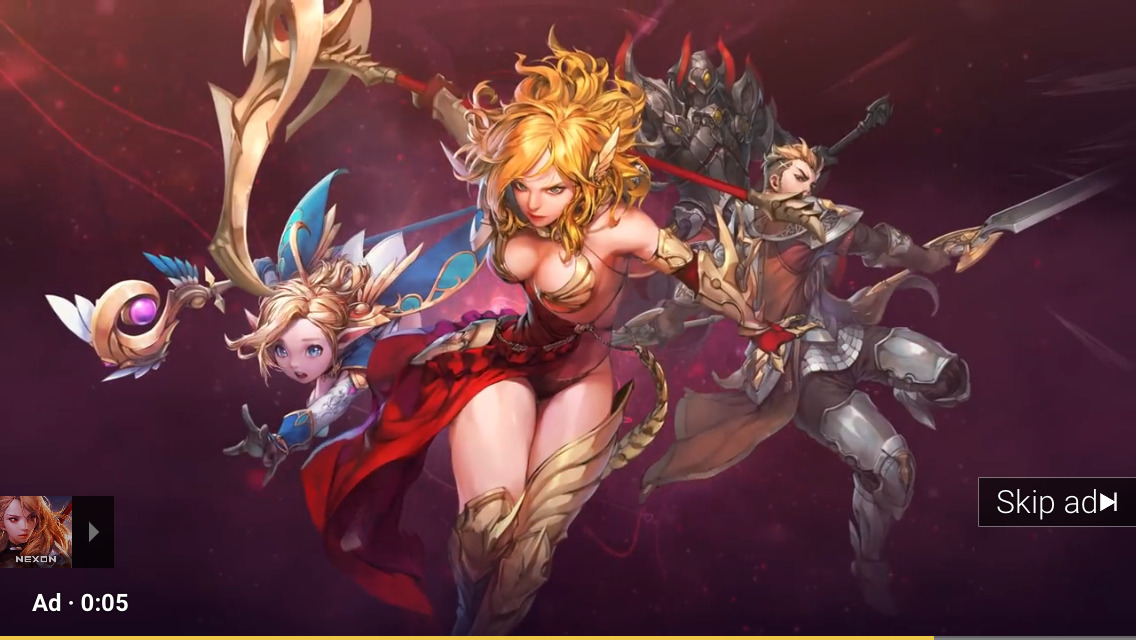
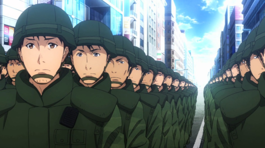
I think the biggest problem I have with Gate – Thus The JSDF Fought There! is how inconsistent it is. Because the animators obviously know how to draw practical modern armor.
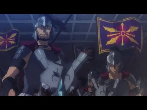
And they can draw practical fantasy armor based loosely on historical armor.
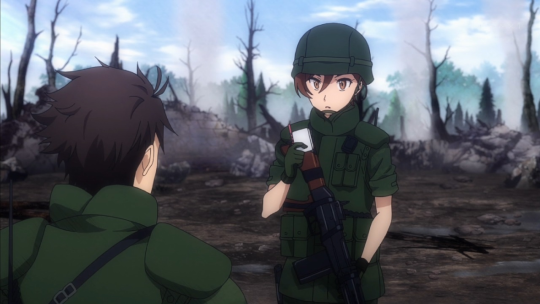
And they clearly know how to draw badass women in practical modern armor.

But when it comes time to draw a warrior woman in practical fantasy armor…


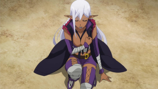
They just can’t do it!
(Granted, the Rose Knights’ armor isn’t entirely terrible, but it’s still not as protective as the male equivalent.)
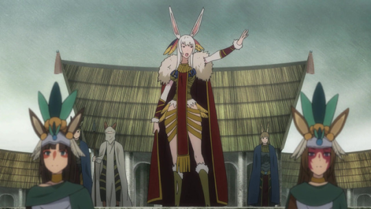
Of course the character in the skimpiest, most blatantly sexualized armour is a brown lady (making her an elf doesn’t make it better). On top of that, this serves as a pretty good discussion piece for another common query we get:
“What about armour that’s impractical but not sexual?”
The question is, largely impossible to address specifically because of it’s open nature, but there important thing to understand with designing fictional anything is that everything that makes it stand out from “real” should stand out for a reason – or the audience will assign a meaning.
In this case, it kind of feels like the main reasons they assigned them were Creepy Marketing Guy and because everyone else in fantasy is doing it to so we may as well too – which suggests that a lot of potential was compromised for the sake of cheap, generic sexualization.
– wincenworks
Gate – Thus The JSDF Fought There!
@the-hittite submitted:
I think the biggest problem I have with Gate – Thus The JSDF Fought There! is how inconsistent it is. Because the animators obviously know how to draw practical modern armor.

And they can draw practical fantasy armor based loosely on historical armor.

And they clearly know how to draw badass women in practical modern armor.
But when it comes time to draw a warrior woman in practical fantasy armor…
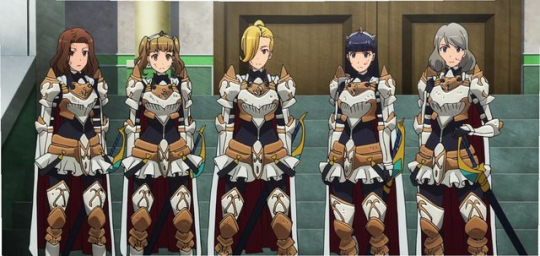

They just can’t do it!
(Granted, the Rose Knights’ armor isn’t entirely terrible, but it’s still not as protective as the male equivalent.)
Of course the character in the skimpiest, most blatantly sexualized armour is a brown lady (making her an elf doesn’t make it better). On top of that, this serves as a pretty good discussion piece for another common query we get:
“What about armour that’s impractical but not sexual?”
The question is, largely impossible to address specifically because of it’s open nature, but there important thing to understand with designing fictional anything is that everything that makes it stand out from “real” should stand out for a reason – or the audience will assign a meaning.
In this case, it kind of feels like the main reasons they assigned them were Creepy Marketing Guy and because everyone else in fantasy is doing it to so we may as well too – which suggests that a lot of potential was compromised for the sake of cheap, generic sexualization.
– wincenworks


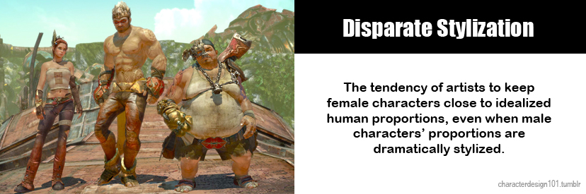
@lauraelyse submitted:
Same character class, same style of game, three different takes on it.
Stylistic choices don’t exist in a vacuum.
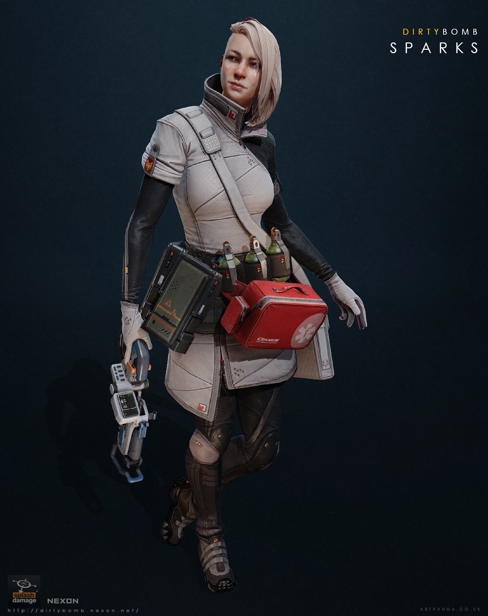
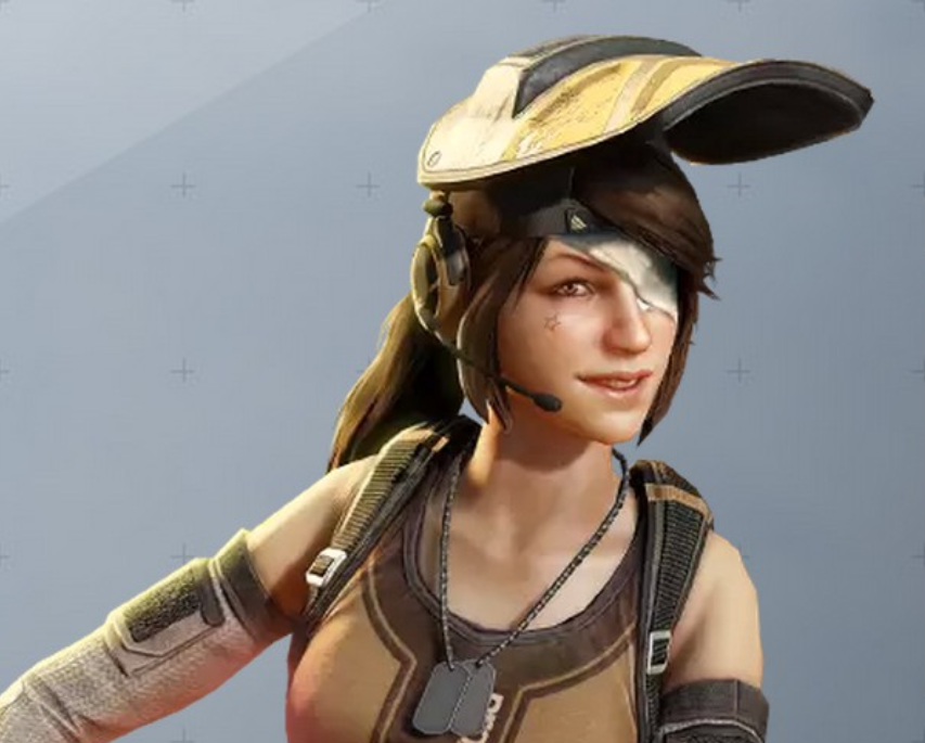
Dirty Bomb really doesn’t get enough credit for it’s walking the walk when it comes to egalitarian character designs and commitment to diversity. Every mercenary has a story, a personality and gear that is suitable to them – on top of that, they’re not afraid to let things get ugly. Have a look at how Proxy (basically their equivalent of Tracer in terms of personality) looks lately:
Needless to say Sparks as a white-clad medic who’s only thoughts on her profession is “Call me Sparks. I heal. I kill. Is ironic paradox. Yadda Yadda.” is a wonderful breath of fresh air in games.
Ambra from Battleborn is certainly not ideal, but as we’ve discussed before her design reeks of the Creepy Marketing Guy influence – but they at least made her a unique character and worked in no small amount of entertaining quirk.
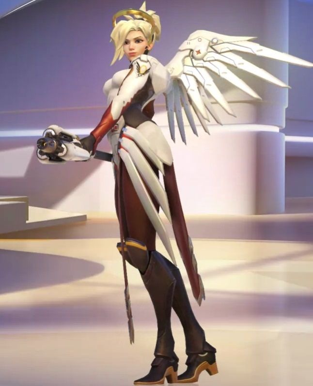
Mercy… oh Mercy.
– wincenworks
Before anyone comes to say we’re taking things out of context or comparing apples to oranges, yes, all those games have their own aesthetic and we should should judge how each character looks within it.
Dirty Bomb is quite realistic, Battleborn is very cartoony and Overwatch lies somewhere in the middle.
Overwatch, out of the three, is the one which suffers from disparate stylization:
And with female cast already less diverse than male, boobplates, the staple of unrealistic ignorant female costume design, look jarrigly cartoony there.
And we’re still not okay with boobplate on Galilea, even though Battleborn is more heavily stylized.
Speaking of ensemble games with cartoony aesthetic, let’s not forget about Gigantic, which while not boobplate-free (on their healer character, no less), does really good with gender and age balance among their cast.
~Ozzie

