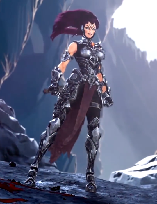
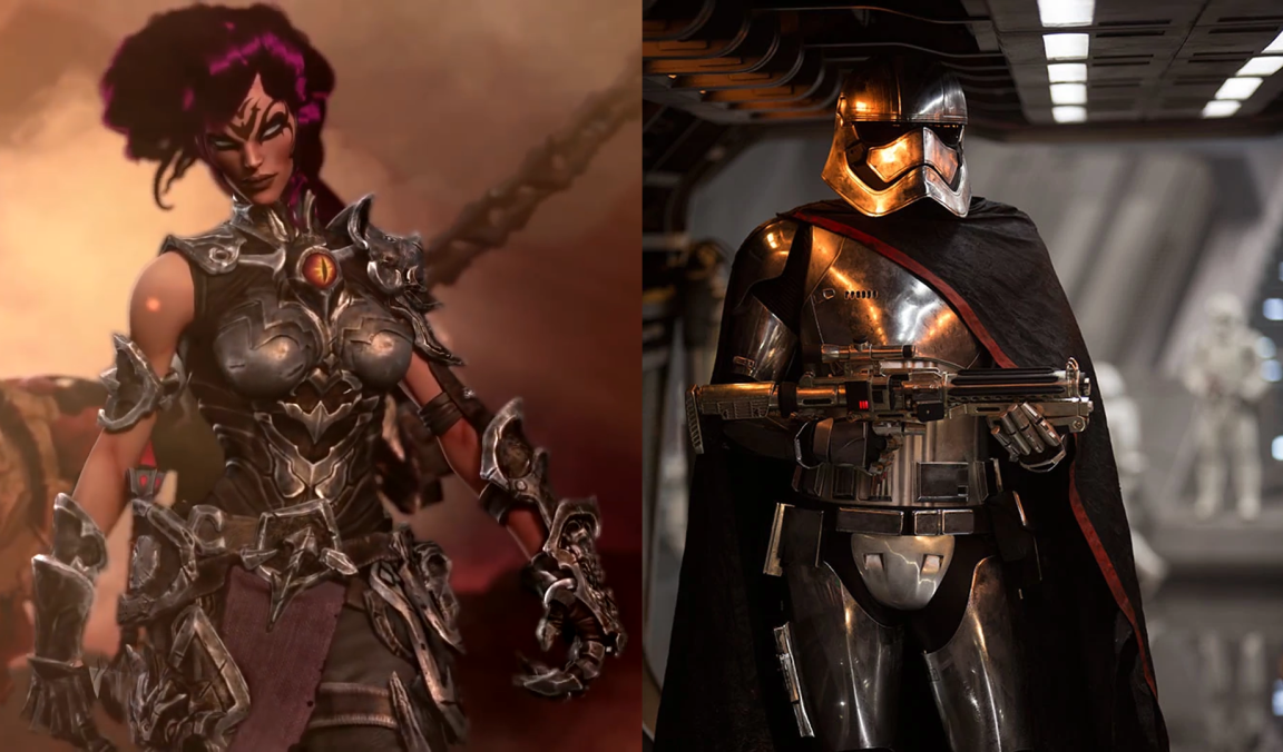
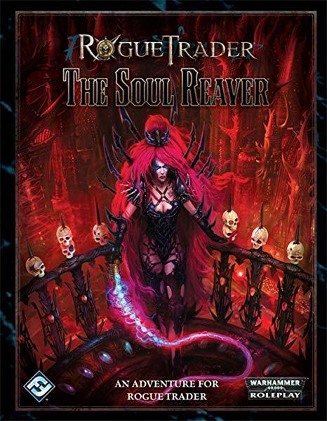
This is the sort of design that explains why people don’t treat the word “edgy” seriously anymore – artists who want their stuff to look “dark and edgy” literally throw as many sharp edges on their villains and antiheroes as possible, no matter how absurd that looks! 

Just imagine all the protection she could get if she used metal from those arm and head spikes to form a practical breastplate!

~Ozzie

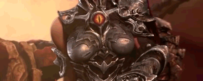
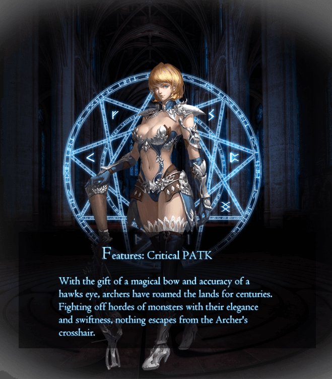
Why does this look like, instead of sending the publisher the actual intended cover art, they accidentally submitted a “how ridiculous can we make it” art piece done on a dare? And the publisher just went with it, because it’s Warhammer?

-Icy 

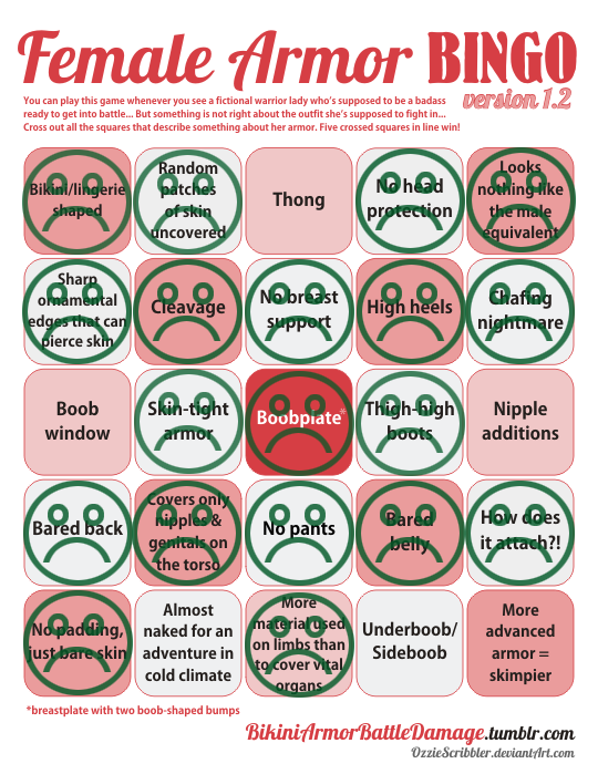
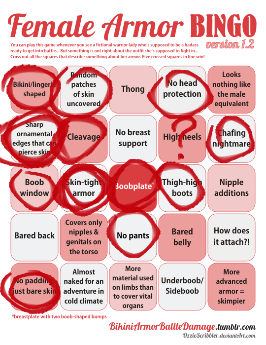
h/t for finding us design to bingo: Gigahorsedeluxe

So, Darksiders III is coming out in November and of course we’re getting the promo videos and Fury looks… well the kindest thing that can be said is that she looks better than the comic indicated she would.

image

Naturally this has led to a certain demographic deciding that her appearance is… unsatisfactory and they last year they needed to declare their discontent and declare it representative of “gamers” and alleges that the design above makes her “armored up to the point of being unfeminine and almost no more clearly recognizable as woman.” (actual quote, after having a year to edit it)

image

I mean…

image

– wincenworks 

When I first watched that trailer, what struck me most is how SERIOUSLY it takes itself, while having a heroine who looks just. that. silly. 

And gamer dudebros apparently think that THIS is “SJW pandering”, REALLY? Being encased in skin-tight metal, including a boobplate so ridiculous and badly designed it doesn’t even warrant breast support of a basic bra? 

So now, in salty dudebro terms, both this and this is a “politically correct” armor “too unfeminine and no longer recognizable as a woman”: 

image

~Ozzie

Swords of Divinity is a game by an asset flipper (actually the one featured in the video) and while they have unspectacular in pretty much everything else, they really managed to make a spectacularly bad design here.

And yes, that is an Archer with what looks like a terribly designed crossbow.

– wincenworks

bikiniarmorbattledamage:

image

some college student submitted

This is the girl from the Ragnarok Online post a while back.

I always found it weird that a common justification was “freedom of movement” for drawing/presenting women in bikinis or lingerie with random bits tacked on as armor. Given that battle bikinis and lingerie armor generally come with accessories such as high heels, spikes jutting against the skin, and extremely tight mini-skirts, etc, such outfits would usually impede movement or even harm the wearer if they moved in certain ways. So, I’m fairly certain that the “freedom of movement” argument is kinda moot.

Finally a kind of post this blog was created for, YAY! 😀
Great point!

A very special comic for this Throwback Thursday, one that illustrates the ongoing problem with so so many designs.  Remember designers: Armor is supposed to help you survive, not hinder you!

– wincenworks