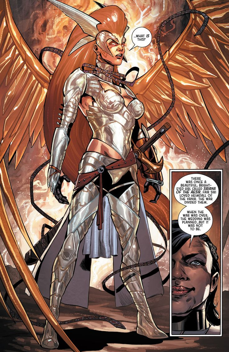
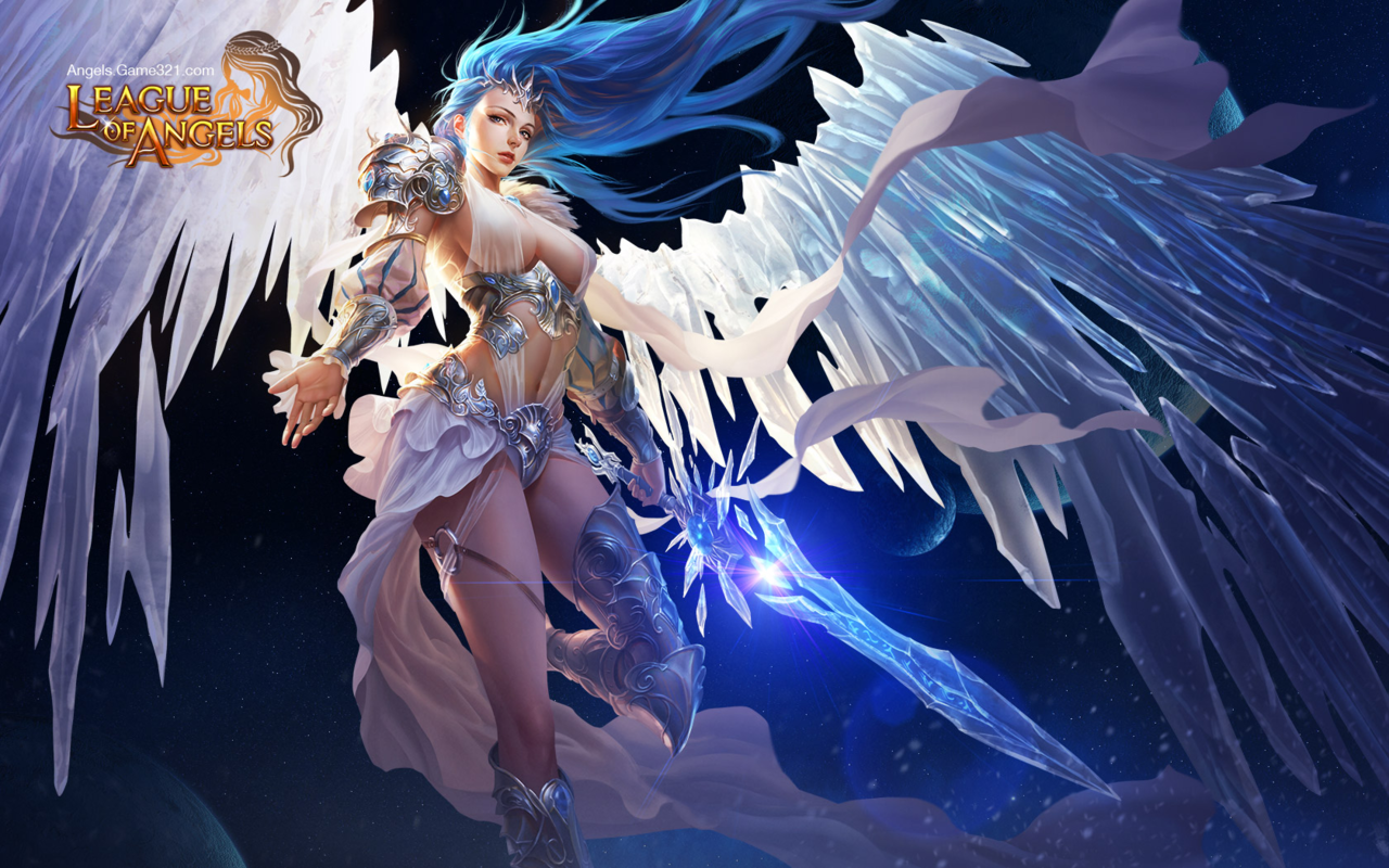
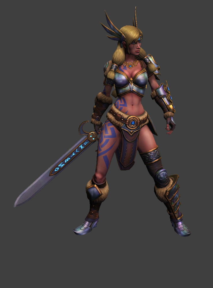
SMITE’s Freya Still Desperately Needs Pants

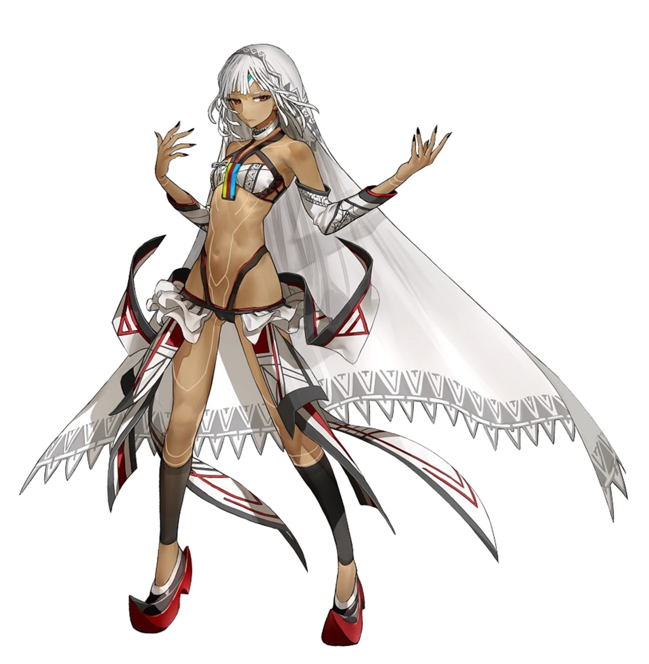
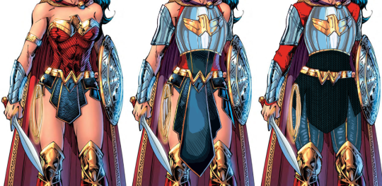
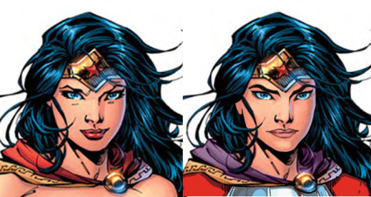
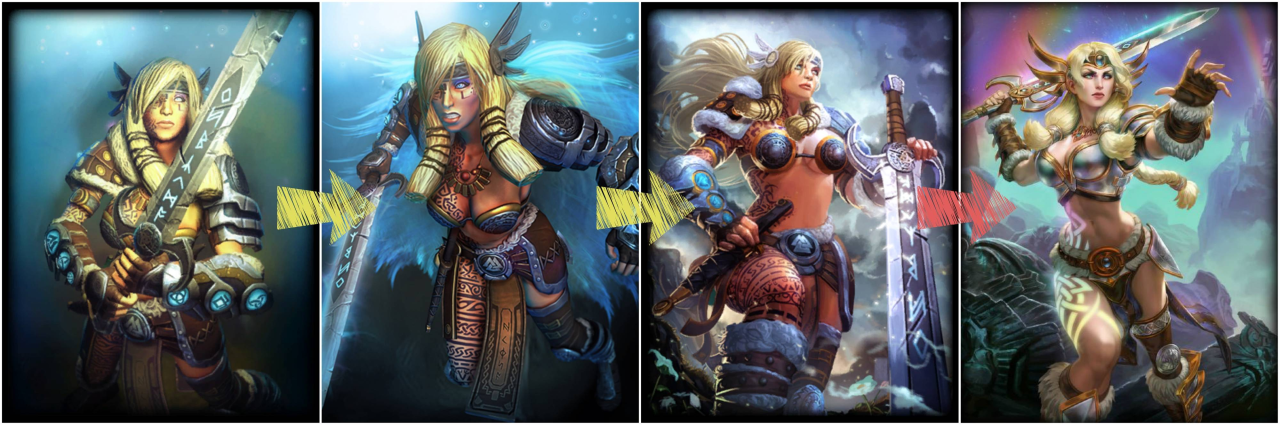
The original here is actually an updated version of Freya. As many characters in SMITE, she went through a few redesigns over time, with arguable quality of improvements (comparison source): 
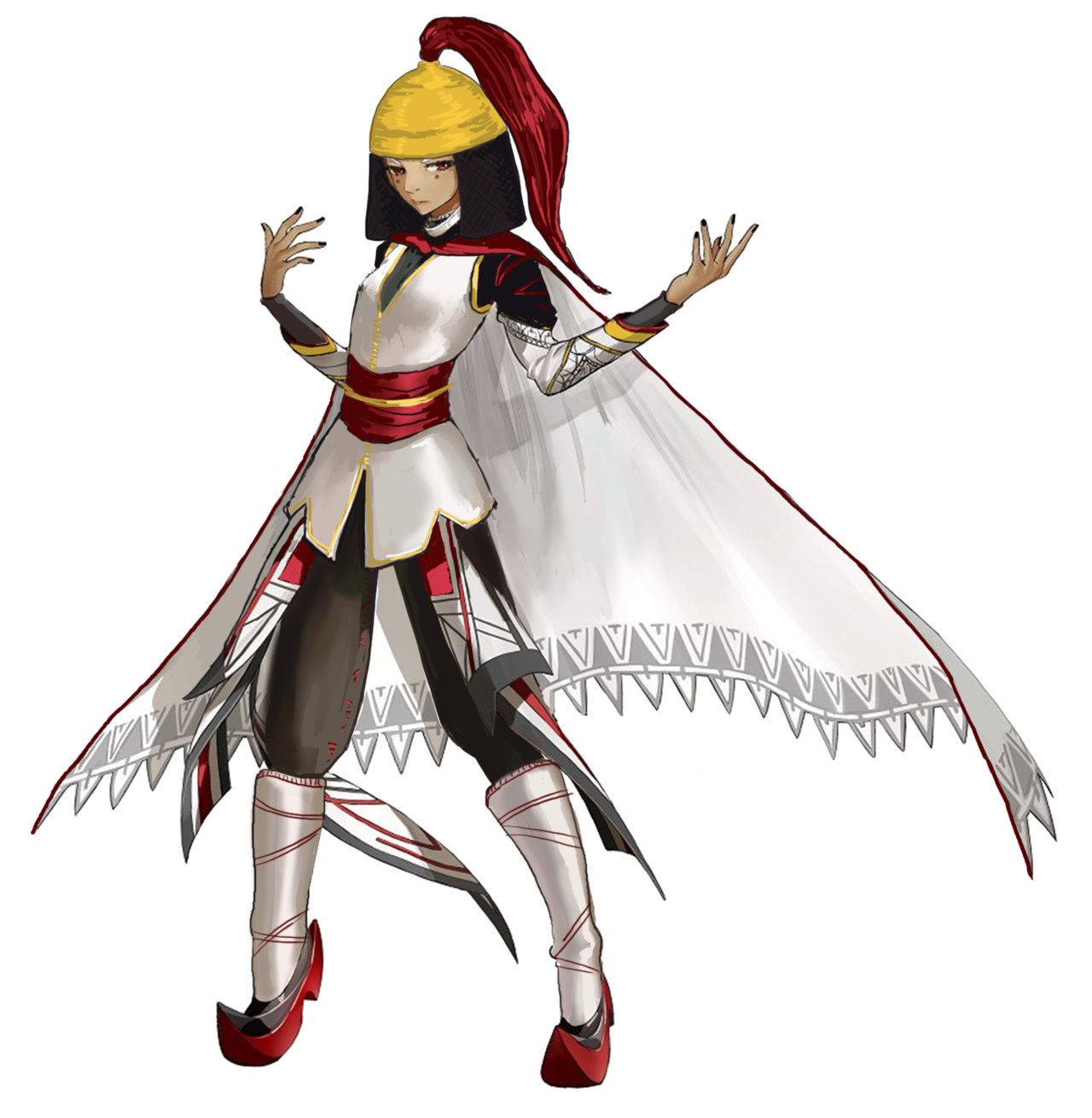
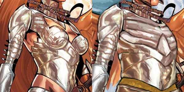
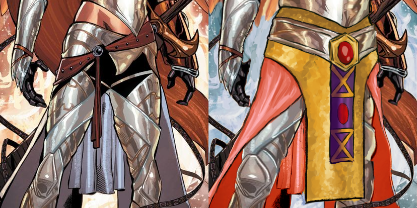
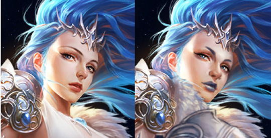
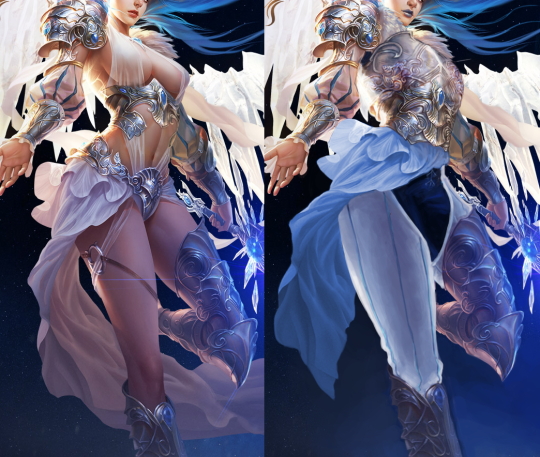
image

The redesign

This is the second character named Freya which I fixed, and this one also got a questionable update between getting bingo’d and redesigned on our platform. I swear it’s a total coincidence. 

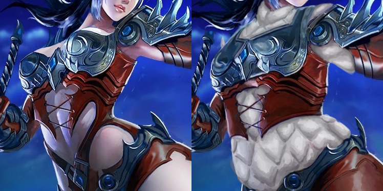
SMITE’s standards are below the bottom, so of course while she no longer had gravity-defying metal pasties for a top, it’s still a skin-tight boobplate

image

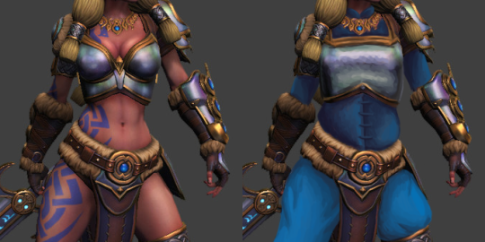
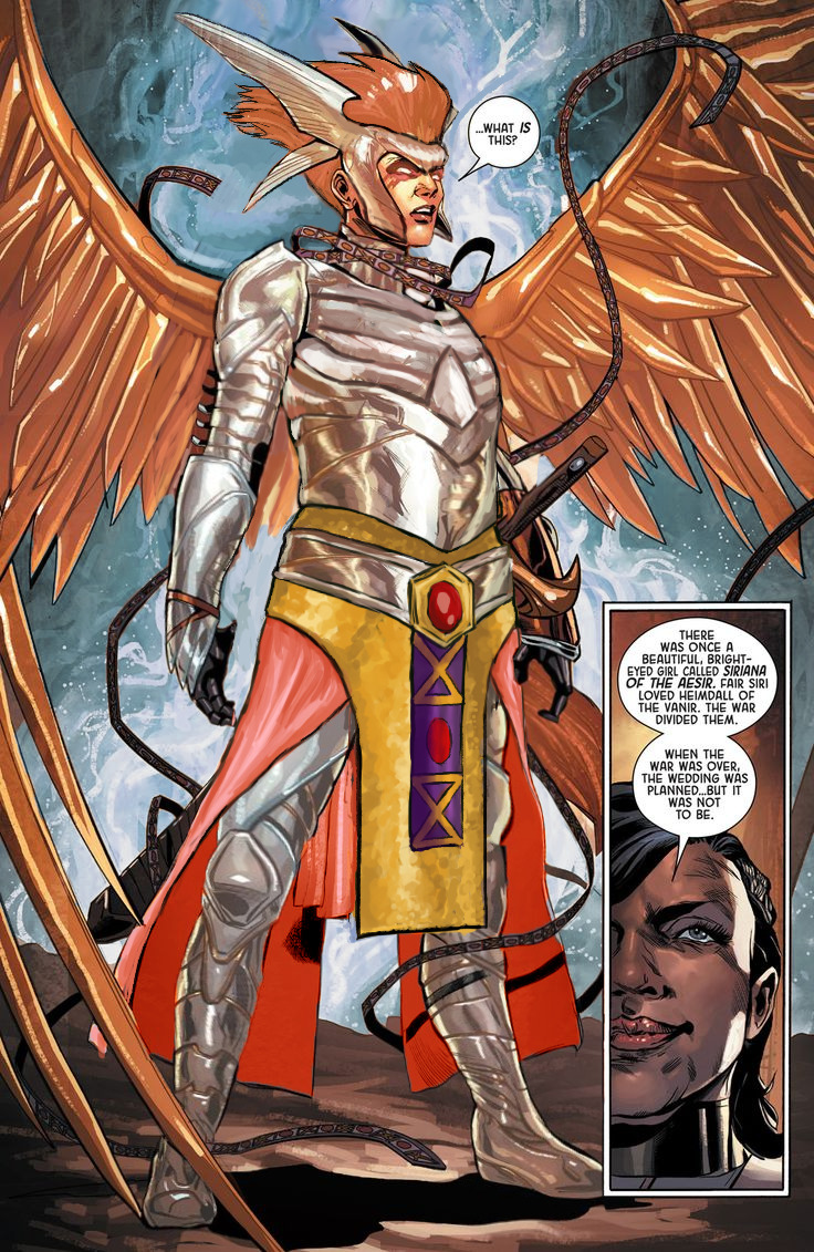
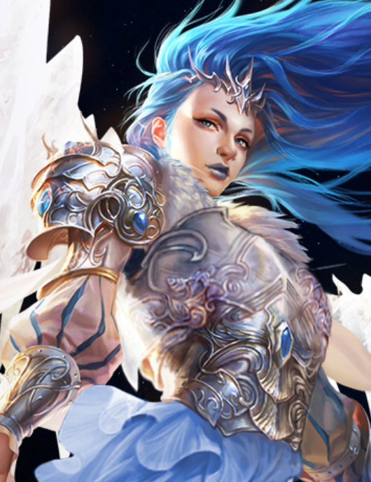
I didn’t go particularly wild with fixes this time. I liked the ornamentation and accessories well enough to leave them be, so the changes are limited to the shape of the breastplate and big blue gambeson under all of it. Thanks to it her pretty necklace suddenly popped out, since color theory is still a thing. ¯_(ツ)_/¯
Blue because it matched her existing color scheme, including those tacky Pict-like tattoos, which are already a cliche on many Norse/Viking characters, for some reason. 

Not my most creative or labour-heavy redo, but I hope you guys like it!

~Ozzie

Fate Extella: Saber Attila, but not the same as the Earth one apparently

I know nothing about Fate lore and I honestly don’t have the time in my life to get into it all, but the wiki page on this character says she is Saber class, and also “different from the Altera of Earth,” (even though they look the same, even down to the clothes) so I’m taking their word for it. Don’t let me down now, fandom wiki!

We sometimes get mail from fans telling us that we’re just offended by the skin-showing, and we should get over it, but we’re honestly not like that. Just take my word for it. However. The original design for this one definitely offended me. A lot. So that’s why I picked it for our Saber redesign stream.

This is another case of me having to go back and finish what I started, at which point I just… started from scratch… I definitely do not have a problem. Here was my first attempt, based on a historical estimate of what Attila might have looked like (the records are less certain than for Nero, from what I found):

image

I ended up doing another Google search (when I went back to finish it) and found an interpretation with the helmet/coif combo that basically looked like her existing bangs and hair shape; so I decided to start over, this time trying to work more with the existing design elements.

There’s probably too much white in the final redraw, but I can’t be bothered at this point. #ITried. At least it’s actually wearable! This is now a Callout Post. Yikes.

-Icy

Fate’s Red Saber Nero – No, you can not unsee it. You’re Welcome! 

Since Fate’s fandom is the way it is, I decided to dedicate a very special stream redesign to them! 

When we commented on Fate: Last Encore’s version of “Saber”, the fanboys predictably, as with many previous posts on that franchise, rushed in to explain to us that this is not the same Saber we used as a positive example before (Artoria, aka waifu King Arthur).
No, apparently it’s just a completely unrelated character who happens to look exactly the same, allegedly because the designer for the franchise has a fetish for this one particular appearance, affectionately referred to by fandom as “Saberface”. Which justifies the shitty sameface syndrome how…? ¯_( ͠° ͟ʖ ͠° )_/¯ 

image

[Yes, those are four different people in various parts of the franchise. Only two of them are related. And yes, there are plenty more Saber clones.

Also, Fate’s lore is an incomprehensible mess with no single continuity. If we were to fully explain that every time a new Saber with giant boobs or stupid butt window comes out, our posts would be ten times longer. ? 

So, considering that this here Red Saber (not confused with the one with spiky hair) happens to be emperor Nero, I decided to right that wrong and make it abundantly clear that this is who this character is supposed to be. 

Enter anime waifu Nero. 

image

While usually I redesign the outfit, leaving character’s face more or less intact, this time I’m leaving the body and the awful boob-and-ass-window (plus visible panties) dress entirely unedited. After all, it fits her personality, or so I’m told. It’s the exact same sexualized anime girl, except she happens to have the face of an ancient Roman ruler, neckbeard included. 

And if you respect Nero’s own choice of clothing, please don’t shame her choice to grow out a beard. She rocks that look so much harder than she did Artoria’s face and haircut. 

image

Obviously I used the most famous Nero statue as a reference and did my best to recreate the cell-shaded anime look. Which is also why I incorporated her original eyes into the new design. Of course she needs to remain consistent with Fate aesthetic. I’m not an art-ruining barbarian. 

Overall this was a really fun stream and I’m pretty happy with the results. Not likely to happen again, but who knows? 

Once again, YOU’RE WELCOME. 

image

~Ozzie 

Another Wonder Woman, Why Not

Ozzie made a great Wonder Woman redesign waaaay back, but I wanted to try my hand at something more akin to the movie design. I enjoyed the Wonder Woman movie a lot, but that outfit of hers was such an eyesore. Also had to deal with constant second-hand cringe at imagining what it was like wearing it.

Sooo…. I ended up changing almost everything, obviously. I didn’t really have a specific theme or time period I was taking inspiration from; I just knew I wanted to give her a nice breastplate, and then worked around it for everything else. I gave her chainmail in a similar shape to her uhh… skirt? And then the gambeson makes a comback for the leggies.

Since the design is pretty clear and simple, let’s instead show my first attempt at a redesign, where I was trying to make the skirt work… somehow.

image

After coming back to this later, I realized that I was just doing the redesign equivalent of this gif:

image

Sooooo I got rid of that tabbard and redid it all.

image

I also changed her face. I gave her thicker, more natural (but still fun) eyebrows, and a stronger nose. I also cut back on her makeup, and changed her expression to look more determined, rather than “awkwardly chuckling at someone’s joke on a first meeting.”

image

Overall, I think I gave it a good try. I feel like it’s missing something in some spots, but I can’t think of anything else to add besides like… some colored ribbon in her chainmail, but I don’t think that’s characteristic for her. 

Would still have preferred my design over the original for the movie.

-Icy

Leveling up with Angela

Trying to recapture lightning in the bottle that was my original Angela redesign, I decided to have a take on her upgraded armor… And it was beyond me, really. 

This thing was so bad to begin with that it should have been remade from scratch, not by modifying the unsalvagable original. I did my best, though.


Before doing anything to the costume, though, I had to take care of the ABSOLUTE GARBAGE color composition on this whole splash page. What genius thought that orange background was optimal way to present a character with big orange hair and even bigger orange wings? 
Fixing it required all the sophistication of the easiest color theory trick in the book – I recolored the background. Wow, amazing! What do you mean orange pops out from blue better than from more orange? What even is complimentary colors? 

image

Only then I could start working on the armor itself. Boobplate proved to be much less inspiring than Angela’s normal golden bikini top, as the shape language and colors in the original gave me much more to work of off. This I could only change into actual, rather boring, breastplate. 

I had no idea what was happening to the leg region, so to cover the nonsensical crotch area and to give the design some consistency with my previous one, I recreated the mail tabard (just in gold this time) and gave her an updated version of the belt I was so proud of the last time. This time not only I let her keep the butt cape, I made it bigger and recolored it to light red, for another splash of color. and also to recreate the look her gambeson tassets.

image

The lesser changes include: fixing the giraffe neck, getting rid of the 90s comic hair (which also seemed to be clipping into her wings?), making her headpiece bigger and connected in the middle, giving her a bit smaller wedge heels and stockier built. 

I’m afraid this really isn’t half as good as my previous Angela redo, but I hope you guys like it anyway!

~Ozzie  

Sexy Overwatch Guys Part 2: Hard Daddy Torbjörn

For our Overwatch man meat week, I decided to empower Torbjörn, whom Blizzard has kind of been ignoring in the sexiness department. I thought this skin was a good start, and gave me some fun elements to work with.

Although as time went on during the stream, I decided that I actually just wanted to make a male character version of this comic (series is NSFW):

image

So here we are.

image

The biggest changes I did are to his face and his now-phallic mechanical accessories. I wanted to make him look like the loving daddy we all want him to be (probably?) so I gave him a more gentle gaze and slightly smaller chin. I also gave him the soft, loving lips he deserved.

image

I made him shirtless, added some male-presenting nipples with piercing, and some chest hair. And then I spent an obscene amount of time rendering out some phallic machinery. You might notice the one on the left is much more in-line with the original art style, and that’s cause I ran out of time! As I always do.

I also gave him a bottle of lube in his tool belt (from Google images). I’m surprised the original design didn’t have that, actually, since keeping your equipment lubed is very important.

What was I talking about again?

-Icy

Sexy Overwatch Guys Part 1: Soft Boi Junkrat 

Time for a sexy male redesign post and this week it’s prooobably my hunky magnum opus so far: shamelessly stripping Overwatch’s Junkrat of almost anything quirky, fun and interesting about him for the sake of maximizing TEH SEXY. 

While he definitely has a cult following among the fandom (have you seen the last week’s reblog?), Junkrat is clearly not designed with sexual/romantic appeal in mind. He’s one of many examples of male characters in the game with pretty extreme appearance and out-there personality. You know, those features which none of the female characters* are allowed to have. So I decided to remedy that and redesign him into a more conventionally attractive boyfriend material. Hope Roadhog doesn’t mind!

Of course the most important part was the face. The sharp jawline, wicked smile, receding hairline and bulging eyes couldn’t stay! With more or less subtle edits I changed them, most importantly giving him a dreamy gaze of a romantic interest. I let him keep his bushy eyebrows, just changed the expression. Also added some attractive facial hair, to soften the face shape. 

image

The cherry on top, which I’m pretty sure Icy suggested, was the blushing, which nicely ties everything together.

The body went through some changes too. Most importantly, those shapeless raggy pants are out, making place for short shorts with a codpiece that matches his belt buckle! Now he can show off those amazing muscular thighs that happen to match the newly sculpted abs!  

image

Also, bonus enlarged male-presenting nipples!

Final, less important changes were to his left leg (the position and a stereotypically Australian flip-flop instead of an ugly shoe) and the RIP-Tire on his back, which now instead of being big and sharp is small and soft, matching his new aesthetic. 

I kinda regret not repainting his lower half in a boobs-and-butt pose, but otherwise I’m very pleased with the results, especially the expression. Hope now he’ll enter some of our readers’ fantasies… And also Roadhog’s. You’re welcome!

~Ozzie


*Yes, it’s an old is post and doesn’t feature Ana, Sombra, Orisa, Moira, Brigitte and Ashe who were introduced since and who collectively changed little to nothing about the narrow conventional beauty standards in OW’s female design. 

De-failing League of Angels Part 2: The Angel of my Personal Hell

You’d think I would have learned my lesson, regarding picking The Worst Things for redesigns, but not before I had to fix this!! I didn’t even have alcohol to keep me company while I worked on it.

I’ll start by briefly noting that every redesigned element, besides the face, took up to 4 tries to figure out, just in terms of shapes alone! I wanted to keep certain elements from the original, such as that belt motif, so I spent a lot of time just trying to figure out what the hell I could do with them. At least one ended up in a weird place.

I will also say that while working on this piece, I decided that this character feels more like an agender rather than a woman angel, so they’re agender now. On that note, let’s begin with what I loved working on the most: the face. I made the eyebrows and nose more interesting, made the makeup more gender-neutral, and changed the palette. Definitely one of my favorite and least painful edits.

image

After doing that… I just changed everything else about the design! Oh, except I did keep the foorwear and the arms. The under-boobs belt became a breastplate, with the crotch armor (?) belt thing incorporated into it. The cloth thingie hanging off the crotch armor (?) got moved up to probably be part of some shirt under the breastplate.

Everything besides that is me exercising my painting and suffering skills, so y’all better appreciate it. I decided to go with some gambeson for the legs, instead of our regular poofy pants, because the cloth thingie was conflicting with the poof. I added black pants and a similar undershirt visible in the armpit to tie the design to the background a bit. Also, I needed another color besides light grey, sky blue, and white. The original palette is pretty limited when you’re not distracted by the tiddy.

image

My rendering skills are obviously not as good as the artist for the original, but I tried (Oh my God, did I try). And I do believe that at least in the design aspect, my reworking is an improvement.

Bonus closeup of the breastplate because it sucked to work on.

image

-Icy

De-failing League of Angels Part 1: Stabby leather lingerie

Apparently we felt like taking a challenge the day we made those edits, because, well, it’s League of Angels, the epitome of creative bankruptcy in video game marketing


What I decided to redesign was this extra-stabby leather… um… outfit that I bingo’d before

After the initial shock of how uncomfortable that “armor” must be, the literally biggest thing that caught my attention in this artwork were her thighs. HOW FREAKING HUGE ARE THEY IN PROPORTION TO THE REST OF THE BODY? Unfortunately this seemed mostly like an epic fail at foreshortening rather than an attempt at ‘thicc’ fetish, let alone at earnest fat representation… So I decided to reverse that. 

Instead of shrinking the thighs to give her conventionally attractive model proportions, I readjusted the rest of the body to fit them, resulting in a chubbier figure.

Her arms now have some heft and her head isn’t tiny anymore.
Though most important changes went into the torso, which now has a human-sized waist and connects to other body parts at humanly possible angles, instead of those of a Tetris puzzle. 

image

I am very satisfied with what I managed to do with that shameless boobplate. The idea was to still have it be a breast-oriented armor without making it look like two coconut halves with extra-emphasis on cleavage, and while retaining as much of the original’s decorative aesthetic. Basically a more sophisticated attempt at what I did with Regime Wonder Woman waaay back

I also slightly reshaped the stabby laced leather part under it, because it looked cool enough… just not on bare skin. Speaking of which, of course there was no way I left this poor woman with no padding, so in place of all this pale skin I painted white gambeson, retaining the original color scheme. She also now has full leather pants, because why wouldn’t she? 

All in all, I think I managed to improve this image significantly. Not all edits are seamless, but I’m quite proud of the way they came out. How do you guys like it? 

~Ozzie 

DC Supersexy Boys Part 2 – J’onn J’onzz

Even though J’onn the Martian is shirtless in Injustice (and other media), I still wanted to redraw him. I’ll admit that he was a childhood crush of mine, back when the animated Justice League was on TV. I was disappointed to see this version of him, which was clearly not designed to appeal to people who liked his soft-spoken nature. So I decided to fix this missed opportunity.

A lot of the changes were textural: I made his skin smoother in a lot of places (decided to go hairless for this one, since he’s a Martian and all), and I actually made his muscles less pronounced. J’onn is a lithe, agile man, after all.

Beyond that, the significant changes were his pants area, and his face. (And of course, the cleavage window that I decided to add last-minute.)

I took away his stifling pants (where are his booty shorts??) and gave him a semi-transparent loincloth, as I’m wont to do. I figured, for this More Mature J’onn, maybe he wants to know what it’s like to have hanging bits? That’s what being more “mature” and “realistic” means, right?

As for his face, I wanted to recapture that animated Justice League look. I got rid of his cartoony Scowl of Doom, and instead gave him smooth, pleasant features. I decided to give him a cute blush at the last minute, too. Even Martians blush.

I do hope that other J’onn fans enjoy this redesign as much as I enjoyed working on it.

-Icy