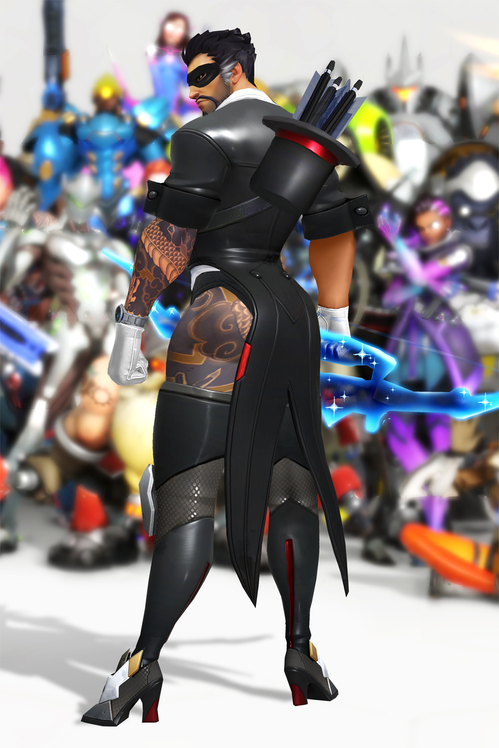
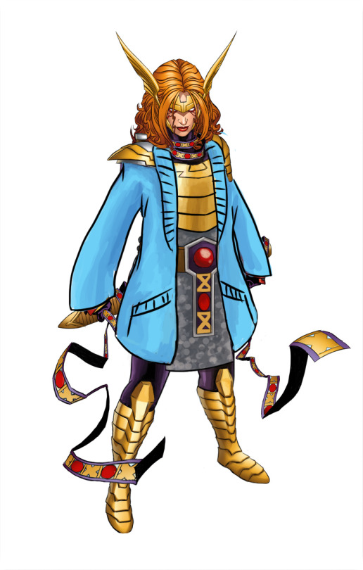
Every year, Hanzo bypasses the bodyguards of Hanamura to visit Shimada Castle, employing all manner of tactics, combat, and costumes.
Storm Arrows take the shape of rabbits.
Dragonstrike is now Rabbitstrike.
There isn’t a single thing I don’t love about this concept: The quiver that’s too short because it’s ~magic~, the tattoo going up his entire leg, the raw magic bow, the little mask.
We all know that Hanzo is a ranged combatant, so he doesn’t need to wear actual protective clothing. Indeed, those shoes probably help him be stealthier! And if someone does find him and tries to initiate in melee, he’s got the distraction tactic all ready to go with those buns. It’s perfect.
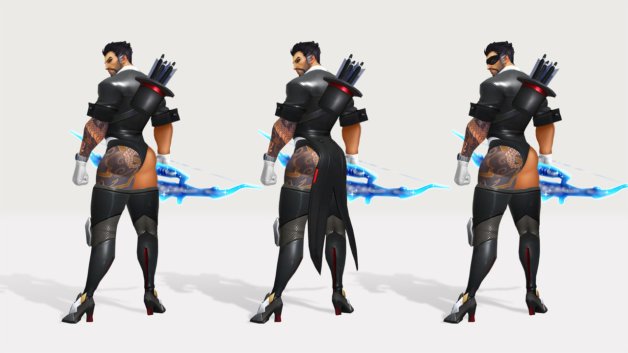
Blizzard really missed a golden opportunity with the magician skin idea. I am conflicted about one thing though…. which skin of the bottom 3 is my favorite!! How am I supposed to choose?
-Icy
Posted on
Starfire and the Legend of Murky Colors
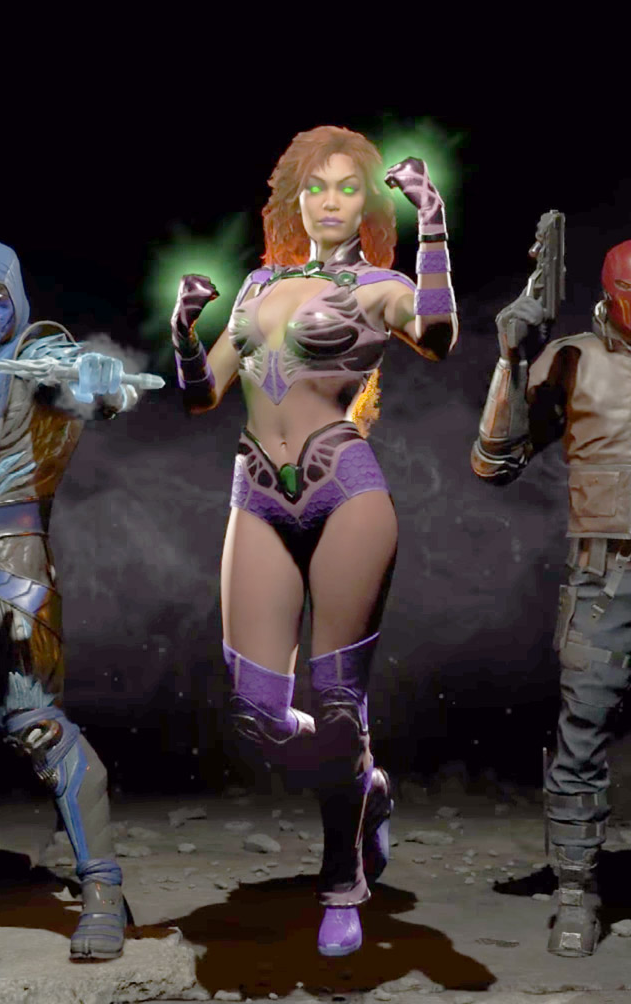
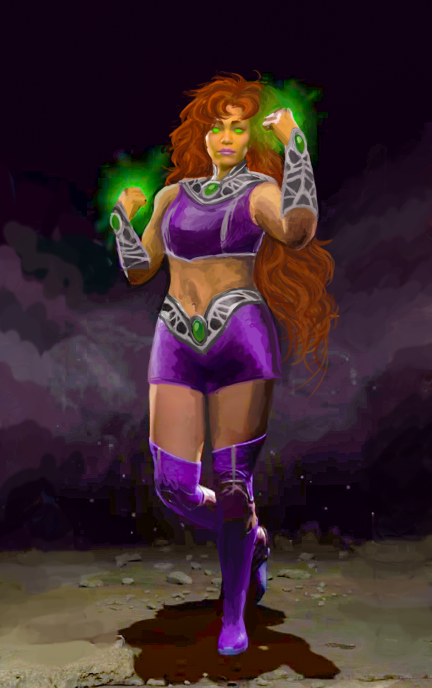
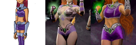
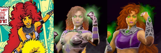
Injustice 2′sStarfire was a challenge with very little potential, so I mostly redid her from scratch, arriving at a mix of her 2000s cartoon outfit and 80s comics hair.
This was by far the hardest design to work with palette-wise, considering not only how desaturated colors in Injustice graphics are, but how outright low quality the official image is – it looks like something’s wrong with how they rendered the lightning! Muted colors were a double insult, considering Starfire’s vibrant color scheme corresponds with her vibrant personality. Did my best to recreate it by cranking up saturation, salvaging the few colors it did bring out and painting over the badly-lit parts with them.
Changed her bodypaint-bikini into a crop top and shorts (with all do respect to Glen Murakami’s cartoon Starfire design, flying in a skirt is just the worst idea).
Only part of her Injustice design worth salvaging were decorative bits on her belt, which I recolored silver and recreated the pattern on her new collar and arm guards to match. Painted her limp, lifeless hair to actually look fiery without even being made of flame – by simply basing them on her original New Teen Titans hairstyle.
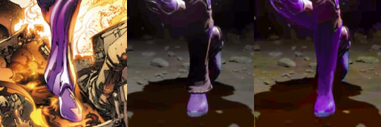
Got rid of those weird bellbottom things on her ankles, which served no purpose and seemed like a throwback to her ugly New 52 footwear. Also, as usual, made her less skinny.
All in all not necessarily my best or most original redesign, but it’s best I could do with limited time, constant computer crashes and very hard material to work off of.
~Ozzie
Posted on
Posted on
Seris, the Oracle of Nothing
I decided to do a redesign of the oracle Seris from Paladins basically 5 minutes after I first saw her design. It was just so… disjointed. The leather top, the pointless belts, the tassel on her magical orb… Ugh. It told me absolutely nothing about her. That purple orb was the only indicator of her oracle-ness.
The only things I liked were: the hood (for the most part), the shawl, and the geometric designs on her skirt. I kept those, and decided to go with a moth-y motif overall, making the shawl longer and adding the top with wing-like tips. I really did not like the color scheme, so I added more light grey and some black, getting rid of all the we-need-another-color-but-got-no-ideas brown.
I made her float (though it’s a bit hard to tell), as it seemed fitting to me since she has an in-game ability of becoming invisible by stepping into a parallel dimension. It’s a symbolic detachment from the material dimension, as well as making her feel a bit more alien. She is supposed to be an oracle, after all. It also fixes her proportions a bit.
I took a few sessions to get to an idea I liked, and then a few hours to execute it. I probably would have added more details to her top, if I had the time. This redesign is back from the days when I was trying to redesign basically everything, which we’ve moved away from since then.
-Icy
Posted on
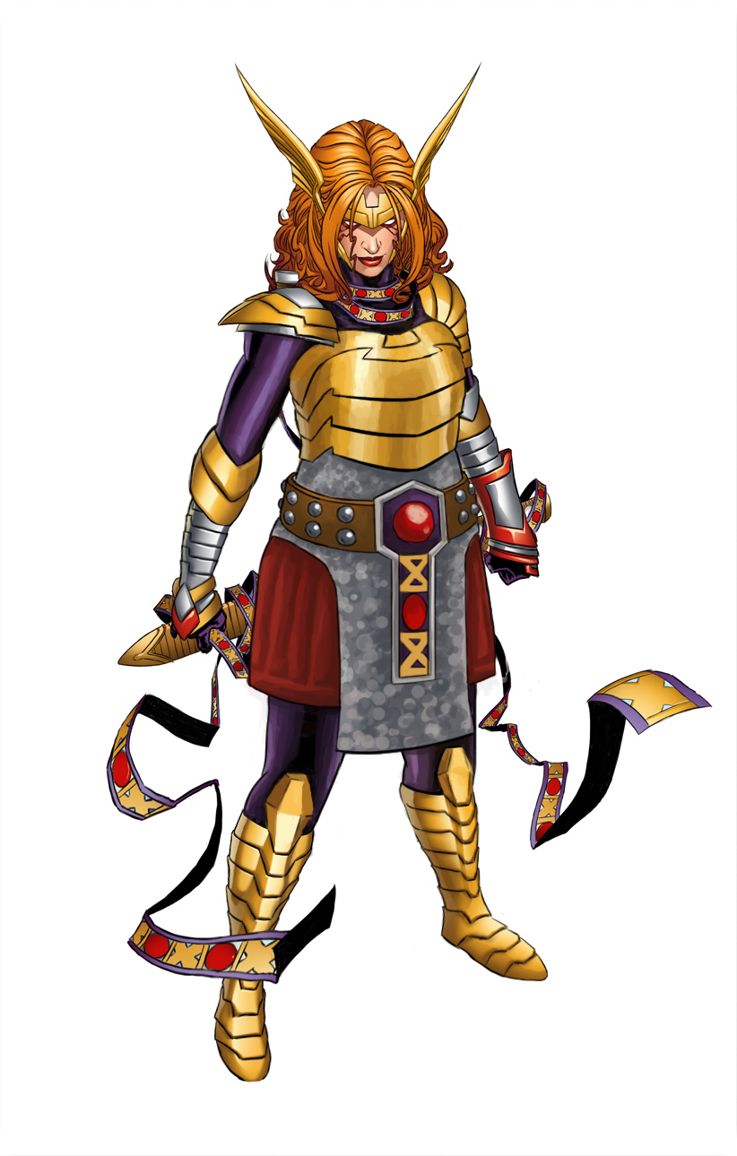
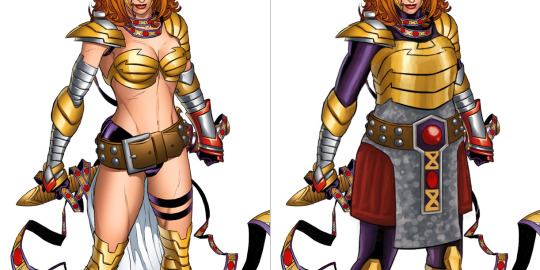
Angela and the layered armor (+ a cozy cardigan)
Marvel’s Angela redesign is still one of the favorite ones I streamed.
Maybe one day we’ll get to stream fixing that winged monstrosity.
Back to the redesign, tho: My priority, given that now she’s an Asgaardian warrior, was giving Angela actual armor, with lots of layering. She got some undershirt and pants, gambeson and mail tunic (painted vaguely, so it can be either chainmail or scalemail), then on top of that a believable breastplate instead of two half-spheres that barely connect at her sternum.
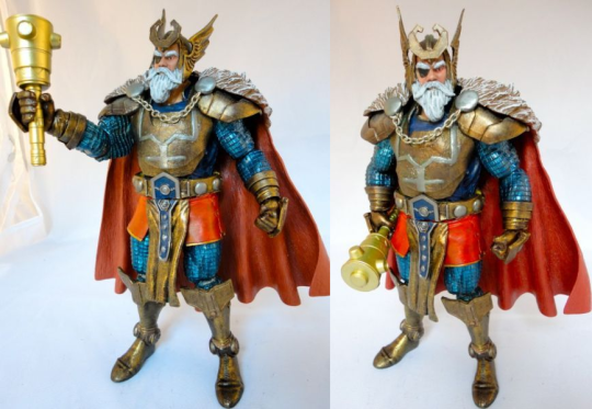
I disliked her generic huge belt design, so looking for inspiration in costumes of her father, Odin, I found this custom figure with really cool belt (unfortunately, source ungooglable):
So I based Angela’s belt buckle on his, as well as on the pattern from her magical ribbon thingie. Now that I look at it, I might have also taken some shape and color cues for her breastplate and gambeson tassetts from Odin.
Other little details: got rid of the pointless butt cape, made shoes not go thigh-high (how is she supposed to bend knees in metal thigh-highs anyway?) and gave her stockier built.
I’m really satisfied with that color scheme. What’s funny is that it was already there. Each color I used was sampled from some minuscule part of her costume that was drowning in the sea of dominating gold and flesh tones.
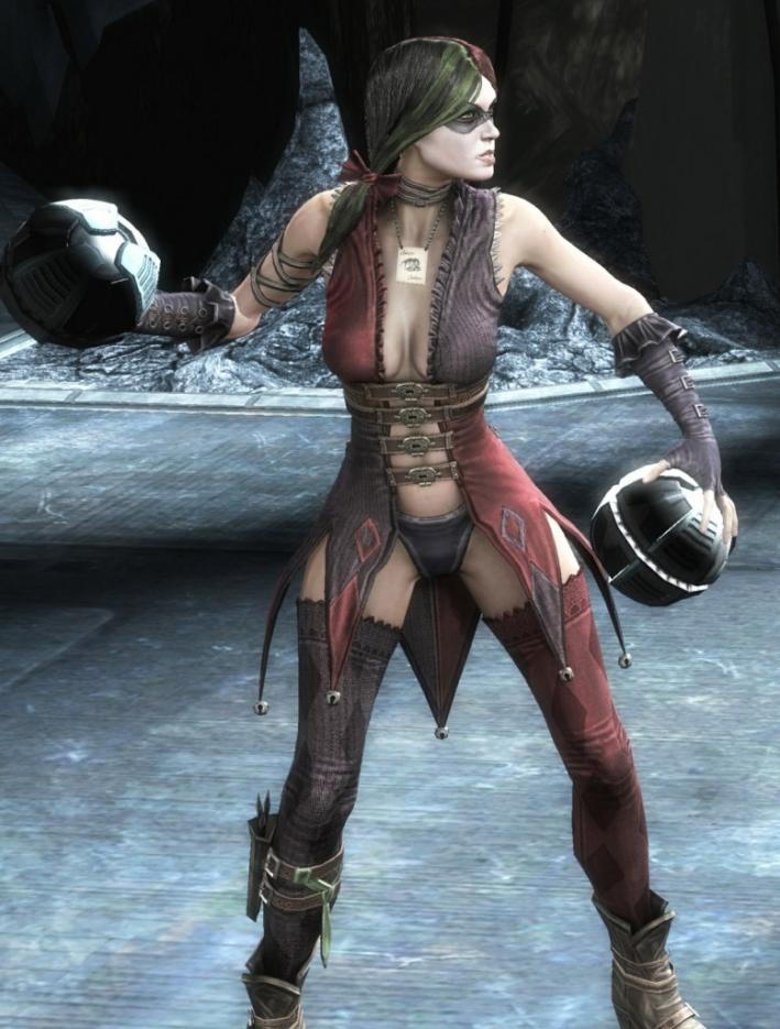
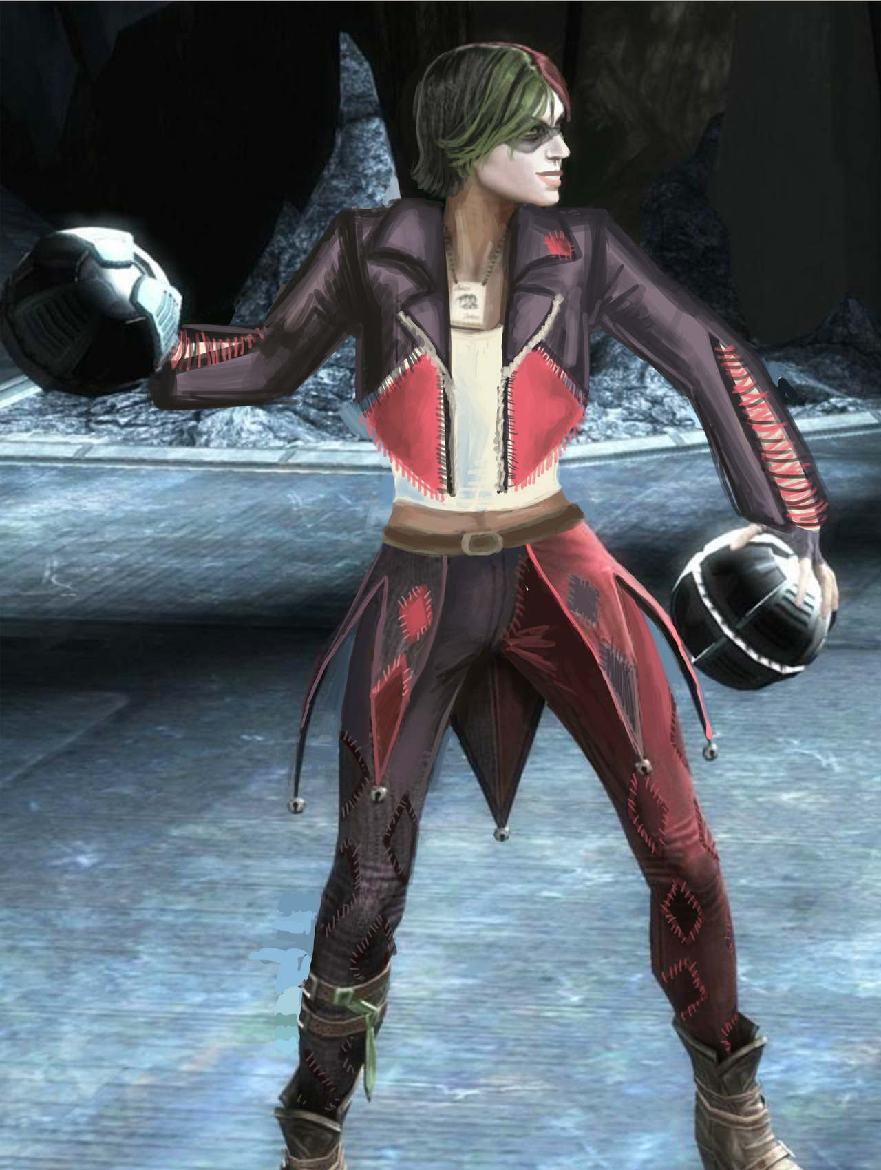
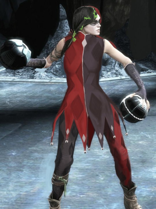
One of my earlier redesigns that I finished recently because of things was for Harley Quinn from Injustice. So, the problems here are pretty obvious… Lots of pointless and impractical skin, shit color saturation…. everything….
I originally was going to make her outfit more like a jester’s, in the vein of the original Harley design. I was just using the original design as a jumping-off point, but it was becoming very dull and uninteresting.
[Pictured above: The diamond market crash]
I ended up scrapping it for a more DIY look. I figured Harley would have fun making a quirky outfit to commit crimes in.
I kept the color scheme, though upped the saturation by a bunch. The idea is that she bought 2 pairs of identical but differently colored pants, a biker jacket, a tank top and some fabric. Then she went home, cut the pants in half and sewed them together, cut out huge chunks of the jacket in diamond shapes, and cut the jacket sleeves so they’re not as restricting. Then she just sewed a bunch of diamonds on everything, without any particular care for making it look professional. I think adding some sequins to her jacket would also not go amiss.
I hated her hair, so I cut it off. I also changed her face a little bit, and gave her back her smile!
Since she’s not a super-powered person with tons of money, I didn’t want to go with the standard power suit look, especially since I don’t think she would prefer one as a character. However, I also don’t think she would prefer to wear a Victoria’s Secret ensemble but with leather belts rubbing against her bare skin. She’d stick to her theme, but in a fun way, and that’s what I tried to convey in the redesign.
-Icy
Posted on
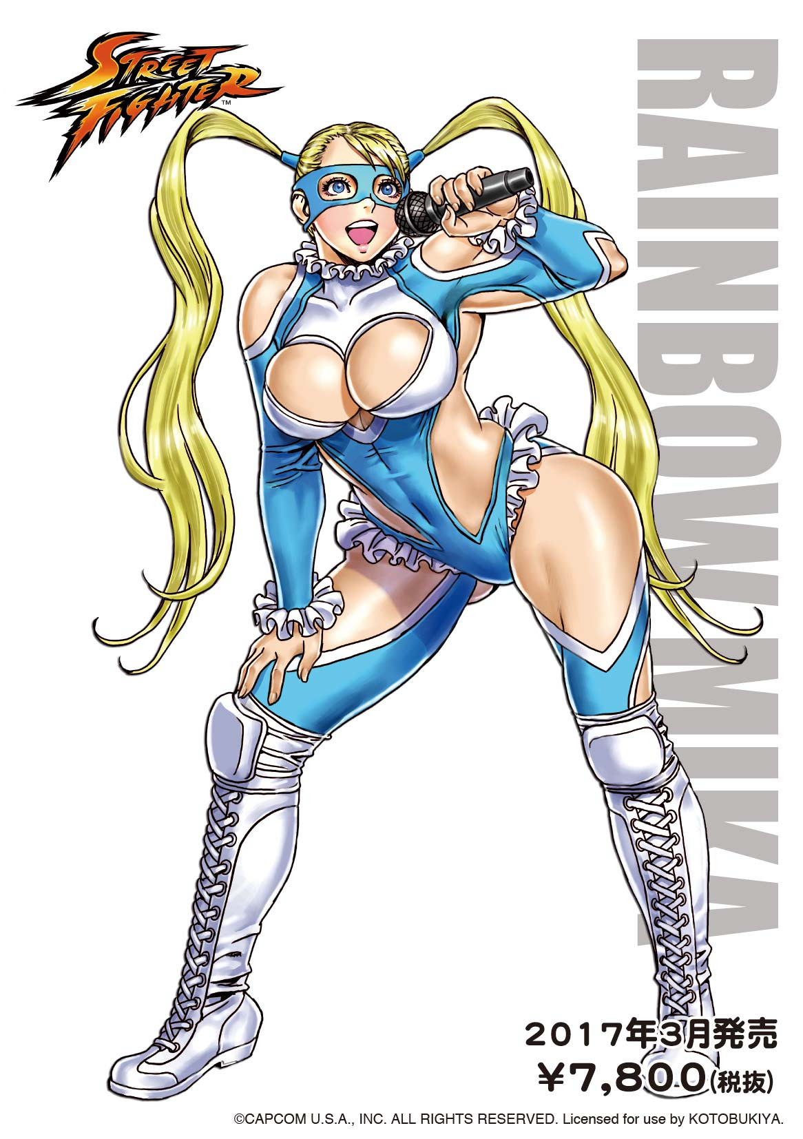
Rainbow Mika and the draftiest of wrestler outfits!
Another redesign I did solo was Street Fighter’s Rainbow Mika, a “wrestling” costume made approximately 80% out of holes.
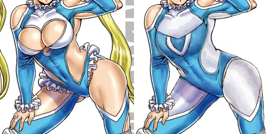
Biggest challenge was figuring out how the hell those breasts are supposed to look when actually contained by fabric – nothing about how they interacted with it in the original made any sort of sense, so the chest area got basically repainted from scratch, with an attempt to recreate white pattern concealed under the balloon boobs as a sort of chest emblem shape.
While there’s nothing wrong with the costume having some tasteful cutouts, the original’s were so awkwardly placed, massive and physics-defying that I decided it was easier to change them to white fabric, while leaving in some smaller holes oh her shoulders and elbows. I’d probably leave something on her legs, if the image shown Mika from another angle.
A small, but significant touch was making the shapes on her sides rounder, so they’re not pointing at her crotch anymore. Also got rid of the pantyline frills, which made her look as if fancy lingerie was peaking from beneath her leotard. Left the frills on her collar and wrists be. Also didn’t do anything to the boots, as they’re perfectly nice and likely the only legitimate wrestling element in her original attire.
Final touches was giving Rainbow more secure hairstyle for a fighter (while stylized Sailor Moon-like hair isn’t much of an issue to me, it just didn’t match the more practical costume anymore) and a knocked-out tooth, to communicate the inherent danger of being a wrestler/fighting game heroine. Also, sometime after finishing the stream, I made her facial features slightly bit less generically pretty, following many watchers’ advice.
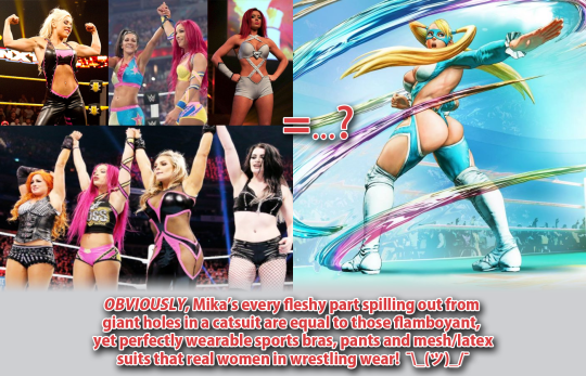
Surprisingly enough, criticizing R. Mika is one of the most “controversial” things we ever did on this blog. To this day, our bingo of her outfit from Street Fighter V tends to periodically resurface among the Status Quo Warriors enraged at us for talking smack about that costume. Their “arguments”?
1. This is totally very legitimate female professional wrestler outfit! OF COURSE that’s exactly how women in that field of sport and entertainment dress, just look:
True, those wrestlers, due to double standards imposed by the industry, tend to show off their cleavages and bellies… which sooo definitely is the same as a video game character’s suit denying all laws of physics and geometry for the sake of showing maximum flesh surface! </sarcasm>
According to them, occasional low-cut v-neck or belly window = giant hole where the back, each breast, thigh and buttcheek is.
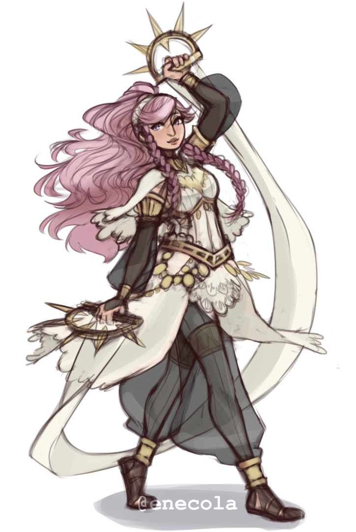
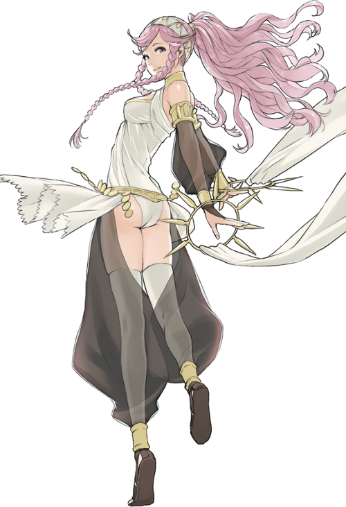
Her legs must hurt… Olivia is pretty fun but I never understood why they made her use a sword when she had these cool rings. Like… that’s not less believable that chrom using his dumbass swords that he keeps sticking into the ground all the fucking time.
I think that fixing a plate armor design is fairly straight-forward in what needs to fixed: put a functional breastplate on the tiddy, add protection to some vital areas that got missed, and add some fabric in-between to pad the armor. I find it harder to fix armor for characters who don’t really wear it. This redesign did that wonderfully. It’s just so darn beautiful!
In Fire Emblem Awakening, Olivia starts out as a Dancer class, and boy do her dancing animations with that original getup look like absolute crap. But I would loooove to see the redesign in motion! There’s so much more potential for interesting movements with all that flowing fabric. I also never noticed Olivia even had a jingly belt until I saw the redesign, and then looked back at the original. That’s how you know you have a Quality Character Design™.
I love the subtle touch of the seam lines going down her legs, which lets us know that even underneath the transparent fabric, she is wearing opaque tights. It really is the little things.
I definitely look forward to featuring more of this artist’s redesigns on the blog. <Sequel Hook>
-Icy
Posted on
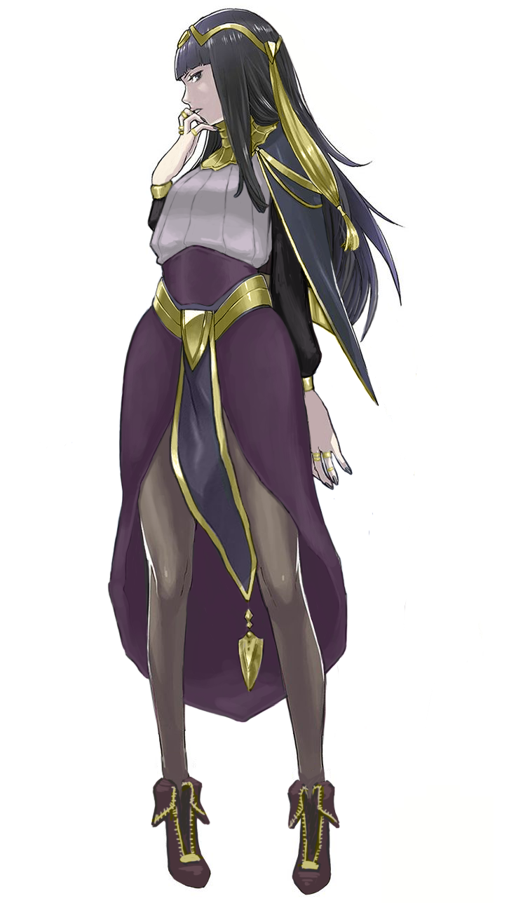
Tharja – Medieval Fantasy Body Stocking Technology
Jumping forward a few streams for this post, since this was back when I went way over our allotted time, and those old designs aren’t done yet… They’ll be done one day. ヽ༼ຈل͜ຈ༽ノ
So this was more of a fashion redesign exercise. Tharja, from Fire Emblem Awakening, is a sorceress. In terms of game mechanics, they tend to stay in the back and be pretty squishy, so I don’t expect her to wear full plate. I just wanted her to not wear… that thing. The body stocking, that somehow exists in this universe. Oh, and she comes from a hot desert region, so….
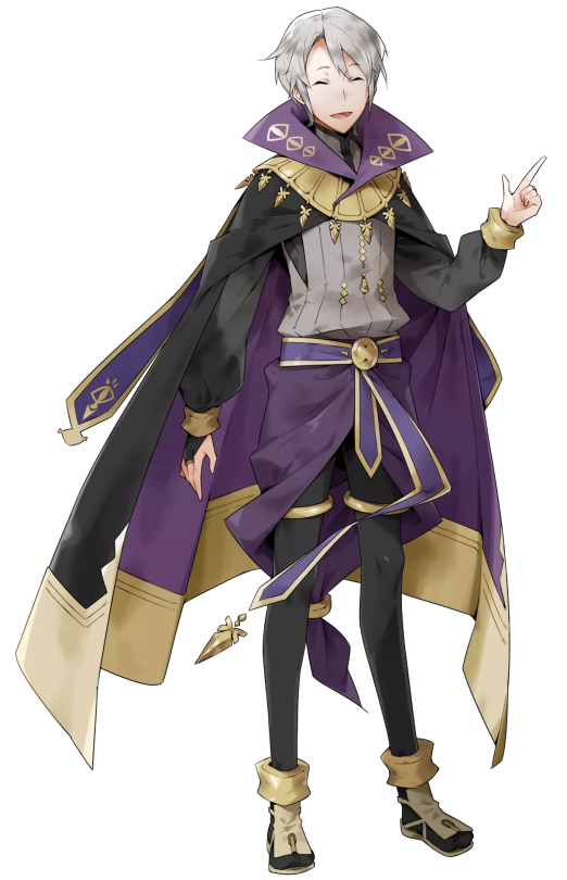
Since this is a fantasy universe that borrows very little from actual desert-dwelling peoples, I took inspiration from her counterpart, who’s from the same country. He looks like this:
So I took the skirt-like thing and the shirt he wears and adjusted it for Tharja. I liked her belt, so I kept it, and instead changed the waistline of the skirt to try and form some nice shapes.
Because of the skirt, however, the cape became redundant. I tried 2 different versions of it before scrapping it. Looking at it now, I should have just made it connect to her sleeves at the wrist. Without the cape, the little dangly things on it looked weird, and I hated her hair from the start, so I basically just moved the shapes around. Got rid of the ponytail thing, while adding a similar shape to her circlet, though I probably should have made it smaller. As for her tights, I was too lazy to paint over them, but in theory, they’d be like Henry’s (the boy above) legging-type things.
The last thing I did was adjust the color balance. Her colors were so muted in the original, especially her golden accents, so I upped the saturation on that to complement the purple.
Overall, I was trying to go for a more professional, distancing look. Tharja is antisocial and strange, after all. I do like the redesign, though there’s always things you see after you “finish” a work that could be improved upon. Honestly, I kind of want to redo Henry’s design, cause it’s kinda bad… Purple on purple; genus.
We’ve been informed that a Tumblr user from whom we reblogged two bingos, including the last one, expresses transphobic views on their blog. We apologize for not picking up on that earlier.
BABD can not stand behind giving exposure to a transphobe, therefore both posts will be marked as private from now on.
Another apology for not noticing that the awesome unofficial Laura Kinney/X-23 redesign we reblogged yesterday was drawn by Kris Anka, who’s definitely a comic industry professional.
Tumblr unmarked our blog from “sensitive” and also apparently fixed the bug that didn’t allow to mark individual posts as sensitive on PC version of the platform.
Now worst of the worst posts from our NSFW tag are also invisible in Safe Mode. They’re additionally tagged as “sentitive” – but before clicking that link please keep in mind they’re the ones that feature imagery of distinctly explicit and/or suggestive and/or disturbing and/or violent nature – viewer discretion highly advised.