The hilarious front line in the tragic war against ridiculous female armor
Tag: Marvel Comics
Posted on
The Masculine Beauty of Superhero Figure, Part 2
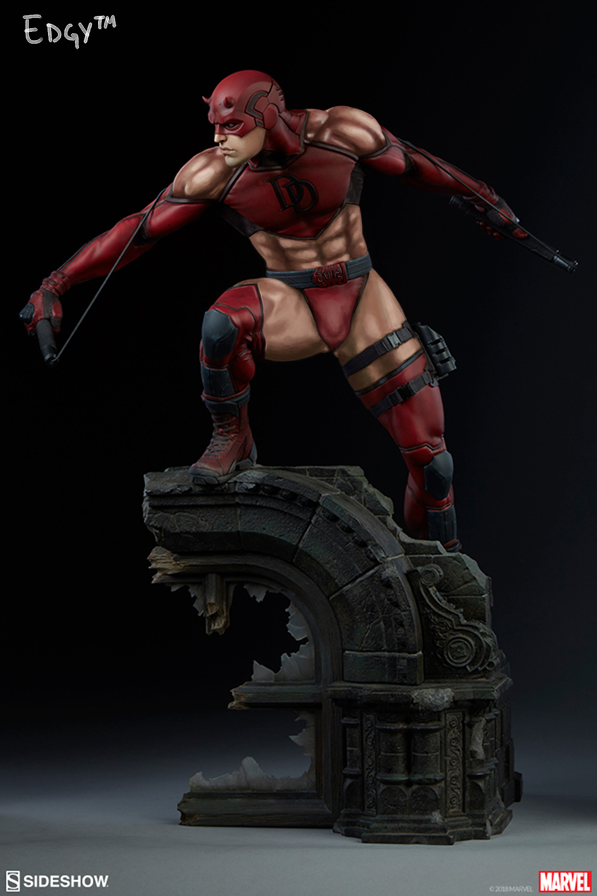
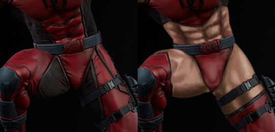
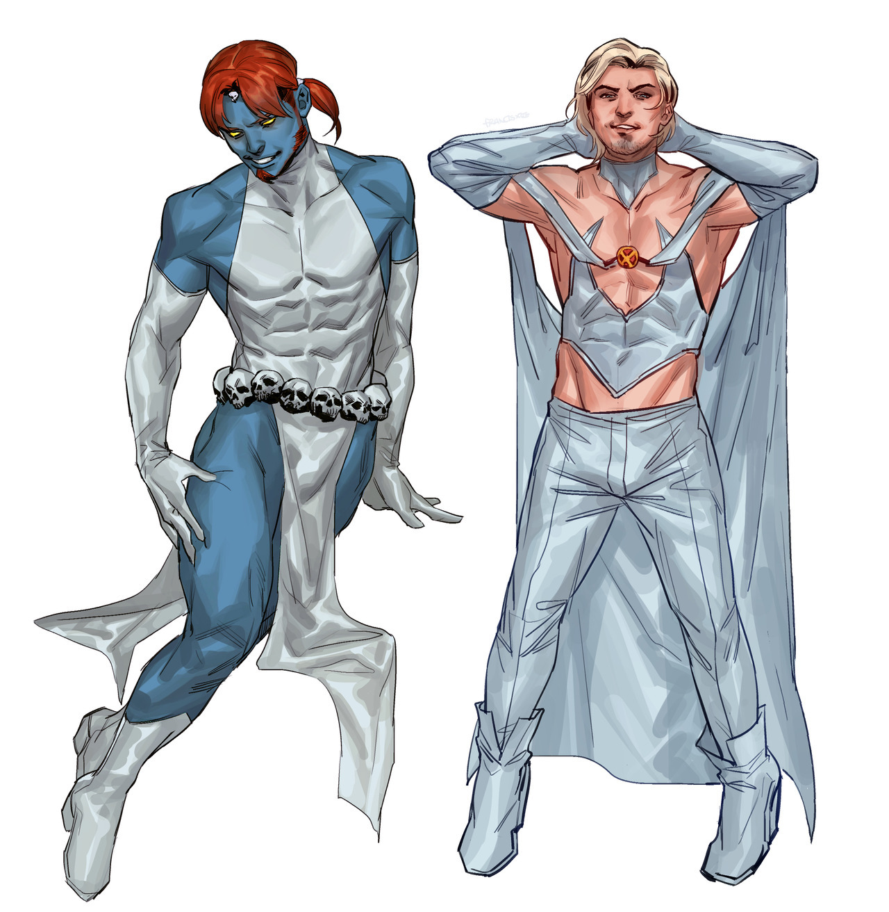
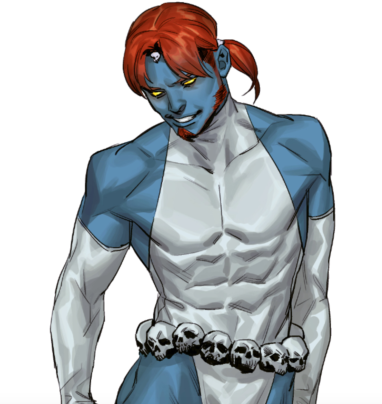
I decided to empower Daredevil, cause his premise lends itself well to wearing a skimpy outfit. After all, he’s an acrobat who cares about mobility and flexibility. He dodged all those shurikens(?) by doing all those backflips (I haven’t seen the movie since it came out, okay?)! Him doing that while fully-clothed was the most unrealistic part of that movie, honestly. Also, the rustling of the cloth against his skin would get in the way of him hearing important things. His design was really careless. :
So to improve it, I started by cutting out some key pieces of his existing bodysuit, to increase his mobility and reduce fabric noise. I also made sure that we can tell exactly how big his empowerment is. Rendering those abs was a lot of fun! (And the belt buckle says “Juicy” thanks to a viewer suggestion.)
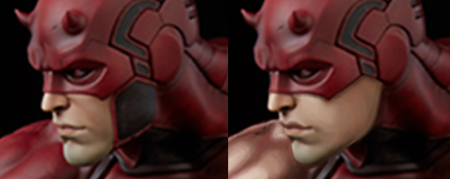
I also adjusted his face a bit. I got rid of his laugh lines and gave him fuller, more shaped lips. He’s supposed to be hot, Elektra kissed him and everything! And since his face is now hotter, I removed some of his mask to show it off. Mmm, that crisp jawline!
I was going to give him a feather crown or something, but decided against it.
This one was definitely fun, especially since I never saw the TV show or read the comics, so my memory of DD came only from the unfortunate movie (you’re welcome for being reminded of it). Maybe we’ll empower Bullseye sometime too.
This thing was so bad to begin with that it should have been remade from scratch, not by modifying the unsalvagable original. I did my best, though.
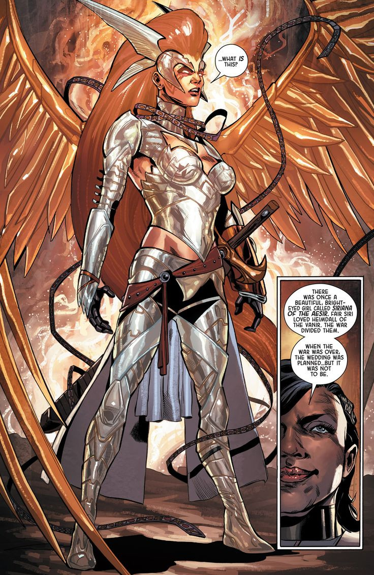
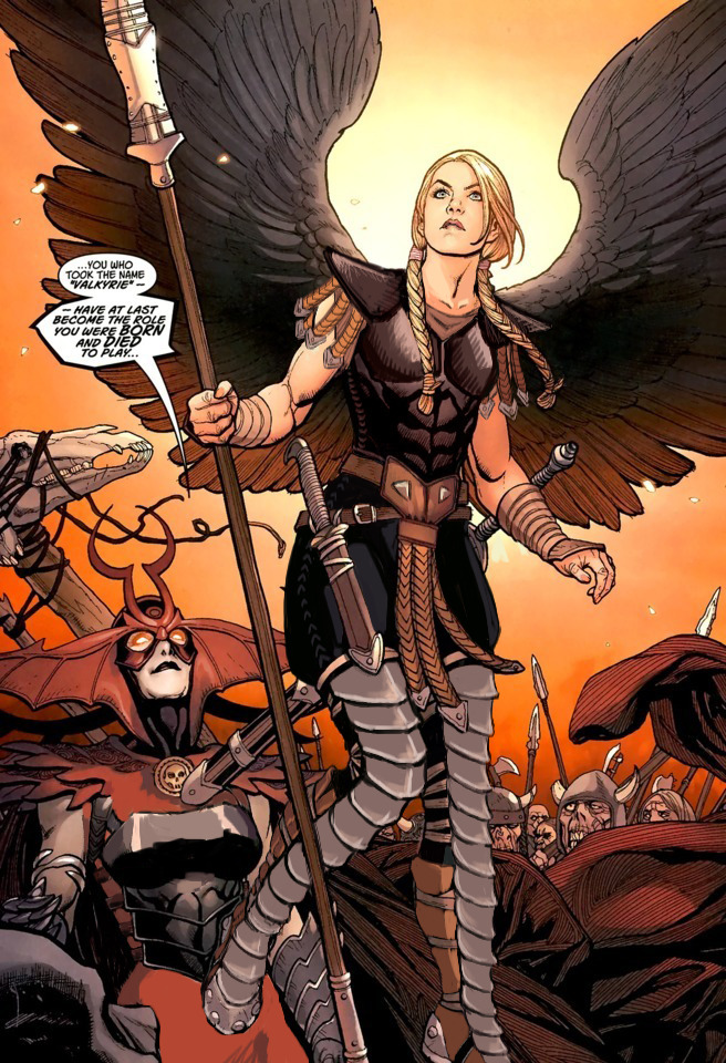
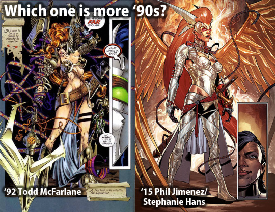
Before doing anything to the costume, though, I had to take care of the ABSOLUTE GARBAGE color composition on this whole splash page. What genius thought that orange background was optimal way to present a character with big orange hair and even bigger orange wings? Fixing it required all the sophistication of the easiest color theory trick in the book – I recolored the background. Wow, amazing! What do you mean orange pops out from blue better than from more orange? What even is complimentary colors?
?
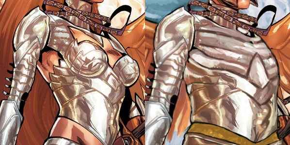
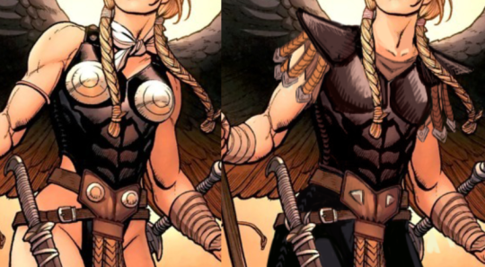
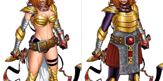
Only then I could start working on the armor itself. Boobplate proved to be much less inspiring than Angela’s normal golden bikini top, as the shape language and colors in the original gave me much more to work of off. This I could only change into actual, rather boring, breastplate.
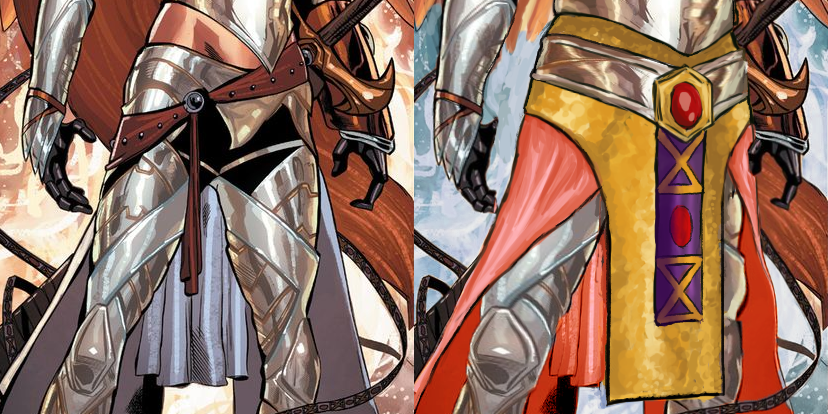
I had no idea what was happening to the leg region, so to cover the nonsensical crotch area and to give the design some consistency with my previous one, I recreated the mail tabard (just in gold this time) and gave her an updated version of the belt I was so proud of the last time. This time not only I let her keep the butt cape, I made it bigger and recolored it to light red, for another splash of color. and also to recreate the look her gambeson tassets.
The lesser changes include: fixing the giraffe neck, getting rid of the 90s comic hair (which also seemed to be clipping into her wings?), making her headpiece bigger and connected in the middle, giving her a bit smaller wedge heels and stockier built.
I’m afraid this really isn’t half as good as my previous Angela redo, but I hope you guys like it anyway!
~Ozzie
Posted on
Marvel Villainesses: Hulk-stomping edition!
Not long after our last take on DC evil sexy ladies, we decided to balance things out with some Marvel characters as well. And by complete coincidence, we both chose artwork in which they stomp on Amadeus Cho! Clearly, that means they’re dating.
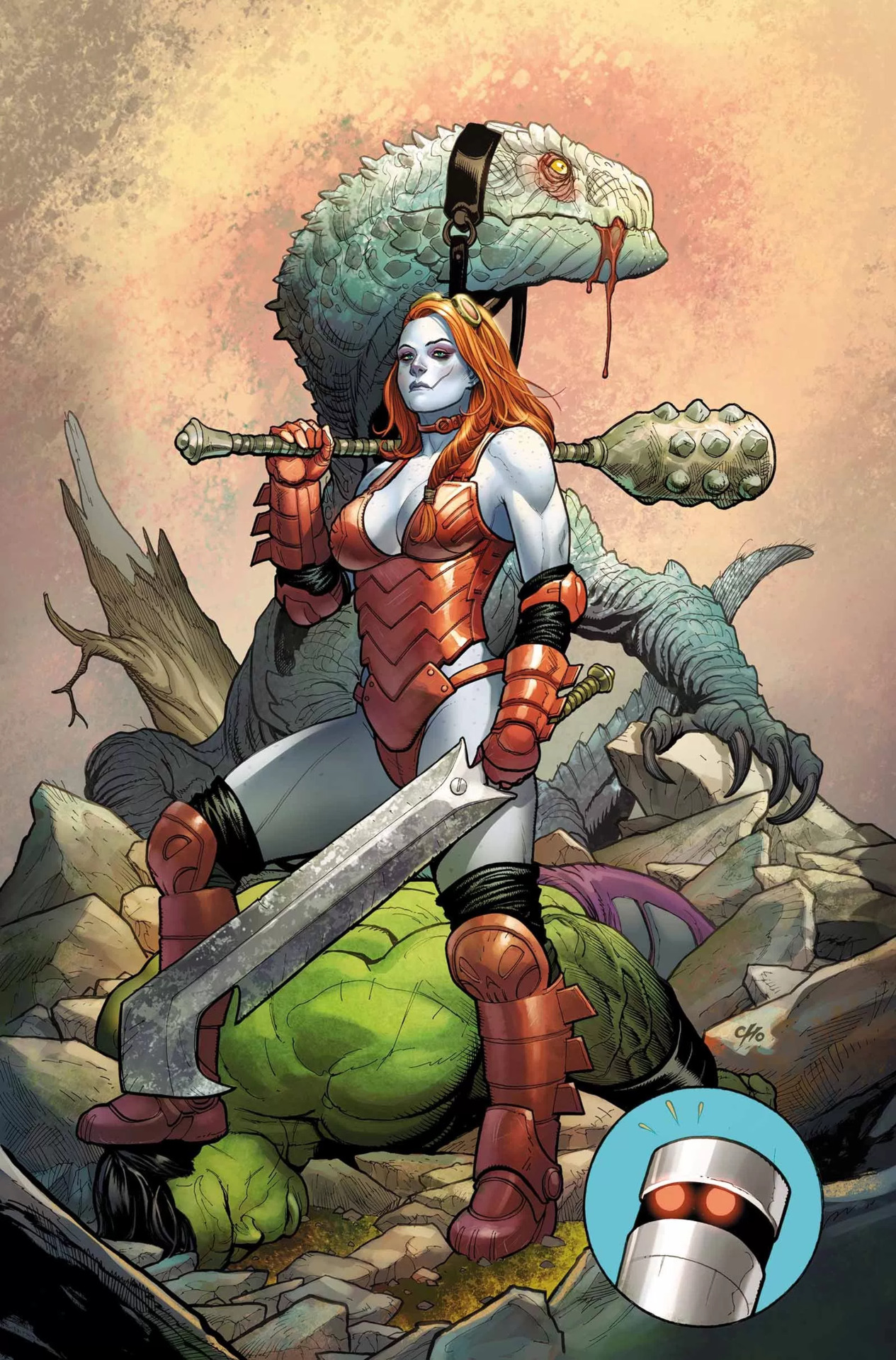
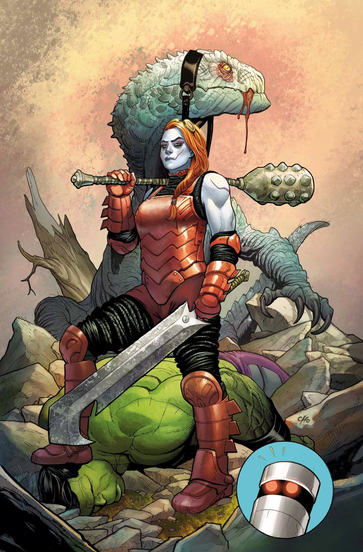
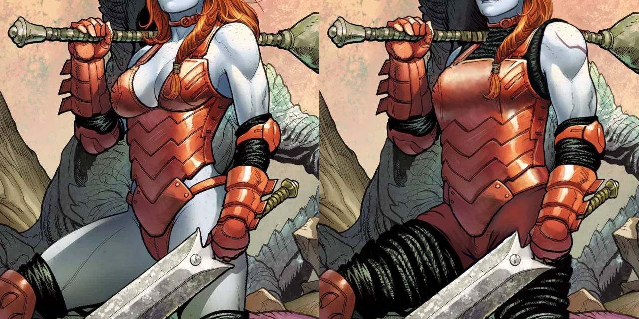
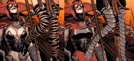
While Frank Choisa human dildo, I will admit that unlike most other whiny dudebro artists he has actual skill and grasp of human anatomy (when he wants to, at least). This is a technically good drawing, with Hellbender’s bizarrely sexualized costume as the only real flaw
Obviously I started the fix by getting rid of the cleavage, boob cups and pinched waist from her metal leotard. It no longer looks skin-tight, especially since I’ve added some padding in the form of the same black fabric she wears under her boots and gauntlets. I liked that material enough to extend it into faux-pantlegs that cover what her new shorts (replacing what seemed like a thong) don’t reach. Along with her armor, I reshaped her upper body. The suggestion of muscular arms was nice, so now they’re bigger, with solid thick torso to match. And a brand new arm scar, fitting the facial one.
One last thing about her costume that needed fixing was her left foot, which inexplicably is drawn as if the boot was a wedge heel, asymmetrical to right foot’s flat sole.
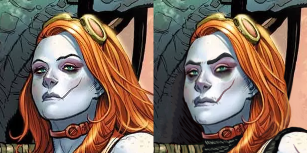
After I was done with the outfit, her face called for some un-genericking. There is a promise of unique features in there (mainly the visible scar), but it falls short, quite obviously due to Cho’s cowardice at making her *too* far from conventionally attractive. As we mentioned before, the color scheme makes her look quite close to Harley Quinn (and arguably also Poison Ivy), which is just bad character design.
I started by changing the hairstyle into more practical one – the braid was already there, so why not make all the hair be part of it instead of flying loosely? It’s also not visible at this angle, but I decided that her right temple has some undercut action going.
Next I made her scar more prominent with color change. Then very subtly turned her features a little more square, gave her a bigger nose, thick natural eyebrows and a tiny bit of facial hair that so much mainstream media denies to depict on women. Also extended the dark lower eyeshadow.
Final touch was, of course, the expression – no more vacant supermodel stare. Someone stomping the Hulk to the ground deserves to make an intimidating face at the camera.
It’s one of the most satisfying redesigns for me. Hope you guys enjoy it too!
~Ozzie
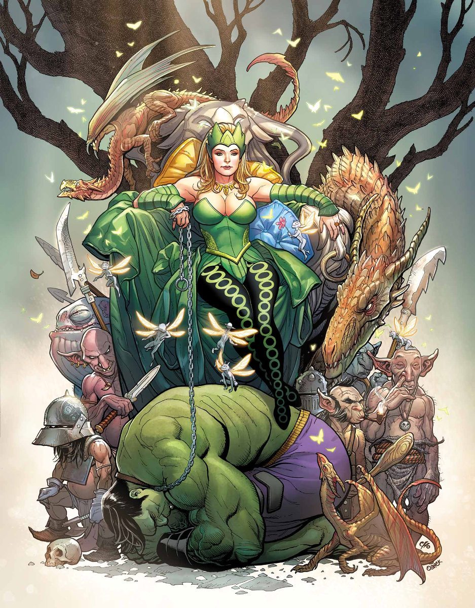
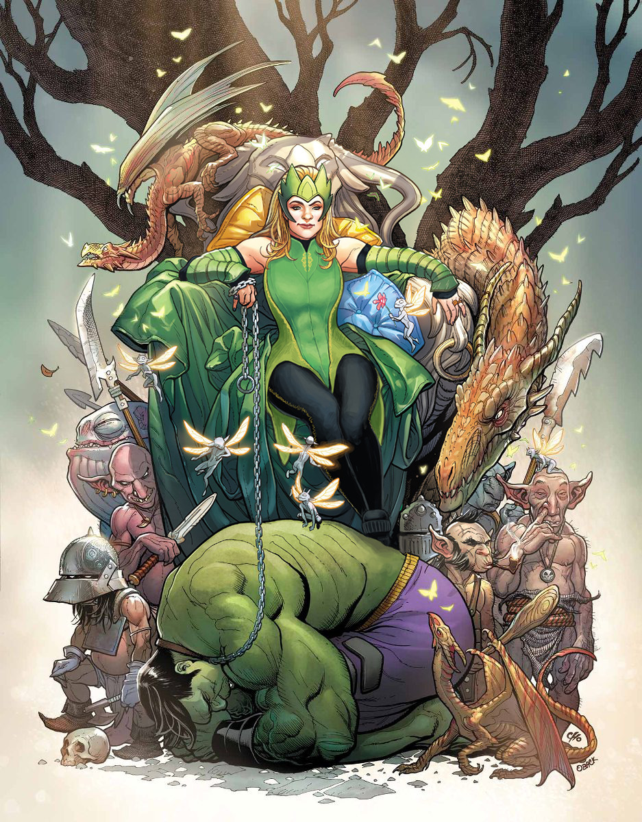
Enchantress
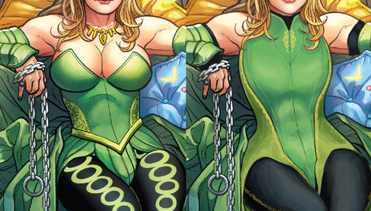
Another Hot Chick who was supposed to look intimidating but does not at all; is this a redesign type I have? All of my design choices centered on this one around making Enchantress into someone to take seriously. Most of the changes were small, outside of her tiddy situation.
I gave her a leotard-type of thing with some nice lines to break up the big shape, and some small details in strategic places. I also made her weird side embroidery into a larger part of the color scheme. I gave her some sick abs under that costume, as well as bigger shoulder and arm muscles. To finish off the upper body, I gave her spots of black to tie her color scheme together. It’s honestly kind of jarring how only her legs have the black in the original.
Next, the leggies! I got rid of the big circles that were Bad, and gave her some stitching down the side of the leggings instead. And I gave her platform shoes to really stomp on that Hulk, rather than… daintily breaking perspective with how the Hulk’s got no shadows on him, but the chain and foot are in front of him….?
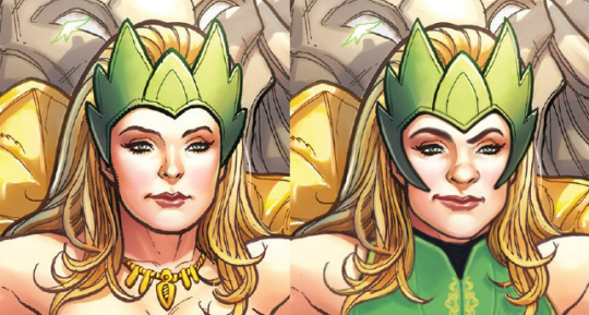
Finally, I changed her face and headpiece. I wanted her to actually look menacing, rather than like a beauty queen wearing a tacky green crown.
And yeah, I guess I got a thing for one-sided smirks, but she’s still hot. She’s just got more attitude and control and a more interesting face than… nothing. Y’all really have no idea how I hate the White Girl Nose so many lady characters get in comics.
This was definitely a fun one and I like what I ended up with. I personally think Ozzie and I did super well with faces this time around. Give us more Intimidating Looking Ladies!
Funny, because Emma Frost in particular is second only to Bayonetta among (dubious) examples that are thrown our way as a female character expressing her sexuality “done right”. Yet other than fans turning her into a dude, there’s no direct male equivalent to her brand of sexy empowerment.
~Ozzie
Posted on
Gotta Fix Everyone’s Weird Boob “Armor”
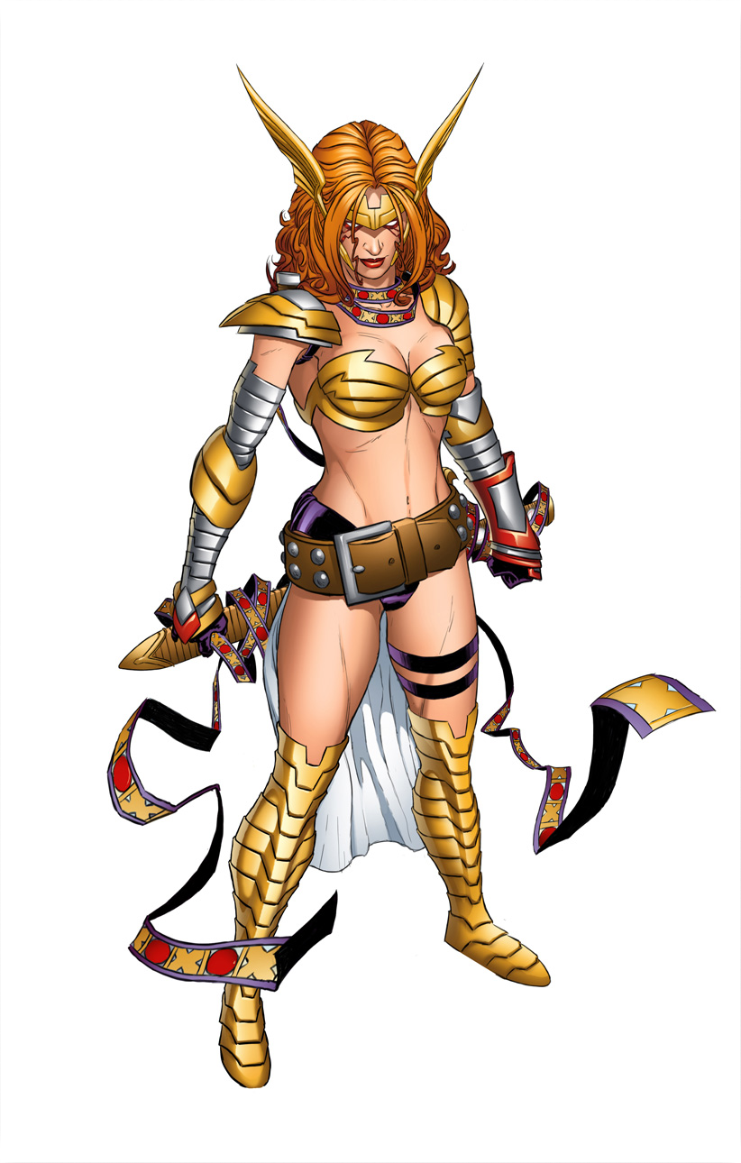
I was frustrated with how Marvel’s Valkyrie was just a sequence of weird design decisions. This particular version ticked me off because they had the cool cuirass with the abs, but then the chafing and the metal boob cones…. ugh.
I started with fixing that chest armor: getting rid of the weird metal bra and adding cool (to me, anyway) shoulder guards. I wanted to give her a more powerful look. I added some small dangling leather straps to mirror those on her belt.
When it was time to fix her…. boots? I took the liberty of, at the same time, painting over poor Hel’s painful-looking <biggest air-quotes ever> “armor.” I actually started giving her a more reasonable breastplate but gave up. That would be a project all on its own.
Those leg ropes seemed very stupid to me, and they didn’t go with the rest of the design, so I gave her plate armor that kept the small shapes. I then gave her simple pants to be the large shape in the design. In hindsight, I feel like I should have gone through with the metal gauntlets I wanted to give her but bailed on.
Finally, I replaced her Generic Pout™ with a more determined expression. Now both ladies can go forth and fight whoever it is they’re fighting.
I’d say I need to update rhetorics bingo but I don’t see a square for outright calling people assholes and telling them to go fuck themselves.
I like how he has to go and actually repeat points from that rhetorics despite how bad they are. I mean, he even went back to the old “she chooses to dress that way” argument with “Women like Laura do what they fucking feel like”.
I would lose all desire of supporting Laura’s new book after this if it wasn’t for the fact that I know Marvel will learn nothing from its eventual failure. They will claim they were totally right to force her back into a skimpy outfit because “sex sells” and to undo her character development and force her back to a codename she rejected (and that stands for dehumanization and abuse did to her more than anything else) because “X-23 is an established brand” and will simply blame Mariko Tamaki for not being able to stop a boat they blew dozen of holes in from sinking. I will still give serious thought if I actually will support that book because it feels to me Marvel is hell-bent on making it fail and I could use my time helping other titles stay afloat.
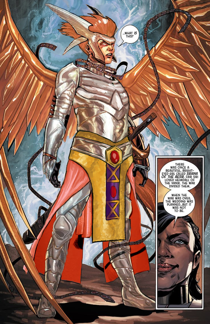
Maybe one day we’ll get to stream fixing that winged monstrosity.
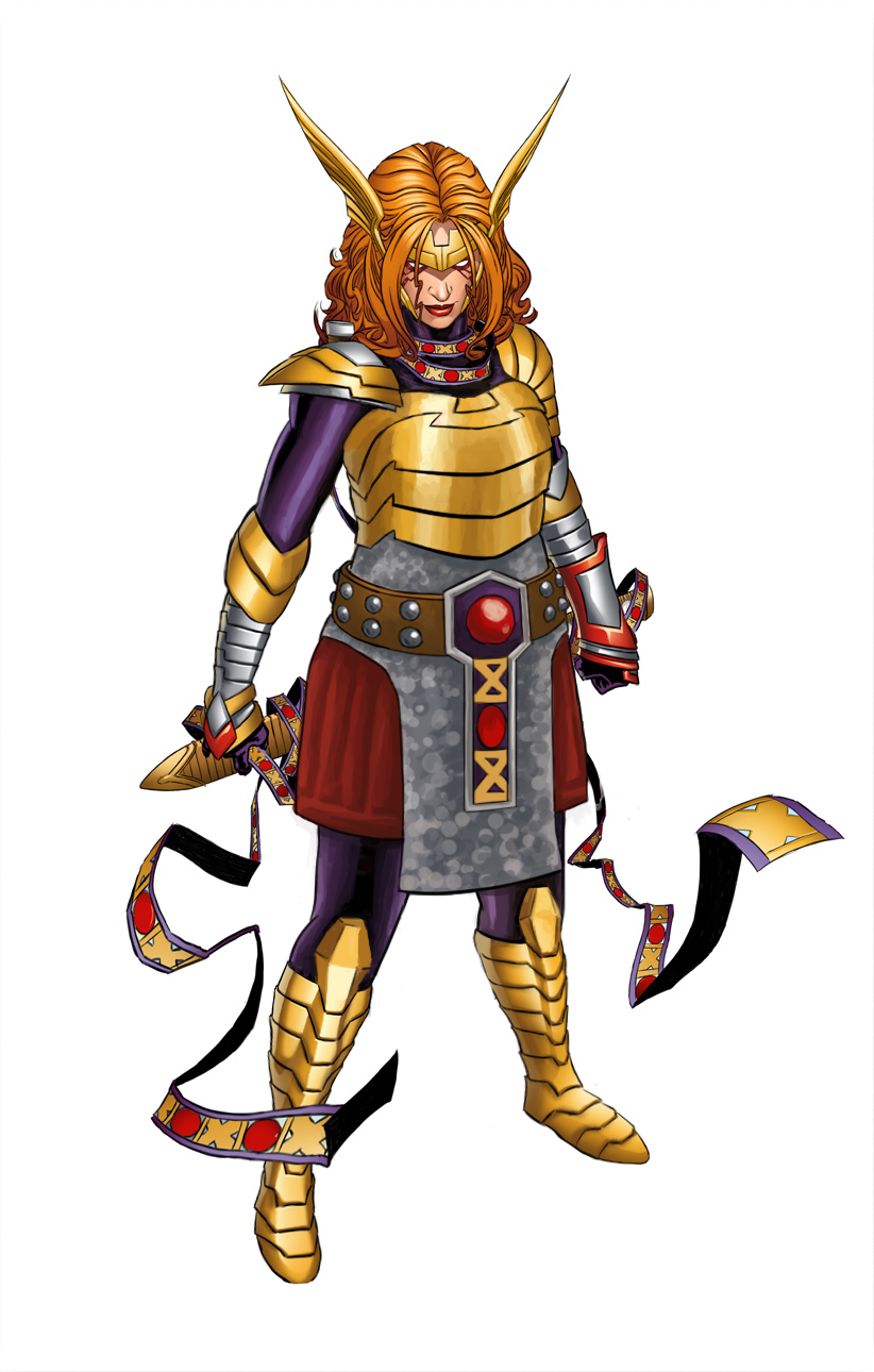
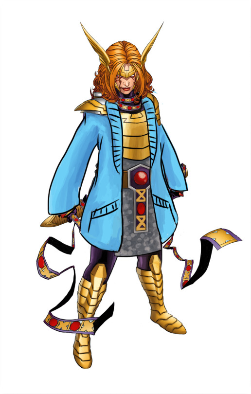
Back to the redesign, tho: My priority, given that now she’s an Asgaardian warrior, was giving Angela actual armor, with lots of layering. She got some undershirt and pants, gambeson and mail tunic (painted vaguely, so it can be either chainmail or scalemail), then on top of that a believable breastplate instead of two half-spheres that barely connect at her sternum.
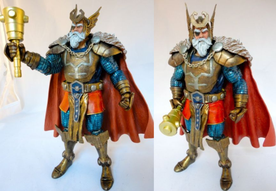
I disliked her generic huge belt design, so looking for inspiration in costumes of her father, Odin, I found this custom figure with really cool belt (unfortunately, source ungooglable):
So I based Angela’s belt buckle on his, as well as on the pattern from her magical ribbon thingie. Now that I look at it, I might have also taken some shape and color cues for her breastplate and gambeson tassetts from Odin.
Other little details: got rid of the pointless butt cape, made shoes not go thigh-high (how is she supposed to bend knees in metal thigh-highs anyway?) and gave her stockier built.
I’m really satisfied with that color scheme. What’s funny is that it was already there. Each color I used was sampled from some minuscule part of her costume that was drowning in the sea of dominating gold and flesh tones.