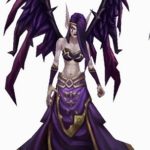
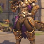
Rainbow Mika and the draftiest of wrestler outfits!

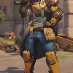
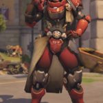
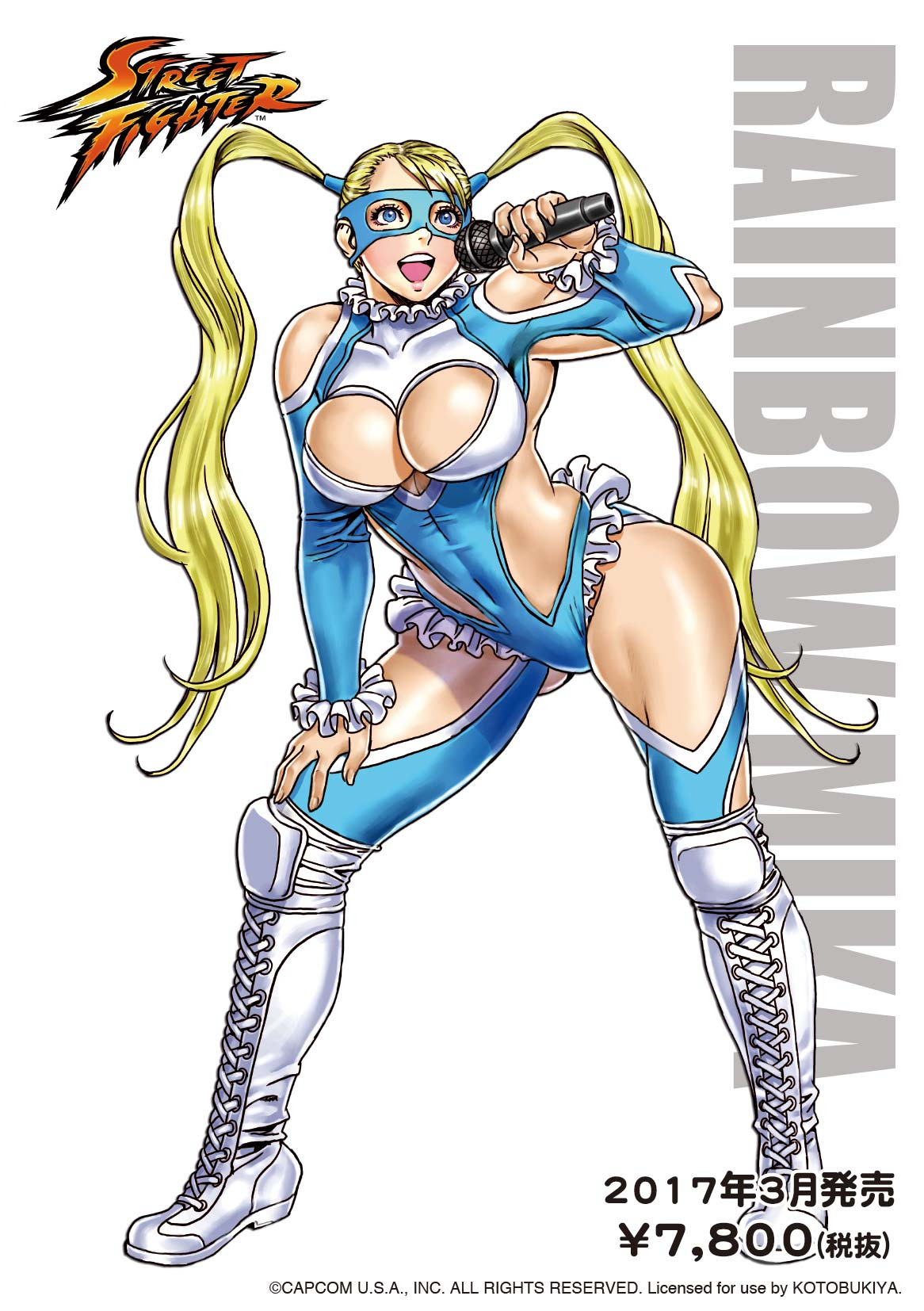
Another redesign I did solo was Street Fighter’s Rainbow Mika, a “wrestling” costume made approximately 80% out of holes. 

Biggest challenge was figuring out how the hell those breasts are supposed to look when actually contained by fabric – nothing about how they interacted with it in the original made any sort of sense, so the chest area got basically repainted from scratch, with an attempt to recreate white pattern concealed under the balloon boobs as a sort of chest emblem shape. 

image

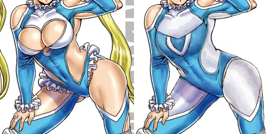
While there’s nothing wrong with the costume having some tasteful cutouts, the original’s were so awkwardly placed, massive and physics-defying that I decided it was easier to change them to white fabric, while leaving in some smaller holes oh her shoulders and elbows. I’d probably leave something on her legs, if the image shown Mika from another angle. 

A small, but significant touch was making the shapes on her sides rounder, so they’re not pointing at her crotch anymore. Also got rid of the pantyline frills, which made her look as if fancy lingerie was peaking from beneath her leotard. Left the frills on her collar and wrists be. Also didn’t do anything to the boots, as they’re perfectly nice and likely the only legitimate wrestling element in her original attire. 

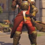
Final touches was giving Rainbow more secure hairstyle for a fighter (while stylized Sailor Moon-like hair isn’t much of an issue to me, it just didn’t match the more practical costume anymore) and a knocked-out tooth, to communicate the inherent danger of being a wrestler/fighting game heroine. Also, sometime after finishing the stream, I made her facial features slightly bit less generically pretty, following many watchers’ advice.


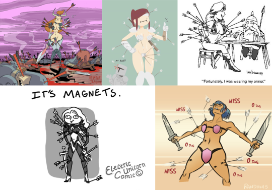
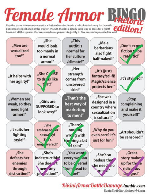
Surprisingly enough, criticizing R. Mika is one of the most “controversial” things we ever did on this blog. 
To this day, our bingo of her outfit from Street Fighter V tends to periodically resurface among the Status Quo Warriors enraged at us for talking smack about that costume. Their “arguments”? 

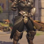
1. This is totally very legitimate female professional wrestler outfit! OF COURSE that’s exactly how women in that field of sport and entertainment dress, just look

image

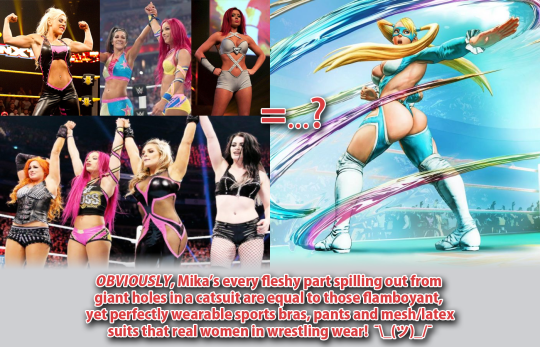
True, those wrestlers, due to double standards imposed by the industry, tend to show off their cleavages and bellies… which sooo definitely is the same as a video game character’s suit denying all laws of physics and geometry for the sake of showing maximum flesh surface! </sarcasm>

According to them, occasional low-cut v-neck or belly window = giant hole where the back, each breast, thigh and buttcheek is. 

2. This is not an armor! That outfit this fighting game character wears to beat the shit out of other fighting game characters shouldn’t be criticized as a fighting outfit, because it’s not a literal suit of armor. 

3. Male Street Fighter characters are treated in exactly the same way! Just look at Zangief’s hairy chest and minuscule speedo! After all, big muscles and no shirt = male sexualization, right? 

Needless to say, exactly the sort of easily debunkable “logic” we’d expect from the people who outcried “censorship!” when this character’s butt slap animation was removed by the developer

~Ozzie 

image

Time to come back to Sideshow Toys and probably their best example yet of how much amazing craftsmanship (that sculpt! the intricate paint job! the fabric and synthetic leather details!) can be wasted on super garbage design.
This time, a classic garbage that is Red Sonja in her standard scalemail bikini

How do the mail bra and loincloth even hold up with such flimsy straps?
What is the point of protecting your neck with metal collar when your heart, guts and skull are all totally exposed?
Why worry about reasonably padding your leg and arm protection, but wear a scalemail bra (that will sand your nipples off) directly on your skin?

“Looks nothing like male equivalent” checked, of course, because of Conan.
Not crossing out “High heels” square, since that (cw: gore) is a reasonable heel size for a horse riding and wouldn’t be out of ordinary for a male character either. 

Also note how all those arrows that apparently completely missed Sonja, presumably due to her “costume” being more of a plot armor than anything else.
Reminds me of those couple “bikini armor makes you completely resistant to arrows” parodies we featured before: 

image

Full comics to be viewed here: 1, 2345.

~Ozzie

Mercedes Marten (Dragon’s Dogma)

qvlqu:

Mercedes Marten (Dragon’s Dogma)

Excuse me, but literally the first concept for this character is fully armored, in reasonable plate, with no Tiddies and with actual pants??

image

E X C U S E  M E ? ? ?

image

-Icy

Just in  case the “no pants” part wasn’t clear enough from the image used by the OP, here’s some concept art for the final design, pants definitely not included:

image

Sad part is that clearly whoever worked on that studied real armor design… Then presumably got told by a creepy marketing guy that if no boob (and thighs), how woman?

I think it’s reasonable to say that Dragon’s Dogma, both with outright bad stuff and clearly missed opportunities, like this one, belongs firmly on our Wall of Shame.

~Ozzie

hellyeahteensuperheroes:

So, Mike Choi’s redesign of Laura Kinney’s costume for new X-23 series is controversial. To put it mildly. I decided that the best way to express what the flying boar in a submarine is wrong with this outfit would be to borrow the amazing Female Armor Bingo from @bikiniarmorbattledamage . Thankfully he had enough decency to not add a thong or it would score a full row.

Now, people have been telling me to go read Choi’s thread on Twitter, where he goes through his previous designs. Supposedly, it will change my mind about the costume. We’ll see about that.

He put his points in several threads, let’s start with the very first.

image

They wanted the outfit be different from her Wolverine outfit AND based on the X-Force one. This is bizarre. Her final Wolverine suit carries clear X-Force inspirations. It’s inspired by Logan’s X-Force costume. It just feels like they’re trying to bring back nostalgia to that specific time in Laura’s history. Which is funny, when you remember that the most of online fandom hated X-Force when she was on it (Kyle and Yost’s run). Despite the critical acclaim. It was seen as the epitome of why making comics darker and edgier is the worst thing you can ever do. I know, I got into arguments with these guys. But now the same people go online wanting it back if that means Laura will be showing off her midriff again. Go figure.

Now, if you pardon me breaking chronology a bit I want to address the second and sixth point on his thread together.

image
image
image
image
image

So let me get this straight – he was told by everyone (and agreed!) how pantless leotard is out of character for Laura, and then gave her equally skimpy short shorts on another try? All while completely aware that her outfit will be drawn by other artists who will likely make the shorts smaller and sexualize her further? He needed two separate attempts and two different arguments to understand Laura needs long pants?

Now back to the chronological order of these tweets. Third part.

image
image
image

Where do I even begin? If he accepts the blame for her having an exposed midriff, why not use an opportunity to fix it and give her an outfit that does not have one? What not being Wolverine has to do with practical costume design? Why cannot she still wear non-revealing outfit under new or old codename? How can he talk about respecting her agency and personality considering what book he is making these designs for? A series that, for all that we know so far, will force her back into a codename that she outgrew? Laura had a whole arc about it, with her proclaiming she is not X-23. To speak of respecting her character when such a big regression is done to her is just a sad joke. 

As a side note – the top picture? These words? They’re out of context. They directly quote a speech Laura makes in issue #19 of All-New Wolverine. A speech that starts with ‘I’m not X-23″ and ends with “I’m Wolverine”. They cherry-picked lines from that monologue and slammed them on a cover for a book that goes against the entire point. It takes away from her both Wolverine title and outfit and forces her back into codename and costume she left behind. In that context talking about respecting her character is just a piece of impudence.

 And this argument about her taste of clothes comes as asinine for a number of reasons. One is that she is a fictional character, she doesn’t really make a choice to dress like this – the artist does. Giving her a midriff always undermines her as a competent fighter. You end up saying she decided to expose herself in the fight, putting herself at risk for fashion.

These outfits would be okay as everyday clothes, I could tolerate them if she wasn’t wearing a costume but was just one of those superheroes who fight in whatever they are wearing at the moment like Luke Cage or Jessica Jones. But she is not, she goes and dresses for a mission, why should fashion sense or taste of clothes have anything to do with it? 

And finally…. if he cares about staying true to her character, why did he try to put her in shorts after being told bare legs are ooc for her?

Let’s go to the fourth part

image
image
image

I agree that talking about fictional character’s agency is an oxymoron. Which is why comparing Laura to real life women, who can choose their own wardrobe, makes no sense. While Choi acknowledges Laura as a fictional person, he still frames it as if he wasn’t the one in control of her looks. This is what trying to call the critics “narrow-minded orthodoxies” and claiming they accuse HER of being some sort of temptress boils down to. It is the artist we have a problem with, the artist who made a choice to dress her like that and now tries to say it’s liberating. He asked his students what they would wear as superheroes. They told him they wanted to express their independence. And somehow this shit is the only way to convey that he could think of?

image

And finally the fifth part. While he speaks about the boots, I need to bring attention to what he says about practicality and realism

image

Again with false equivalences. Superhero costumes can look cool while still being practical, many male outfits prove that. Hell, Snake-Eyes is a good example. And I’m pretty sure “that thing” on his face is eyes protection if a stylized, properly stylized, one. To say you cannot make a character look practical without losing the cool factor is an admission of a failure as an artist.

And for the finishing touch, I decided to put his arguments on the second famous feature from @bikiniarmorbattledamage , the Female Armor Rhetoric Bingo

image

 His points I spotted are in green. I also put in purple arguments I’ve seen from people trying to defend his designs and the fans. Arguments that were always thrown in defense of sexualized outfits for Laura, by the way. The “Great story makes up for these ridiculous designs” is one I especially need to highlight. People are coming to me saying that I should not judge Mariko Tamaki’s story before it appears. And I need to underline that I’m sure she can write a great story with Laura. In fact, I hope she does. But that will in no way change the fact this outfit is horrible.    

Just like is the case with Mike Choi’s designs – they suck, all of them, be it unused ones or the final one. And while I can understand some parts of his thought process in working on them, they do not justify what he created and cannot serve as a good defense for the outfit he went with.

– Admin

So not only all those new outfit ideas for Laura were the generic “must. show. female. skin!” shit and the one approved in the end is no better than the rest… The designer also walked us through his “creative” process and didn’t manage to give a single satisfactory explanation to why he landed on any of those! 

It’s pretty amazing how so many completely valid points, like consulting actual women, considering how other artists will draw it and referencing the character’s history were supposedly taken into consideration… and nothing about those boring rags informs us of that

~Ozzie 

Why does it feel like every time Mike Choi talks about the “research” and “introspection” he did with regards to women, he’s actually trying to blame them? 

Also, I really love that this veteran of the comics industry apparently assumes that, if anything has even one impractical element, then it is 100% impractical. If that’s the case, Laura’s outfit is immediately impractical, due to the fact that I don’t see any bra straps under that see-through fabric! And wearing a strapless bra into the kind of acrobatic fights that Laura gets into is a bad idea. Too bad he didn’t ask any of his students about that, though he probably would have ignored them anyway.

-Icy

One of the complete redesigns I did when we first started streaming: Morgana from League of Legends. I read her background blurb and got angry cause she has a lot of potential with a backstory involving familial strife, law vs. chaos as ideology, and resorting to dark powers to fight for what you believe in. But her design was…. just generic bra and skirt, and some evil makeup, I guess?? Ugh. So I basically started from scratch, which means this write-ups is gonna be just a little longer than the first.

More under the cut.

What Stayed In:

I kept the color scheme, for the most part, the belt part of her skirt, and her posture. Or rather… what I think her posture was supposed to be, cause she sure doesn’t look hunched over in the original, more like she’s got a sore shoulder.

So not much.

Initial Redesign Ideas:

I decided that Morgana should be more monstrous because of the dark magic she was using. I wanted to give her more colors than just purple and gold (LoL has a problem with 2-color costumes), so I went for a sickly green that would add to the “wrongness” of her design, as well as hint at multiple sources of corruption. They tried to make her look malnourished, I guess?? –

[Not even the splash artist was sure what was going on with her torso.]

–so I pushed it to the extreme in the redraw. I was also trying to maintain triangles as the main shape in the design.

Storytelling Elements and Later Additions:

So, Morgana has a sister in the game who fights against her, named Kayle.

image

I wanted to add elements of that old life to her appearance, so I changed her hair to blonde, like her sister’s. I also gave Morgana a tabbard similar to Kayle’s, with the same symbol on it, albeit old and worn-out. Forgotten, almost. The final change I did was adding the corrupted halo. The blurb on Morgana’s life sounds very obviously disapproving of her life choices, but I was more interested in making the sisters not so cut-and-dry good or evil. Kayle is very lawful, so she has to eliminate evil, at any cost. Morgana disagrees with that kind of ideology, and ends up resorting to making some bad deals in order to face her sister. Is either of them right? They both sound like they’re suffering in their respective positions. So I wanted Morgana to be a bit more sympathetic and interesting.

Final Thoughts:

You could call me out for giving her even less clothes than she had before, but I would argue that it makes sense in this context. Morgana’as power comes from dark, unnatural magic, unlike her sister’s armor and sword (Kayle’s equipment has a backstory of its own). I feel like she would have continued to give more and more of herself to gain more power, possibly even to the point where she can’t wear armor anymore. 

But I didn’t give her a silly bikini and buttcrack-showing skirt and call it a day. The developers couldn’t even be bothered to give her any indications of her backstory. If they had at least given her some deformities or something, I probably wouldn’t have been so angry. At least something fun came out of it.

-Icy

Brigitte and Overwatch’s continous female design problem

We talked already about Brigitte’s costume, but there’s a whole lot of other issues about her character design that shouldn’t be overlooked. Again, it’s a nice idea to have a new lady in actual armor in the game, though we wouldn’t be BABD if we didn’t point out some obvious and less obvious problems that can be spotted with her. 

She’s, after Moira, another white European lady in a row, while still the closest to black female representation among playable heroes is Orisa, a robot (and before anyone says it – nope, none of the dark-skinned female characters are black).
For a game that prides itself in having diverse international cast, Overwatch can not imagine people of color color coming from places that wouldn’t be POC-dominant already (also lots of their heroes of color somehow happen to be morally dubious compared to white ones). And just because Brigitte is a pre-established character doesn’t yet excuse prioritizing adding her to the game over someone with different background. 

It’s kind of funny how after being unnamed for no reason in her last major media appearance, the Reinhardt animated short, now Brigitte got elevated from a supporting lore character to one of main heroes. This, paired with ridiculous lack of consistency in her cross-media appearances gives us a strong feeling that no-one at Blizzard is overseeing writing and art direction of Overwatch as a franchise. Fans who spot constant retcons in the story would agree.

Speaking of no visual consistency, seems like from comics to the animated short to the actual game Brigitte finished her long journey from a unique-looking person to another standard issue pretty face. 

image

And no, different artists working on each of those appearances isn’t an excuse for how only her hair and skintone remain relatively consistent. Her crucial features like jawline, freckles, nose shape and size, how big her eyes are and how strong her chin is shouldn’t alter so widely just because of art style change. Blizzard is perfectly capable of making and using style guides – and when they don’t, it’s either by choice or negligence.

And if you wondered what we meant by “standard issue pretty face”, this pic, for obvious reasons, has gained some major mileage around the Internet: 

image

Congrats, Blizzard! You officially care about diverse female appearances as little Disney does! (image sources: [x] & [x]) 

image
image

Or maybe the jokes are true and the (weak) excuse for looking like clones is the same as for the Frozen ladies? Mercy is Brigitte’s real mom!

Not to mention that Blizzard can’t make up their mind on what Brigitte’s body type is supposed to be. Is she thin and curvy as virtually every other Overwatch lady? Is she almost as buff as Zarya? Something inbetween? Who knows.

I saw some fans trying to excuse her twig arms from Christmas comic as being possibly earliest in the timeline, but no official channel would confirm or deny any speculation. Overwatch is pretty satisfied with fans using their headcanons to justify whatever information the story canon won’t commit to. Why make an effort when fans can do your job for you? 

~Ozzie

“Brigitte Lindholm, squire to Reinhardt Wilhelm, is a former mechanical engineer who has decided to take up arms and fight on the front lines to protect those in need.”

If I didn’t know anything about this character and was just reading her background blurb, I would be imagining a character design more akin to this:

image

Why build a regular armor and shield when I can pilot a 12-foot-tall exoskeleton? Her father builds turrets during combat, it would have been cool if she had skills related to building and adjusting her own armor in-combat.

Her design doesn’t inform me of her character at all, which is a problem with several of the Overwatch cast (mostly ladies, I wonder why that is). She wears armor, but so does Pharah; is she also a soldier? She has no welding mask or a tool belt that would indicate that she’s a mechanic type. I get that she doesn’t want to just fix things on the sidelines, but she does throw out armor for her allies. It isn’t a stretch to flavor it as her fixing her team’s equipment in the heat of battle, and she does get a welding mask in a different skin but not the primary one?

Her color scheme is almost the same as Mercy’s, with silver (instead of white), yellow and black being the core, which really isn’t helping that same-face problem, Blizzard. Not to mention the shapes are very similar to Pharah’s. There’s just nothing new here design-wise, and I am disappointed.

-Icy