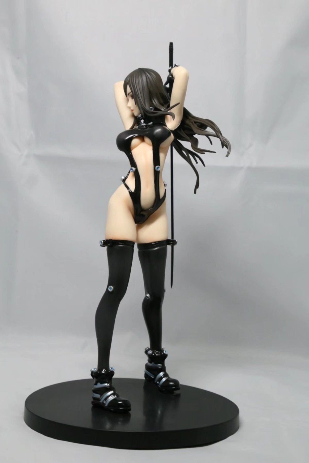
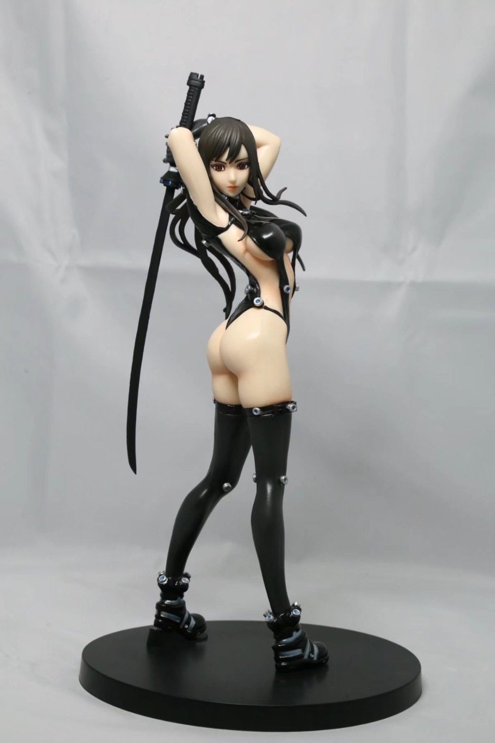
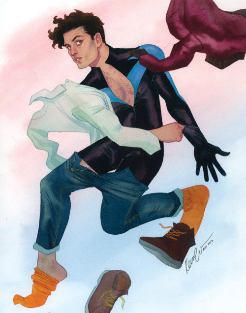
I’m surprised that neither version wears 5-inch heels, but I’d assume that is because with such botched anatomy and pose, balancing her on ridiculous stilettos would just make the figure physically impossible to make.
~Ozzie
Post marked as sensitive, because there’s no way this figure is safe for work.
Posted on
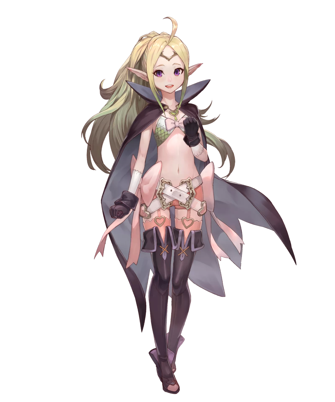
Fire Emblem Gals Part 1
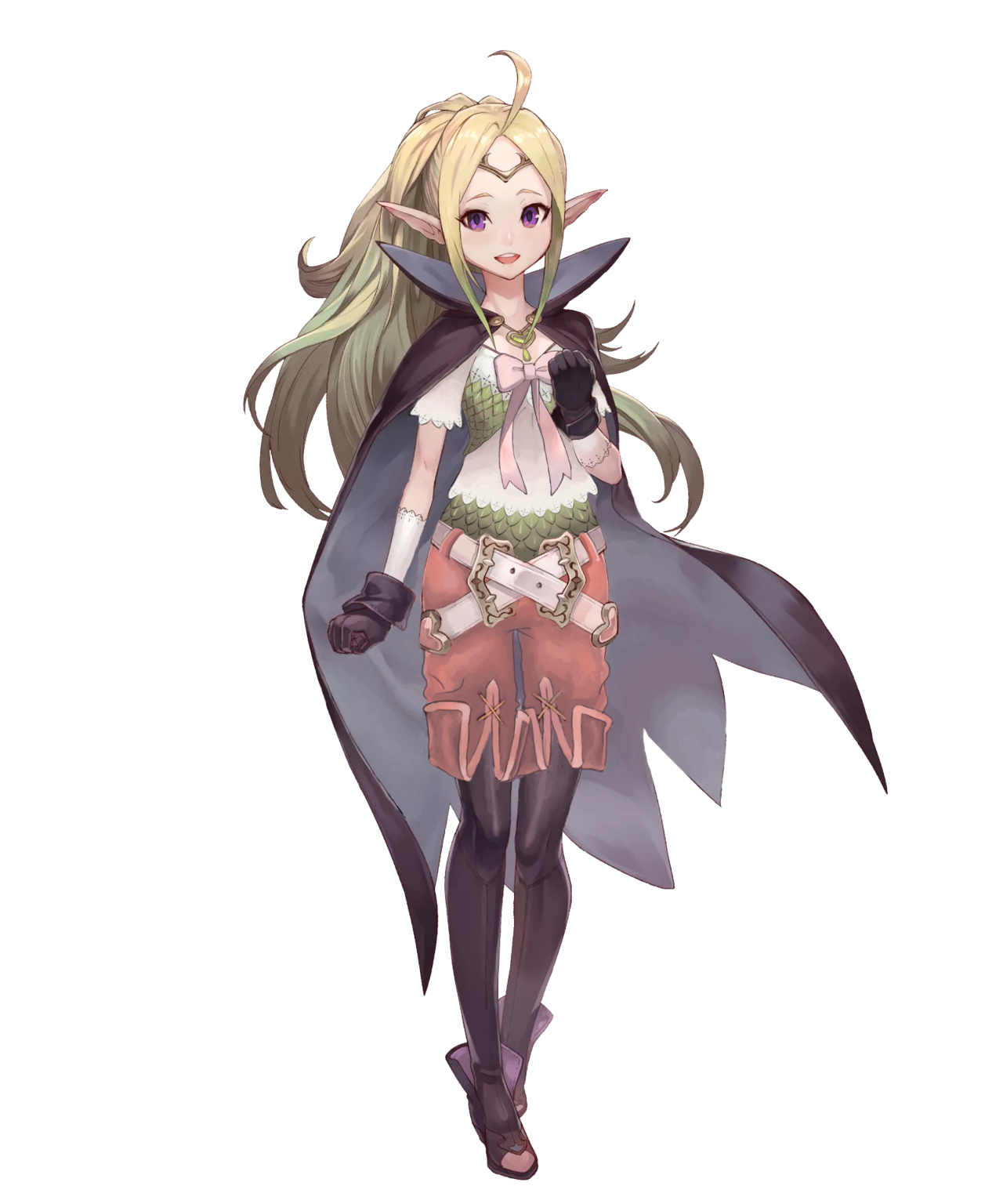
We are assured that Fire Emblem is great game franchise with engaging characters. We have to take the readers’ word for that, because we always find a distinct dissonance between how FE female characters look and what their bios tell us about their stories and personalities. This week, my take on Nowi, the loli dragon.
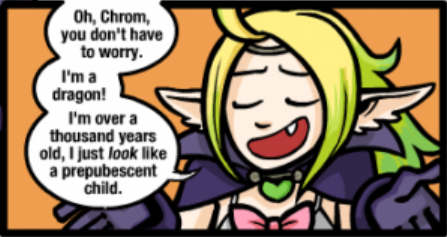
“She chose to wear that!” is a bullshit excuse for a grown woman character running around a battlefield in a bikini, let alone for a thousand year old magical creature who also chooses to have the body and face of a child.
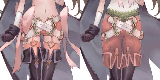
Since she’s really a dragon and probably needs no armor, the goal of redesign was to give her clothes that would look appropriate (rather than protective) for someone who takes form of roughly a 12-year old.
I actually found the color scheme and many shapes in Nowi’s costume very good, just wasted because the focus was on showing skin and adding too many decorations.
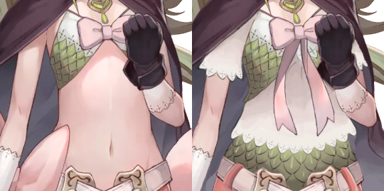
I decided that her teeny tiny scaly bra would make a good vest, if put on top of a crop t-shirt with the same lace finish as those white gloves… which she wears under the black gloves? Then, since I liked the scale pattern a lot, I recreated it also on her belly. Is that a matching undershirt or her real dragon skin? Who knows! It looks cool.
The area between her belly and knees was made of pure visual noise. It was sexualized and overdesigned at the same time. The only ridiculous thing I decided to leave in were the crossing belts, because they look cool enough and aren’t implausible… Provided that I added belt loops to her pants. Speaking of which, fetishy short shorts connected to stockings with garter belts had to go, for obvious reasons. Since her shoes had such a strange shape, I decided to turn them from thigh-highs with inexplicable ankle boots bottom into tights and ankle boots. All it took was to reverse and change the hem of the boots into that of short pants.
Ribbons weren’t a bad idea on their own, but they just completely didn’t belong as decoration on her sides, so I got rid of them and just transplanted the long tails onto her chest ribbon, making it both cuter and a more prominent splash of pink on her upper half.
All in all, it’s one of my favorite, while most subtle, redesigns. Probably also my best simulation of the original’s coloring style. I really hope it managed to turn creepyness of a sexualized childlike character into cuteness.
~Ozzie
Posted on
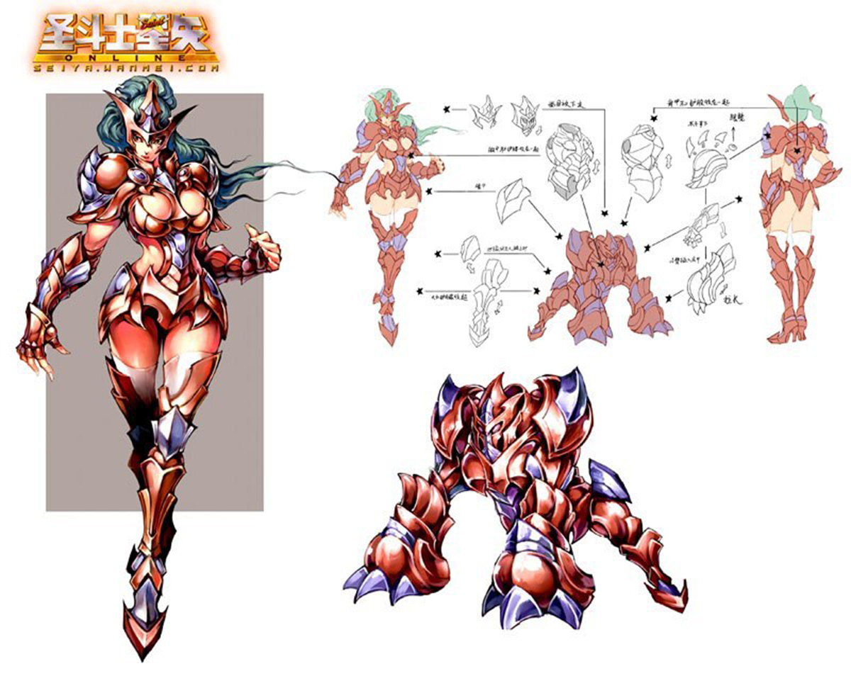
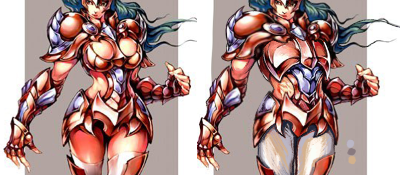
Saint Seiya Online SWITCHEROO Part 1: Armoring the ladies!
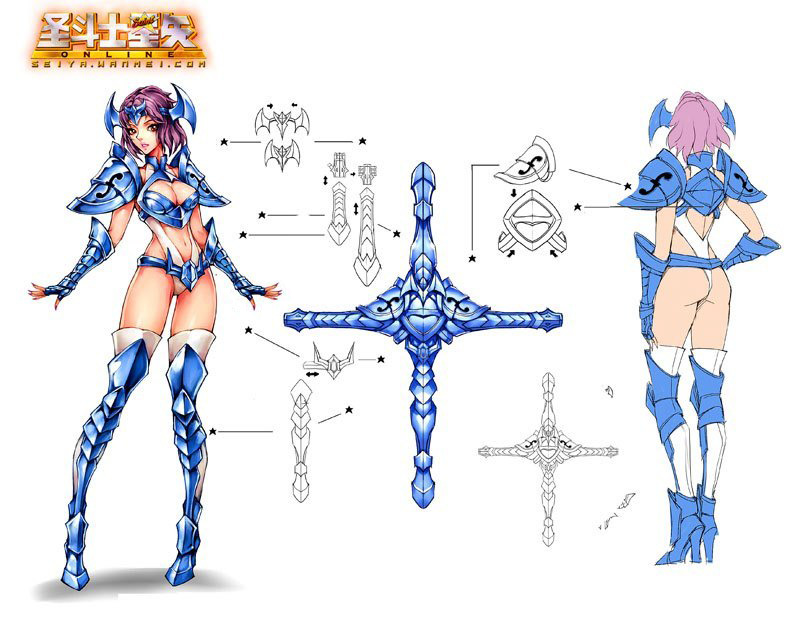
The idea is to take two gender disparate version of the same costume and make them equal to one another, by either basing male version on female’s or the other way round.
We concluded that Saint Seiya Online, which we bingoed twice since, is a perfect material to try this out on, as their concept art (credit to @saintseiya-zone for posting them!) includes most armors in both male and female version, which are basically always textbook examples of double standard in costume design.
Prepare for this being a double feature. Today we’re posting female knights equalized with their male counterparts. On Friday come the same male knights sexified to be as empowered as original forms of their female equivalents.
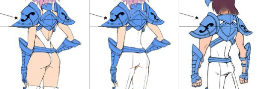
First thing I noticed about the blue-white knights is that since the dude one happens to be rather androgynous and strikes a flamboyant pose, designers doubled down on “feminizing” the lady one with pigeon-toed pose and super bingo-able version of the outfit. The two share very similar body type, so I concluded that pasting his parts onto her verbatim would work perfectly.
First thing to do was to give her his legs and right hand, so she can strike a power pose instead of generic dainty passive body language completely disparate from her male counterpart’s.
Then the task was relatively easy: paint over all those completely out of place holes in her outfit, give her waist a little more plausible girth and shrink her high heels to be exactly the same size as the guy’s.
It’s actually quite upsetting how the developers put in an active effort into ruining perfectly fine costume just to communicate that the lady version is different.
~Ozzie
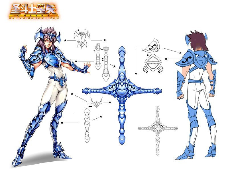
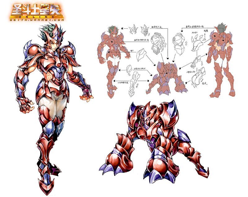
I will fully admit that I probably? cheated by cutting the red guy’s chest right off of him (misandry?) and pasting it onto the lady, but I have good reason! We so often see strong women characters who are supposed to have a more “masculine” muscled look, but it never actually gets to the part where they don’t have an hourglass figure with the same old narrow shoulders. (See Overwatch’s Zarya and her most narrow shoulders.) So I wanted this lady to be beefy as heck.
To me, it seems like the artists’ definition of “beefy” for women was just a bigger rack and thiccer hips, and that wasn’t doing it for me. I made her shoulders way wider, stole the guy’s entire torso, and narrowed her hips. You also can’t ever have too much biceps. There are women who look like this, believe it or not.
(A minor thing, but I shortened her nails as well.)
For people who may not like this one because she looks too much like a dude… sometimes people do look like that. And maybe the problem is with our definitions of “manly” and “girly.” Why even cisnormativity.
-Icy
Posted on
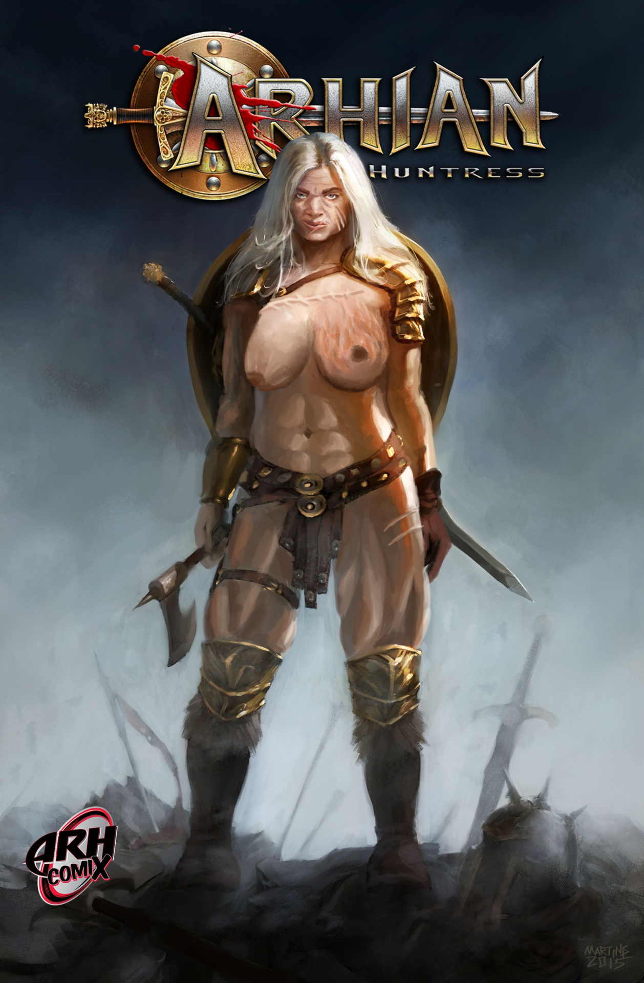
Actual Barbarian Women (NSFW)
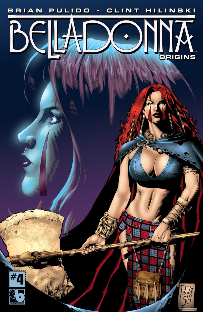
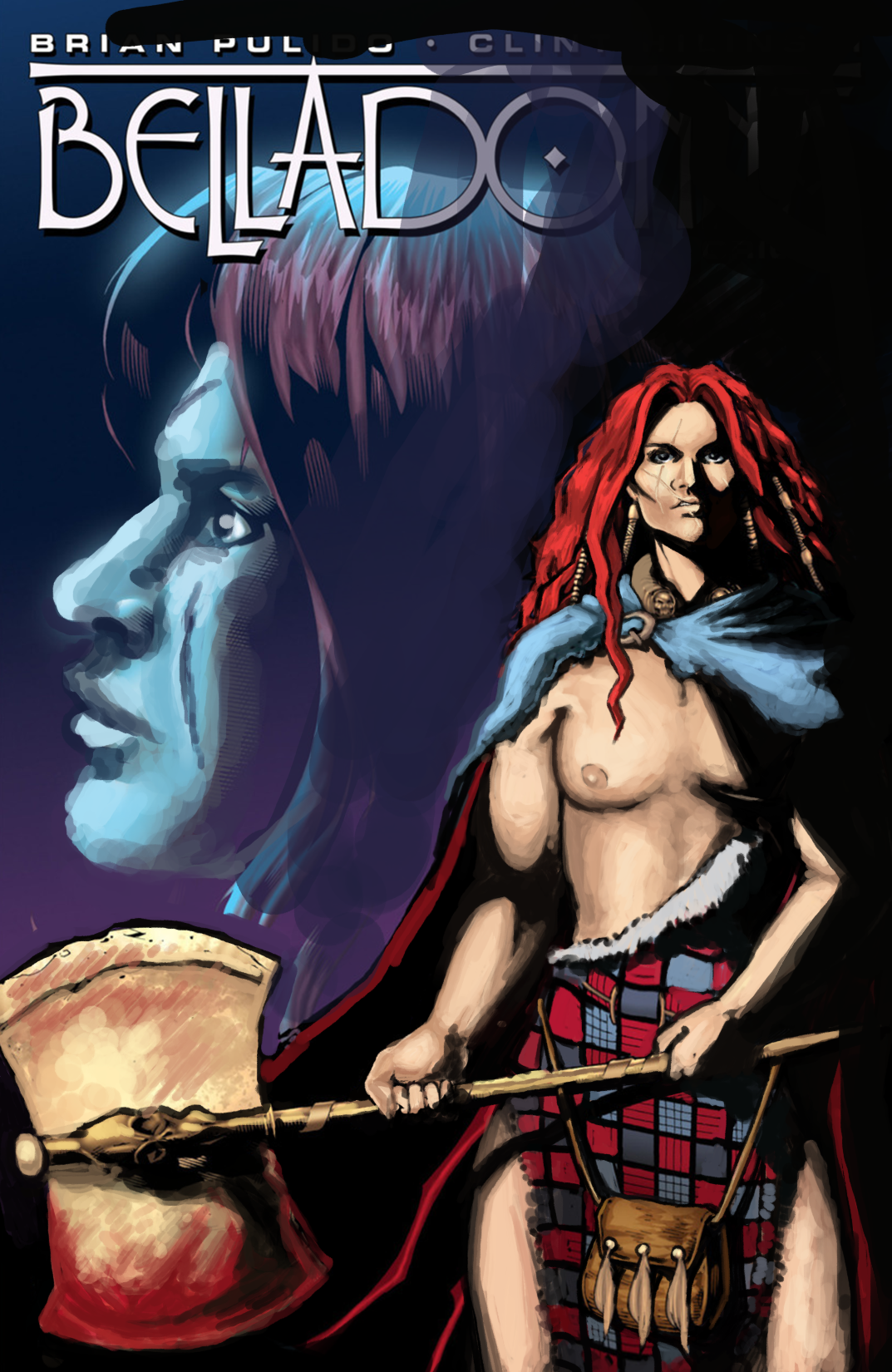
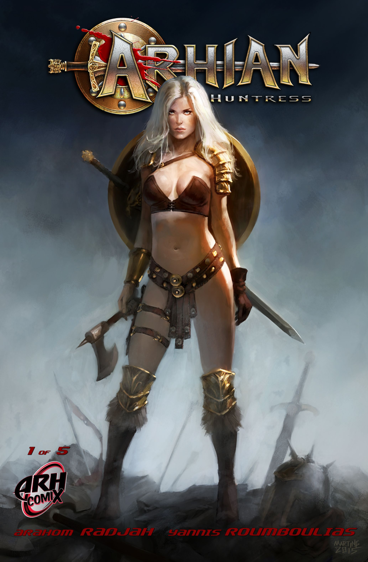
Seeing as how many “barbarian” ladies grace our blog, we thought we had a great opportunity to see the kinds of barbarian women we actually wanted to see; by drawing them ourselves! Here are our takes on 2 barbarian characters that appeared on BABD before: Belladonna and Arhian. It’s a shame we couldn’t redesign their names, honestly.
Belladonna
So the first thing that had to change was Bella’s boring, impassive face. I wanted her to be formidable, and I decided to play up the dramatic lighting that the cover artist tried to do, in a half-assed way. I removed her makeup and tried to make her look intimidating and experienced, overall, with the obligatory battle scars. I decided to play with the scars a bit, and so ended up giving her a slightly-disfiguring lip scar. Also, messy hair!
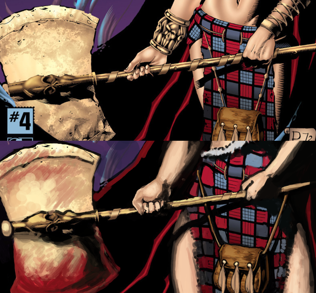
As for the rest of her, first thing was to get rid of her awful top. Her clothes in general seemed too manufactured-looking, so I ended up making her kilt into a more ripped and imperfect-looking garment.
I then gave her more muscle and an overall larger frame, and changed the way she was holding the axe, because her original hold on it looks like a nail polish ad pose. The thing doesn’t even look like it’s heavy in the original! Now it has blood on it, too, which was to add to the intimidation factor.
Her face in the background was like a 2-min afterthought I did at the very end cause it looked so goddamn boring. Overall, I’m very happy with the changes I did to her face and attire, though my rendering wasn’t as good as I wish it were now. I should have given her some body scars, too, but at least she has more stage presence on her own cover than none at all.
-Icy
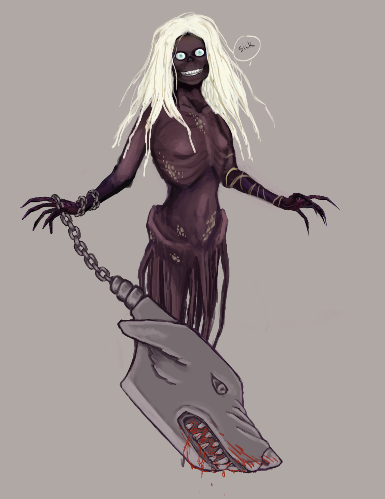
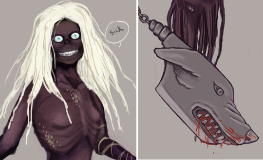
Arhian
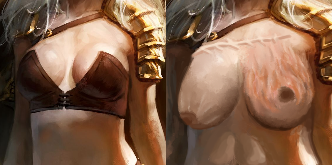
I decided to leave most of her skimpy costume as is, just getting rid of the physically impossible bra – Barbarians either go topless or wear something comfortable, not… this thing!
Her platinum, almost white hair inspired me to turn Arhian into a significantly older character. And in the Barbarian warrior’s life, with age come scars. Lots and lots of scars. Most prominent one is the big burn scar tissue on her left breast, which I referenced from real life. Perhaps a “gift” from a dragon?
Then there’s the giant stitch scar above her breasts and some cuts here and there, especially her face. Speaking of which, I made it my priority to give her unique facial features instead of the generic conventionally beautiful supermodel mug.
It’s by far my most satisfying face redo. I drastically changed the shape to be more squat and angular, with strong jawline. He original nose was a disproportionately small vestigial organ, so I have her a schnooze she can breathe through, and also made it broken, to match the scarred aesthetic. Then completed the look by getting rid of her makeup, undoing the obviously tweezed eyebrows, adding wrinkles and scars. I also changed her expression from vacant, vaguely “sultry” stare into a scowl of a veteran warrior.
As for her body, I just made it visibly more muscular, with prominent abs and thigh muscles. Her breasts are bigger in my version, as I wanted to present what time and gravity (and some scorching burns) actually do to the breast tissue. Nipples not only do exist, but they tend to point downwards the bigger the breast is! Also, boob stretch marks are a thing! Who knew?
All in all, I’m quite proud of that redesign. Hope you guys like it too!
-Ozzie
Posted on
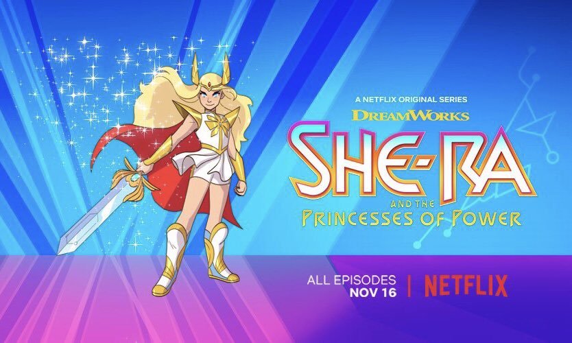
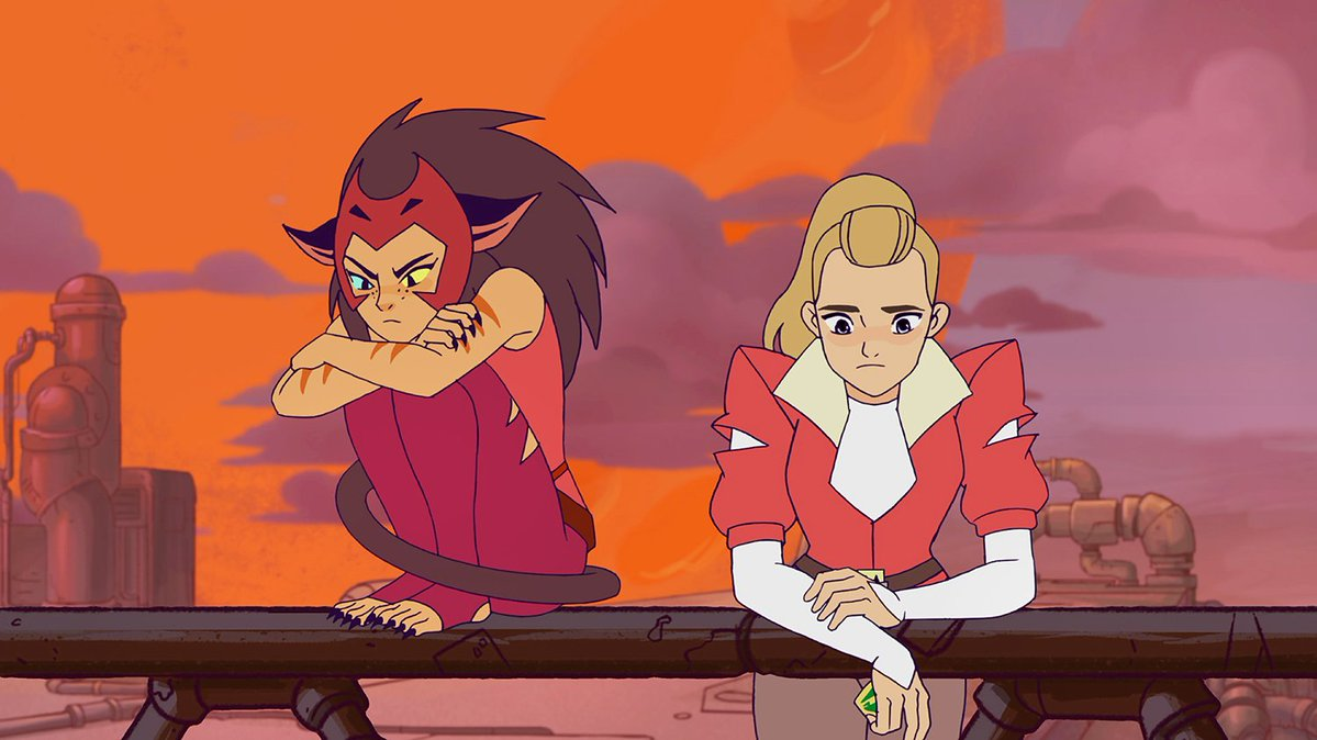
She-Ra Reboot
Something a lot of readers asked us to chime in on is the recently revealed artwork for rebooted She-Ra cartoon.
Considering the showrunner for it is Noelle Stevenson, aka @gingerhaze, the author of Nimona and co-creator of Lumberanes, and from whom we reblogged a couple times in the past, it’s quite safe to assume it will be much more interesting and diverse than the original’s “exactly like He-Man, except looks like a Barbie doll and rides a flying unicorn.”
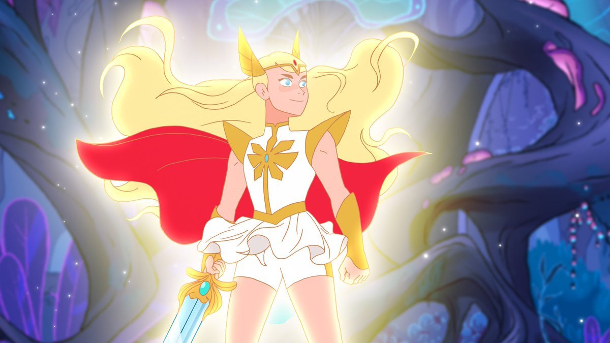
First off, judging from the EW interview, Stevenson intends to take full advantage of the heroine’s backstory, in which she was kidnapped and raised from infancy by the Evil Horde before she turns against them as She-Ra. That leaves a lot of story potential for internal conflict and development of relationship between princess Adora, her antagonists and friends (some of whom will likely be one and the same).
Second, and more relevant to BABD, her character design is pretty damn solid mix of stylized magical girl elements (long hair, barely any armoring) and some practical choices, like comfortable looking shoes, short pants under her tunic and breast piece without the original’s cleavage. This is what we mean when we say a warrior design can be feminine without being objectifying.
And yes, since we need to address the elephant in the room: there is a vocal minority of entitled manbabies crying that their childhood icon got snatched by the evil gay SJW agenda. That Adora/She-Ra, a teenager, is deliberately unsexyfied and that is bad because sexyness is totally what original show’s intended audience (young girls who wanted a He-Man’s feminine counterpart) liked about her. Not to mention allegations that the story is going to be “forcibly” turned into a queer narrative by the lesbian showrunner, which would be a bad thing, because…?
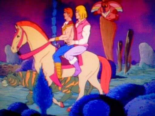
Here’s hoping that if this series catches on, then maybe a He-Man reboot comes next, this time turning all the gay undertones into overtones and angering dudebros even more.
That post about “attractive armor without bikini” actually left me wondering: why would you actually want an attractive armor? Sure, everyone loves an aesthethically pleasing armor, but we can’t just forget that armor is mostly made to be, well, intimidating. It’s supposed to make people both safer in combat and also more powerful. Not having to battle – because you look so threatening or even downright unbeatable – is some 40% of the purpose of an armor piece. Why does it need to be attractive?
But let’s set some things straight first: armor is done primarily to be protective. It sure helps if the design makes the wearer intimidating enough to make the opponents surrender right away, but at its core it was invented as a physical barrier between a person and whatever or whoever threatens their life or health.
That doesn’t mean there isn’t a place for decorative armor in the history. Highly ornamented muscle cuirass (male equivalent of boobplate) was designed to impress and worn by high-standing officers during non-battle special occasions, like parades.
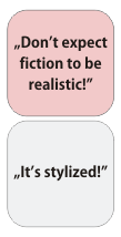
That said, in the world of fiction the distinction between purely functional and decorative armor is not necessary. It’s not real, and unless the setting of choice is gritty life-like naturalism, the armor (and any other design) needs just to be believable, not realistic. We commented on it before.
This is where those two bingo squares come in. Fictional worlds, especially the more fantastic ones, can be stylized, sometimes even to ridiculous degree, as long as all of the world is consistent with its level of stylization. That’s why it’s not inherently bad to have people fight monsters in G-strings… It just needs to all make sense within its own narrative and preferably not be gendered (which basically never happens).
Hope that answers it.
~Ozzie
Sometimes we make comments about how attractive a person looks in armor, because a lot of the time, their design is going for that. Unfortunately, the shorthand for that tends to be More Skin, High Heels, the usual offenders. But even if a character is designed to be attractive, that can be done without resorting to tired sexist tropes. And so we bring attention to it sometimes, when it’s done well.
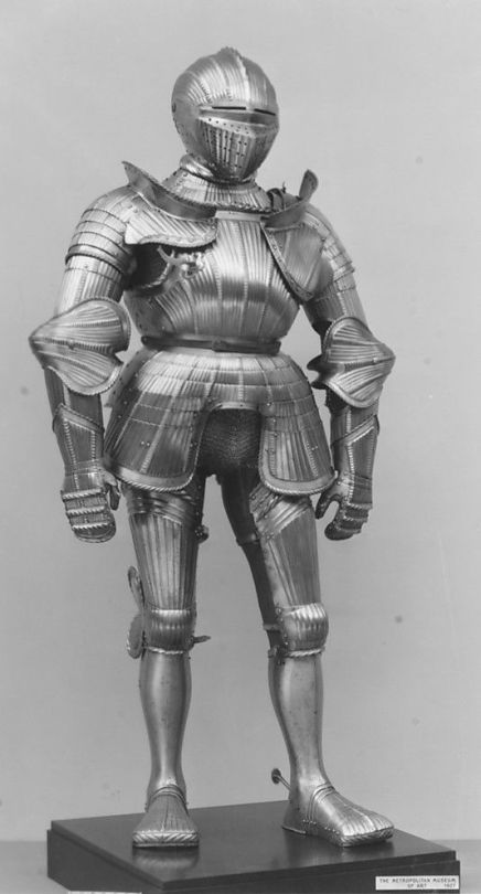
Historically speaking, a lot of European plate armor was quite ugly from a design perspective, actually.
Look at that silhouette, the tiny shapes everywhere, that scarecrow head-adjacent helmet, those duck feet. Beautiful.
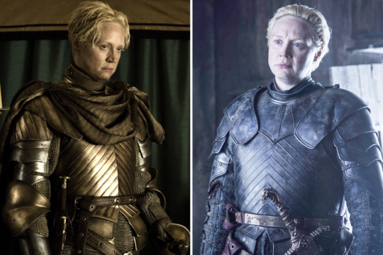
Compare that to any armor in Game of Thrones, which is functional, but is just so much nicer to look at.
As critics of art and design, we care more about seeing women’s designs being consistent (and good) in their universe, rather than having 100% Organic Free Range Realism. (Don’t worry though, we will continue to feature actual ladies in actual armor for positive examples.)
The thing about how women in comics used to be drawn and sometimes are still drawn, you can only really understand the difference between an action girl being forced into unrealistic sexual, sensual positions, and an actual strong and well posed, empowering but still sexy female character, when you see what it looks like to have male characters depicted in overtly sensual poses
And I’m not talking about the Hawkeye Initiative or any given parody
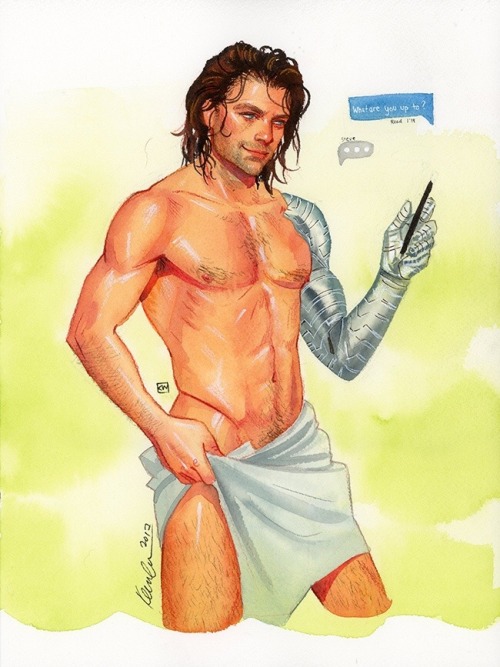
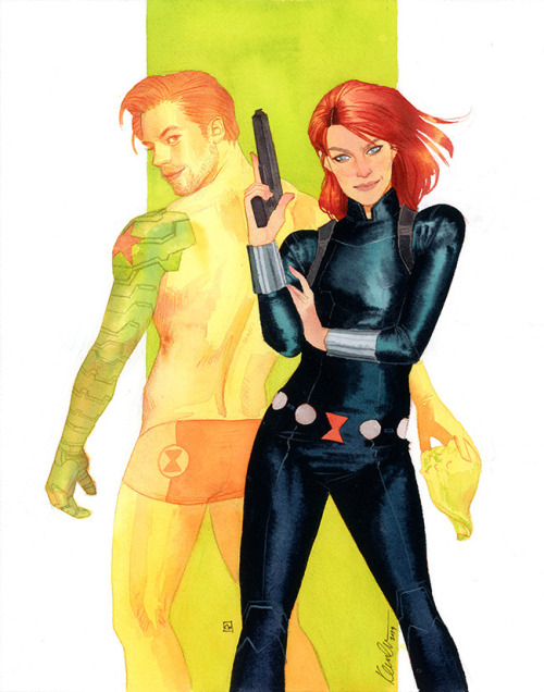
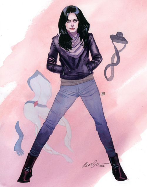
I actually want to draw a comparison using art by Kevin Wada
Kevin Wada is a proud part of the LGBTQ+ community and he has this unique ability to sexualize mainstream male heroes without it looking like a parody. He draws covers for multiple big comic companies and his style reminiscent of old fashion magazines, drawn largely in traditional watercolor, has made him a stalwart of the industry.
He also draws a lot of naked Bucky Barnes.
Anyway, I want to talk about how interesting his art is, the difference between his power poses and his sexy poses for male and female characters.
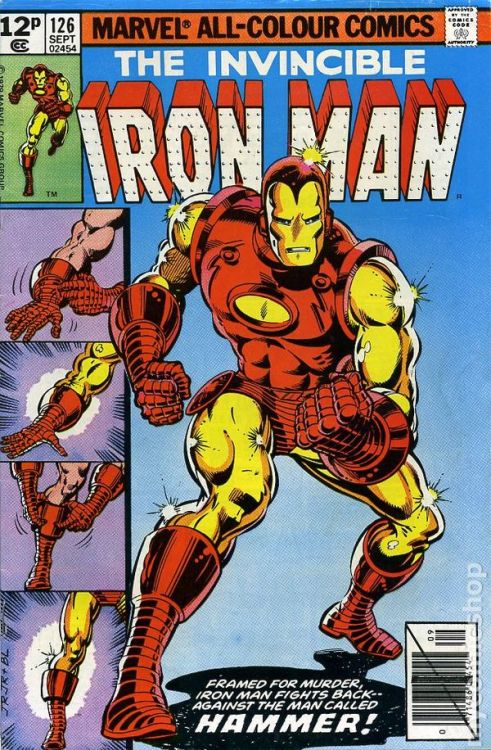
A typical power pose for a male comics character would look like this
Whereas every so often with female heroes you get something like this
Not all the time, of course, but it happens and it happens in the wrong places. You wouldn’t be posing like a cover model in the middle of a battle, you really wouldn’t.
But when it comes to Wada and male and female characters, the difference is pretty clear.
When he draws male characters, they more often look like this
Sensual, in a pose you wouldn’t usually see a big, muscular hero doing. If not that, then playful, sexy, for looking at, but nothing about their anatomy overly exaggerated
How he draws women is also very clearly different from many other artists, from sexy pose to power pose.
Still posing for the camera, still to be looked at, but very, very different from how we’ve seen female characters portrayed in mainstream comics in the past.
And I guess it’s really just a matter of variety? Objectification in art is a long time debate and appears everywhere always, but for all that we can argue about its impact on popular media, there are a few things I know for sure:
1) having a female character pose like a playboy cover girl in the middle of a battle scene is just Bad Art and y’all need to find better references
2) female power poses will never look quite as right as when they’re drawn by people who know the value of expressing personality through pose (it’s basic animation principles and some artists still need to learn it) and who actually know what a female character’s personality beyond “sexy”
3) Iron Man or Batman posing like they’re about to beat somebody up is 100% not the same as a fashion drawing by Kevin Wada where a Typical Beefy Action Guy gets to pose like a flirty pretty boy
4) the MCU films have figured out the value of pandering to female audiences by sexually objectifying all their male action heroes while simultaneously appealing to the male demographic’s action movie power fantasy. Quoting Chris Hemsworth and Taika Waititi: “I’m not a piece of meat” “Uh, yes you are.”
They definitely struck some kind of balance there.
Also, more important than this entire post: y’all should follow @kevinwada on Tumblr and give him love because his art is divine and his talent beyond words
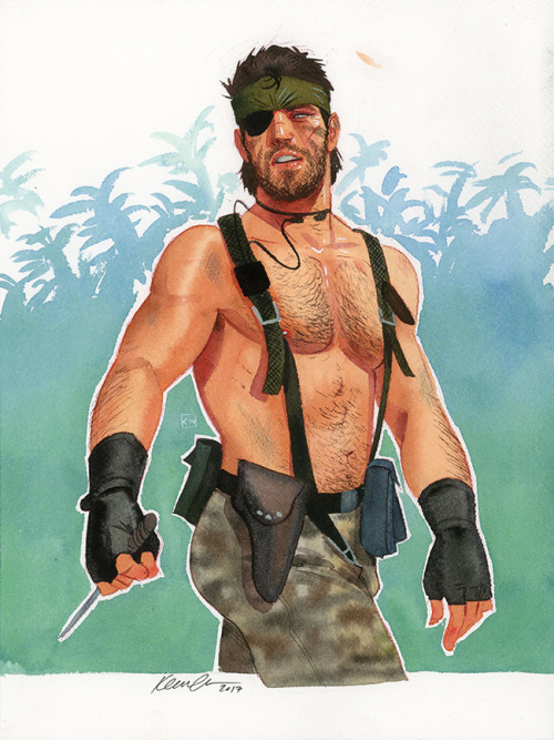
We featured @kevinwada‘s Naked Snake last year and mentioned (as a couple times before) that if you really want to see the principles male gaze applied unironically to masculine characters, you gotta find pinup done by a male artist who’s into men. And Wada’s artwork is a great proof of that, without resorting to pandering exaggerations (which belong more to parody art).
~Ozzie
Posted on
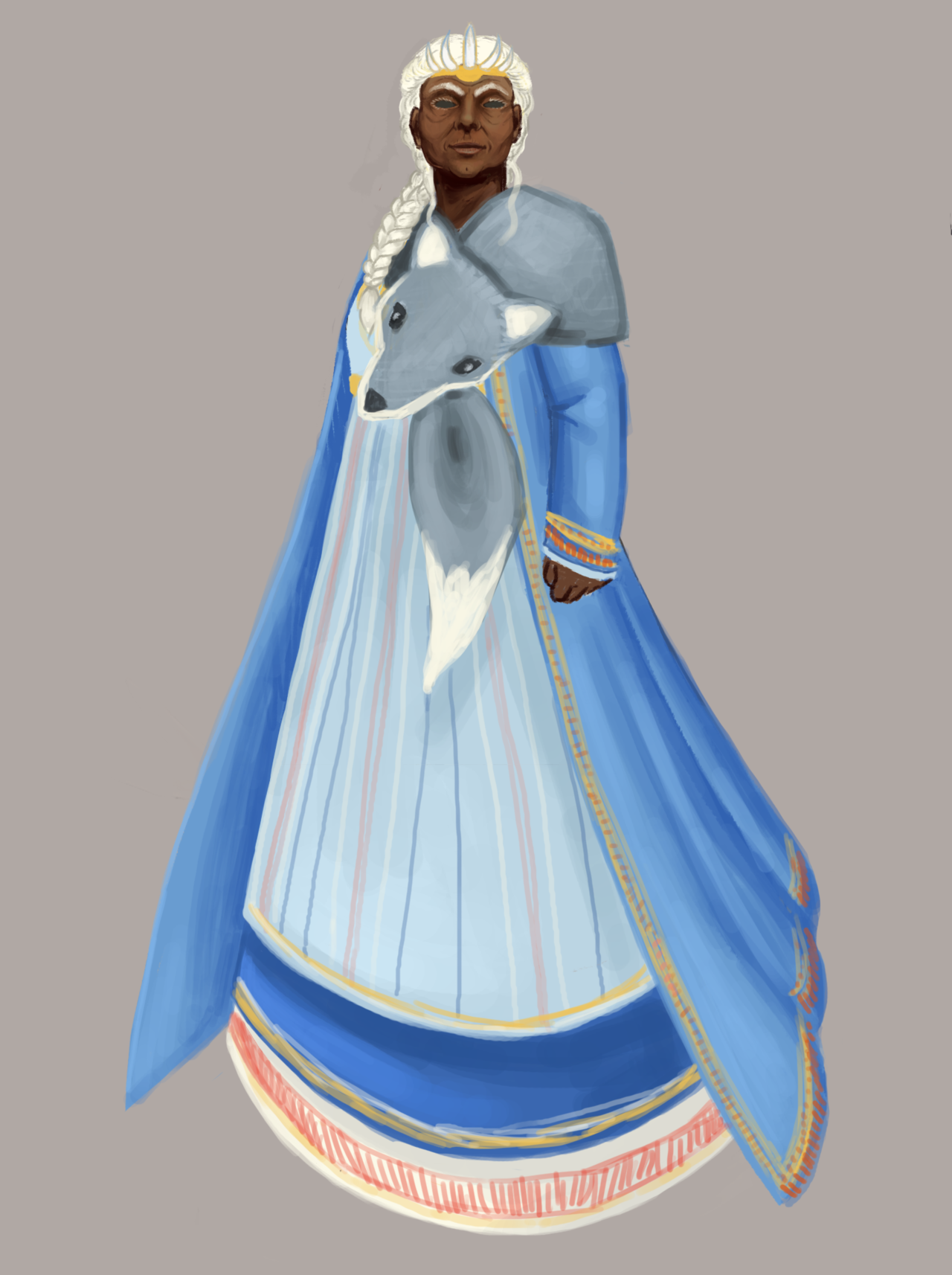
Hel Hath No Fury
From one Hel to another, this week. This particular one is from SMITE, which is a game that lets you play as various deities from different pantheons. This was their interpretation of Hel, who they split into 2 forms instead of keeping to the original mythology, where she was a person who had 2 different-looking halves. Ok, fine. But could they not have made her just a generic white woman? Twice?
So that was my main beef with the original, besides the nonsensical clothes: the lack of any connection to her Norse roots, and her original myth. To briefly describe her game mechanics, which I was also considering while redesigning her: White Bread is a healer/support, and the Jelly Sandwich is a debuffer and does some over-time damage. The player’s able to switch back and forth between them.
In that vein, I decided to make Vanilla Wafer and Blueberry Tart into Old Woman Healer and Undead Monstrosity, respectively.
[Warning: There’s a close-up of her corpse face below the Read More!]
I was sent some lovely reference pictures of traditional Norse clothing, which I used to build the warm, functional clothing for the Old Lady half. I went with a color scheme that would evoke the frosty conditions of Niflheim, the place where her domain was located.
She floats in the game, so I was able to get away with impractically-long skirts.
I also made her a woman of color, because why not? Honestly, the sheer Whiteness of the original just had to change.
The scarf is her dog, Garmr. Since this is her healing half, the dog is nonthreatening (even though I used a wolf scarf for reference, shh).
For her debuffing half, I just took the idea of the fact that in the original myth, half her body looked like a corpse, and went all out with it. And like a corpse, she’s got no tits, cause fatty tissue is the first to go in the decomposing process.
Since she floats, she didn’t need the legs, and the dog becomes an angry knife inspired by traditional Norse knives. In-game, it would be mostly the animated knife that would attack. Over-time damage can be flavored as bleeding from a bite, stuff like that.
So that’s my Hel. I had a lot of fun working on her, especially because we don’t get to work with older ladies a lot, and I got to use a lot of cool references.
Ozzie just gave me the idea of giving each version one eye, since the corpse has 2 and the old lady doesn’t, which would have been a cool idea.
Now if only SMITE would remove their depictions of Hindu dieties, but that’s a rant for another day.
-Icy
Posted on
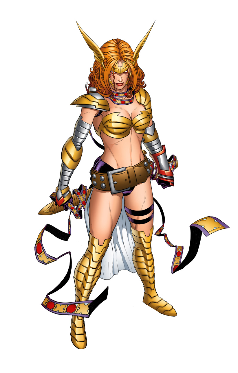
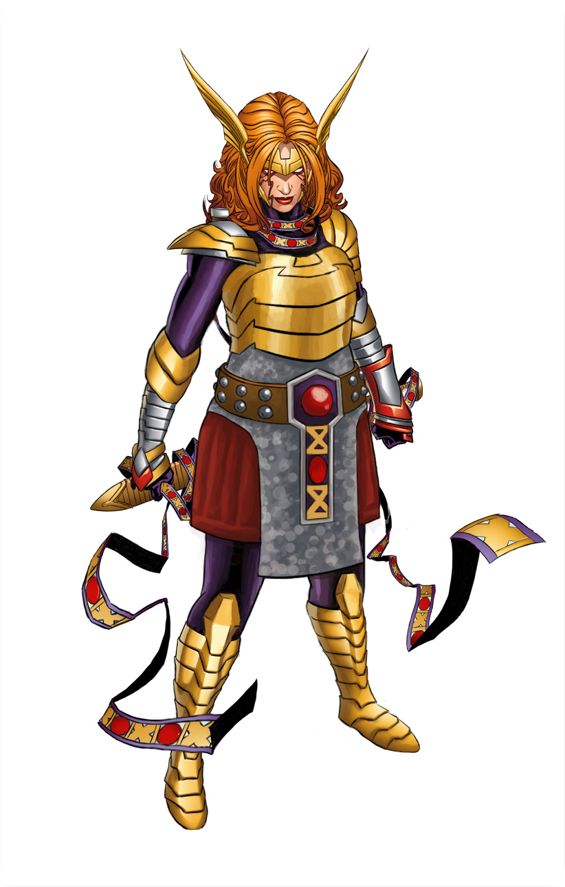
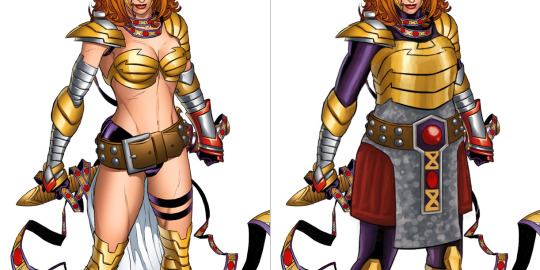
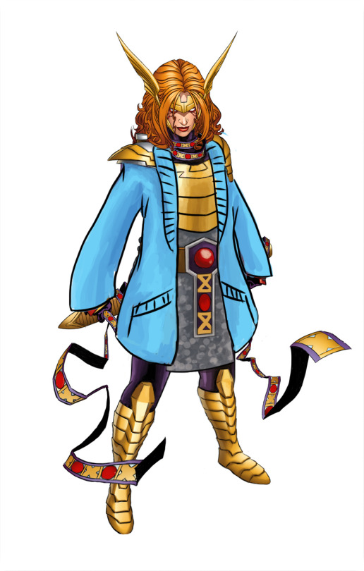
Angela and the layered armor (+ a cozy cardigan)
Marvel’s Angela redesign is still one of the favorite ones I streamed.
Maybe one day we’ll get to stream fixing that winged monstrosity.
Back to the redesign, tho: My priority, given that now she’s an Asgaardian warrior, was giving Angela actual armor, with lots of layering. She got some undershirt and pants, gambeson and mail tunic (painted vaguely, so it can be either chainmail or scalemail), then on top of that a believable breastplate instead of two half-spheres that barely connect at her sternum.
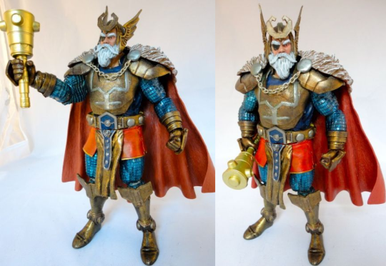
I disliked her generic huge belt design, so looking for inspiration in costumes of her father, Odin, I found this custom figure with really cool belt (unfortunately, source ungooglable):
So I based Angela’s belt buckle on his, as well as on the pattern from her magical ribbon thingie. Now that I look at it, I might have also taken some shape and color cues for her breastplate and gambeson tassetts from Odin.
Other little details: got rid of the pointless butt cape, made shoes not go thigh-high (how is she supposed to bend knees in metal thigh-highs anyway?) and gave her stockier built.
I’m really satisfied with that color scheme. What’s funny is that it was already there. Each color I used was sampled from some minuscule part of her costume that was drowning in the sea of dominating gold and flesh tones.
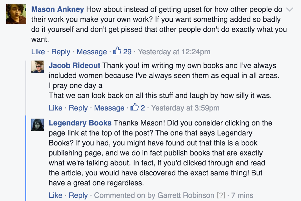
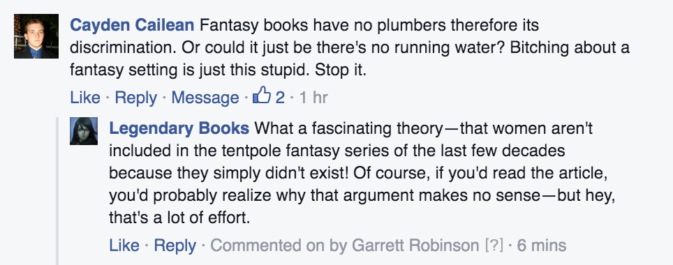
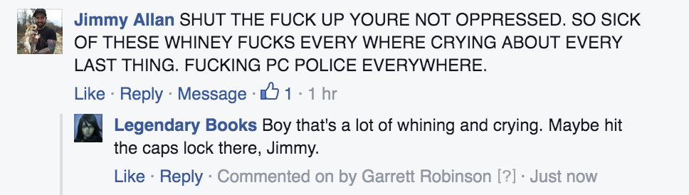
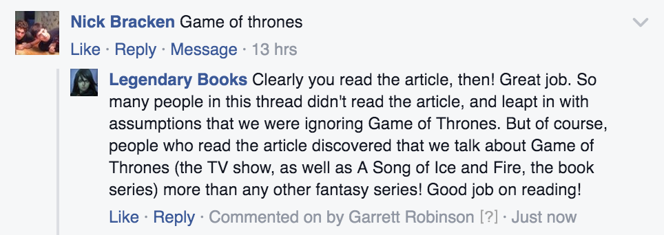
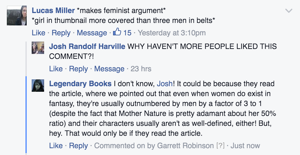
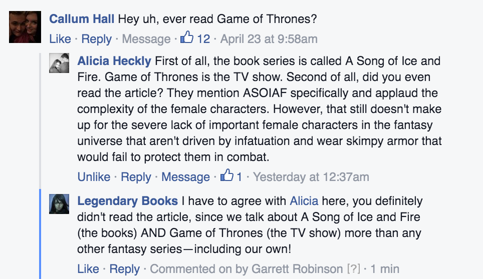
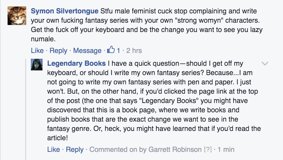
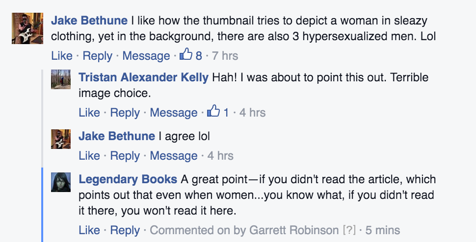
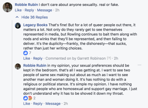
Time to bring back this awesome article, its amusingly ignorant backlash and A+
responses
to detractors from @garrettauthor (the OP), as the saga of snark continues… This time against some dude who “doesn’t care” about sexuality of fantasy book characters. Who indeed cares so little that he needs to openly inform a publisher how they shouldn’t advertise their books for having LGBTQ+ themes.
[more context and excepts from that Facebook thread under this link]
Also, if you’re interested in getting the first novel in Garret Robinson’s Underrealm series as a free e-book, here’s the link!