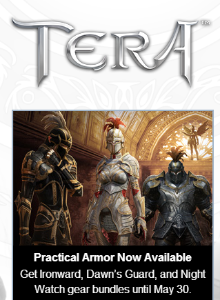
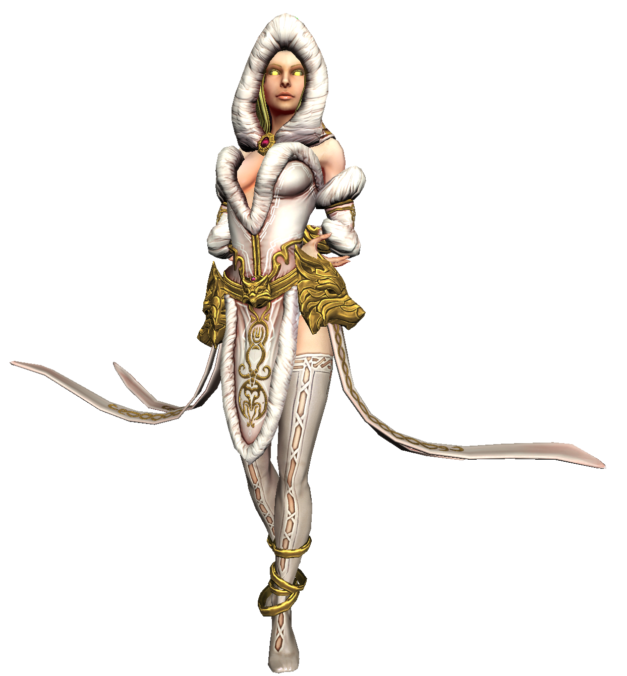
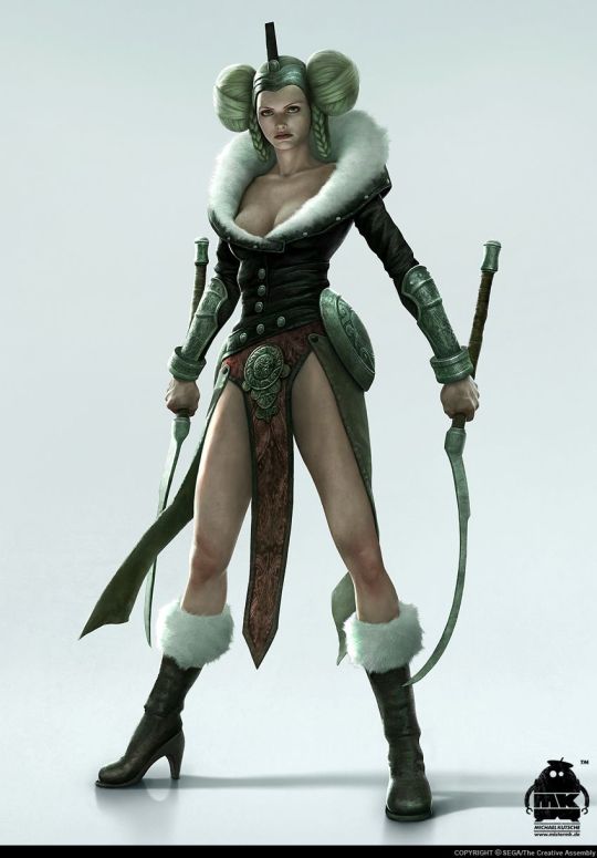
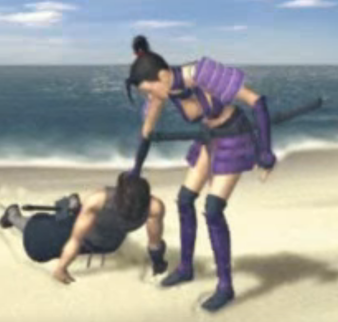
Whoah. The absurd of Tera, the universal example of logic-defying female battle outfits, advertising itself to have “practical armor”… that is skin-tight and boobsock-y on women leaves me astonished.
This armor is so totally practical that even Erik Larsen, the devoted anti-practicality in women’s costumes guy, probably wouldn’t mind it.
Dear Tera’s Creepy Maketing Guy: Just because boobplate and figure-hugging metal cover more than what you usually call “armor”, it doesn’t mean you should label it as “practical”.
~Ozzie
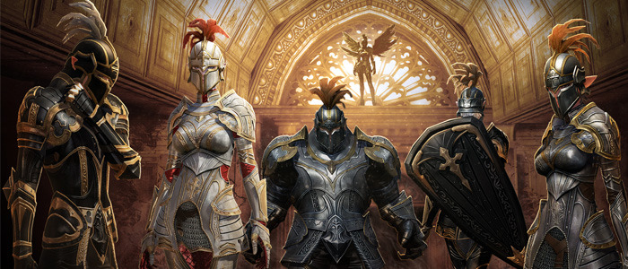
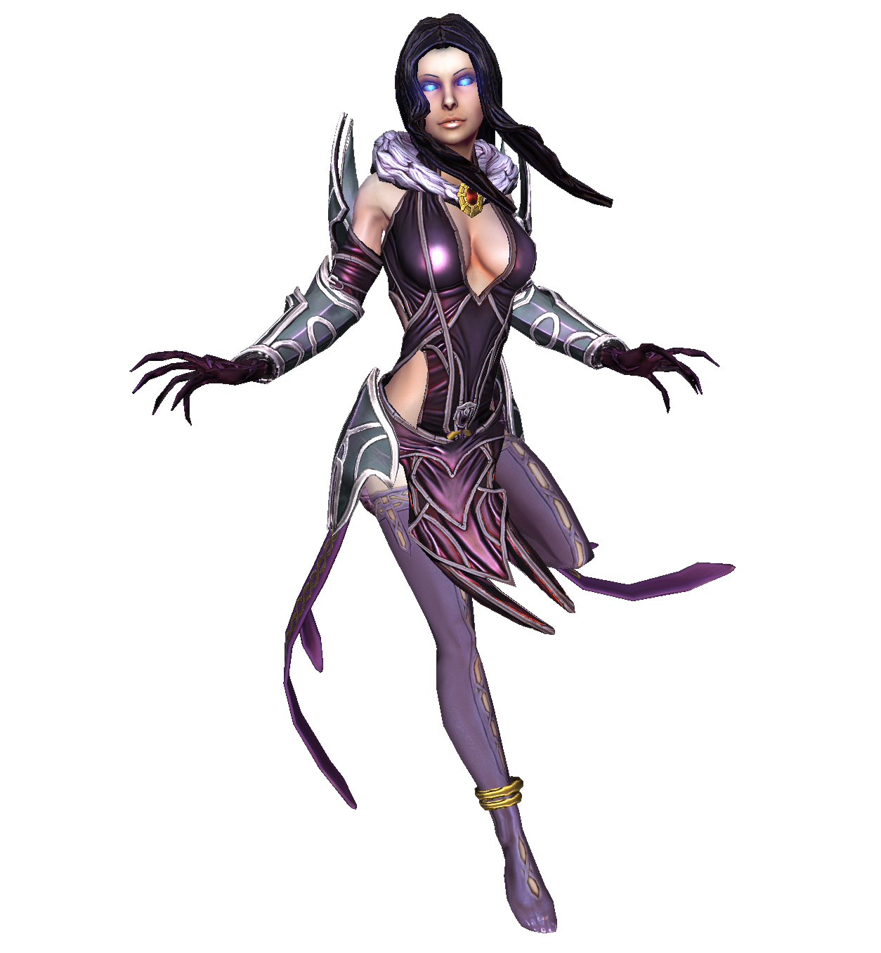
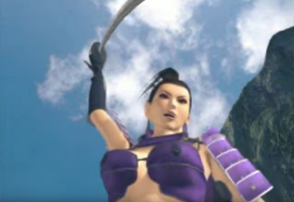
I feel it’s time to bring this back, not just because laughing at Tera’s idea of quality armor never gets old, there’s a funny thing I noticed. I feel like I’ve seen this… somewhere recently…
Yes to everyone assuring us that Blizzard is really trying… we have confirmation they are trying about as hard as Tera was last year.
From one Hel to another, this week. This particular one is from SMITE, which is a game that lets you play as various deities from different pantheons. This was their interpretation of Hel, who they split into 2 forms instead of keeping to the original mythology, where she was a person who had 2 different-looking halves. Ok, fine. But could they not have made her just a generic white woman? Twice?
So that was my main beef with the original, besides the nonsensical clothes: the lack of any connection to her Norse roots, and her original myth. To briefly describe her game mechanics, which I was also considering while redesigning her: White Bread is a healer/support, and the Jelly Sandwich is a debuffer and does some over-time damage. The player’s able to switch back and forth between them.
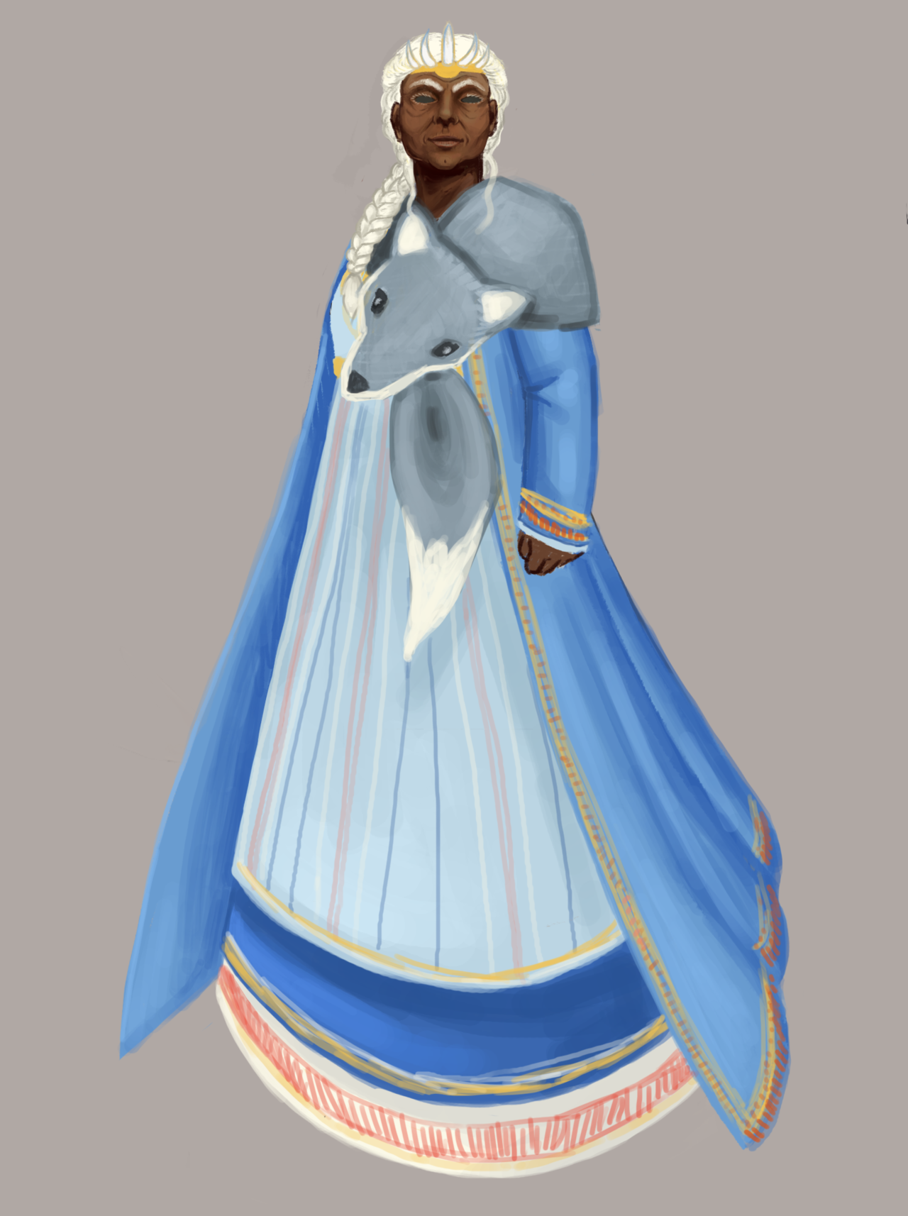
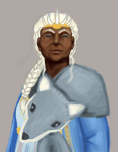
In that vein, I decided to make Vanilla Wafer and Blueberry Tart into Old Woman Healer and Undead Monstrosity, respectively.
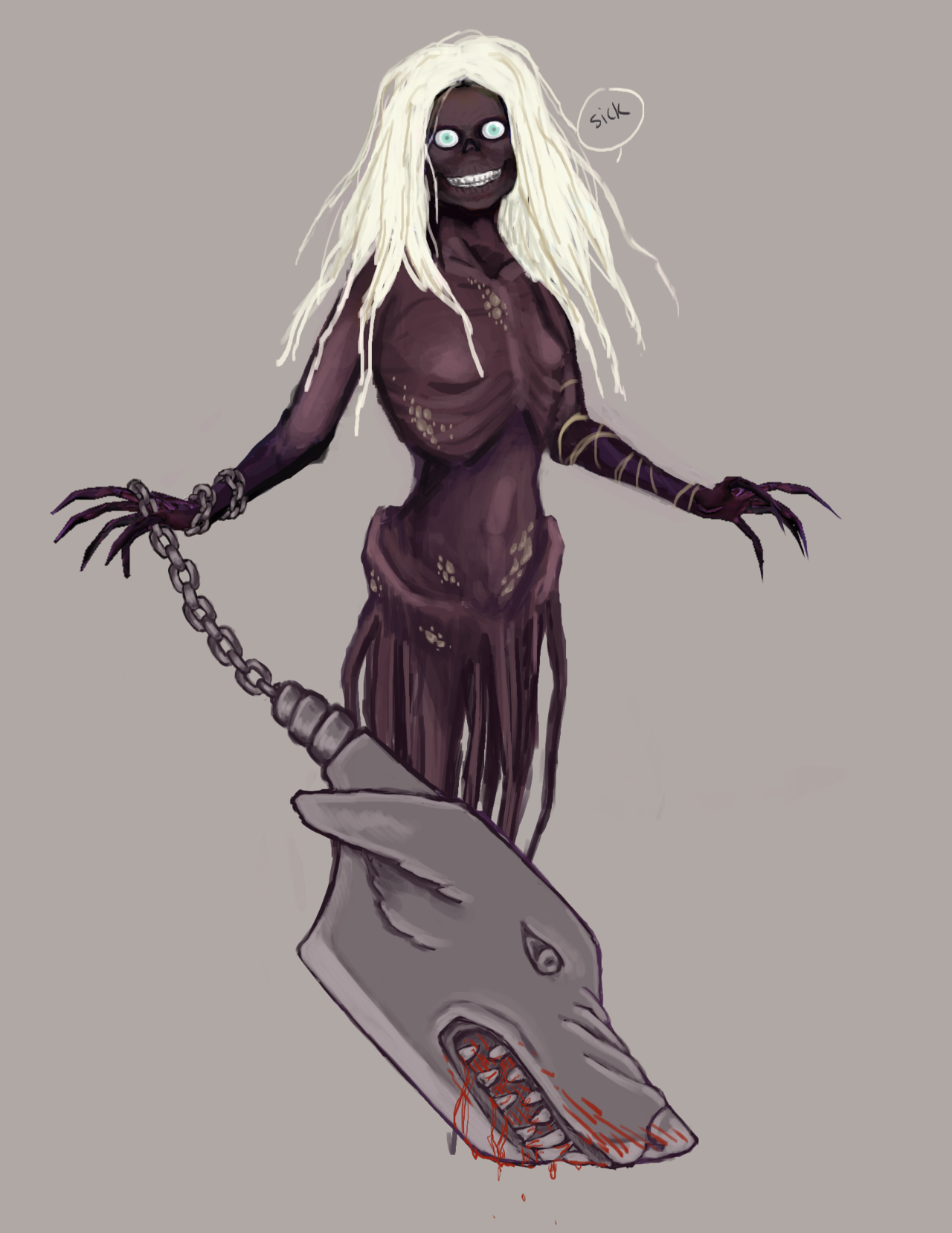
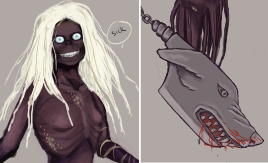
[Warning: There’s a close-up of her corpse face below the Read More!]
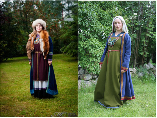
I was sent some lovely reference pictures of traditional Norse clothing, which I used to build the warm, functional clothing for the Old Lady half. I went with a color scheme that would evoke the frosty conditions of Niflheim, the place where her domain was located.
She floats in the game, so I was able to get away with impractically-long skirts.
I also made her a woman of color, because why not? Honestly, the sheer Whiteness of the original just had to change.
The scarf is her dog, Garmr. Since this is her healing half, the dog is nonthreatening (even though I used a wolf scarf for reference, shh).
For her debuffing half, I just took the idea of the fact that in the original myth, half her body looked like a corpse, and went all out with it. And like a corpse, she’s got no tits, cause fatty tissue is the first to go in the decomposing process.
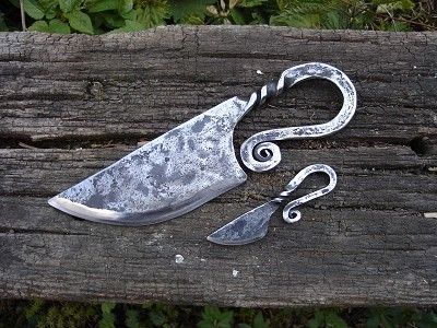
Since she floats, she didn’t need the legs, and the dog becomes an angry knife inspired by traditional Norse knives. In-game, it would be mostly the animated knife that would attack. Over-time damage can be flavored as bleeding from a bite, stuff like that.
So that’s my Hel. I had a lot of fun working on her, especially because we don’t get to work with older ladies a lot, and I got to use a lot of cool references.
Ozzie just gave me the idea of giving each version one eye, since the corpse has 2 and the old lady doesn’t, which would have been a cool idea.
Now if only SMITE would remove their depictions of Hindu dieties, but that’s a rant for another day.
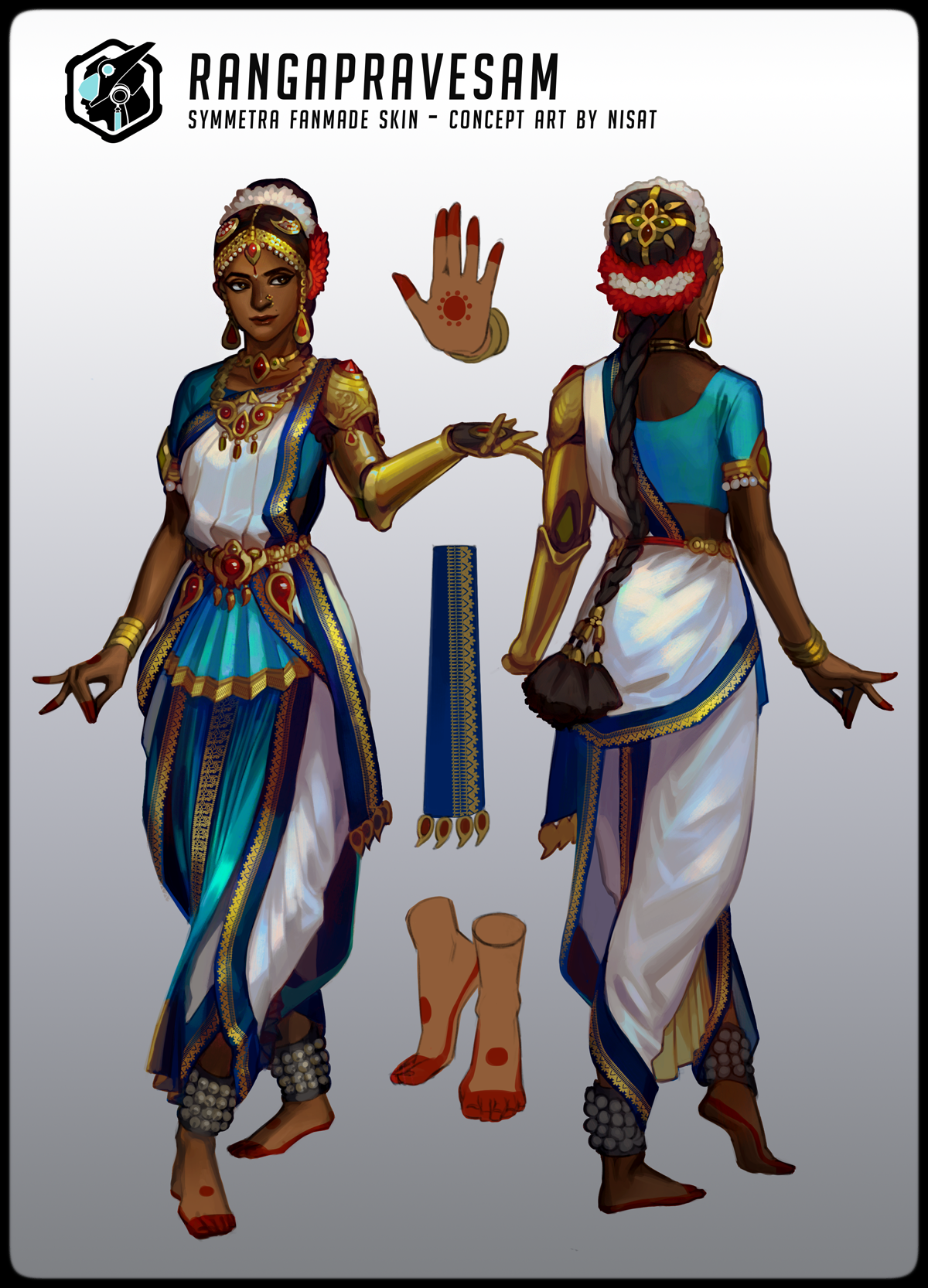
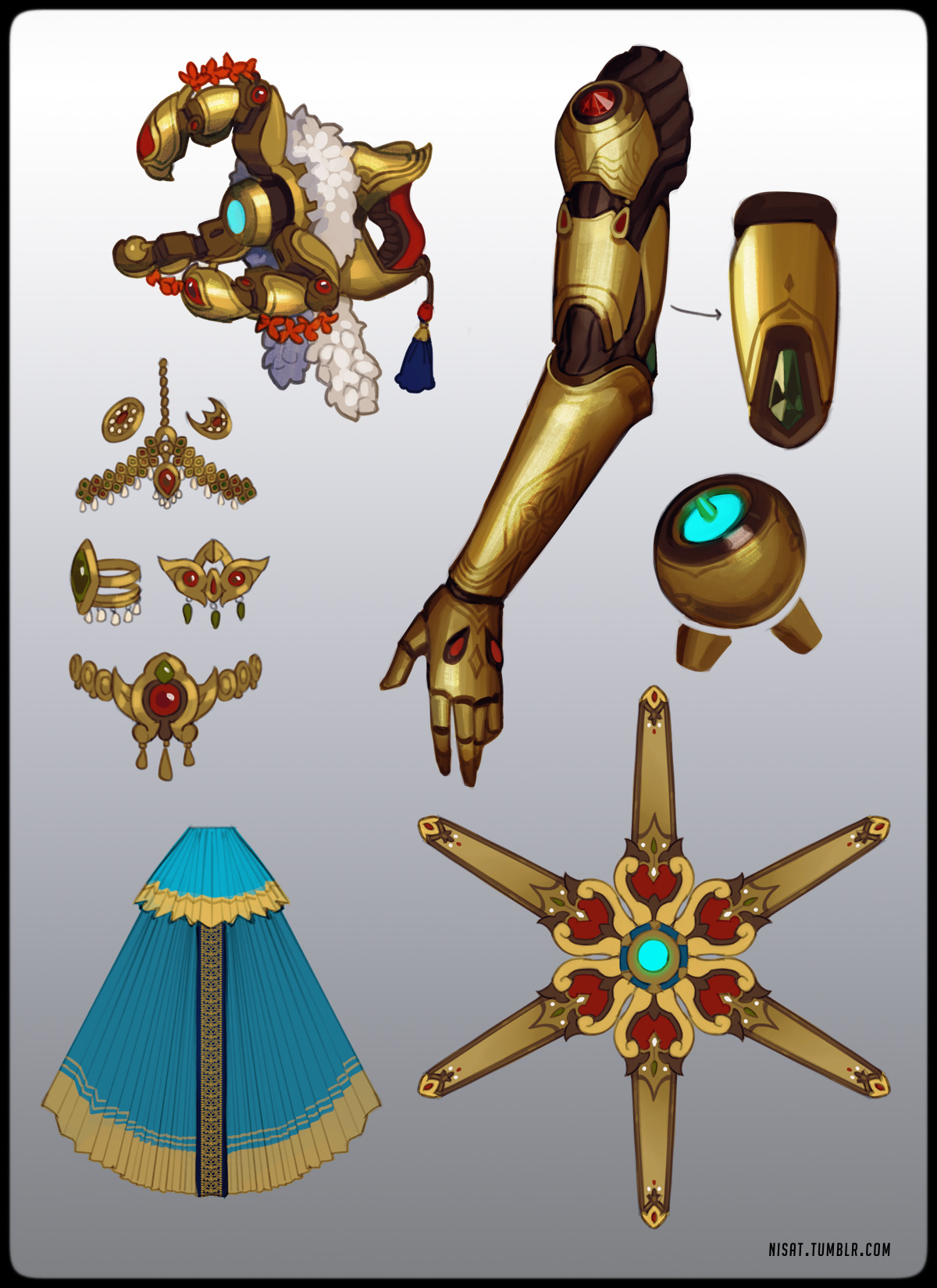
This is truly fantastic not only for the authentic touch of the culture, but also for the excellent choice of a dancer outfit for a character who has elegant dancing sequences as her emotes. This is really the sort of thing I’d hope to see in a game as touted for diversity as Overwatch is.
I really do wish that Jeff Kaplan would look to these kinds of designs and priorities for his goal of “trying to do women characters better” rather than looking for ways to make their previous design standards seem more acceptable under casual examination.
– wincenworks
Posted on
This design comes from a game about Norse mythology. I challenge you, our readers, to take a guess at which character from Norse mythology this is. I’ll wait.
Did you say Hel, who is the villain of the game Viking: Battle for Asgard? If you did, you must have read our post about Foldable HumanDan Olson looking into So Bad They’re Good games from a few months back. Because that awfully specific answer is indeed correct…. unfortunately.
I can’t even comprehend what the art direction was for this concept. What in the Hel (ha) is this? I was only able to find this single promo picture where the full glory of this design is shown, which I can only assume is because if she stands in any other way, that belt bra will slip off.
But let’s also not forget Freya, who also makes an appearance in the game!
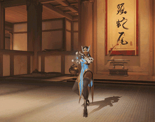
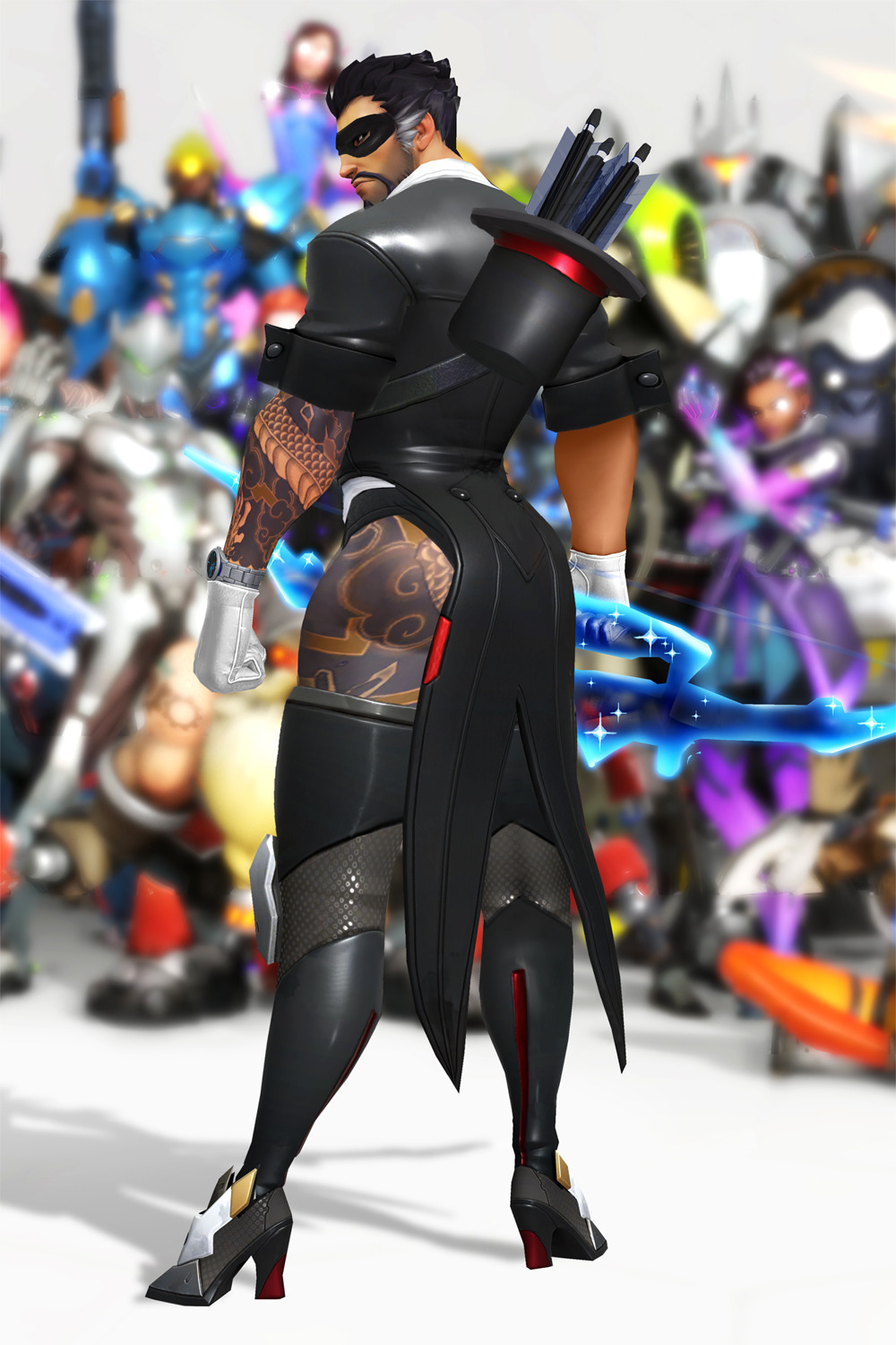
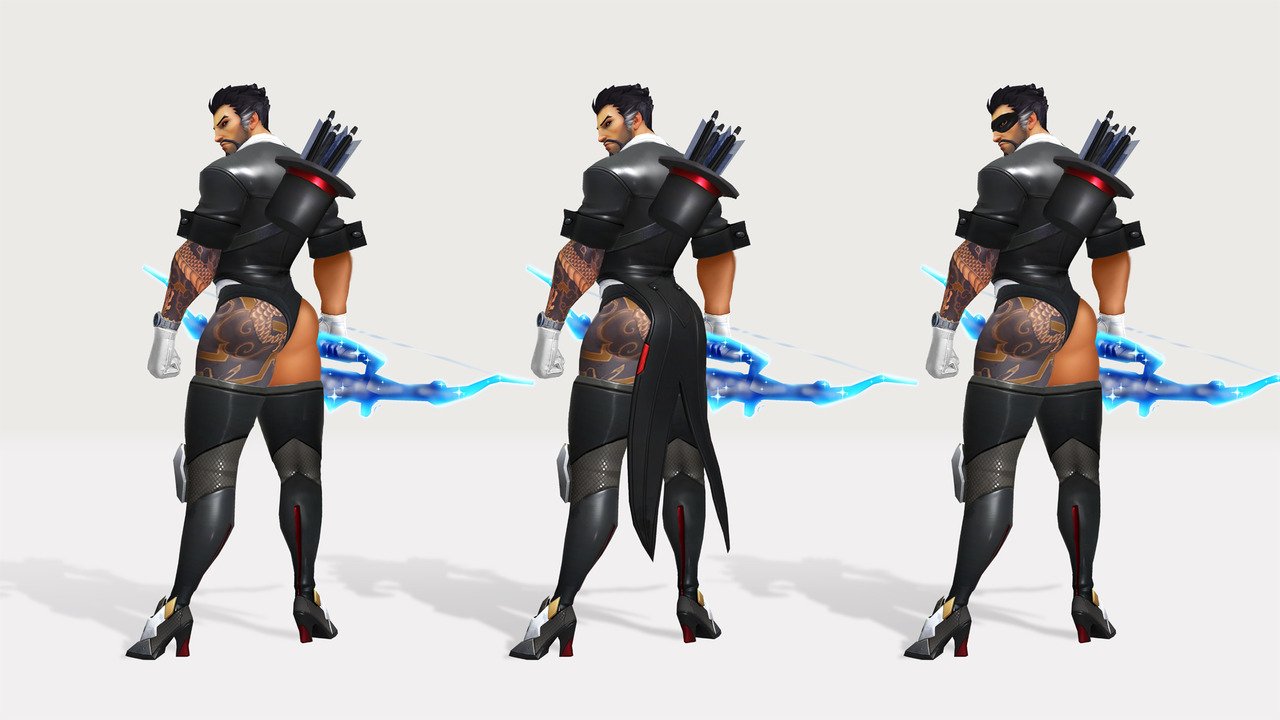
Every year, Hanzo bypasses the bodyguards of Hanamura to visit Shimada Castle, employing all manner of tactics, combat, and costumes.
Storm Arrows take the shape of rabbits.
Dragonstrike is now Rabbitstrike.
There isn’t a single thing I don’t love about this concept: The quiver that’s too short because it’s ~magic~, the tattoo going up his entire leg, the raw magic bow, the little mask.
We all know that Hanzo is a ranged combatant, so he doesn’t need to wear actual protective clothing. Indeed, those shoes probably help him be stealthier! And if someone does find him and tries to initiate in melee, he’s got the distraction tactic all ready to go with those buns. It’s perfect.
Blizzard really missed a golden opportunity with the magician skin idea. I am conflicted about one thing though…. which skin of the bottom 3 is my favorite!! How am I supposed to choose?
-Icy
Posted on
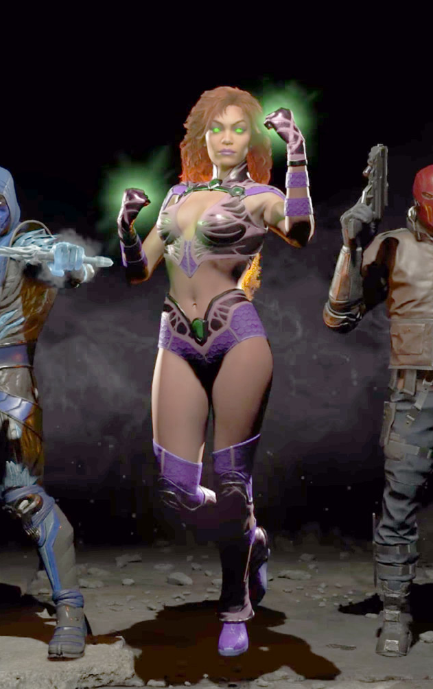
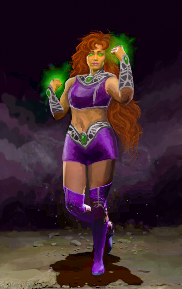
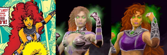
Starfire and the Legend of Murky Colors
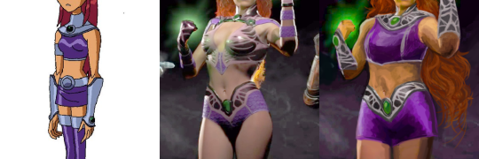
Injustice 2′sStarfire was a challenge with very little potential, so I mostly redid her from scratch, arriving at a mix of her 2000s cartoon outfit and 80s comics hair.
This was by far the hardest design to work with palette-wise, considering not only how desaturated colors in Injustice graphics are, but how outright low quality the official image is – it looks like something’s wrong with how they rendered the lightning! Muted colors were a double insult, considering Starfire’s vibrant color scheme corresponds with her vibrant personality. Did my best to recreate it by cranking up saturation, salvaging the few colors it did bring out and painting over the badly-lit parts with them.
Changed her bodypaint-bikini into a crop top and shorts (with all do respect to Glen Murakami’s cartoon Starfire design, flying in a skirt is just the worst idea).
Only part of her Injustice design worth salvaging were decorative bits on her belt, which I recolored silver and recreated the pattern on her new collar and arm guards to match. Painted her limp, lifeless hair to actually look fiery without even being made of flame – by simply basing them on her original New Teen Titans hairstyle.
Got rid of those weird bellbottom things on her ankles, which served no purpose and seemed like a throwback to her ugly New 52 footwear. Also, as usual, made her less skinny.
All in all not necessarily my best or most original redesign, but it’s best I could do with limited time, constant computer crashes and very hard material to work off of.
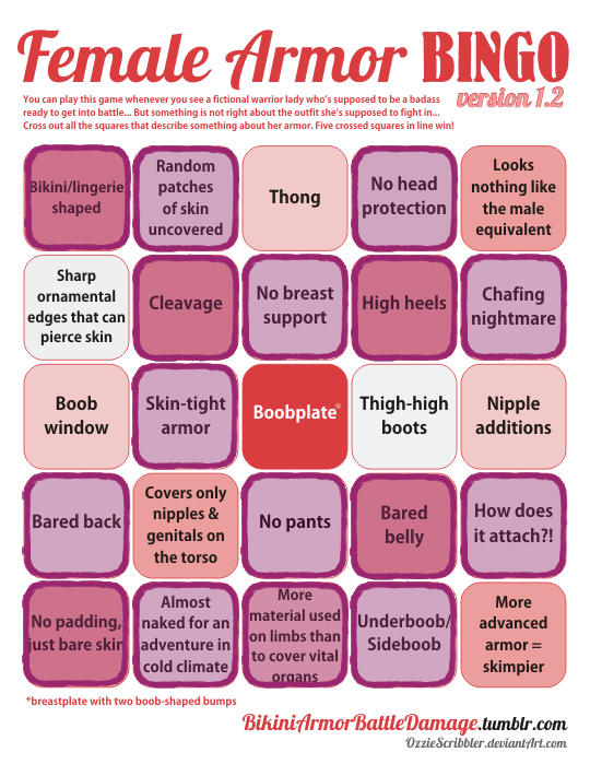
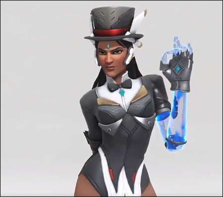
And on today’s episode of Doing Women Better™, Blizzard finally granted us the much requested Magician Symmetra. Only instead of going for something super classy like the many fan interpretations out there or even just ladies in suits from real life, they went with…this.
Lack of pants and framing her bust (what is even with those metal plates) aside, the fact that this is a legendary skin and costs 3000 credits when it’s so close to her default skin makes this whole thing very disappointing.
Thanks for submitting this highly requested post, including some quality scathing commentary! The Saga of Pantless Symmetra continues.
This would be insulting enough just by the virtue of being a fetishy leotard instead of a suit, but what the hell are those boob-holder bars?! They’re some sort of garbage afterthought slapped on to make this look more “sci-fi”, I guess? Why would a costume need that? Because you can’t be science fiction without framing the tits with random pieces of metal?
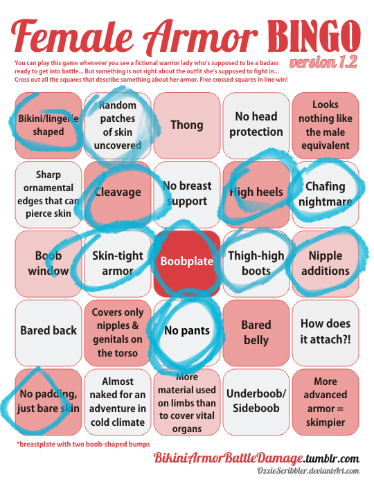
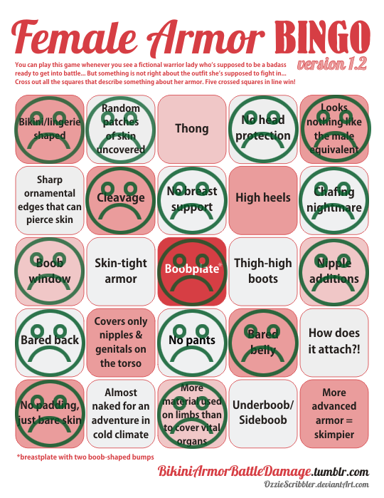
Since the bingo lacks a “What the fuck am I looking at?!” square, I marked “Boobplate” instead.
Fun fact: a convention I attended last week had an Overwatch: Character design done right! talk that I just couldn’t subject myself to come to, both out of the fear of my brain melting on sight and because I didn’t want to rain on some enthusiastic fan’s parade when the time for Q&A comes.
I’m still amused that at the same time Blizzard made THIS, easily disproving the “character designdone right” claim.
I decided to do a redesign of the oracle Seris from Paladins basically 5 minutes after I first saw her design. It was just so… disjointed. The leather top, the pointless belts, the tassel on her magical orb… Ugh. It told me absolutely nothing about her. That purple orb was the only indicator of her oracle-ness.
The only things I liked were: the hood (for the most part), the shawl, and the geometric designs on her skirt. I kept those, and decided to go with a moth-y motif overall, making the shawl longer and adding the top with wing-like tips. I really did not like the color scheme, so I added more light grey and some black, getting rid of all the we-need-another-color-but-got-no-ideas brown.
I made her float (though it’s a bit hard to tell), as it seemed fitting to me since she has an in-game ability of becoming invisible by stepping into a parallel dimension. It’s a symbolic detachment from the material dimension, as well as making her feel a bit more alien. She is supposed to be an oracle, after all. It also fixes her proportions a bit.
I took a few sessions to get to an idea I liked, and then a few hours to execute it. I probably would have added more details to her top, if I had the time. This redesign is back from the days when I was trying to redesign basically everything, which we’ve moved away from since then.
-Icy
Posted on
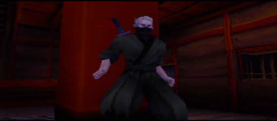
So Lady Kagami was the main antagonist of Tenchu 2… which was supposed to be an epic battle between ninja clans and rulers in Feudal Japan but somehow ended up with this as the major villain.
How seriously can you expect to take people take this kind of villain when facing off against a protagonist like this:
For those rushing to type that it’s an old game and doesn’t matter – it’s worth remembering what the final installment in core series was. Design aspects like this left unaddressed can kill otherwise unique and engaging properties.