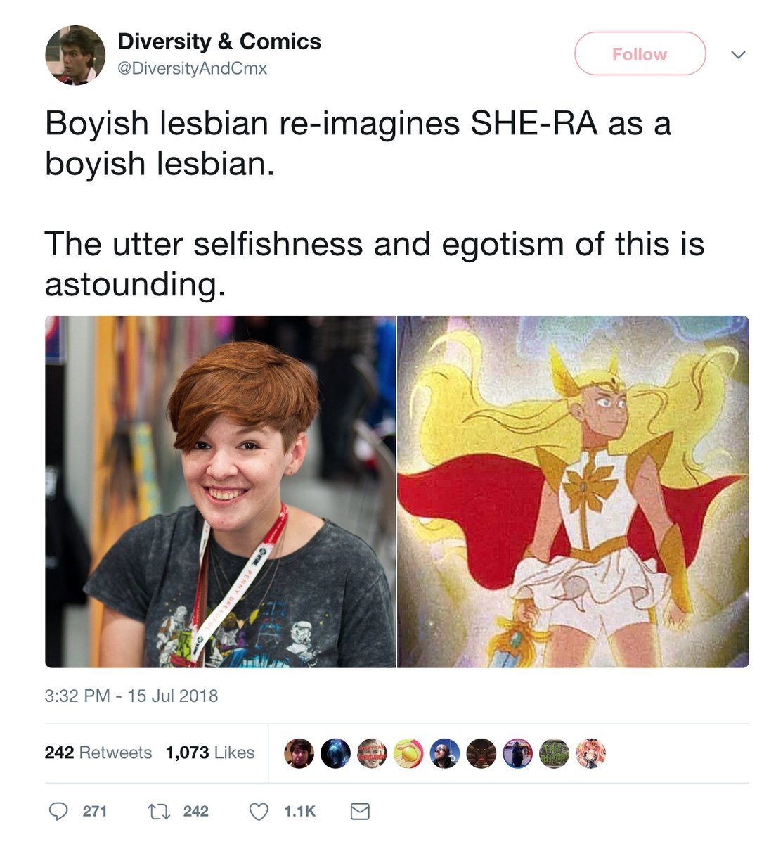
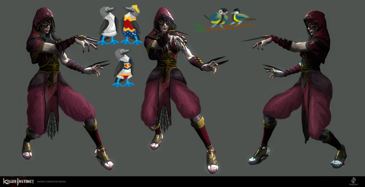
Saint Seiya Online SWITCHEROO Part 1: Armoring the ladies!

This stream redraw session was heavily inspired by this reblog we did from @amusing-saint-seiya and the exercise @costumecommunityservice proposed in the post we reblogged ages ago

The idea is to take two gender disparate version of the same costume and make them equal to one another, by either basing male version on female’s or the other way round. 

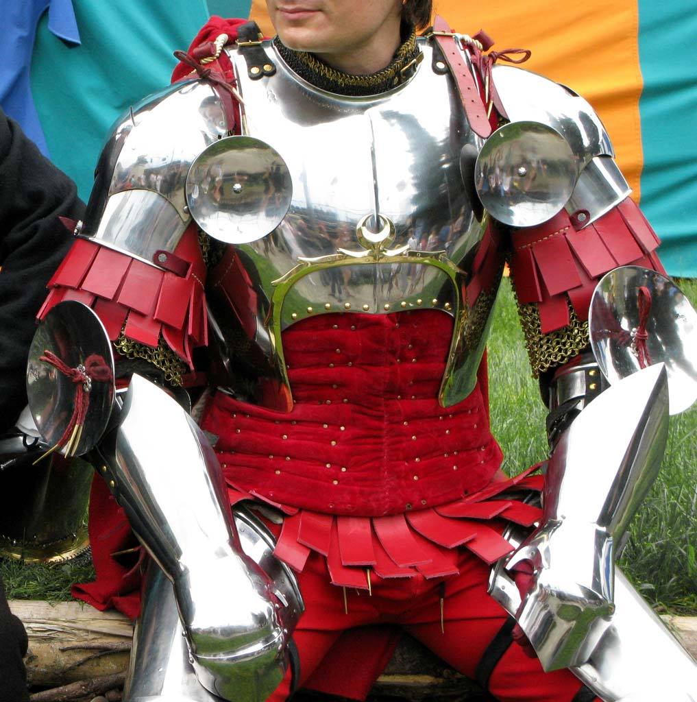
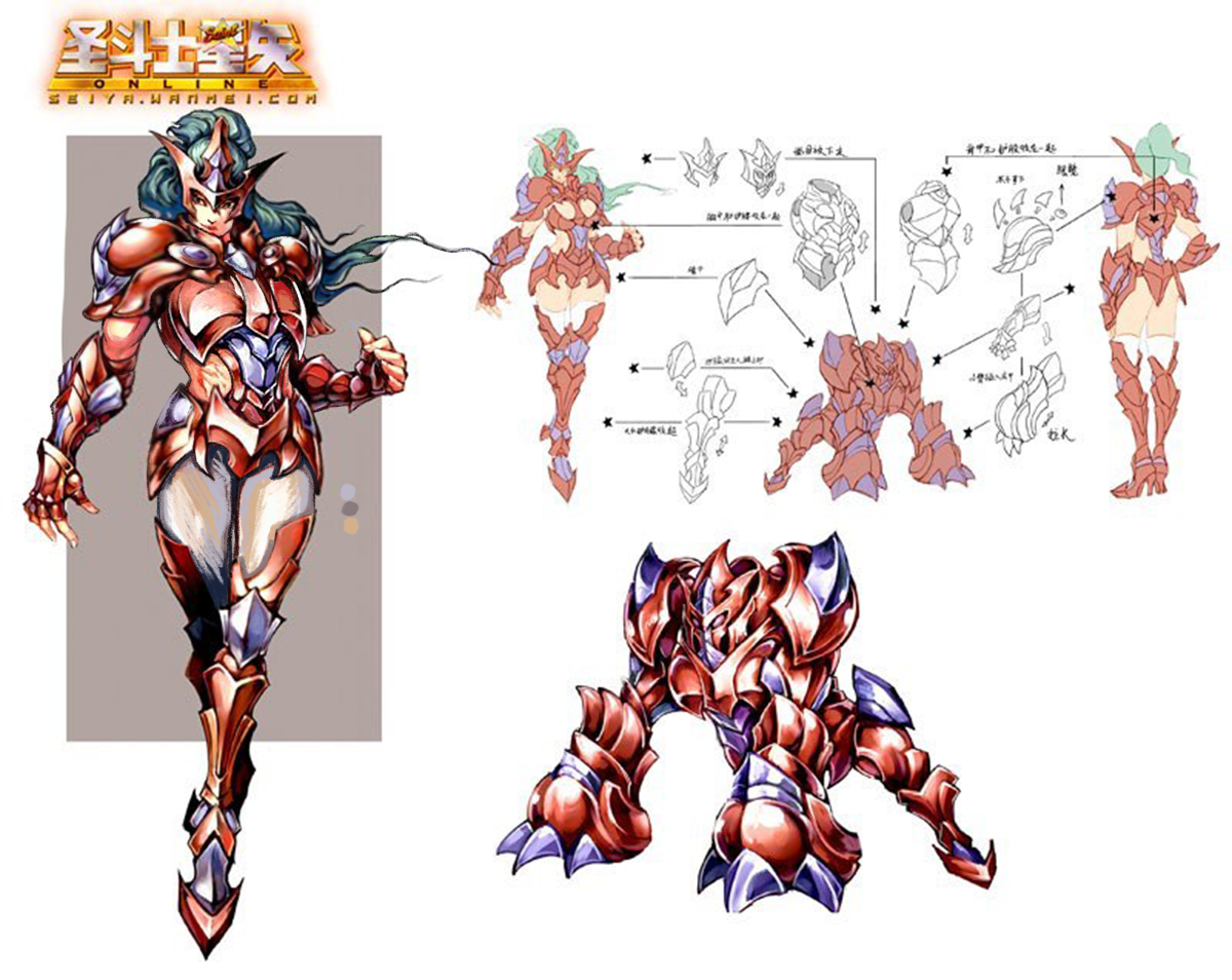
We concluded that Saint Seiya Online, which we bingoed twice since, is a perfect material to try this out on, as their concept art (credit to @saintseiya-zone for posting them!) includes most armors in both male and female version, which are basically always textbook examples of double standard in costume design.

Prepare for this being a double feature. Today we’re posting female knights equalized with their male counterparts. On Friday come the same male knights sexified to be as empowered as original forms of their female equivalents.


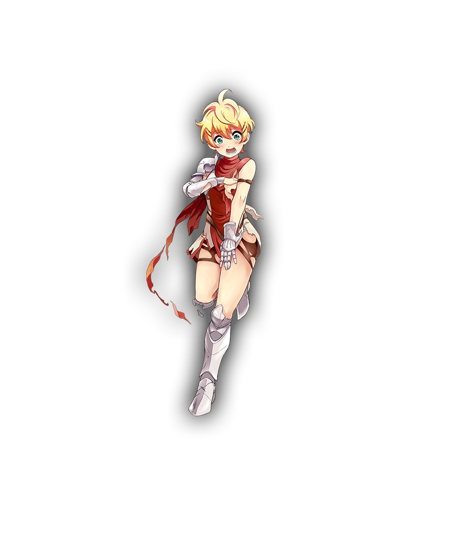
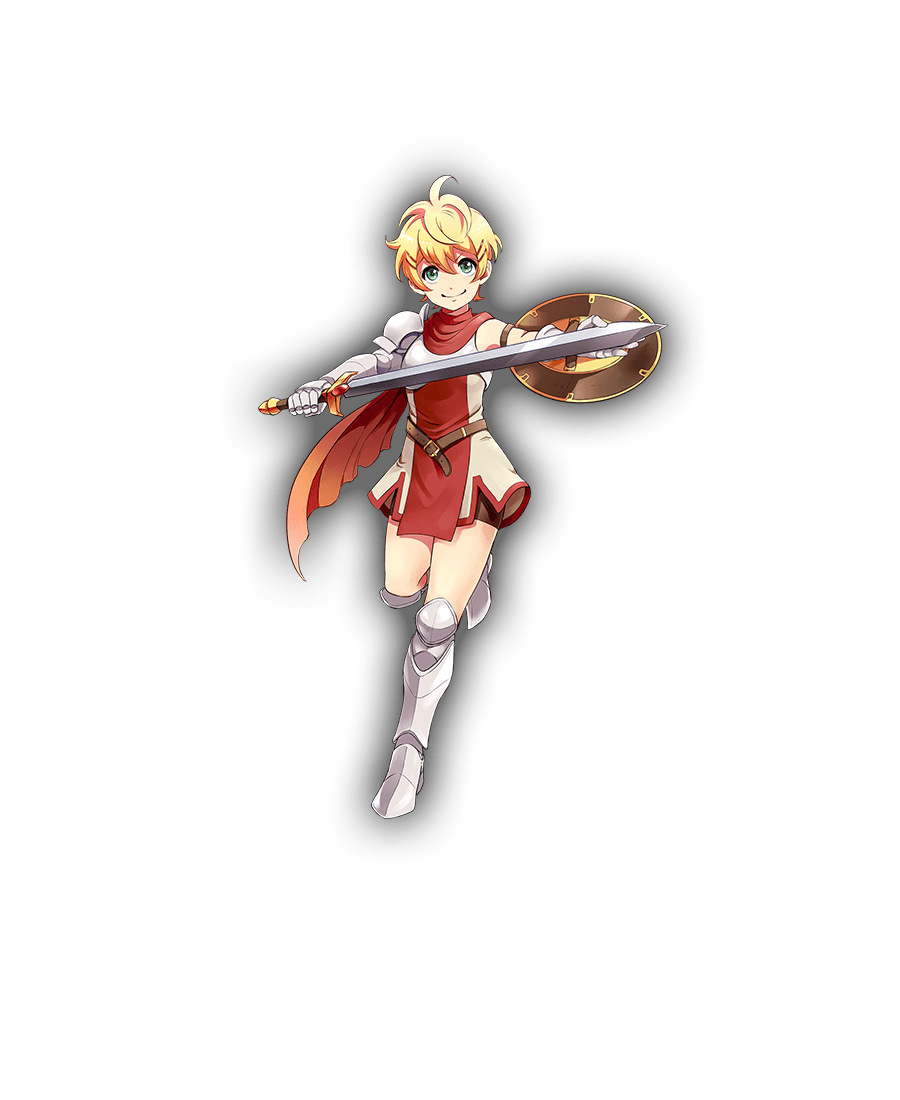
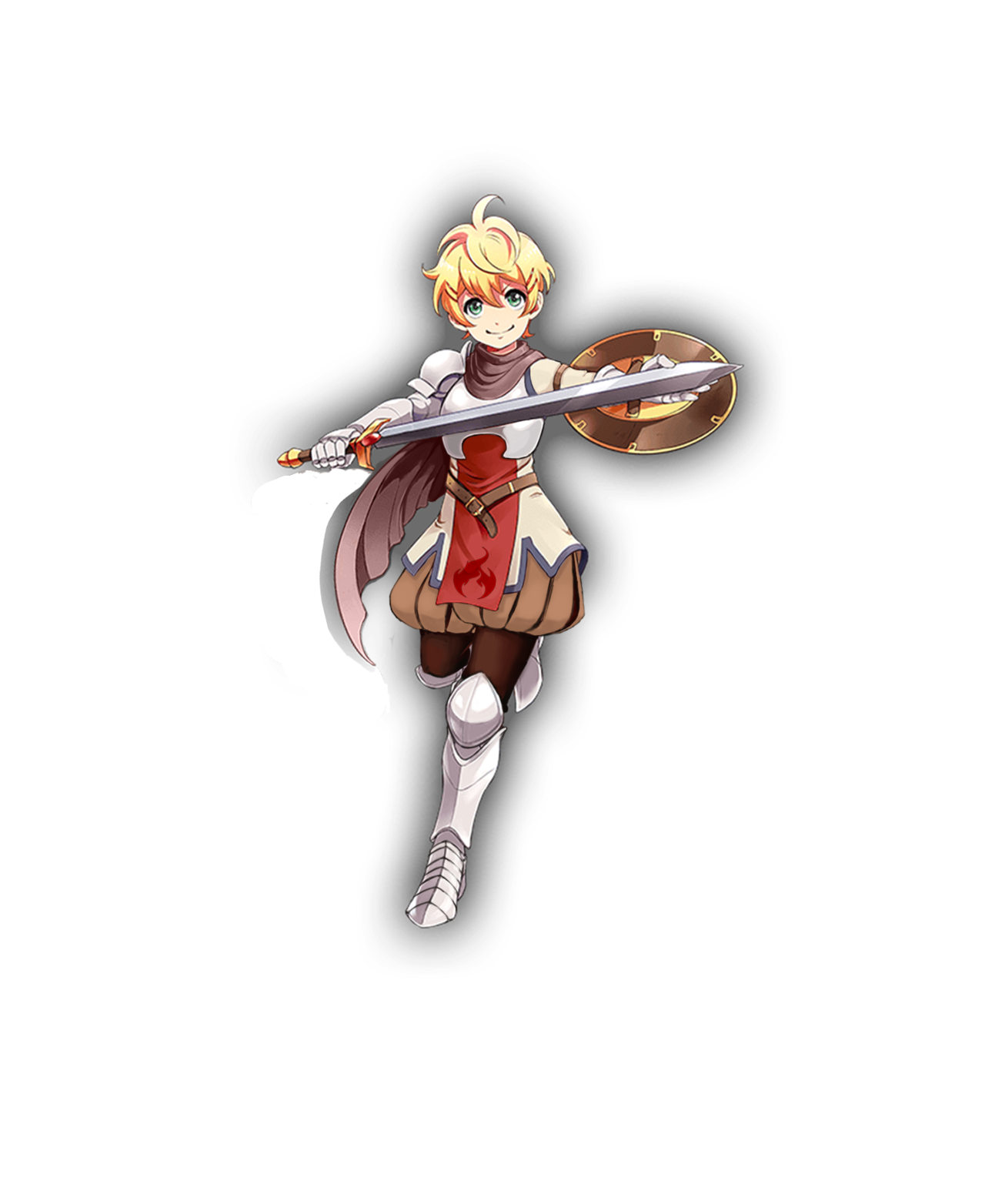
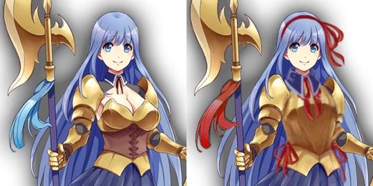
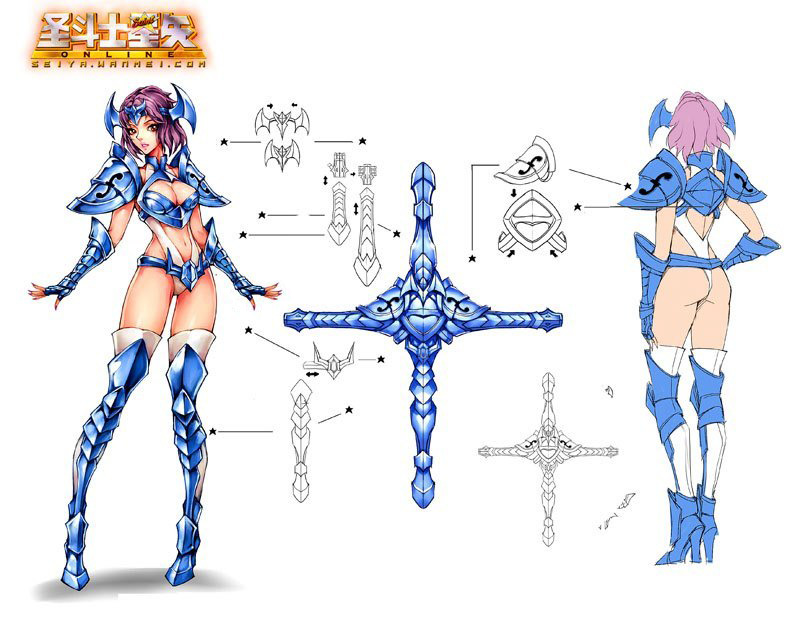
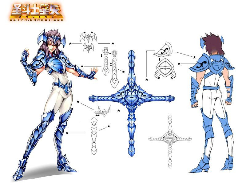
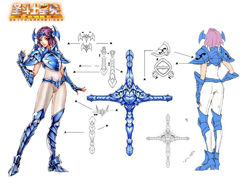
First thing I noticed about the blue-white knights is that since the dude one happens to be rather androgynous and strikes a flamboyant pose, designers doubled down on “feminizing” the lady one with pigeon-toed pose and super bingo-able version of the outfit. The two share very similar body type, so I concluded that pasting his parts onto her verbatim would work perfectly. 

First thing to do was to give her his legs and right hand, so she can strike a power pose instead of generic dainty passive body language completely disparate from her male counterpart’s. 

image

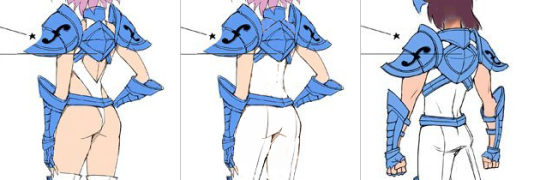
Then the task was relatively easy: paint over all those completely out of place holes in her outfit, give her waist a little more plausible girth and shrink her high heels to be exactly the same size as the guy’s. 

It’s actually quite upsetting how the developers put in an active effort into ruining perfectly fine costume just to communicate that the lady version is different

~Ozzie 


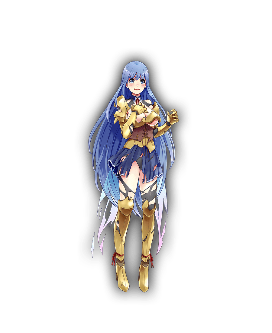
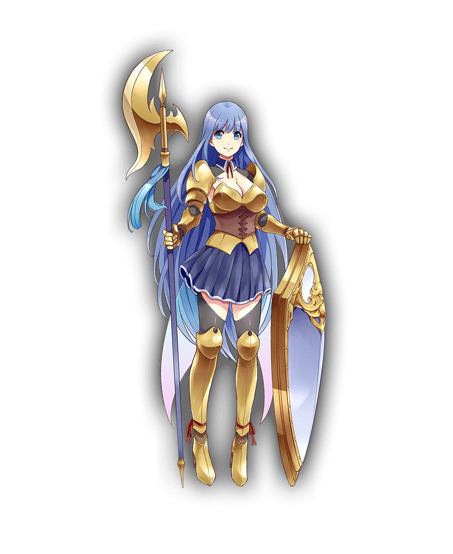
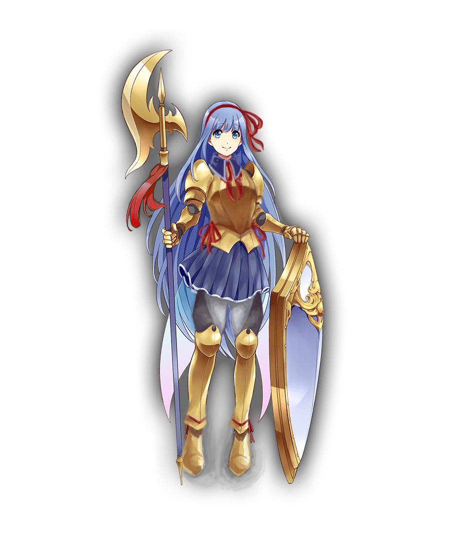
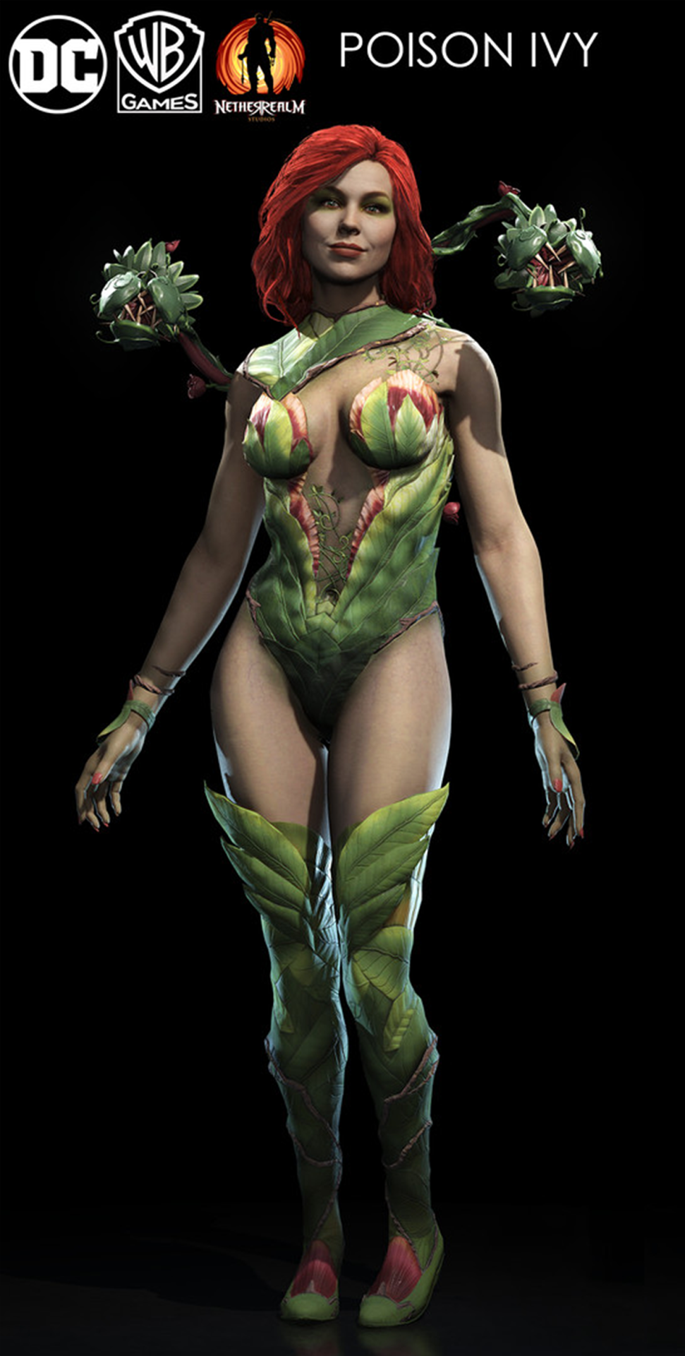
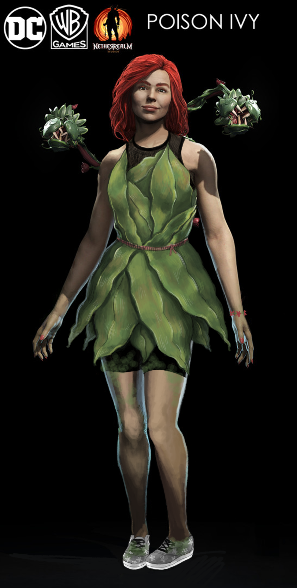
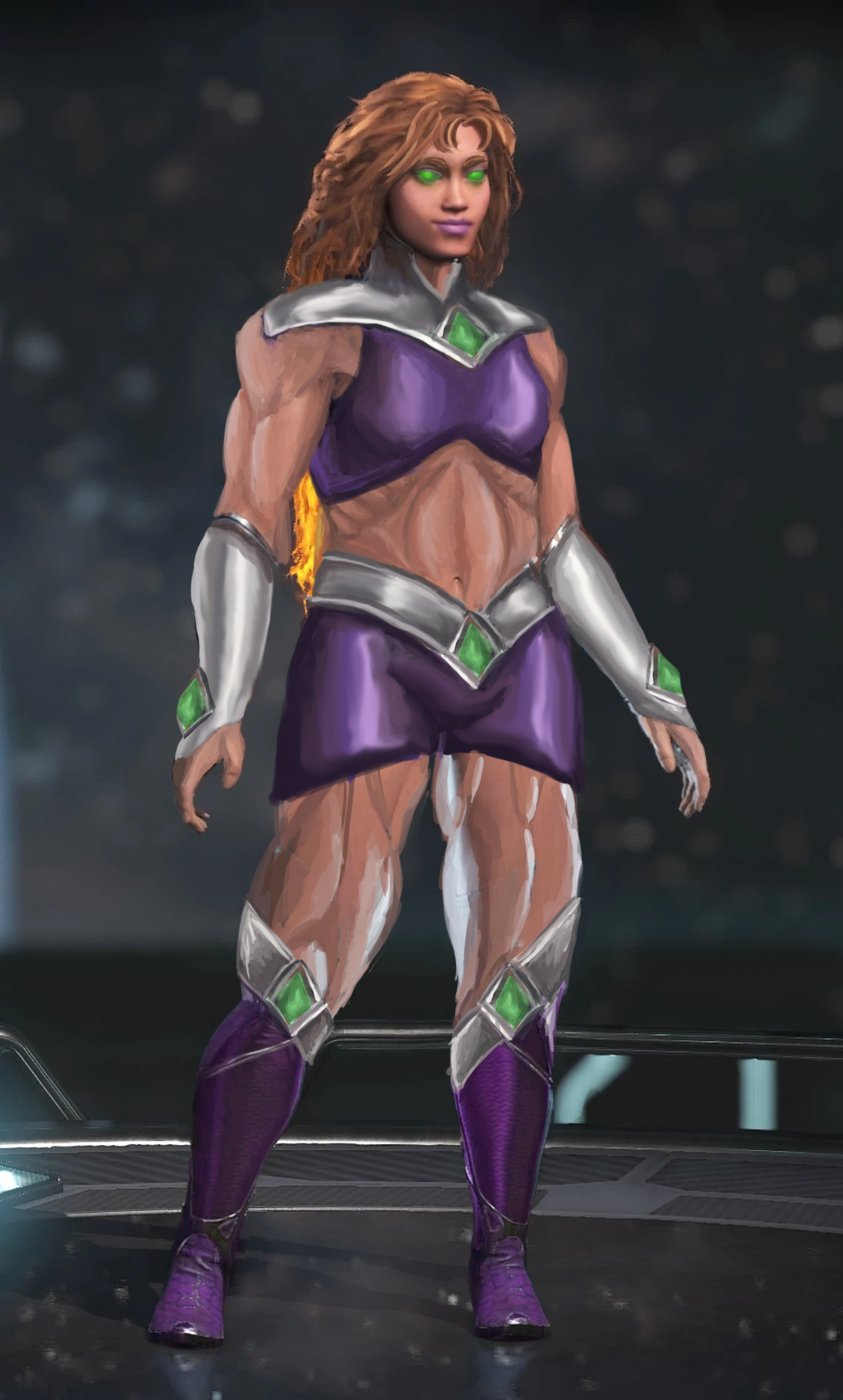
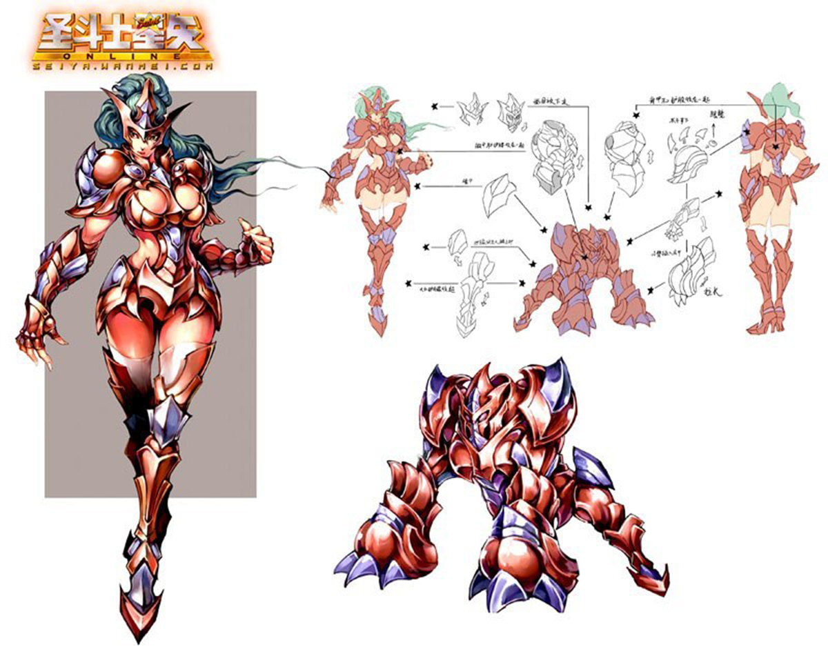
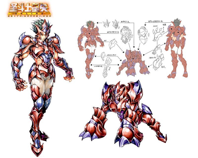
I will fully admit that I probably? cheated by cutting the red guy’s chest right off of him (misandry?) and pasting it onto the lady, but I have good reason! We so often see strong women characters who are supposed to have a more “masculine” muscled look, but it never actually gets to the part where they don’t have an hourglass figure with the same old narrow shoulders. (See Overwatch’s Zarya and her most narrow shoulders.) So I wanted this lady to be beefy as heck

To me, it seems like the artists’ definition of “beefy” for women was just a bigger rack and thiccer hips, and that wasn’t doing it for me. I made her shoulders way wider, stole the guy’s entire torso, and narrowed her hips. You also can’t ever have too much biceps. There are women who look like this, believe it or not.

image

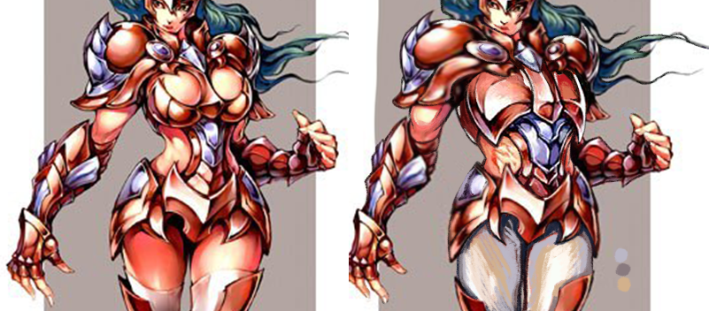
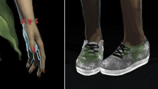
(A minor thing, but I shortened her nails as well.)

For people who may not like this one because she looks too much like a dude… sometimes people do look like that. And maybe the problem is with our definitions of “manly” and “girly.” Why even cisnormativity.

-Icy 

Y’know, even if there wasn’t a single woman in all of history who had fought in war or a single example of real, historical female armor, there would be no problem in pointing out fantasy armor is unrealistic because the complaint is not based on what women DID wear but what women WOULD wear.

A. Noyd 

Came across this amazing comment while archive binging our positive examples tag

I think it perfectly sums up the basic flaw in the “women warriors aren’t historically accurate, so realism doesn’t matter when portraying them in media” kind of rhetoric.

~Ozzie

(via bikiniarmorbattledamage)

Much like… most of the angry ranting we receive, the plea “not proven historically accurate” tends to ignore the key reason why “sex sells” doesn’t work.

In fiction, armor is a costume, and a costume is a statement about the wearer.  It is the creator’s opportunity to tell the audience about the world, the society the wearer is from and the wearer of themselves.

If a creator’s most compelling message they can think of is “she’s got sexy bits” then not only is every female character going to be yet another addition to an already over saturated nonsensical trope.

However, if you decide to actually communicate some things like… what the armor is made from, what it’s supposed to protect against, what’s happened to it since it was made, or how the wearer would decorate it: you open up the doors to infinite possibilities.

Some of which may be heavily influenced and inspired by history.

– wincenworks

bikiniarmorbattledamage:

durendals:

on a textual level, a female character can dress however she wants and shouldn’t be slut-shamed and hated for what she prefers to wear.

on a metatextual level, she might still have been designed with an intention to provide fanservice.

this means that criticising a design, as opposed to a character, is neither misogyny nor slut-shaming. being displeased about the way a character has been designed is not synonymous with hating her. 

have i made myself clear?

CRYSTAL CLEAR.

PS: I love you, durendals. Why didn’t I see this post on my dash ever before? It’s perfection.

Throwback this week: the character’s agency argument in a nutshell.

A silly, sexualized outfit might as well fit* the character’s personality and preferences within her story. That doesn’t make her design any less silly and sexualized to us, real people consuming that story for entertainment and criticizing it.

~Ozzie 

*Keep in mind, though, that just as often it can’t be justified with even that much. Some characters walk around in bikinis or boob and butt windows despite being canonically modest or shy or body conscious etc. because Creepy Marketing Guy put his foot down and demanded for every lady in the story to be poster child of “sex sells”.

She-Ra Reboot

Something a lot of readers asked us to chime in on is the recently revealed artwork for rebooted She-Ra cartoon. 

Considering the showrunner for it is Noelle Stevenson, aka @gingerhaze, the author of Nimona and co-creator of Lumberanes, and from whom we reblogged a couple times in the past, it’s quite safe to assume it will be much more interesting and diverse than the original’s “exactly like He-Man, except looks like a Barbie doll and rides a flying unicorn.”

First off, judging from the EW interview, Stevenson intends to take full advantage of the heroine’s backstory, in which she was kidnapped and raised from infancy by the Evil Horde before she turns against them as She-Ra. That leaves a lot of story potential for internal conflict and development of relationship between princess Adora, her antagonists and friends (some of whom will likely be one and the same). 

image

Second, and more relevant to BABD, her character design is pretty damn solid mix of stylized magical girl elements (long hair, barely any armoring) and some practical choices, like comfortable looking shoes, short pants under her tunic and breast piece without the original’s cleavage. This is what we mean when we say a warrior design can be feminine without being objectifying. 

And yes, since we need to address the elephant in the room: there is a vocal minority of entitled manbabies crying that their childhood icon got snatched by the evil gay SJW agenda. 
That Adora/She-Ra, a teenager, is deliberately unsexyfied and that is bad because sexyness is totally what original show’s intended audience (young girls who wanted a He-Man’s feminine counterpart) liked about her. Not to mention allegations that the story is going to be “forcibly” turned into a queer narrative by the lesbian showrunner, which would be a bad thing, because…? 

image

[Because Diverstiy & Comics dude is a raging bigot, that’s why]

Also, people who who think that She-Ra or He-Man can be suddenly turned gay clearly didn’t rewatch either of the 80s shows lately

image

Here’s hoping that if this series catches on, then maybe a He-Man reboot comes next, this time turning all the gay undertones into overtones and angering  dudebros even more. 

~Ozzie

see also: Original She-Ra’s co-creator calls bullshit on claims that she was supposed to be “an idealized woman” | The Backlash Over She-Ra’s Redesign Is Why Girls Can’t Have Nice Things 

Destroyable Armor – Why we should destroy it

bikiniarmorbattledamage:

I was quite surprised to find people rushing to comment that a certain terrible screenshot was actually demonstrating destroyable armor (I guess if you already knew about it, and hence knew that her armor had been destroyed… so it doesn’t really help with marketing).

Now we have mentioned destroyable armor before… but maybe it’s best we do a little more talking on it since apparently it’s a thing that’s been sold as making sense.  Surprisingly, the first appearance of this trope in video games (that I’m aware of) was inflicted up a male character.

image

A manly man named Arthur who was on a quest to save his love, Prince Prin Prin (actual name!), from a foe no less than Satan himself (who lives in Hades… just go with it! I promise nothing in the game will make any more sense than this summary. Nothing at all.)

image

It was released in 1985 and is probably one of the most frustrating video games ever to grace an arcade (you can play it here if you don’t believe me, and imagine putting money in every time you run out of lives)

Arthur had a full suit of plate male armor that would, upon the impact of any attack or even light touch of an enemy, fly off and leave him running around in his whitey tighties (later re-inventions would give him boxer shorts).  Destroyable armor didn’t make sense in Ghosts ‘N Goblins and it’s not going to make sense anywhere else.

While “soft” armors like kevlar weave and leather will become less protective over time they don’t fly apart for a very simple reason.  Anything that hits your hard enough to dislodge armor from your person has hit you hard enough to kill you.  Even the force to dislodge regular clothes by impact (rather than deliberate tearing off) will easily kill you in a most spectacular fashion!

image

Armor isn’t a car, it doesn’t have crumple zones. Your armor being blasted off you and you coming out relatively unscathed means that you are literally tougher and more resistant to damage of all sorts than your armor is.  

That’s the story you tell when you show a character get hit and their armor falls off.  It doesn’t matter if it applies to all genders (though it always seems to be women chosen for the “demo”), it just doesn’t make sense and is more distracting than simply going without armor.  There are so many better ways to convey damaged armor:

image

Missing enamel/coloring, destroyed ornamentation, blood marks, changes in the silhouette on parts etc all convey that the armor is damaged and becoming less and less useful without also conveying that the actual point of the game is to try to see your character naked without them dying.

– wincenworks

A thing we didn’t reference in yesterday’s redesign post is that Kanpani Girls indulges in a very particular version of destroyable armor trope – creepy “defeated” sprites of humiliated waifus with their clothes and “armor” shred to pieces. I’ll put Flavie and Marica’s “defeated” looks under the cut for comparison with the previous post, because it’s genuinely disturbing. 

So this week’s throwback is a reminder that there’s no reason to incorporate armor which suspiciously falls apart during (or after) a fight in fiction, especially on female characters. And people who do it have an obvious agenda to show off flesh, not battle damage, which could be easily conveyed in non-pervy ways. 

~Ozzie

image
image

Flavie - originalFlavie - Icy's redesignMarica - originalMarica - Ozzie's redesign

Kanpani Girlfriends

When we discovered that Kanpani Girls is a perfect candidate for our Wall of Shame, we dug through their massive library of really badly designed waifus and picked some relatively easy fixes. Reading up their bios, our choice were two Holy Knight friends, Flavie and Marica, whose defining characteristic is being self conscious about being too short and too tall, respectively. 

Liking the cute dynamic of them both helping overcome one another’s complexes, we decided our versions should be girlfriends. 


Flavie 

Well, the obvious first thing to go was that single-breasted boob plate, which was a…. unique design, I guess? I instead changed it to a design I saw when looking up armor references for my OCs.

image

I gave her Elizabethan poofy pants because everyone should wear them, honestly. I decided to go for an overall brown and cream color scheme, but left in the red and added some blue to tie the colors in with Marica’s red and blue details, since they are girlfriends. The flame on her tabbard comes from her element in the game, which is fire. Her design is basically all large and medium-sized shapes, so I wanted to add something small. It’s hard to see, but I also gave her a cream-colored sleeve on her left arm. Finally, I adjusted the scarf shapes to look better, both around her neck and as it blows in the wind.

Even though the final redraw is fairly simple, it was definitely fun to work on. I ended up trying like 3 different pants shapes for her before I settled on these. Cell shading is definitely not my thing, though.

-Icy


Marica 

It was one of those designs that’s very close to working as a stylized girly armor, but doesn’t, because someone HAD to give her big ol’ cleavage and exposed thighs. So, my aim was to bring back its potential. 

I’m quite happy with how the breastplate shape came out, with its high curve and slightly bigger tassets. First I intended to incorporate that leather cincher into it, but it just didn’t work. I also gave her semi-poofy pants with diagonal pattern similar the absurd shape of her original  thigh-baring stockings. 

Another thing was to make her shoes at least a tiny bit flatter and more planted on ground, considering the original artist drew her as if she was floating in air rather than supporting her own weight on her feet. High heels not only are universally stupid footwear for a knight, but Marica is supposed to dislike being tall! Why would she wear shoes that add to her height? 

Finishing touches were to establish her better as the girlish one of the couple (big part of her and Flavie’s actual bios) by making her red ribbon/bow motif more significant, especially with hair bow that nicely contrasts with her blue locks (inspired largely by the ending of one of my favorite anime). Also last minute change: decorative piece on her halberd is now red too, to tie everything together.

Bonus point that red accents connect her to Flavie 🙂

If I were to do it today, I’d also turn her skirt and collar into the same graphite color as her armor joints and dark part of her pants, so that they wouldn’t blend into her blue hair.
All in all, not my best or most complex rework (I also had big trouble with cel shading style, obviously), but I think it goes to show how small changes can make a difference between gratuitous sexualization and cute girlishness. 

~Ozzie

Poison Ivy’s Design Team has Clearly Never Touched a Plant

We’re going back in time a little with this one, as I was working on this at the same time that Ozzie was doing her Starfire redraw. With this one, I was mainly focusing on giving her an actually plausible costume for the Gritty and Realistic “aesthetic” (insert a few more quotes around that word) of Injustice 2. Wearing plants against bare skin sounds like a bad idea to me, so I instead decided to give her a sports bra and shorts, and a leaf dress on top. After all, Black Canary and Harley Quinn (and Catwoman, sorta) get to wear Real People clothes. Why does Ivy have to (ironically) get the rash?

I also wasn’t really a fan of the almost militaristic “plants should rule the world” motivation she has the game, so I decided to just make her into an overenthusiastic plant lover. Although her vine…. things, have bigger teeth, she’s got a bracelet and flowers on her sensible non-high-heel shoes, as well as moss on her legs so that the green is not restricted to only the top half of the design.

image

Her makeup was predictably hideous, so I reduced it and gave her a more defined face shape, though I should have given her deeper eye sockets. I decided to give her lip gloss instead of the cliche red lipstick, because I was thinking that if I was going to a fight, what kind of don’t-have-to-worry-about makeup would I put on in 5 minutes? Mascara and gloss were the ones.

image

I think with more time, I probably could have worked the design to be more interesting, with vines and flowers everywhere. As it is now, it’s a pretty simple design overall. I rendered the crap out of those frigging dress leaves though!

-Icy

Ivy & Starfire: Fan Feedback edition!

Jumping ahead for this post to past weekend’s 50th Stream Extravaganza Finale so we can showcase two pieces that would not exist without our Fans


The first was a response to our Soul Calibur 6 Ivy reveal Bingo, telling us to just “let them be hot.” 

image

I decided to take them up on their advice, and made Ivy into a hot, firey, Machiavellian goddess. She’s so hot, she’s even sweating a little! 

And in case you’re wondering, everything below the waist there is Fire–as it should be.

-Icy 

The second is an attempt to meet the very vague expectations that some random new commenter left under the old Injustice Starfire redesign. They implied that compared to the super-skinny original, my stouter version actually wasn’t muscular… and at the same time implied that this alien humanoid might be too heavy to use her power of flight

image

Following this very helpful comment, I used two newer, better quality images from the game, redid Star’s bodytype and gave her a costume redesign I was working on in my free time. 

NOW princess Koriand’r is of perfectly muscular and aerodynamic shape, not to mention the adequate weight to get off the ground and get decent momentum! 

~Ozzie

Spider ladies, tits and boobies, oh my!

The spider-themed Sadira from Killer Instinct proved to be a much easier fix than first expected. Just giving her poofy pants and limiting the excessive spikes made her look so much less generic! Her silhouette also became significantly more distinct, if I say so myself. 

image

Another tiny fix was making the muted brown accessories, especially the spider belt, a little bit more vivid. I probably should have given that treatment to her whole color scheme. Oh well. 

Since I was basically done with all three angles of her model sheet, I’ve spent the rest of the stream adorning it with sketches of boobies and tits… THE BIRDS (every innuendo intended, though).

image

Now they are the splash of color Sadira really needed.

~Ozzie

bikiniarmorbattledamage:

itsbirds:

It really says something about fantasy art that the thing people seem to remark most on in my work is the fact the female armor I draw is ‘functional’  with out and sexy bits out there showing.  Something I just think of as “well you wouldn’t want to get stabbed in the navel… so lets put some studs and leather there” is so foreign to some that it sticks out. But, it really shouldn’t stick out. People shouldn’t even notice that. And that kind of pisses me off about the other artists out there. Look I am not saying every character has to be all covered up and armored, if it is a female/male rogue who uses her god given talents to subvert, distract, and get what s/he wants by all means  show some skin.. .but if it is a paladin, warrior, anything that needs to be heavily armored then put some damn good armor on them! And despite what some art directors think, a girl can look pretty damn hot in some nice, functional, armor with out her tits flopping about. And if you are an artist and the only way you can make a female attractive is by showing her ass or cleavage, you are a BAD ARTIST, go practice.

Bolded for emphasis.

It’s really a painful realization that bikini armors are so ingrained in the collective consciousness that actually protective female armor stands out as novelty.

Which also proves just how bullshitty the “skimpy costume design is creative” excuse is. If it was so, people would be more surprised by it than by costumes that do provide cover.
Yet here we are and no-one’s shocked by the sight of bikini armor anymore.

~Ozzie

Four years later this post remains topical. 

For some inexplicable reason, skimpy armor on women is still perceived as standard in pop media, while practical female costumes (especially gender-neutral ones) at best meet with bafflement, at worst are quickly labeled as “SJW pandering” by dudebro fanboys. 

Not to mention

(again)

that male skimpy armor, aside from LGBTQA+ pinup art, tends to be framed as ironic parody and never really treated as default or normal, like its female equivalent is.

~Ozzie

This kind of double standard really points out our culture’s idea that (White) Man is the norm, and is thus allowed to be other things than just Man. Meanwhile, Woman is like its own all-encompassing descriptor. Once you’re a Woman, you can’t be anything else, so everything about the Woman has to point out how Womanly she is. 

And we can’t give her armor that doesn’t accentuate the fact that she’s a Woman, because then she’ll be like the Man! We can’t have that! And then we end up with Bingo material.

-Icy