Velvet’s Thermian Argument
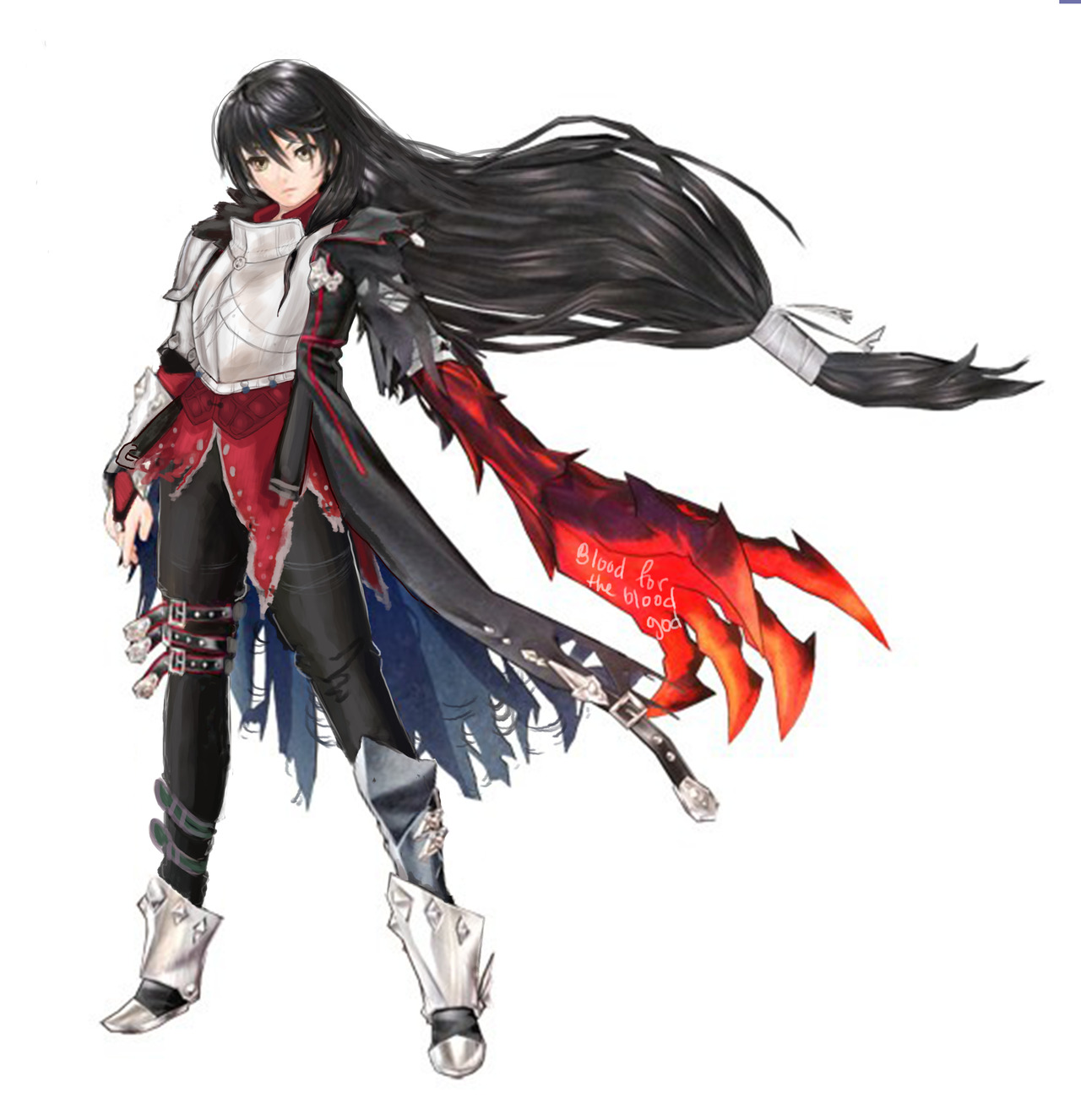
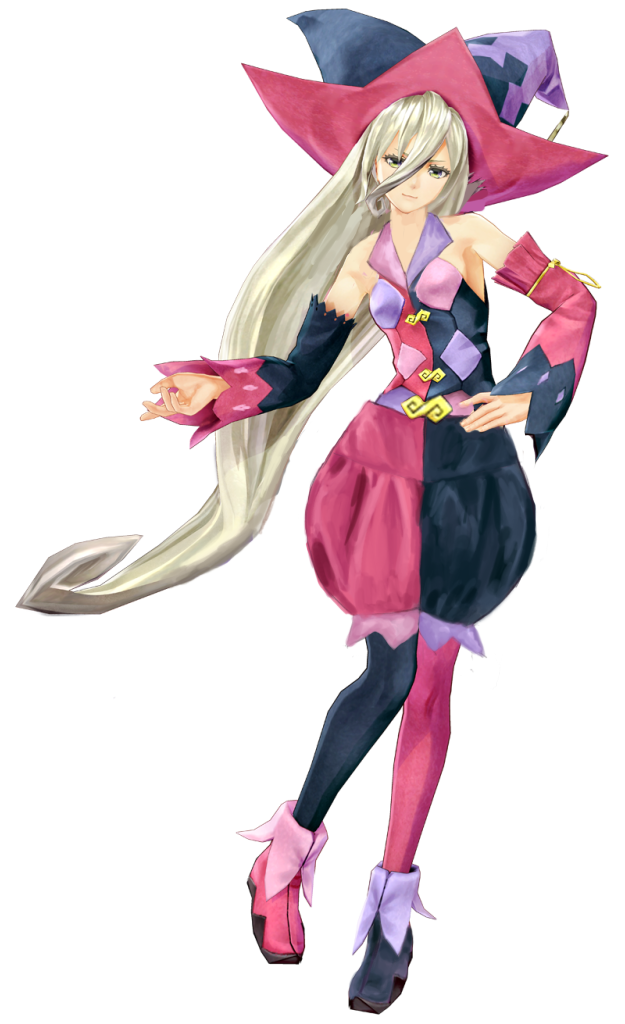
Following up Ozzie’s redesign of Magilou, this is the character from
Tales of Berseria
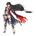
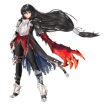
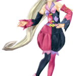
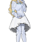
that I picked to redesign for the same week: Velvet! I started out by giving her actual pants. Then I moved the leg armor she has from her right leg to the left, in order to balance out the armor on her right arm, to which I added more parts. I decided to keep the leg belts because she seemed like an edgy character from the backstory I read up on the game wiki.
I spent a lot of time trying to figure out what to do about her red shirt. There were probably like 6 different iterations, and I didn’t really like any of them. The final design before this final one was actually:
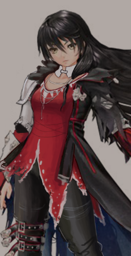
Because despite the awful execution, I could see what the artist was trying to do: frame her body with large shapes (the coat, the monster arm, and the hair), and fill the inner body with small shapes. I did like the torn edges to her shirt, but didn’t know what to do with the collar.
Then after the last stream I spent working on her, we got an ask from @solaela explaining that her outfit was put together from prisoner belongings when she escapes from jail early in the game. That gave me the idea that, what if she found an old breastplate that was confiscated, or on a guard that had to be knocked out, or whatever? It wouldn’t fit her perfectly, and it might be old and dirty, but even if Velvet doesn’t care about modesty, she should probably care about staying alive. So I gave her a breastplate and broke it up into smaller shapes.
While the Thermian Argument is a poor excuse for bad design, I do think knowing about the character helps to makes for better designs.
-Icy
Magilou and the case of book-skirt
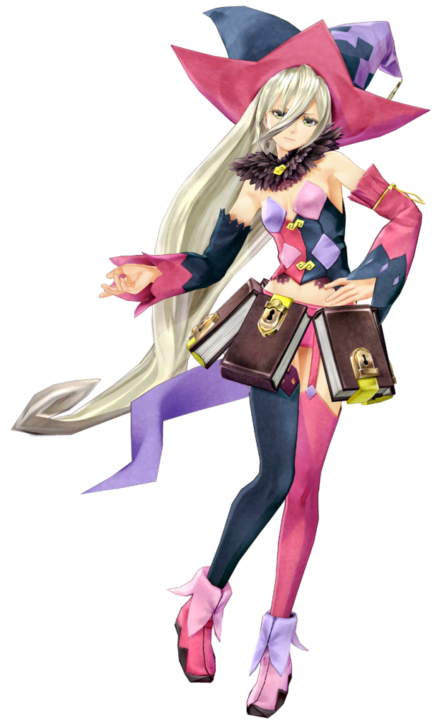
The first stream redesign I did was for the infamous “leatherbound books make a perfect skirt!” costume of Magilou from Tales of Berseria, which we bingoed before.
I suppose the creators thought that being a magic user excuses her sense of fashion, but I wouldn’t know how to begin explaining their exact thought process.
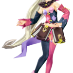
Agreeing with Icy that poofy pants are great (and would compliment the shape of Magilou’s hat), I decided to put them in place of the mind-boggling book-skirt.
Without books, her furry collar became the only splash of brown in her design, so I got rid of it, replacing it with a collar that would make her top wearable.
While working on that I noticed that the alternating blue-pink rythm of her color scheme was inconsistent in some small details, so I recolored her left shoe and painted light pink diamonds on her right sleeve. Also added a fringe to the pants and an undershirt that, along with new collar, fit the scheme of details being lighter shades of pink and blue, while primary shapes are colored darker.
Her hat was pretty awesome and its color asymmetry not really distracting, so I left it as it was.
~Ozzie


WOOO I did a redesign of this hot monstrosity. The screen shots used in this post were provided by doctorsanity, who submitted them to bikiniarmorbattledamage
Look, I’ve been employed as a designer for two years now, and maybe that’s not that long; I’m at least sure I don’t have the same kind of industry experience that the designers in charge of this train wreck probably do, but I do know one thing:
Design that fails to communicate its intended message is bad design.
It is, in my opinion, the chore element that separates what we do from Fine Art – fine art is a personal expression. Someone can argue with the conclusions that you came to in fine art but ultimately, it’s your territory, your message, your composition, your voice, your story.
When you’re a hired designer, everything changes. It’s their story, their character, their message, their voice.
Putting aside the obvious pandering and intent to profit off of misogynistic ideals in female video game characters for just an instant, let’s talk about Charlotte.
Charlotte [evidently, from what I’ve admittedly heard through the grapevine; this game is not yet out in my country] uses a masquerade of charm and innocence to seduce men for their wealth. When I heard this, I was shocked, because from the moment I saw her outfit, she never looked like someone I could trust.
If she’s supposed to look demure, make her look demure, goddammit. You shouldn’t need a greenhorn like me to tell you these things. Learn to treat your female characters with more respect.
Awesome redesign accompanied by an awesome writeup, thank you, pixelcut!
One more thing I’d add about the difference between design (hired or not) and fine art, is that design is supposed to serve the same purpose for everyone who sees it. To communicate an intended message, as pixelcut puts it.
The problem with how Charlotte looks basically boils down to the whole issue our blog concerns: that a lot of female character designs, particularly female warrior costumes, do not tell us who we’re dealing with. Lingerie models, maybe, but not warriors, especially not if male characters of the same or similar class establish a completely different aesthetic.
~Ozzie
Speaking of communicating a character’s backstory and personality via original design, let’s again celebrate this awesome fanmade Charlotte fix that tells us all she would want us to know about her… instead of being just a straight-up bikini armor
~Ozzie


Brigitte and Overwatch’s continous female design problem
We talked already about Brigitte’s costume, but there’s a whole lot of other issues about her character design that shouldn’t be overlooked. Again, it’s a nice idea to have a new lady in actual armor in the game, though we wouldn’t be BABD if we didn’t point out some obvious and less obvious problems that can be spotted with her.
She’s, after Moira, another white European lady in a row, while still the closest to black female representation among playable heroes is Orisa, a robot (and before anyone says it – nope, none of the dark-skinned female characters are black).
For a game that prides itself in having diverse international cast, Overwatch can not imagine people of color color coming from places that wouldn’t be POC-dominant already (also lots of their heroes of color somehow happen to be morally dubious compared to white ones). And just because Brigitte is a pre-established character doesn’t yet excuse prioritizing adding her to the game over someone with different background.
It’s kind of funny how after being unnamed for no reason in her last major media appearance, the Reinhardt animated short, now Brigitte got elevated from a supporting lore character to one of main heroes. This, paired with ridiculous lack of consistency in her cross-media appearances gives us a strong feeling that no-one at Blizzard is overseeing writing and art direction of Overwatch as a franchise. Fans who spot constant retcons in the story would agree.
Speaking of no visual consistency, seems like from comics to the animated short to the actual game Brigitte finished her long journey from a unique-looking person to another standard issue pretty face.
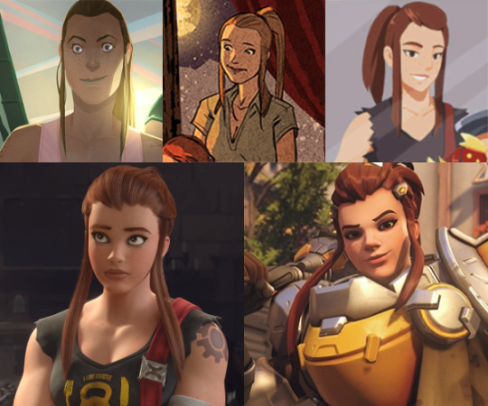
And no, different artists working on each of those appearances isn’t an excuse for how only her hair and skintone remain relatively consistent. Her crucial features like jawline, freckles, nose shape and size, how big her eyes are and how strong her chin is shouldn’t alter so widely just because of art style change. Blizzard is perfectly capable of making and using style guides – and when they don’t, it’s either by choice or negligence.
And if you wondered what we meant by “standard issue pretty face”, this pic, for obvious reasons, has gained some major mileage around the Internet:
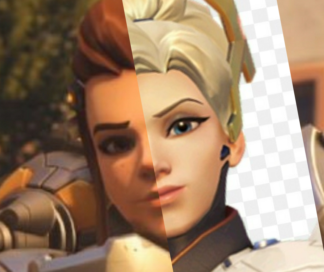
Congrats, Blizzard! You officially care about diverse female appearances as little Disney does! (image sources: [x] & [x])
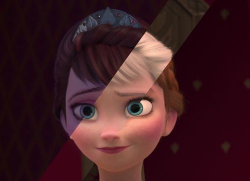
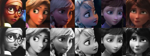
Or maybe the jokes are true and the (weak) excuse for looking like clones is the same as for the Frozen ladies? Mercy is Brigitte’s real mom!
Not to mention that Blizzard can’t make up their mind on what Brigitte’s body type is supposed to be. Is she thin and curvy as virtually every other Overwatch lady? Is she almost as buff as Zarya? Something inbetween? Who knows.
I saw some fans trying to excuse her twig arms from Christmas comic as being possibly earliest in the timeline, but no official channel would confirm or deny any speculation. Overwatch is pretty satisfied with fans using their headcanons to justify whatever information the story canon won’t commit to. Why make an effort when fans can do your job for you?
~Ozzie
“Brigitte Lindholm, squire to Reinhardt Wilhelm, is a former mechanical engineer who has decided to take up arms and fight on the front lines to protect those in need.”
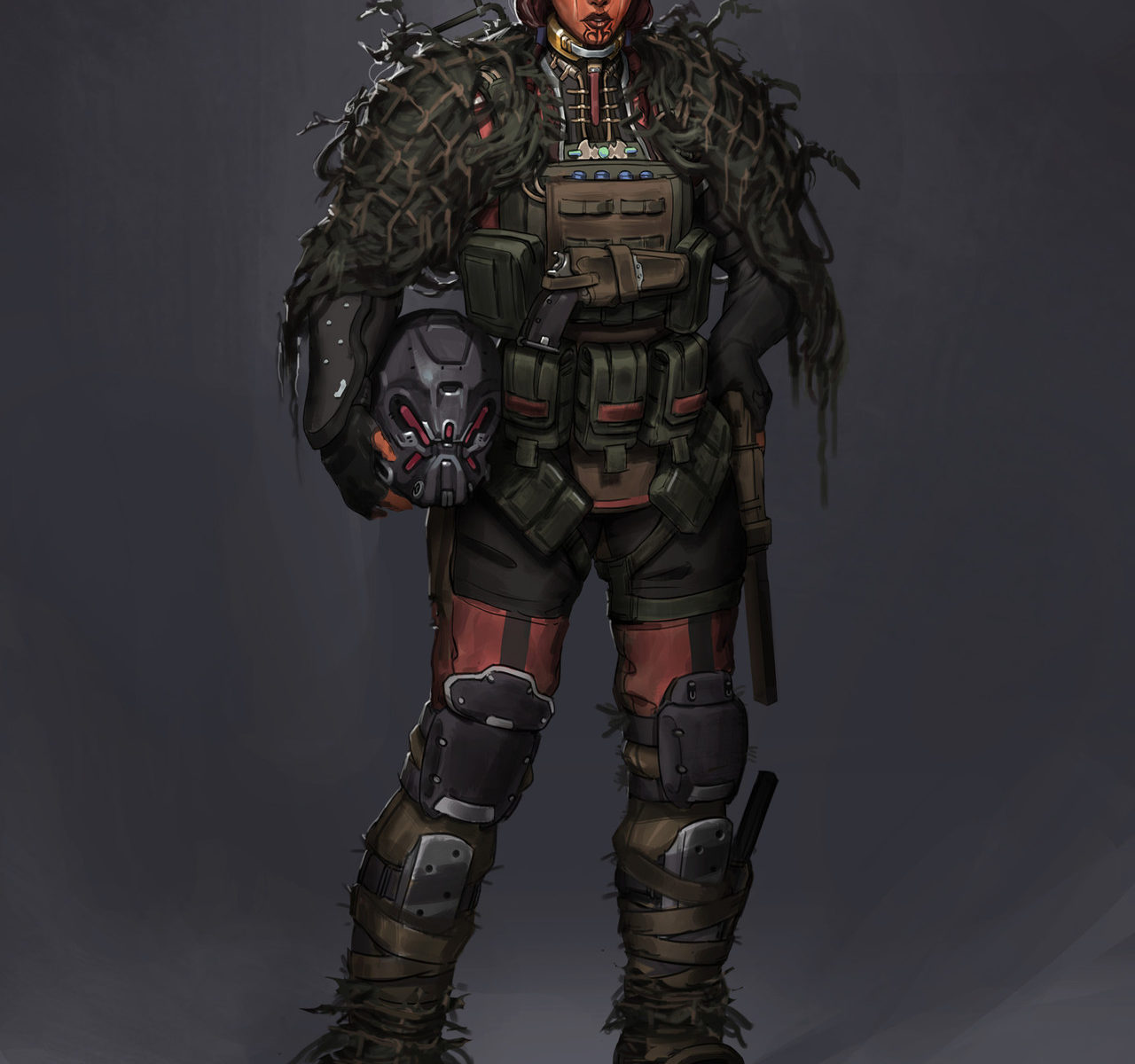
If I didn’t know anything about this character and was just reading her background blurb, I would be imagining a character design more akin to this:
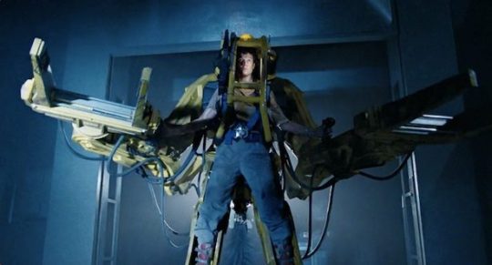
Why build a regular armor and shield when I can pilot a 12-foot-tall exoskeleton? Her father builds turrets during combat, it would have been cool if she had skills related to building and adjusting her own armor in-combat.
Her design doesn’t inform me of her character at all, which is a problem with several of the Overwatch cast (mostly ladies, I wonder why that is). She wears armor, but so does Pharah; is she also a soldier? She has no welding mask or a tool belt that would indicate that she’s a mechanic type. I get that she doesn’t want to just fix things on the sidelines, but she does throw out armor for her allies. It isn’t a stretch to flavor it as her fixing her team’s equipment in the heat of battle, and she does get a welding mask in a different skin but not the primary one?
Her color scheme is almost the same as Mercy’s, with silver (instead of white), yellow and black being the core, which really isn’t helping that same-face problem, Blizzard. Not to mention the shapes are very similar to Pharah’s. There’s just nothing new here design-wise, and I am disappointed.
-Icy
