I think it’s been long enough but if you find yourself getting ready to type up a comment related to Mass Effect: Andromeda’s animations please consider watching this educational video from Extra Credits and not commenting here instead. This post is going to be a clarification of what we mean when we say Creepy Marketing Guy, and since the first post on this topic featured Samara, it’s only fair that Cora be the star of the clarification.
First, let’s start with what we do not mean when we refer to Creepy Marketing Guy. It does not refer to:
Using distinctly porny ads to promote products (be they porn or not porn), particularly if they’re generic images from a clickbait ad company
What we instead refer to is a product where you can see the development team’s intentions are to create something where every element is involved in telling a specific story – and then someone (usually marketing) steps in and makes the change specific parts of them with the assumption that the cishet male demographic needs the sexual availability of at least one female character broadcast to them in order to be interested in the unrelated aspects.
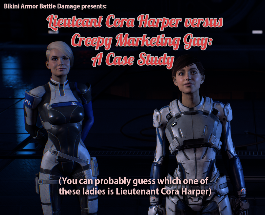
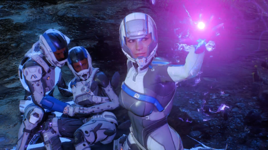
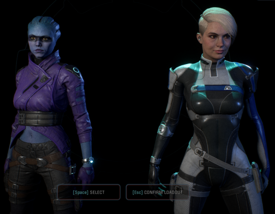
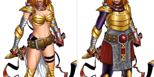
In this case, they pick Cora Harper, who is an ultra-professional soldier (one of the most battle hardened in the team), introduced as being calm in a crisis, the second in command on the mission, and seems to use “male” set of animations for her running, etc (instead of the elbows-in butt wiggle run generally assigned to female characters, including fem!Ryder).
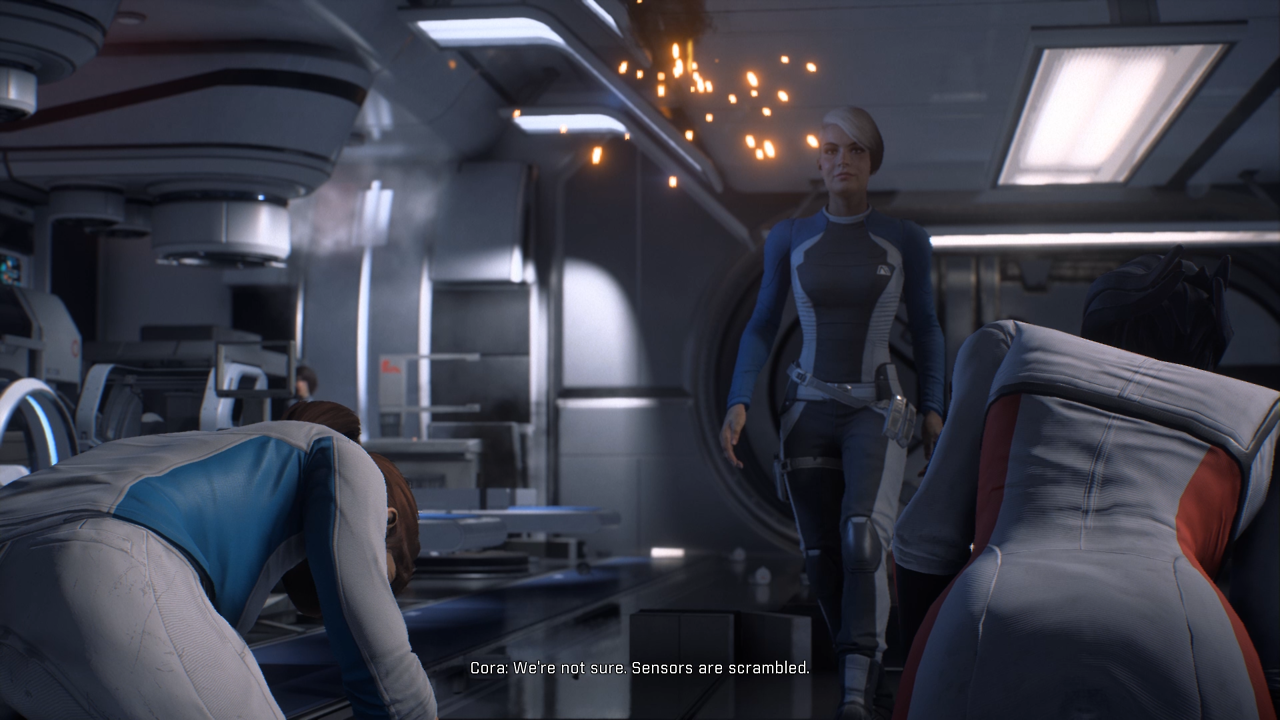
Then you see in the outfit in the top of the post before launching into the tutorial mission, during which she appears in cut scenes like this:
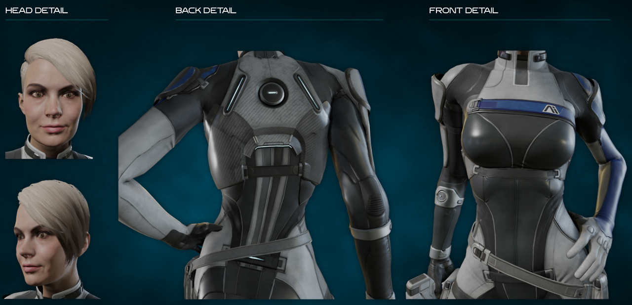
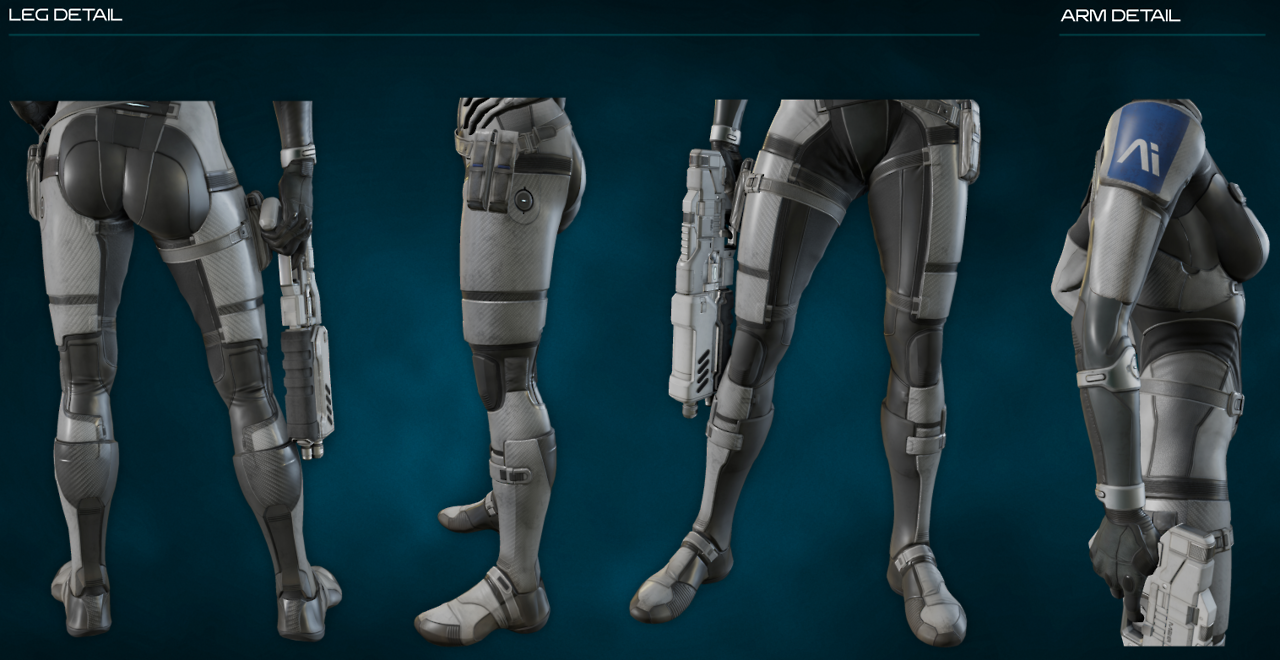
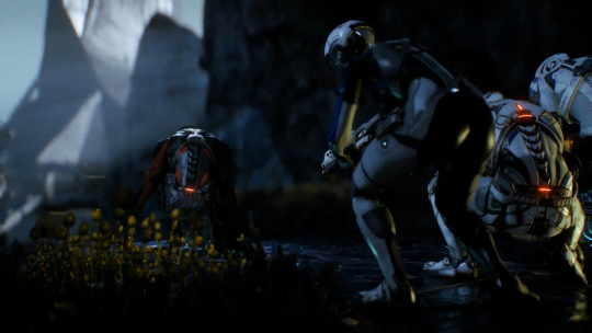
Pretty much every other female character in the establishing chapters of the game has pragmatic, non-gendered attire on and off the battlefield. But, since Cora is a romance option for bro!Ryder, she apparently needs to wear a fetish outfit sculpted around her boobs and butt, while on the battlefield. The other female member of the away team who is a romance option also similarly needs to broadcast she’s got a sexy side (she also only owns one set of clothes).
All other traits other than romance option to bro!Ryder are considered secondary – to the extent now Cora looks not just contradictory to her character but out of place in the game about exploring a new galaxy, finding wondrous alien technology and shaping humanity’s future.
(This does not seem to apply to the male romance options, examples 1 & 2)
Ironically this now means she is so out of place cannot be included in marketing material without making the game look a ridiculous parody of a dramatic adventure exploring alien worlds in a new galaxy. It’s almost like they should have just given her one of the dozens of pragmatic outfits I am sure the concept artists designed for Cora before being told to sex it up.
– wincenworks
What is it with the “above boobs and under boobs belts” design feature that’s become so popular lately? Also, I thought Ashley’s outfit in Mass Effect 3 was insulting; the new BioWare studio really took it up a notch, though. … Good job?
I’ve read none of the promotional material for ME:A before it came out, so when I watched part of a Let’s Play of it out of curiosity, I couldn’t believe that Cora was this battle-hardened badass soldier type; I thought she was just another human on the ship. Her design makes me think of EDI before anything else. Those really sad attempts at actual armor pieces (like the baby plates on her shoulders) somehow make it worse, like Creepy Marketing Guy begrudgingly allowed it.
Also, send help, that butt window is staring into my soul.
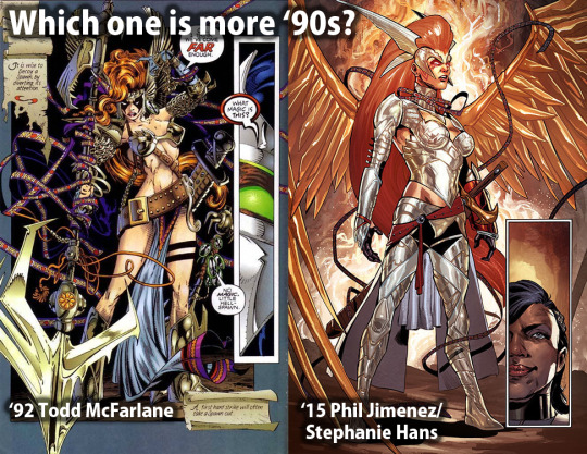
This throwback is as the reminder that the problem of ridiculous female armor design is a wide spread enough probably that even studios known for being progressive end up falling prey to it.
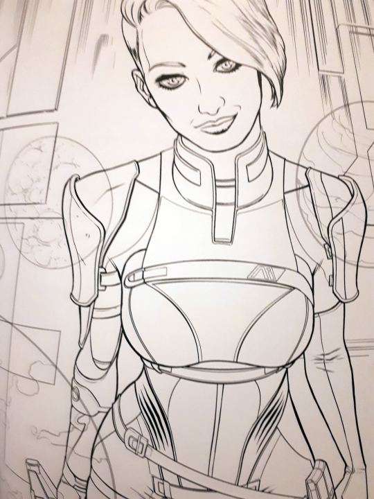
That and well I recently acquired the Mass Effect Adult Coloring Book, which features Cora in it, but she’s clearly more inspired by the costume design than the writing in the game…
So much good work can be lost by pandering to an unappreciative demographic.
– wincenworks
Posted on
Posted on
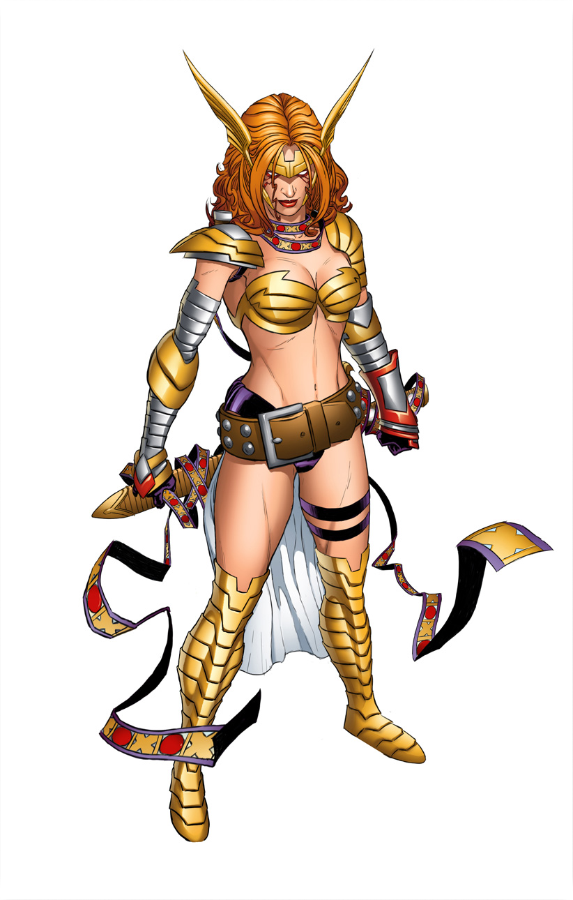
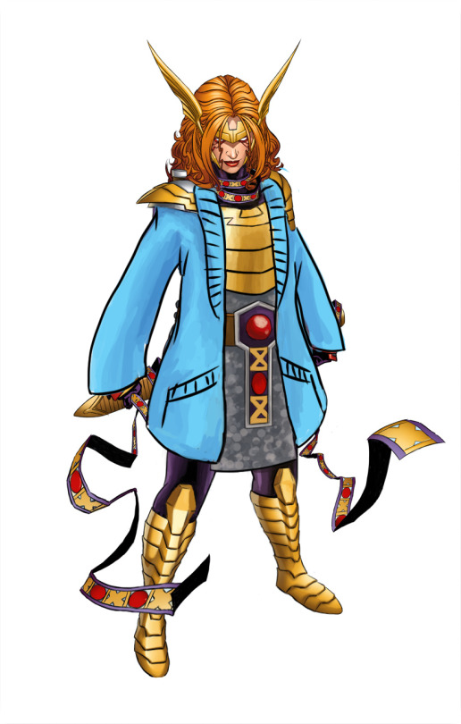
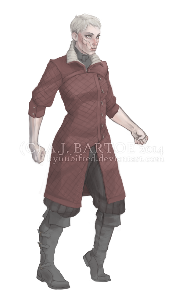
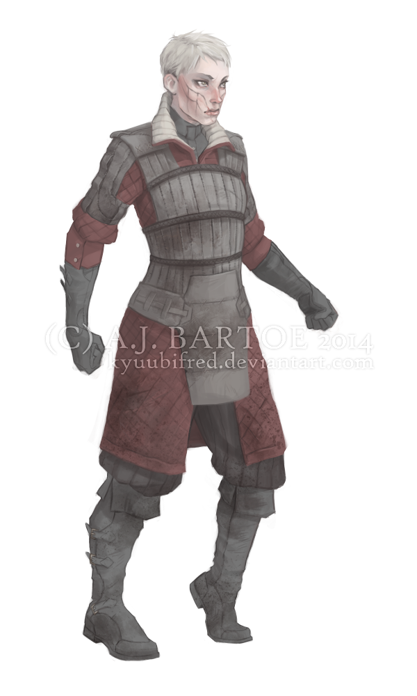
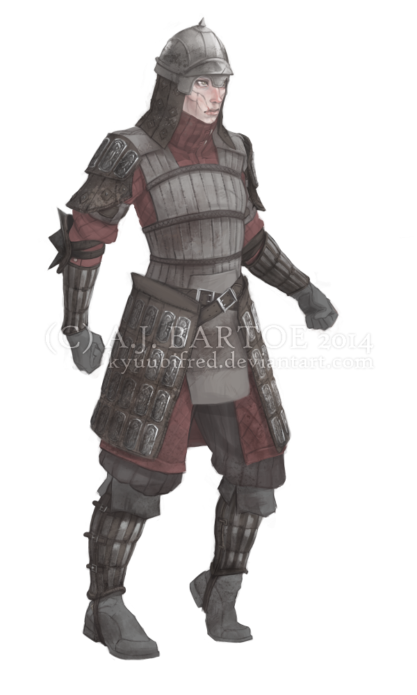
Angela and the layered armor (+ a cozy cardigan)
Marvel’s Angela redesign is still one of the favorite ones I streamed.
Maybe one day we’ll get to stream fixing that winged monstrosity.
Back to the redesign, tho: My priority, given that now she’s an Asgaardian warrior, was giving Angela actual armor, with lots of layering. She got some undershirt and pants, gambeson and mail tunic (painted vaguely, so it can be either chainmail or scalemail), then on top of that a believable breastplate instead of two half-spheres that barely connect at her sternum.
I disliked her generic huge belt design, so looking for inspiration in costumes of her father, Odin, I found this custom figure with really cool belt (unfortunately, source ungooglable):
So I based Angela’s belt buckle on his, as well as on the pattern from her magical ribbon thingie. Now that I look at it, I might have also taken some shape and color cues for her breastplate and gambeson tassetts from Odin.
Other little details: got rid of the pointless butt cape, made shoes not go thigh-high (how is she supposed to bend knees in metal thigh-highs anyway?) and gave her stockier built.
I’m really satisfied with that color scheme. What’s funny is that it was already there. Each color I used was sampled from some minuscule part of her costume that was drowning in the sea of dominating gold and flesh tones.
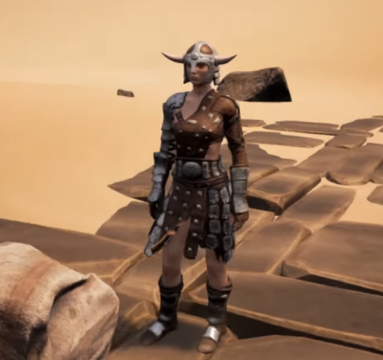
Ironically, despite this armor being the first “screenshot” image on Conan Exiles’ Steam page – I can’t find any evidence that it is or has ever actually been in the game. The reason why is not particularly clear. After all, this is “heavy armor”:
The part that is most amazing about it is that the lower half is covered in pants that seem far beyond the heavy armor but then have a nightmarish boobplate that seems to have been designed with zero considerations for protection.
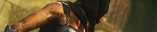
It gets chafing nightmare because it seems that after adding a layer of padding under the metal… they decided that a bare steel chain strap will be fine.
This is doubly a shame because not only does a certain marketing strategy seem to impeding them giving a solid representation of the game but they’re also missing the opportunity to show the real empowerment in the game:
– wincenworks
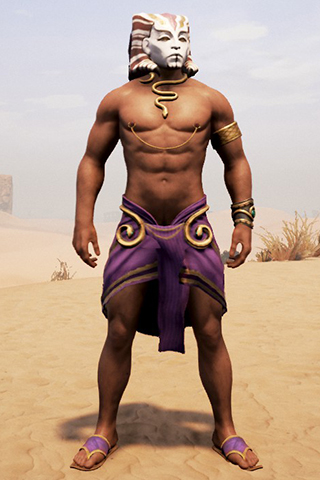
Update: Apparently it is possible to recreate the outfit, but requires mixing and matching bits, @p75369 created the female version here and… well I’m sure you’ll be shocked the male version is different.
Proper layer-by-layer female* armor designalways deserves more love and exposure. For many reasons, including non–boob-shaped breastplate and the inclusion of gambeson padding. Always ready to be looked up in our reference and resource tags!
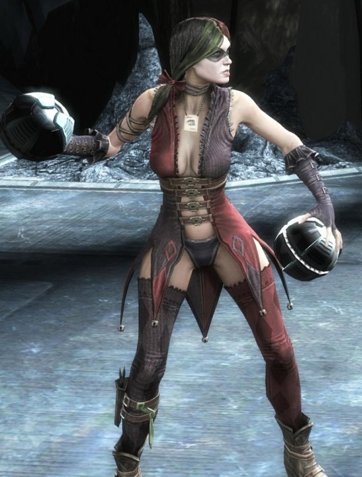
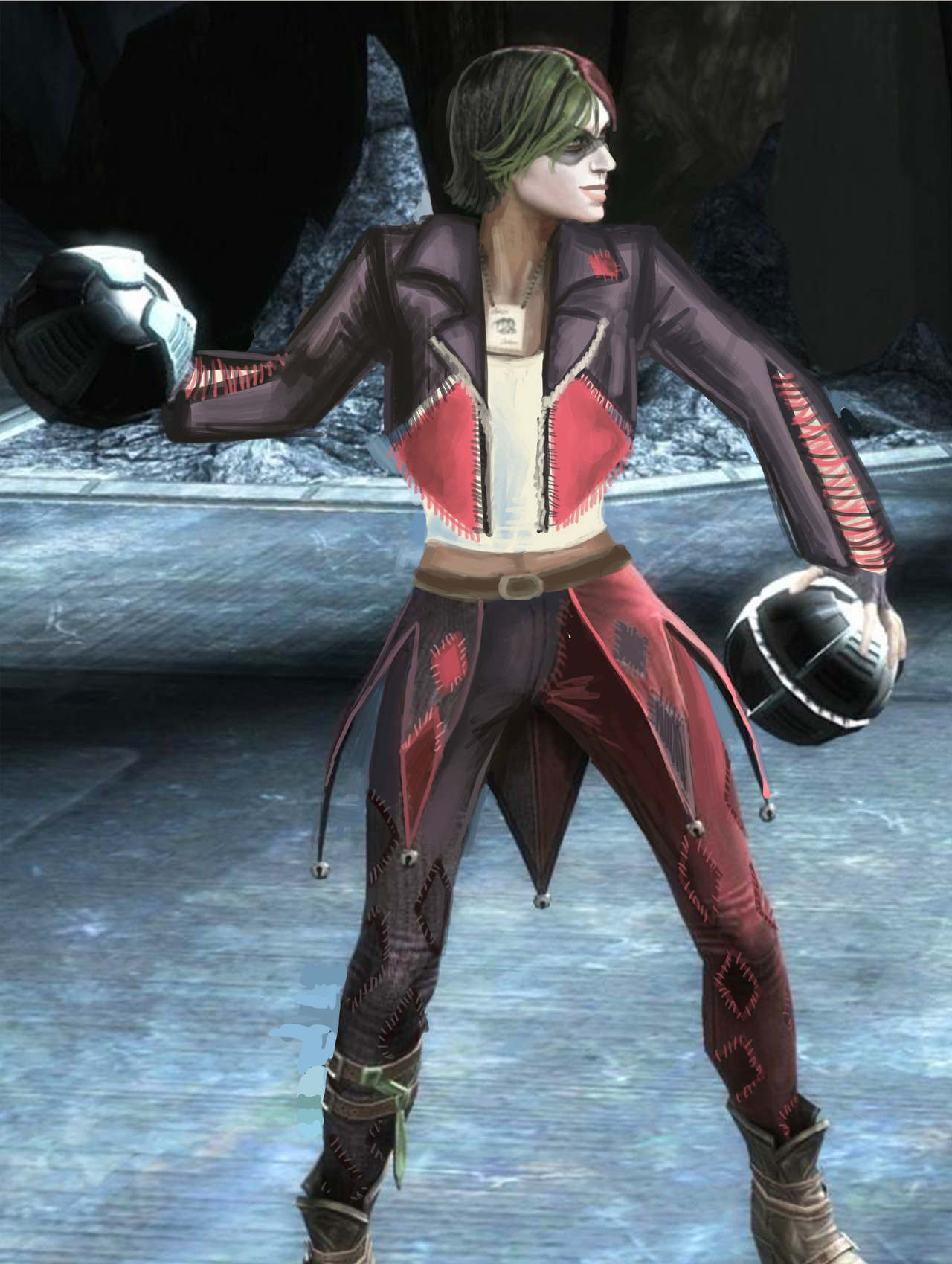
One of my earlier redesigns that I finished recently because of things was for Harley Quinn from Injustice. So, the problems here are pretty obvious… Lots of pointless and impractical skin, shit color saturation…. everything….
I originally was going to make her outfit more like a jester’s, in the vein of the original Harley design. I was just using the original design as a jumping-off point, but it was becoming very dull and uninteresting.
[Pictured above: The diamond market crash]
I ended up scrapping it for a more DIY look. I figured Harley would have fun making a quirky outfit to commit crimes in.
I kept the color scheme, though upped the saturation by a bunch. The idea is that she bought 2 pairs of identical but differently colored pants, a biker jacket, a tank top and some fabric. Then she went home, cut the pants in half and sewed them together, cut out huge chunks of the jacket in diamond shapes, and cut the jacket sleeves so they’re not as restricting. Then she just sewed a bunch of diamonds on everything, without any particular care for making it look professional. I think adding some sequins to her jacket would also not go amiss.
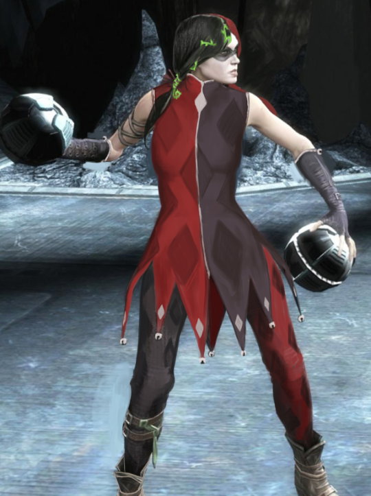
I hated her hair, so I cut it off. I also changed her face a little bit, and gave her back her smile!
Since she’s not a super-powered person with tons of money, I didn’t want to go with the standard power suit look, especially since I don’t think she would prefer one as a character. However, I also don’t think she would prefer to wear a Victoria’s Secret ensemble but with leather belts rubbing against her bare skin. She’d stick to her theme, but in a fun way, and that’s what I tried to convey in the redesign.
While we are happy to feature positive and commentary examples from a wild variety of sources, we will (with very few exceptions) only be featuring critical examples that come from verified commercial productions.
As such, we are unable to use images that are effectively unsourced (ones from Pintrest, Imgur, etc) – particularly given that the current state of reverse image searching rarely yields reliable results.
Please ensure all submissions are properly sourced so we can assign credit and blame alike to the deserving.
If you, a submitter, know where artwork comes from – tell us. If you don’t – look it up and only send it to us if you found the source.