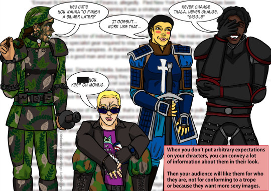
As a blog focused on criticism, there’s something we come across regularly in responses to our writing – insistence that we’re “never happy” no matter how much better a particular example is than most media we feature on BABD.
Readers (though mostly detractors) question why we can’t qualify something (mostly games) as 100% positive example if it does one thing better than the rest in its medium/genre/etc.
Examples:
Samus Aran is a formidable fighter and legendary female game protagonist, so it’s totally not a big deal that with every iteration of the character she gets designed as daintier, more conventionally feminine and runs around in skin-tight undersuit and impossible heels rather than her classic power armor.
Overwatch has cast with diverse ethnic and cultural backgrounds, therefore we should ignore how, despite that, most of its female characters are a very slight variation on the same “pretty” character mold and have costumes and poses that put gratuitous emphasis on their boobs and butts.
NieR Automata’s creator admits the main character is another skinny chick in high heels and with boob window, because of his personal preference instead of some convoluted lore-specific excuse… and that honesty means her design is beyond criticism?
It’s quite disheartening to have the audience insist that we should settle for media to be tiny bit better than mediocre and call it a day. That a game or its creator not being as bad as they could deserve to be awarded and held up as an example for the rest of the industry.
We refuse to set our standards so low that “her battle costume isn’t a literal bikini” or “has characters who are female in it” or “shows a male butt/chest sometimes” qualify a title as good, equal gender representation with no room for improvement.
Being better than a random asset-flipping game with stolen artwork in their web ads isn’t hard. Being better than your last project and learning from its mistakes should be a given. Simply not makingasinine excuses for poor representation shouldn’t be applauded. No-one is asking for perfection, but all creators should be held accountable for the product they’re selling, with its good and bad sides.
BABD in particular, instead of doing comprehensive reviews, is focused on female costume and character design compared to male ones. Yet even such specific topic can’t be talked about from both angles without someone decrying unfairness. Does it really say more about us being negative and cynical or the fans being entitled and blind to any challenging point of view?
~Ozzie
*The link leads to a satirical @pointandclickbait article, but the satire is not really all that exaggerated. Yes, really.
We must be doing pretty well lately, given that the majority of totally legit criticism we receive seems to be around the idea that there is really nothing wrong with anything… so naturally we must be deluded or clueless to think there’s some sort of issue with depictions of female characters.
(My personal favorite for this has been people rushing in to tell us since we don’t, allegedly, know enough about a male character in a scene – we clearly can’t tell if a female character’s outfit is ridiculous)
All of this, of course, coming back to the same statement when properly translated: “I am comfortable with the level and quality of representation other people are being given, so fuck them if they’re not.”
When really, the overall goal shouldn’t be to make everyone begrudgingly accepting of the state of global media. The goal should be to make everyone excited about the state of global media.
Because right now every major professionally produced piece of media has so much potential to explore long neglected opportunities and break away from painfully boring cliches. That they’re not doing that isn’t some sort of mild disappointment, it’s just ridiculous.
– wincenworks
Posted on
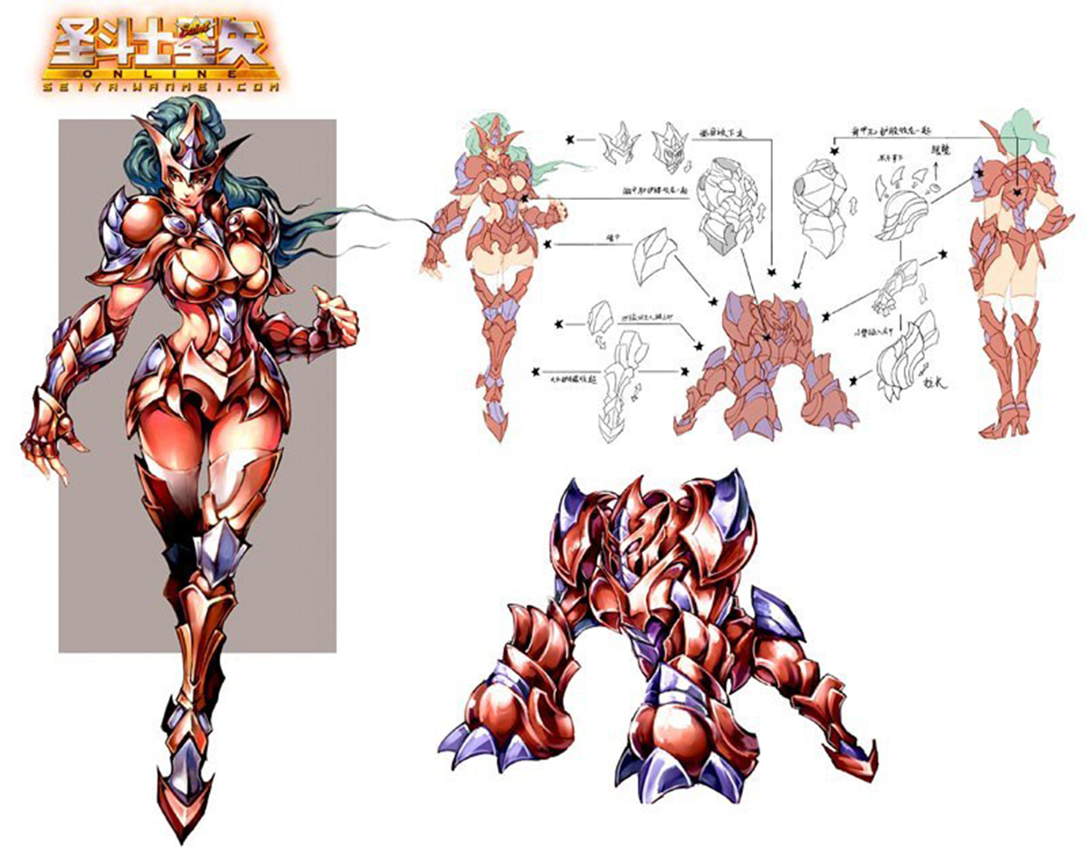
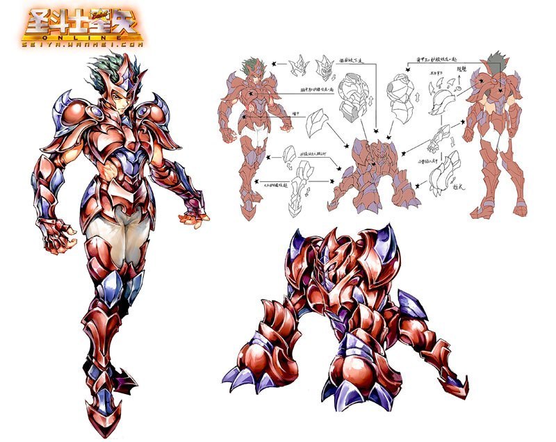
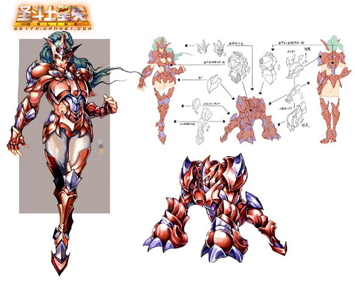
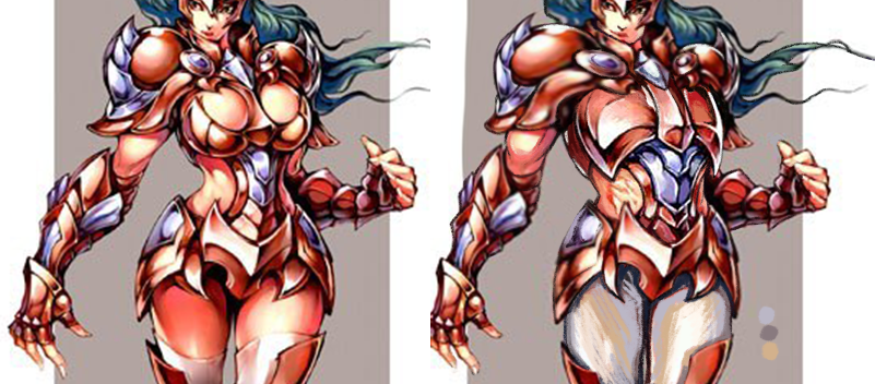
Saint Seiya Online SWITCHEROO Part 1: Armoring the ladies!
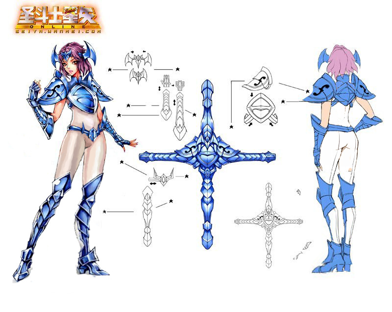
The idea is to take two gender disparate version of the same costume and make them equal to one another, by either basing male version on female’s or the other way round.
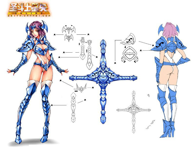
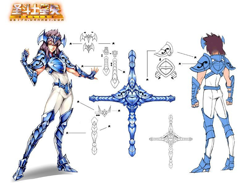
We concluded that Saint Seiya Online, which we bingoed twice since, is a perfect material to try this out on, as their concept art (credit to @saintseiya-zone for posting them!) includes most armors in both male and female version, which are basically always textbook examples of double standard in costume design.
Prepare for this being a double feature. Today we’re posting female knights equalized with their male counterparts. On Friday come the same male knights sexified to be as empowered as original forms of their female equivalents.
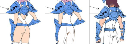
First thing I noticed about the blue-white knights is that since the dude one happens to be rather androgynous and strikes a flamboyant pose, designers doubled down on “feminizing” the lady one with pigeon-toed pose and super bingo-able version of the outfit. The two share very similar body type, so I concluded that pasting his parts onto her verbatim would work perfectly.
First thing to do was to give her his legs and right hand, so she can strike a power pose instead of generic dainty passive body language completely disparate from her male counterpart’s.
Then the task was relatively easy: paint over all those completely out of place holes in her outfit, give her waist a little more plausible girth and shrink her high heels to be exactly the same size as the guy’s.
It’s actually quite upsetting how the developers put in an active effort into ruining perfectly fine costume just to communicate that the lady version is different.
~Ozzie
I will fully admit that I probably? cheated by cutting the red guy’s chest right off of him (misandry?) and pasting it onto the lady, but I have good reason! We so often see strong women characters who are supposed to have a more “masculine” muscled look, but it never actually gets to the part where they don’t have an hourglass figure with the same old narrow shoulders. (See Overwatch’s Zarya and her most narrow shoulders.) So I wanted this lady to be beefy as heck.
To me, it seems like the artists’ definition of “beefy” for women was just a bigger rack and thiccer hips, and that wasn’t doing it for me. I made her shoulders way wider, stole the guy’s entire torso, and narrowed her hips. You also can’t ever have too much biceps. There are women who look like this, believe it or not.
(A minor thing, but I shortened her nails as well.)
For people who may not like this one because she looks too much like a dude… sometimes people do look like that. And maybe the problem is with our definitions of “manly” and “girly.” Why even cisnormativity.
Please remember to always provide sources with any submissions as there is no guarantee we’ll be able to trace the origin of any images without some help.
thaumaturgists (formerly durendals) actually rephrased its old text after a couple of years to have better wording regarding the notions of individual character agency:
on a textual level, a female character can dress however she wants and shouldn’t be shamed and hated for what she prefers to wear.
on a metatextual level, she might still have been designed with an intention to provide fanservice.
this means that criticising a design and the person/people who created it, as opposed to a character, is not misogyny. being displeased about the way a character has been designed is not synonymous with hating her. it is impotant to recognise that character designs don’t exist in a vacuum.
On related note, “slut shaming” is a term that refers to being shitty to real people who posses their own agency, not fictional characters. For further commentary on the matter, read any of those posts.
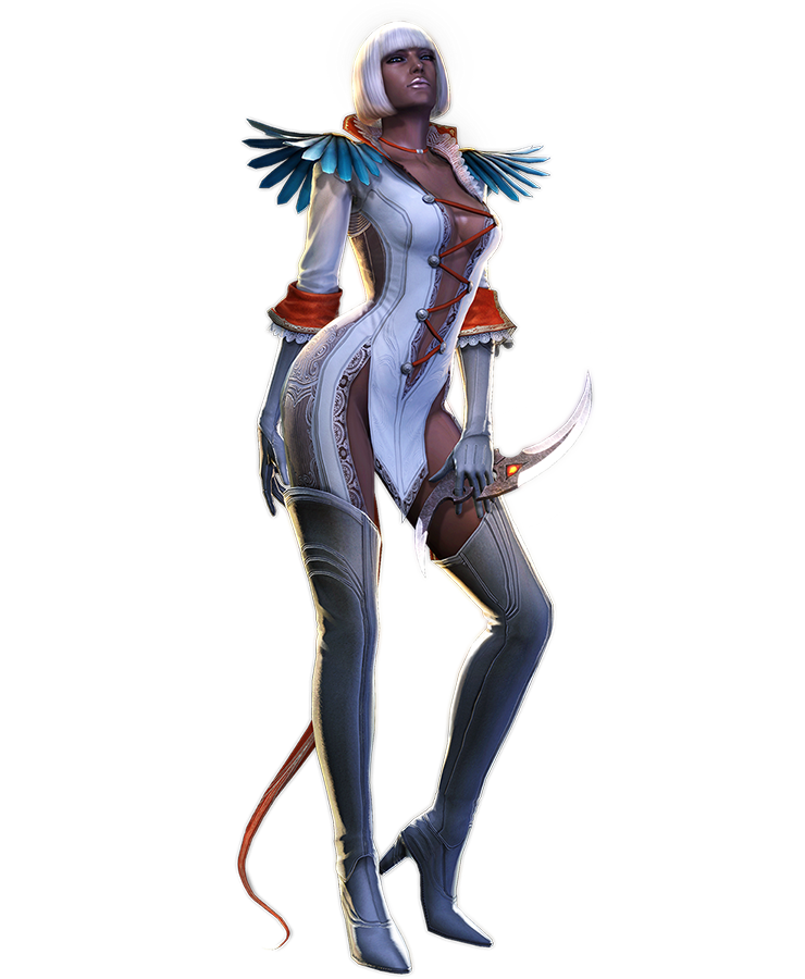
Ah, Gloria… What in the Nine Hells is even going on.
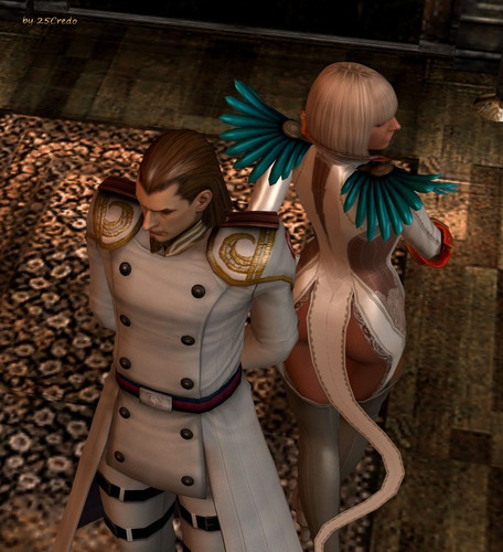
Gloria here is from Devil May Cry 4, where she is a high-ranking soldier. Yes, you read that right. She even demonstrates her “acrobatic and combat skills” in the game, to even the horror of VergilNero*, the main character. Watch the video at your own risk, not in public if possible.
For those who don’t want to scar their eyes and brains, here’s instead a picture of what the back of her “outfit” looks like:
In case you thought that the front of her could not be outdone.
-Icy
* The series really needs to consider in giving male leads distinct appearances or unique personalities… or maybe just personalities at all.
After much deliberation (and coming to a conclusion that a 5-day judging deadline that intersects with our holiday season wasn’t a wise idea), BABD is proud to present winners of the Break the Bingo design contest!.
But first, let’s give shout-out to those of fans who started working on their designs, but didn’t end up officially submitting them, particularly the artists who tagged us in their WIP posts. Those drawings, even when unfinished, were pretty great!
We’re amazed by the ultimate turn-out. A lot of contestants put extra effort into their entries, by doing things things like:
putting them into a form of a comic/concept art pitch/fake advertisement
It’s a bit scary just how close to the industry standards lots of you guys came! Some of the designs look like lifted straight-up from a video game or comic book studio!
Each and every submission is appreciated and we’re sorry we could reward only a select few of them, ones that we found to be the most creative in their use of the Female Armor Bingo tropes. And those are…
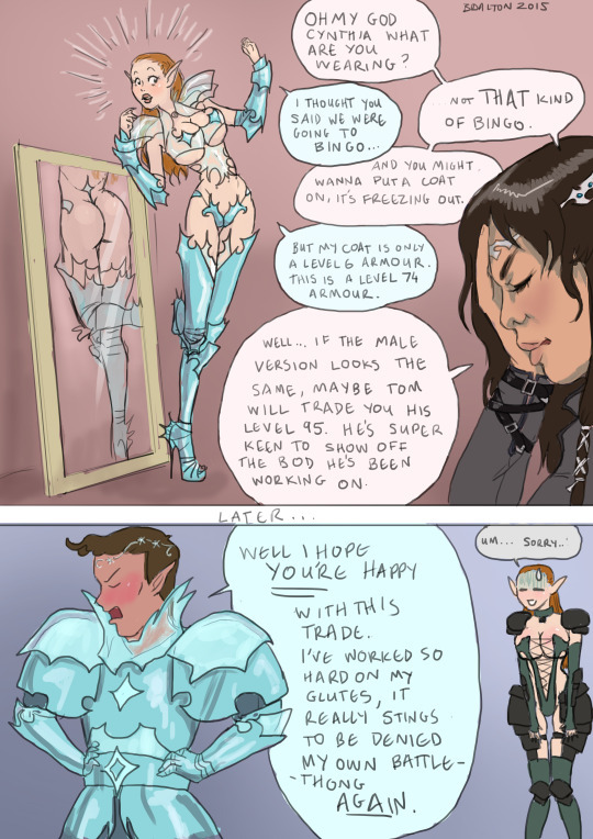
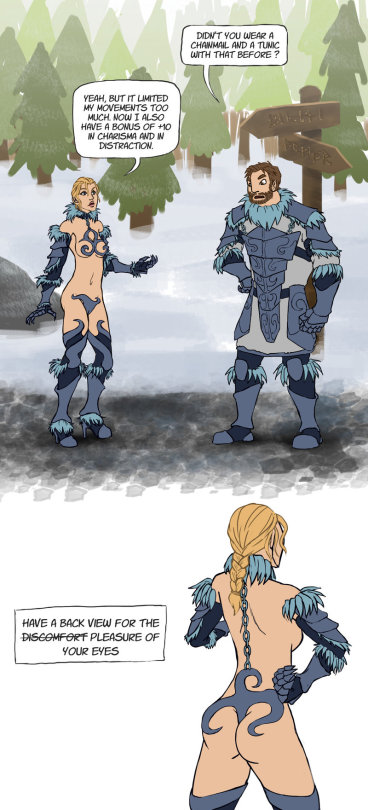
The plexi-boobplate is very clever! Nice way to score “Covers only nipples and genitals” while technically giving her a chest piece 😀 Also best luck to Tom in his never-ending quest of finding the sexy male armor suitable for his empowered body. ~Ozzie
Legitimate depiction of how heavy armor works in video games. – wincenworks
Her main “covering” is mostly mesh/chain mail thing. It’s sorta lingerie stocking AND boob sock armor. What I think is most innovative about this design is the boob holes in her boobplate. The girls can swing free and unencumbered while in action. Great for badass empowered female warriors.
Accurate representation of shoulder plates and fantasy high heels! – wincenworks
Chainmail boobsocks encased in what seems like a boobplate frame… possibly the most painful-looking chest piece in the contest. That + super impossible heels + pointy bits that will stab her whenever she moves = another winner! ~Ozzie
Extra points for showing accurate understanding of how bikini armor artists think how physics work. – wincenworks
Personally I think the original version of this chest piece fitted the definition of “boobplate” a bit better, but both versions are very well designed and look as uncomfortable as expected from a bingo winner! ~Ozzie
Bonus prize:
Thanks to lokificent’s generous prize donation, we were able to choose the fourth winner! And that artist is…
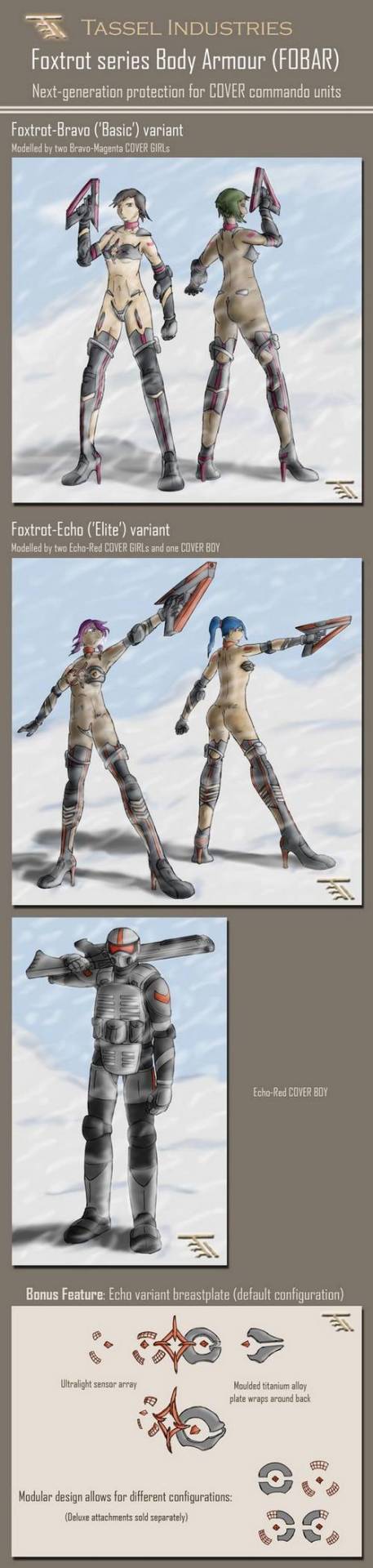
Designing ‘armour’ that would score all 25 squares and the bonus points was equal parts interesting challenge and vicarious thrill. I had to constantly resist the urge to make things less ridiculous. The pinnacle (or nadir, depending on how you look at it) of this exercise was the Echo variant ‘breastplate’; it’s practically a bingo in its own right
Particularly accurate with sci-fi’s tendency to put bits of metal and lights in random places. – wincenworks
I’m getting an impression that more thought was put in designing those modular nipple pieces alone than in many complete outfits we bingo’d before. ~Ozzie
The prizes:
As established above, there are four rewards to choose from:
To collect their prizes, the winners should contact us at bikiniarmorbattledamage via askbox/fanmail or at BikiniArmorBeDamned via private message and the first three of them should specify what is their preferred reward. First prize winner gets whatever they choose, then the second and then the third one pick from the remaining poll. Bonus winner gets whatever is left for them.
All the other contest entries + further commentary under the cut:
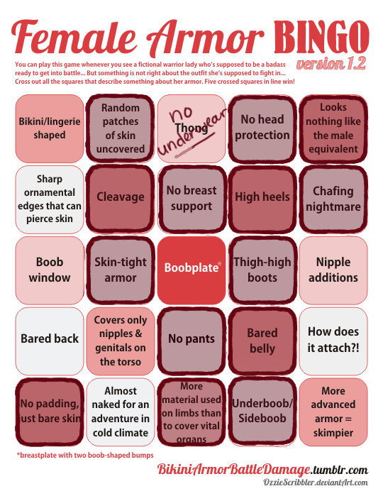
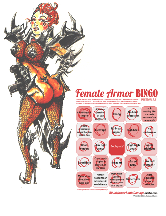
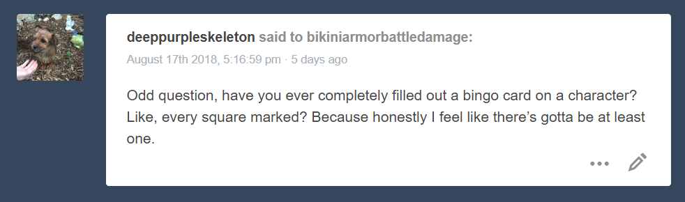
Bonus throwback this week in reference to a question we get periodically regarding the Female Armor Bingo. Credit to the latest asker of it, @deeppurpleskeleton:
The answer, in short, is: We have, to date, not come across any example that fills all squares of the Female Armor Bingo in the wild. We did, however, run a contest to break the bingo card and were very impressed with the creativity of the entrants.
Please do click on the Keep reading link and view all the entries. We’re very proud that our blog inspired artists of many skill levels to come up with so many distinct, yet equally absurd costume designs. All of them deserve recognition.
~Ozzie
Posted on
Posted on
Cool for the Summer Skins (NSFW)
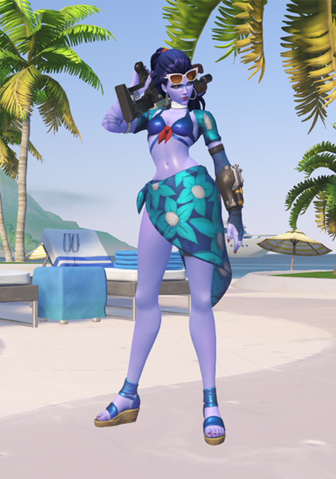
Our first (and definitely not last) foray into redrawing Overwatch. Their summer 2017 skins were a strange mix of bland and safe, cosplay, and a single actually good idea (grill dad 76). We decided that wouldn’t do, and so picked two of the more unsatisfactory skins in the collection to redesign and actually have some fun with!
Widowmaker
When I first saw Widow’s boring, predictable summer skin, I was mildly annoyed. But after giving it some thought, I became hugely disappointed that they didn’t make her into a fisherman! The fishing rod that looks like a sniper rifle? She even has a grappling hook that could be made to look like she’s throwing a fishing line. What a missed opportunity.
So I made try-explaining-those-tanlines Widow into fishing-day Widow, complete with plaid shirt and huge rubber boots. Because her legs are so fricking long, I should probably have given her hip waders, which are rubber boots that go up to your thighs or higher. They’re actually appropriate thigh-high boots, for once! Given more time, I could have also given her more accessories on her belt, like a bunch of lures and containers with bait.
This is one of those ideas that I may come back to and actually design properly
in the future.
-Icy
Mercy
I found the “Nike” Mercy skin utterly uninteresting and kinda overdesigned. to fight that, I changed her tunic to have a shorter “tabbard”, expose one breast (because why not?) and cover up more of her butt.
Got rid of those sandals with weird, borderline impossible to wear straps, and replaced them with winged Nike sneakers.
And to make more serious attempt at portraying her as Nike, the goddess of victory, I put the laurel in her hand, instead of head, which is this mythical figure’s most basic attribute, right after the wings. And one more in her mouth, to make her more cheeky.