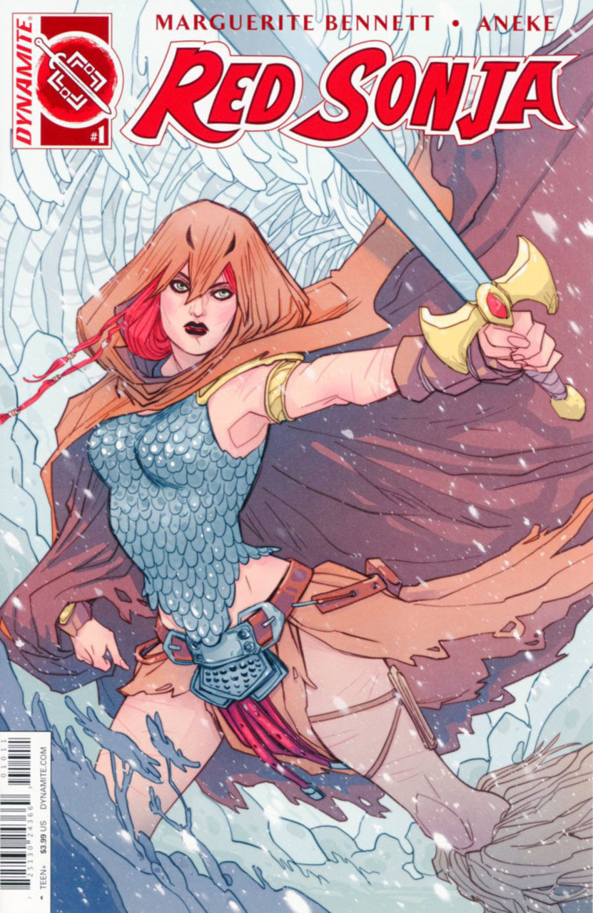
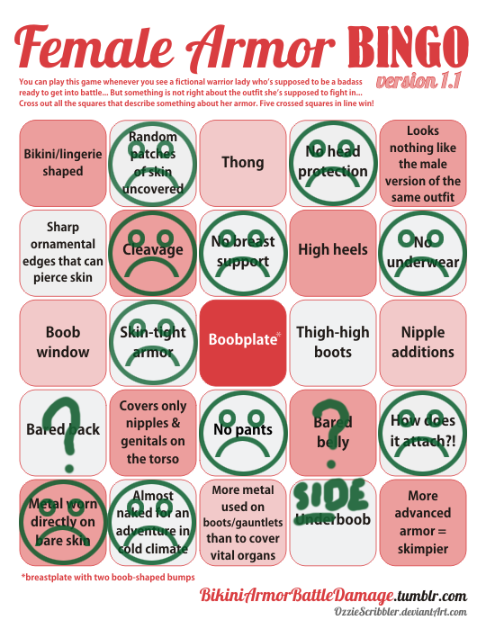


So, Red Sonja’s new image is an improvement on the bikini, but sadly right on the first issue highlights a lot of the sexy lady armor tropes.
This is doubly frustrating because all they had to do was give her the rest of the scalemail shirt and some pants. Well, maybe she’ll get pants next time Dynamite re-invents the franchise.
– wincenworks
NYCC: Simone, Scott revamp Red Sonja, Vampirella & Dejah Thoris for Dynamite
NYCC: Simone, Scott revamp Red Sonja, Vampirella & Dejah Thoris for Dynamite
I feel that the most critical step to really re-inventing those characters would be to get them away from Dynamite Entertainment.
I enjoy Gail Simone’s re-invention of Red Sonja and understand there’s a balancing act with the branding and appearance. But an ongoing thing with Dynamite Entertainment is that they stockpile old characters to use them in spinoffs, mash-ups, etc.
So far, at Dynamite, we’ve had:
- Steampunk Red Sonja in a skimpy scalemail bikini
- Red Sonja being stripped against her will covers
- Steampunk Red Sonja now with covers by sexy pinup artists
- The Black Tower – which is actually worse than it looks
- Swords of Sorrow – where every female lead was in bikini armor
I mean – these are the most recent spinoffs (one working with Dark Horse):
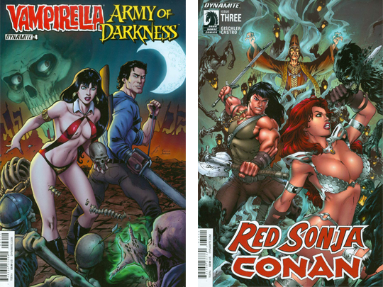
Furthermore, while these designs might be bold for Dynamite, they’re not really that bold when you step back and look.
Red Sonja is basically back to a sexier version of the outfit she in her very first appearance, Vampirella appeared in a space suit in March (and I remember seeing concept ideas to re-invent her wearing full body gear in the 90s) – and okay, the movie bombed but nobody thinks it’s because of what Lynn Carter wore as Dejah Thoris.
What would really be bold – is actually re-inventing these characters without anchoring them to bad branding and design decision made in 70s (or earlier). Red Sonja has changed far more than her costume has, and not updating her appearance to reflect that hampers the comic.
At the end of the day – the reason these properties got sold to Dynamite Entertainment and the reason this is the second time Red Sonja’s been re-invented since then is because the old branding isn’t speaking to audiences today.
– wincenworks
NYCC: Simone, Scott revamp Red Sonja, Vampirella & Dejah Thoris for Dynamite
NYCC: Simone, Scott revamp Red Sonja, Vampirella & Dejah Thoris for Dynamite
I feel that the most critical step to really re-inventing those characters would be to get them away from Dynamite Entertainment.
I enjoy Gail Simone’s re-invention of Red Sonja and understand there’s a balancing act with the branding and appearance. But an ongoing thing with Dynamite Entertainment is that they stockpile old characters to use them in spinoffs, mash-ups, etc.
So far, at Dynamite, we’ve had:
- Steampunk Red Sonja in a skimpy scalemail bikini
- Red Sonja being stripped against her will covers
- Steampunk Red Sonja now with covers by sexy pinup artists
- The Black Tower – which is actually worse than it looks
- Swords of Sorrow – where every female lead was in bikini armor
I mean – these are the most recent spinoffs (one working with Dark Horse):

Furthermore, while these designs might be bold for Dynamite, they’re not really that bold when you step back and look.
Red Sonja is basically back to a sexier version of the outfit she in her very first appearance, Vampirella appeared in a space suit in March (and I remember seeing concept ideas to re-invent her wearing full body gear in the 90s) – and okay, the movie bombed but nobody thinks it’s because of what Lynn Carter wore as Dejah Thoris.
What would really be bold – is actually re-inventing these characters without anchoring them to bad branding and design decision made in 70s (or earlier). Red Sonja has changed far more than her costume has, and not updating her appearance to reflect that hampers the comic.
At the end of the day – the reason these properties got sold to Dynamite Entertainment and the reason this is the second time Red Sonja’s been re-invented since then is because the old branding isn’t speaking to audiences today.
– wincenworks


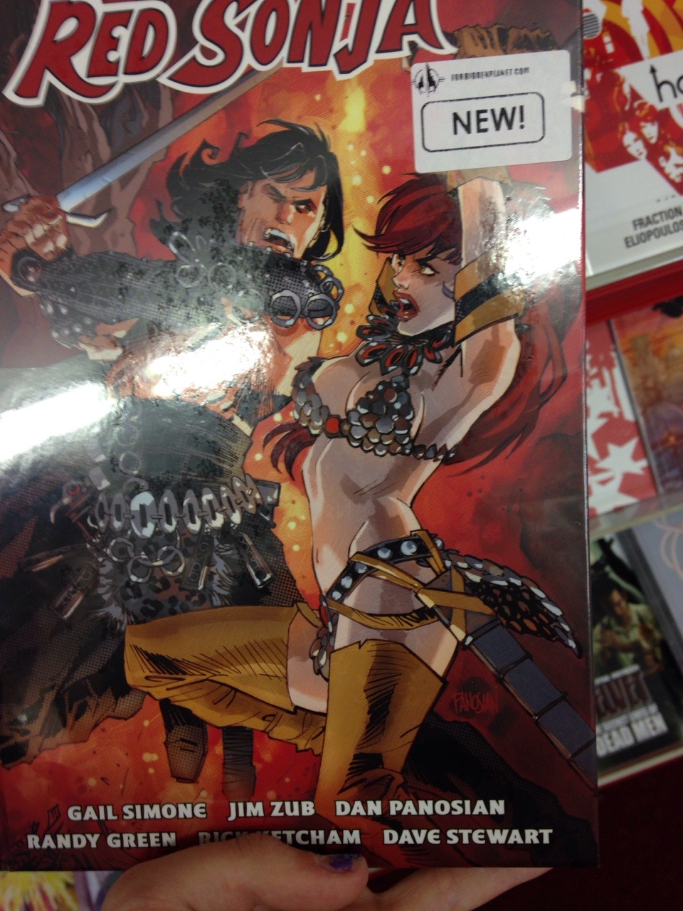
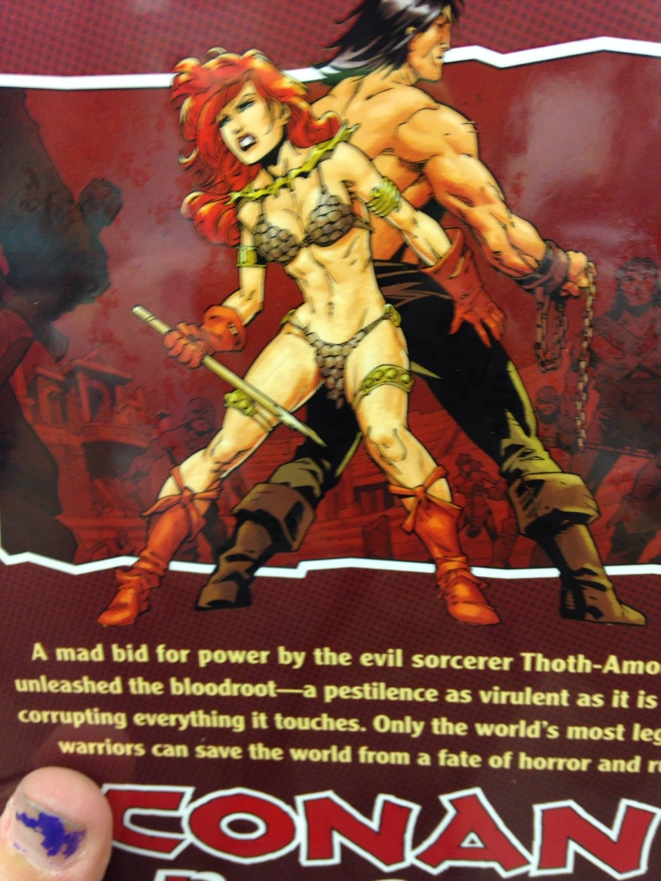
inkformyblood submitted:
So a friend pointed this out to me in a comic book shop the other day cause she knows I like to play Bikini Amour Battle Damage Bingo. Didn’t think to write down the name however ^^; and also couldn’t look inside the comic because it was sealed.
The title is “Conan Red Sonja” (preview on Google Books) and while one could make the argument that Conan is also wearing impractical attire for fighting battles, I feel that the book maintains a kind of double standard in the presentation of the two characters.
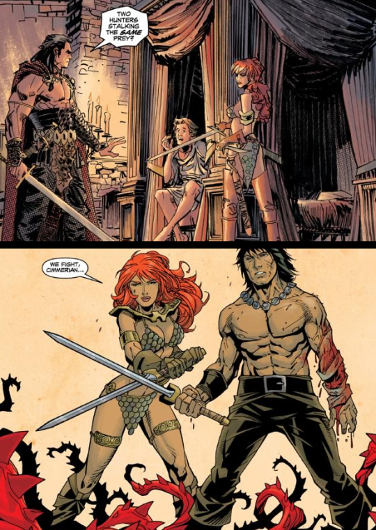
Specifically that Red Sonja regularly gets to be slightly more active, as an excuse to pose her oddly and to try to balance out that she’s posing for the titillation of the audience while Conan is… being Conan.
– wincenworks
leggomywaffle submitted:
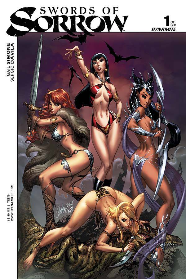
Saw this cover from a post by my local comic store. This comes out on May 6th and has the description: “featuring Vampirella, Dejah Thoris, Red Sonja, Kato, Jungle Girl, and many, many more! Villains and heroes from a dozen worlds and eras face off against a legendary evil that threatens all their homelands.”
Funny how not a single woman from this various eras and worlds has ever considered wearing more than lingerie into battle. The one ladies sword has more metal than her entire set of metal “armor”!
Combined, these women almost fulfill the entire bingo card! Wow!
I was really hoping that this cover would not summarize the content of the book, which is the combining of many great heroines from the Golden Age of comics – but sadly the contents of the book do seem to send a clear message from Dynamite Entertainment: Women are only worth putting in comics if they visually coded as sex objects first:
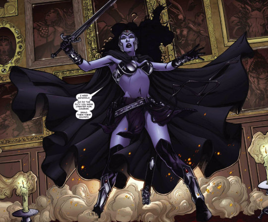
Nostalgia has a massive influence on comics, largely because only a few creative people are involved in making them (compared with video games and movies) and most of them are specialist skill sets. This combined with general risk aversion, means that sadly none of the “big” titles are prone to challenging their old conventions.
This is particularly disappointing for Dynamite since the company only started in 2005 – but has huge gallery of golden age characters they purchased but have continued to make them generic copies of what made them so unsuccessful they were up for sale.
I mean you want to know how generic this cover is? Let’s compare it to another heroine based book J Scott Campbell was recruited to do the cover for:
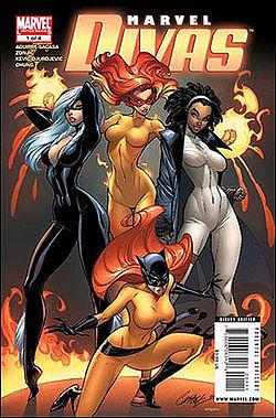
So, while I want to be really excited about having a big story that is a lot of Golden Age heroines getting together, it’s really hard to do that when the art is basically reduces them all down to the same Barbie dolls with the same “How do we dodge the censors?” costume design ideas.
I love nostalgia as much as the next comic book fan – but at some point we have to ask what is the point of continuing the art if we don’t really advance it? And what is the point of doing a girl power comic if the introduction to it could be used as a textbook example of male gaze in comics?
– wincenworks
More on comic books | More on Red Sonja | more on J. Scott Campbell


