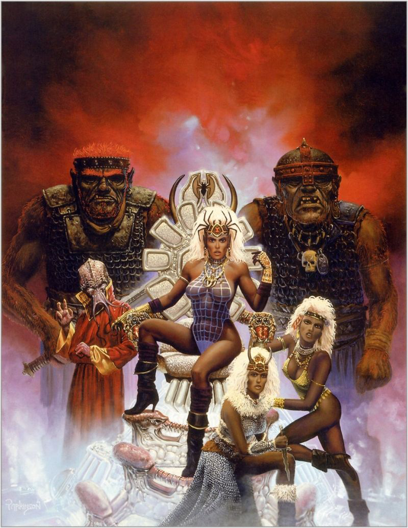
Queen of the Spiders Re-Covered 

We decided to try our hand at a combined redesign, where each of us picked a character in the same picture and redesigned them. And we thought this image, the cover of an old Dungeons and Dragons adventure called “Queen of the Spiders” would be a good candidate (blame for throwing it at us goes to @theoldhack​​​). 

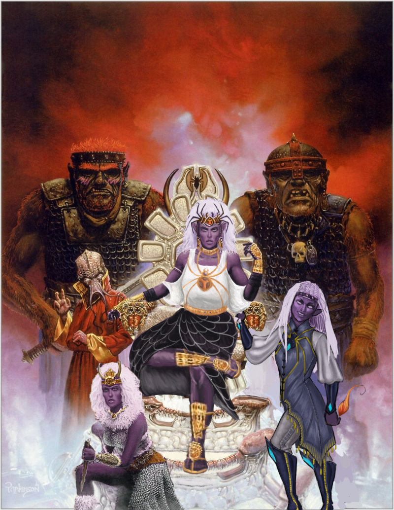
This is where the infamous drow race is introduced, where I guess they were just… evil women of color. ? Unfortunate. We decided to make them purple-skinned like they are in more modern lore.

At first, Icy thought the “queen” in the title referenced the lady in the middle there, but it’s actually one of the names for Lolth, the spider goddess whom the drow venerate, so…. We’re sure the drow on the cover are important mini-bosses somewhere in the adventure, probably, maybe.

Full write-up and close-up images under the cut.

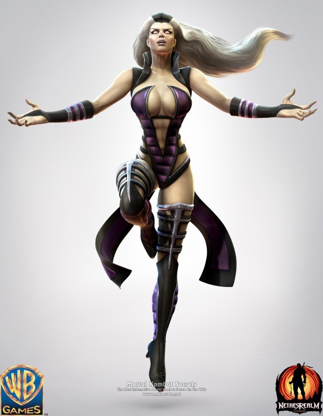
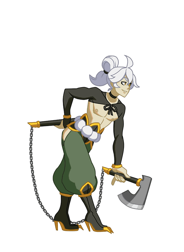
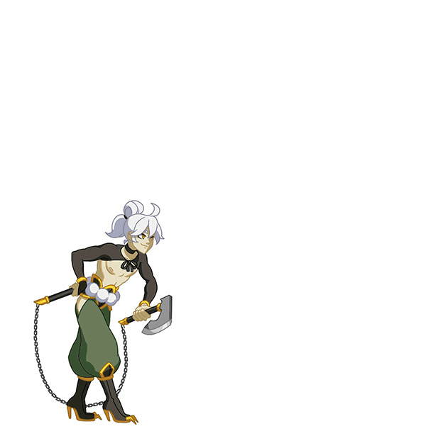
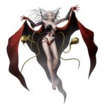
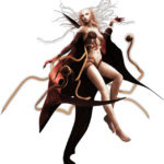
What’s-her-Face on the Right 

image

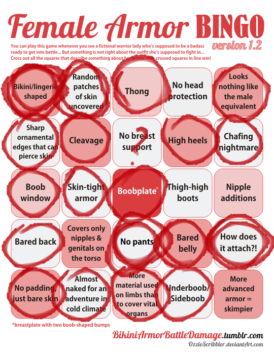
Just gotta say that it’s a huge pet peeve of mine when (usually male) writers write a matriarchal society as, air quotes, “sexually liberated,” otherwise known as “an excuse to draw them in lingerie because I can’t imagine women’s bodies not catering to me personally in any scenario, while still drawing men in full body armor.” Thanks for coming to my TED talk.

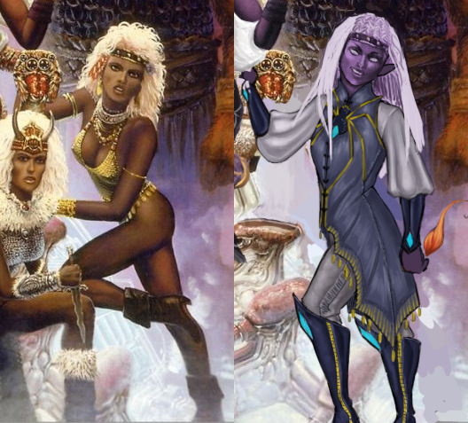
Okay, so…. I’m not sure what she’s supposed to be… besides a swimsuit model, which maybe the drow do have. Is there a quest where the players go to the underground beach to play underground beach volleyball? Cause if not, why is she like that???

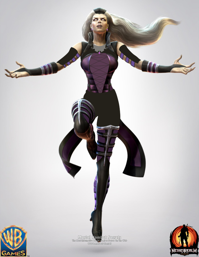
I decided to make her a mage (this was a 1st edition book, so that’s all we got). I ended up changing…. everything, really. I think the only thing I didn’t change was her nose shape. It’s not my fault though, the redline for her original pose was an unsalvageable eldrich nightmare.

I gave her a more confident pose, more comfortable magic-user-friendly clothes (with the spider motif, cause spider god), and even different hair. The original hairdo just wasn’t doing it for me. I wanted her to look cool enough to have her own illustration in the book. She even has a little magic flame (mostly cause I didn’t know what to do with her hand lol)!

Her hair didn’t quite turn out how I wanted it to, but overall, I think it’s a good redraw. She’s got lots of fun shapes, an actual color scheme, and an attitude. What else do we need?

-Icy

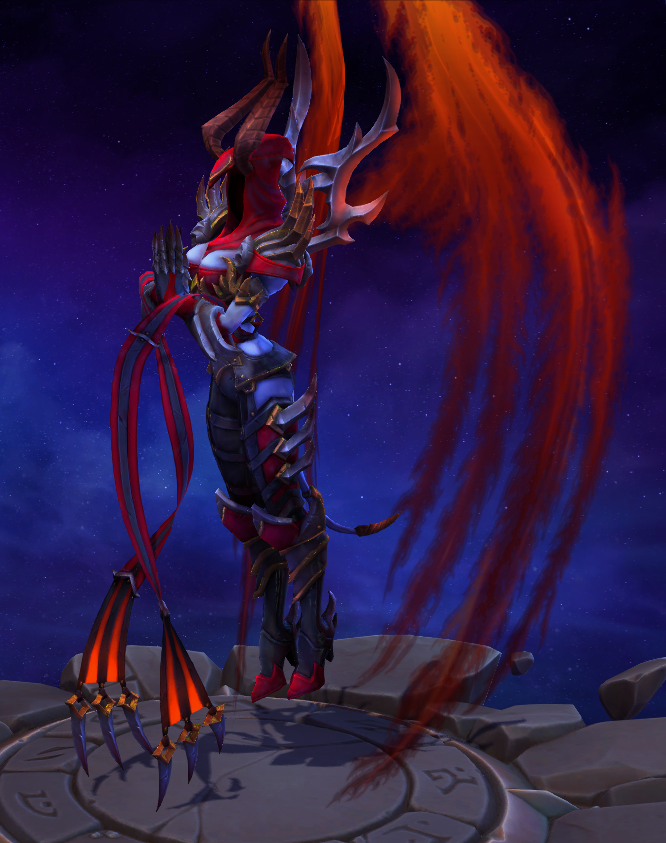
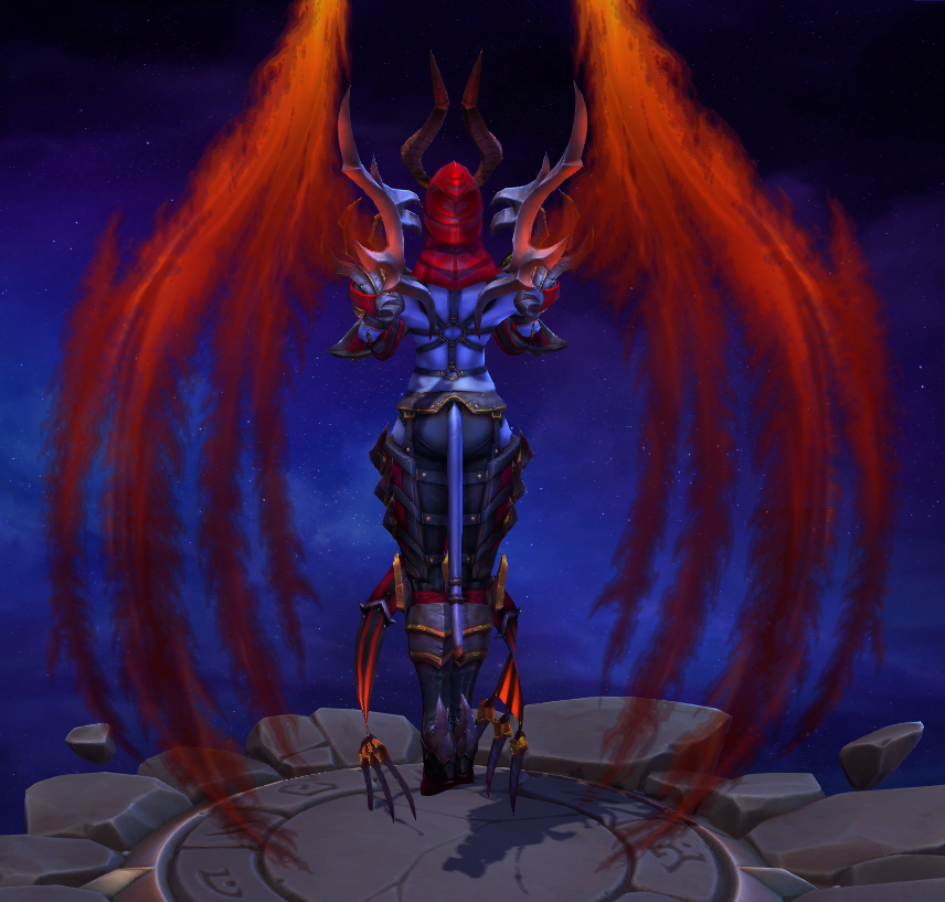
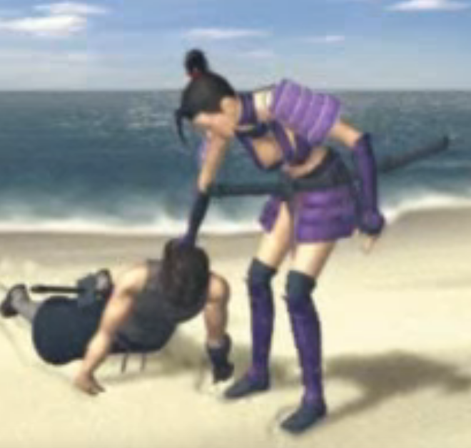
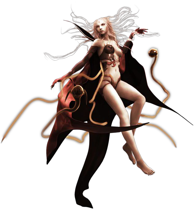
Queen/High Priestess Crotchleg 

image

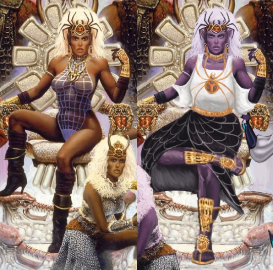
The composition was so awful that I had to actually largely re-do it by changing the third lady’s position from right to left and recreating large parts of the throne… some of which ended up covered by the main drow’s dress anyway (probably for the better). 

Speaking of which, boy was she hard to fix without just throwing everything away and starting over! First of all, the way she sits on the throne seems like a product of an alien who never experienced what a chair is… which might also explain the throne’s uncomfortable-looking design. I actually ended up giving it a bigger seat and more lumbar support. 

The pose, of course, got changed to something less concerned with showing off her immaculate Brazilian and more with looking comfortable and intimidating in the authority position. I also noticed her neck was disturbingly short, so I moved her face a tiny bit up. Now her spider crown is more of a tiara than a hat. And she got a golden choker to match.

A lot of questionable physics of how she actually sits got covered up by roomy, relatively simplistic clothes I gave her. Maybe I’d consider something more elaborate if the rest of the painting didn’t require so much fixing. What matters is that it’s not a painted-on swimming suit anymore. I’m overall satisfied with the design of her top and the spiderweb skirt. Hopefully the golden spider jewelry (the legs are thin chains!) gives it some regal feel. 

The original shoes were quite stylish, but looked neither comfortable nor  matched the fashion sense I went with for the character (also didn’t match the angles at which I redrew legs). So I ended up giving her sandals with golden ornamentation, matching her gauntlets. Sorry not sorry for half-assing the legs. One has to prioritize while on a deadline*. 

I’m  generally happy with the results, considering the sheer scale of changes we had to apply to have it meet BABD standards for positive example

~Ozzie

*Icy sobbing in the background 

satan-general-irl submitted:

LET MOM CHARACTERS BE ATTRACTIVE & BADASS WITHOUT BEING OVERLY SEXUALIZED-

Sindel has such an interesting concept?? But then they tried to make her like… god, I can’t. I did this in like 20 minutes on my phone. No cruelty intended, but if you can’t design a scary older woman to where she’s hot without wearing a leather monokini, you’re not doing it right.

I emphasized the royalty motif with the jewelry & corset (so her impossibly tiny waist makes some semblance of sense). Hope you guys like it.

Emphasis mine, cause I agree 100%. For 20 minutes on your PHONE, trying to work around that disaster, this is such a huge improvement, it’s kind of embarrassing for the original. I wonder what other designs were on the drawing board before they picked this one. At least she seems to have abs in the original…. but damn, was this the worst way to show them? The answer is yes. Check out our bingo of the original “outfit” here.

The way I see it, this is one of those designs where you have to just scrap everything, except for that shrug thing maybe, to redo. I don’t think the corset is a great look (or great for fighting), but honestly, I wouldn’t be able to come up with any ideas in 20 minutes, as anyone who has watched our livestreams will confirm. ¯_(ツ)_/¯

I think this is a good example of just how easy it is to not give your character an ugly double-sided-tape-requiring swimsuit made out of that puffy coat material. But this was Mortal Kombat 9, where clothes went to die.

-Icy

image

Sooooo….. this is a thing.

image

This the Demonic skin for Aurelia, an angel character in Heroes of the Storm. She normally looks like this:

image

So of course when she becomes a demon (or almost, according to the backstory blurb), she wears an S&M outfit, cause that’s what demons are about? Where’s my S&M Azmodan skin, then, Blizzard?? 

The closest a male equivalent outfit gets is the Demonic Imperius skin, where he shows off his abs but unfortunately doesn’t wear a leather harness.

image

At least he wears hot pants, but at the same time, he gets, like, a legitimate chest piece. Auriel is getting a nip slip the second she casts anything, assuming angels have nipples. Imperius also has an actual demonic appearance about him, whereas Auriel is just a Hot Chick with red wings. The fact that none of the angels have faces only makes it worse with her design.

Ugh. It’s such a shame, they could have made her actually scary-looking, but we can’t have that. After all, even an alien insect queen has to have a hot skin.

-Icy

fenrhi:

indivisiblerpg:

Today’s @indivisiblerpg update features Mara henchman and blade-licking afficionado, Ren!

Read up on his gameplay and check out his animations at the link!

http://www.indivisiblegame.com/2018/01/19/ren-animations-and-gameplay/

@bikiniarmorbattledamage

While we talked about Indivisible’s design being pretty damn awesome and varied, there were still issues we had to point out, like Phoebe’s whole costume. 

Good to see a genuinely sexyfied male character added to the game! 

Like, this sort of costume (high heels! underboob! thigh cutuouts!) and animations are very rarely used unironically on male characters.

He’s still though one of the villains, making this an example of evil is sexy and arguably also of antagonist LGBT coding.

Hoping to see a heroic dude get this sort of design treatment next time, to level the playing field and normalize sexy masculinity!

~Ozzie 

So Lady Kagami was the main antagonist of Tenchu 2… which was supposed to be an epic battle between ninja clans and rulers in Feudal Japan but somehow ended up with this as the major villain.

How seriously can you expect to take people take this kind of villain when facing off against a protagonist like this:

image

For those rushing to type that it’s an old game and doesn’t matter – it’s worth remembering what the final installment in core series was.   Design aspects like this left unaddressed can kill otherwise unique and engaging properties.

– wincenworks

aleph-ozone submitted (and Icy Bingo’ed):

She doesnt really wear armor, but i wanted to show this to you anyway: Final Fantasy’s embodiment of entropy, the Cloud of Darkness. She’s supposed to be a god-level creature of destruction, who for no reason looks like a human being.

For no reason indeed! Yikesaroonie. From the wiki:

Though the Cloud of Darkness universally takes on a feminine form, it is officially considered a genderless being that merely chooses to appear as such.

(And yes, the entire wiki page uses “it” to refer to this being.) I guess an almost-naked woman dressed in unexplainable blobs of coverings is scarier than just an evil cloud or something, especially when their original appearance in Final Fantasy III looked like this:

image

This was the final boss, by the by. Much scare.

-Icy 

Hey, but it’s aaall okaaay, because they are a powerful genderless being who only chooses to look like a generically sexy woman in absurdly impossible “clothing”! Their appearance doesn’t have to make sense as long as they possess magic and will to be like that. 

Yup. Makes total sense to me. Don’t look at that nosebleed I’m getting from cognitive dissonance brain strain! Just accept that this is what a sentient evil cloud of entropy would look like, okay?! *passes out*

~Ozzie

Since last time we bingoed a dark evil shmexy lady in strange head gear and since Thor: Ragnarok movie came out lately, how about we bingo Marvel’s Hela, another villainess with a penchant for silly hats? 

She had a lot of exquisitely ridiculous costumes throughout time (green is usually her color, corresponding with Loki’s), so I decided to take jab at by far the most WTFiest design, from the Ultimate Marvel continuity. 

image

Now that is an “evil is sexy” trope in full swing! Looks like literal BDSM outfit, only done by someone who never saw real BDSM gear (so E.L. James’s visual artist counterpart?).
Art by our “favorite” Frank Cho (first and third image) and  David Finch (second image), so the comparison wasn’t really far off.

I’m always upset by Hel(a) being just another smooth-skinned Barbie in Marvel stories, considering how interesting is her appearance as told by Norse myths she originates from.
Half of her body is supposed to be that of a corpse, which disturbed Asgardians enough to give her reign over Hel (or Helheim), the land of those who died inglorious deaths, where other gods won’t have to interact with her. 

Just look how myth-accurate Hel is depicted in Dat Asynja calendar by artist

TheEndOfGrey,

which we promoted before:

image

Other interesting Norse myth artwork I’d personally recommend is that of Hellanim. Here are their pieces related to Hel and her family: [x] [x]

Sadly, Marvel’s still BY FAR much more iconic and original take on the death goddess than SMITE’s, which just made her alternate between two generic “sexy” chick appearances. I mean, Marvel one at least has that weird hat going on.

~Ozzie 

edit: Added comic artists’ names, h/t: @filipfatalattractionrblog

Warhammer Battle Bikini Brigade (and more)!

@universe63 submitted: 

From this article

This was the first image in the rotating slides for the article about Warhammer: Total War.  It doesn’t get much better.  Later in the article we have these two Dark Elves.

Even his frickin’ FACE is covered, but for her?  Armor?  NOOOOoooooo. We get… whatever those things are on her boobs that are going to gut her like a fish if she bends over and can’t possibly stay on without glue or piercings.  I guess all her armor budget went into that hat.

OTOH, after showcasing the horrible, I wanted to showcase the one good female armor in there:

…but you have to scroll through tons of images (including more bikini armors) before you can find this one.  And I can’t tell for sure if it’s a trick of the light or if she actually has a bare middrift because reasons. [sigh]

Personally I think the greatest display of priorities in these designs is this piece of concept art which could almost be “spot the difference” game:

(And in case there is any doubt as to whether this is the artist or the studio/Games Workshop’s decision, I invite you to compare and contrast with the other works in Evgeniya Egorova’s Artstation gallery)

Yeah.

As is so often the case with Warhammer (and many other fantasy settings), there’s so many things to unpack in these: Bikini armorEvil is sexy, and of course: Nipple armor.

The worst part is that I can’t even bring myself to be surprised.

– wincenworks