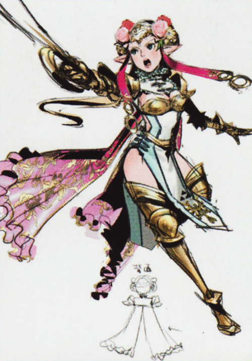
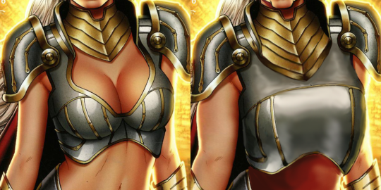
I’d say Hyrule Warriors developers should be ashamed of having this sort of artwork going public, with all the tackyness of “female Link” having boobplate, bared belly and panties on top of trousers, but judging by their Zelda costume concepts, “tacky” is their status quo and shame is alien to them.
~Ozzie
Posted on
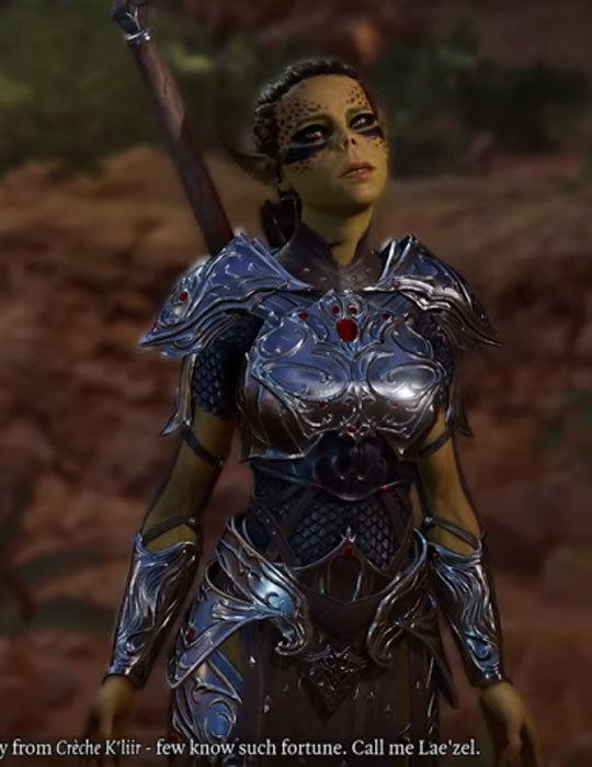
So, the creators of Divinity 2: Save the Boobplate … sorry Divinity 2: Girls don’t play video games… sorry Divinity 2: Original Sin have shown off a couple of hours gameplay for Baldur’s Gate 3… and this is the iconic character in the intro sequence before you pick/create a character.
Which means aside from being in this atrocity, she also gets the dubious honor of being the character who we see as a fellow prisoner having a parasite implanted via her eye (then the first person scene implies its happening to you, even though she is playable as one of the pre-generated characters).
Aside from the obvious mountain of baggage to unpack about women as victims, ridiculous armor for women – accurate for men, etc. There’s something else I’d like to point out which is probably not going to be obvious for anyone who isn’t a huge Dungeons and Dragons nerd.
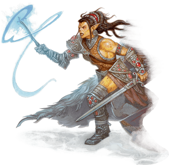
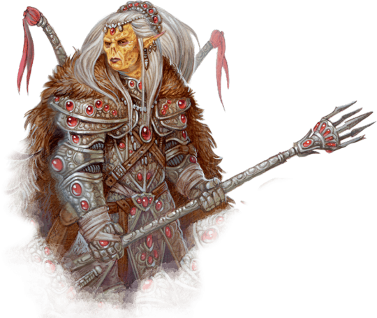
Lae’zel is a githyanki, basically a near human but not human “alien” race from another dimension with a long history and pile of lore which actually makes the whole scene worse. However, what I wanted to cover is this is what female githyanki look like in the current 5th Edition Dungeons and Dragons art:
So for this character, Larian Studio’s entire design process has been:
Remove all muscle tone and threatening aspects of appearance
Make the worst armor more ridiculous but cutesy and hyper-feminine
Great job at depicting a race where all members are raised as warrior from birth.
Why are people calling the people story tellers again?
– wincenworks
Posted on
Fixing Some Grim Designs ?, Part 2
Thanks to my forgetfulness, Throwback Thursday and Wednesday redesign switched places this week. Hope you don’t mind!
It wasn’t a very inspired stream for me, so I basically worked from a Zenescope artist’s default mindset. The difference is, my priority wasn’t “MOAR BEWB”.
Most major edit was sharperning her facial features, so that she looks like an old lady we expect Baba Yaga to be. She doesn’t need to be “sexy” to disguise her dangerous nature – looking like a grandma already did that! Also gave her greying eyebrows and got rid of those random golden rectangles (warpaint?) on her cheeks which, because of outlines, looked like adhesive bandages and added nothing to the design.
I’m not as happy with her new, older face as I am with Arhian, but anything’s preferable to Generic Hot Lady Face #9575.
Another obvious fix was turning this bodypaintboobplate into something resembling a breastplate. Not my best edit, and I left the center of the chest kinda barren, but I did extend her pseudo-gorget to somewhat normal size for this armor piece. Now she can’t die of stabbing in the cleavage!
The lesser edits, after those, were thickening of her noodly arms and putting a red dress under her plate armor pieces. Not exactly realistic or practical padding, but still preferable to gratuitous skin display.
Definitely among my worse redesigns, but I hope you like it in comparison to the original anyway!
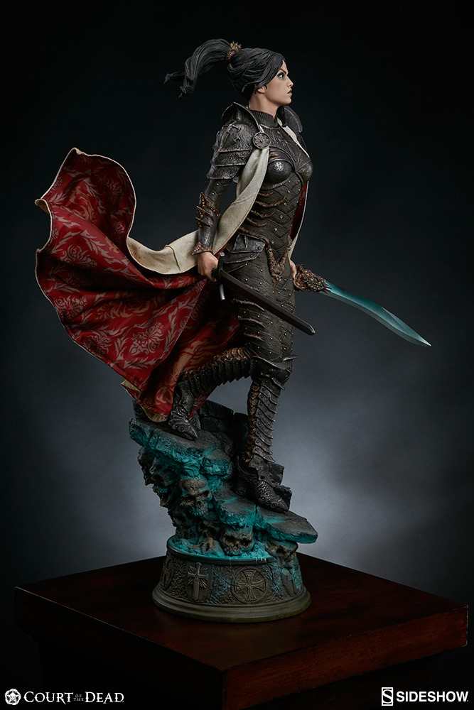
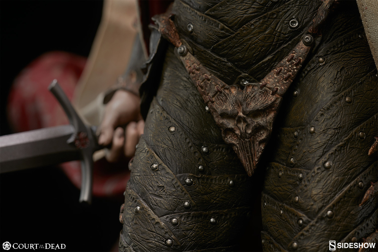
Here’s a good example of how “fully armored” doesn’t mean a thing if said armor is still sexualized: this is Shard, Sideshow Collectible’s original character from their ongoing series “Court of the Dead”. The series already has plenty of questionable designs, but Shard here really stands out due to her backstory: she’s a mortal knight Templar that somehow wound up in the Underworld, whose inhabitants then made her armor for her. Highlights include the absolutely bizarre crotch plate (hard to tell if it’s a thong as the cape blocks the back view,) the insignia on her chest that just winds up looking like a literal “stab here” sign, and interesting footwear. It’s a shame, too, because her backstory sounds really interesting and the Court of the Dead series has some prettybeautifuldolls, but also has a metal bony groping hands bra because reasons.
Oh goodie, Sideshow Toysfigures, we meet again! ? And this time you guys don’t even have the excuse of adapting someone else’s sexist design – it’s your own all original creation!
Obviously the bingo score isn’t very high, and I stretched definition of “male equivalent” to “all male-presenting characters in the series”. However, while not bikini-shaped or skimpy, impossibly skin-tight armor is still a staple of BABD content. The fact that metal gives no additional girth to any part of her body made me confident in marking off the “No padding, just bare skin.” square, despite no bare skin at display. And no, the “fine bone filaments of this protective encasement were woven around her form by the osteomancers and artisans of the dead”Thermian argument doesn’t excuse the sexualized design one bit.
This is so much more interesting in every way: costume, posing, expression, even painting detail. Textbook positive example. What a downgrade!
Thank you for the submission, @the-midnight-doe! Hope you don’t mind me bolding part I found most telling about Shard’s problem.
Considering how other female Court of the Dead characters look, we’re likely to revisit the property, with bingos and/or redesigns, later.
~Ozzie
Posted on
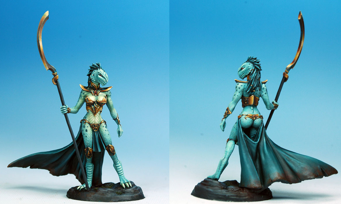
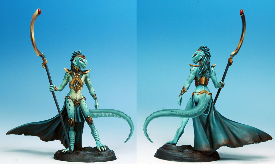
Fixin’ Up Some Figurines, part 2 – Lizard Boobs Edition
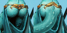
While we’re likely to go back to fixing some Dark Sword Miniatures in the future, this here dragonkin lady was the reason I proposed redesigning the figurines in the first place. The butt cape window was always amazingly mesmerizing, considering it displays her very human glutes with no trace of reptilian tail, which would be much expected in such character design.
So I simply changed her metal thong into a decorative belt that rests on the base of her new big tail.
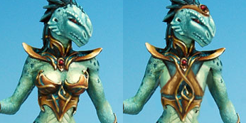
Another obviously non-lizard anatomy on her were the human breasts, adorned with a really ugly boobplate. So I flattened her chest and redesigned the breastplate to be more interesting, while still exposing some of the pec.
Also added a tiara with a matching jewel, for some non-tiddy-based feminine touch. Her weapon/scepter got a matching jewel as well.
It’s one of the subtler redesigns, but also one with more deliberate process behind it. Hope you like it!
~Ozzie
Posted on
As if that wasn’t enough, twin-bulged breastplates ignore the anatomical makeup of the female breast itself. To make a long story short, the breast largely consists of fat and modified sweat glands (for the production of milk, that is), and hence it’s not nearly as solid as a comparable mass of muscle. So all but the largest breasts can be bound quite flat against the woman’s chest without occasioning too much discomfort. In turn, this means a fighting woman probably isn’t going to need a breastplate with a chest profile larger than one worn by a fighting man of a similar height and general body shape, and therefore it’s quite likely that the woman would simply fit into the man’s breastplate with the aid of some padding to make up the slack in the waist and shoulders.
Today’s throwback: Boobs 101 or that thing NO pop media artist seems to know about basic human anatomy, as illustrated in one of our recent reblogs. (Also cloth doesn’t work that way…)
If you actually know that and still decided that boobsocks or boobplate on a breasted character is a good idea, maybe consider it’s cause you wanna see The Tiddy? And then consider, where are all the codpieces that really existed that you could be drawing instead?
~Ozzie
Hey you… yeah you, the one typing the comment about how a guy on YouTube told you the shape of armor is just an “aesthetic” and hence boobplates would be fine because “hardened steel is really hard”.
Don’t take advice from a guy who only assess armor based off what it feels like to swing one of his wooden swords and not on the distinct likelihood of the wearer being hit by a sharp stick wielded by a person on top of a one ton warhorse charging at full gallop.
Another game I’ve never played but felt that it would be fun to do an armor fix for!
BlackRose from .hack
I remember back in the day I thought she looked really cool, and that hasn’t really changed but I wanted to just give her some protection.Also what kinda sword is that I am so confused.
Man, this brings back memories. Mostly of a very depressed and quiet protagonist either sitting around or looking confused/concerned at various set-pieces. (Can you tell that I found the series boring?) Oh, there was also a cat lady. In the games, at least.
I really like the redesign! There are so many small but great changes, like the pattern on her stomach that breaks up the large overall shapes much better than in the original (what large shapes). I especially like the knee guards; they make it really obvious how the original’s inclusion of teal/grey is not enough to tie the design together, but it looks great in the redesign.
I’m also not mad about the sword being changed; I always wondered how it attached to her, even when I used to watch the show.
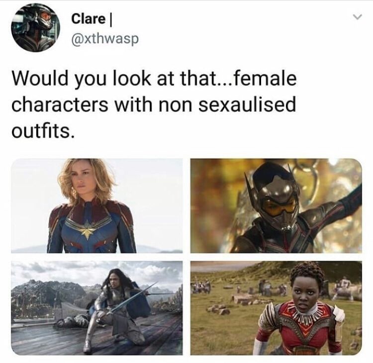
Yes! …and no. While not overtly sexualized, they all have femminizing features that…become impractical. If I remember right the WASP suit had heels instead of flats. Valkyrie’s outfit is, just bad? It doesn’t seem to fit her and is guilty of boobplate and worse. I agree that these are great steps in a direction, like holy hell it used to be worse, but these are not without their faults.
We touched on Marvel and their love of boobplate before, as well as the fact that coverage of skin does not mean nonsexualized by default. Now, we’re not saying that all femininizing aspects of costuming are bad. However, for a warrior to wear heels, or clothes so tight that they can’t properly move (to get that perfect Ass and Legs look, etc)… that’s just not practical, and will probably lead to injury.
Of course some of these costumes have positives; it’s not often we see a lady character wearing a helmet, for example. But we can definitely do better, and we should! And hopefully, we will.
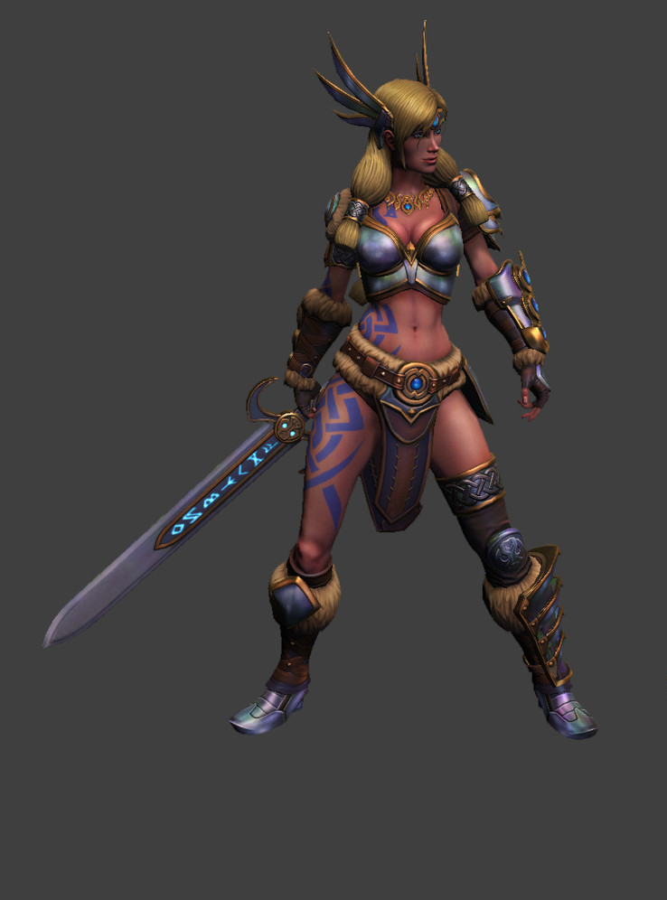
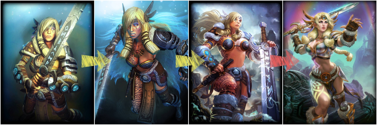
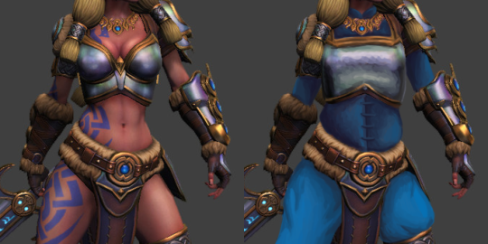
This is the second character named Freya which I fixed, and this one also got a questionable update between getting bingo’d and redesigned on our platform. I swear it’s a total coincidence.
SMITE’s standards are below the bottom, so of course while she no longer had gravity-defying metal pasties for a top, it’s still a skin-tight boobplate.
I didn’t go particularly wild with fixes this time. I liked the ornamentation and accessories well enough to leave them be, so the changes are limited to the shape of the breastplate and big blue gambeson under all of it. Thanks to it her pretty necklace suddenly popped out, since color theory is still a thing. ¯_(ツ)_/¯ Blue because it matched her existing color scheme, including those tacky Pict-like tattoos, which are alreadya cliche on many Norse/Viking characters, for some reason.
Not my most creative or labour-heavy redo, but I hope you guys like it!