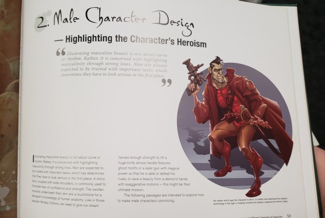
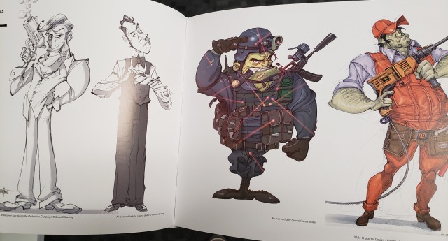
The Masculine Beauty of Superhero Figure, Part 1

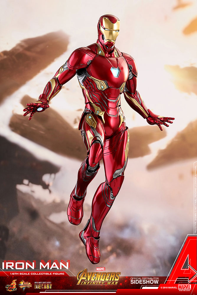
Time to fix a Sideshow Toys figure! With male empowerment!

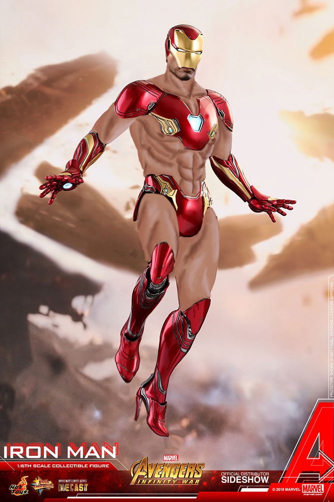
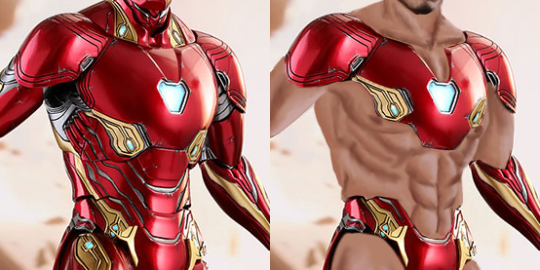
The modular design of Iron Man’s armor lent itself really great to a sexy redesign. Tons of clean lines to replace metal plates with some hot, hot bare skin and also anatomy-inspired detailing that served as a reference to painting his musculature. 

image

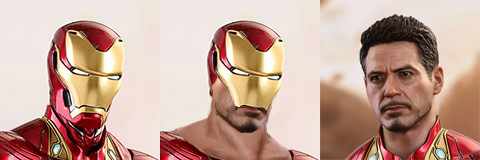
I also decided while getting rid of the whole helmet might be against keeping Tony’s hero persona iconic, I did  leave out the lower part, giving it the jawline from the figure’s creepily realistic replacable Robert Downey Jr. head.

image

The only actual changes to metal pieces on his costume I did were: 

  • moving those glowy things under his pecs to right over his nipples – glowy nipple armor for the win!
  • changing the shape of his shoes to super pointy heels (also very smol size, because if female designs aren’t allowed to have feet proportional to their bodies, why should male?)
  • giving him an oversized codpiece, so that we know he’s very confident in his masculinity ? 

While I went lazy on the rendering of repainted parts, I’m still quite happy with the results. Hope you guys agree. 

~Ozzie 

image

This comic opens with this line, then outlines the brutal deaths of the protagonists parents in a manner plenty of people will find disturbing.  The core plot for this is the protagonist avenging her brother.

So, it’s a little confusing why ever single cover depicts her like one of her like less armoured version of a long forgotten pulp fantasy character. I mean, okay it’s a an improvement on her famous appearance in 1982:

image

However at some point, the creators of these things really need to decide if they want them to be a:

  • A light hearted romp full of pulp, cheesecake and beefcake OR
  • A serious and shocking drama story about hatred and revenge

‘Cause this weird thing of wanting to have the 80s pinup camp along with the “we have serious stories” grit really isn’t going to do them any favours.

-wincenworks

From Generic Bikini, to Generic Swashbuckler. What creativity!!

-Icy

celesteateyourrights:

reversetimelord:

roskii:

despazito:

despazito:

what the fuck is going on in this

it gets worse

God this is ugly

This is genuinely one of the worst things I’ve ever seen, on so many levels

wOmGaNn…AlWaYs SsExY, mEhN…jObS

@bikiniarmorbattledamage Can I ask for your input on this… modern day wonder of the world?

My reaction to this is

image

-Icy

This is exactly the kind of book that made me introduce the bad drawing guides tag (which is an equivalent to @eschergirls​‘ How to Draw Books tag). 

Somehow, this is an even uglier version of that infamous “Body shapes: men and women” chapter and those gems (content warning: extremely sexist and gender essentialist) from books by Christopher Hart (AKA the king of BAD “How to draw” books).

This artwork looks like an attempt at imitating Chris Sanders style of pinup, but with Uncanny Valley effect instead of his deep understanding of anatomy and character appeal.

Oh, the hubris it takes to draw every single female character as contorted fish-faced… thing with giant boobs and ass and then insist that it’s the only right way to design cartoony women, because females be sexy. And also that male cartoony characters should be all angular and ‘heroic’-looking, because that’s somehow inherently masculine. Then to present way more diversity among men anyway

~Ozzie 

See also: our All the Slender Ladies @femfreqvideo post reblog | the same-y attitude towards female diversity in Overwatch | suspicious dimorphism – when creepy male/female design differences are justified as ‘natural’