Marvel Villainesses: Hulk-stomping edition!
Not long after our last take on DC evil sexy ladies, we decided to balance things out with some Marvel characters as well. And by complete coincidence, we both chose artwork in which they stomp on Amadeus Cho! Clearly, that means they’re dating.
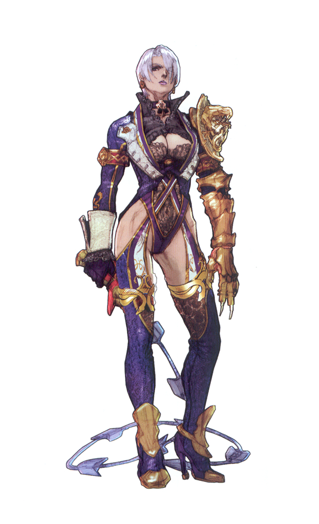
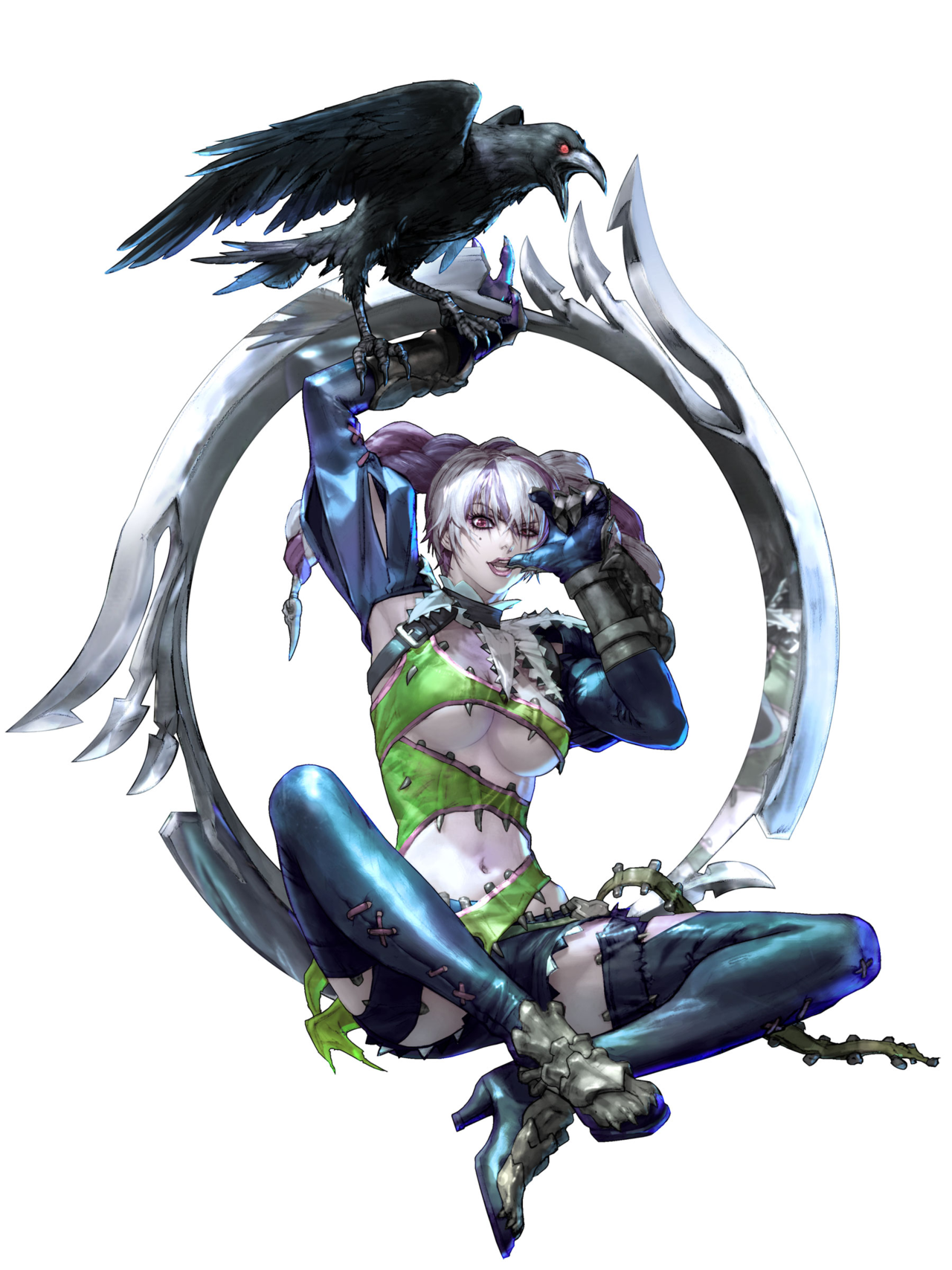
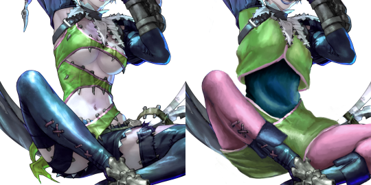
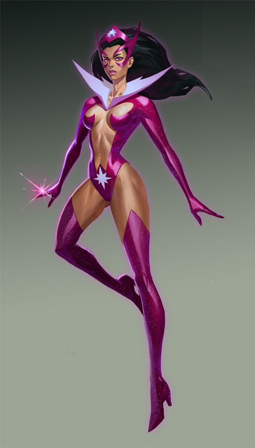
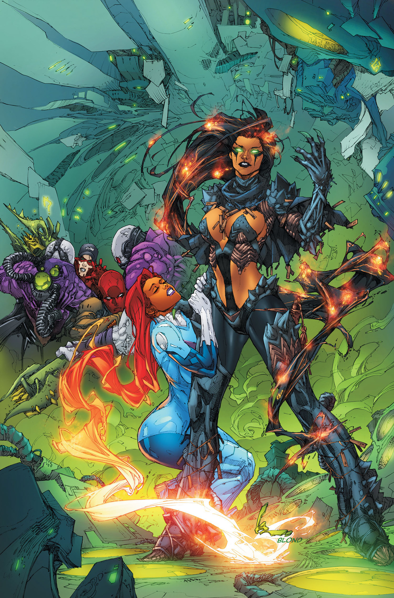
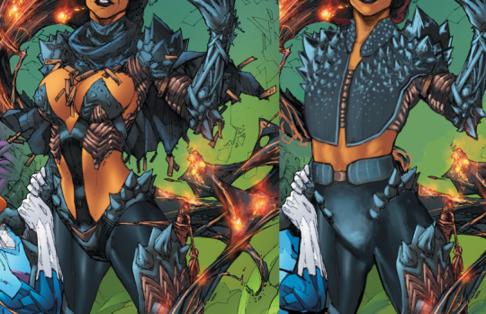
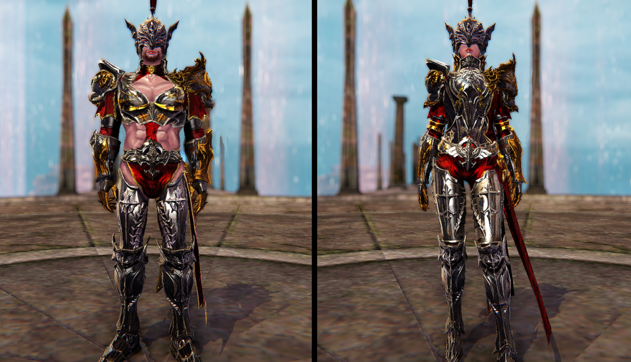
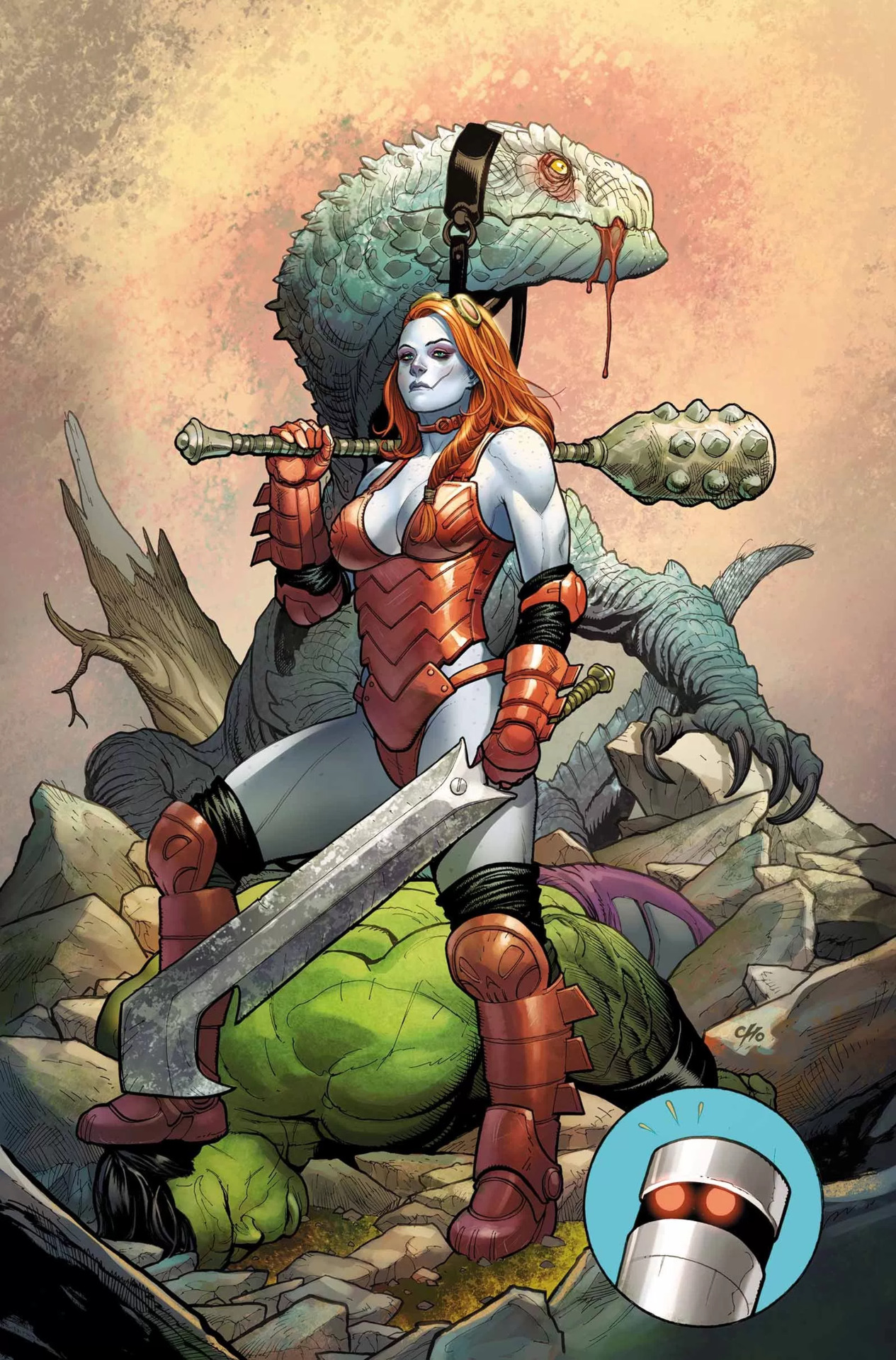
While Frank Cho is a human dildo, I will admit that unlike most other whiny dudebro artists he has actual skill and grasp of human anatomy (when he wants to, at least). This is a technically good drawing, with Hellbender’s bizarrely sexualized costume as the only real flaw
(again, those panty-line bars! (ノಠ_ಠ)ノ).
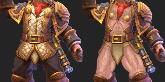
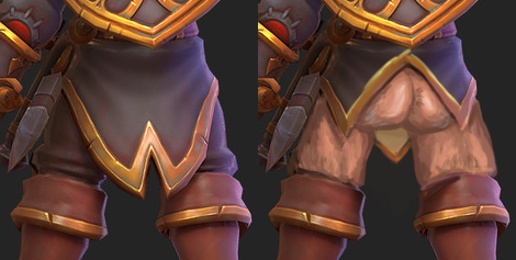
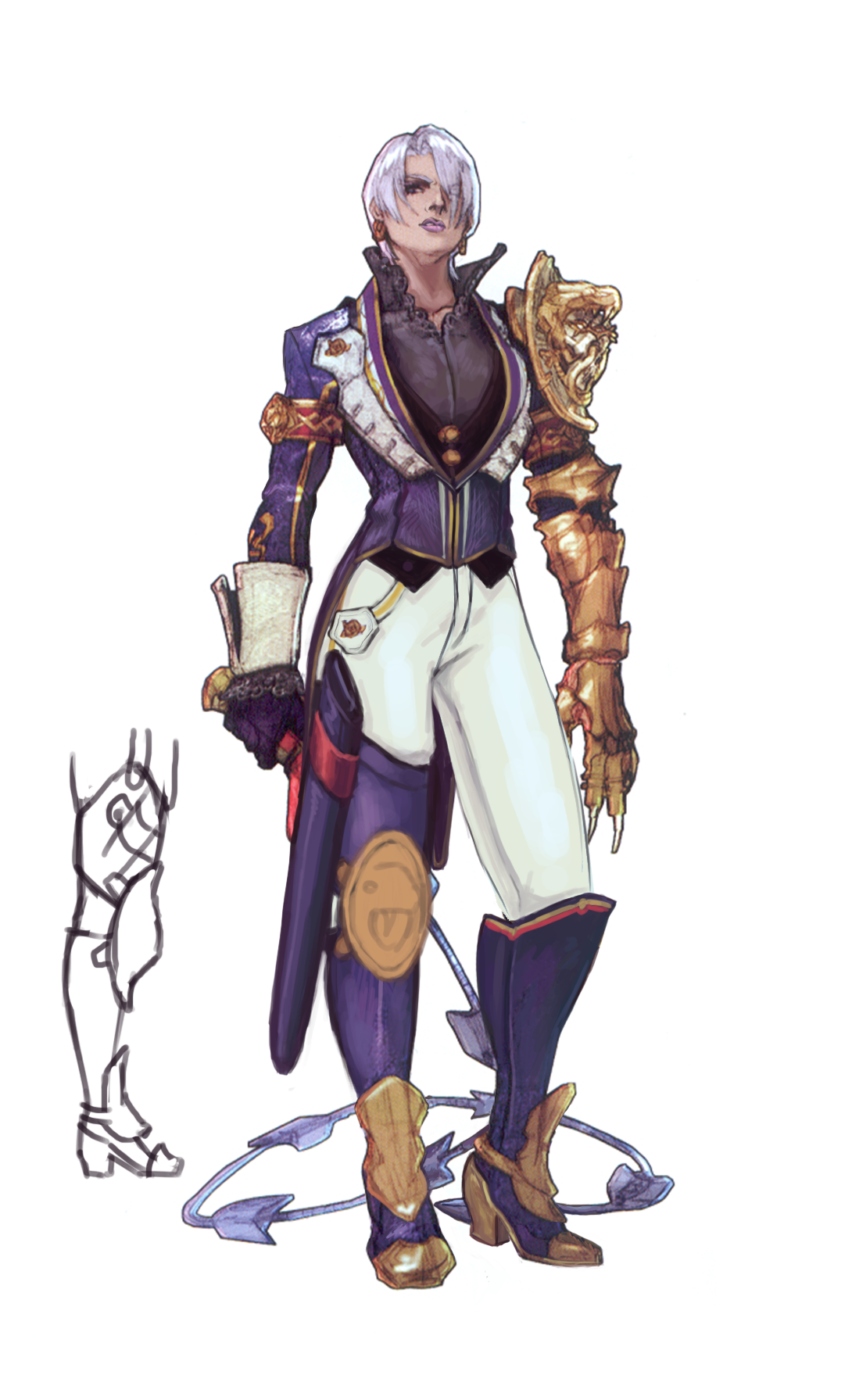
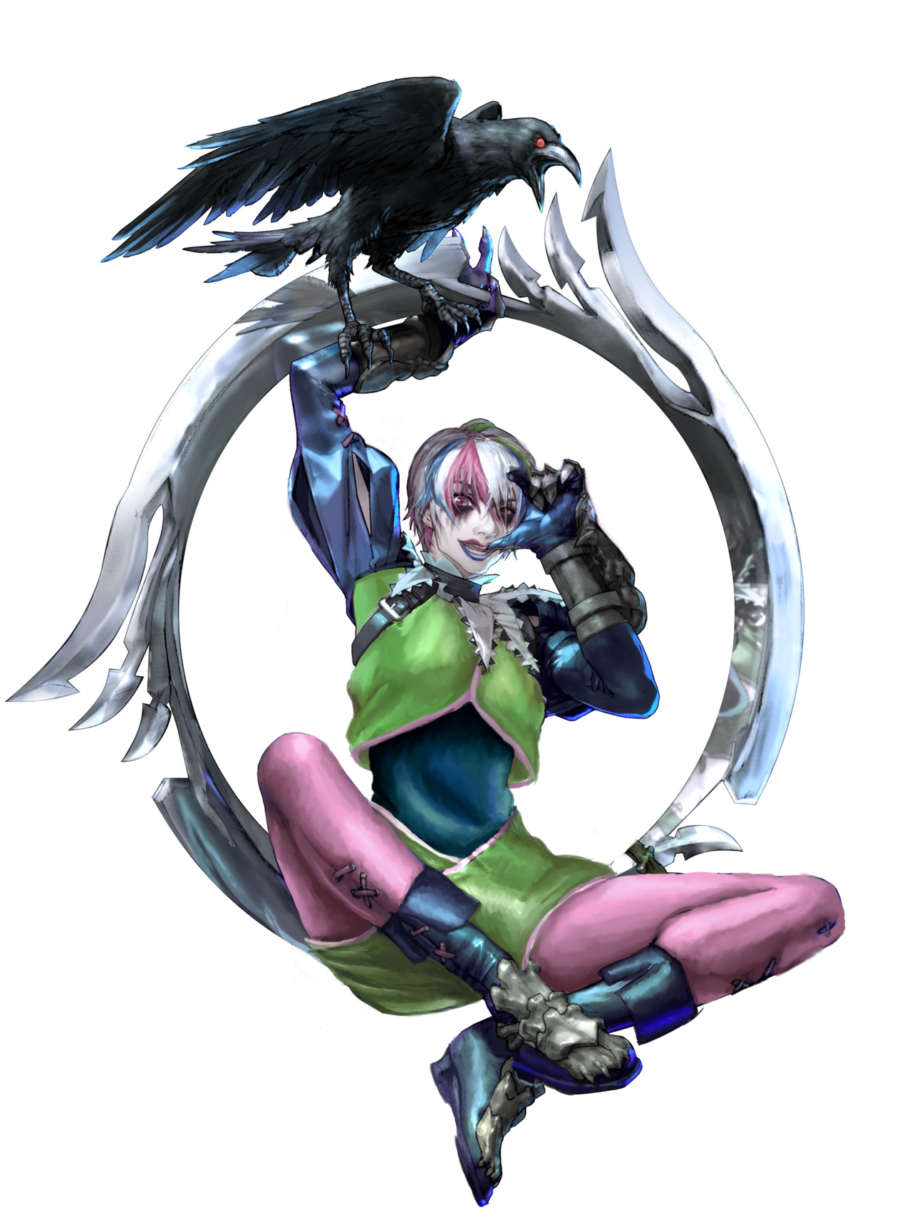
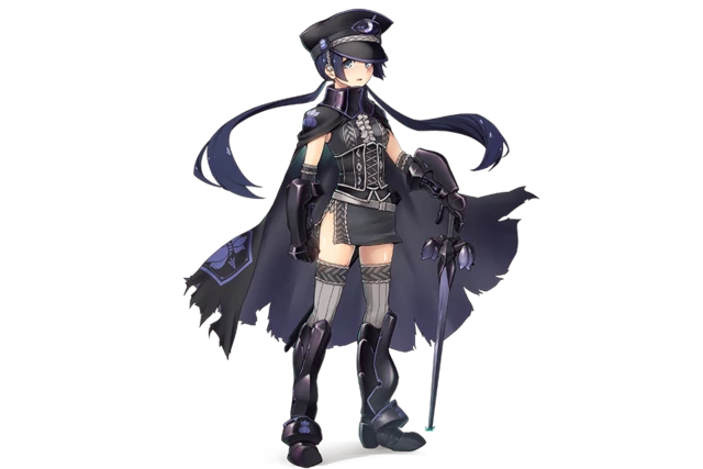
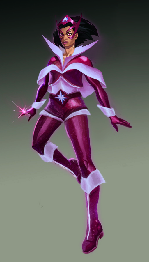
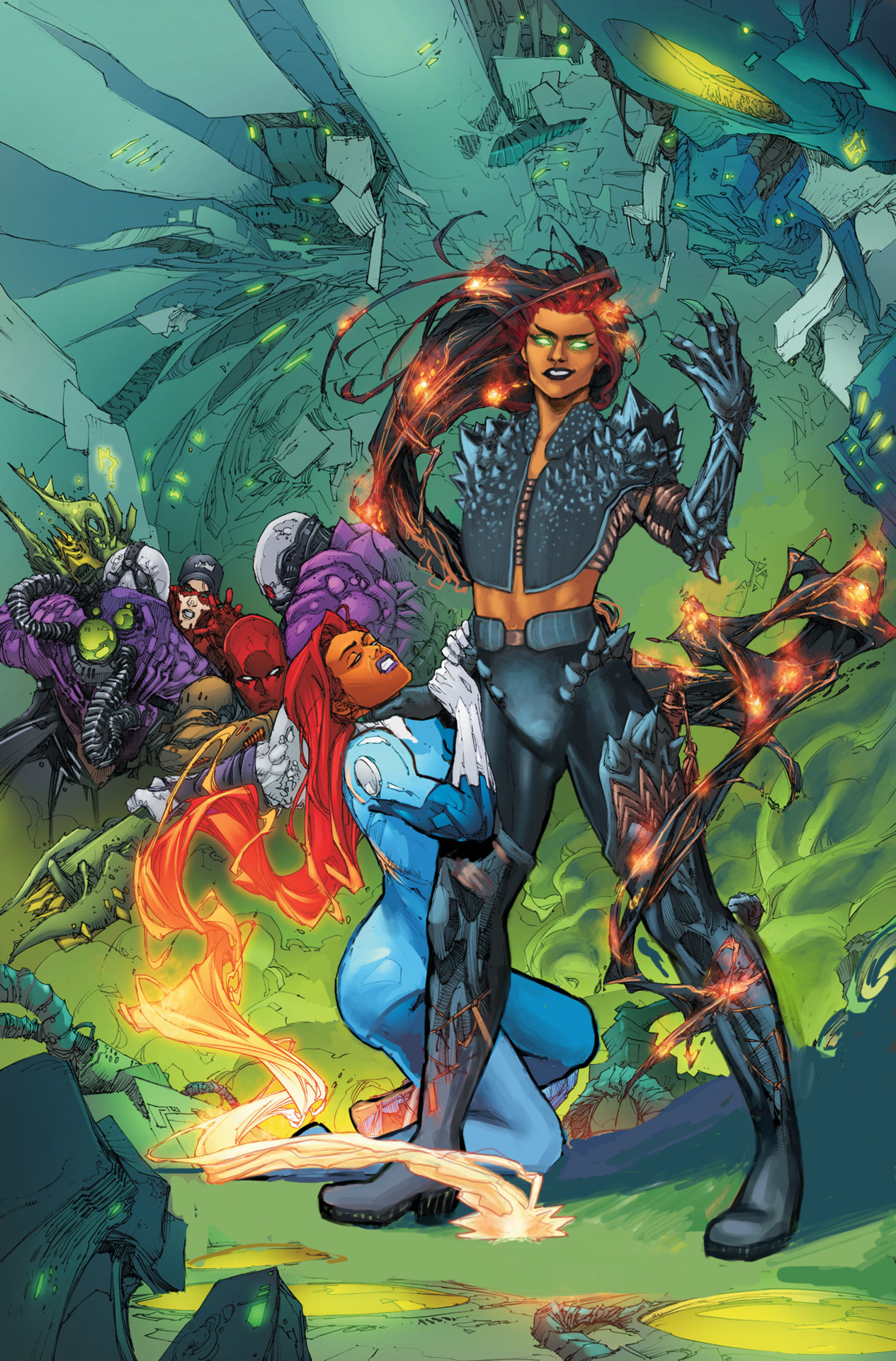
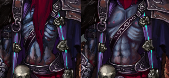
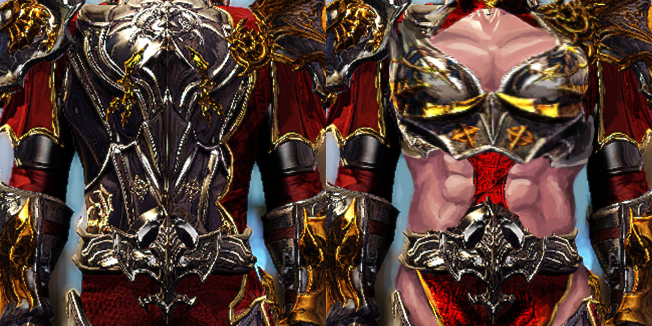
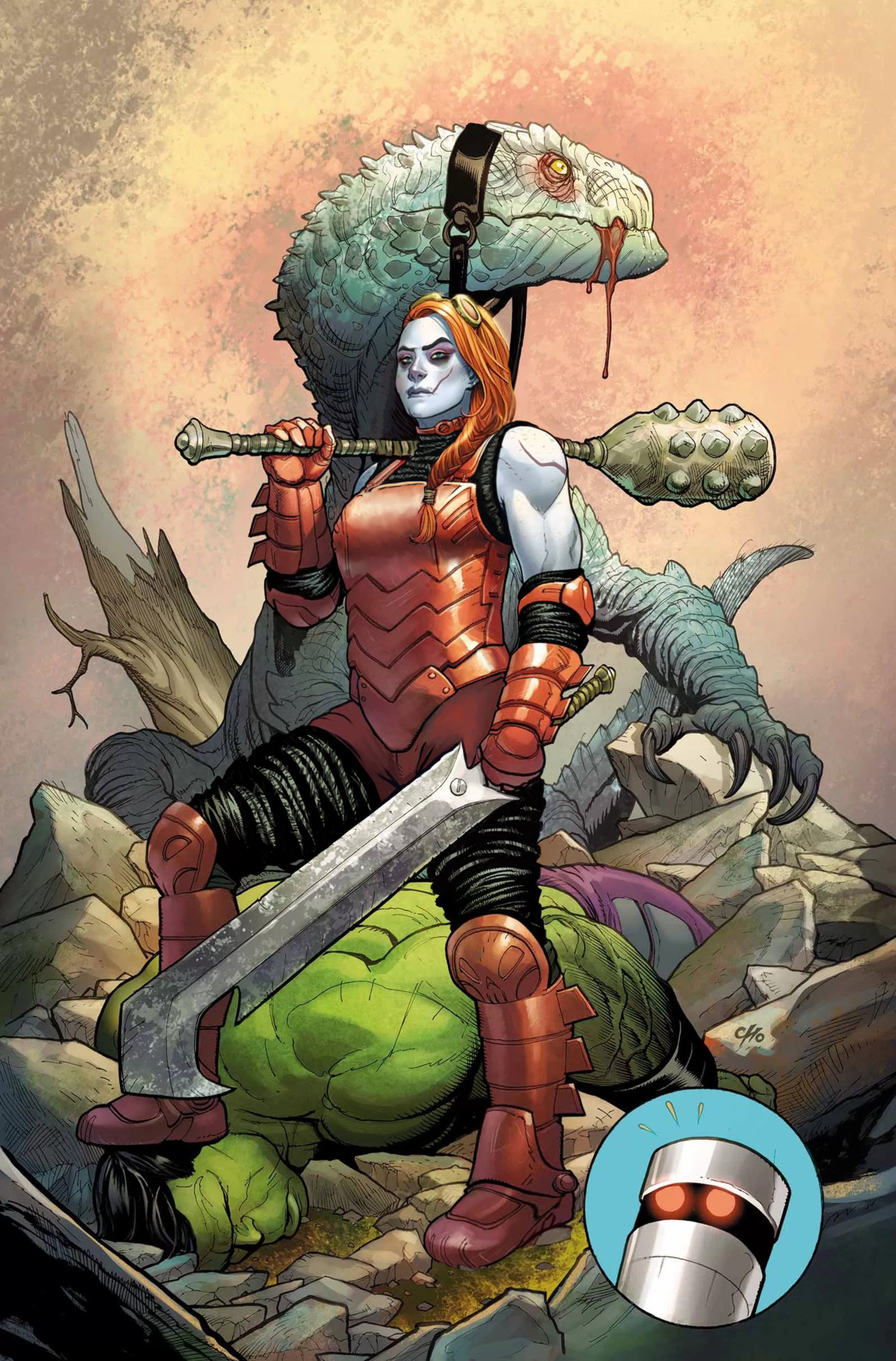
Obviously I started the fix by getting rid of the cleavage, boob cups and pinched waist from her metal leotard. It no longer looks skin-tight, especially since I’ve added some padding in the form of the same black fabric she wears under her boots and gauntlets. I liked that material enough to extend it into faux-pantlegs that cover what her new shorts (replacing what seemed like a thong) don’t reach.
Along with her armor, I reshaped her upper body. The suggestion of muscular arms was nice, so now they’re bigger, with solid thick torso to match. And a brand new arm scar, fitting the facial one.
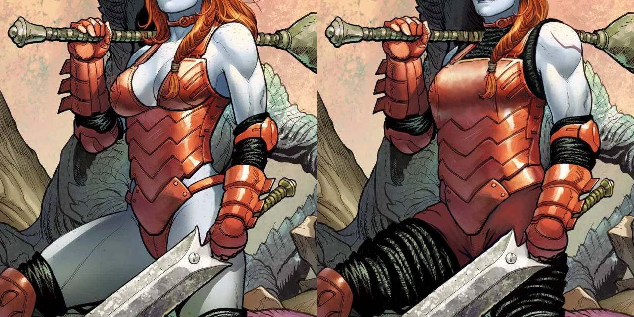
One last thing about her costume that needed fixing was her left foot, which inexplicably is drawn as if the boot was a wedge heel, asymmetrical to right foot’s flat sole.
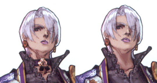
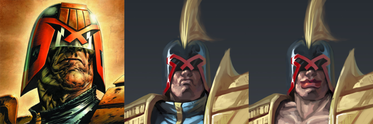
After I was done with the outfit, her face called for some un-genericking. There is a promise of unique features in there (mainly the visible scar), but it falls short, quite obviously due to Cho’s cowardice at making her *too* far from conventionally attractive. As we mentioned before, the color scheme makes her look quite close to Harley Quinn (and arguably also Poison Ivy), which is just bad character design.
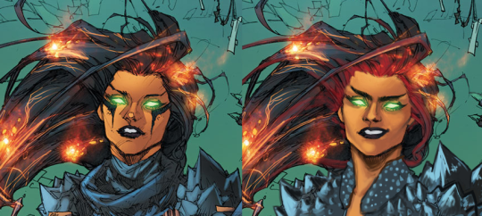
I started by changing the hairstyle into more practical one – the braid was already there, so why not make all the hair be part of it instead of flying loosely? It’s also not visible at this angle, but I decided that her right temple has some undercut action going.
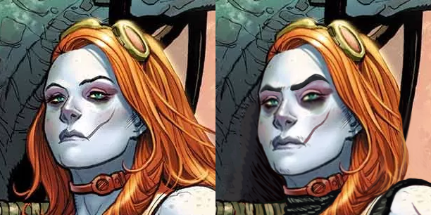
Next I made her scar more prominent with color change. Then very subtly turned her features a little more square, gave her a bigger nose, thick natural eyebrows and a tiny bit of facial hair that so much mainstream media denies to depict on women. Also extended the dark lower eyeshadow.
Final touch was, of course, the expression – no more vacant supermodel stare. Someone stomping the Hulk to the ground deserves to make an intimidating face at the camera.
It’s one of the most satisfying redesigns for me. Hope you guys enjoy it too!
~Ozzie
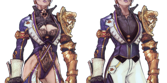
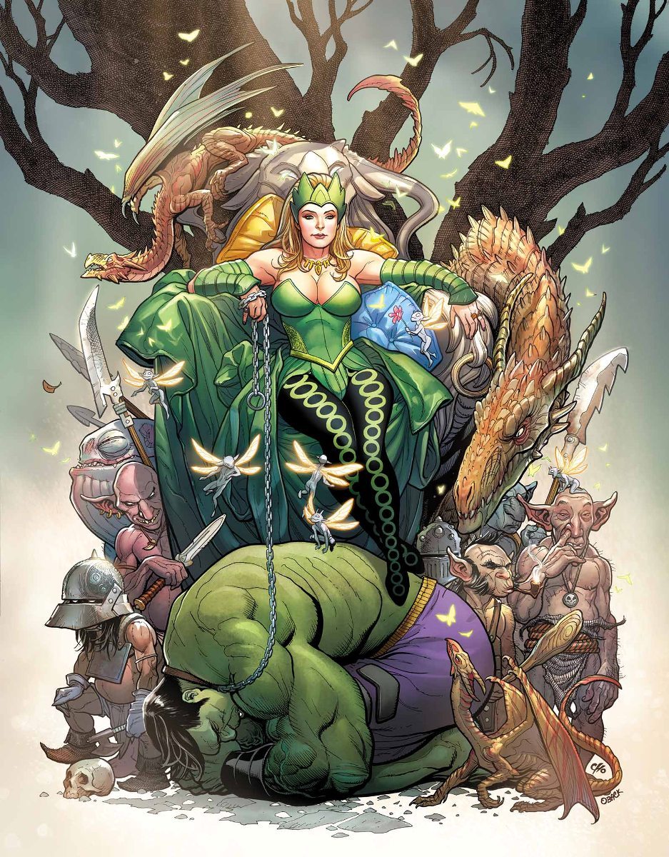
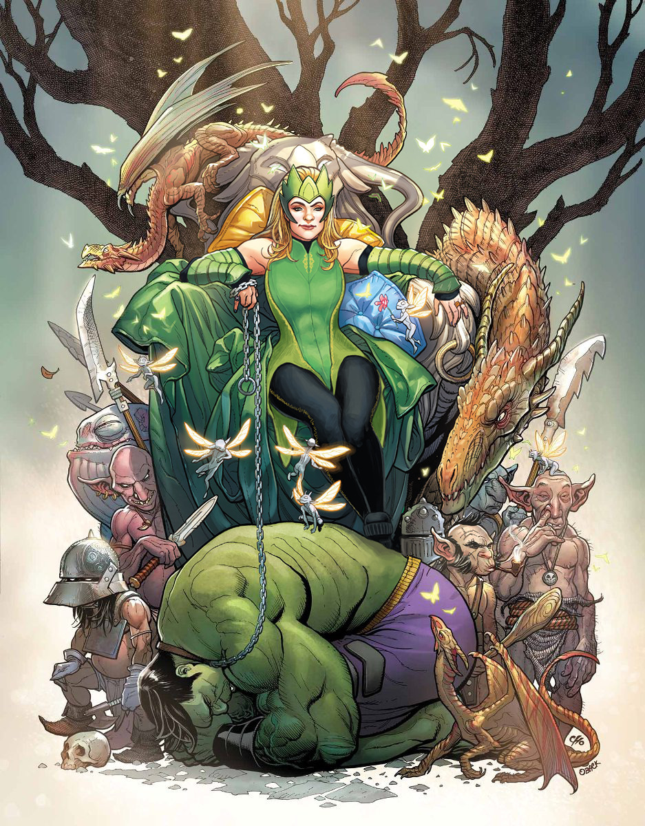
Enchantress
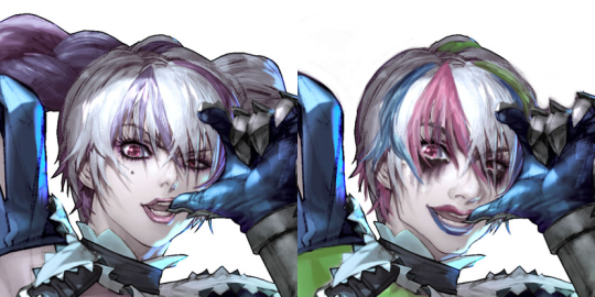
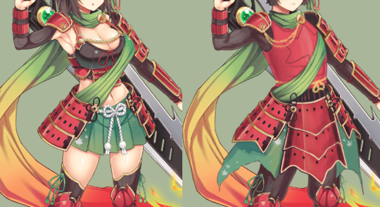
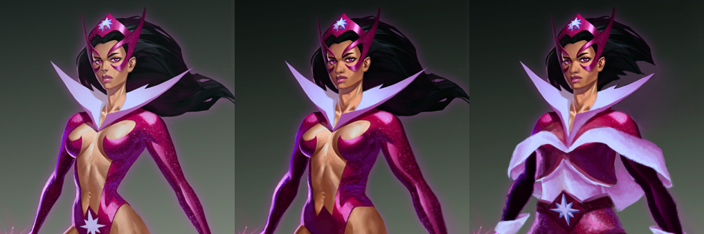
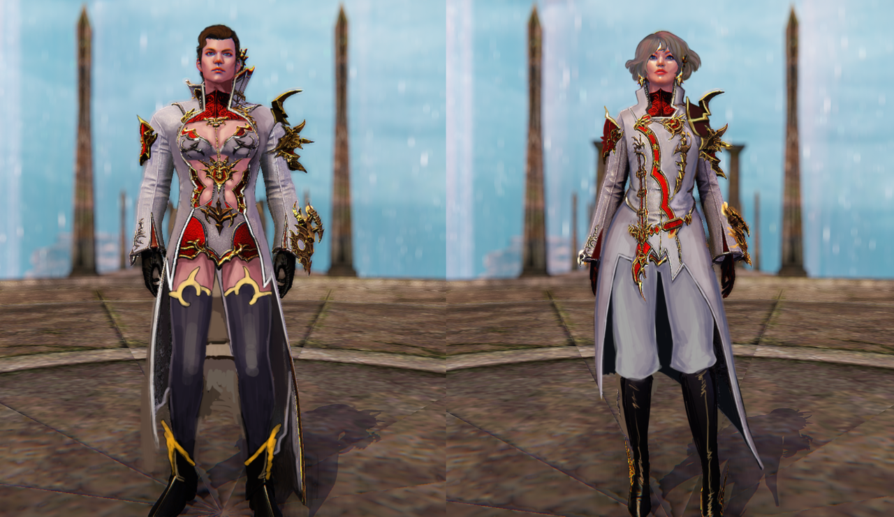
Another Hot Chick who was supposed to look intimidating but does not at all; is this a redesign type I have? All of my design choices centered on this one around making Enchantress into someone to take seriously. Most of the changes were small, outside of her tiddy situation.
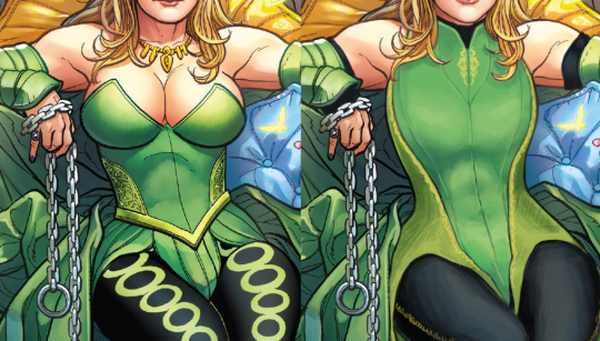
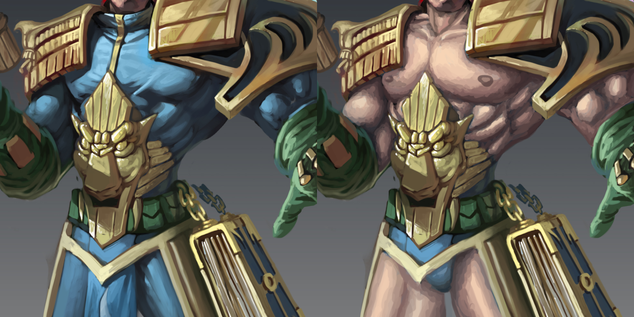
I gave her a leotard-type of thing with some nice lines to break up the big shape, and some small details in strategic places. I also made her weird side embroidery into a larger part of the color scheme. I gave her some sick abs under that costume, as well as bigger shoulder and arm muscles. To finish off the upper body, I gave her spots of black to tie her color scheme together. It’s honestly kind of jarring how only her legs have the black in the original.
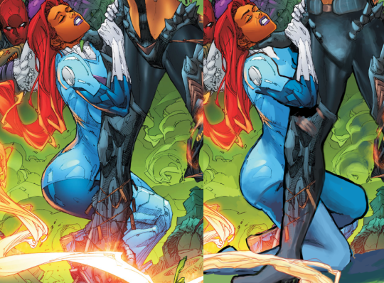
Next, the leggies! I got rid of the big circles that were Bad, and gave her some stitching down the side of the leggings instead. And I gave her platform shoes to really stomp on that Hulk, rather than… daintily breaking perspective with how the Hulk’s got no shadows on him, but the chain and foot are in front of him….?
Finally, I changed her face and headpiece. I wanted her to actually look menacing, rather than like a beauty queen wearing a tacky green crown.
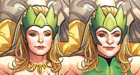
And yeah, I guess I got a thing for one-sided smirks, but she’s still hot. She’s just got more attitude and control and a more interesting face than… nothing. Y’all really have no idea how I hate the White Girl Nose so many lady characters get in comics.
This was definitely a fun one and I like what I ended up with. I personally think Ozzie and I did super well with faces this time around. Give us more Intimidating Looking Ladies!
-Icy