The hilarious front line in the tragic war against ridiculous female armor
Tag: redesign
Posted on
Return to Soul Calibur: Cassandra, Part 2
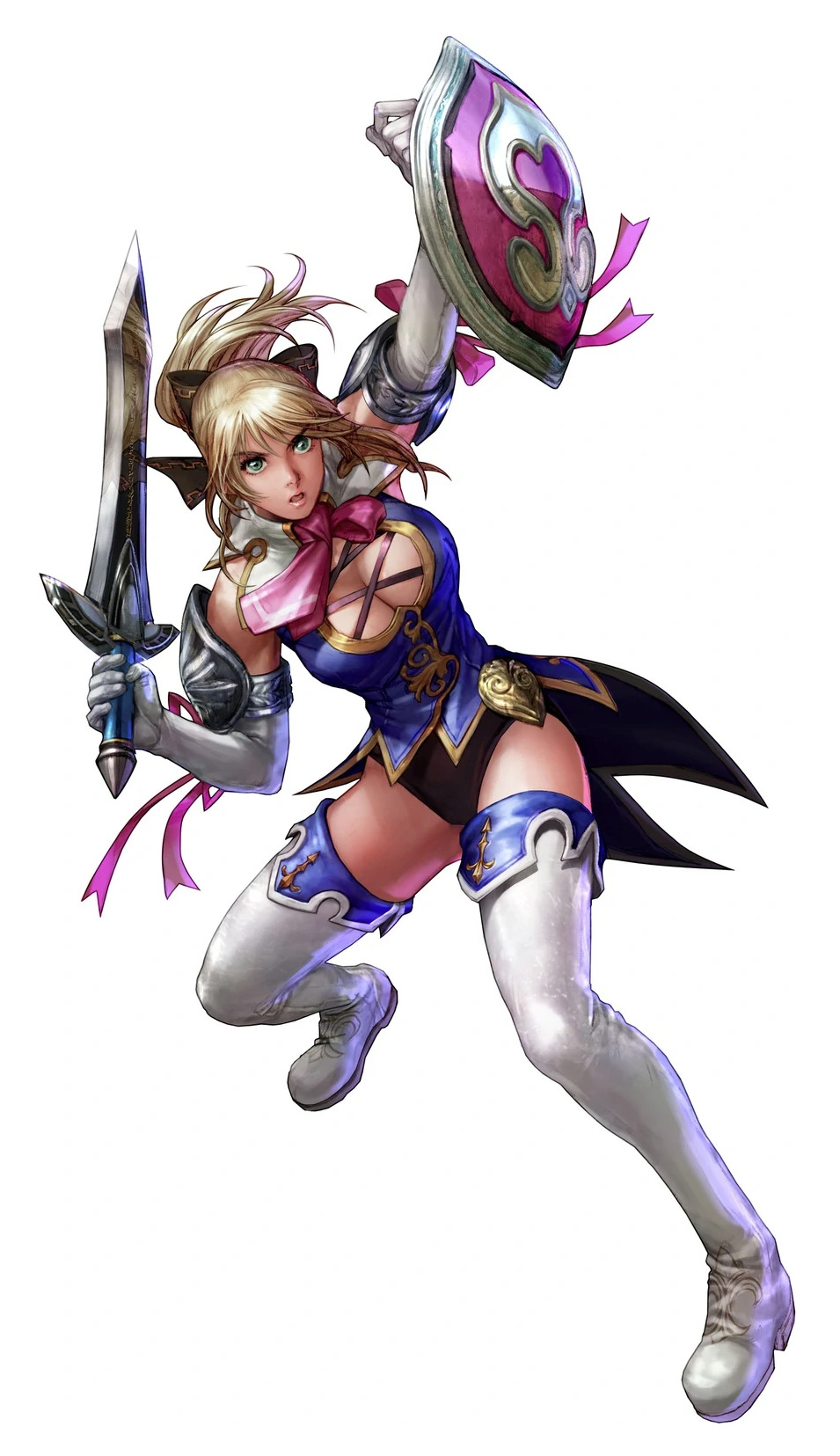
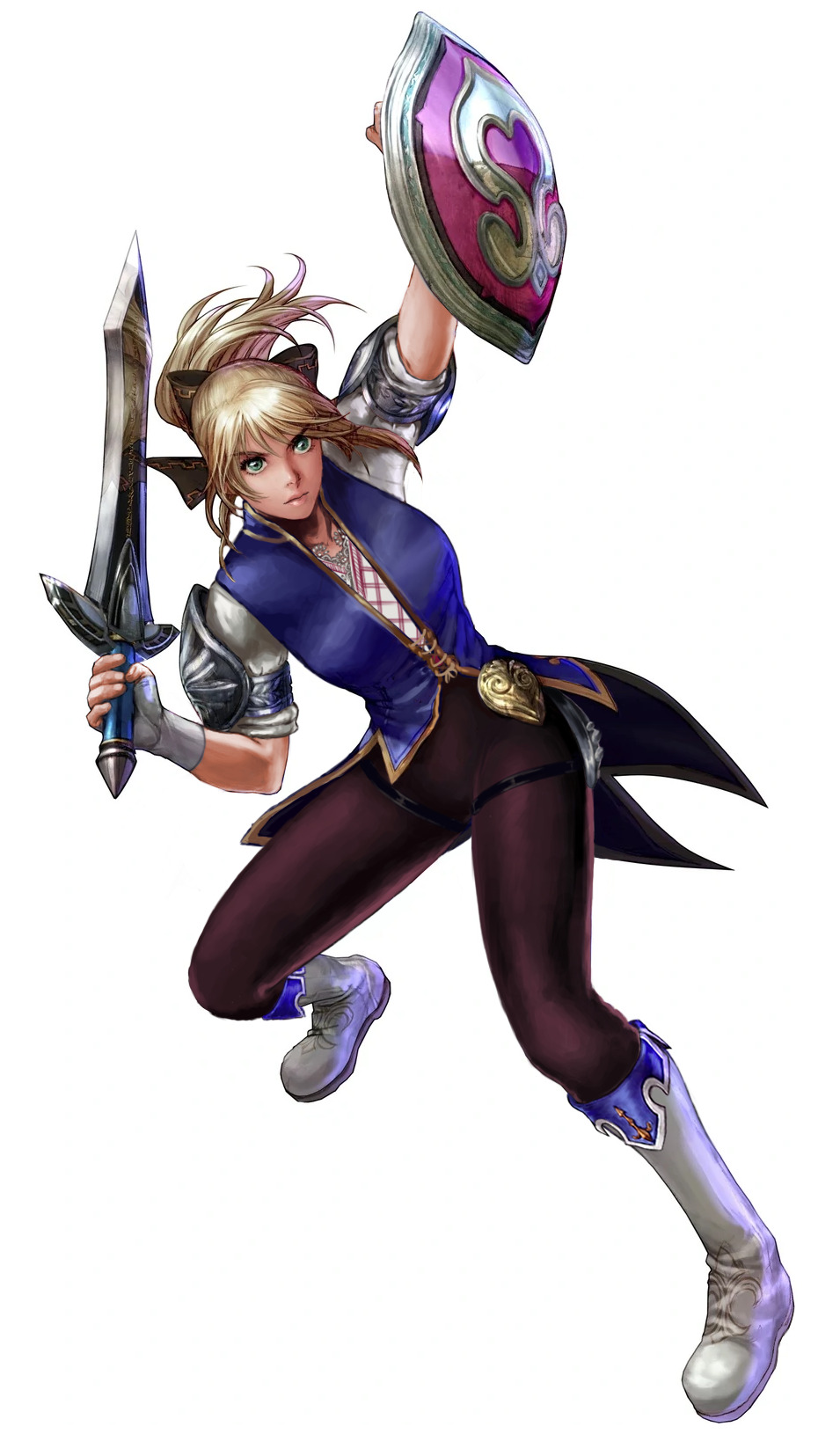
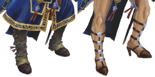
Soul Calibur IV/V: The Worst One
I don’t know why I do this to myself, but I decided to tackle the worst out of Cassandra’s outfits. The design started kind of silly at first, with me giving her a butt armor plating pretty much immediately. If she’s going to have a bunch of butt attacks, she might as well pack a real punch with those cheeks.
But as I was trying to figure out how to redo her entire upper half, which I hated all of, I ended up looking up some traditional Greek clothing for inspiration. Even though this is a while after Cass left home, I still wanted to include something that tied her back there. As I was explaining during a stream, SC has all these varied characters from all over the world, all with their own motivations, and yet their designs (especially in the later games) are so focused on the fan-service that any actual storytelling is lost.
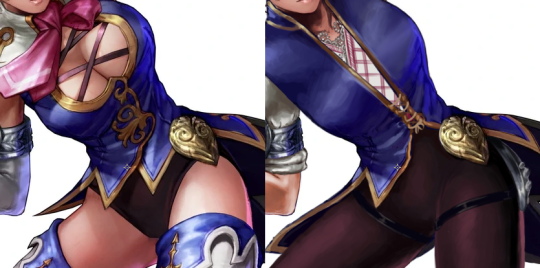
In the end, I maintained the color scheme, and even the overall shape spread, with the legs being the biggest shapes (although reversed), and the small shapes breaking up the larger shape of the jacket. I guess the only shape I really broke up were in the arms, because I hate her stupid gloves lol.
I got rid of all of her pink ribbons because they just seem out-of-place no matter how you look at it. Guess they were tying the pink of the shield into her outfit, but they were too stupid. Rest in Pieces, ribbons.
This design would probably suit an earlier game, but whatevs. Overall, it’s pretty passable, if I do say so myself.
-Icy
Posted on
Return to Soul Calibur: Cassandra, Part 1
Soul Calibur’sCassandra, much like her Greek mythology namesake, is cursed. But instead of no-one believing her accurate prophecies, no-one ever gives her adequate costume! And, as per usual in the franchise, designs basically only get worse over time. So we agreed to do a double-Cassandra stream and fix two different outfits of hers.
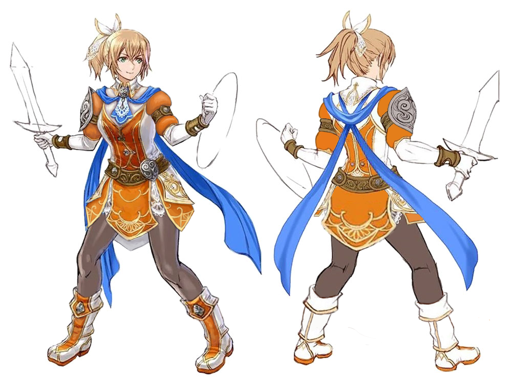
Soul Calibur 6: Orange-white minidress
While this is her latest iteration, I wouldn’t call the SC6 Cassandra dress the worst by a long shot. Still plenty shitty, though! See its bingo here.
It is rather surprising that after years of her main color scheme being blue and pink with white details, latest game changed it to orange and white with blue detail. The new, complimentary, colors look nice together. I don’t think the palette change was necessary, but unlike many designs we comment on, this one’s artists have their basic color theory in check.
Obviously, first thing to change was the boob window. I decided to color in that whole part white (not orange) and connect it with her collar, to give the remaining orange part a vest-like look. Moved its hem a bit higher, too, so that it stops implying low cut cleavage. Some subtler, but still annoyingly sexualized parts, like sideboobs and the belt on her chest, also had to go. I usually don’t mind bare shoulders, but this design looked better with some poofy sleeves, in lieu of our stream redesign staple, the poofy pants.
I decided to extend the front and back flap on her dress, and to add two side flaps under the tassets, as an additional splash of color and some padding. And while I appreciate how comfortable her shoes looked, I turned them into longer boots that look much better with this cut of costume.
Rather than a massive overhaul, it was the kind of redesign that consists of many small changes that add up. And I’m quite happy with the whole thing. Hope you enjoy it!
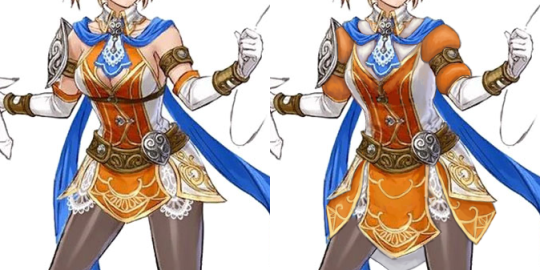
I wanted to do one from the front so it’s easier to see what I did with her chest plate! I just made it a lil more protective while keeping with the design
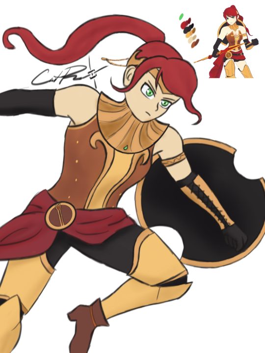
What do you think?
I think she would not get an arrow through her cleavage if she wore this armor!*
Good job in fixing Pyrrha, @caitsketches! I appreciate how much difference such a simple change can make.
Personally, as a big opposer of Sameface Syndrome, I have a huge beef with RWBY’s character and costume designs in general. I welcome any fix to their absurd double standards and obsession with making everything look gratuitously “cool” and anime-like without questioning how much it fits the characters and worldbuilding. Especially the casual sexualization of teenage girls. Uuugh. ?
~Ozzie
Comparing between this and the original honestly points out how embarrassingly close the creators were to a good design.
Literally connect the neck thing to the chest piece, and give her pants, and we wouldn’t need a redesign.
-Icy
*Sorry not sorry for spoiling ancient seasons. Also, while plate armor isn’t considered a fool-proof protection against arrows, it’s obviously better than no protection at all.
Posted on
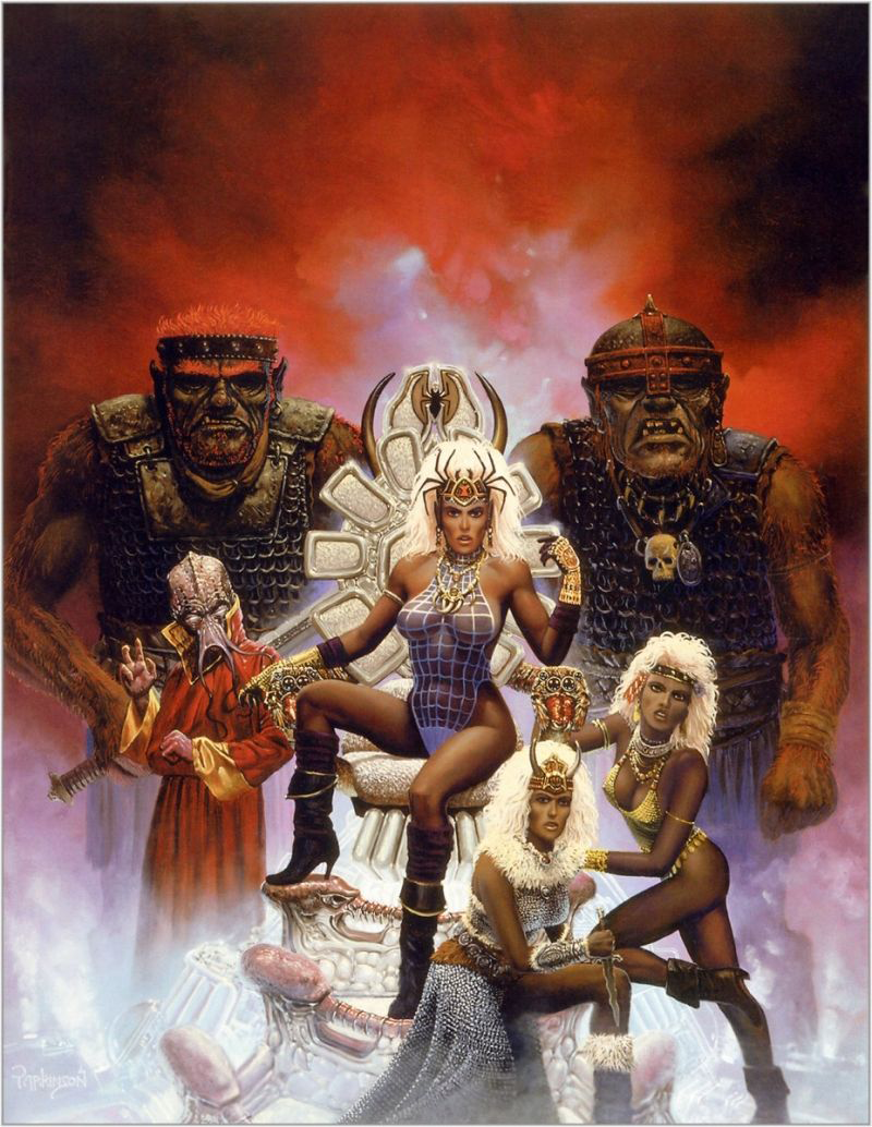
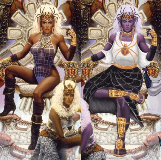
Queen of the Spiders Re-Covered
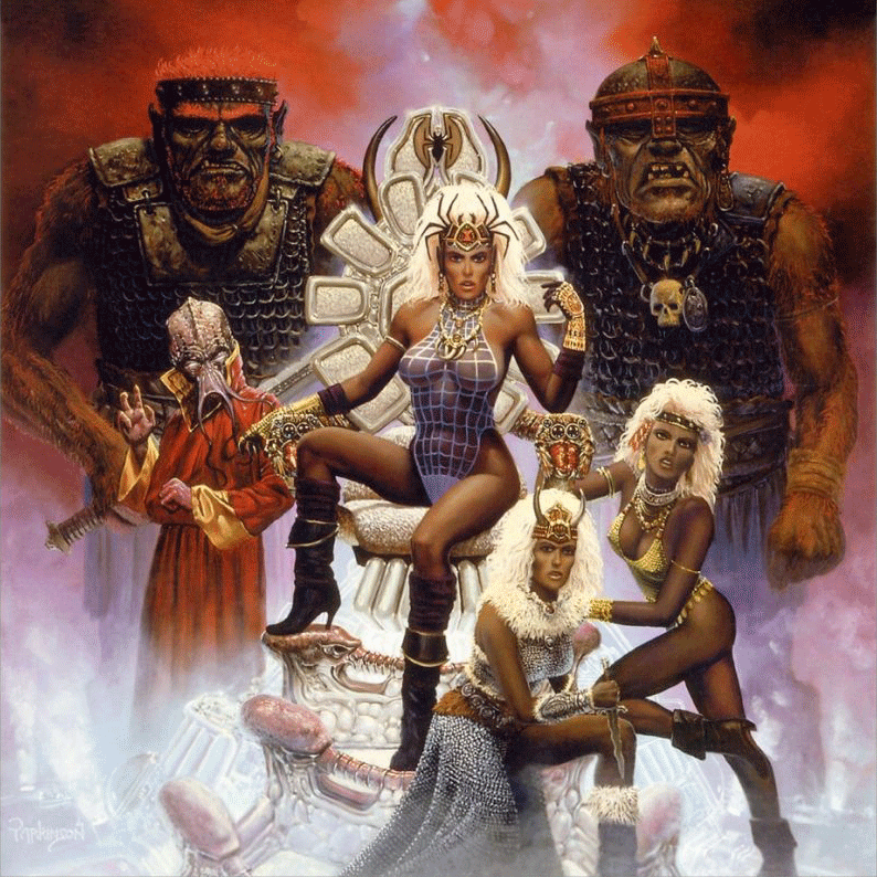
We decided to try our hand at a combined redesign, where each of us picked a character in the same picture and redesigned them. And we thought this image, the cover of an old Dungeons and Dragons adventure called “Queen of the Spiders” would be a good candidate (blame for throwing it at us goes to @theoldhack).
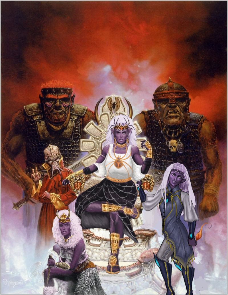
This is where the infamous drow race is introduced, where I guess they were just… evilwomen of color. ? Unfortunate. We decided to make them purple-skinned like they are in more modern lore.
At first, Icy thought the “queen” in the title referenced the lady in the middle there, but it’s actually one of the names for Lolth, the spider goddess whom the drow venerate, so…. We’re sure the drow on the cover are important mini-bosses somewhere in the adventure, probably, maybe.
Full write-up and close-up images under the cut.
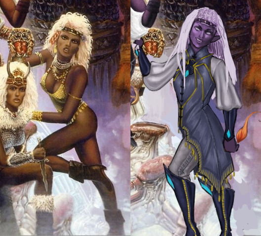
What’s-her-Face on the Right
Just gotta say that it’s a huge pet peeve of mine when (usually male) writers write a matriarchal society as, air quotes, “sexually liberated,” otherwise known as “an excuse to draw them in lingerie because I can’t imagine women’s bodies not catering to me personally in any scenario, while still drawing men in full body armor.” Thanks for coming to my TED talk.
Okay, so…. I’m not sure what she’s supposed to be… besides a swimsuit model, which maybe the drow do have. Is there a quest where the players go to the underground beach to play underground beach volleyball? Cause if not, why is she like that???
I decided to make her a mage (this was a 1st edition book, so that’s all we got). I ended up changing…. everything, really. I think the only thing I didn’t change was her nose shape. It’s not my fault though, the redline for her original pose was an unsalvageable eldrich nightmare.
I gave her a more confident pose, more comfortable magic-user-friendly clothes (with the spider motif, cause spider god), and even different hair. The original hairdo just wasn’t doing it for me. I wanted her to look cool enough to have her own illustration in the book. She even has a little magic flame (mostly cause I didn’t know what to do with her hand lol)!
Her hair didn’t quite turn out how I wanted it to, but overall, I think it’s a good redraw. She’s got lots of fun shapes, an actual color scheme, and an attitude. What else do we need?
-Icy
Queen/High Priestess Crotchleg
The composition was so awful that I had to actually largely re-do it by changing the third lady’s position from right to left and recreating large parts of the throne… some of which ended up covered by the main drow’s dress anyway (probably for the better).
Speaking of which, boy was she hard to fix without just throwing everything away and starting over! First of all, the way she sits on the throne seems like a product of an alien who never experienced what a chair is… which might also explain the throne’s uncomfortable-looking design. I actually ended up giving it a bigger seat and more lumbar support.
The pose, of course, got changed to something less concerned with showing off her immaculate Brazilian and more with looking comfortable and intimidating in the authority position. I also noticed her neck was disturbingly short, so I moved her face a tiny bit up. Now her spider crown is more of a tiara than a hat. And she got a golden choker to match.
A lot of questionable physics of how she actually sits got covered up by roomy, relatively simplistic clothes I gave her. Maybe I’d consider something more elaborate if the rest of the painting didn’t require so much fixing. What matters is that it’s not a painted-on swimming suit anymore. I’m overall satisfied with the design of her top and the spiderweb skirt. Hopefully the golden spider jewelry (the legs are thin chains!) gives it some regal feel.
The original shoes were quite stylish, but looked neither comfortable nor matched the fashion sense I went with for the character (also didn’t match the angles at which I redrew legs). So I ended up giving her sandals with golden ornamentation, matching her gauntlets. Sorry not sorry for half-assing the legs. One has to prioritize while on a deadline*.
I’m generally happy with the results, considering the sheer scale of changes we had to apply to have it meet BABD standards for positive example.
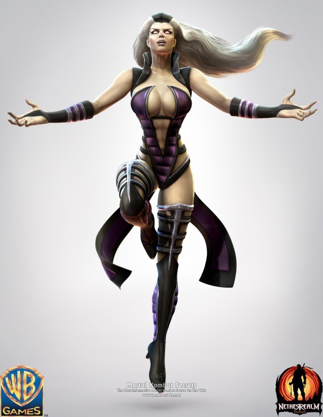
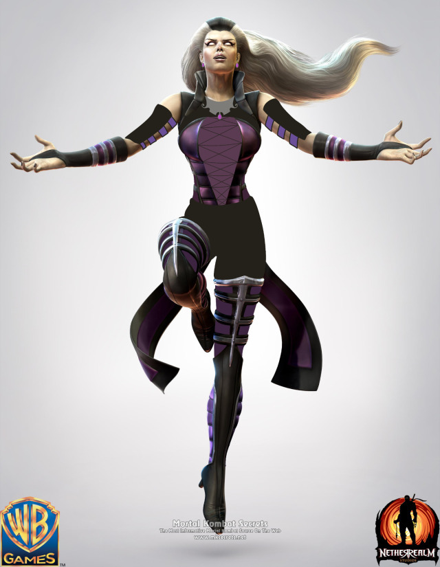
LET MOM CHARACTERS BE ATTRACTIVE & BADASS WITHOUT BEING OVERLY SEXUALIZED-
Sindel has such an interesting concept?? But then they tried to make her like… god, I can’t. I did this in like 20 minutes on my phone. No cruelty intended, but if you can’t design a scary older woman to where she’s hot without wearing a leather monokini, you’re not doing it right.
I emphasized the royalty motif with the jewelry & corset (so her impossibly tiny waist makes some semblance of sense). Hope you guys like it.
Emphasis mine, cause I agree 100%. For 20 minutes on your PHONE, trying to work around that disaster, this is such a huge improvement, it’s kind of embarrassing for the original. I wonder what other designs were on the drawing board before they picked this one. At least she seems to have abs in the original…. but damn, was this the worst way to show them? The answer is yes. Check out our bingo of the original “outfit” here.
The way I see it, this is one of those designs where you have to just scrap everything, except for that shrug thing maybe, to redo. I don’t think the corset is a great look (or great for fighting), but honestly, I wouldn’t be able to come up with any ideas in 20 minutes, as anyone who has watched our livestreams will confirm. ¯_(ツ)_/¯
I think this is a good example of just how easy it is to not give your character an ugly double-sided-tape-requiring swimsuit made out of that puffy coat material. But this was Mortal Kombat 9, where clothes went to die.
-Icy
Posted on
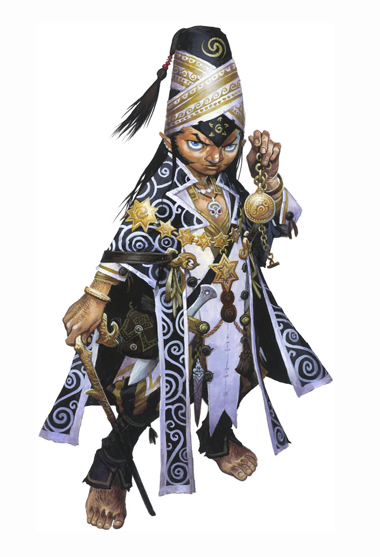
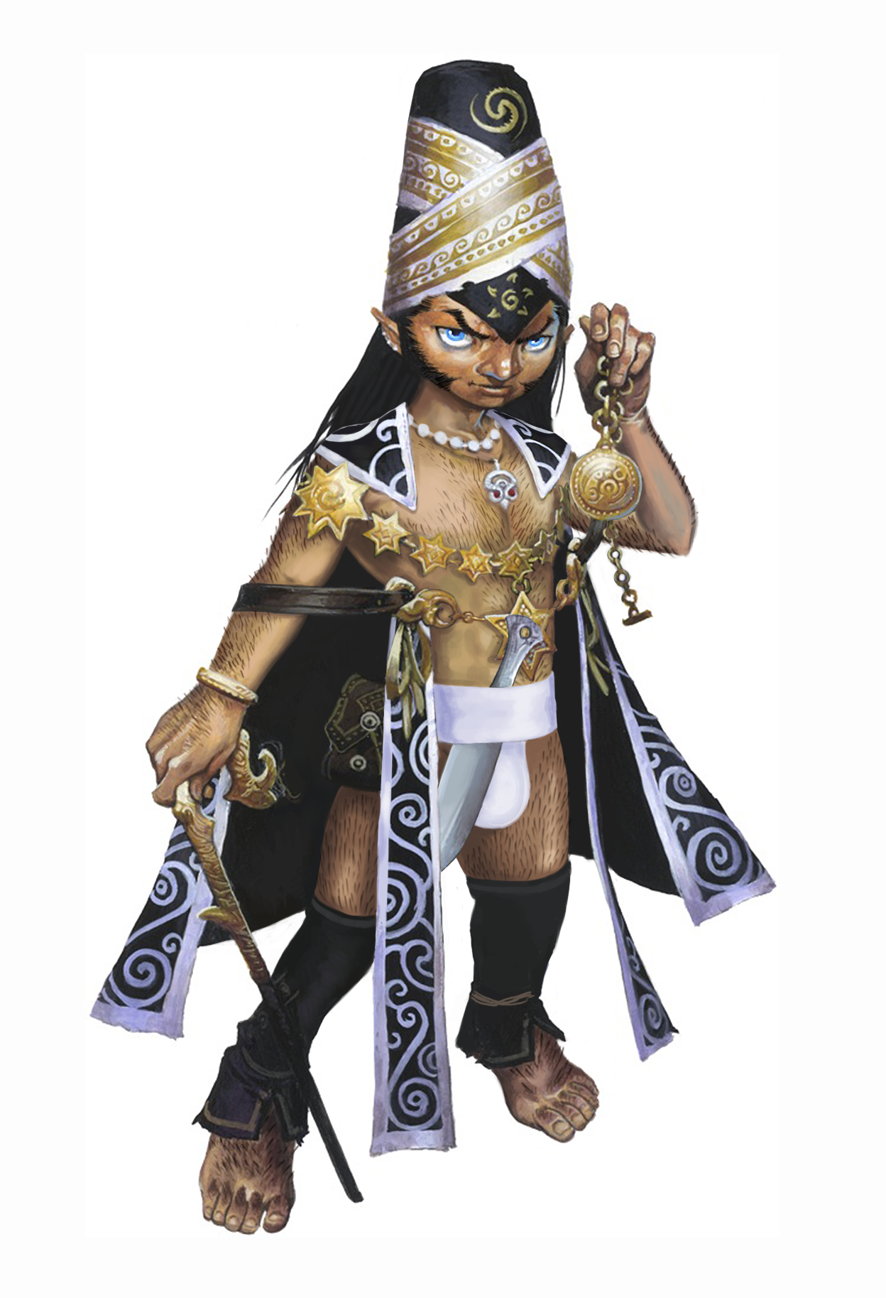
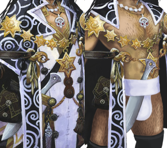
Abfinder, Part 2: Meligaster
I obviously had to go for a charisma-based iconic character (so I could give them a Very Big Charisma) and my favorite class happens to be the mesmerist, so here we go: the iconic mesmerist, Meligaster. Mesmerists use manipulation to get their way, so it’s strange that the original design for Mel here is so prudish. So I decided to fix that.
I ended up getting rid of almost all of his clothes. I left the fancy chain so that he can hide his nipples and flash them strategically when interacting with people. I also made sure to give him a good amount of body hair, since he’s a halfling.
There are a lot of more subtle changes I did to empower him further, like giving him invisible high heels (the epitome of empowerment), adding to his facial hair, and making his eyes pop a bit.
I definitely had a lot of fun working on this, as a Pathfinder player who knows the lore. I’ll definitely be informing my fellow tabletop friends of this New and Improved Mel.
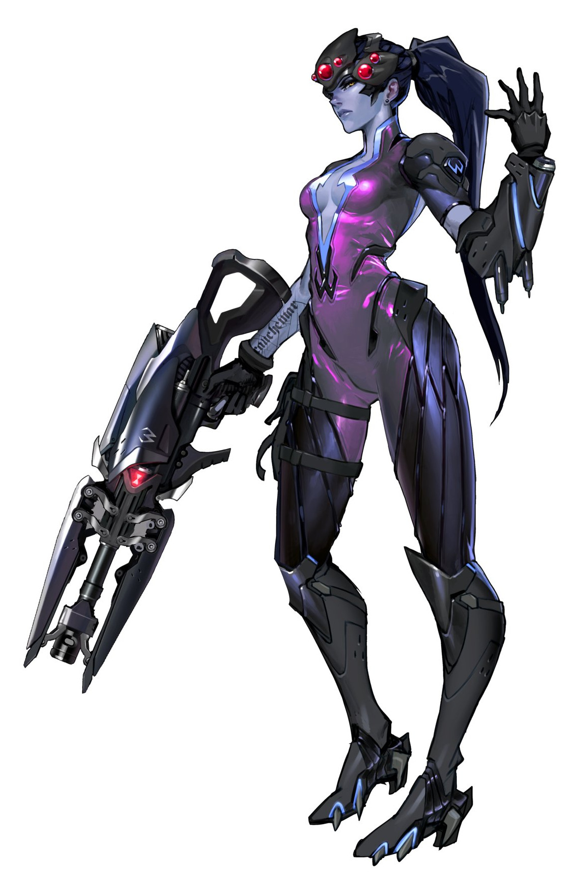
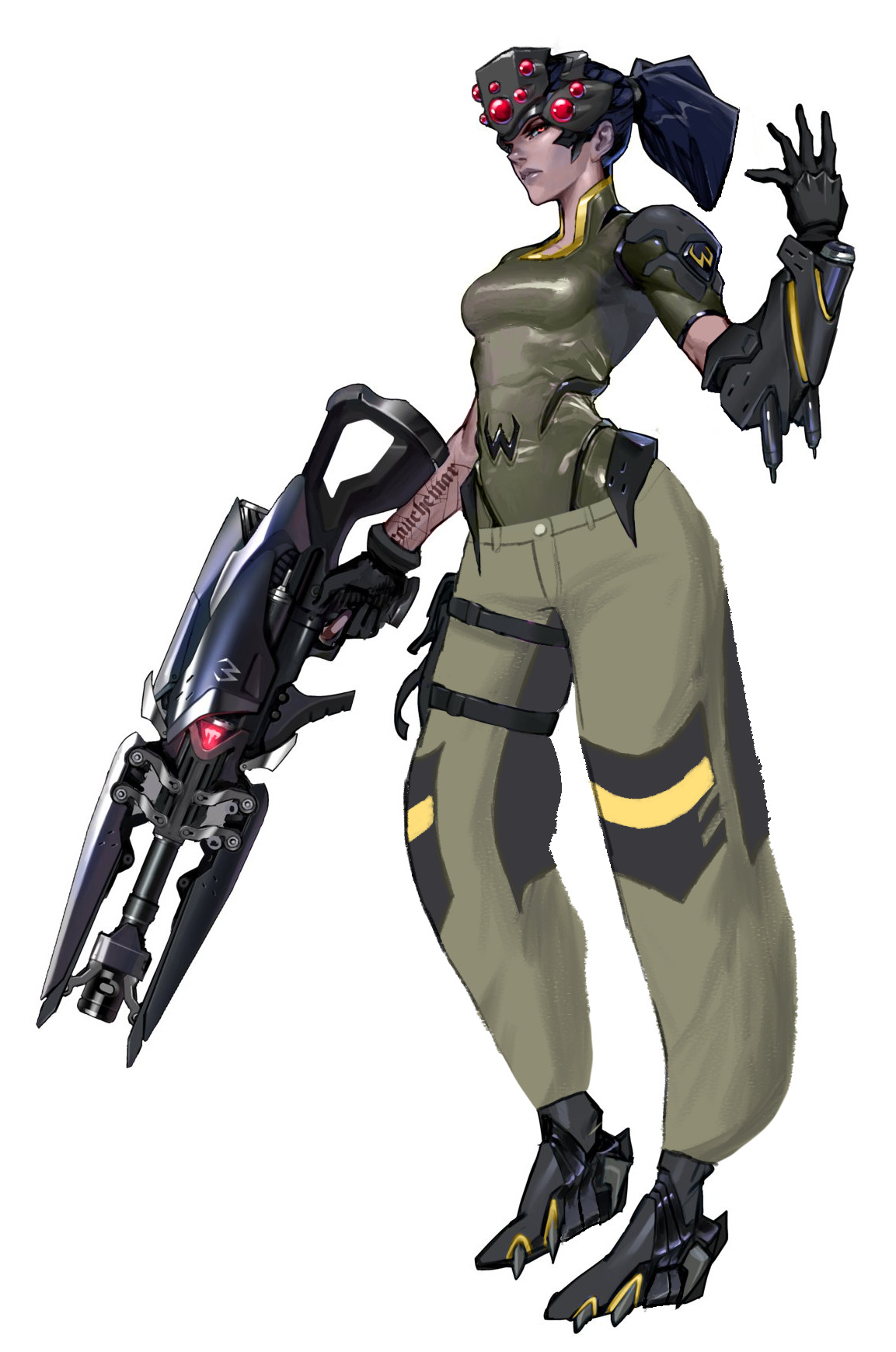
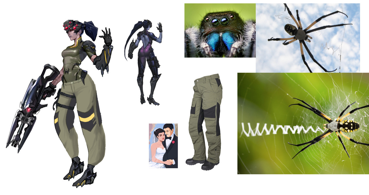
Inspired by going on one of my classic Overwatch character design rants the other day and binging @bikiniarmorbattledamage yesterday, I took it upon myself to try to make Widowmaker’s design… less worse. Here’s what I changed:
I gave her pants. Widowmaker is a victim of the weirdly common Overwatch character design trope of “armor from the knees down, skin-tight from the knees up”. (Well, the armor is also somehow skin-tight, but.) Since Widowmaker is a sniper and Talon is supposed to be paramilitary, I decided to put her in some actual tactical pants. …Of course, I still forgot to draw pockets. Pretend they’re there.
I decided not to shorten her legs or widen her waist, despite how ridiculous both of those features are, because Widowmaker actually has a reason to look like that – her spider motif. On any other character, I wouldn’t stand for it.
I closed up her ridiculous cleavage window. Again, she’s a sniper. Lay down on a roof in that and you’ll get your chest absolutely cut up. While I was in the area, I gave her bodysuit some subtle segmentation for a “carapace” look.
I think the way I changed her shoes she’d still have her feet in the high-heel position, but I at least wanted to made them flat on the bottom so Widow doesn’t catch her foot on a gutter and faceplant into an alley while doing her whole parkour thing.
Purple isn’t a very “spidery” color, so I changed her to a dull greenish-brown with yellow accents to evoke an orb weaver’s color scheme.
I shortened her hair so it doesn’t get in the way while she’s fighting, and so it’s the almost exact shape of a spider abdomen, thus making her whole head a big spider design.
I made her skin a normal human color, with some subtle purplish tones on her nose, lips, ears, and cheeks. I also removed her earring.
I made her visor boxier both to look like a jumping spider and for a more realistic “tactical” look, which also gave me room to pop some more eyes on there. Plus I think it just looks better; the original looks like they were going for Giger and gave up.
Black widows are overplayed. I changed the hourglass light on her gun to the Talon logo, so she’s actually representing her organization somewhere on her design.
It’s a second fan redesign of Widowmaker we share that adds roomy pants to her costume, so it probably tell us something about what’s the next most glaringly inadequate part of her design, right after the navel-deep cleavage.
Not sure if I’m personally into the proposed color scheme, at least without invoking orb weaver’s interesting patterns in some ways. That would also add some much needed segmentation and contrast in her outfit. I agree, though, that the original colors were completely out of nowhere and should be revised.
The ponytail combined with helmet creating a spider-like shape is definitely much better evoked than in Blizzard’s design and shoes being somewhat wearable are appreciated.
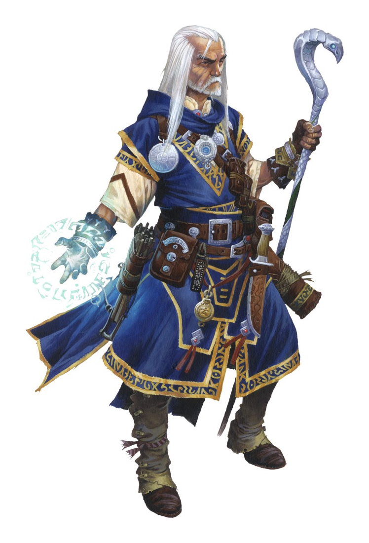
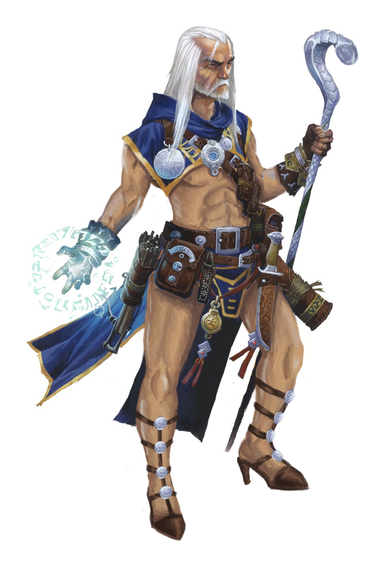
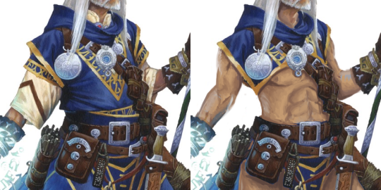
I usually keep the silhouette roughly the same for male characters, just uncovering as much of skin as possible, but this was a special case, cause male wizards tend to dress in tons of unsexy layers. I had no choice but to recreate his legs, arms and abs from scratch, without much indication of how ripped he should be.
No sleeves, no coat flaps, a crop top that reaches juuust above his male presenting nipples. Now that’s empowerment.
Hope you also liked the new stylish shoes I designed him from scratch.
Everyone knows that when fighters and barbarians go topless, it’s to display their physical strength, right? Clearly, when squishy magic user does the same, it’s a sign of magic power making up for their vulnerable bodies! At least that’s what we usually hear when a witch or a sorceress of some kind runs around in a bikini.
I tried giving Umah from Blood Omen 2 some proper armour, design based broadly off the single piece of armour to her name – that weird double pauldron thing. Edited the bottom half of her bikini into a fantasy tabard, and if I’d thought to use a fuller screenshot I’d have put the dragon from her Defiance concept art on there, but thought of that way too late. Come up with your own reason for why she has the Soul Reaver, preferably one more interesting than the fact that it’s hiding some lop sided hip armour that would have been a pain to fix. Another case of not as good as I was hoping for but automatically an improvement on the bare skin chafing nightmare of the original.
Personally I ascribe to @bikiniarmorbattledamage‘s tongue in cheek philosophy that women in fantasy should be fully armoured while men should wear something tastefully revealing. Legacy of Kain at least gets halfway there with the well muscled men in leather pants, just a shame about the prevalence of bikini armour.
Wow, the original is a yikes, especially the huge boob part made from unidentifiable material. I guess it counts as better than most booplates we’ve seen on BABD because there’s no boob window/exposed cleavage, but that’s one low bar to clear. Also, one huge grey boob blob on her chest is somehow extremely distracting and boring at the same time. At least put some symbol on it or something!
I like your simplistic redesign, @kainissoable. If me or Icy were doing it we’d probably put some design (likely sampled from other part of the costume) on the breastplate, to break up this huge shape, which was also the original’s problem. It still works objectively better than the generic garbage the original was.
~Ozzie
Posted on
Disagreeing with Disgaea’s Designs, Part 2: Flonne
I feel like I’m going to get flack for this but oh well lol. So Flonne here, in her initial appearance, is an angel, assassin, otaku, ditz, and believer in love and justice. Hashtag relatable, am I right? I’m not sure why an assassin would have annoying detachable sleeves and hotpants. The color contrast between her pale-ass skin and white shirt isn’t even strong enough to make her shoulder an interesting standout shape. Maybe all the angels wear pajamas, which honestly, I can relate to. But not for assassinating.
For the redesign, I took inspiration from the lolita fashion style and gave her some fun shorts and a little cape. I was trying to maintain a lot of circles/rectangles in the redesign, since she is a force for good, even though the original had those bow triangles.. I guess they’re supposed to foreshadow her role in the sequel games? I’m not sure. I kept the color scheme, and I moved around some of the bows for balance in the design.
I think she could benefit from some socks, maybe, but I decided to forgo them cause I feel like even if she wore them, she’d forget to. She’s supposed to be an airhead, after all!
I’m not sure how I feel about the final product, this is the result of like 3 different tries, as usual. The only thing I’m really sure of is that cape. ?