Rule: When analyzing or critiquing media, you can not defend a problematic aspect of media by saying that a character CHOSE to do it, and that people are allowed to CHOSE to do things.

bikiniarmorbattledamage:

fandomsandfeminism:

Because fictional characters do not have the capacity to make choices. Because they are not REAL people. 

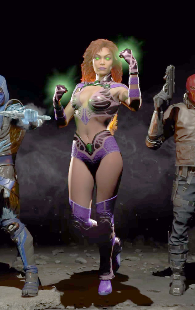
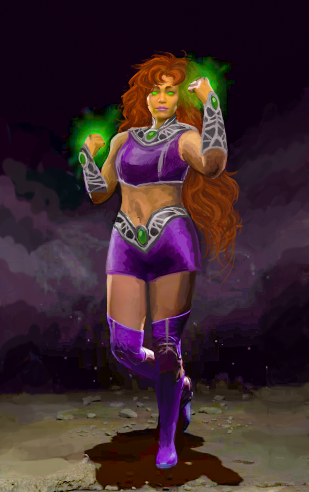
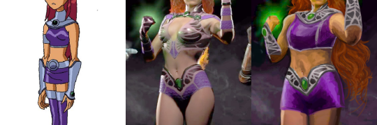
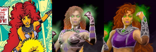
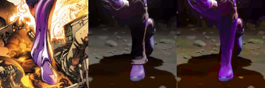
Power Girl and Starfire did not CHOOSE to fight evil in skimpy, revealing outfits. It is not their PERSONAL CHOICE to wear those clothes. They are fictional characters and their wardrobes are under the control of the author and artist.

Dumbledore did not CHOOSE to stay in the closet as a personal and professional choice because that was his right as a person. He is a fictional character. The fact that his sexuality was left at only vague subtext and only revealed through word of god was a deliberate decision made by the author.

Fictional characters are fictional characters. They do not make their own choices.

Addendum to the rule: for the same reasons, you can not argue that criticism “shames” a character for their appearance or behavior.


And just for the record, seeing what kind of responses this post received before we got to reblog it: NO, the fact that fictional characters tend to grow and take a life of their own still does not mean they have agency.

No matter how developed a fictional person is, they’re still written by a real person (or people) who have their own biases and rationalizations. Just because some “choices” feel natural to the author doesn’t mean they’re objectively plausible “choices” for a character to make within the given narrative.

Sometimes the choice, like (in case of what our blog critiques) decision to wear a sexualized costume to battle, can be explained by specific circumstances. But in most circumstances or with other explanations, the same choice can be plain silly and inconsistent with the rest of established story/worldbuilding.

~Ozzie

more about character agency on BABD

This week’s throwback: a timely reminder that yes, we still live in a world where fiction doesn’t merge with the reality, so no, fictional characters do not possess free will that lets them personally decide what to wear and how to behave. 

Each and every “choice” a character makes is 100% responsibility of their real, living creator(s). Thus criticizing how fictional people are designed or written isn’t the same as personally attacking them.
To cite @foldablehuman‘s Thermian Argument video

Criticism of a creative work is, ultimately, criticism of the decisions that people made when they were putting it together. 

Essentially, there’s no point in getting offended on behalf of a person who doesn’t exist, especially in response to valid critique.

~Ozzie 

Starfire and the Legend of Murky Colors

Injustice 2′s Starfire was a challenge with very little potential, so I mostly redid her from scratch, arriving at a mix of her 2000s cartoon outfit and 80s comics hair.

This was by far the hardest design to work with palette-wise, considering not only how desaturated colors in Injustice graphics are, but how outright low quality the official image is – it looks like something’s wrong with how they rendered the lightning!
Muted colors were a double insult, considering Starfire’s vibrant color scheme corresponds with her vibrant personality. Did my best to recreate it by cranking up saturation, salvaging the few colors it did bring out and painting over the badly-lit parts with them.

Changed her bodypaint-bikini into a crop top and shorts (with all do respect to Glen Murakami’s cartoon Starfire design, flying in a skirt is just the worst idea).  

image

Only part of her Injustice design worth salvaging were decorative bits on her belt, which I recolored silver and recreated the pattern on her new collar and arm guards to match. Painted her limp, lifeless hair to actually look fiery without even being made of flame – by simply basing them on her original New Teen Titans hairstyle. 

image

Got rid of those weird bellbottom things on her ankles, which served no purpose and seemed like a throwback to her ugly New 52 footwear. Also, as usual, made her less skinny.

image

All in all not necessarily my best or most original redesign, but it’s best I could do with limited time, constant computer crashes and very hard material to work off of.

~Ozzie

the-midnight-doe submitted (and Ozzie bingo’d):

And on today’s episode of Doing Women Better™, Blizzard finally granted us the much requested Magician Symmetra. Only instead of going for something super classy like the many fan interpretations out there or even just ladies in suits from real life, they went with…this.

Lack of pants and framing her bust (what is even with those metal plates) aside, the fact that this is a legendary skin and costs 3000 credits when it’s so close to her default skin makes this whole thing very disappointing. 

Thanks for submitting this highly requested post, including some quality scathing commentary! The Saga of Pantless Symmetra continues. 

This would be insulting enough just by the virtue of being a fetishy leotard instead of a suit, but what the hell are those boob-holder bars?! 
They’re some sort of garbage afterthought slapped on to make this look more “sci-fi”, I guess? Why would a costume need that? Because you can’t be science fiction without framing the tits with random pieces of metal? 

Since the bingo lacks a “What the fuck am I looking at?!” square, I marked “Boobplate” instead.

Here’s some closeup, to see their full absurdity, provided by @red-queen-on-the-heathen-throne:

image

Fun fact: a convention I attended last week had an Overwatch: Character design done right! talk that I just couldn’t subject myself to come to, both out of the fear of my brain melting on sight and because I didn’t want to rain on some enthusiastic fan’s parade when the time for Q&A comes. 

I’m still amused that at the same time Blizzard made THIS, easily disproving the “character design done right” claim. 

But sure, Overwatch is totally ready to do women better. Anytime now.

~Ozzie 

#GiveSymmetraPants2k18

Gotta love the “creativity” of web ads presenting just another grizzled military dude as an equivalent to a generic pretty girl with long flowing hair, cleavage and belly out. Totally legit and “equal” soldier designs! Especially for a game that apparently takes place during WW2? 

Um, is that supposed to be some sort of parallel universe? Because other than USSR imagery slapped on like an afterthought, even the guy doesn’t look anything close to a soldier from the 1940s…

~Ozzie 

Seris, the Oracle of Nothing

I decided to do a redesign of the oracle Seris from Paladins basically 5 minutes after I first saw her design. It was just so… disjointed. The leather top, the pointless belts, the tassel on her magical orb… Ugh. It told me absolutely nothing about her. That purple orb was the only indicator of her oracle-ness.

The only things I liked were: the hood (for the most part), the shawl, and the geometric designs on her skirt. I kept those, and decided to go with a moth-y motif overall, making the shawl longer and adding the top with wing-like tips. I really did not like the color scheme, so I added more light grey and some black, getting rid of all the we-need-another-color-but-got-no-ideas brown.

I made her float (though it’s a bit hard to tell), as it seemed fitting to me since she has an in-game ability of becoming invisible by stepping into a parallel dimension. It’s a symbolic detachment from the material dimension, as well as making her feel a bit more alien. She is supposed to be an oracle, after all. It also fixes her proportions a bit.

I took a few sessions to get to an idea I liked, and then a few hours to execute it. I probably would have added more details to her top, if I had the time. This redesign is back from the days when I was trying to redesign basically everything, which we’ve moved away from since then.

-Icy

whiteraven13:

wearepaladin:

The Guardian by

Lam Nguyen

@bikiniarmorbattledamage

This is obviously not a functional armor design, but it’s a cool concept for an idolized historical figure, or perhaps even a parade armor. The shapes work really well together, and I’m glad that the artist didn’t engrave the entirety of her breastplate. It’s hard to tell apart the metal from the cloth textures in some of the shots, but I like the contrast of the materials against each other. I do wish the color scheme was more than just 90% white and grey, but that would suit a depiction of a saint or similar figure.

My big gripe is that cincher-shaped detailing on her breastplate.

I thought to showcase this as a good example of how one can design even a nonfunctional feminine armor without having to expose the Tiddy, or give her 4 square inches of fabric.

The link to the artist’s gallery above is broken, so here is a new one. They’ve got some interesting costume designs, and they include their process, which is really interesting.

-Icy