She-Ra Reboot

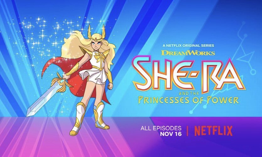
Something a lot of readers asked us to chime in on is the recently revealed artwork for rebooted She-Ra cartoon. 

Considering the showrunner for it is Noelle Stevenson, aka @gingerhaze, the author of Nimona and co-creator of Lumberanes, and from whom we reblogged a couple times in the past, it’s quite safe to assume it will be much more interesting and diverse than the original’s “exactly like He-Man, except looks like a Barbie doll and rides a flying unicorn.”

First off, judging from the EW interview, Stevenson intends to take full advantage of the heroine’s backstory, in which she was kidnapped and raised from infancy by the Evil Horde before she turns against them as She-Ra. That leaves a lot of story potential for internal conflict and development of relationship between princess Adora, her antagonists and friends (some of whom will likely be one and the same). 

image

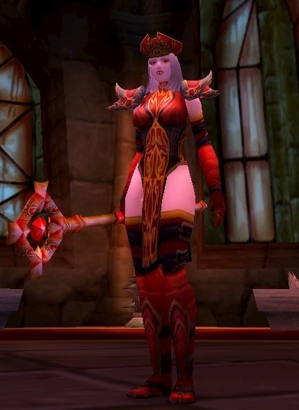
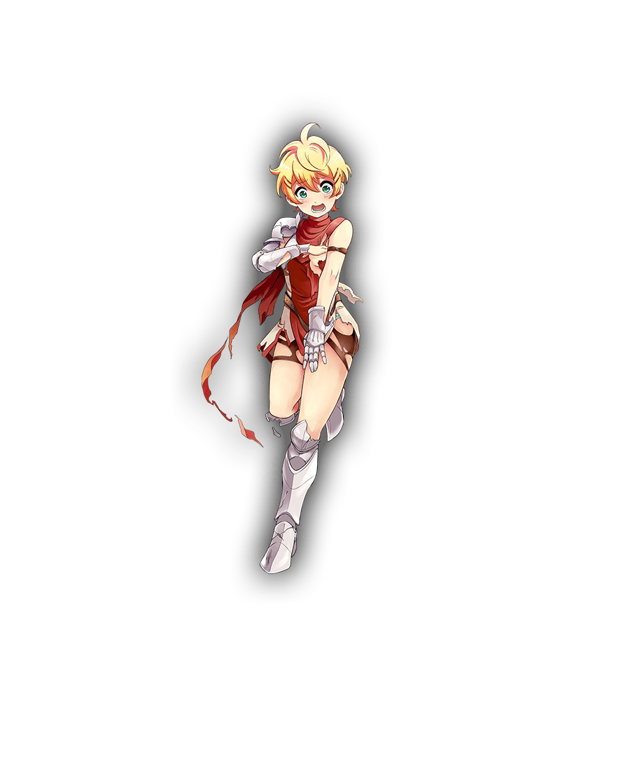
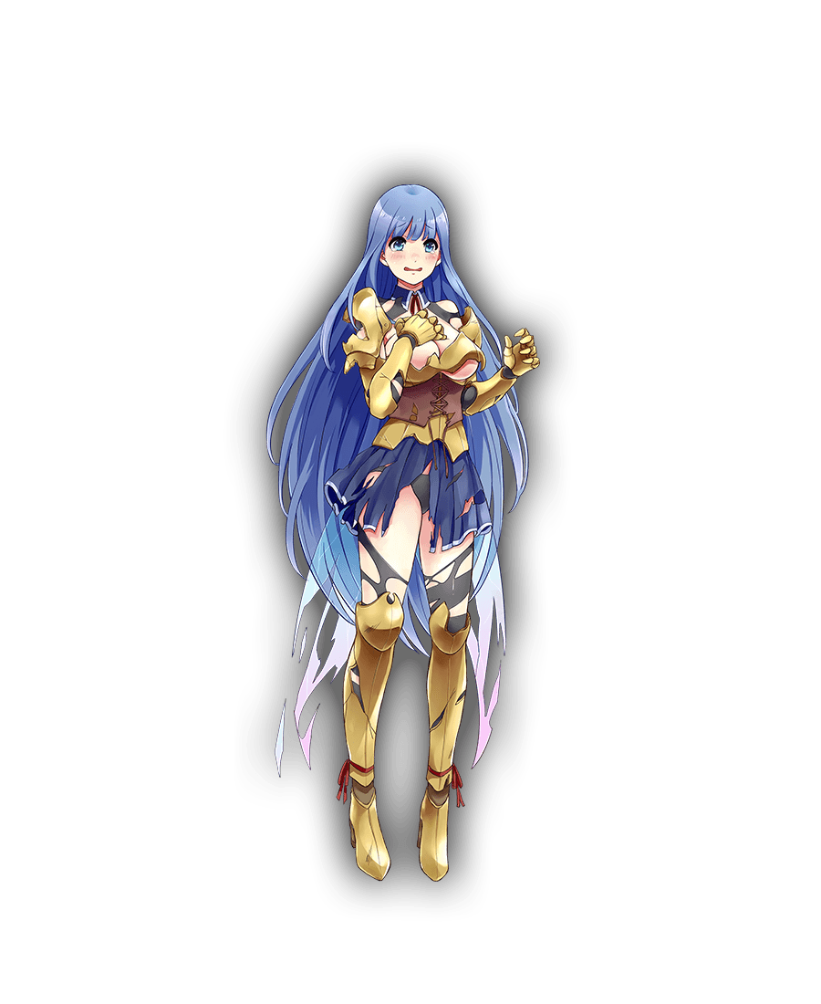
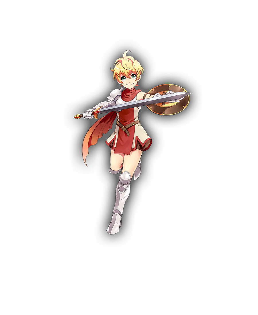
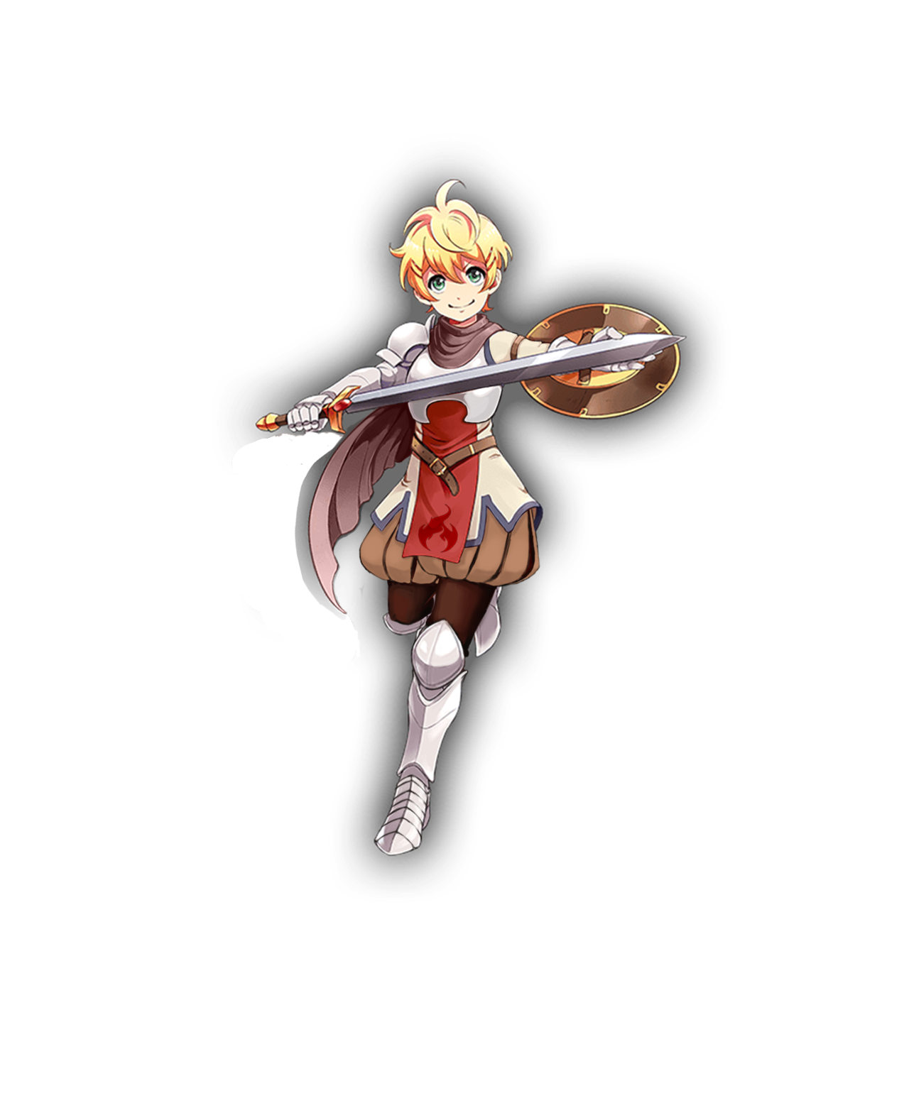
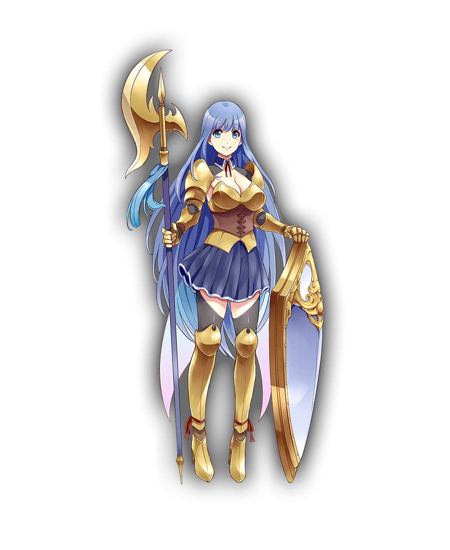
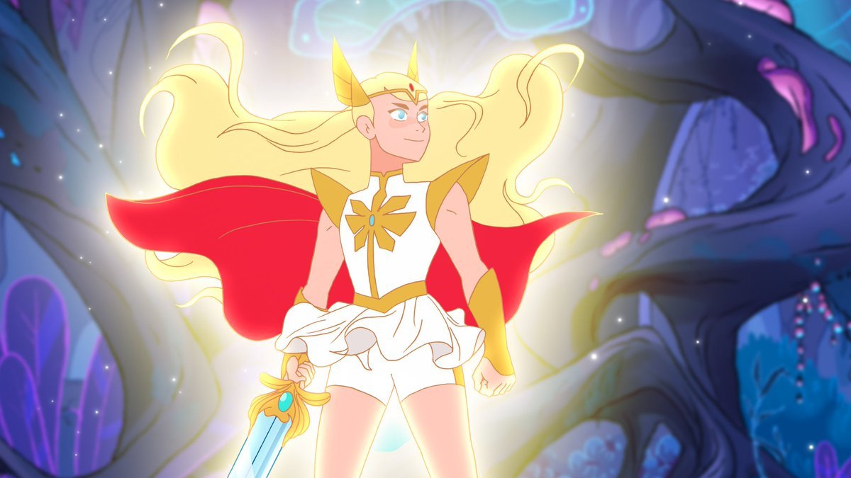
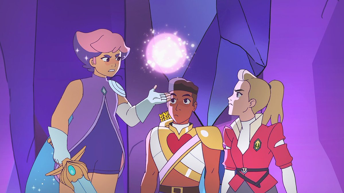
Second, and more relevant to BABD, her character design is pretty damn solid mix of stylized magical girl elements (long hair, barely any armoring) and some practical choices, like comfortable looking shoes, short pants under her tunic and breast piece without the original’s cleavage. This is what we mean when we say a warrior design can be feminine without being objectifying. 

And yes, since we need to address the elephant in the room: there is a vocal minority of entitled manbabies crying that their childhood icon got snatched by the evil gay SJW agenda. 
That Adora/She-Ra, a teenager, is deliberately unsexyfied and that is bad because sexyness is totally what original show’s intended audience (young girls who wanted a He-Man’s feminine counterpart) liked about her. Not to mention allegations that the story is going to be “forcibly” turned into a queer narrative by the lesbian showrunner, which would be a bad thing, because…? 

image

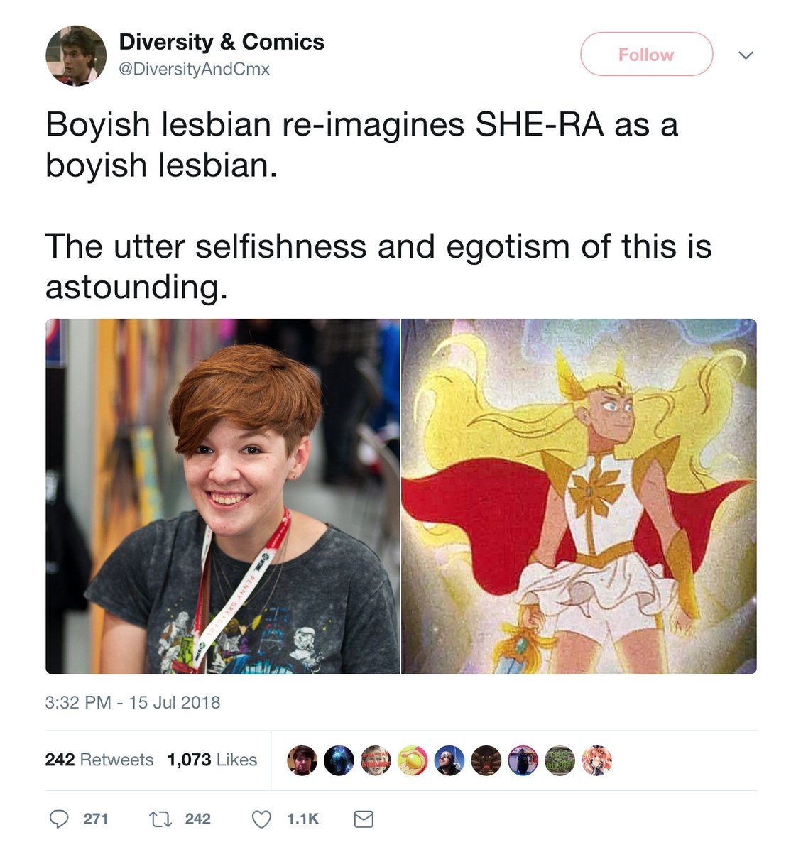
[Because Diverstiy & Comics dude is a raging bigot, that’s why]

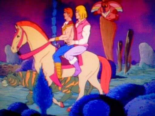
Also, people who who think that She-Ra or He-Man can be suddenly turned gay clearly didn’t rewatch either of the 80s shows lately

image

Here’s hoping that if this series catches on, then maybe a He-Man reboot comes next, this time turning all the gay undertones into overtones and angering  dudebros even more. 

~Ozzie

see also: Original She-Ra’s co-creator calls bullshit on claims that she was supposed to be “an idealized woman” | The Backlash Over She-Ra’s Redesign Is Why Girls Can’t Have Nice Things 

Red is for the High Inquisitor skin, Blue is additionals from the Celestial Empress skin

Clickbait Title: You Won’t Believe What Character Blizzard is Adding to Heroes of the Storm!

Having blocked out most of my memories of playing World of Warcraft (and I didn’t do raids), I didn’t remember Sally Whitemane, so boy was I surprised to learn she led a religious order!

image

I’m not sure how anybody took this character seriously as an authority figure of any kind. Her outfit looks like something out of a fetish lingerie catalog. The HotS design is almost exactly the same as her original WoW model, which really highlights how much effort Blizzard is putting into doing women better.

image

Not to mention, her first alternative skin is some kind of scissors accident, rather than, for example, her Horseman version? Yeah, she became one of WoW’s Four Horsemen (the only woman in the current lineup, of course).

image

I mean, give her some padding on her exposed stomach, and that would be a fine alternate skin! But she does have a lot of skull motifs all over, so maybe they thought it would be too similar-looking to Sonya’s Death Knight skins.

-Icy

h/t: @evjazurian

So…  the Fate series started with a frankly amazing female character, Saber* but since then they’ve… well they haven’t been really respecting the concept that they started with.  This one however… well it looks like they decided they need to go back closer to the original look while still trying to find ways to pointlessly sexualize her.

From episode 2 onward of the latest series the opening credits of Fate: Last Encore are just ninety seconds of this version of Saber hacking up literal shadow opponents in a shadow maze in a manner to flaunt her T & A.

Kind of disappointing for a series that is supposed to be about all manner of mythical heroes, now seem

– wincenworks

* Yes, we are aware this is technically not the same character due to Fate’s obsession with alternative universes, and the universe in Last Encore being very alternative… but putting “identically named variants on a broad character concept” doesn’t parse as well.

Tidy Up Tuesday #81


We were sorry to find out that Tumblr mobile app doesn’t respect the “Read more” feature (funnily, Tumblr viewed through mobile Internet browsers does!). Apologies to readers who saw “defeated” Kanpani Girl pics on their dashboards.


Speaking of Kanpani Girls, as far as our research can tell, that game was not considered porn/hentai/NSFW by its publisher’s standards (they do sell a lot of that stuff, but on a separate web portal). 

Also, it was discontinued in April of 2017, proving, as couple other closed down games we talked about before, that “sex” doesn’t sell.


Some people rushed in to explain to us that Warhammer 40k is supposed to be ridiculous and not taken seriously. 

To them we gotta say: tell that to all the geniuses who sincerely think that female Space Marines are literal blasphemy


Things we addressed before: 


-Ozzie, -Icy & ~wincenworks

talvin-muircastle:

jammy-lannistray:

can we take a second to ponder on the fact that a kids movie did lady armor better than the entire film and comic industry

guess who i’m talking about

did you guess? Well you’re fucking WRONG because it’s Susan goddamn Pevensie

image

They gave her light armor, appropriate for a small archer:chainmail, an arm brace, chest plate, and a light skirt she can easily run around murderizing dudes in the face in

her hair is also only loose in the promo pictures because Susan is fucking busy not dying because her hair was flying into her eyeballs so she braids that shit back

image

her mail shirt is also loose enough that it doesn’t impede her arm movements it’s almost like she’s dressed for a fight wow

image

I like the pinks and purples under her bitchin as hell leather armor here, because you don’t have to be masculine to shoot someone in the goddamn face

@bikiniarmorbattledamage you’re up.

Everyone, including the actress who played her, agrees that Susan was the most boring of the Pevensie siblings, yet the filmmakers had enough respect for the character to dress her in practical light armor. And didn’t have to bend over backwards to slap on “feminine features” (read: giant boobplate) to make sure no-one confuses her gender. 

Would other female characters in life action get non-exploitative clothes if they were also played by underage girls?

~Ozzie 

PS: Props for archer costume with puce as its primary color instead of green!

This is the sort of design that explains why people don’t treat the word “edgy” seriously anymore – artists who want their stuff to look “dark and edgy” literally throw as many sharp edges on their villains and antiheroes as possible, no matter how absurd that looks! 

Just imagine all the protection she could get if she used metal from those arm and head spikes to form a practical breastplate!

~Ozzie

Why does this look like, instead of sending the publisher the actual intended cover art, they accidentally submitted a “how ridiculous can we make it” art piece done on a dare? And the publisher just went with it, because it’s Warhammer?

-Icy 

h/t for finding us design to bingo: Gigahorsedeluxe

Destroyable Armor – Why we should destroy it

bikiniarmorbattledamage:

I was quite surprised to find people rushing to comment that a certain terrible screenshot was actually demonstrating destroyable armor (I guess if you already knew about it, and hence knew that her armor had been destroyed… so it doesn’t really help with marketing).

Now we have mentioned destroyable armor before… but maybe it’s best we do a little more talking on it since apparently it’s a thing that’s been sold as making sense.  Surprisingly, the first appearance of this trope in video games (that I’m aware of) was inflicted up a male character.

image

A manly man named Arthur who was on a quest to save his love, Prince Prin Prin (actual name!), from a foe no less than Satan himself (who lives in Hades… just go with it! I promise nothing in the game will make any more sense than this summary. Nothing at all.)

image

It was released in 1985 and is probably one of the most frustrating video games ever to grace an arcade (you can play it here if you don’t believe me, and imagine putting money in every time you run out of lives)

Arthur had a full suit of plate male armor that would, upon the impact of any attack or even light touch of an enemy, fly off and leave him running around in his whitey tighties (later re-inventions would give him boxer shorts).  Destroyable armor didn’t make sense in Ghosts ‘N Goblins and it’s not going to make sense anywhere else.

While “soft” armors like kevlar weave and leather will become less protective over time they don’t fly apart for a very simple reason.  Anything that hits your hard enough to dislodge armor from your person has hit you hard enough to kill you.  Even the force to dislodge regular clothes by impact (rather than deliberate tearing off) will easily kill you in a most spectacular fashion!

image

Armor isn’t a car, it doesn’t have crumple zones. Your armor being blasted off you and you coming out relatively unscathed means that you are literally tougher and more resistant to damage of all sorts than your armor is.  

That’s the story you tell when you show a character get hit and their armor falls off.  It doesn’t matter if it applies to all genders (though it always seems to be women chosen for the “demo”), it just doesn’t make sense and is more distracting than simply going without armor.  There are so many better ways to convey damaged armor:

image

Missing enamel/coloring, destroyed ornamentation, blood marks, changes in the silhouette on parts etc all convey that the armor is damaged and becoming less and less useful without also conveying that the actual point of the game is to try to see your character naked without them dying.

– wincenworks

A thing we didn’t reference in yesterday’s redesign post is that Kanpani Girls indulges in a very particular version of destroyable armor trope – creepy “defeated” sprites of humiliated waifus with their clothes and “armor” shred to pieces. I’ll put Flavie and Marica’s “defeated” looks under the cut for comparison with the previous post, because it’s genuinely disturbing. 

So this week’s throwback is a reminder that there’s no reason to incorporate armor which suspiciously falls apart during (or after) a fight in fiction, especially on female characters. And people who do it have an obvious agenda to show off flesh, not battle damage, which could be easily conveyed in non-pervy ways. 

~Ozzie

image
image

Flavie - originalFlavie - Icy's redesignMarica - originalMarica - Ozzie's redesign

Kanpani Girlfriends

When we discovered that Kanpani Girls is a perfect candidate for our Wall of Shame, we dug through their massive library of really badly designed waifus and picked some relatively easy fixes. Reading up their bios, our choice were two Holy Knight friends, Flavie and Marica, whose defining characteristic is being self conscious about being too short and too tall, respectively. 

Liking the cute dynamic of them both helping overcome one another’s complexes, we decided our versions should be girlfriends. 


Flavie 

Well, the obvious first thing to go was that single-breasted boob plate, which was a…. unique design, I guess? I instead changed it to a design I saw when looking up armor references for my OCs.

image

I gave her Elizabethan poofy pants because everyone should wear them, honestly. I decided to go for an overall brown and cream color scheme, but left in the red and added some blue to tie the colors in with Marica’s red and blue details, since they are girlfriends. The flame on her tabbard comes from her element in the game, which is fire. Her design is basically all large and medium-sized shapes, so I wanted to add something small. It’s hard to see, but I also gave her a cream-colored sleeve on her left arm. Finally, I adjusted the scarf shapes to look better, both around her neck and as it blows in the wind.

Even though the final redraw is fairly simple, it was definitely fun to work on. I ended up trying like 3 different pants shapes for her before I settled on these. Cell shading is definitely not my thing, though.

-Icy


Marica 

It was one of those designs that’s very close to working as a stylized girly armor, but doesn’t, because someone HAD to give her big ol’ cleavage and exposed thighs. So, my aim was to bring back its potential. 

I’m quite happy with how the breastplate shape came out, with its high curve and slightly bigger tassets. First I intended to incorporate that leather cincher into it, but it just didn’t work. I also gave her semi-poofy pants with diagonal pattern similar the absurd shape of her original  thigh-baring stockings. 

Another thing was to make her shoes at least a tiny bit flatter and more planted on ground, considering the original artist drew her as if she was floating in air rather than supporting her own weight on her feet. High heels not only are universally stupid footwear for a knight, but Marica is supposed to dislike being tall! Why would she wear shoes that add to her height? 

Finishing touches were to establish her better as the girlish one of the couple (big part of her and Flavie’s actual bios) by making her red ribbon/bow motif more significant, especially with hair bow that nicely contrasts with her blue locks (inspired largely by the ending of one of my favorite anime). Also last minute change: decorative piece on her halberd is now red too, to tie everything together.

Bonus point that red accents connect her to Flavie 🙂

If I were to do it today, I’d also turn her skirt and collar into the same graphite color as her armor joints and dark part of her pants, so that they wouldn’t blend into her blue hair.
All in all, not my best or most complex rework (I also had big trouble with cel shading style, obviously), but I think it goes to show how small changes can make a difference between gratuitous sexualization and cute girlishness. 

~Ozzie