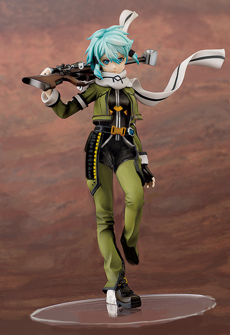
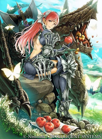
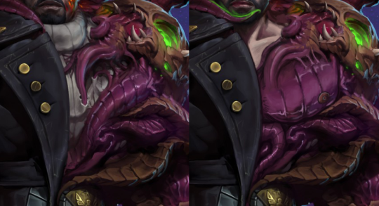
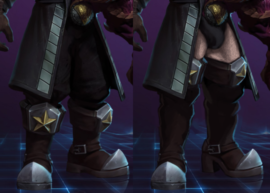
SAO/GGO Figurine Redraws, Part 2: The Incest Fairy 

Continuing the fixing of Sword Art Online heroines with Alfheim arc’s notable addition to the harem party, Leafa.  

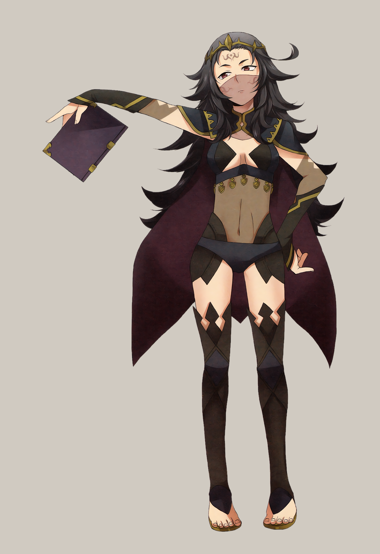
Why do I call her The Incest Fairy? Well… people even remotely familiar with SAO’s lore are aware that this character’s sexualized design is only worse in the context of her story >_> 
The interesting twist is that this girl who joins the main character in the game  turns out to be his adoptive sister/cousin, literally playing in the next room. The creepy twist is that she happens to have a massive crush on him. 

As the Anime Pope sayeth, DON’T FUCK YOUR SISTER! 

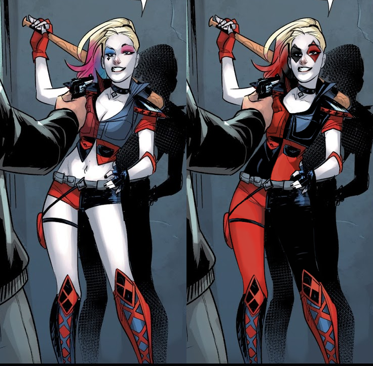
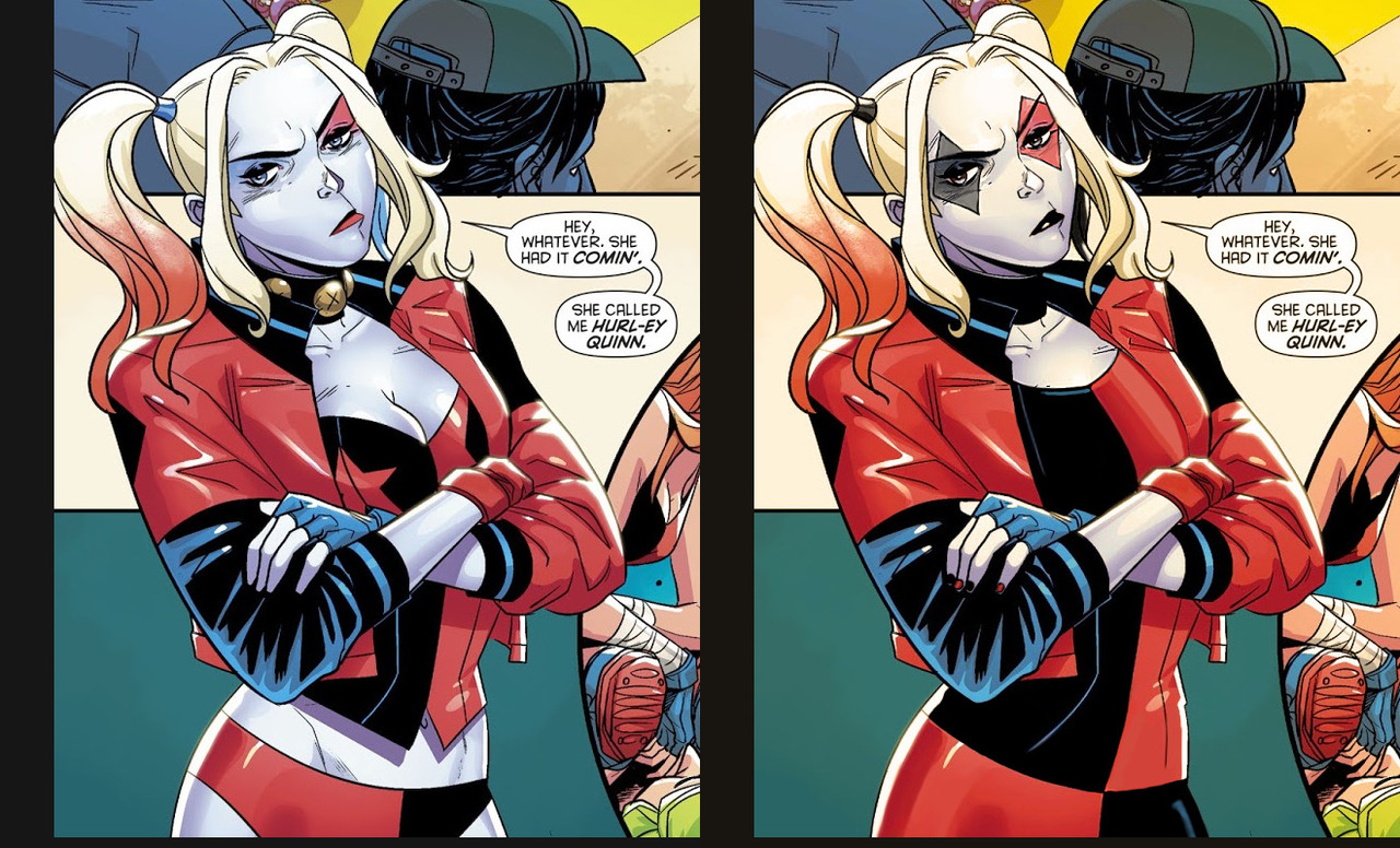
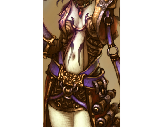
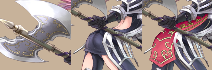
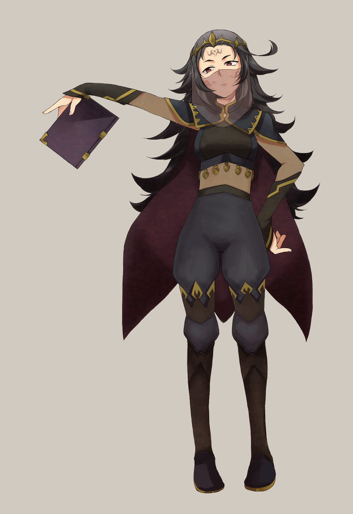
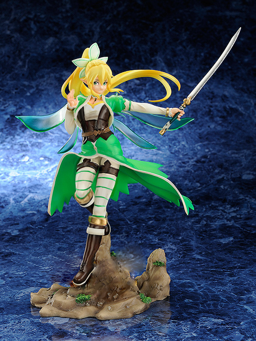
So, there’s a lot of emphasis on Leafa’s ample cleavage here, with the creepy anime waifu hand gesture which I hate. I redrew her hand completely. 
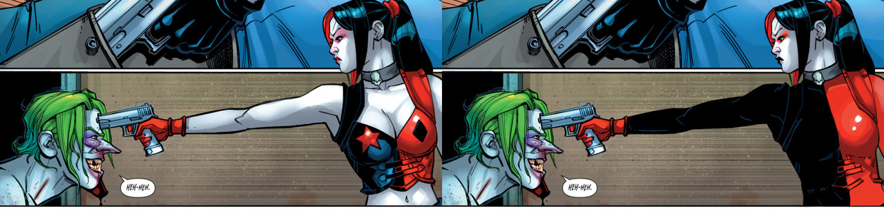
Then I reworked her weird impractical cincher into something combined with a leather vest, to contain her breasts with something more than just the white top (which I made less boobsocky). Keep in mind her breasts aren’t smaller now, they’re just held together by actual clothes. 

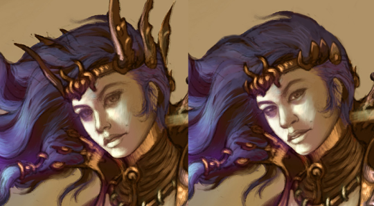
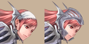
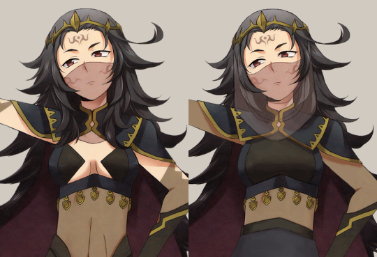
I also decided to give her a bit less generic anime facial features, with a more prominent nose, chin and eyebrows. Also subtly changed her eyes’ expression and added some detail to the shading on her face and hair, so that it’s all more interesting and not as weirdly 2-dimensional on a 3D figurine. 

image

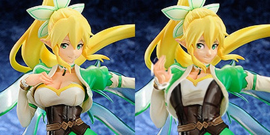
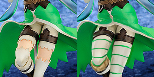
Or course, her waist was tiny and her limbs stick-like, so I gave them some heft. The most head-scratching part of her costume were the tights that somehow just… disconnect in the middle of the thigh, then continue below like nothing happened. I made them whole, then added thin green stripes, to match the one stripe on each of her arms. Also, since there was little to no contrast between where the tights end and the boot begins, I recolored the upper part of the boots into golden rings, matching ones on her wrist. Now her legs and arms don’t look like designed separately. 

I also noticed what seems like a minor case of Imperial Walker Hip, or at the very least that her right leg is disjointed from her pelvis. Did the best I could to fix it with limited time and liquify tool at my disposal. It’s not ideal, but at least I also took that opportunity to not make her crotch visible from the cut in front of her skirt. I would probably repaint the whole pelvis section if I had to do it today, because even with some painting over the current results are kinda awkward. 

image

I have no idea what those white… pillows she was standing on were, but they looked so weird and suspiciously boob-shaped (a thing really hard to not think about when looking at this figure), so I decided to erase them the best that I could with my Photoshop stamp tool skills. 

Overall, not the most creative or technically proficient of my work, but hopefully she ended up as something with more balanced design than just “DID YOU NOTICE I HAVE A CHEST?”, which seemed to be the principle of the original.

~Ozzie 

SAO/GGO Figurine Redraws, Part 1: “Bulletproof Armor”

This one was Ozzie’s idea, as she’s heard a lot about Sword Art Online and then got me in on those videos. I decided to stay in the franchise but go to a different fictional MMO. This is Sinon from the in-anime game Gun Gale Online, which is about characters with guns running around doing… stuff. 

I was doing some Googling trying to find the online store where I first found this thing and am now regretting I didn’t go for this picture instead:

image

Just kidding, I don’t regret it at all. This is a totally Serious Action Anime, not about girl butts at all.

Anyway, I’m stalling because my redesign is pretty boring, I think. Most of my time was spent trying to fix her posture. Is this another casual, confident pose? Oh sorry, the description says she “marches along the battlefield.”

Apparently she is supposed to be wearing “bulletproof armor” in the original?????????? Where is it??????? So I gave her actual coverage that would allow her to lay on the ground and snipe without getting dirt and sand inside her clothes (also known as a Yikes). Honestly, I was so distracted by her pose that I couldn’t really think of any cool design elements to give her. I even kept the stupid boob-supporting buttons on her shirt.

Maybe one day I’ll go back to this and do it some justice. At least now I can believe she’s actually a sniper wearing bulletproof armor.

-Icy

PS – God, I forgot what the back of her looked like…. enjoy!

image

Simplifying the Diablo Ladies, Part 2 

Demon Hunter from Diablo 3 was… a challenge, to say the least. Mainly because I couldn’t decide where to even start with that ridiculousness!
Not only is she super sexualized via the enforced “feminine” silhouette of skin-tight armor, boobplate and giant thigh gap, including a cameltoe… she’s also the most overdesigned thing I ever tried my Photoshop skill on. 

Apparently to work as an artist at Blizzard, you have to willfully forget the most basic rule any design school worth its salt teaches: Less is more
For concept art of what would ultimately be a small character model in-game, all those pieces have SO. MUCH. NEEDLESS. DETAIL! Teeny tiny little shapes of distracting ornamentation, basically nothing to rest your eye upon. 

I feel really sorry for anyone who ever attempted cosplaying this shitshow – so much work added into recreating all those arbitrary seams, textures and spikes, sheesh. 

image

I was so busy simplifying the shape language that I overlooked some stuff I do pretty routinely, like getting rid of the cleavage in the first and second levels, and modifying the hourglass silhouette (I did add some bulk in higher levels, just not much). 

Preparation for posting this redesign is why I threw back this post lately (also, you know, it’s just a good post to resurface) – because those level ups convey neither a better set of armor, nor more protective layers, except for pauldrons. The shape of her boobs and thin waist remain a constant, no matter how much more “armored up” she’s supposed to be.

Like with Ashe before, I decided that my version is a trans lady, with a noticeable crotch bulge

in the place of the creepy thigh gap. Though I discarded my initial gag related to its size, as it was just in poor taste and not my joke to make. 

Overall, this thing took two or three weeks to finish (last level seemed unsalvagable at first), but hopefully I managed to put some actual design thought into this hot mess.

~Ozzie

mistfather:

anna-nicholl:

vagabond-art:

unpopular opinion: harley quinn is better with clothes


made w @chokit-pyrus on paintshop pro 9 and paintshop pro X8

Also unpopular opinion: she looks more badass that way.

Further unpopular opinion: it just makes sense for her to wear more than a bikini. Gotham is fucking cold and she’s a graduated psychiatrist and psychologist, not someone immune to cold. Plus, body armor and potential for concealable weapons.

I especially appreciate the reinforcement of the diamond motif and red/black color scheme that got changed to red (sometimes pink?!)/blue for no reason over the years.

We touched upon this before, but the big problem with most contemporary depictions of Harley Quinn is that her designs convey anything but her Harlequin/jester theme. 

It’s not just that she dresses skimpy for no other reason than very transparent “fanservice” (as we established, she was plenty sexy and sexual even while fully dressed in her original costume), but that when it’s stripped of colors and prior knowledge of the character, no-one seeing this design for the first time would know what her deal is

image

Who is that? Some randomly underdressed biker chick? Why is she wearing a cropped leather jacket directly over drafty lingerie? Where are her pants? Is there a reason for her girlish pigtails? Hell if I know! ¯_(ツ)_/¯ 

Good character design, including costume and make-up, should work context-free. The only thing thing we’re told by this sort of Harley design is “she sexy”. 

~Ozzie 

See also: This article summarizing Harley’s design changes since Arkham games introduced the non-jester look. Just remember that every time the word “unique” comes up, it should be read as “awful”.

muslimgamer:

idle-animations:

It’s what she deserves

@bikiniarmorbattledamage behold justice

Speaking of My Hero Academia, the official stage play costume designers also agree that Momo would not dress like that if she was a real person. 

It’s almost as if suspiciously many of female comic/cartoon character outfits were not designed to be worn by actual humans… 

And for those already furiously replying how her power set requires exposed skin, note the life-action version’s most crucial improvement: a zipper.
Wow, now she can just unzip to do the freaky shit with her chest and belly skin and just zip back after she’s done? Who would have thought? ╮(╯ل͜╰)╭

~Ozzie

also h/t: @athelind

PS: We didn’t bring attention to that in our last MHA post, because the OP, @bumbleshark, already said in in their part – but most of those characters are middle-school aged. Let that sink in. 

whiteraven13:

starbuckssollux:

bumbleshark:

bumbleshark:

i wanted to fix some things that made me uncomfortable…also it was fun kinda redesigning these ladies from bnha cuz god damn their original suits are shit and dont make sense according to their quirks…. 

@bonedragonsans 

first off: shutup omg. yall forgetting these are fictional women written by a man. “they design their own outfits” is a dumb argument. these women dont exist and didnt decide anything. the artist/writer did. get smart.

second. the only thing different with momo is i took away the tittyshow of a 15 yr old. she still has a window on her chest and tummy but a lot of the shit she forms from her body comes from her back and limbs. there’s an inch long difference between her weird ass skirt and the shorts i gave her– i think she’ll make do.

ashido is a disaster. her quirk is secreting acids so why are the parts of her body that show as much skin covered? legs take up a lot of the body. the only other difference in her uniform is–once again— i took away the tittyshow of a 15 yr old. i literally gave her MORE skin to show.

let me wrap it up with nemuri since yer argument to this was by far the dumbest. nemuri can still rip off her clothes. she is STILL showing the same amount of skin as the original. I just changed the color and design so it looked like this bitch didnt just roll outta bed and throw over a hot topic lingerie set over a white lace onesie.  

die mad about me. 

this post is literally the embodiment of this

@bikiniarmorbattledamage

Those are very awesome redesigns of some of the worst female costumes in current mainstream anime. Thank you, @bumbleshark, for saving those poor heroines. 

And no thank you to the rhetoric bingo scorer who actually thinks that anime waifus have any say in their character design (ノಠ_ಠ)ノ 

image

And it’s not like My Hero Academia can’t do female costumes well. It just seems to mysteriously give up when a certain threshold of boob size is crossed ( ͠° ͟ʖ ͡°) 

image

~Ozzie 

Well yeah, Ozzie; at a certain boob size, you gotta give them a window to breathe through. Then you strap them in with your boob sealbelt. And MHA’s got both!

-Icy 


See also: last time we had this @prozdvoices video on BABD 

Simplifying the Diablo Ladies, Part 1

We’ve talked about how Diablo makes such an effort to make very disappointing characters. So, it was finally time to take on some of those designs and try to make them less overdone and less….

Anyway, I went for a concept art of the Wizard from Diablo 3. I stayed in the color scheme because I was more distracted by…. everything else that was happening. All the tiny details that only highlighted how little she was wearing… it had to go. I ended up giving her a simple tunic and pants, in order to have some grounded large shapes in the middle of all the small ones. I do like the shoes (below the knee, anyway) and the jacket, so I left them alone.

I did remove some weird-looking accessories, like the not-glove and the awful crown sharps, and I changed her face as I always do.

Definitely a simpler redesign, but it was still not easy to work around all the things that I wanted to keep in the design. I probably should have made her tunic a different color, but it’s still way easier to look at than the original. Hope y’all enjoy!

-Icy

Fire Emblem: Pantsening, Part 2

I seriously needed Icy’s last post to remind me where that character comes from! With all those anime-style underclad game heroines I can not tell anymore the difference between That Popular jRPG Which Panders to Perverts More With Every New Game, That Harem Thing With Undressed “Defeated” Sprites and That Sexy Flower Warrior Girl Hentai. Turns out it was the first one. ¯_(ツ)_/¯


So the character I worked with is Cherche, the wyvern rider. You can totally tell that this lady mounts a big scaly monster by the all the protection her legs get against the chafing, right? 

image

And then there’s the very practical bare back. 

It’s one of those very frustrating designs which you can tell were referenced from some real armor and had some interesting shape language incorporated, then at some point someone just went “FUCK IT, WE NEED TO SEE SOME SKIN!” and cut out a huge chunk of fabric in a few vital places. 

image

It’s a shame, because while I doubt the practicality of her perforated pauldrons and tassets, they’re very interesting visually and make her costume stand out so much better than the shmexy back and thigh cutouts do. 

So, of course, my main goal was to get rid of those holes and make it look like a full set of armor. While the pants demanded only to patch those holes with the color of the fabric, I figured that doing the same for the back would be boooring. So I decided to add a tabard, which would also be a splash of color this grey-navy design so desperately needs. I went for rosy pinkish color similar to her hair and lined with golden detailing based on the design on her axe. I’m quite proud of how it came out.

image

The shape of the tabard also helped to mask  the @eschergirls anatomy and not to make this picture all about her butt.

Smaller, but still relevant change was turning her weird batwing gorget (?) into a full helmet (with grilling similar to that on her shoulders and hips). It’s not supposed to be realistic of fully protective, but counts for something.
She, as an axe wielder, should really know that a lacy kerchief won’t protect her cranium from getting split open. 

image

~Ozzie

Fire Emblem: Pantsening, Part 1

(The title is not a joke on Awakening, I know Nyx is not from that game.)

So, doing redesigns for the game series that keeps on giving… its lady characters no pants. I don’t even care if they’re garbage pants, can they please have something, so that they’re not riding frigging scaley wyverns with bARE LEGS-

Ahem. Anyway, Fire Emblem. I decided to redesign Nyx. I don’t know what it is with me and FE dark mage types. Mostly, what caught my eye was that this was another FE woman who looks way younger than her age, while wearing strangely revealing clothes.

image

Most of the edits I did involved giving her an actual shirt, rather than…. uhh?? … as well as some PANTS. I also broke up her shoes into two parts mostly for the design aspect. Such tall thigh-highs make any non-leggings look weird. The last big change was her veil, which I tried to make a little more realistic-looking. I’m not sure how, in the original, the veil is supposed to be hanging down, but then be behind her long bangs that fall close to her face??

The dark skin-tone parts on her clothes are opaque, by the way. I was just too lazy to come up with another color for them, to be honest. This was definitely one of those streams where I was struggling to work with what I had… I probably could have done a better job given more time, but I’m fairly happy with it as it is now. I promise I’ll do a non-mage the next time we redesign Fire Emblem ladies.

-Icy

Hot Blizzard dudes Part 2 – Alexei Stukov

While Ozzie continued her silver fox transformation theme, I continued my own theme of Hot Monster Men, this time with Stukov here. I thought his halfsie outfit had some fun potential.

So instead of toning down the monstrosity, I decided to just make the monster half Hotter. Instead of tentacles on his chest, I gave him a zerg tiddy, because we all know how much the zerg love those tiddies. (And yes, that’s a nipple.) I also got rid of his shirt, because it’s not like he needs it. It’s all torn up by the infection anyway.

I reduced his pants to a thong (trust me, it’s a thong in the back), made his boots into thigh-high high heels, and added some hair on the visible skin. After all, we have to remember that Stukov was a man once. It’s all part of his Character Development.

Oh, and we can’t forget the little tentacle dick in his shorts. Or is it just a tentacle down his shorts? It’s for the Fans to figure out!

Finally, I gave him a face that better communicates his age of 50-52, at least according to how Blizzard draws them.

Overall, I had fun with this one, since it was pretty silly, but I hope that Blizzard realizes what the people want.

-Icy