I wish Fire Emblem was self-aware enough to serve the same sort of costume design for male and female heroes without the need of fanmade fixes… >_>
~Ozzie
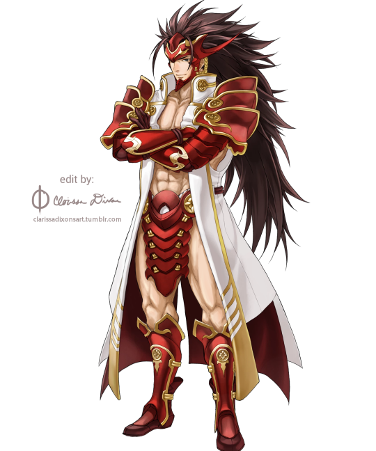
The empowered version really is so much better design-wise. I mean, the original had white-on-white! Who thought that was a good idea? But in the edit, his skin becomes a contrasting color, and my eyes don’t unfocus looking at him. Not to mention, getting rid of all those pesky armor bits on his torso gives us several clear points of red breaking up the large white shape that is his coat, rather than sticking so much red together around his chest. It’s just better on the eyes in every way~
I wish Fire Emblem was self-aware enough to serve the same sort of costume design for male and female heroes without the need of fanmade fixes… >_>
~Ozzie
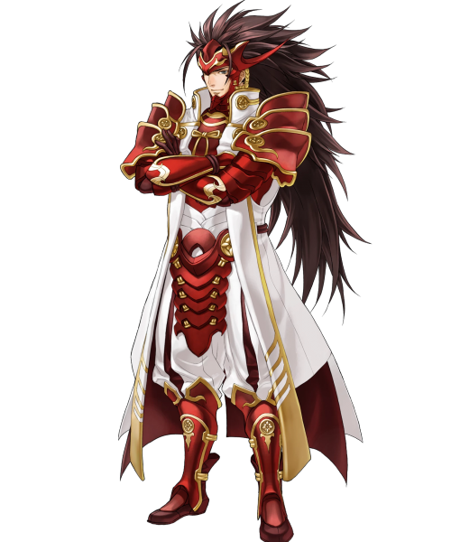
The empowered version really is so much better design-wise. I mean, the original had white-on-white! Who thought that was a good idea? But in the edit, his skin becomes a contrasting color, and my eyes don’t unfocus looking at him. Not to mention, getting rid of all those pesky armor bits on his torso gives us several clear points of red breaking up the large white shape that is his coat, rather than sticking so much red together around his chest. It’s just better on the eyes in every way~
-Icy
Posted on
Posted on
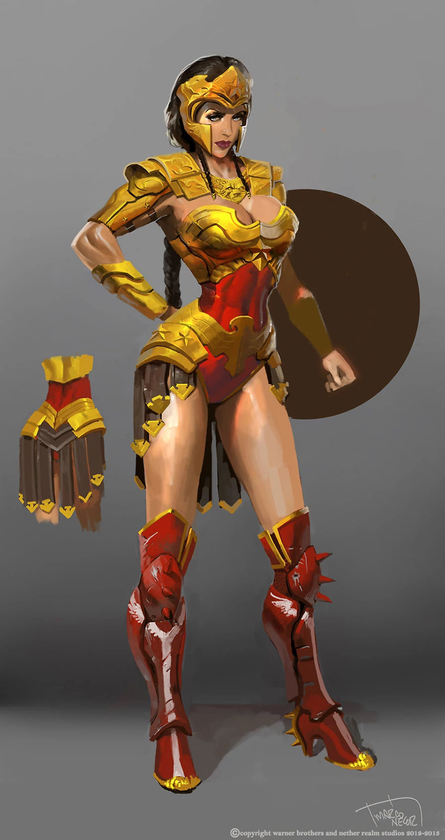
Wonder Woman and the Regime of Missed Opportunities
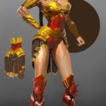
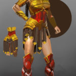
I took Regime Wonder Woman from Injustice as my second stream fix project, because this concept art reeked of wasted potential. And because as a big fan of the Cliff Chiangdesign I’d love to also prove that Diana can be done well while showing quite a lot of skin and doing a homage to Greco-Roman armor that fits her origin.
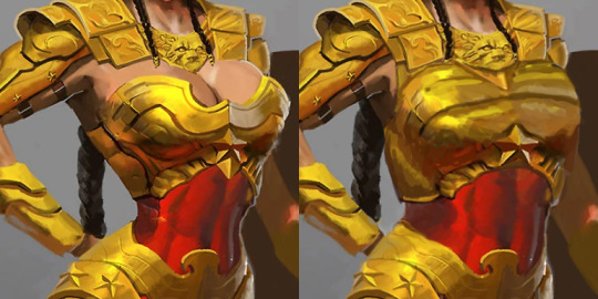
There were elements to this costume which deserved to stay – the helmet, pauldrons and belt joined with tassets. Boobplate with giant cleavage, high heels and unarmored crotch had to go. But first I gave Wondy a torso that can fit an adult woman’s internal organs. Funny how making her waist the right size all of sudden made her toned abs so much more apparent, even though they’ve always been there.
I remodeled her chestpiece into a half-breastplate that actually contains the boobs while retaining some of their shape. Did my best to not emulate the look of cleavage or draw the eye to where it would have been.
Got rid of the absurd high heels and edgelordy spikes from her shoes. Then duplicated some straps from the tassets to the front, as there was never a reason to put her crotch on display.
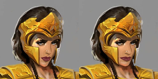
Final touches was giving Diana a tiny bit more distinct facial features: wider jaw and lips, aquiline nose. Minimal change, but hopefully for the better.
If there’s something I’d change if I had more time to work on that, it would be probably making her boots look less modern (and adding more gold accents to them) and drawing her right palm on top of her hip, which the original artists clearly was too lazy to do.
This was the first, but we keep coming back to redesigning Injustice regularly during our streams, because of how shamelessly “edgy” its sexualized female characters are. And because its in-game color palettes are the ugliest ever! This piece is based on an official concept artwork, so the colors are quite brilliant, but once rendered into the actual game, everything gets murky and desaturated to the point of blending with dark backgrounds.
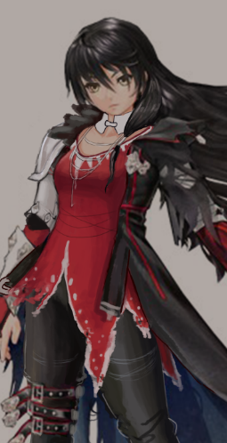
that I picked to redesign for the same week: Velvet! I started out by giving her actual pants. Then I moved the leg armor she has from her right leg to the left, in order to balance out the armor on her right arm, to which I added more parts. I decided to keep the leg belts because she seemed like an edgy character from the backstory I read up on the game wiki.
I spent a lot of time trying to figure out what to do about her red shirt. There were probably like 6 different iterations, and I didn’t really like any of them. The final design before this final one was actually:
Because despite the awful execution, I could see what the artist was trying to do: frame her body with large shapes (the coat, the monster arm, and the hair), and fill the inner body with small shapes. I did like the torn edges to her shirt, but didn’t know what to do with the collar.
Then after the last stream I spent working on her, we got an ask from @solaela explaining that her outfit was put together from prisoner belongings when she escapes from jail early in the game. That gave me the idea that, what if she found an old breastplate that was confiscated, or on a guard that had to be knocked out, or whatever? It wouldn’t fit her perfectly, and it might be old and dirty, but even if Velvet doesn’t care about modesty, she should probably care about staying alive. So I gave her a breastplate and broke it up into smaller shapes.
While the Thermian Argument is a poor excuse for bad design, I do think knowing about the character helps to makes for better designs.
-Icy
Posted on
Posted on
Magilou and the case of book-skirt
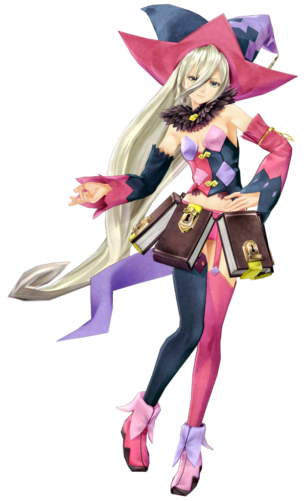
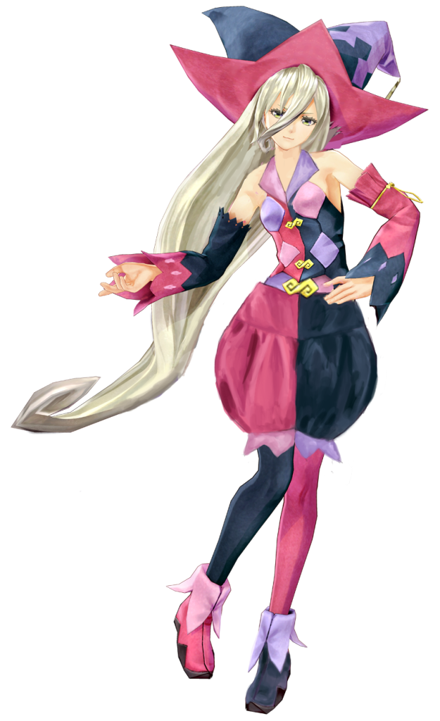
The first stream redesign I did was for the infamous “leatherbound books make a perfect skirt!” costume of Magilou from Tales of Berseria, which we bingoed before. I suppose the creators thought that being a magic user excuses her sense of fashion, but I wouldn’t know how to begin explaining their exact thought process.
Agreeing with Icy that poofy pants are great (and would compliment the shape of Magilou’s hat), I decided to put them in place of the mind-boggling book-skirt. Without books, her furry collar became the only splash of brown in her design, so I got rid of it, replacing it with a collar that would make her top wearable.
While working on that I noticed that the alternating blue-pink rythm of her color scheme was inconsistent in some small details, so I recolored her left shoe and painted light pink diamonds on her right sleeve. Also added a fringe to the pants and an undershirt that, along with new collar, fit the scheme of details being lighter shades of pink and blue, while primary shapes are colored darker.
Her hat was pretty awesome and its color asymmetry not really distracting, so I left it as it was.