The hilarious front line in the tragic war against ridiculous female armor
Tag: video games
Posted on
King’s Raid is a mobile game with good graphics and artwork, typically addicting gameplay through psychologically rewarding progression mechanics, and a fun, cooperative Raid gameplay mode.
In other words, a Skinner box game with Sexy Girls, got it. Could have just said that, it’s much shorter.
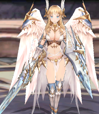
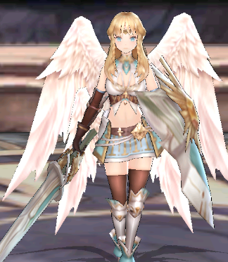
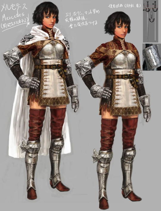
I got an ad for this game the other day, so I decided to check out the wiki for some Bingo material, and now I’m feeling really bad for the poor Bingo card. This one is literally the first character listed under their first category in the Heroes tab: Aselica the Knight (she’s a Tank, can’t you tell??). Here’s a better look at her “armor:”
Good Graphics and Artwork™, as advertised.
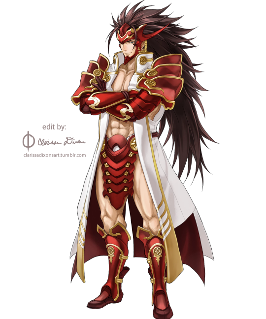
And of course, this is what her lesser version looks like:
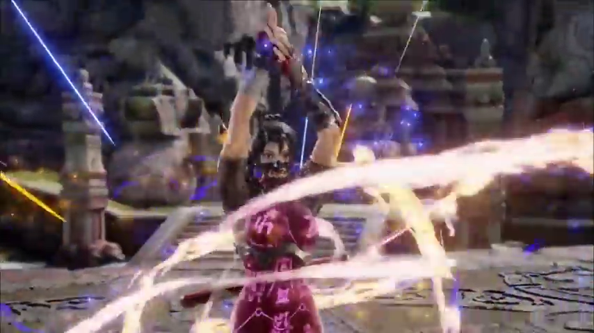
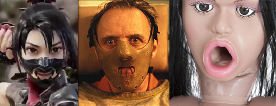
Coincidentally, less than a month after where we get a God of War game where Kratos acts like a character with feelings instead of a screaming murder machine… a trailer goes live (and then is taken down) for Taki and… they’ve managed to actually make it worse.
Of all the options to expand her outfit… they chose to add some sort of weird fetish mask that looks like someone designed a classic Hannibal hockey mask but for a sex doll.
(Hey you, the one typing up the explanation for the mask: no, it looks exactly nothing like a traditional samurai mask)
Posted on
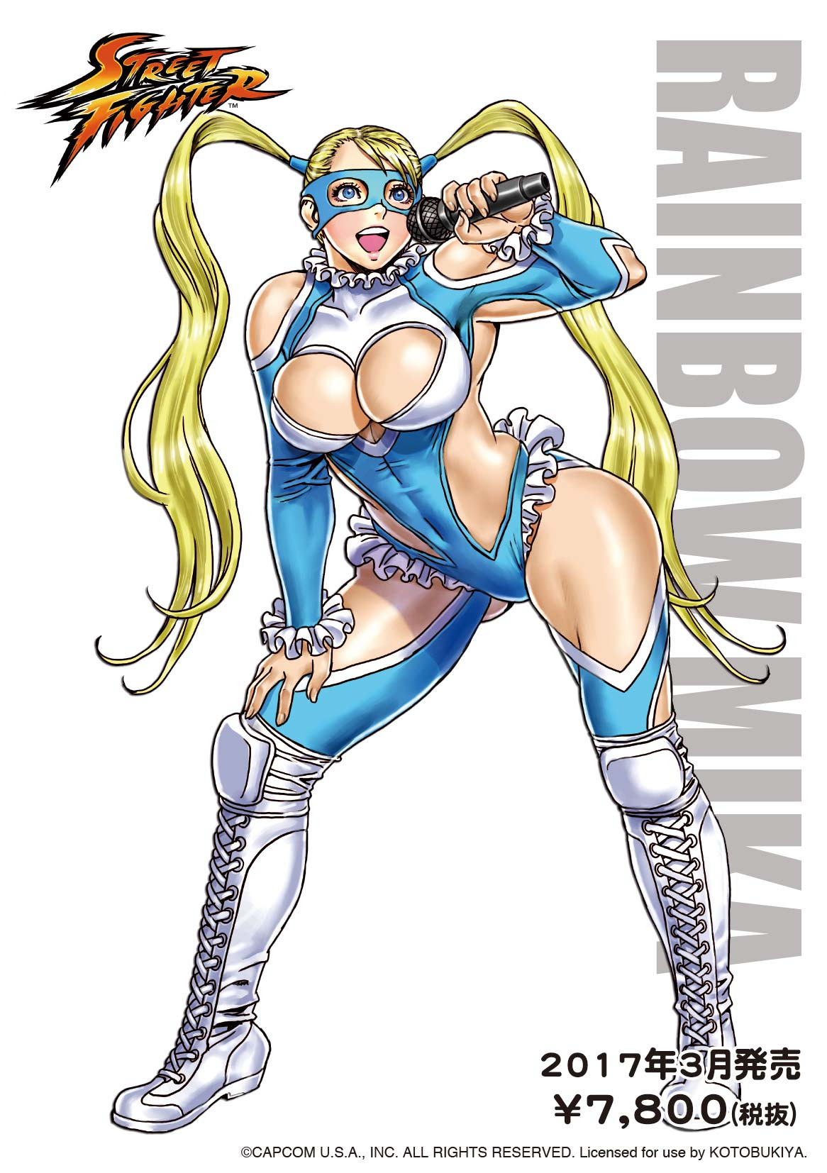
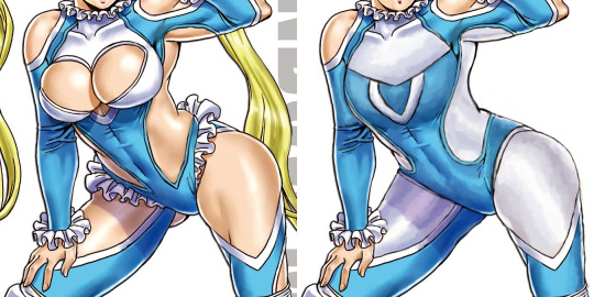
Rainbow Mika and the draftiest of wrestler outfits!
Another redesign I did solo was Street Fighter’s Rainbow Mika, a “wrestling” costume made approximately 80% out of holes.
Biggest challenge was figuring out how the hell those breasts are supposed to look when actually contained by fabric – nothing about how they interacted with it in the original made any sort of sense, so the chest area got basically repainted from scratch, with an attempt to recreate white pattern concealed under the balloon boobs as a sort of chest emblem shape.
While there’s nothing wrong with the costume having some tasteful cutouts, the original’s were so awkwardly placed, massive and physics-defying that I decided it was easier to change them to white fabric, while leaving in some smaller holes oh her shoulders and elbows. I’d probably leave something on her legs, if the image shown Mika from another angle.
A small, but significant touch was making the shapes on her sides rounder, so they’re not pointing at her crotch anymore. Also got rid of the pantyline frills, which made her look as if fancy lingerie was peaking from beneath her leotard. Left the frills on her collar and wrists be. Also didn’t do anything to the boots, as they’re perfectly nice and likely the only legitimate wrestling element in her original attire.
Final touches was giving Rainbow more secure hairstyle for a fighter (while stylized Sailor Moon-like hair isn’t much of an issue to me, it just didn’t match the more practical costume anymore) and a knocked-out tooth, to communicate the inherent danger of being a wrestler/fighting game heroine. Also, sometime after finishing the stream, I made her facial features slightly bit less generically pretty, following many watchers’ advice.
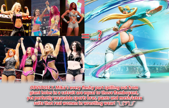
Surprisingly enough, criticizing R. Mika is one of the most “controversial” things we ever did on this blog. To this day, our bingo of her outfit from Street Fighter V tends to periodically resurface among the Status Quo Warriors enraged at us for talking smack about that costume. Their “arguments”?
1. This is totally very legitimate female professional wrestler outfit! OF COURSE that’s exactly how women in that field of sport and entertainment dress, just look:
True, those wrestlers, due to double standards imposed by the industry, tend to show off their cleavages and bellies… which sooo definitely is the same as a video game character’s suit denying all laws of physics and geometry for the sake of showing maximum flesh surface! </sarcasm>
According to them, occasional low-cut v-neck or belly window = giant hole where the back, each breast, thigh and buttcheek is.
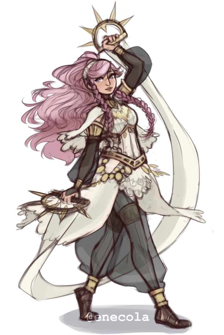
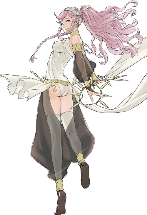
Her legs must hurt… Olivia is pretty fun but I never understood why they made her use a sword when she had these cool rings. Like… that’s not less believable that chrom using his dumbass swords that he keeps sticking into the ground all the fucking time.
I think that fixing a plate armor design is fairly straight-forward in what needs to fixed: put a functional breastplate on the tiddy, add protection to some vital areas that got missed, and add some fabric in-between to pad the armor. I find it harder to fix armor for characters who don’t really wear it. This redesign did that wonderfully. It’s just so darn beautiful!
In Fire Emblem Awakening, Olivia starts out as a Dancer class, and boy do her dancing animations with that original getup look like absolute crap. But I would loooove to see the redesign in motion! There’s so much more potential for interesting movements with all that flowing fabric. I also never noticed Olivia even had a jingly belt until I saw the redesign, and then looked back at the original. That’s how you know you have a Quality Character Design™.
I love the subtle touch of the seam lines going down her legs, which lets us know that even underneath the transparent fabric, she is wearing opaque tights. It really is the little things.
I definitely look forward to featuring more of this artist’s redesigns on the blog. <Sequel Hook>
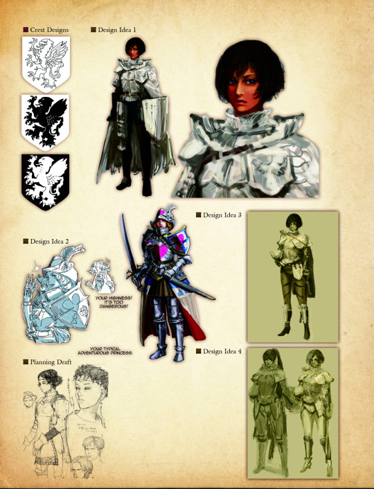
Excuse me, but literally the first concept for this character is fully armored, in reasonable plate, with no Tiddies and with actual pants??
E X C U S E M E ? ? ?
-Icy
Just in case the “no pants” part wasn’t clear enough from the image used by the OP, here’s some concept art for the final design, pants definitely not included:
I think it’s reasonable to say that Dragon’s Dogma, both with outright bad stuff and clearly missed opportunities, like this one, belongs firmly on our Wall of Shame.
I wish Fire Emblem was self-aware enough to serve the same sort of costume design for male and female heroes without the need of fanmade fixes… >_>
~Ozzie
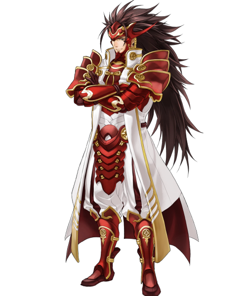
The empowered version really is so much better design-wise. I mean, the original had white-on-white! Who thought that was a good idea? But in the edit, his skin becomes a contrasting color, and my eyes don’t unfocus looking at him. Not to mention, getting rid of all those pesky armor bits on his torso gives us several clear points of red breaking up the large white shape that is his coat, rather than sticking so much red together around his chest. It’s just better on the eyes in every way~
I wish Fire Emblem was self-aware enough to serve the same sort of costume design for male and female heroes without the need of fanmade fixes… >_>
~Ozzie
The empowered version really is so much better design-wise. I mean, the original had white-on-white! Who thought that was a good idea? But in the edit, his skin becomes a contrasting color, and my eyes don’t unfocus looking at him. Not to mention, getting rid of all those pesky armor bits on his torso gives us several clear points of red breaking up the large white shape that is his coat, rather than sticking so much red together around his chest. It’s just better on the eyes in every way~
-Icy
Posted on
Posted on
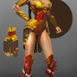
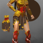
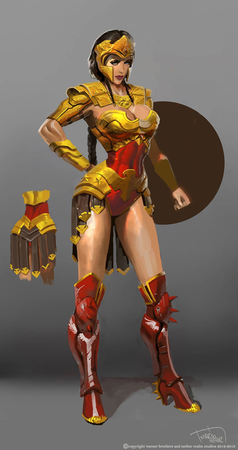
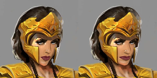
Wonder Woman and the Regime of Missed Opportunities
I took Regime Wonder Woman from Injustice as my second stream fix project, because this concept art reeked of wasted potential. And because as a big fan of the Cliff Chiangdesign I’d love to also prove that Diana can be done well while showing quite a lot of skin and doing a homage to Greco-Roman armor that fits her origin.
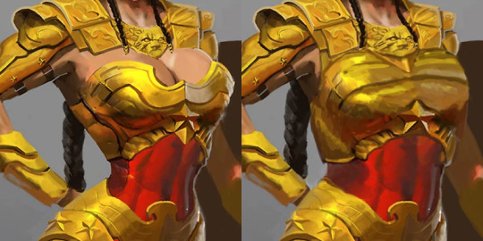
There were elements to this costume which deserved to stay – the helmet, pauldrons and belt joined with tassets. Boobplate with giant cleavage, high heels and unarmored crotch had to go. But first I gave Wondy a torso that can fit an adult woman’s internal organs. Funny how making her waist the right size all of sudden made her toned abs so much more apparent, even though they’ve always been there.
I remodeled her chestpiece into a half-breastplate that actually contains the boobs while retaining some of their shape. Did my best to not emulate the look of cleavage or draw the eye to where it would have been.
Got rid of the absurd high heels and edgelordy spikes from her shoes. Then duplicated some straps from the tassets to the front, as there was never a reason to put her crotch on display.
Final touches was giving Diana a tiny bit more distinct facial features: wider jaw and lips, aquiline nose. Minimal change, but hopefully for the better.
If there’s something I’d change if I had more time to work on that, it would be probably making her boots look less modern (and adding more gold accents to them) and drawing her right palm on top of her hip, which the original artists clearly was too lazy to do.
This was the first, but we keep coming back to redesigning Injustice regularly during our streams, because of how shamelessly “edgy” its sexualized female characters are. And because its in-game color palettes are the ugliest ever! This piece is based on an official concept artwork, so the colors are quite brilliant, but once rendered into the actual game, everything gets murky and desaturated to the point of blending with dark backgrounds.