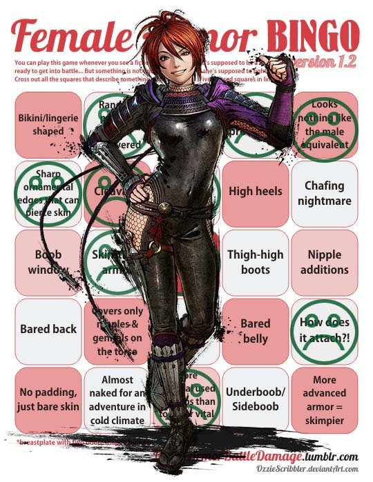
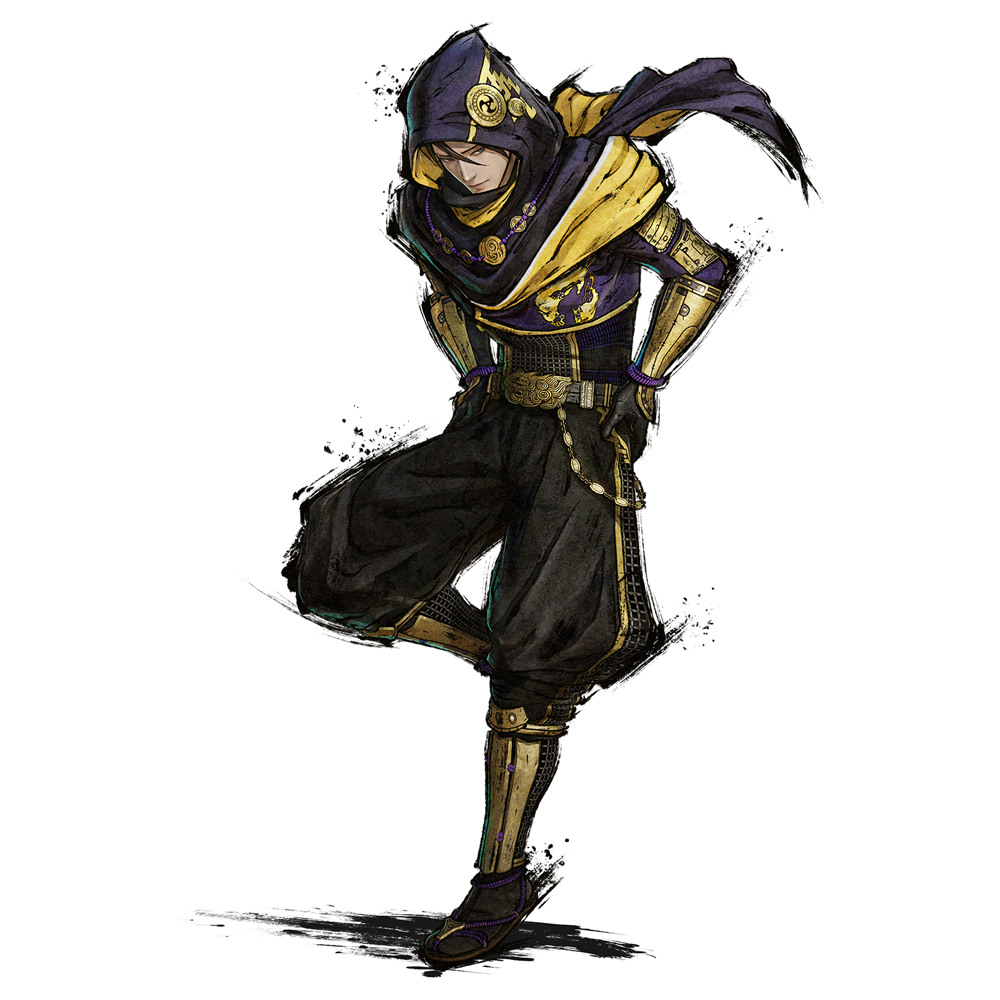
Mitsuki

from Samurai Warriors 5 (her mentor, Kazuuji Nakamura, in the bottom right)

After a seven year pause in games, Samurai Warriors 5 is out and it features a new kunoichi (female ninja)

character – Mitsuki.  You can tell she’s a kunoichi  because she’s dressed like she’s from a ninja gaiden game.  For those not aware, Ninja Gaiden is set in 1980s USA and Samurai Warriors is set in Sengoku Period (1467 – 1615) Japan.

Sadly this is an improvement for the series.

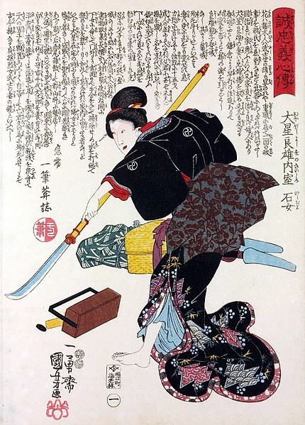
Now the thing with the Sengoku Period is that it is an area of history where we have some good evidence of female professional warriors (onna-musha) being around (though their role has historically been downplayed and so the specifics are unclear) and we have some artwork depicting what they might have looked like…  unsurprisingly the armour they wore was the same as the men’s.  

When not in armour, they are understood to have worn clothes typical of feudal Japan… basically the opposite of this outfit.
image

So… how can this be an improvement?  Well from Samurai Warriors 1 – 4 the equivalent character was a kunoichi who’s name is… Kunoichi and is… *checks notes* apparently fifteen years old…
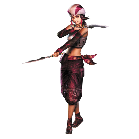
image

And, again… I want to stress… there are real women from his era with artistic depictions of them available, so for a game where most of the cast are historical figures… this is um… well I don’t need to tell you.

I didn’t say it was a big improvement… or one worth congratulating them on, but it is at least a very minor improvement… very, very minor.

image

Very, very, very minor.

– wincenworks
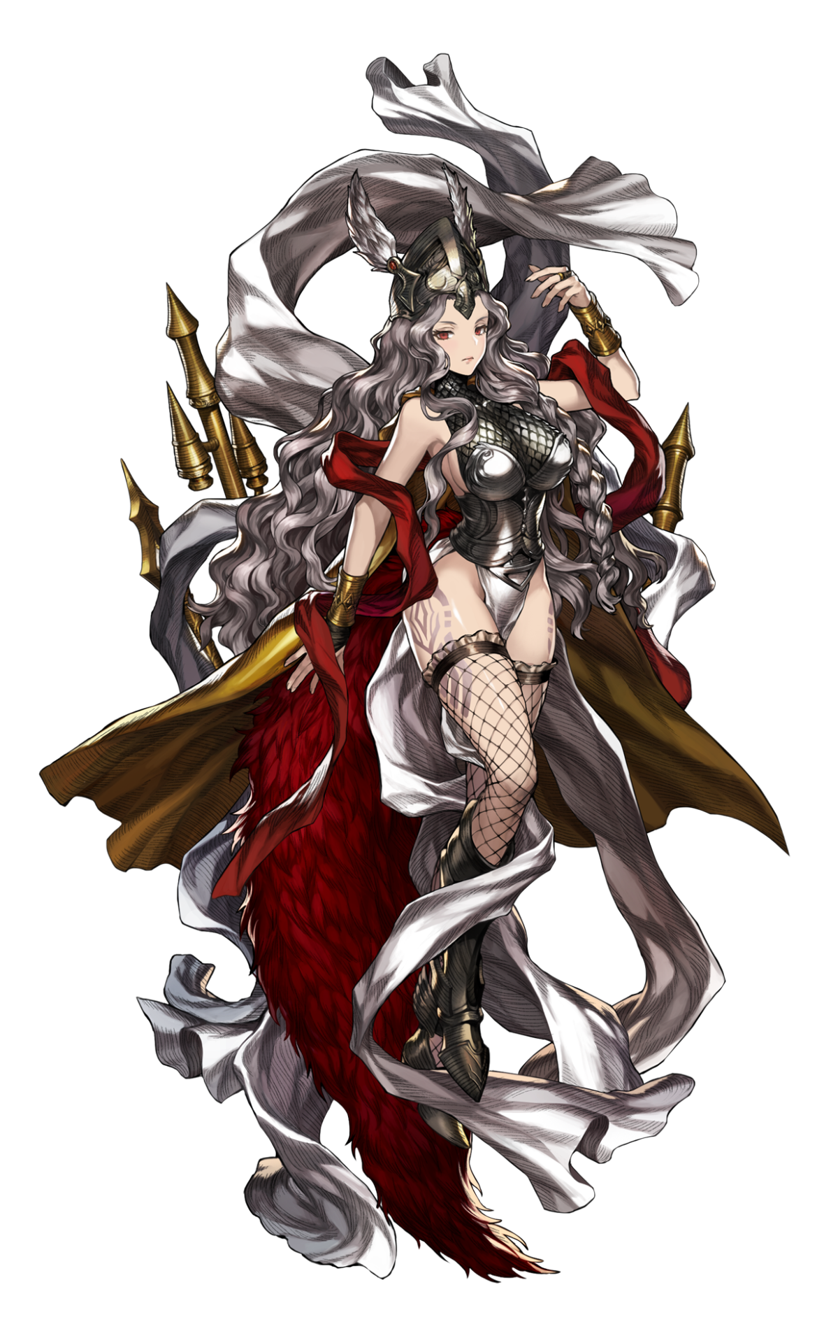
Powdered Shit Brown Dust Brave Nine, Part 1: Frellea 

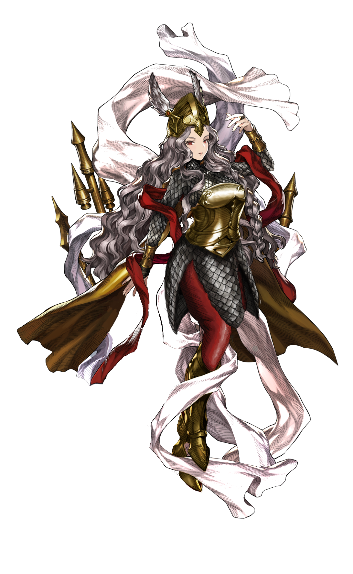
Speaking of Brown D… I mean Brave Nine, whatever the changes to the game’s name, story and character roster, it still remains a confusing mess, seemingly made only for the sake of its exploitative waifu art. So of course I proposed to Icy that we stream redesigns from it! We’re definitely alright after staring at them for hours ? 

This character is Frellea, older sister to the backstory comic’s protagonist demigoddess Eda and, I guess, from how well-endowed she is, a very powerful deity. I think, judging by character names (is Frellea a corrupted take on Freya?), they’re Norse mythology-inspired, like Odin’s Sphere’s butt-wing Valkyrie
And of course, literally nothing else about the designs communicates that. 

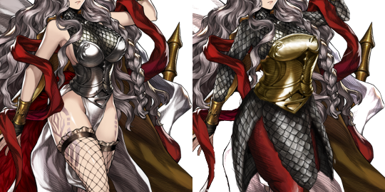
It was SO HARD to decide what should take priority in fixing this mess, but the mix of boobplate and scalemail boobsocks went first. I reshaped her breastplate into something plausible and decided to extend the scalemail into a long-sleeved tunic (though that one’s tight fit is mostly my artistic license). 

image

Next step was to tidy up the messy design composition, including the color scheme. Both me and Icy concluded those huge feathery… trains? tails? were purely decorative, so we got rid of them. 
I decided to balance out the contrast by making that ribbon white (instead of the shade shade of grey as her hair), reusing redness of the other ribbon (and the feathers) on new pants and, most of all, recoloring her non-mail armor to brass color of her bracers.* 

Easily one of my favorite redesigns, but also one of the most work-intensive ones, too. Hope you enjoy it!

~Ozzie 

PS: *In the comic the helmet and greaves are slightly different metal shade from the rest of armor, so it seems like different artists couldn’t agree on the color. Pic below, for the interested. 

image

image

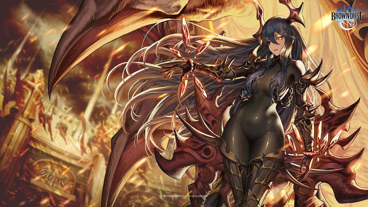
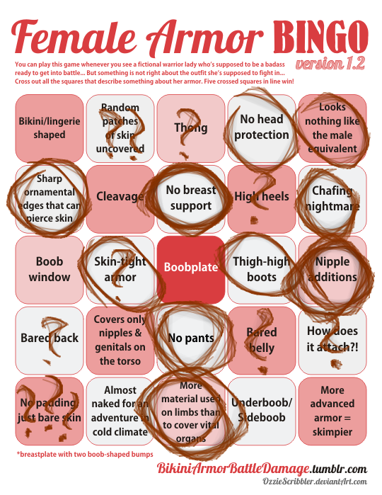
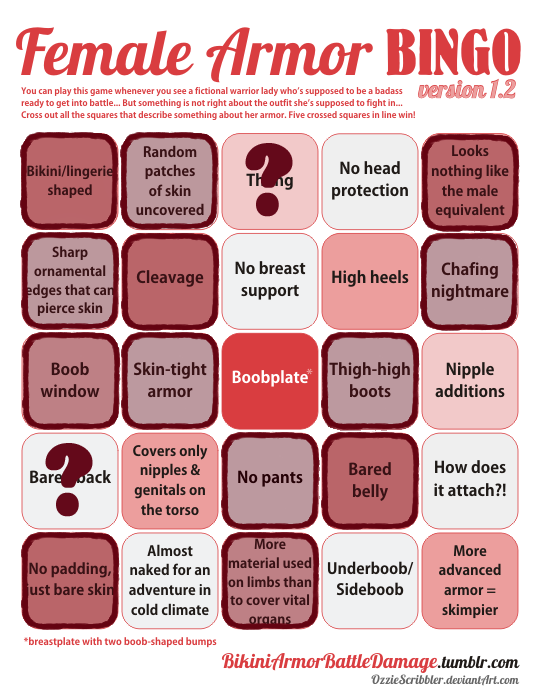
Continuing with Powdered Shit Brown Dust, this thing I referenced last time just broke me and the bingo.  

That is literally just a naked lady with her skin tone recolored from the neck down to pretend it’s a skin-tight outfit, with just a couple super pointy “armor” bits thrown on top as an afterthought. Calling this “bodypaint” would be kinda insulting. 

While they didn’t detail in her navel or give her a cameltoe, which is so often the case with gratuitously tight “latex” outfit art, the composition DOES put a lot of emphasis on her crotch. I feel like this artwork has an uncensored nude version somewhere, that some creepy developers pass around each other. 

So many question marks on the card, cause I don’t even know whether to count the ‘latex’ parts as a pretense to padding or bare skin. It definitely reads more like the latter.
Now, if you look carefully, she got a “Nipple additions” square marked because I’m counting those collar chains resting on her boobsocks. Yeah, this hair isn’t just conveniently hiding the spots where nipples would be, they obscure the kinky chains as well. Not trying to kinkshame, but what the hell even is this game’s target audience?
As we established before, just looking suspiciously erotic doesn’t yet warrant that IP is aimed at/allowed only for mature audiences. And a quick check in the app store tells me it’s indeed rated PEGI 12

image

Is it the creepiest PEGI 12 thing we had on the blog or do X-Blades’ ass cover and BlazBlue Centralfiction cameltoe crotch figure beat it? 

 ~Ozzie

Shard Mortal Trespasser 

@the-midnight-doe submitted (and Ozzie bingo’d):

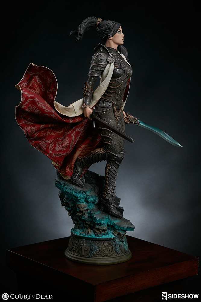
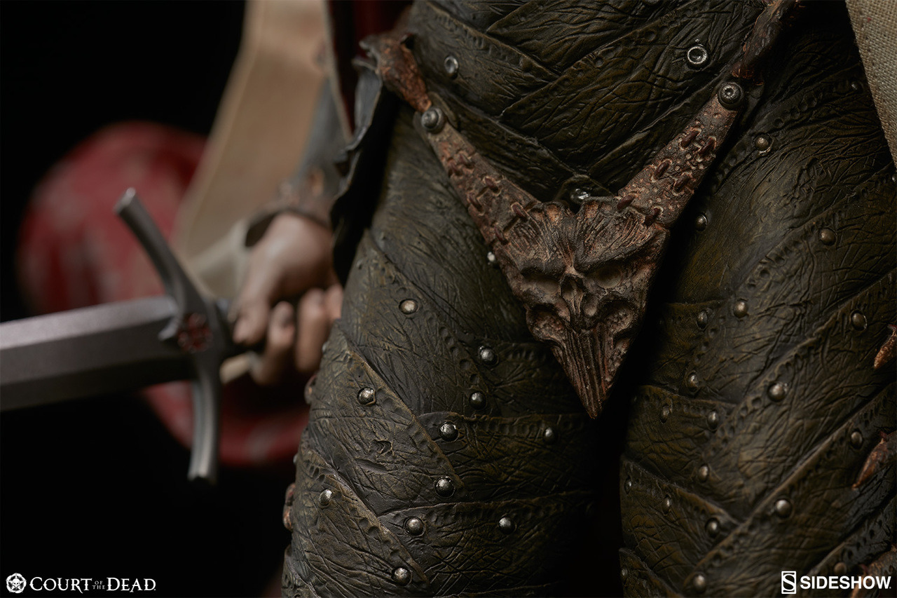
Here’s a good example of how “fully armored” doesn’t mean a thing if said armor is still sexualized: this is Shard, Sideshow Collectible’s original character from their ongoing series “Court of the Dead”. The series already has plenty of questionable designs, but Shard here really stands out due to her backstory: she’s a mortal knight Templar that somehow wound up in the Underworld, whose inhabitants then made her armor for her. Highlights include the absolutely bizarre crotch plate (hard to tell if it’s a thong as the cape blocks the back view,) the insignia on her chest that just winds up looking like a literal “stab here” sign, and interesting footwear. It’s a shame, too, because her backstory sounds really interesting and the Court of the Dead series has some pretty beautiful dolls, but also has a metal bony groping hands bra because reasons.

Oh goodie, Sideshow Toys figures, we meet again! ? And this time you guys don’t even have the excuse of adapting someone else’s sexist design – it’s your own all original creation! 

Obviously the bingo score isn’t very high, and I stretched definition of “male equivalent” to “all male-presenting characters in the series”. However, while not bikini-shaped or skimpy, impossibly skin-tight armor is still a staple of BABD content.
The fact that metal gives no additional girth to any part of her body made me confident in marking off the “No padding, just bare skin.” square, despite no bare skin at display.

And no, the “fine bone filaments of this protective encasement were woven around her form by the osteomancers and artisans of the dead” Thermian argument doesn’t excuse the sexualized design one bit. 

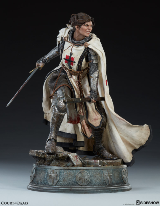
Saddest part is that this is what she looked like in her backstory

image

This is so much more interesting in every way: costume, posing, expression, even painting detail. Textbook positive example. What a downgrade! 

Thank you for the submission, @the-midnight-doe! Hope you don’t mind me bolding part I found most telling about Shard’s problem. 

Considering how other female Court of the Dead characters look, we’re likely to revisit the property, with bingos and/or redesigns, later. 

~Ozzie 

Simplifying the Diablo Ladies, Part 2 

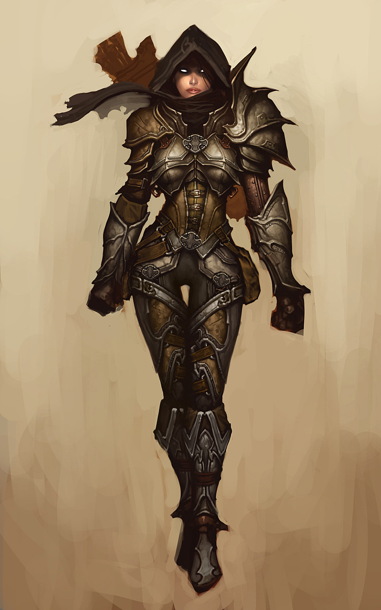
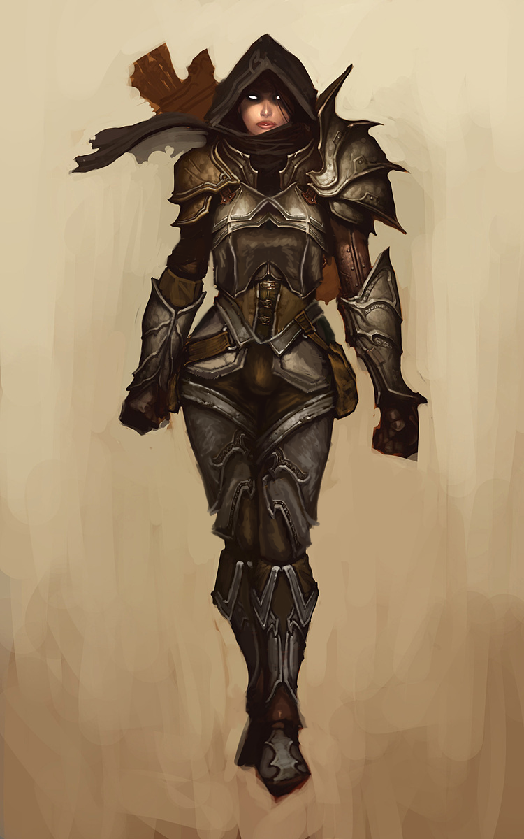
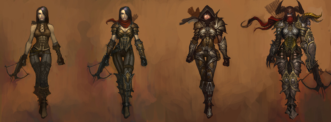
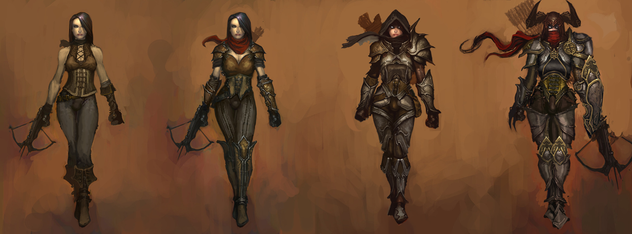
Demon Hunter from Diablo 3 was… a challenge, to say the least. Mainly because I couldn’t decide where to even start with that ridiculousness!
Not only is she super sexualized via the enforced “feminine” silhouette of skin-tight armor, boobplate and giant thigh gap, including a cameltoe… she’s also the most overdesigned thing I ever tried my Photoshop skill on. 

Apparently to work as an artist at Blizzard, you have to willfully forget the most basic rule any design school worth its salt teaches: Less is more
For concept art of what would ultimately be a small character model in-game, all those pieces have SO. MUCH. NEEDLESS. DETAIL! Teeny tiny little shapes of distracting ornamentation, basically nothing to rest your eye upon. 

I feel really sorry for anyone who ever attempted cosplaying this shitshow – so much work added into recreating all those arbitrary seams, textures and spikes, sheesh. 

image

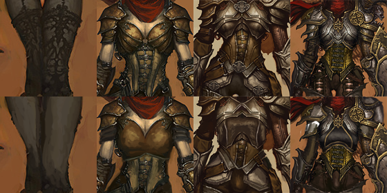
I was so busy simplifying the shape language that I overlooked some stuff I do pretty routinely, like getting rid of the cleavage in the first and second levels, and modifying the hourglass silhouette (I did add some bulk in higher levels, just not much). 

Preparation for posting this redesign is why I threw back this post lately (also, you know, it’s just a good post to resurface) – because those level ups convey neither a better set of armor, nor more protective layers, except for pauldrons. The shape of her boobs and thin waist remain a constant, no matter how much more “armored up” she’s supposed to be.

Like with Ashe before, I decided that my version is a trans lady, with a noticeable crotch bulge

in the place of the creepy thigh gap. Though I discarded my initial gag related to its size, as it was just in poor taste and not my joke to make. 

Overall, this thing took two or three weeks to finish (last level seemed unsalvagable at first), but hopefully I managed to put some actual design thought into this hot mess.

~Ozzie

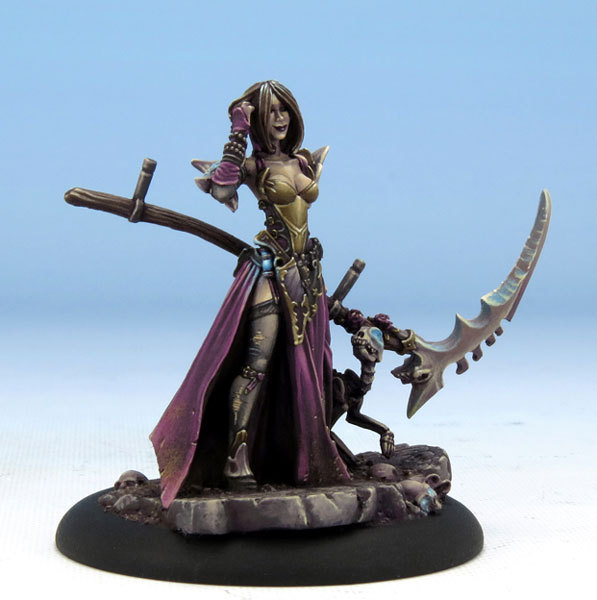
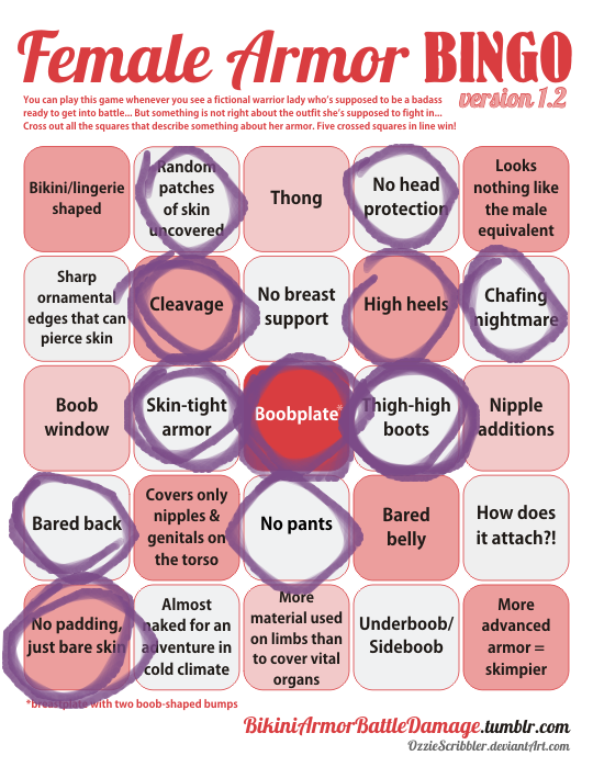
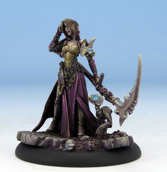
Since one of our latest stream redesigns was of some Dark Sword miniatures (including the return of butt-window lizard lady), we considered a couple more characters to fix, including this here Jen – Harvester of Souls, lady necromancer with serious boobplate problem. 

I like me some goth characters with perky attitude (that smile is adorable!), and Jen was actually based on the woman who did this miniature’s paint job, but wow is that costume some generic fantasy garbage, scoring some typical bingo points without hitting a single row. 

Obviously not the worst we’ve seen, just disappointingly uncreative.

~Ozzie

bikiniarmorbattledamage:

hands-of-blue:

prokopetz:

It’s bad enough when a sci-fi setting has all the ladies wearing painted-on tights so snug that you can see all the way up their respective buttcracks, but then they go and do it with the armour, too.

Like, it’s armour.

It’s a solid chunk of heavy, rigid material.

How does that work?

How do you walk with a pair of inflexible domes tightly cupping your glutes?

Hell, how do you even stand when you’ve got a quarter-inch durasteel plate wedged so far up your ass you’re tasting metal?

Makes no sense.

@bikiniarmorbattledamage

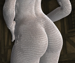
While we’re certain skin-tight metal butt armor happens a lot in media (battle thong is by far more popular), the best, most literal examples of it from our blog were those chafiest short shorts ever:

image

And this full body atrocity (whole thing is arguably NSFW, open link at own risk):

image

We can also infer from some frontal images when a design probably includes a butt vacuum-sealed in metal, just like it has boobplate/metal boobsocks:

image

[x] [x]

That said, butts or no butts, armor so snug it looks like shiny bodypaint/metal spandex is a blight on costume design that should be stopped.

~Ozzie

As we throwback this nightmare fuel this week, I’d just like to casually remind everyone that, at least when it comes to 3D modeling, giving a character individual butt cheeks and individual boobs is way more work than giving them actual Real Person clothes. So there are still people in the gaming industry who look at their budget, look at their specs, and then decide that, yes, spending that money on individually-modeled boobs and butts is a Good Investment.

image

That’s not even metal, and even it looks physically painful.

-Icy

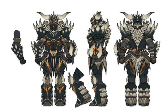
The Monster Hunter series has been a mixed bag when it comes to armor design, and as we’ve shown before, Monster Hunter World has proudly followed in that tradition. We’ve seen that they can do actual armor for both the men and women characters, so what the fresh hell is this? This is high level armor, too. This is what the male version looks like, by the way:

image

I guess I’m impressed that the characters can hand-mold monster carapaces into boob cups?

image

-Icy