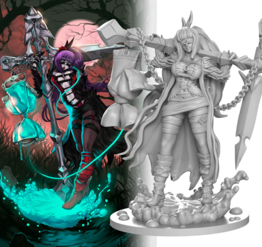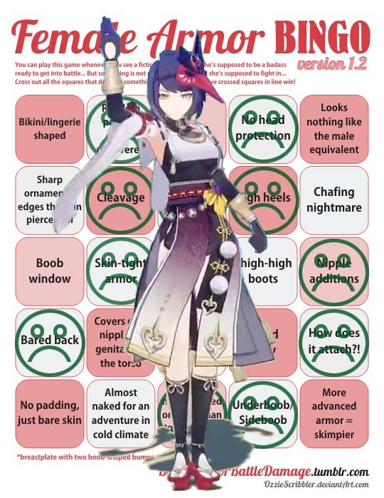
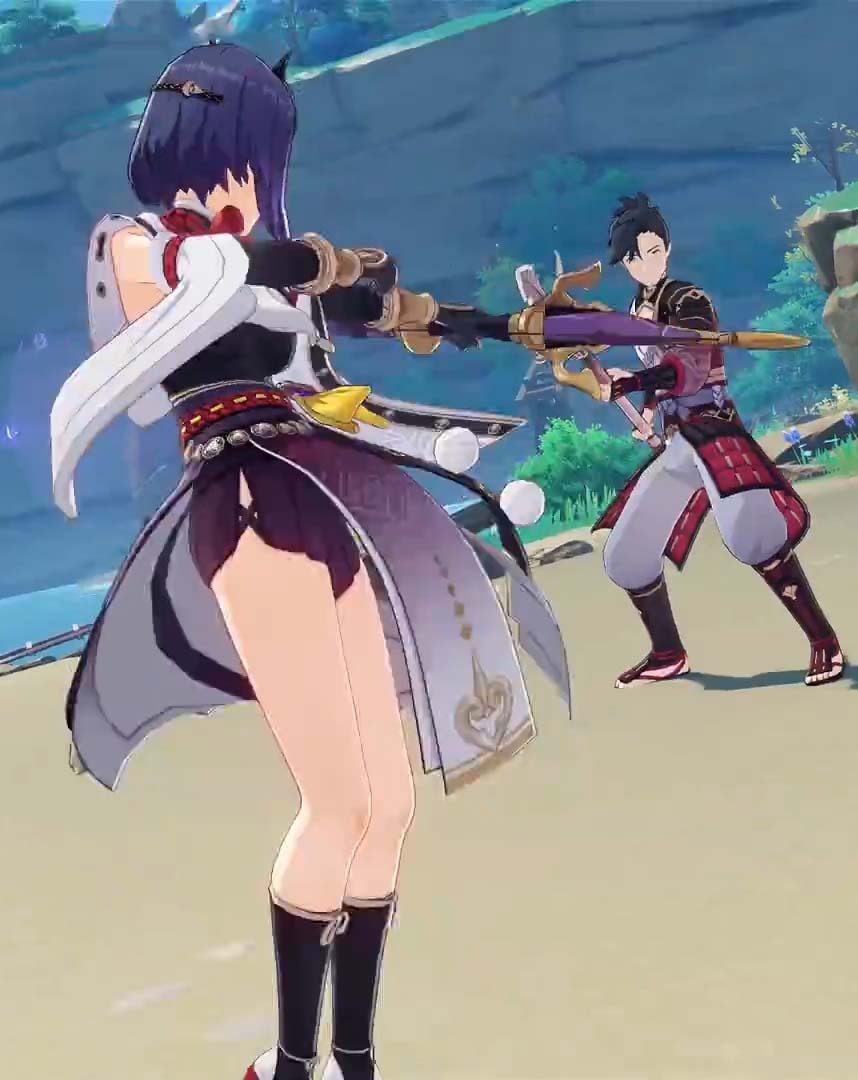
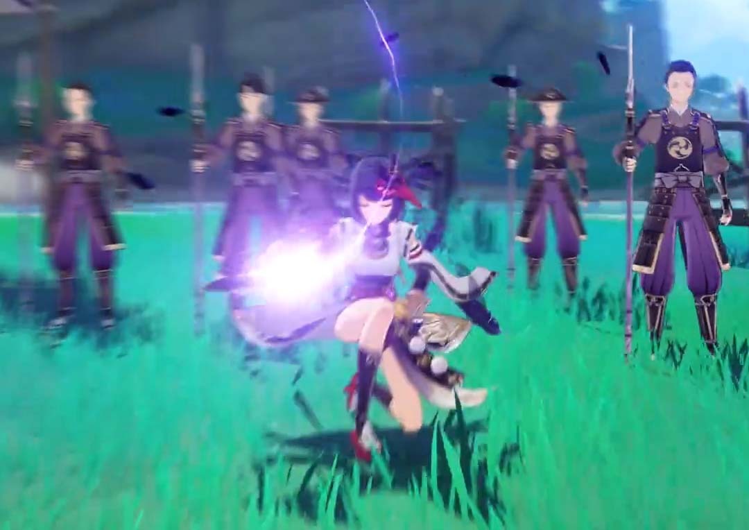
Infamous gacha game Genshin Impact is introducing Kujou Sara, and I have to say… this is probably the most bizarre “sex sells but keep it family” outfit I have seen in a while.(If you’re not familiar with gacha games, they’re basically a micro-payment scam that uses fake randomness).

Not the mask used as a fascinator, not the inexplicable window on her back, not the skirts that seem to only exist only to blow up and show her legs – nor the odd peakaboo slits on the sides of her shorts, nor the or the skin tight top – but rather the weird piece of cloth that sits on top of of the vacuum sealed top to incorporate underboob and nipple tease without actually showing any torso skin.

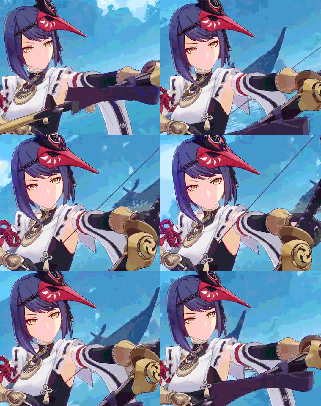
She is also possibly the worst archer in the history of bad archers.
image

Now… obviously expectations are low for this genre of game, but this particular gacha game has had made spread in the market and multiple articles about tis monetization techniques – so this remains an example of how this kind of trash design goes unquestioned in modern media.

– wincenworks
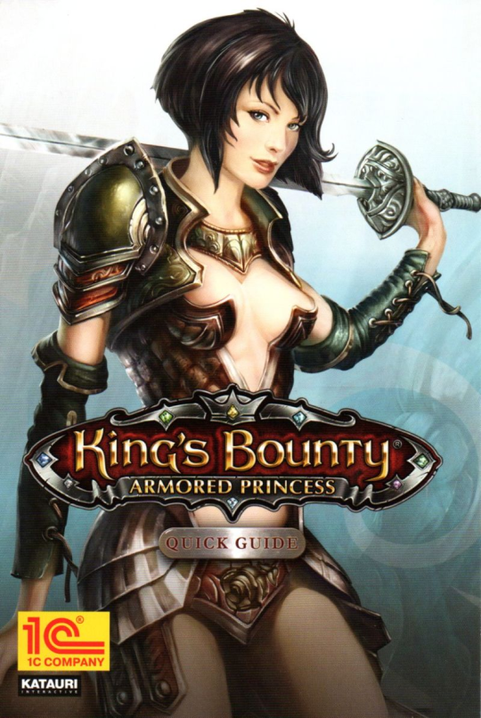
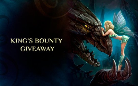
So the (forty year long) King’s Bounty video game series has had it’s up and downs, the biggest down being the cover art for the ironically named Armored Princess.

image

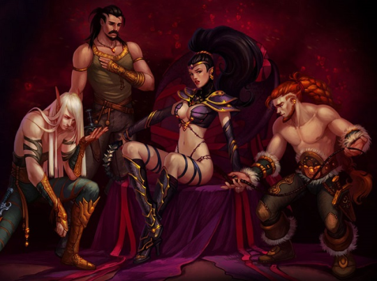
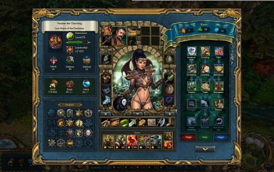
Second place goes to Dark Side:

image
image

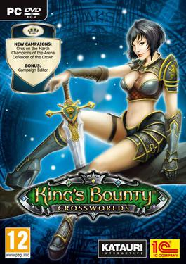
Third place goes to Crossworlds expansion to Armoured Princess where they decided to go with an even worse design like it was going to be the core brand:

image

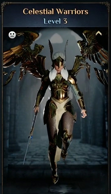
So when I saw they had a new game in the works, I was kind of surprised that it appeared relatively low fantasy with costumes inspired by history and… no beyond peasants and nobles… then I saw the Celestial Warrior, which seems to be the only female unit.

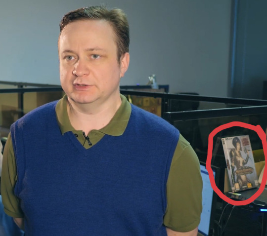
Now, this does of course count as improvement… but that’s hardly worth celebrating since the bar for that was so low and… there’s just something about the developer videos and promotions that makes me… concerned about what content they may not yet be showing off…

image
image

…oh dear.

– wincenworks

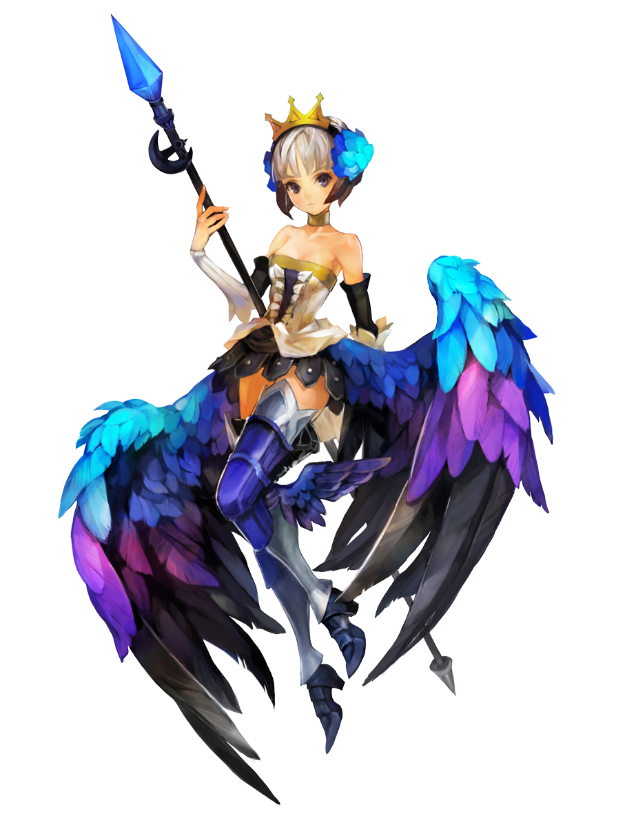
Odin’s Boob Sphere Redraws: Gwendolyn 

I went into redesigning this with no idea who that character is supposed to be, and frankly, looking her up now, can’t say I’ve missed much back then. 

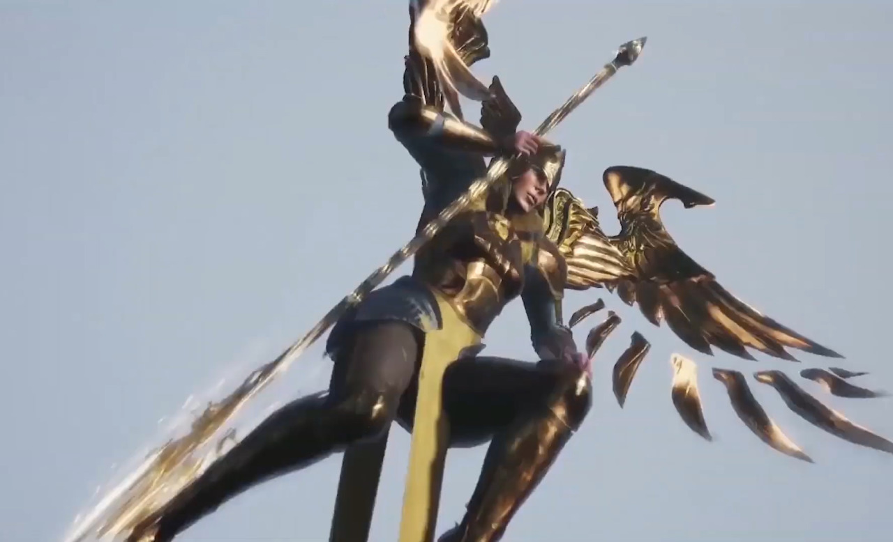
Can you believe she’s supposed to be a Valkyrie? Judging by her (and her sister’s, Griselda’s) design, Gwendolyn looks more like a really weird mashup of Odette/Odile from Swan Lake and lingerie model with random armor bits on legs… plus the ass wings.
Call me weird, but I never got the idea of putting wings on humanoid characters’ butts/hips/lower back instead of shoulders. It’s not like regular laws of physics apply either way, but this seems like a much less uncomfortable way to fly than with the upper back. 

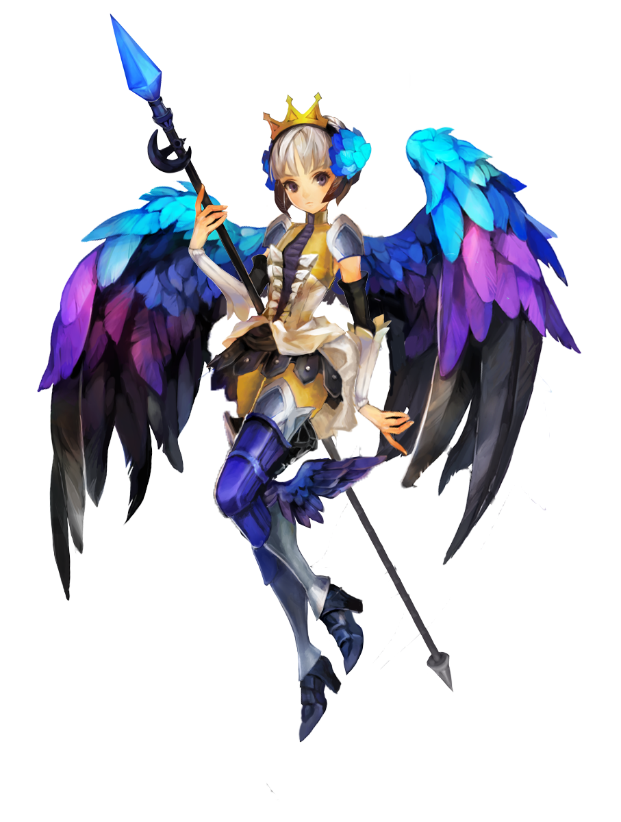
Of course, first thing I did was move the wings to more conventional position, then copypasting her a brand new left arm, it fitted surpirisingly well. 

image

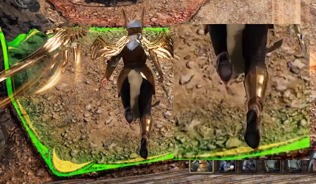
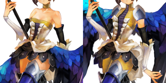
I kept the changes to the outfit to a minimum, giving her tights and expanding her frilly top, so that it doesn’t slip off her chest (both in matching yellow/gold). Also got her some pauldrons (edited from the armor on her thighs) and recreated from scratch a bit of her dress that was hidden behind the ass wing (quite happy with how I painted it). Another minor detail was changing her left shoe’s shape into something that doesn’t require foot liquification

Much less radical redraw than Icy’s excellent Velvet (who’s apparently Gwen’s half-sister), but I hope you guys like it! 

~Ozzie 

denilsonsa submitted and Icy bingo’d:

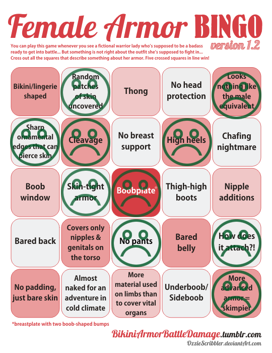
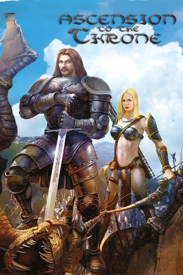
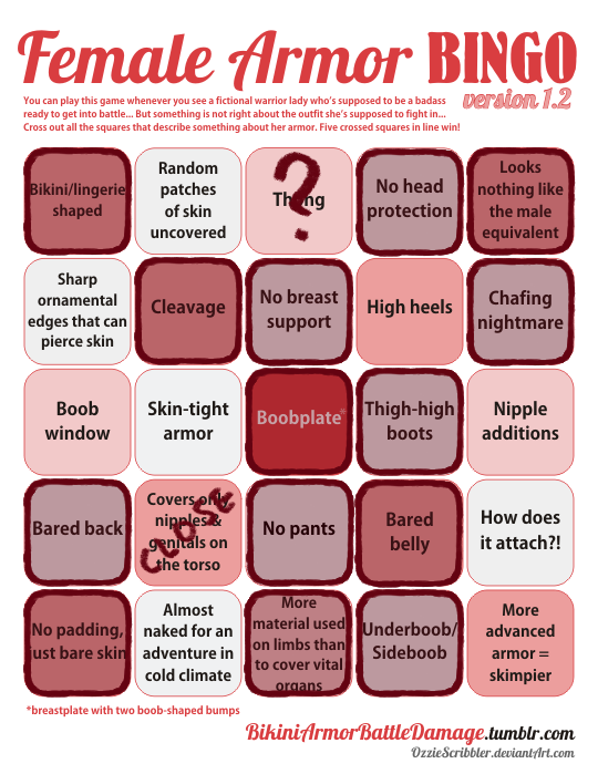
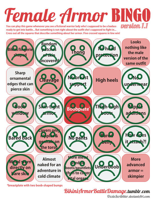
Bingo-worthy, shows how male and female characters are not treated equally. The contrast is very clear at this game cover art, and it summarizes bikiniarmorbattledamage in one picture.

Y-yeah it sure does…. ughh

image

Honestly, what is even the point? You might as well be naked, going into battle looking like that. She doesn’t even look like she belongs in the setting. Also for people not in the know, this is NOT a dating sim where you’re a stud (?) with long flowing hair who’s looking for a sexy girlfriend. This game is about fighting and conquering for your royal family. With troops that wear bikinis, apparently. Fantasy~

At least the dude (the player character) has some nipple accents on his breastplate to even it out?

image

Though personally, I would have just taken away 85% of his armor. When will game devs give the people what they want? ?

-Icy

bikiniarmorbattledamage:

Thank you to icykitty for sharing the trauma of a set of armor that may actually be worse than the infamous outfit of Shahde from Prince of Persia.

– wincenworks
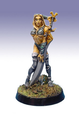
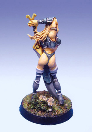
I like to think that the all-around badness of

this figure

kinda makes it an unintentional piece of commentary art. As if the designer/sculptor/company behind it was trying to say “You though you saw the worst of sexy female warriors? Nope, they could look like THIS!”.

And it just gets better when you turn it around and consider the anatomy… not only is her whole shoulder clearly dislocated and torso unnaturally swiveled, the sculpt of her underboobastic top makes it look as if she had an extra breast right under her armpit!

~Ozzie

Ah, sweet memories, of when I was cruising the internet for cursed content only part-time. : )

I was actually feeling optimistic lately about the state of miniatures nowadays. All the board games I play avoided this kind of low-effort designing for their lady characters. Were board game developers finally embracing the endless possibilities that not necessitating “Tiddy Out” provided??

But then I discovered that I actually living in a bubble and that a board game RPG got kickstarted in the year of our lord 2019 with this as a promised character/mini:

image

That’ll teach me to have barely-mid-tier standards! 

image

-Icy

Odin’s Boob Sphere Redraws: Velvet

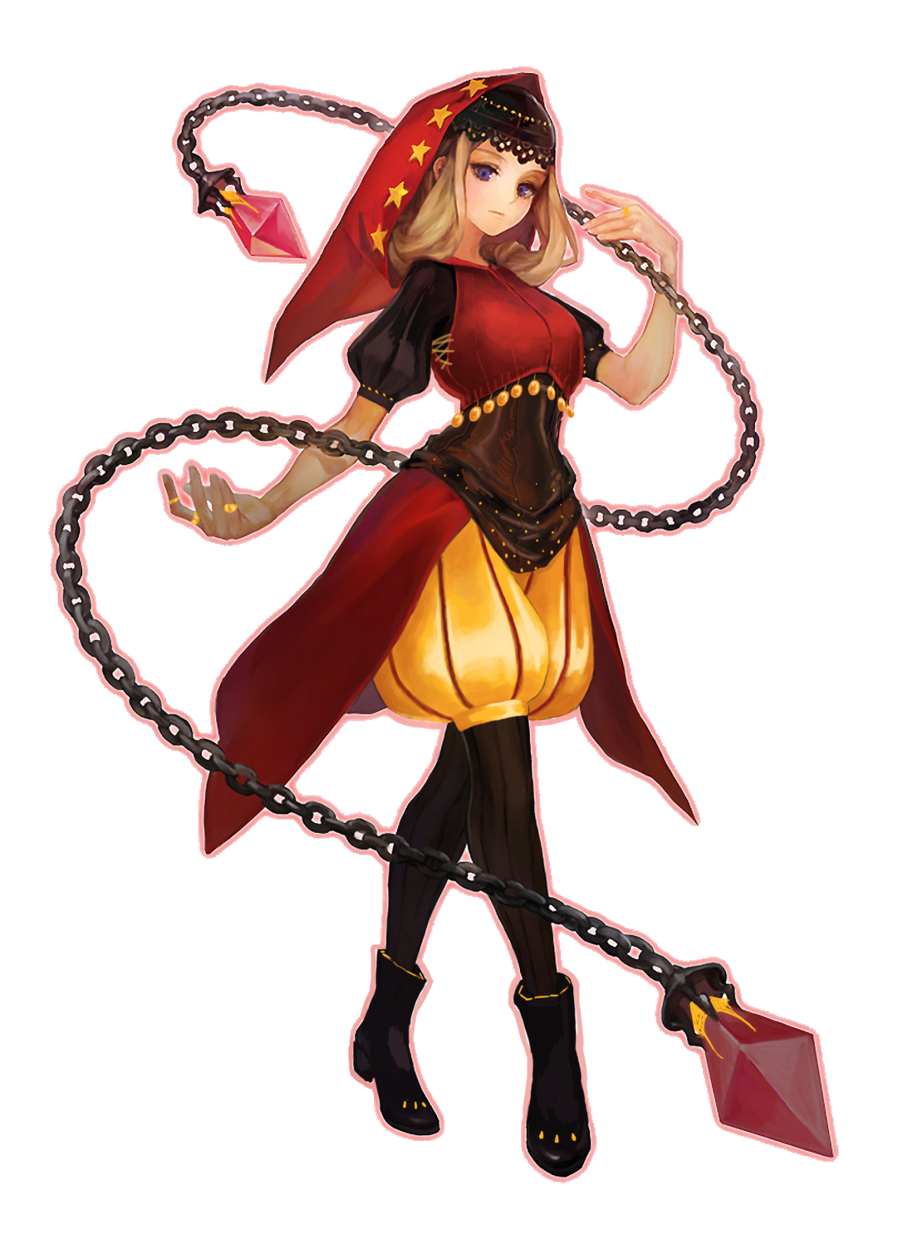
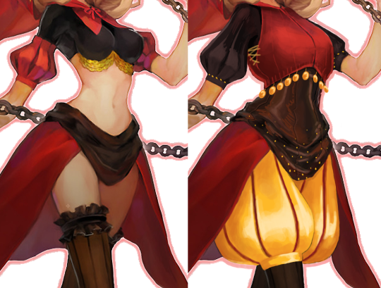
Not sure why it’s now apparently my brand to redesign characters named Velvet, but here we are. Can you tell that this gal is a forest witch? Cause neither can I. She’s also a princess. ¯_(ツ)_/¯ I really want to see the art lead’s notes on this design, just to see what their “reasoning” was for this. “The gold jewels under her breasts are symbolic of her ties to the royal family, but she can’t see them because of her breasts obscuring them, just like she lost sight of her family!!” I don’t know.

For the redesign, I just wanted to give her some breast support (since she does acrobatics and stuff, and you don’t want to be distracted by The Jiggles), as well as some kind of pant so that she doesn’t have to worry about forest insects biting her in the crotch. This is the result of 2 iterations on both the top and the pants, in usual “me” fashion. So let’s break it down.

The red sleeves looked weird to me, so I just combined them into the black shirt. Since the belt? crotch covering? I don’t know, but since that part is also black, I just decided to make all that into the collective Shirt. On top of them is that half vest that has the hood attached. I decided to give her some jingling coins at the last minute, cause the idea of hearing her walking through the forest would be kinda eerie, and she’s apparently an expert acrobat, so they would make noise when she fights. ~It could also be seen as a remnant of her royal life,~ or something.

image

As for the pants, I didn’t really have any ideas, so I just went the default “poofy pants” route, and then picked the only other color in the color scheme that wasn’t red or black. I initially was going to get rid of her butt cape, but decided to keep it cause she just didn’t look quite right without it.

I remember disliking the final result when I finished it initially, but looking at it again now, it actually looks kind of good? Maybe her shirt sleeves are a bit too short, but at least I don’t have to continuously grimace just looking at her now.

-Icy

earth-to-dragons submitted (and Icy bingo’d):

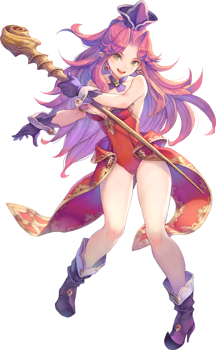
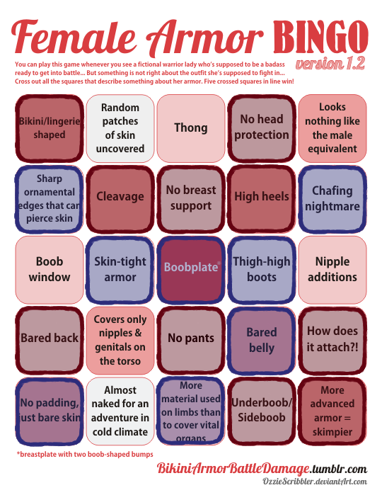
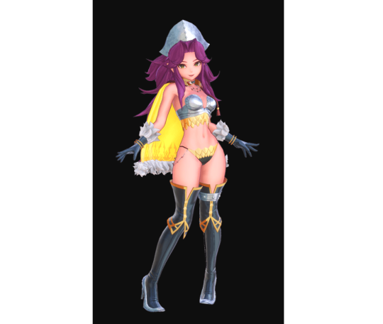
Could you guys cover something about Angela in the new Trials of Mana game? Ive been playing it but its honestly difficult just because every time I look at her outfits it makes less sense! Although I dont think Riesz is any better…

A spell-caster lady in a video game who dresses for the beach? It’s more likely than you think! This is from the recent remake, where you would think the developers would want to modernize their designs. 

You would think.

The red is her original outfit (pictured above the bingo), which is apparently the outfit a magician from a cold country wears (even though it’s in magical spring, but it’s still described as cold). The blue are added in from her worst class option… the magus.

image

Why have nice things when you can cry over the sympathy pains of imagining scale mail on your crotch?

-Icy

The Masculine Beauty of Superhero Figure, Part 2

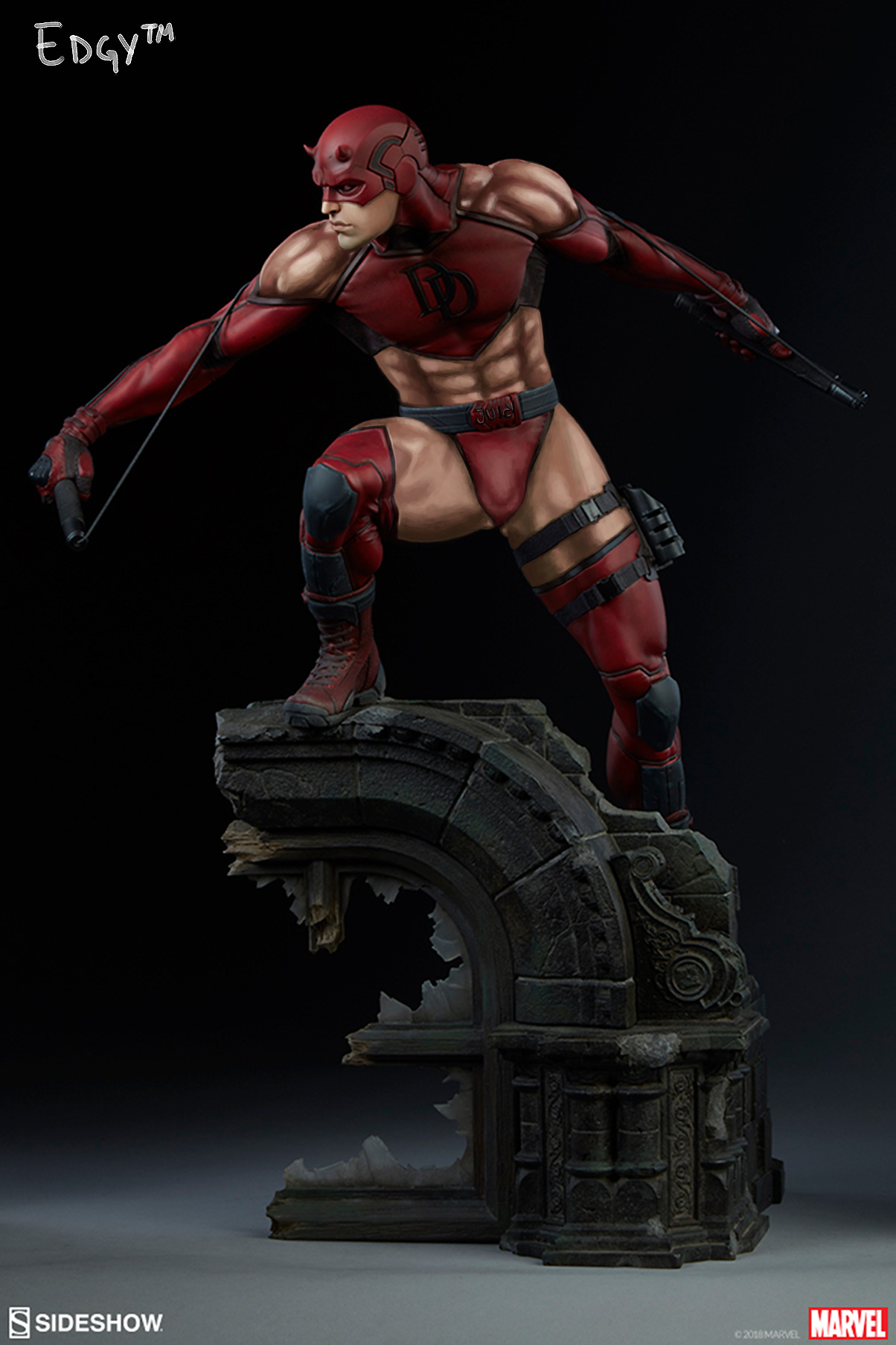
I decided to empower Daredevil, cause his premise lends itself well to wearing a skimpy outfit. After all, he’s an acrobat who cares about mobility and flexibility. He dodged all those shurikens(?) by doing all those backflips (I haven’t seen the movie since it came out, okay?)! Him doing that while fully-clothed was the most unrealistic part of that movie, honestly. Also, the rustling of the cloth against his skin would get in the way of him hearing important things. His design was really careless. :

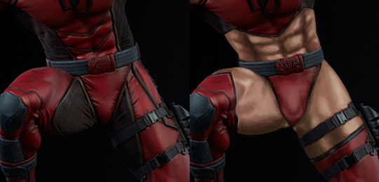
So to improve it, I started by cutting out some key pieces of his existing bodysuit, to increase his mobility and reduce fabric noise. I also made sure that we can tell exactly how big his empowerment is. Rendering those abs was a lot of fun! (And the belt buckle says “Juicy” thanks to a viewer suggestion.)

image

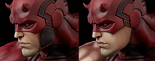
I also adjusted his face a bit. I got rid of his laugh lines and gave him fuller, more shaped lips. He’s supposed to be hot, Elektra kissed him and everything! And since his face is now hotter, I removed some of his mask to show it off. Mmm, that crisp jawline!

image

I was going to give him a feather crown or something, but decided against it.

This one was definitely fun, especially since I never saw the TV show or read the comics, so my memory of DD came only from the unfortunate movie (you’re welcome for being reminded of it). Maybe we’ll empower Bullseye sometime too.

Hope you enjoyed!

-Icy