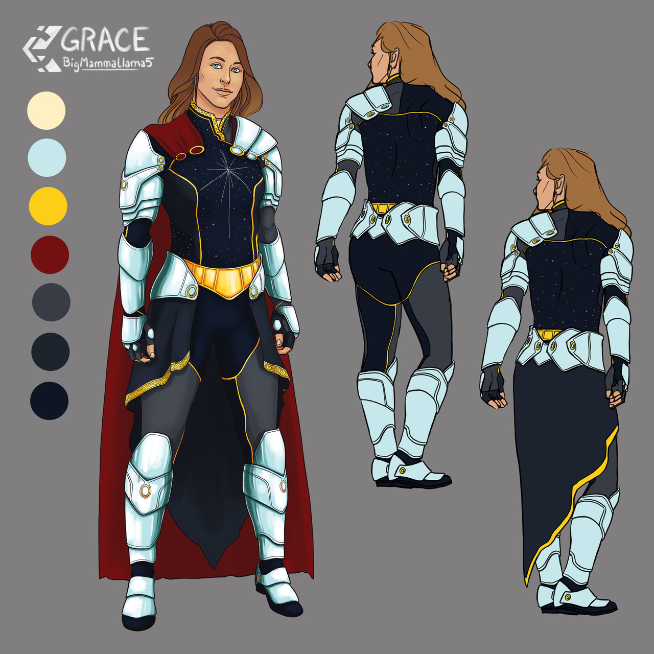
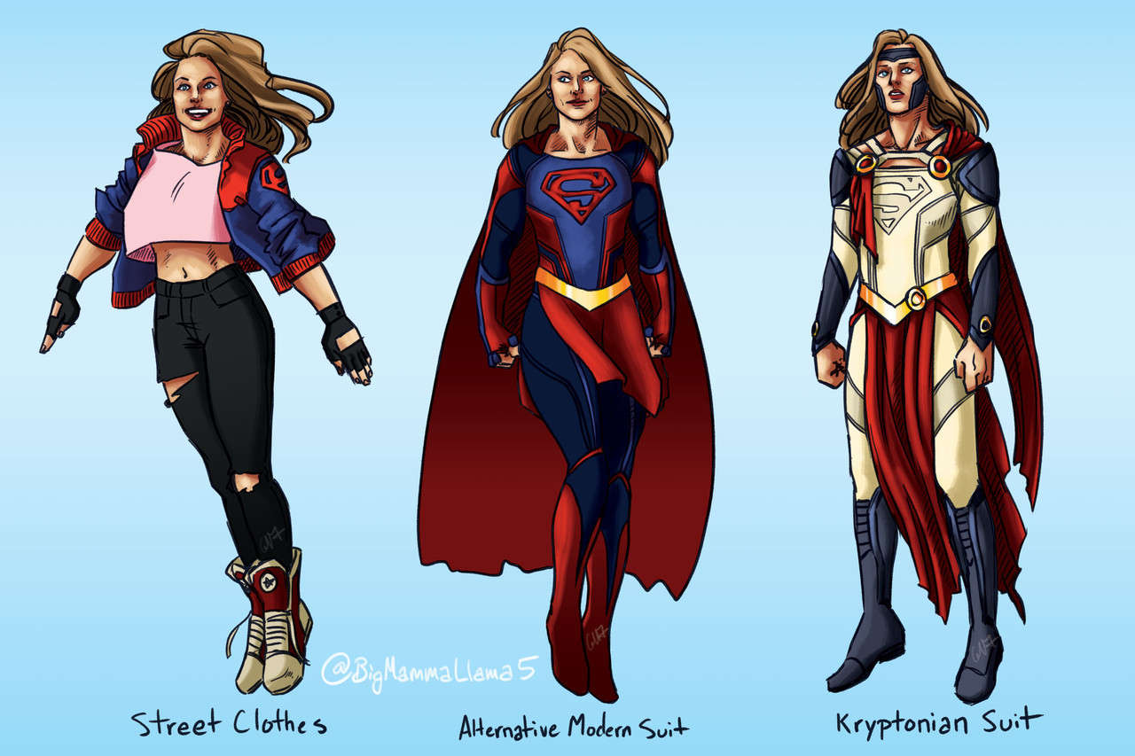
Supergirl Suit Redesigns, by Grace Kooken (Earth Ambassador Suit @ top)
Y’all need to check out the original page for this right now. There are breakdown images of each suit, with glow-in-the-dark options and turnarounds. And there are some other fun suits, like a Sun Suit and a Tank-Buster Suit.
These are all so fun, and each has its own style and flair. And they’re situation-appropriate! They’re really a joy to look at. I love how the more typical suits she would wear day-to-day keep to her established color scheme, but the “special” suits dip into different colors, but not in a way that makes her unrecognizable. Except maybe the Earth Ambassador suit, because she’s not representing herself in that context, but it comes with the coolest cloak in the known universe, so I don’t even care.
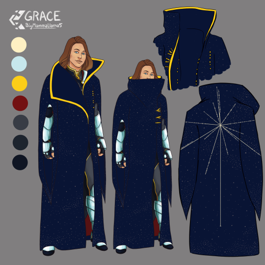
Check out the artist’s gallery for more fun characters and clay work, if that’s your thing.
-Icy

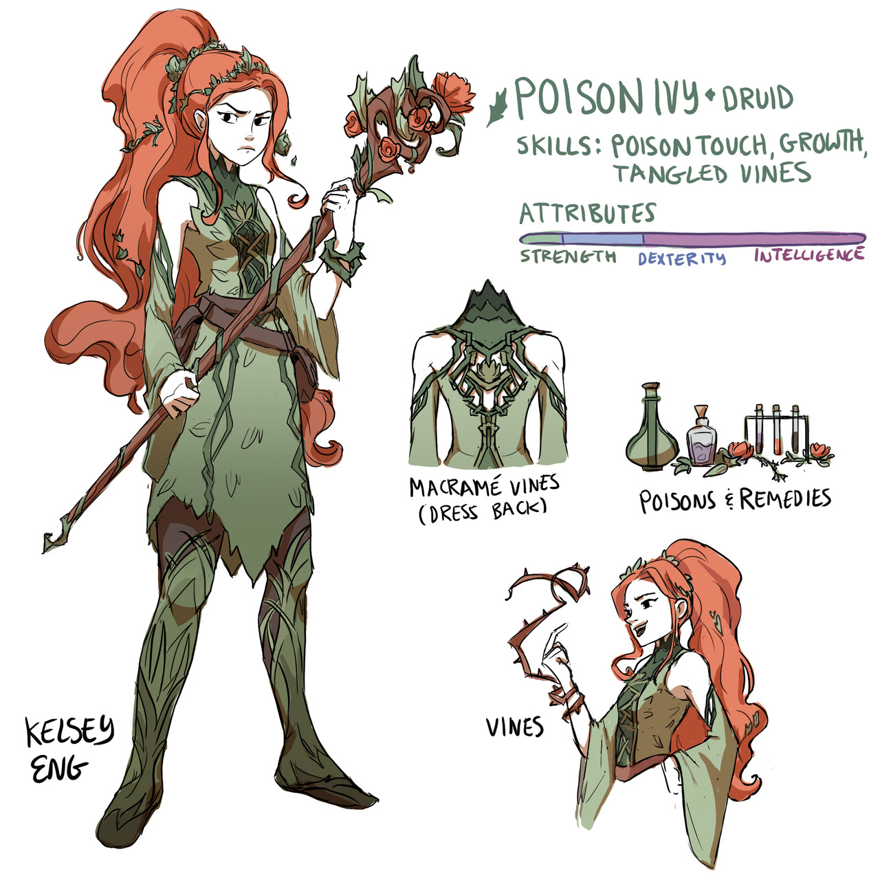
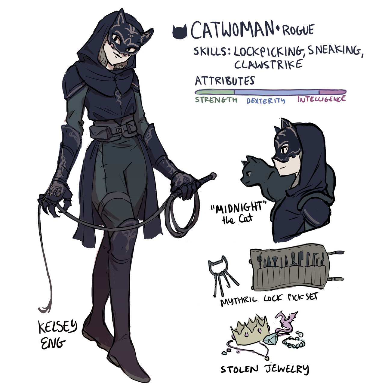
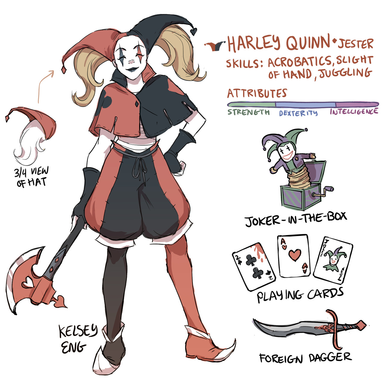
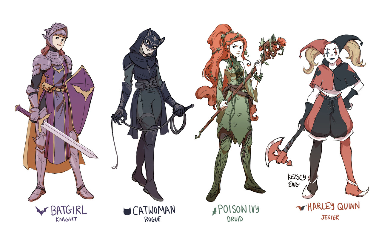
Gotham Girls RPG redesign for fun 🙂 They actually make a very well-balanced team! I was originally going to do them all as knights but then saw Mindy Lee’s Poison Ivy Druid and got inspired. www.instagram.com/kelseyeng32
I love seeing women in fantasy worlds with practical and pretty outfits that fit their personalities
@bikiniarmorbattledamage I suppose you would be interested in this
Oh, we are very interested. ? I love how every gal has her own distinct style, and their armor/clothes are actually… appropriate… for their roles???? There are so many subtle details on each of the ladies, and y’all know how much I love those. I particularly like the fresh take on Harley, because just the “jester” look, separate from Harley, has kind of become boring and same-y over the years, but this version is different and fun and cool. That hat + pigtails idea is Gold.
I would play the crap out of this RPG if it existed, though there’s no healer… Would Ivy begrudgingly hand out healing potions?
-Icy
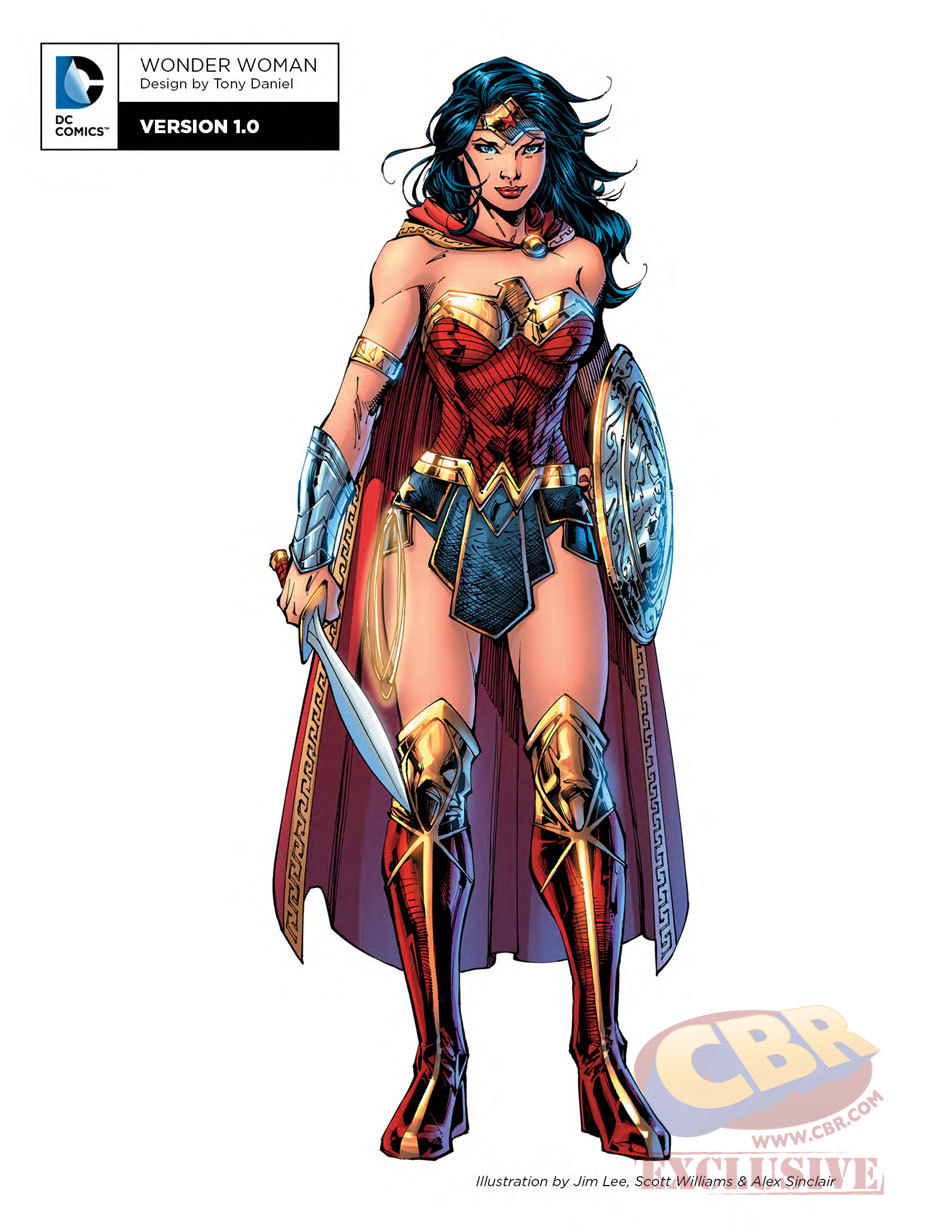
Another Wonder Woman, Why Not
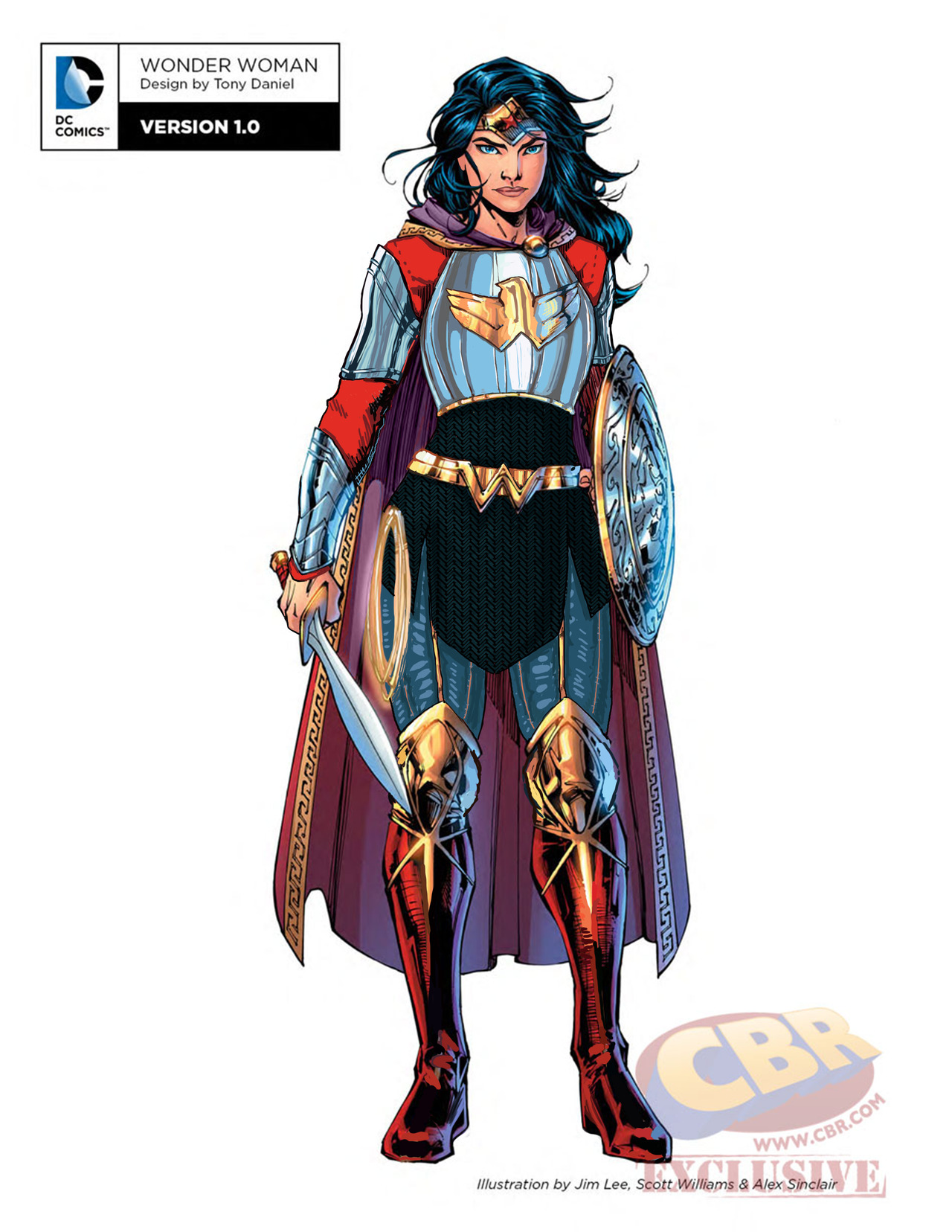
Ozzie made a great Wonder Woman redesign waaaay back, but I wanted to try my hand at something more akin to the movie design. I enjoyed the Wonder Woman movie a lot, but that outfit of hers was such an eyesore. Also had to deal with constant second-hand cringe at imagining what it was like wearing it.
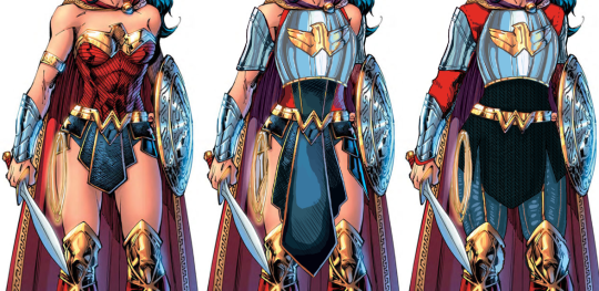
Sooo…. I ended up changing almost everything, obviously. I didn’t really have a specific theme or time period I was taking inspiration from; I just knew I wanted to give her a nice breastplate, and then worked around it for everything else. I gave her chainmail in a similar shape to her uhh… skirt? And then the gambeson makes a comback for the leggies.
Since the design is pretty clear and simple, let’s instead show my first attempt at a redesign, where I was trying to make the skirt work… somehow.
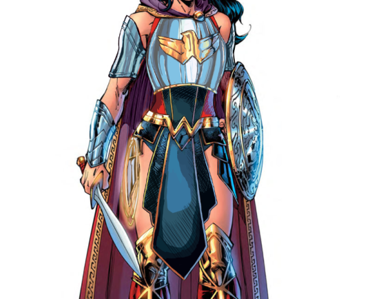
After coming back to this later, I realized that I was just doing the redesign equivalent of this gif:
Sooooo I got rid of that tabbard and redid it all.
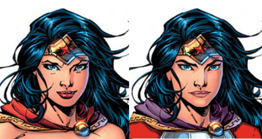
I also changed her face. I gave her thicker, more natural (but still fun) eyebrows, and a stronger nose. I also cut back on her makeup, and changed her expression to look more determined, rather than “awkwardly chuckling at someone’s joke on a first meeting.”
Overall, I think I gave it a good try. I feel like it’s missing something in some spots, but I can’t think of anything else to add besides like… some colored ribbon in her chainmail, but I don’t think that’s characteristic for her.
Would still have preferred my design over the original for the movie.
-Icy
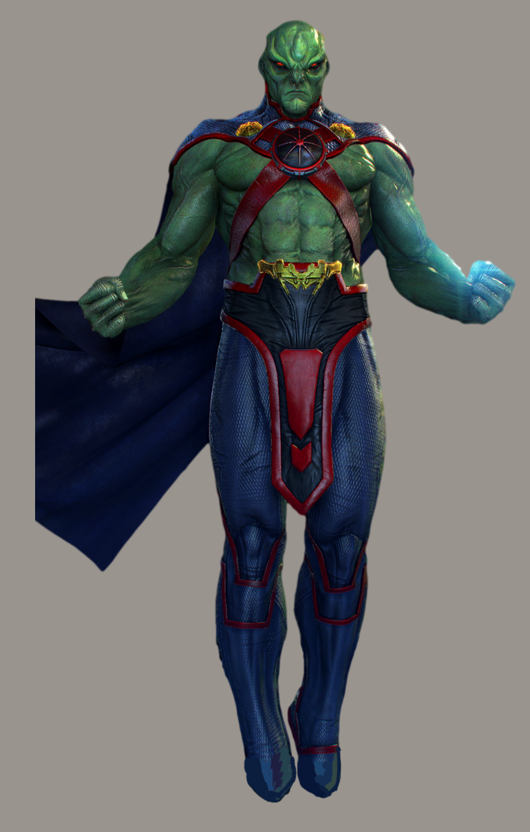

DC Supersexy Boys Part 2 – J’onn J’onzz
Even though J’onn the Martian is shirtless in Injustice (and other media), I still wanted to redraw him. I’ll admit that he was a childhood crush of mine, back when the animated Justice League was on TV. I was disappointed to see this version of him, which was clearly not designed to appeal to people who liked his soft-spoken nature. So I decided to fix this missed opportunity.
A lot of the changes were textural: I made his skin smoother in a lot of places (decided to go hairless for this one, since he’s a Martian and all), and I actually made his muscles less pronounced. J’onn is a lithe, agile man, after all.
Beyond that, the significant changes were his pants area, and his face. (And of course, the cleavage window that I decided to add last-minute.)
I took away his stifling pants (where are his booty shorts??) and gave him a semi-transparent loincloth, as I’m wont to do. I figured, for this More Mature J’onn, maybe he wants to know what it’s like to have hanging bits? That’s what being more “mature” and “realistic” means, right?
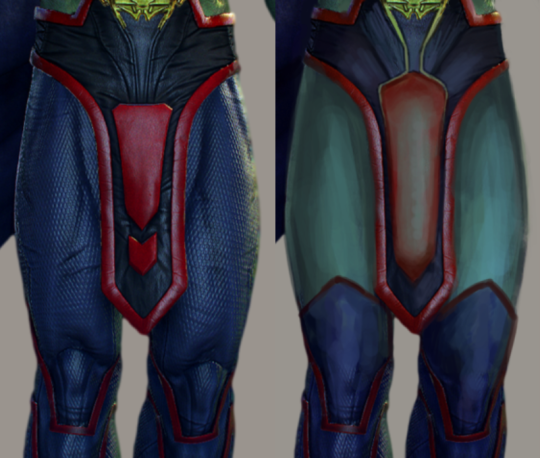
As for his face, I wanted to recapture that animated Justice League look. I got rid of his cartoony Scowl of Doom, and instead gave him smooth, pleasant features. I decided to give him a cute blush at the last minute, too. Even Martians blush.
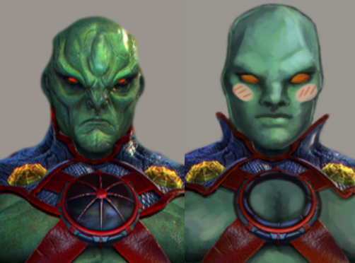
I do hope that other J’onn fans enjoy this redesign as much as I enjoyed working on it.
-Icy

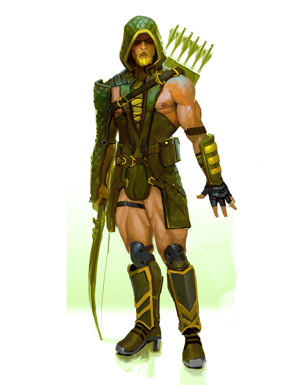
DC Supersexy Boys Part 1 – Green Arrow
For our attempt at sexifying DC male heroes I managed to find this Green Arrow concept art for Injustice: Gods Among Us, which was surprisingly good material to work of off.
For starters, he was already striking a vogue pose. And just look how easy it was to expose his male-presenting nipple with that giant armpit cutout!
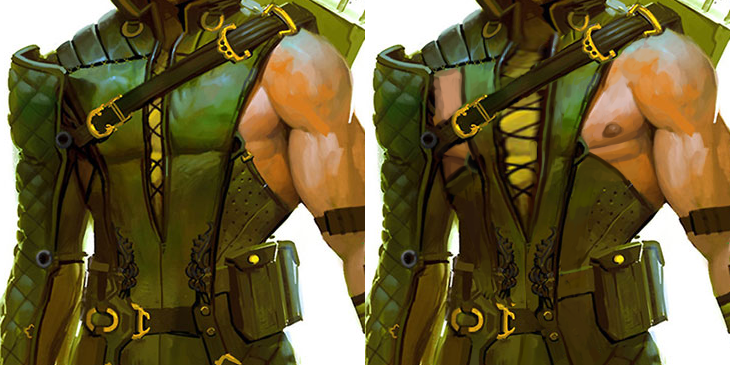
I also widened that lacing in the middle of his chest… my regret is not replacing the yellow undershirt (?) with his skintone 🙁
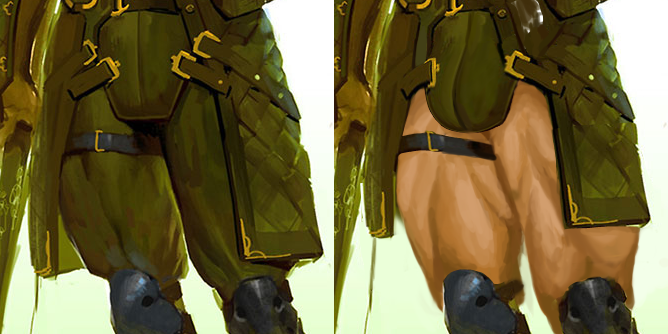
Since this was concept piece, not a final render for the game, the artist went wild with Ollie’s thicc thighs compared to tiny knees, so I also run with it!
I shortened his tunic flaps, exposed the thigh skin entirely and used some particularly beefy reference for the musculature. Also, of course, made his codpiece much obviously bulge-shaped (while rather restrained compared to how big and detailed we usually make them).
Also changed his shoes into high heels, as per usual 😉
Hope you guys like it. I’m quite satisfied with the edits here, especially how they blend into the original’s painting style.
~Ozzie
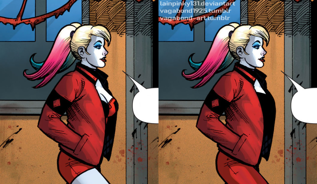
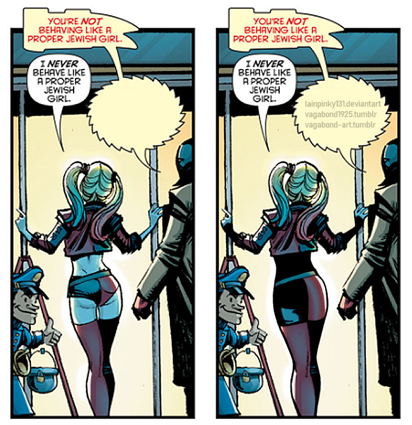
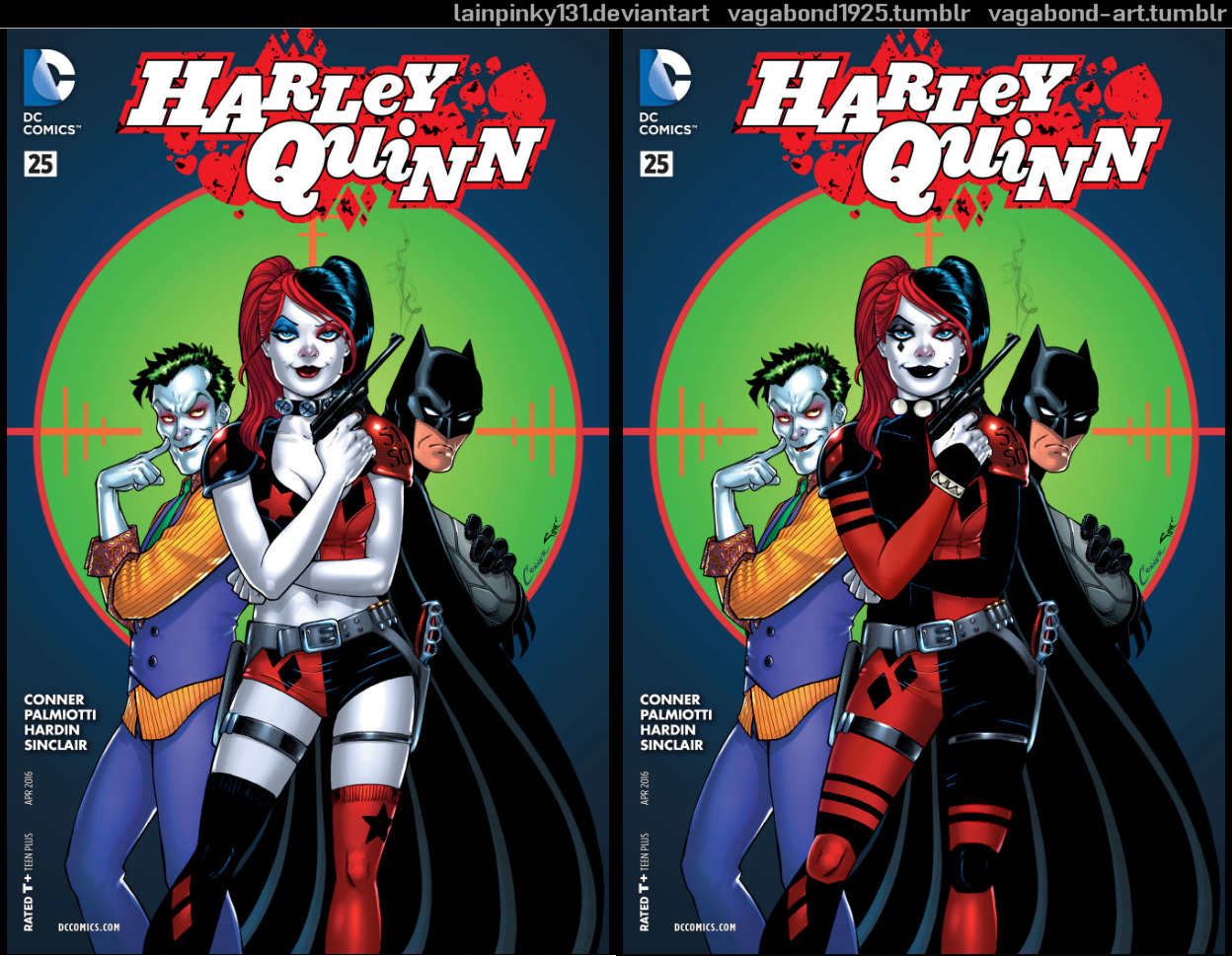
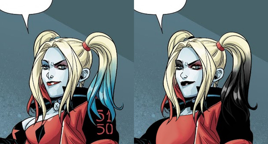
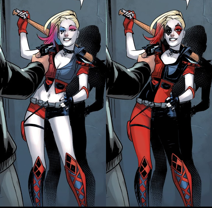
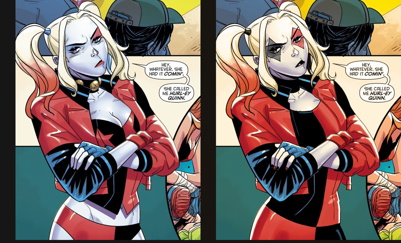

unpopular opinion: harley quinn is better with clothes
made w @chokit-pyrus on paintshop pro 9 and paintshop pro X8
Also unpopular opinion: she looks more badass that way.
Further unpopular opinion: it just makes sense for her to wear more than a bikini. Gotham is fucking cold and she’s a graduated psychiatrist and psychologist, not someone immune to cold. Plus, body armor and potential for concealable weapons.
I especially appreciate the reinforcement of the diamond motif and red/black color scheme that got changed to red (sometimes pink?!)/blue for no reason over the years.
We touched upon this before, but the big problem with most contemporary depictions of Harley Quinn is that her designs convey anything but her Harlequin/jester theme.
It’s not just that she dresses skimpy for no other reason than very transparent “fanservice” (as we established, she was plenty sexy and sexual even while fully dressed in her original costume), but that when it’s stripped of colors and prior knowledge of the character, no-one seeing this design for the first time would know what her deal is.
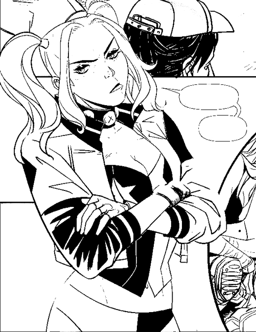
Who is that? Some randomly underdressed biker chick? Why is she wearing a cropped leather jacket directly over drafty lingerie? Where are her pants? Is there a reason for her girlish pigtails? Hell if I know! ¯_(ツ)_/¯
Good character design, including costume and make-up, should work context-free. The only thing thing we’re told by this sort of Harley design is “she sexy”.
~Ozzie
See also: This article summarizing Harley’s design changes since Arkham games introduced the non-jester look. Just remember that every time the word “unique” comes up, it should be read as “awful”.
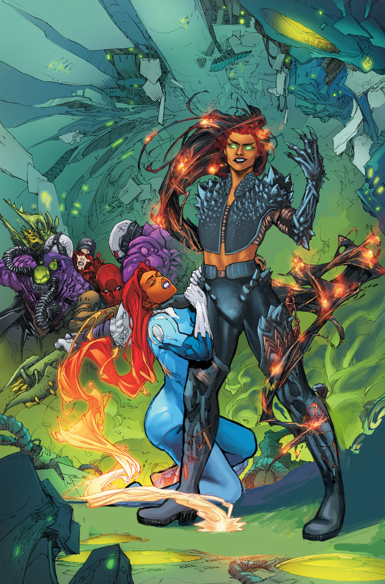
DC Supervillain Girls
This stream session was devoted to antagonistic women of DC universe. They might be fiends to superheroes, but mostly to wearable fashion.
Star Sapphire
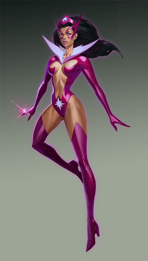
I knew that at some point we’ll discuss the amazingly awful modern costume of Star Sapphire (not to be confused with Starfire, also a DC property), so around the same time we redesigned and bingo’d two equally skimpy takes on the same character.
Managed to find this official concept art for Infinite Crisis game on the artist’s dA account (please do not bully them for doing a commission of a character who already looked sexualized) that looked like a good material to work of off – digital painting that represents quite fairly how she tends to look in the comics.
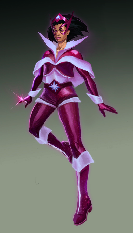
There were so very little things worth preserving in the original, so I ended up redoing it almost from scratch.
First I readjusted her cartoonishly thin figure, made her olive skin a little less ambiguously brown and gave her a bigger nose – she’s more often an antihero than a villain since Star Sapphires got retconned into a Lantern corp, so I don’t think she needs to be white-passing. Also changed her haircut to a less bothersome bob.

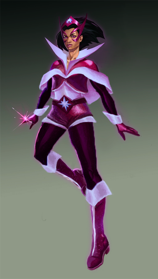
Leaving in her white popped collar, I decided to use white detailing to break up purple shapes on her. Little cape with big white trim and lining is probably my favorite original part. When I was done, we concluded that it’s probably still a bit too purple, so I ended up making an alternate version, with dark violet for sleeves and pants, to have the color scheme contrast better.
Completely coincidentally we’re posting this redesign, which turned out a lot like a Ms. Claus outfit, around the Winter Holiday season. But I’ll take Santa Sapphire over Skin Sapphire any day of any season.
~Ozzie
Blackfire
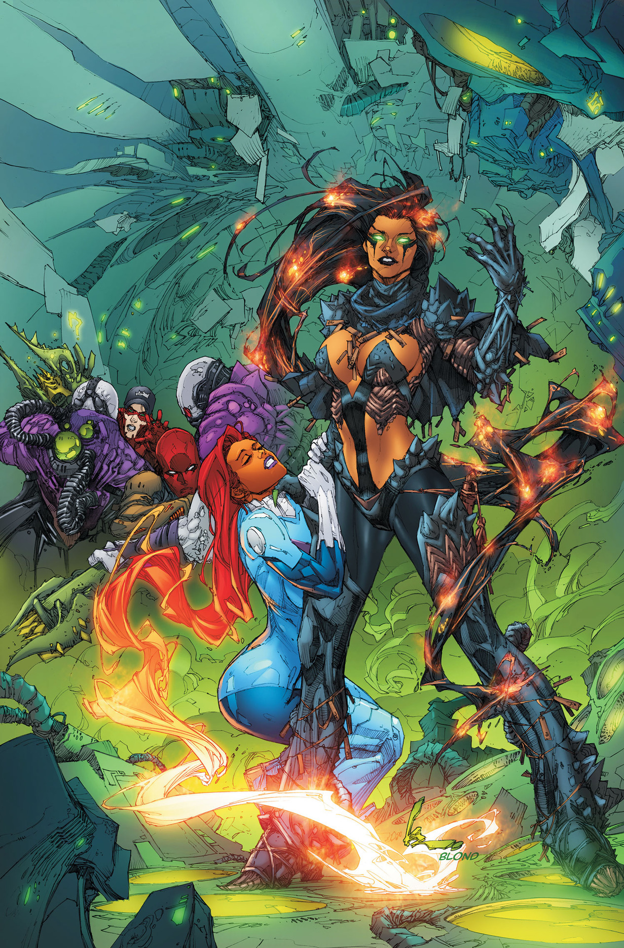
This was another one of those images where everything in it was just Bad. (See Valkyrie redesign for the first of these that I worked on.) So, I ended up fixing Starfire’s body too. That’s actually what I started with, because it kept distracting me how she’s doing a T&A pose while being choked. Not sure what the thought behind that was….
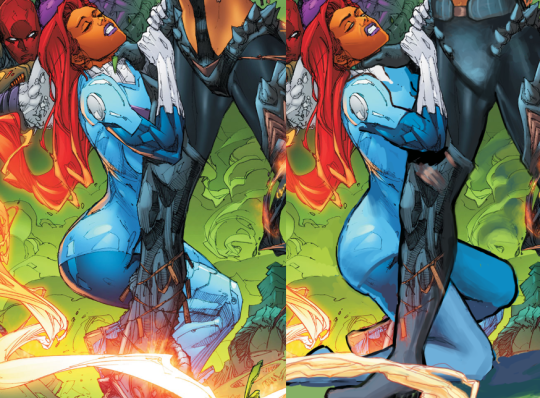
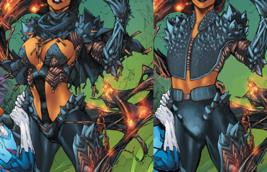
After that, I had to redline Blackfire to fix her back and legs, and I got to fixing her… “clothes.” I decided to go with the spikes motif and extend it into a vest. I left some of her abs showing because she’s kind of a cocky lady, and I feel like she’d want to show off a bit. I just think that she’d show off while wearing reasonable clothes.
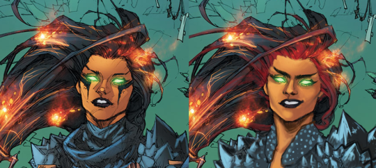
Her face is one of my all-time favorite edits of mine. I also gave her hair red roots because I think that siblings should share at least a small piece of a design element, like I did with Morgana.
This was definitely a fun redesign. People who were there for the streams may remember that I wanted to make Blackfire trans, but I decided to back down on that, since she is a villain, and I didn’t want that association. We don’t have enough of a track record of non-evil trans ladies here, but there will definitely be more of an effort to change that.
-Icy
