The hilarious front line in the tragic war against ridiculous female armor
Tag: chainmail
Posted on
Posted on
Posted on
Hyrule Warriors – A Link to the Pants, Part 1
Hyrule Warriors has been on our radar for some time, so we finally decided to try making its female characters live up to the game’s name. Basically only Impa is anywhere close to consistent with how male warriors are depicted, while other ladies at best look like they’re on a runway rather than battlefield, and at worse are Cia the Boobplate Witch.
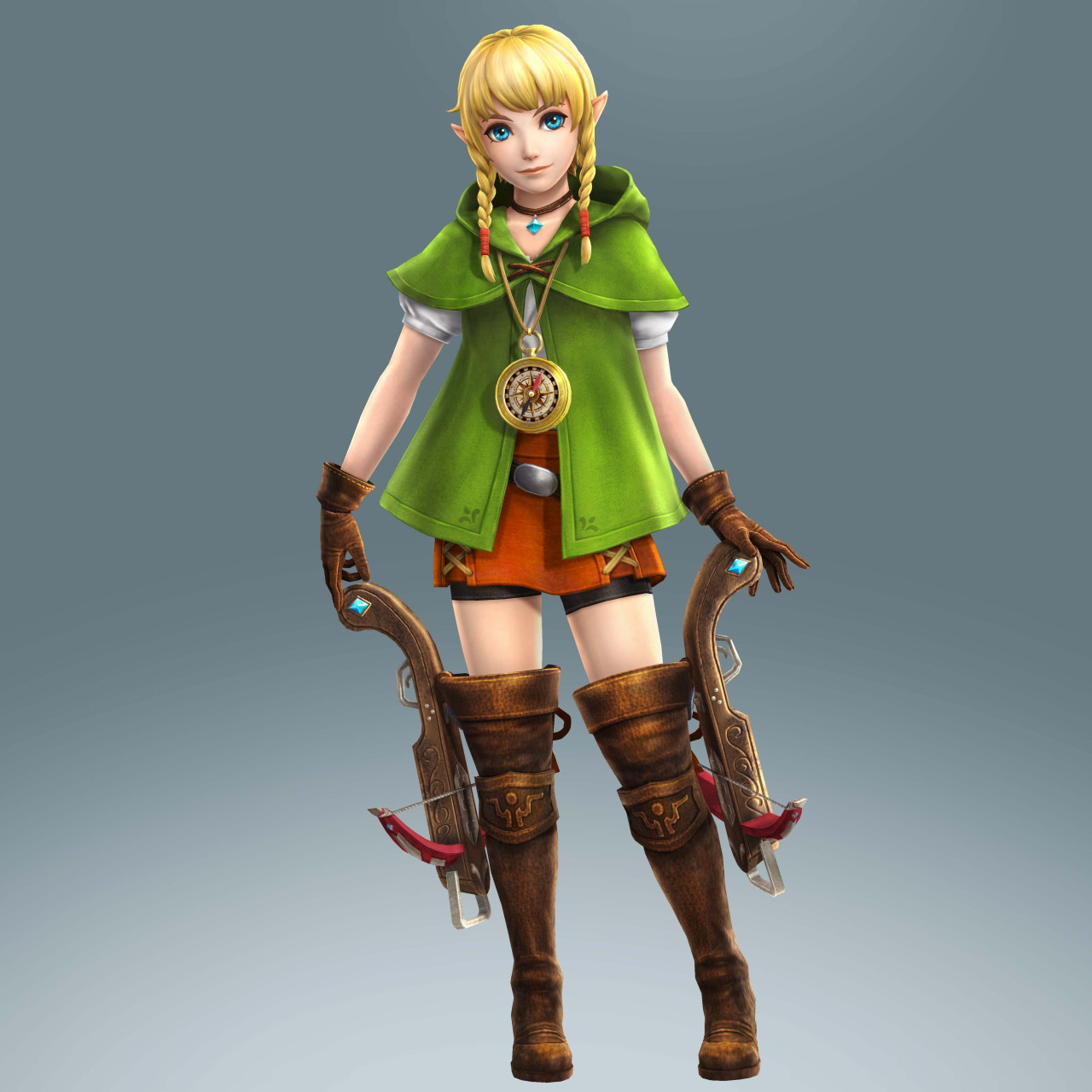
Linkle
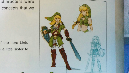
First planned either as female version of Link or his sister, Linke apparently ended up as a separate character who just happens to be very similar to him… And also to many other green archer ladies, especially the Elf fromDragon’s Crown.
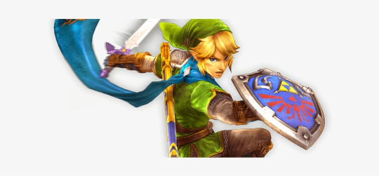
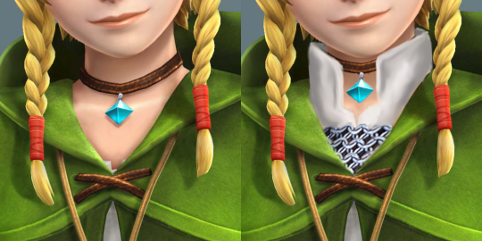
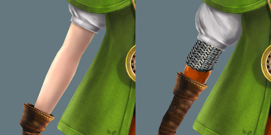
Her final costume is quite fashionable, just not very functional when directly compared to how Link presents in this game, wearing layers of armor, including chainmail under his green tunic.
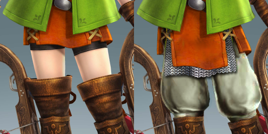
While all she gets is short poofy sleeves and the fetishy “absolute territory” of bared flesh between a her skirt/shorts and thigh-high boots.
So, of course, my aim with her redesign was to give her some layers and basic armor while retaining her individual fashion sense.
Now her poofy white blouse is gambeson padding that she wears chainmail over, much like Link does. And the poofy sleeves are bigger, cause why not?
Speaking of sleeves, she also gets some additional orange undershirt that matches her skirt. And her gloves got a lot longer, to cover her forearms from harm. Sorry for the botched shading on chainmail, I copied it from Link, but didn’t have time to re-shade properly… or to layer it in a way that makes sense ?
Finally, poofy pants, to match the sleeves, and to properly protect her legs. Covered with some more layering of chainmal and longer skirt. And the boots have functional knee-high length now.
All in all, with the amount of edits this went through, I’m not unhappy with the results. Hope you guys like it too!
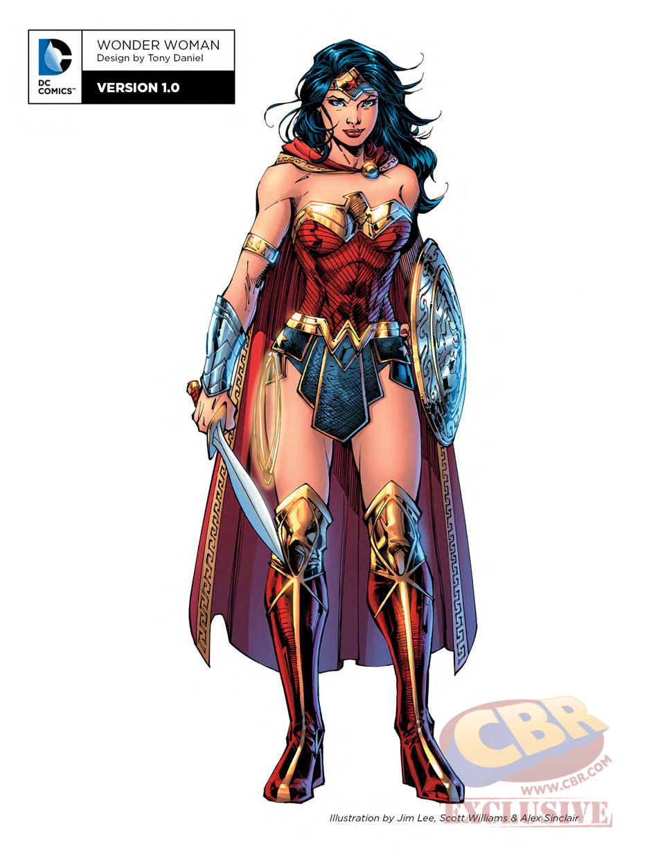
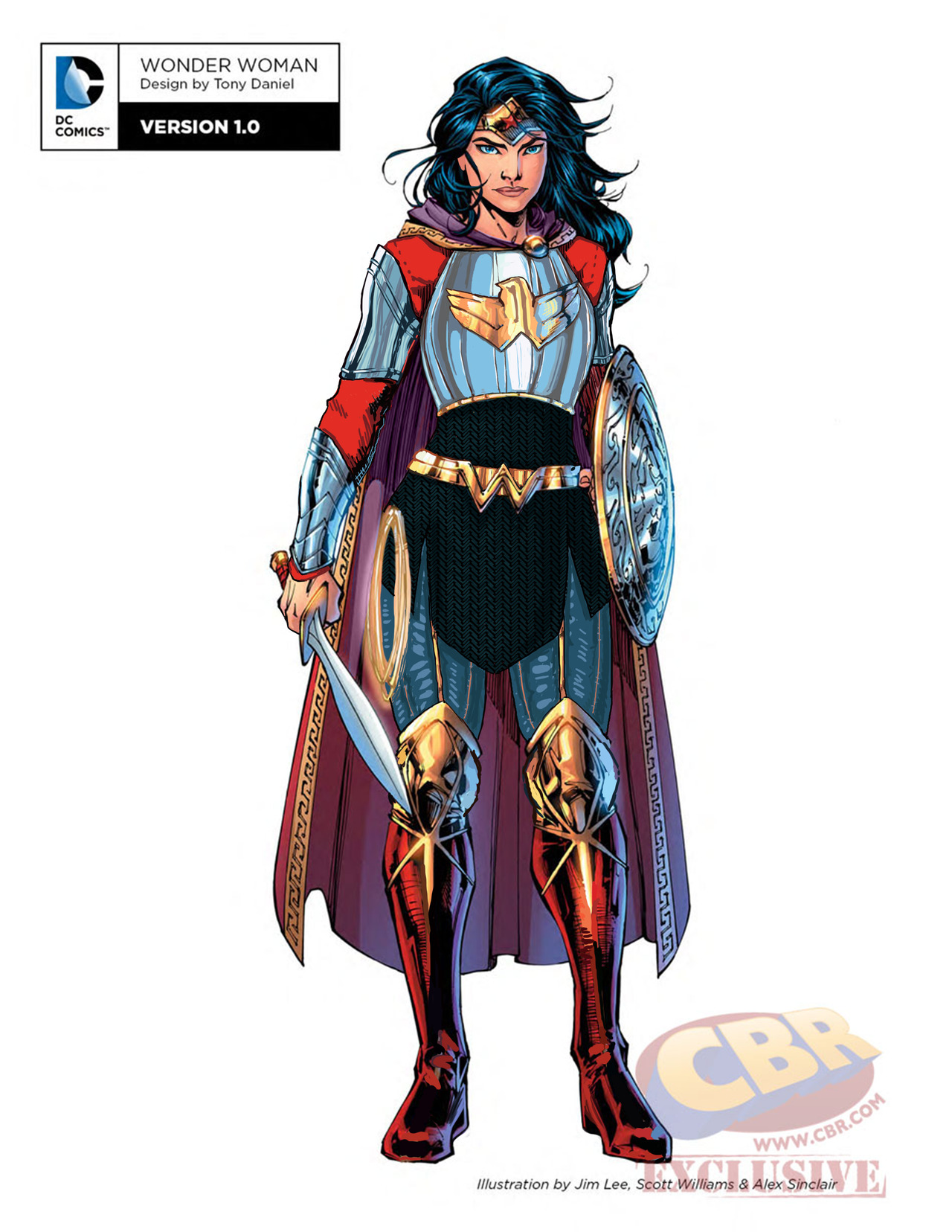
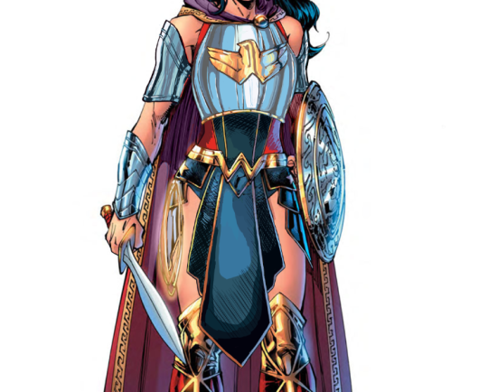
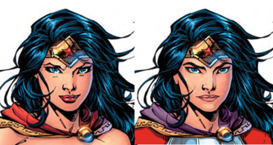
Ozzie made a great Wonder Woman redesign waaaay back, but I wanted to try my hand at something more akin to the movie design. I enjoyed the Wonder Woman movie a lot, but that outfit of hers was such an eyesore. Also had to deal with constant second-hand cringe at imagining what it was like wearing it.
Sooo…. I ended up changing almost everything, obviously. I didn’t really have a specific theme or time period I was taking inspiration from; I just knew I wanted to give her a nice breastplate, and then worked around it for everything else. I gave her chainmail in a similar shape to her uhh… skirt? And then the gambeson makes a comback for the leggies.
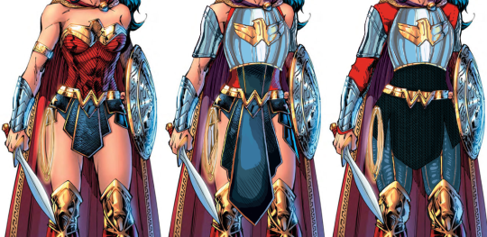
Since the design is pretty clear and simple, let’s instead show my first attempt at a redesign, where I was trying to make the skirt work… somehow.
After coming back to this later, I realized that I was just doing the redesign equivalent of this gif:
Sooooo I got rid of that tabbard and redid it all.
I also changed her face. I gave her thicker, more natural (but still fun) eyebrows, and a stronger nose. I also cut back on her makeup, and changed her expression to look more determined, rather than “awkwardly chuckling at someone’s joke on a first meeting.”
Overall, I think I gave it a good try. I feel like it’s missing something in some spots, but I can’t think of anything else to add besides like… some colored ribbon in her chainmail, but I don’t think that’s characteristic for her.
Would still have preferred my design over the original for the movie.
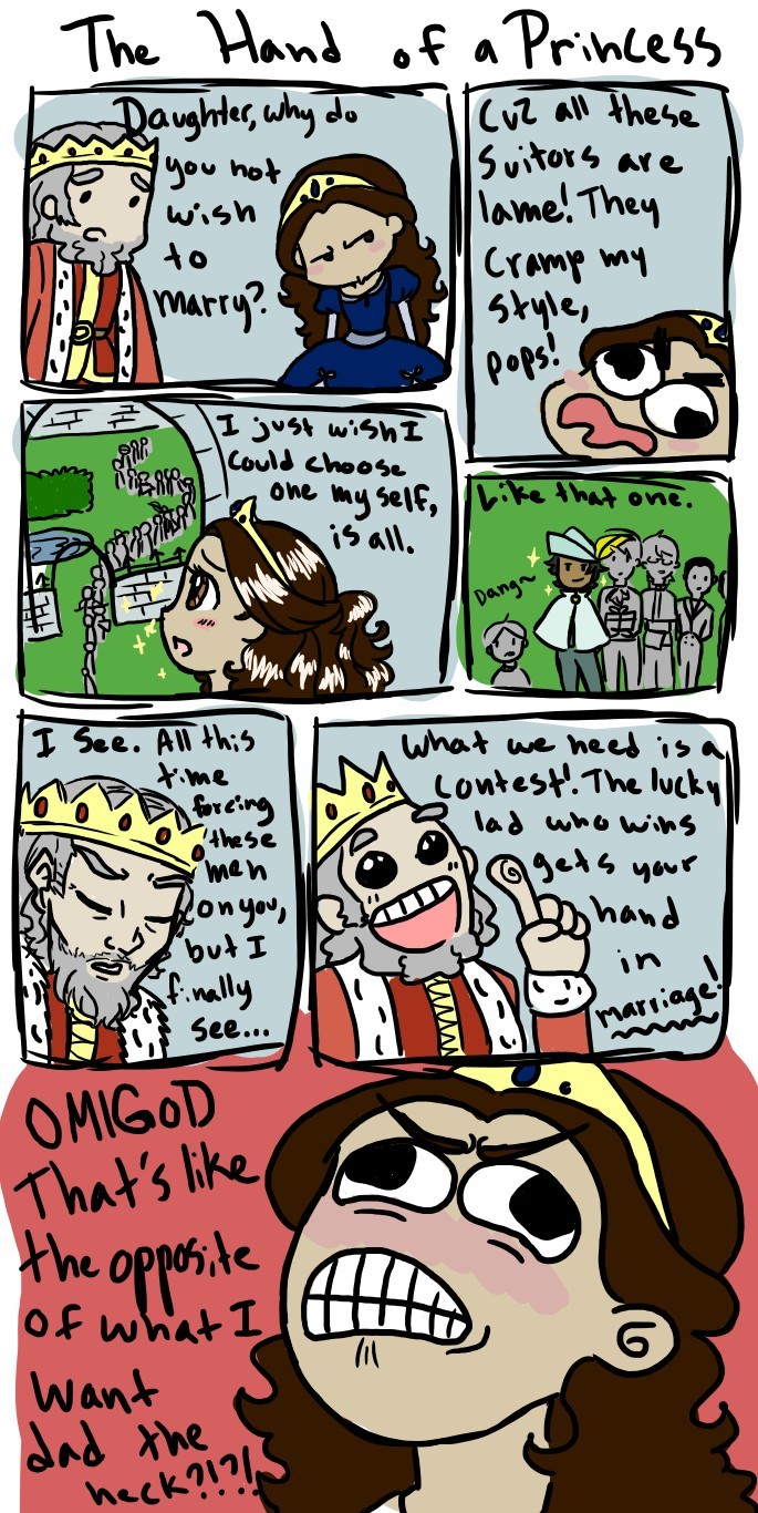
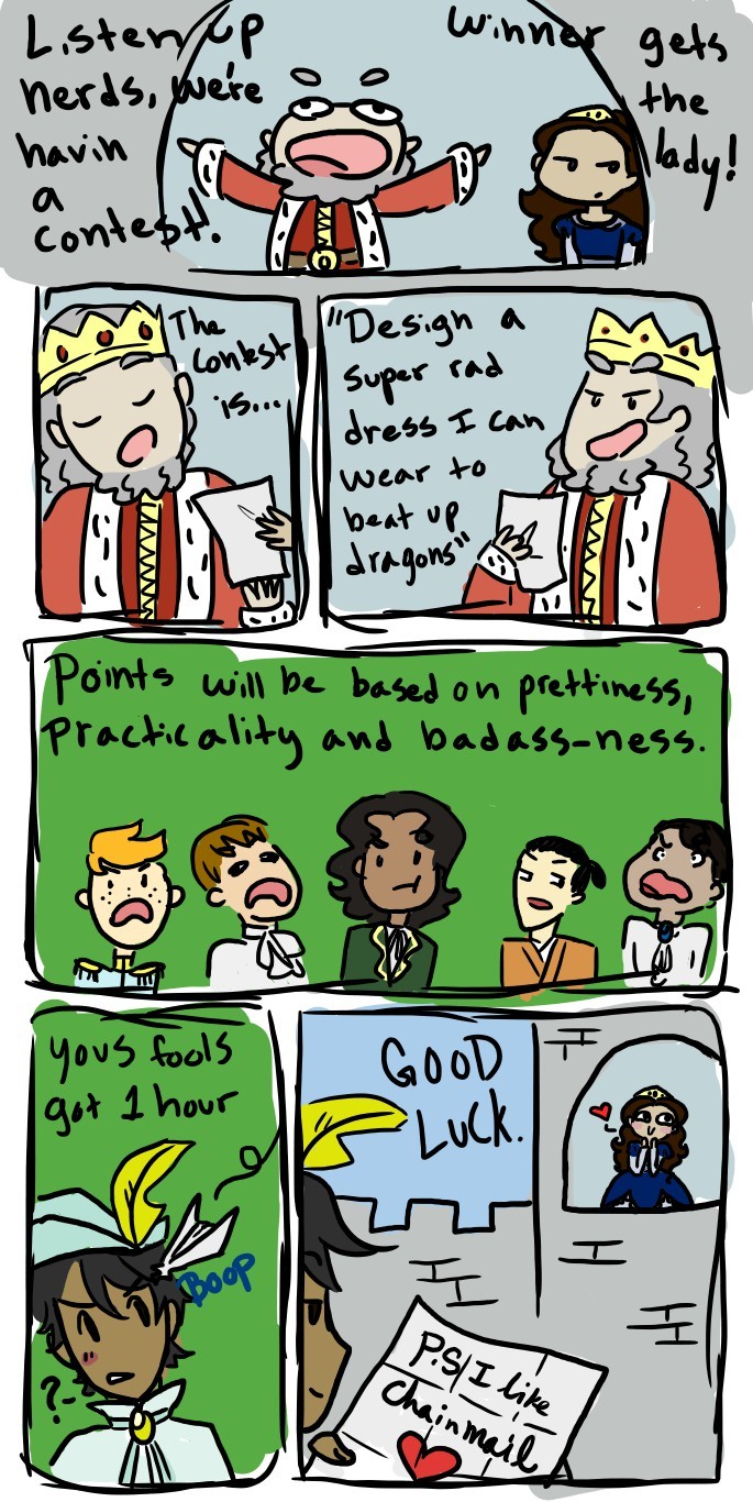
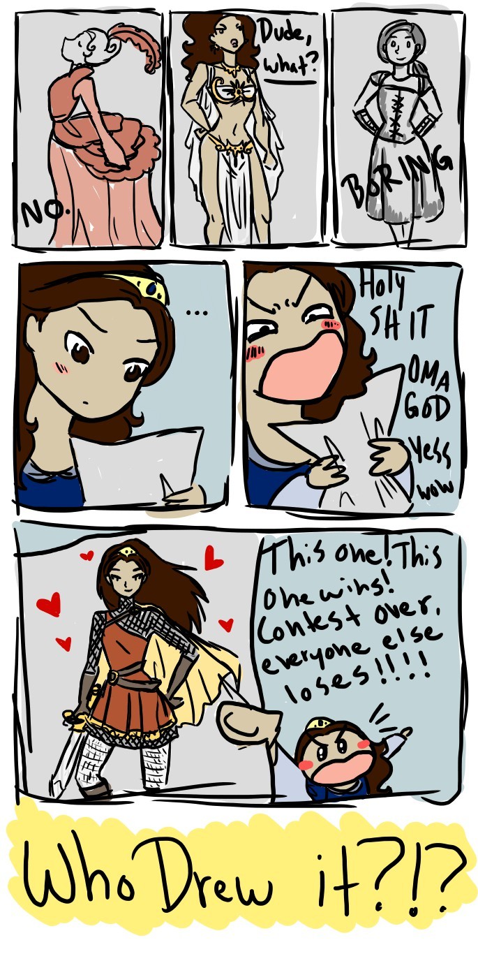
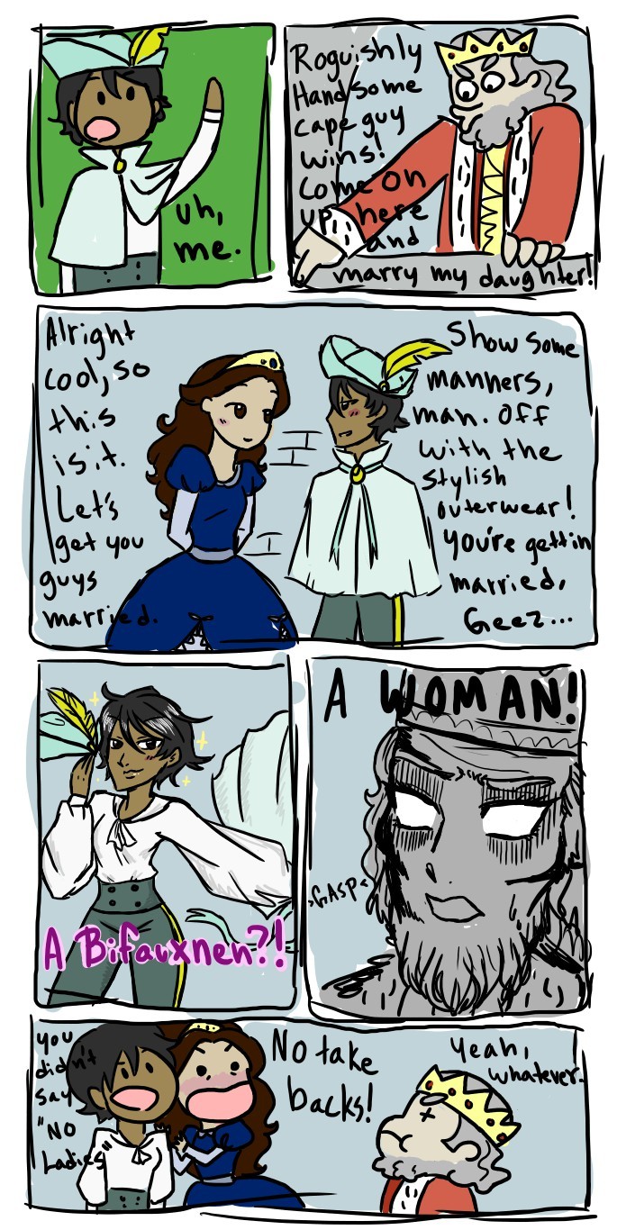
Well, the king is not a very good listener, but at least he allowed the best contest theme ever. Princesses shouldn’t be prizes to be won, but if they have to, let it always be in a “Design a super rad dress I can wear to beat up dragons!” competition.
Thanks to Ros for recommending this to us!
~Ozzie
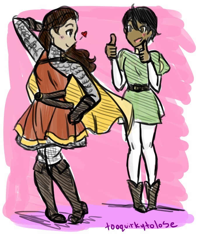
Throwing back this adorable comic, because it made it wonder: why do artists spend so much time making metal boob cups when they can give their lady characters reasonablechainmail armor and then decorate it with cloth? That would achieve the feminine look they want, right?
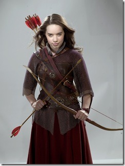
can we take a second to ponder on the fact that a kids movie did lady armor better than the entire film and comic industry
guess who i’m talking about
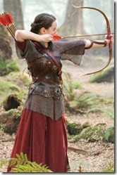
did you guess? Well you’re fucking WRONG because it’s Susan goddamn Pevensie
They gave her light armor, appropriate for a small archer:chainmail, an arm brace, chest plate, and a light skirt she can easily run around murderizing dudes in the face in
her hair is also only loose in the promo pictures because Susan is fucking busy not dying because her hair was flying into her eyeballs so she braids that shit back
her mail shirt is also loose enough that it doesn’t impede her arm movements it’s almost like she’s dressed for a fight wow
I like the pinks and purples under her bitchin as hell leather armor here, because you don’t have to be masculine to shoot someone in the goddamn face
Everyone, including the actress who played her, agrees that Susan was the most boring of the Pevensie siblings, yet the filmmakers had enough respect for the character to dress her in practical light armor. And didn’t have to bend over backwards to slap on “feminine features” (read: giant boobplate) to make sure no-one confuses her gender.
Would other female characters in life action get non-exploitative clothes if they were also played by underage girls?
~Ozzie
PS: Props for archer costume with puce as its primary color instead of green!
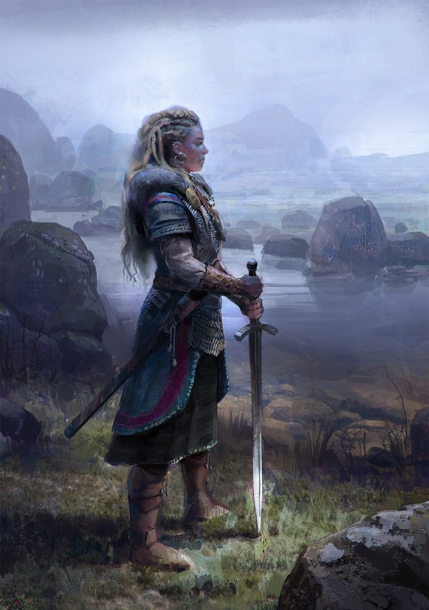
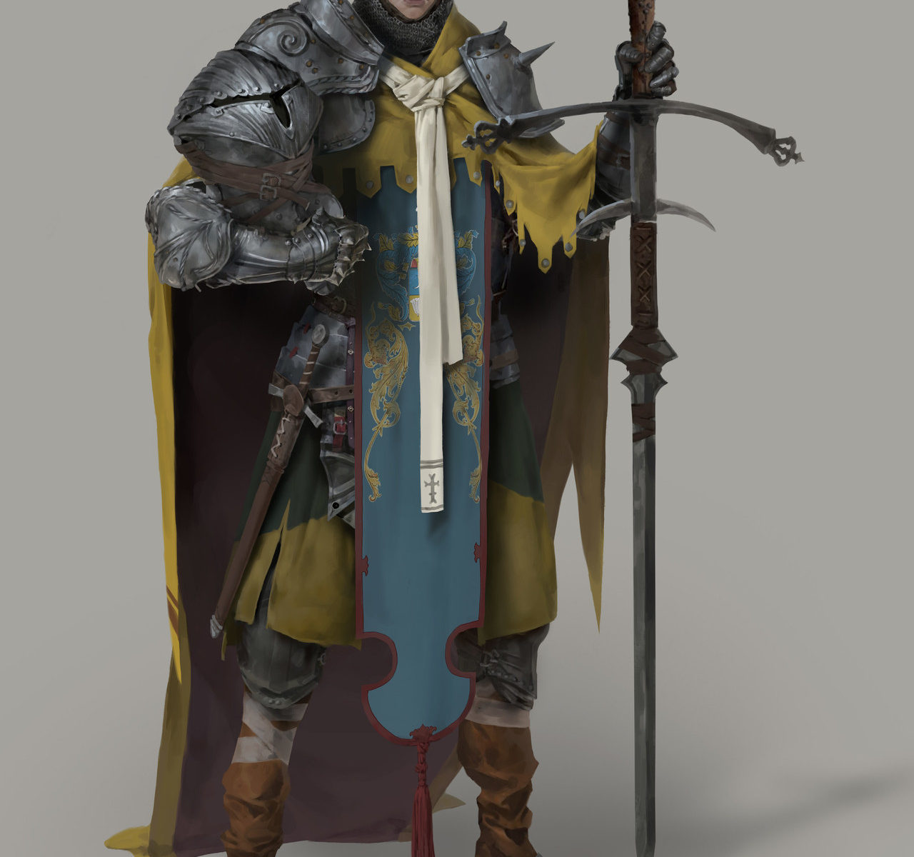
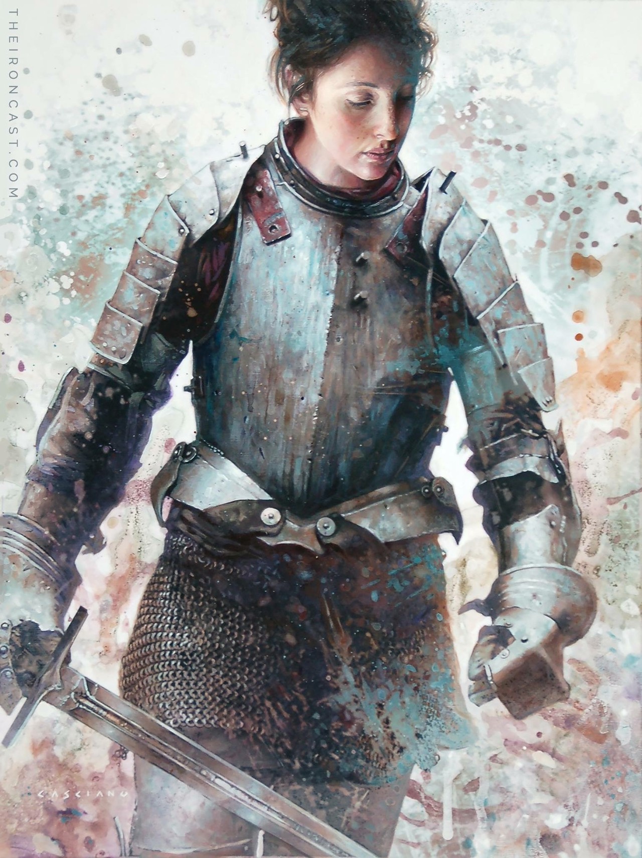
Do you love the rough, painterly metal aesthetic, and illustrations of people in armor? Well, then do I have the art series for you!
This definitely looks like a realistic armor, which means that while it may not be designed with aesthetics first, this piece feels real. It definitely looks like a portrait of an actual knight. I love these kinds of works because they normalize women in armor. She looks like just another knight, and wouldn’t that be nice, if woman fighters were seen as normal and mundane as men. Not to mention, the style is wonderful.
I definitely recommend checking out the Iron Cast series.