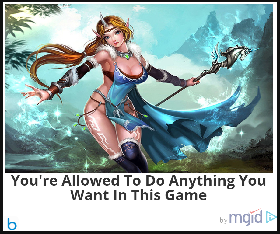

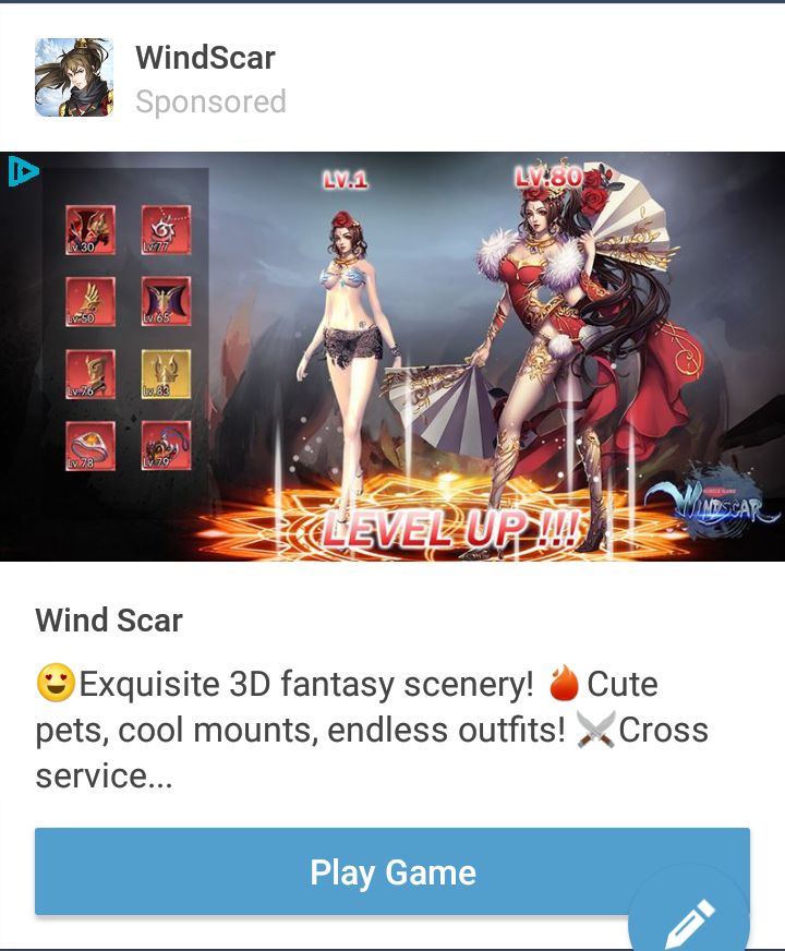
A random game ad I found long ago… somewhere. I don’t really think this deserves any actual credit or research, considering this seems like a generic asset flip-type game web ad, including a cringy, vaguely sexual tagline!
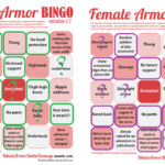
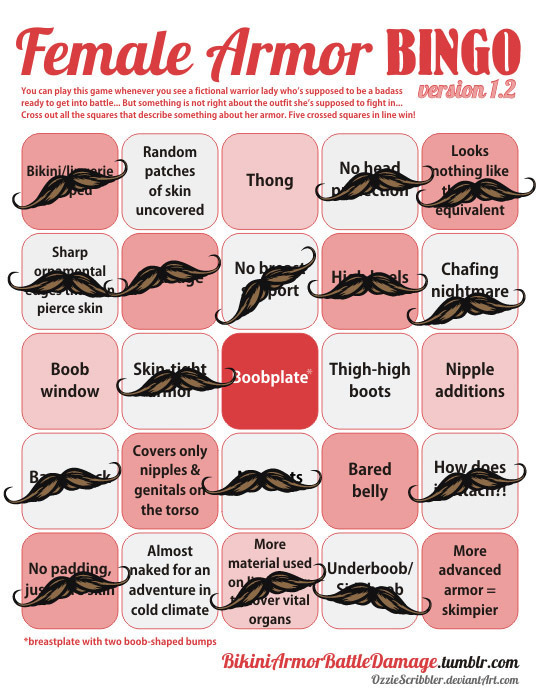
The outfit, though, I think, justified doing a bingo. It’s basically a one big “don’t” in dos and don’ts of costume design.
She’s clearly a magic user, though, why would she need clothes that make any sort of sense or keep her warm? Maximal skin exposure, with complete disregard for functionality and physics, is all that matters!
? </sarcasm>
~Ozzie
@dinopasta33 submitted:
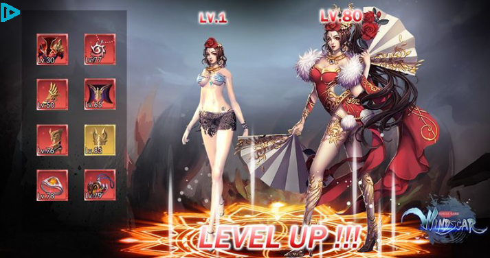
The designs used in Windscar’s advertisement are an absolute travesty. Like, I’m pretty sure she needs more than a chiropractor with her back bent like that
Wow, good find for BABD and for @eschergirls! The closest to this contorted promo pic I found from this game was this:
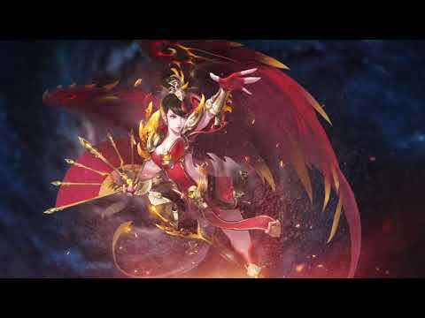
And generally WindScar seems to be very satisfied with looking like every other generically boobastic shit in our web ads tag.

~Ozzie
What I find amusing about these designs is they are made by an Chinese company – but there’s almost no link to Chinese fashions, clothing, designs, etc.
These are basically Chinese artists looking at how Western artists have tried to imagine these costumes, then trying to make them kind of like the weird western fantasy designs they see in western video games.
Thus creating a cycle of terrible where some guy in a western company is now going to look at these and go try to outdo them….
*sigh*
– wincenworks
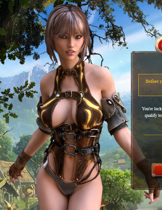

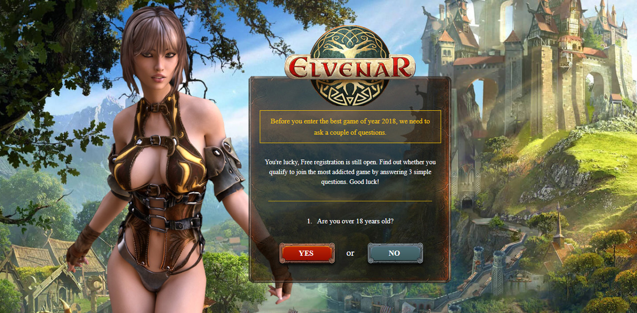
Elvenar continues to be the kind of game with very standard, unsexy strategy gameplay and completely unrelated marketing imagery that is basically Fantasy Porn™ (read: standard for web ads).
And this is the sort of design that amazes me. The kind that covers over half of the Female Armor Bingo card, but doesn’t manage to score a single row. All while not being a full body image. We can only assume whether it would score high heels and/or thigh-high boots if we saw more of this poor poor lady.
~Ozzie
That is very uncomfortable-looking bondage clothing
– Icy
Marking it as sensitive, just in case.


Gotta love the “creativity” of web ads presenting just another grizzled military dude as an equivalent to a generic pretty girl with long flowing hair, cleavage and belly out. Totally legit and “equal” soldier designs! Especially for a game that apparently takes place during WW2?
Um, is that supposed to be some sort of parallel universe? Because other than USSR imagery slapped on like an afterthought, even the guy doesn’t look anything close to a soldier from the 1940s…
~Ozzie
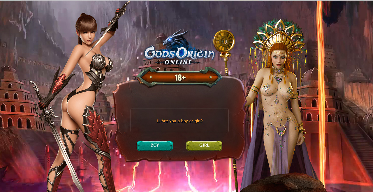

iiphides submitted:
Found in a pop up while I was trying to watch something.
Plus bingo cards! The gal on the left is the green board, while the right is purple.
Wow are those extremely awful (with @eschergirls anatomy on the left one, to boot!), I’d say your scores are very lenient.
Sorry to do a rare bingo correction, but those two are SO over the top physically impossible and ultrasexualized I think they deserve cards as fully crossed out as possible:
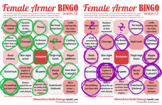
(Also, I’m using the most recent bingo card design (1.2), we grew quite tired of the “No underwear” square and discussions on what it means).
Okay, so the left one, with her “Hot Chick With a Sword” aesthetic has a pretense of being a warrior. What the other one’s supposed to be, aside from, well…

…a sorceress? …a cleric? …a double sided tape commercial cleverly disguised as a burlesque strip tease?
~Ozzie
This game’s apparently supposed to be a “Greek Mythology Browser Game.” I don’t think it’s physically possible to squint hard enough to make that come across in any way.
Also, is it just me, or do those 2 ladies look like they were made for 2 different art styles? Not to mention, this “promotional material” is orders of magnitude more shameless about the sexy girls than any other art on their website.
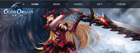
Although the “clothes” are still as confusing, so… at least that’s consistent??
-Icy
edit: Readers informed us that art in that web art is stolen. Surprising no-one, game with porny marketing is an asset stealer.



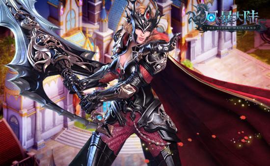
I have to admit that Oraco has been impressive in their dedication to minimizing the amount of creativity in their designs. Sometimes I joke about some studios using a spinner to pick random design elements, but it seems genuinely possible (example: nature + League of Angels)
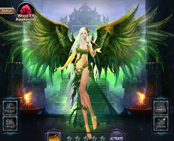
Seriously the recycling art assets on the front page and committing to this level of generic imagery, is impressive in a terrible kind of way. Not to mention the combining with @eschergirls type anatomy.
No surprise that it’s not only incredibly generic in gameplay, but often accused of another game which is essentially a game that plays itself (so not quite an asset flip, but close enough it may was well be).

This is why we say that if you’re counting on sex to sell, it’s probably because you don’t have anything worthwhile in your game.
– wincenworks


