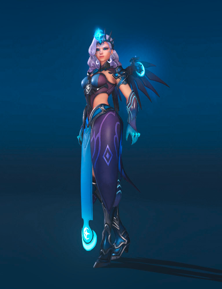

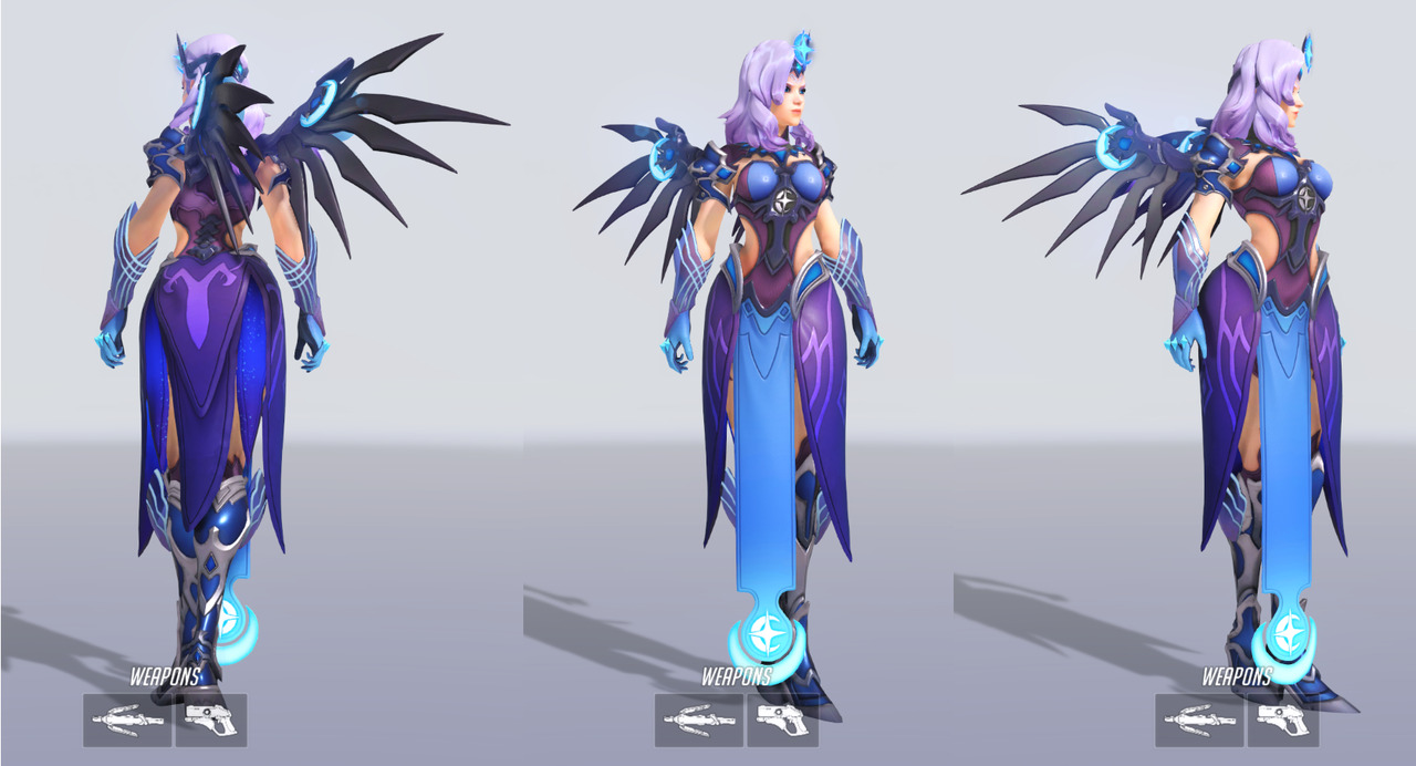
In relation to an Overwatch League event two new exclusive skins were released, and one of them is an off-brand Camilla from Fire Emblem… I mean generic JRPG waifu… I mean Atlantic Mercy >_> CREATIVITY!
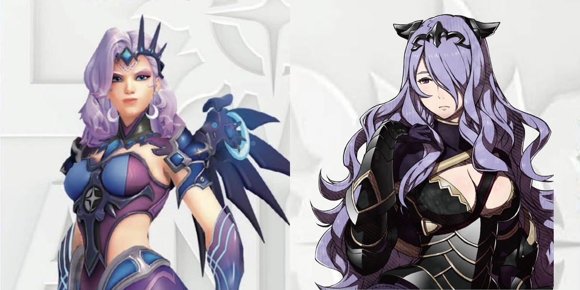
Unlike Camilla’s, her boobs might be all covered, but the shape and color contrast of the chest piece make sure that our attention goes to them first!
So, how is your “doing women better” going, Blizzard?
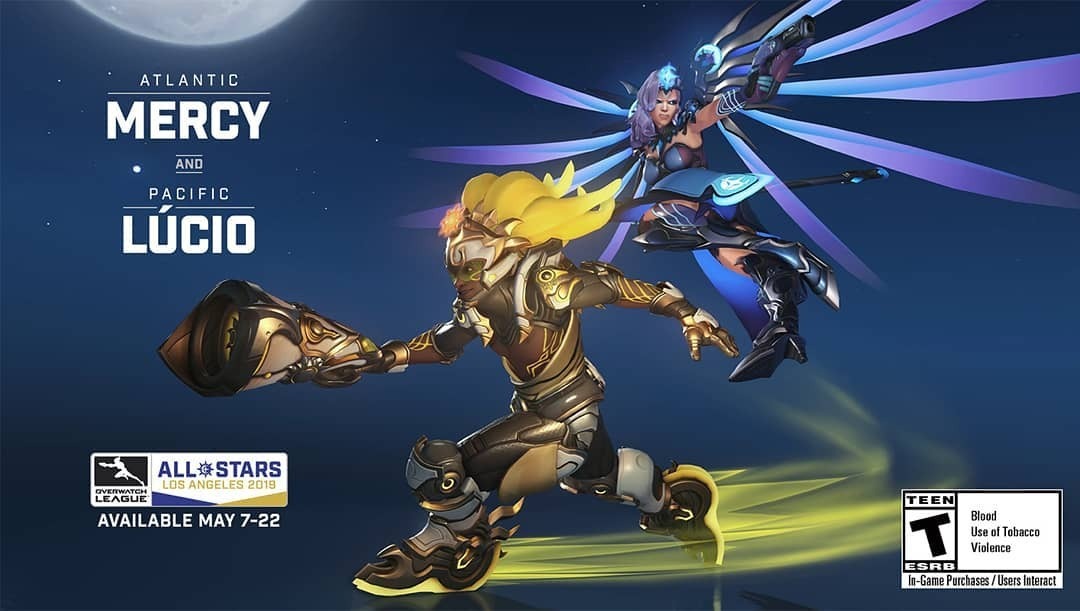
For those curious, here’s what the last season’s All-Star skins looked like:
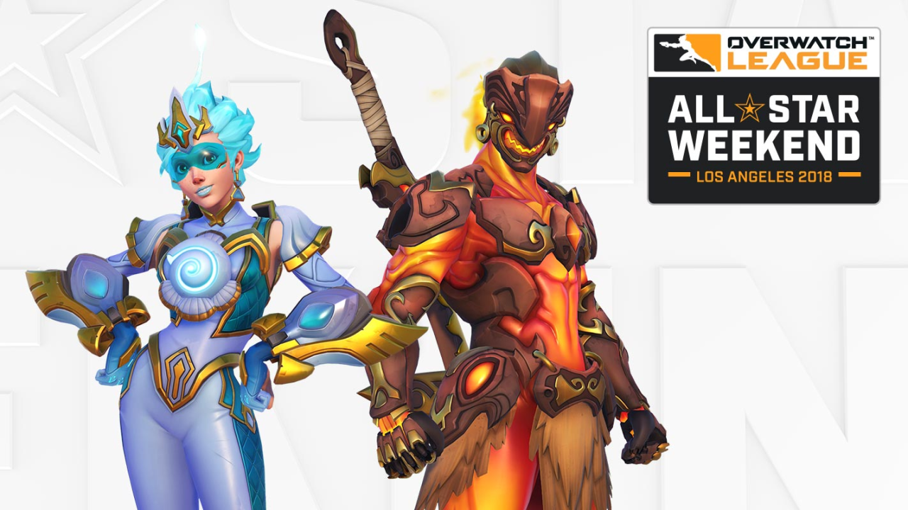
Of course Tracer’s Atlantic costume wasn’t designed all around her tiddies (we know she’s all about that ass)… So, what’s that thong-resembling golden bar for, exactly? ( ͠° ͟ʖ ͡°)
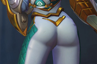
And even then, the weird butt ornamentation wasn’t as egregious as the boobplate on wannabe Camilla…
Also, both the Pacific skins should prooobably reconsider the appropriation of vaguely native Pacific Islander imagery.
~Ozzie
h/t: @amozzarellastick
PS: I discourage looking up fanart of Atlantic Mercy without safe search on, at the very least not while in public.
PPS: A pic I found on a fan forum, very reminiscent of this parody we posted three years ago.
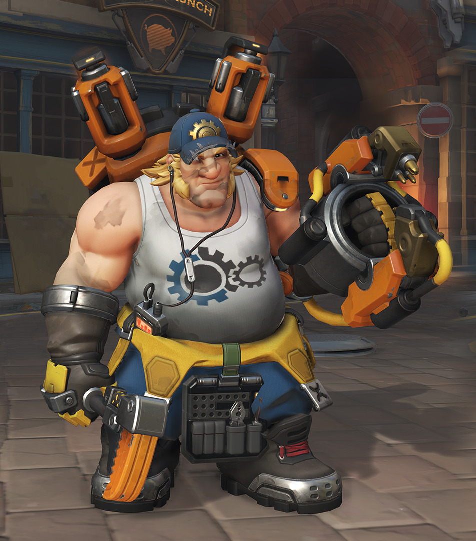

Sexy Overwatch Guys Part 2: Hard Daddy Torbjörn
For our Overwatch man meat week, I decided to empower Torbjörn, whom Blizzard has kind of been ignoring in the sexiness department. I thought this skin was a good start, and gave me some fun elements to work with.
Although as time went on during the stream, I decided that I actually just wanted to make a male character version of this comic (series is NSFW):
So here we are.
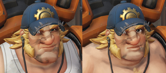
The biggest changes I did are to his face and his now-phallic mechanical accessories. I wanted to make him look like the loving daddy we all want him to be (probably?) so I gave him a more gentle gaze and slightly smaller chin. I also gave him the soft, loving lips he deserved.
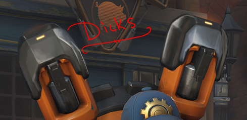
I made him shirtless, added some male-presenting nipples with piercing, and some chest hair. And then I spent an obscene amount of time rendering out some phallic machinery. You might notice the one on the left is much more in-line with the original art style, and that’s cause I ran out of time! As I always do.
I also gave him a bottle of lube in his tool belt (from Google images). I’m surprised the original design didn’t have that, actually, since keeping your equipment lubed is very important.
What was I talking about again?
-Icy
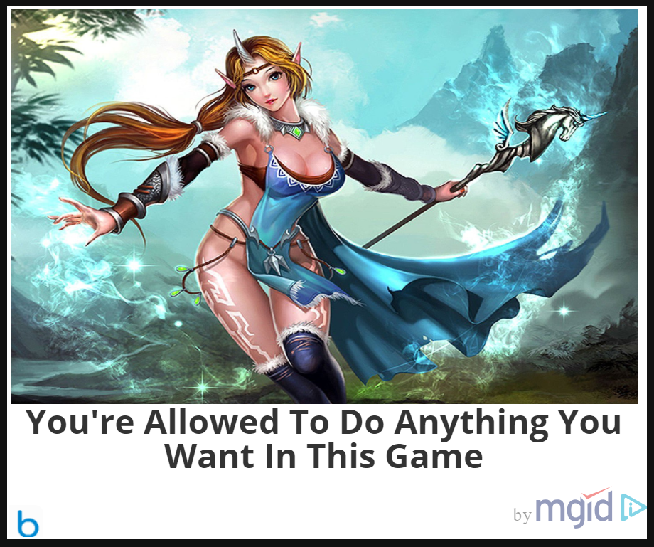

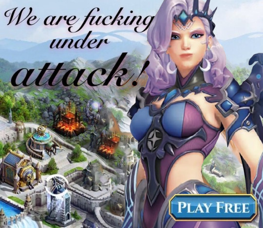
A random game ad I found long ago… somewhere. I don’t really think this deserves any actual credit or research, considering this seems like a generic asset flip-type game web ad, including a cringy, vaguely sexual tagline!
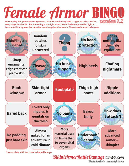
The outfit, though, I think, justified doing a bingo. It’s basically a one big “don’t” in dos and don’ts of costume design.
She’s clearly a magic user, though, why would she need clothes that make any sort of sense or keep her warm? Maximal skin exposure, with complete disregard for functionality and physics, is all that matters!
? </sarcasm>
~Ozzie

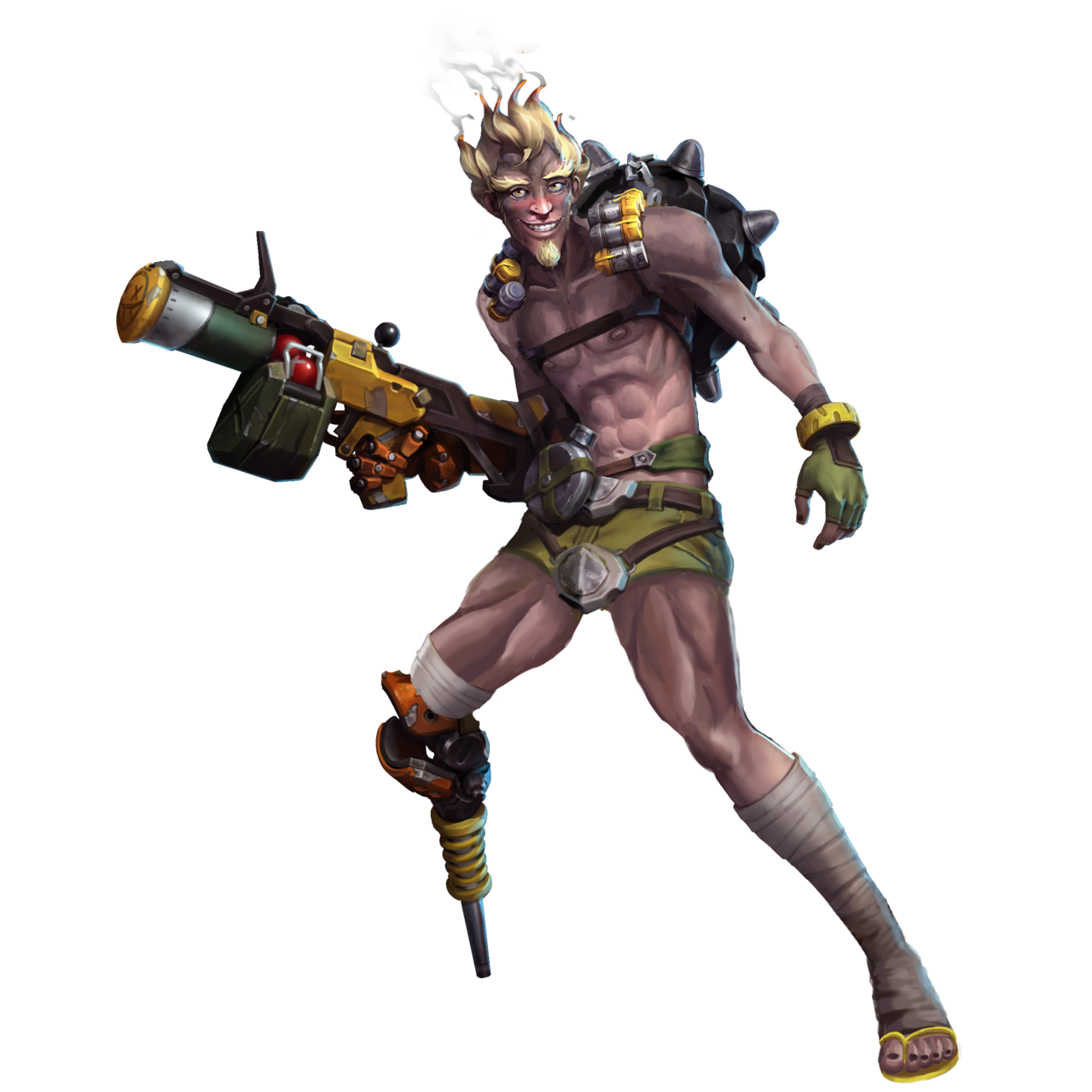
Sexy Overwatch Guys Part 1: Soft Boi Junkrat
Time for a sexy male redesign post and this week it’s prooobably my hunky magnum opus so far: shamelessly stripping Overwatch’s Junkrat of almost anything quirky, fun and interesting about him for the sake of maximizing TEH SEXY.
While he definitely has a cult following among the fandom (have you seen the last week’s reblog?), Junkrat is clearly not designed with sexual/romantic appeal in mind. He’s one of many examples of male characters in the game with pretty extreme appearance and out-there personality. You know, those features which none of the female characters* are allowed to have. So I decided to remedy that and redesign him into a more conventionally attractive boyfriend material. Hope Roadhog doesn’t mind!
Of course the most important part was the face. The sharp jawline, wicked smile, receding hairline and bulging eyes couldn’t stay! With more or less subtle edits I changed them, most importantly giving him a dreamy gaze of a romantic interest. I let him keep his bushy eyebrows, just changed the expression. Also added some attractive facial hair, to soften the face shape.
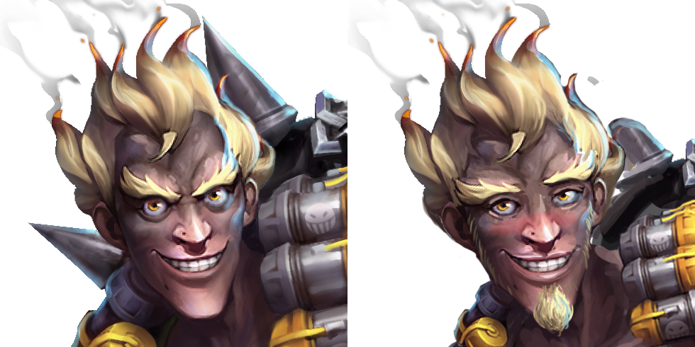
The cherry on top, which I’m pretty sure Icy suggested, was the blushing, which nicely ties everything together.
The body went through some changes too. Most importantly, those shapeless raggy pants are out, making place for short shorts with a codpiece that matches his belt buckle! Now he can show off those amazing muscular thighs that happen to match the newly sculpted abs!
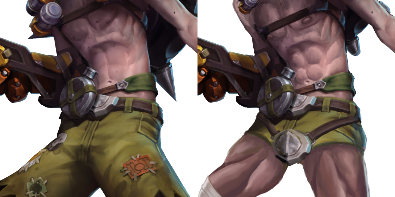
Also, bonus enlarged male-presenting nipples!
Final, less important changes were to his left leg (the position and a stereotypically Australian flip-flop instead of an ugly shoe) and the RIP-Tire on his back, which now instead of being big and sharp is small and soft, matching his new aesthetic.
I kinda regret not repainting his lower half in a boobs-and-butt pose, but otherwise I’m very pleased with the results, especially the expression. Hope now he’ll enter some of our readers’ fantasies… And also Roadhog’s. You’re welcome!
~Ozzie
*Yes, it’s an old is post and doesn’t feature Ana, Sombra, Orisa, Moira, Brigitte and Ashe who were introduced since and who collectively changed little to nothing about the narrow conventional beauty standards in OW’s female design.

One of these things is not like the other~
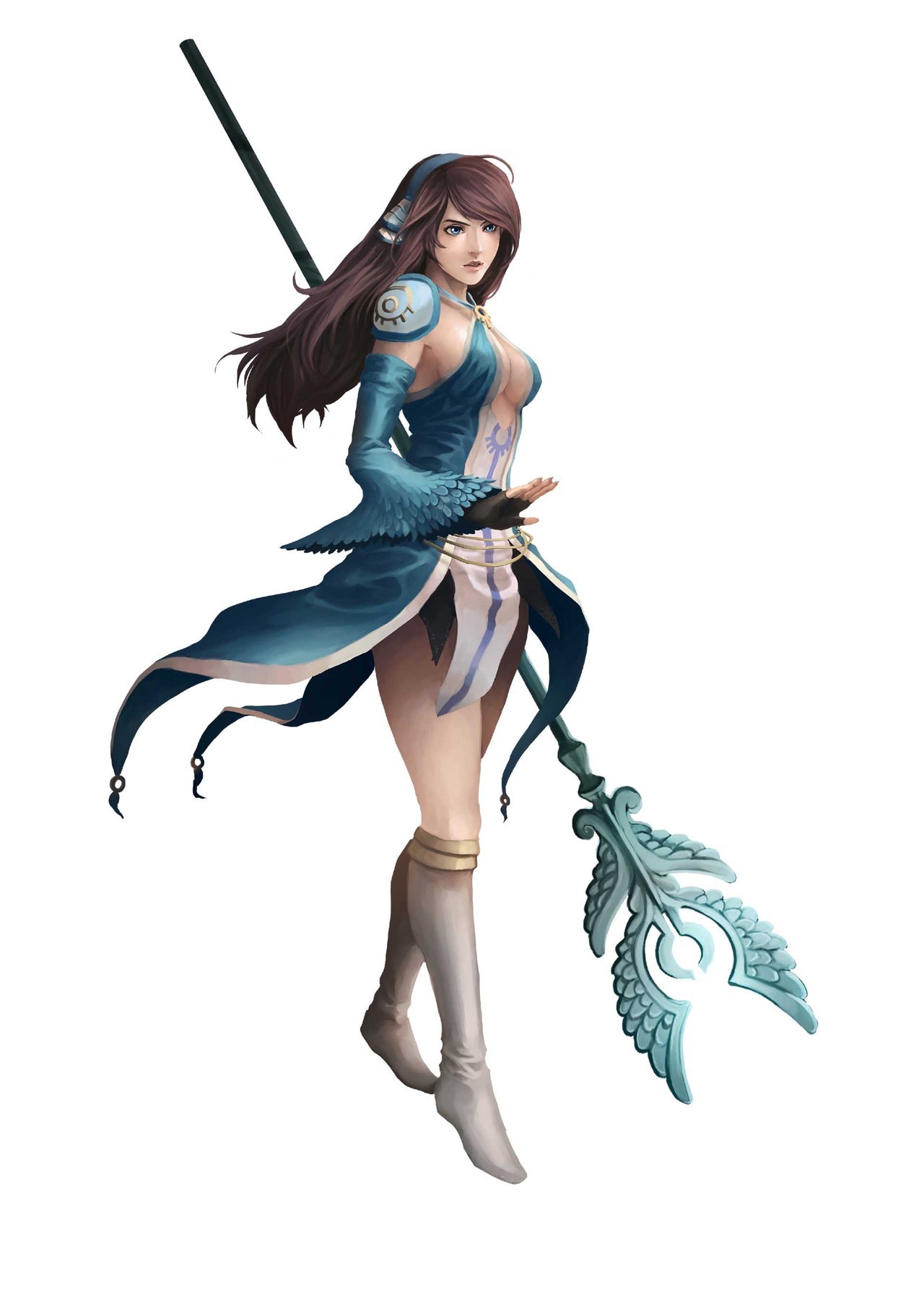
Definitely not a high-scoring design, but it’s still baffling enough that I wanted to showcase it. This is Clery the cleric high priestess from a recently-released JRPG named Azure Saga: Pathfinder (as the logo says).
Besides the lack of pants, or even a skirt really, and the top ripped off from another franchise with Pathfinder in the name… it’s just not cohesive as a design? It isn’t even an aesthetically-pleasing excuse for cleavage.
We seem to have feathers as a motif, but it’s like it got forgotten halfway through. There’s no consistent shapes aside from the (apparently) holy symbol, except then there is a different symbol on her shoulder. And the “how does it attach” square is marked specifically for that pauldron being hot-glued to her skin, presumably. (In her in-game sprite, her sleeve is attached to it and it looks better, even though it still wouldn’t be useful as armor without further support.)
At least she’s not wearing heels, but her boots look like the last thing to be designed, when they had no ideas left.
On a positive note, this might make good livestream material, along with one of the other lady characters in this game:
Oh no, is that a Green Archer Lady??
-Icy
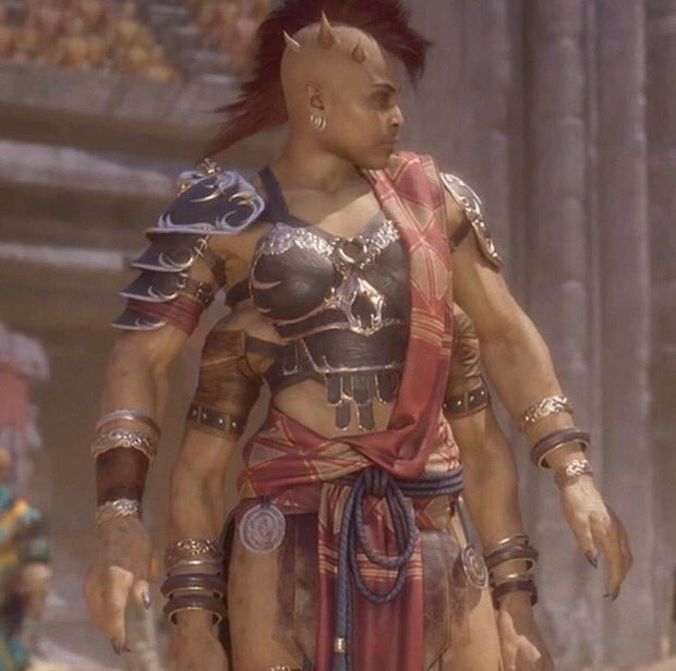
Gamers are blaming socialism for making the women in Mortal Kombat ‘ugly’
Gamers are blaming socialism for making the women in Mortal Kombat ‘ugly’
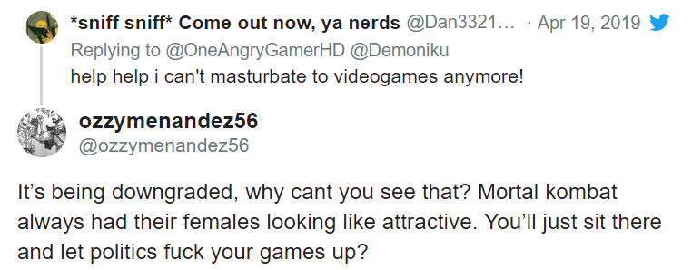
(Article does link to some tweets that, unsurprisingly, contain particularly sexist, racist and islamaphobic statements)
That’s right bros, the Red Menace is back and it’s already taken your fighting fucktoys from Mortal Kombat. Though if you’re wondering how, I’ll save you time – none of them have any theory on the how or why beyond buzzword salad.
If there was ever a moment that highlighted just how much a particular demographic loves to wallow in ignorance and choose literally anything they’ve been led to believe is good for others must be to blame for them not be pandered to literally 24/7.
As the article states itself:
Companies making or localizing games in a way that does not cater to the way a particular (insensitive, misogynistic) audience demands are not engaging in censorship; they are simply marketing to wider audiences. Ironically, the same people who claim to be fighting for free speech in video games are now trying to punish NetherRealm Studios for making a game they’ve deemed offensive. But what they consider “offensive” is reducing a character’s visible cleavage and slightly changing her facial structure.
Ironically, as the article points out – it seems that Netherrealm did make some backsliding in terms of their (minimal) LGBT+ representation.
But to finish on a positive note, finally Sheeva actually looks like a demon warrior who could break you in half:
– wincenworks

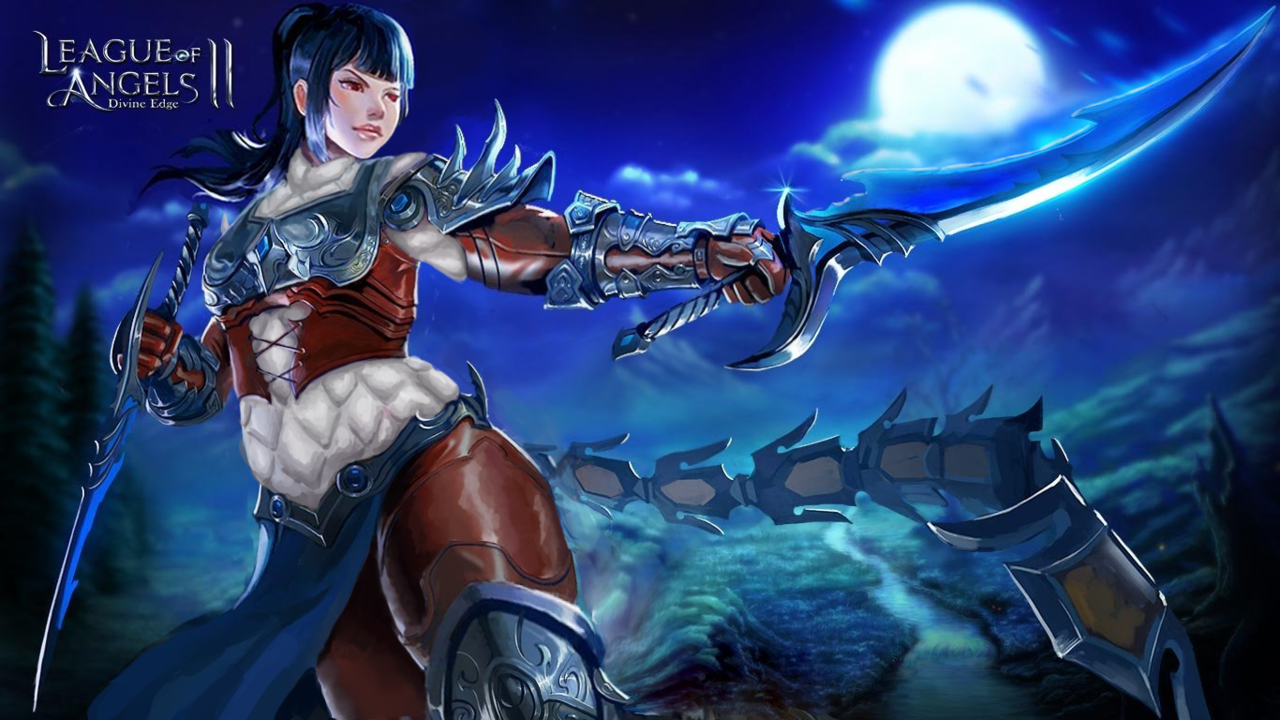
De-failing League of Angels Part 1: Stabby leather lingerie
Apparently we felt like taking a challenge the day we made those edits, because, well, it’s League of Angels, the epitome of creative bankruptcy in video game marketing.
What I decided to redesign was this extra-stabby leather… um… outfit that I bingo’d before.
After the initial shock of how uncomfortable that “armor” must be, the literally biggest thing that caught my attention in this artwork were her thighs. HOW FREAKING HUGE ARE THEY IN PROPORTION TO THE REST OF THE BODY? Unfortunately this seemed mostly like an epic fail at foreshortening rather than an attempt at ‘thicc’ fetish, let alone at earnest fat representation… So I decided to reverse that.
Instead of shrinking the thighs to give her conventionally attractive model proportions, I readjusted the rest of the body to fit them, resulting in a chubbier figure.
Her arms now have some heft and her head isn’t tiny anymore.
Though most important changes went into the torso, which now has a human-sized waist and connects to other body parts at humanly possible angles, instead of those of a Tetris puzzle.
I am very satisfied with what I managed to do with that shameless boobplate. The idea was to still have it be a breast-oriented armor without making it look like two coconut halves with extra-emphasis on cleavage, and while retaining as much of the original’s decorative aesthetic. Basically a more sophisticated attempt at what I did with Regime Wonder Woman waaay back.
I also slightly reshaped the stabby laced leather part under it, because it looked cool enough… just not on bare skin. Speaking of which, of course there was no way I left this poor woman with no padding, so in place of all this pale skin I painted white gambeson, retaining the original color scheme. She also now has full leather pants, because why wouldn’t she?
All in all, I think I managed to improve this image significantly. Not all edits are seamless, but I’m quite proud of the way they came out. How do you guys like it?
~Ozzie
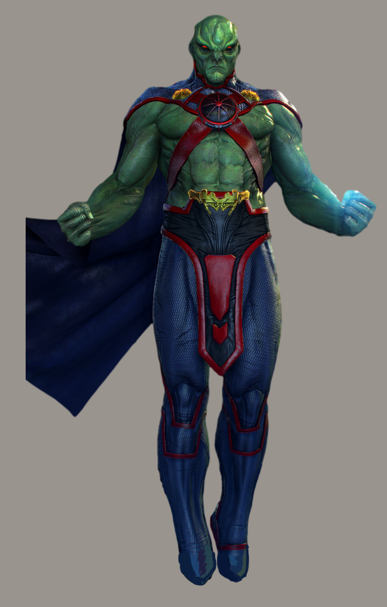

DC Supersexy Boys Part 2 – J’onn J’onzz
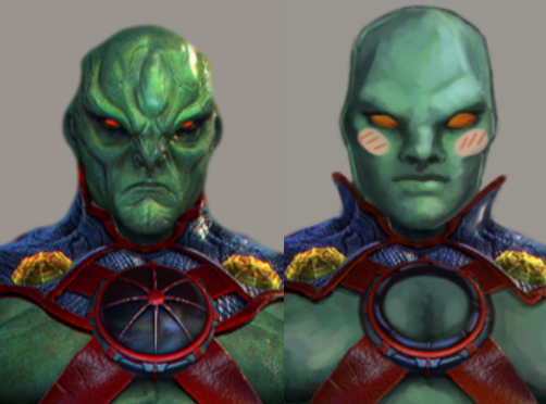
Even though J’onn the Martian is shirtless in Injustice (and other media), I still wanted to redraw him. I’ll admit that he was a childhood crush of mine, back when the animated Justice League was on TV. I was disappointed to see this version of him, which was clearly not designed to appeal to people who liked his soft-spoken nature. So I decided to fix this missed opportunity.
A lot of the changes were textural: I made his skin smoother in a lot of places (decided to go hairless for this one, since he’s a Martian and all), and I actually made his muscles less pronounced. J’onn is a lithe, agile man, after all.
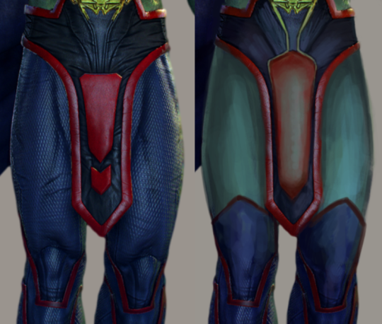
Beyond that, the significant changes were his pants area, and his face. (And of course, the cleavage window that I decided to add last-minute.)
I took away his stifling pants (where are his booty shorts??) and gave him a semi-transparent loincloth, as I’m wont to do. I figured, for this More Mature J’onn, maybe he wants to know what it’s like to have hanging bits? That’s what being more “mature” and “realistic” means, right?
As for his face, I wanted to recapture that animated Justice League look. I got rid of his cartoony Scowl of Doom, and instead gave him smooth, pleasant features. I decided to give him a cute blush at the last minute, too. Even Martians blush.
I do hope that other J’onn fans enjoy this redesign as much as I enjoyed working on it.
-Icy