Powdered Shit Brown Dust Brave Nine, Part 1: Frellea 

Speaking of Brown D… I mean Brave Nine, whatever the changes to the game’s name, story and character roster, it still remains a confusing mess, seemingly made only for the sake of its exploitative waifu art. So of course I proposed to Icy that we stream redesigns from it! We’re definitely alright after staring at them for hours ? 

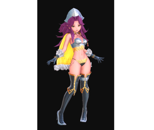
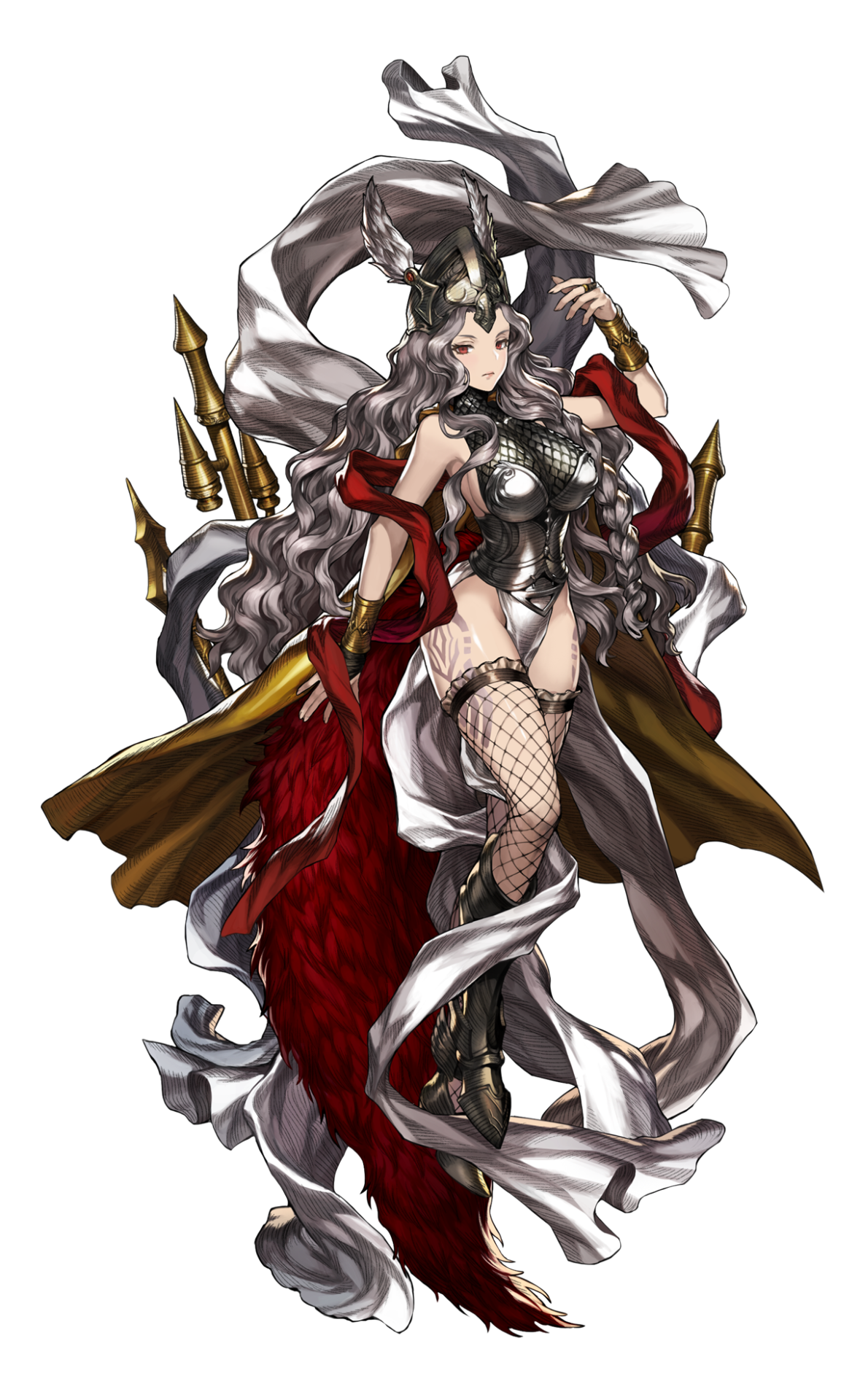
This character is Frellea, older sister to the backstory comic’s protagonist demigoddess Eda and, I guess, from how well-endowed she is, a very powerful deity. I think, judging by character names (is Frellea a corrupted take on Freya?), they’re Norse mythology-inspired, like Odin’s Sphere’s butt-wing Valkyrie
And of course, literally nothing else about the designs communicates that. 

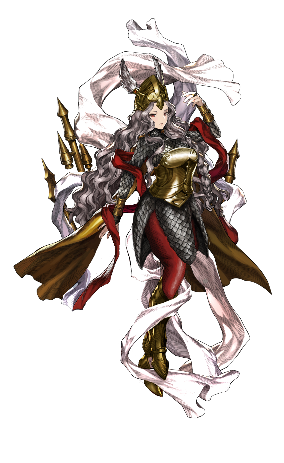
It was SO HARD to decide what should take priority in fixing this mess, but the mix of boobplate and scalemail boobsocks went first. I reshaped her breastplate into something plausible and decided to extend the scalemail into a long-sleeved tunic (though that one’s tight fit is mostly my artistic license). 
image

Next step was to tidy up the messy design composition, including the color scheme. Both me and Icy concluded those huge feathery… trains? tails? were purely decorative, so we got rid of them. 
I decided to balance out the contrast by making that ribbon white (instead of the shade shade of grey as her hair), reusing redness of the other ribbon (and the feathers) on new pants and, most of all, recoloring her non-mail armor to brass color of her bracers.* 

Easily one of my favorite redesigns, but also one of the most work-intensive ones, too. Hope you enjoy it!

~Ozzie 

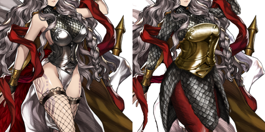
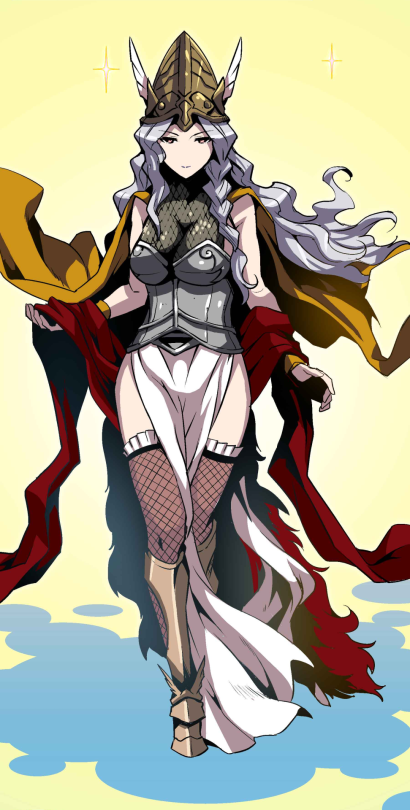
PS: *In the comic the helmet and greaves are slightly different metal shade from the rest of armor, so it seems like different artists couldn’t agree on the color. Pic below, for the interested. 
image

image

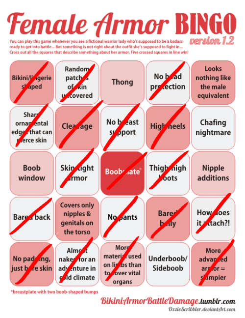
@thegreqtlilac​ submitted (and Ozzie bingo’d):

To be completely honest, Summoners War probably has way worse cases of terrible female armor if you go through their monster collection, but what’s worse about this one is that she is the reward for getting through the second scenario area of the game, which means EVERYONE has her, so you have to see this monstrosity all the time. 
I always feel so weird about the clash of chibi AND “sexy” aesthetic. Trying to have a cake and eat it too.
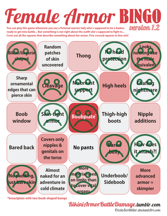
There’s really not much to add about the costume itself, other than this being too painfully generic to even register. BUT it did strike a rare diagonal bingo, so congrats to Summoners War, I guess?
I am sorry for all the players who are subjected to multiple copies of this running around inside the game. 

Thank you for the submission! 

~Ozzie

earth-to-dragons submitted (and Icy bingo’d):

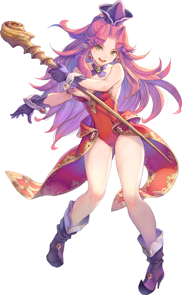
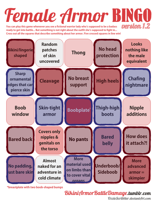
Could you guys cover something about Angela in the new Trials of Mana game? Ive been playing it but its honestly difficult just because every time I look at her outfits it makes less sense! Although I dont think Riesz is any better…

A spell-caster lady in a video game who dresses for the beach? It’s more likely than you think! This is from the recent remake, where you would think the developers would want to modernize their designs. 

You would think.

The red is her original outfit (pictured above the bingo), which is apparently the outfit a magician from a cold country wears (even though it’s in magical spring, but it’s still described as cold). The blue are added in from her worst class option… the magus.

image

Why have nice things when you can cry over the sympathy pains of imagining scale mail on your crotch?

-Icy

Shard Mortal Trespasser 

@the-midnight-doe submitted (and Ozzie bingo’d):

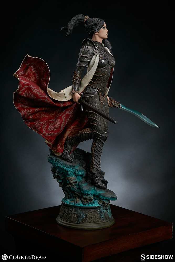
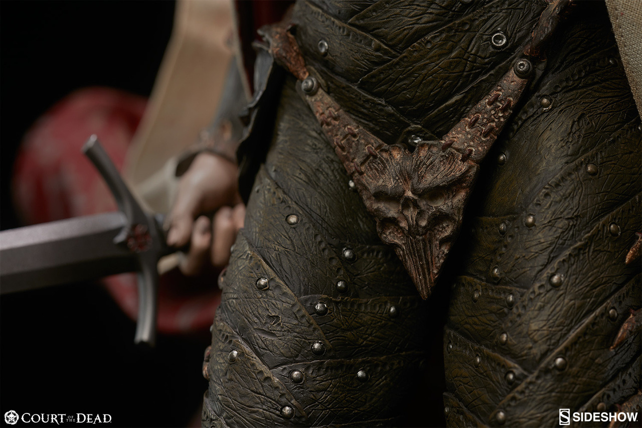
Here’s a good example of how “fully armored” doesn’t mean a thing if said armor is still sexualized: this is Shard, Sideshow Collectible’s original character from their ongoing series “Court of the Dead”. The series already has plenty of questionable designs, but Shard here really stands out due to her backstory: she’s a mortal knight Templar that somehow wound up in the Underworld, whose inhabitants then made her armor for her. Highlights include the absolutely bizarre crotch plate (hard to tell if it’s a thong as the cape blocks the back view,) the insignia on her chest that just winds up looking like a literal “stab here” sign, and interesting footwear. It’s a shame, too, because her backstory sounds really interesting and the Court of the Dead series has some pretty beautiful dolls, but also has a metal bony groping hands bra because reasons.

Oh goodie, Sideshow Toys figures, we meet again! ? And this time you guys don’t even have the excuse of adapting someone else’s sexist design – it’s your own all original creation! 

Obviously the bingo score isn’t very high, and I stretched definition of “male equivalent” to “all male-presenting characters in the series”. However, while not bikini-shaped or skimpy, impossibly skin-tight armor is still a staple of BABD content.
The fact that metal gives no additional girth to any part of her body made me confident in marking off the “No padding, just bare skin.” square, despite no bare skin at display.

And no, the “fine bone filaments of this protective encasement were woven around her form by the osteomancers and artisans of the dead” Thermian argument doesn’t excuse the sexualized design one bit. 

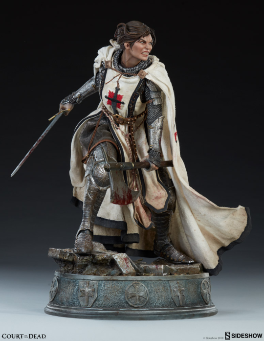
Saddest part is that this is what she looked like in her backstory

image

This is so much more interesting in every way: costume, posing, expression, even painting detail. Textbook positive example. What a downgrade! 

Thank you for the submission, @the-midnight-doe! Hope you don’t mind me bolding part I found most telling about Shard’s problem. 

Considering how other female Court of the Dead characters look, we’re likely to revisit the property, with bingos and/or redesigns, later. 

~Ozzie 

image

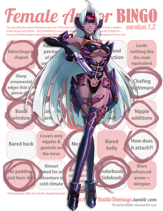
Remember that time looong ago when we commented on Kos-Mos from Xenosaga? The gynoid who needs her boobs exposed to use her ultimate energy blast attack

image

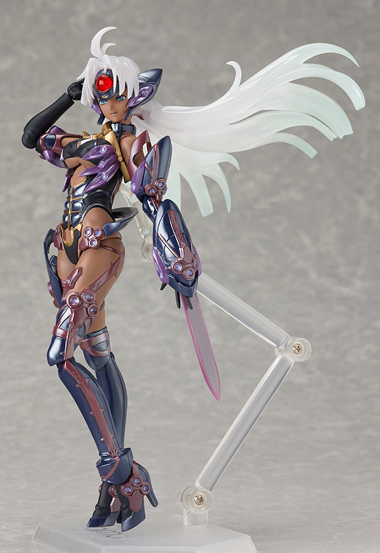
Ever wondered if that game could do female robot design any worse? THEN YOU’RE IN LUCK! The bingo today is T-elos, who seems to be some sort of darker (and even more underbooby) counterpart/nemesis to her.
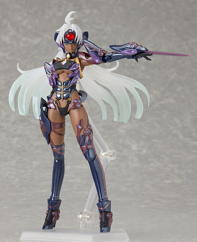
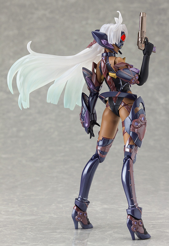
When I found pics of T-elos Figma action figure (so we’re provided with 3D view from all angles), I couldn’t not put it on the to-bingo list.

Bonus racism points for having the robot lady with “a more malevolent personality” (literal quote from game’s Wiki) have darker skin and more revealing costume

~Ozzie 

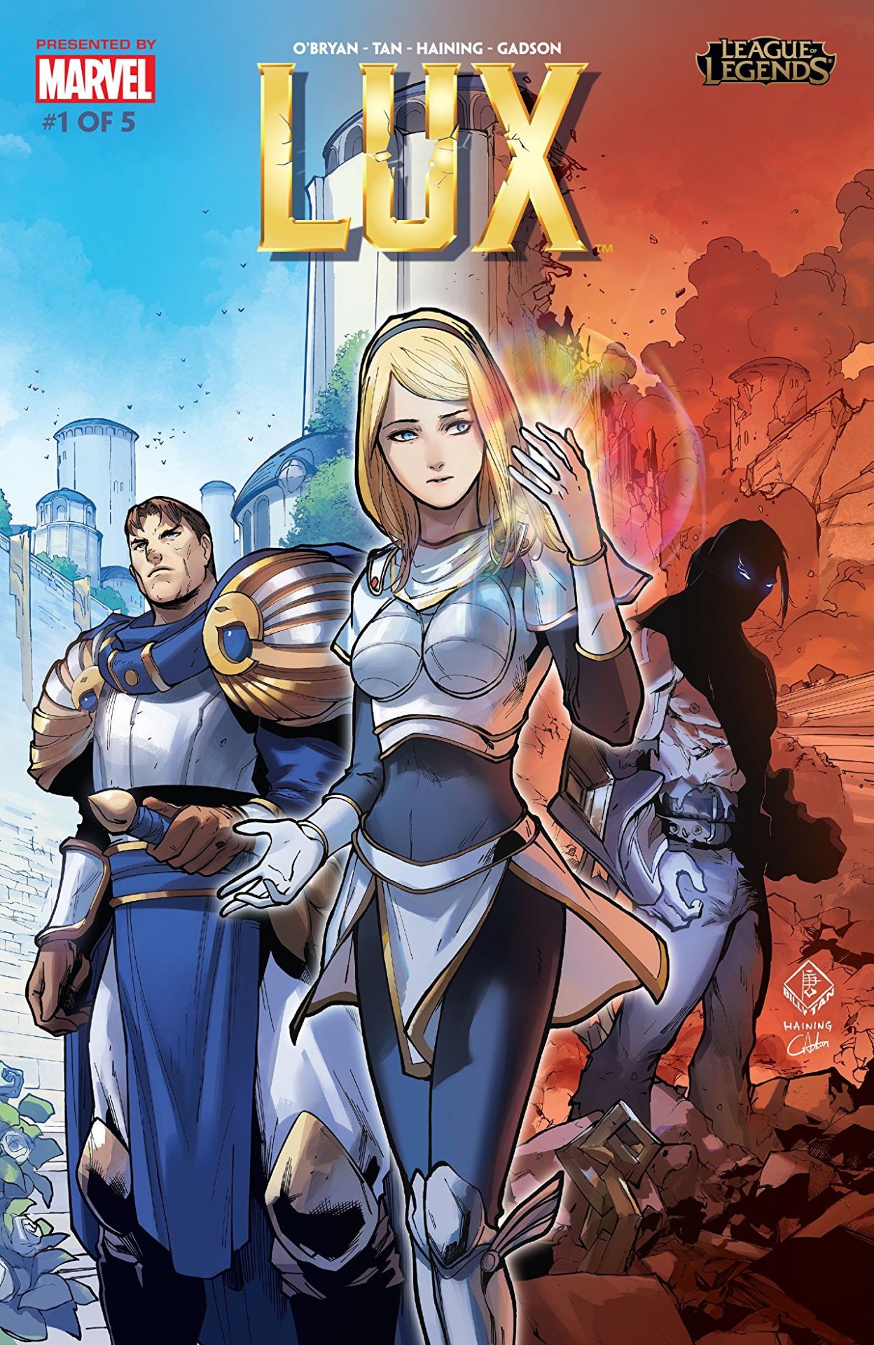
So, recently League of Legends decided to release this origin story for Lux, which has really helped showcase how terrible her design is in comparison to that of… well the rest of her culture.  Right off the cover makes it look like she’s the princess to be rescued, not the heroine to reach her potential. 

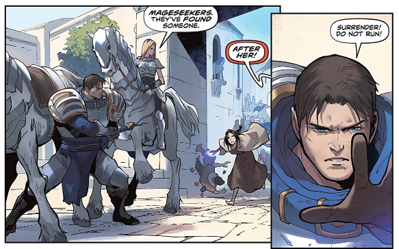
The best thing that can be said about this comic is that they’re depicting her within the society she supposedly came from: it’s now well illustrated how tacky and impeding that shitty boobplate would be.

image

If it wasn’t for the title, you’d assume this was actually a story where Garen was the hero for baby sitting a generic damsel in distress… Which is kind of horrifying when you realize Lux has been in the game for eight years, and somehow fixing her design or evolving her default into something better has never occurred to the folks in charge. 

– wincenworks 

The design process for this definitely not sexualized, because not skimpy (?) “armor”: 

  1. Draw a naked chick, make sure her (obviously nipple-less) breasts have an amazingly implausible shape.
  2. Add the tiniest hint of texture (and little to no volume) on parts that you think might need to pass as armored (hence the boobplate).
  3. Loincloth/buttflap for modesty.
  4. Literally everything else: fill in with non-flesh colors!
  5. Profit?????

~Ozzie 

Simplifying the Diablo Ladies, Part 2 

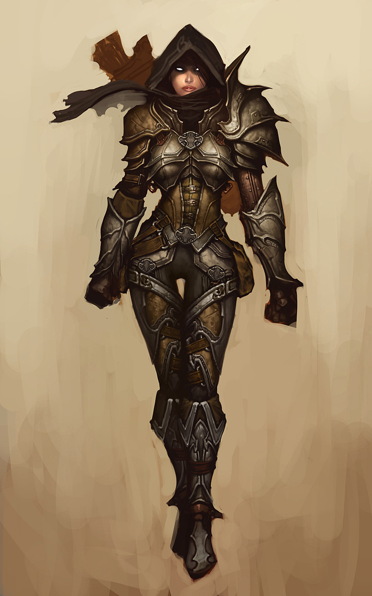
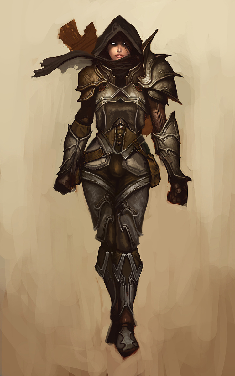
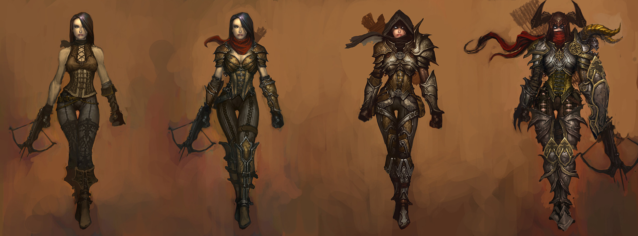
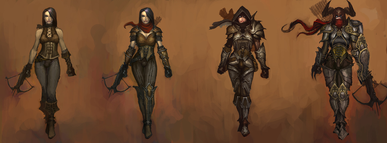
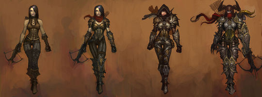
Demon Hunter from Diablo 3 was… a challenge, to say the least. Mainly because I couldn’t decide where to even start with that ridiculousness!
Not only is she super sexualized via the enforced “feminine” silhouette of skin-tight armor, boobplate and giant thigh gap, including a cameltoe… she’s also the most overdesigned thing I ever tried my Photoshop skill on. 

Apparently to work as an artist at Blizzard, you have to willfully forget the most basic rule any design school worth its salt teaches: Less is more
For concept art of what would ultimately be a small character model in-game, all those pieces have SO. MUCH. NEEDLESS. DETAIL! Teeny tiny little shapes of distracting ornamentation, basically nothing to rest your eye upon. 

I feel really sorry for anyone who ever attempted cosplaying this shitshow – so much work added into recreating all those arbitrary seams, textures and spikes, sheesh. 

image

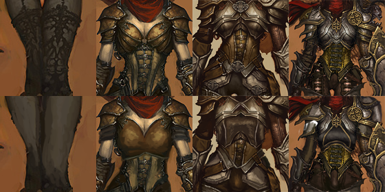
I was so busy simplifying the shape language that I overlooked some stuff I do pretty routinely, like getting rid of the cleavage in the first and second levels, and modifying the hourglass silhouette (I did add some bulk in higher levels, just not much). 

Preparation for posting this redesign is why I threw back this post lately (also, you know, it’s just a good post to resurface) – because those level ups convey neither a better set of armor, nor more protective layers, except for pauldrons. The shape of her boobs and thin waist remain a constant, no matter how much more “armored up” she’s supposed to be.

Like with Ashe before, I decided that my version is a trans lady, with a noticeable crotch bulge

in the place of the creepy thigh gap. Though I discarded my initial gag related to its size, as it was just in poor taste and not my joke to make. 

Overall, this thing took two or three weeks to finish (last level seemed unsalvagable at first), but hopefully I managed to put some actual design thought into this hot mess.

~Ozzie

Gamasutra: Anna Jenelius’s Blog – Armor for Dummies and/or Game Developers

Gamasutra: Anna Jenelius’s Blog – Armor for Dummies and/or Game Developers

bikiniarmorbattledamage:

A handy armor design 101 for games (but works for other visual media as well). It approaches a lot of tropes we often discuss, like the importance of covering vital body parts or the absurdity of adding boobplates and high heels to female armor.

I especially like how the article handles the double standard in gendered armor silhouettes, a subject we alluded to before a few times, but didn’t have opportunity to talk in depth about. Thus, here’s an excerpt:

Tight armor and layers

image

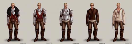
Looking at the Demon Hunter (Diablo III, Blizzard Etertainment, 2012) above, you will notice that while her shoulder pads and scarf increase in size with her armor level, her waistline does not. In this case, it looks like she keeps wearing only some sort of leather corset to protect her stomach, while strapping on enough excess metal on the rest of her body to build a spare suit of armor. Honestly, I would have advised her to trade the sexy female silhouette for actual protection. This would mean adding for example a gambeson and maybe also a mail under the harness, which would make her waistline several inches thicker.

image

[source]

[…] While you would most likely want the layer that looks like leather here to be padded to soften incoming blows, and the harness probably is too tight to actually move around in, it shows quite well how layers are put upon layers in heavy armor. This sadly means that you’ll have to choose between looking like an hourglass and surviving while fighting.

Bolding mine.

Thanks to storiesfromthevoices for directing that link at us!

So yeah, that’s also why we don’t settle on announcing any outfit “good” just because it covers more skin than a bikini. You can’t just paint a skin-hugging suit silver, label it “armor” and call it a day. Armor design doesn’t work like that.

~Ozzie

more on why padding is crucial in armor designmore on armor design | more reference | more resources

This week we’re bringing back the nice little guide to armor design for fiction, with special emphasis on double standard in portrayals of layering in male and female armored characters. 

~Ozzie 

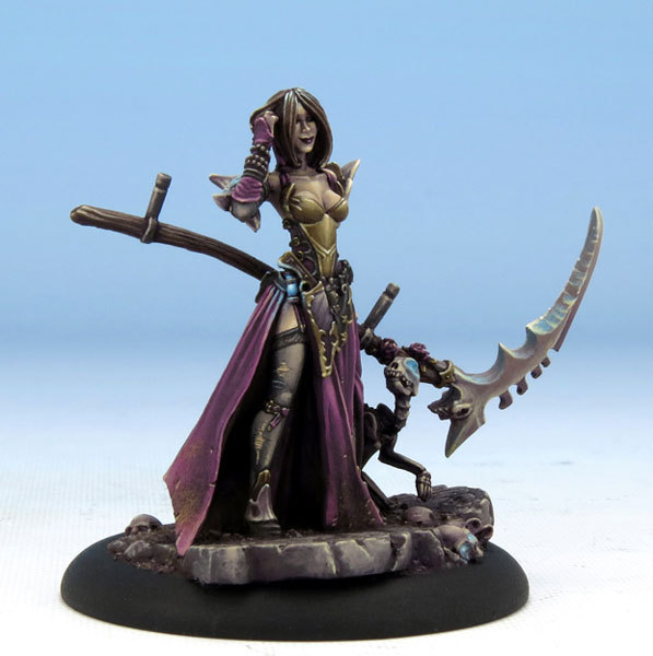
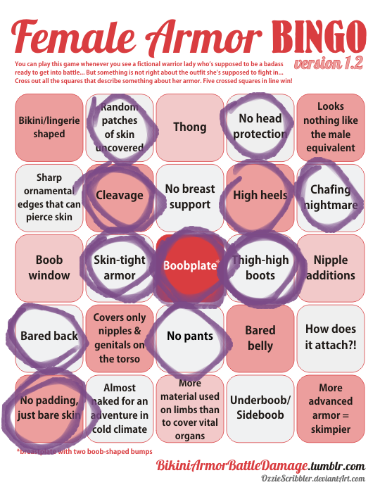
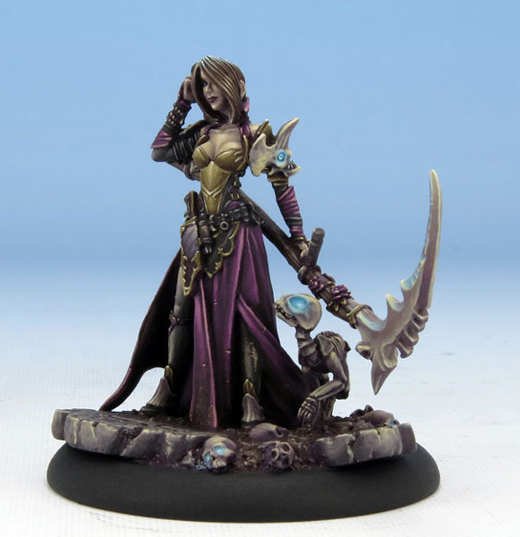
Since one of our latest stream redesigns was of some Dark Sword miniatures (including the return of butt-window lizard lady), we considered a couple more characters to fix, including this here Jen – Harvester of Souls, lady necromancer with serious boobplate problem. 

I like me some goth characters with perky attitude (that smile is adorable!), and Jen was actually based on the woman who did this miniature’s paint job, but wow is that costume some generic fantasy garbage, scoring some typical bingo points without hitting a single row. 

Obviously not the worst we’ve seen, just disappointingly uncreative.

~Ozzie