Zenescope – Sweater Edition Part 1

Right around Halloween last year we decided to fix up some poor Zenescope comic heroines with Autumn-appropriate sweaters, similarly as we did with Applibot ladies before

Wicked Witch of the West 

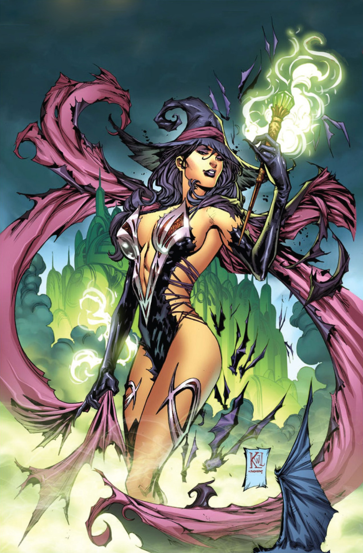
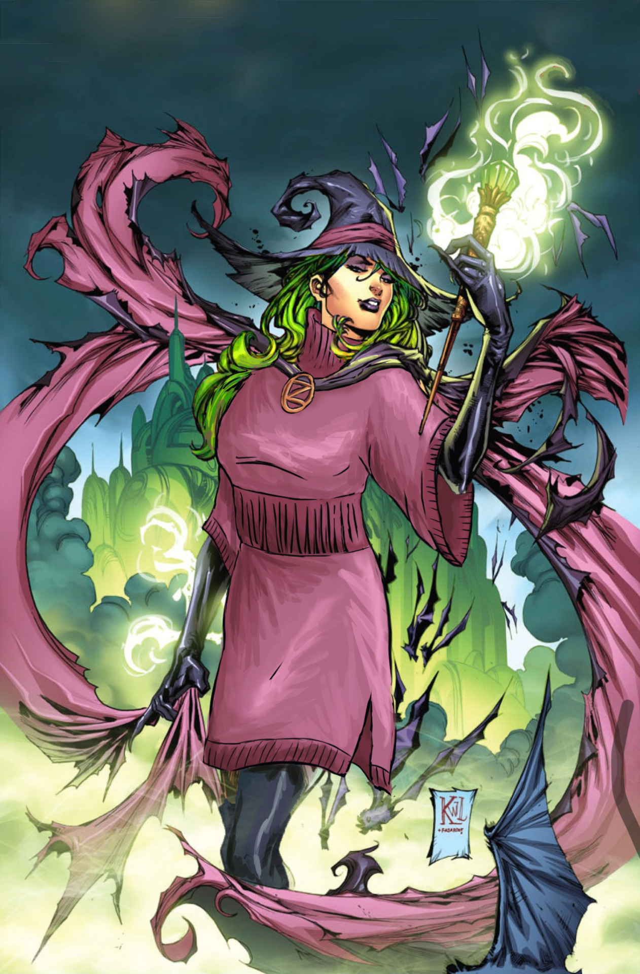
In case this wasn’t clear from this old bingo, we hate what Zenescope’s Grimm Fairy Tales franchise did to Oz characters, especially the Wicked Witch of the West. Attempts at reinventing this villainess since the 1939 movie were hit and miss (mostly miss), but this one is easily the laziest and most insulting one. 

What the hell was the thought process behind the outfit is beyond human or Munchkin comprehension. I refuse to believe that evil magic is what keeps this thing on her body. It’s just too nonsensical.
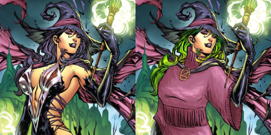
Thankfully, with the sweater theme I didn’t have to reinvent the costume from scratch, just throw something comfy on top. I went with a loose turtleneck tunic, matching in color the inside of her cape and her hat’s detailing. I didn’t fix anything about her pose, but she did get pants/tights that match her gloves.

Thing I noticed rather soon was that after covering all the gratuitous flesh she became a blob in various shapes of purple, especially since her hair blended with the hat and cape. I figured that if her skin isn’t supposed to be green, then at least her hair can be, both for contrast and to match the overall image’s composition better. 
image

I didn’t remember it while editing, but other images of the Witch we had on the blog actually did sport very dark green hair, along with sickly pale greyish skin. Whoever changed the color scheme for that particular cover made a mistake and stripped the character of the last bit of distinctness. 

Very casual redesign overall, and while much less detailed than the rest of the image, I’m rather happy with the improved color scheme and the shading I did to match the cape. Hope you like it too.

~Ozzie 
Mortal Kombat Post-11 Sexy Fix, Part 2

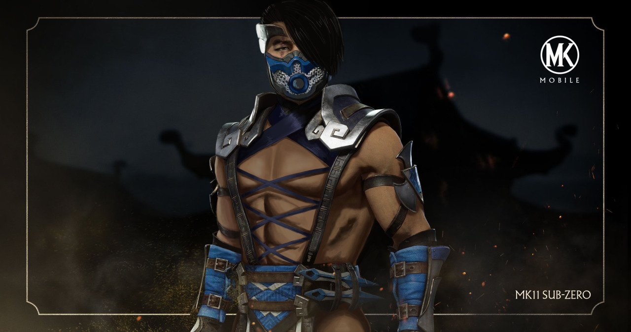
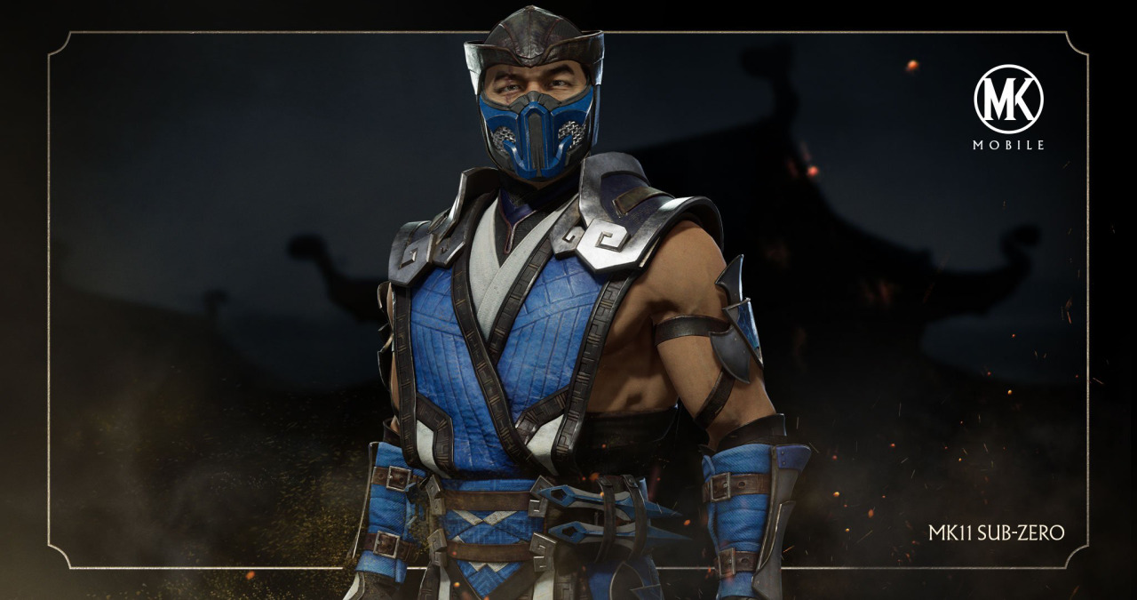
Sub-Zero, the Blue PecNinja

As my name might imply (it’s subtle, I know), I love me some icy bois. And who better to give an empowered cold-weather outfit than Sub-Zero himself!

Basically, I just used what he already had on, except I took away…. most of it. He looks so much more comfortable now though. I did take some inspiration from MK9, for that corset look. Of course, Sub-Zero is a bit more conservative in his dress than Scorpion, so he covers his nips.

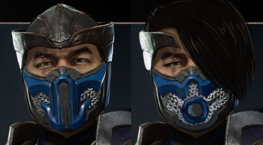
I also changed his mask, face, and hair. The mask I made more sensual, so that people he’s fighting are distracted no matter if they look at his Hot Bod, or his face. I also removed his face wrinkles, because we can’t have men be wrinkly. Gross. And I let his hair down to give him that mysterious look. I can just see his entrance being like, flipping his bangs and flexing his pecs, with little snowflakes popping out from the cleavage. ???

At the time we streamed this, I couldn’t find a good full-body picture of him, so I had to do with this hips-up one. I did take his pants away, and gave him a bubble butt, but feel free to add your ideas for what he’d wear on his leggies.

-Icy

Mortal Kombat Post-11 Sexy Fix, Part 1

Since “real fansdemanded for  Mortal Kombat 11 to bring back the sexyness, we decided to succumb to the demands and fix some disappointingly unsexy characters.
If women in martial arts games are titninjas, it only stands to reason that male equivalent is a pecninja, right? 

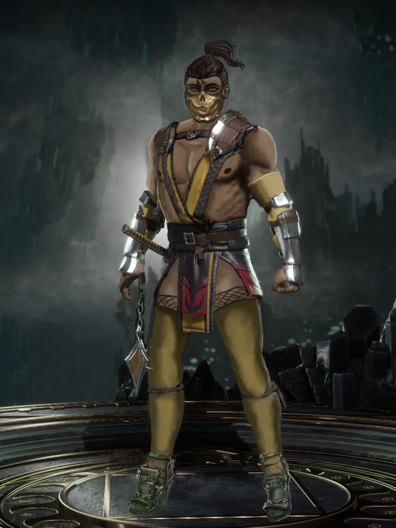
Scorpion the Yellow Pecninja 

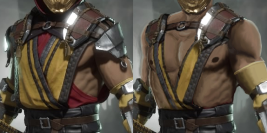
This design was surprisingly generous in showing us his oblique muscles and a tasteful sideboob sidepeck, so I had something to work of off! I reduced the top only to two strips of cloth forming a V and definitely-not-useless pauldrons that don’t even reach his lovingly rendered biceps now. And, of course, the male-presenting nipples clearly on display! 

image

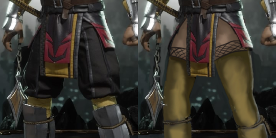
Since I went for the aesthetic that female characters sported for the last couple MK games, he ended up with long, laced stockings and arm warmers. Also obligatory zero pants. 

image

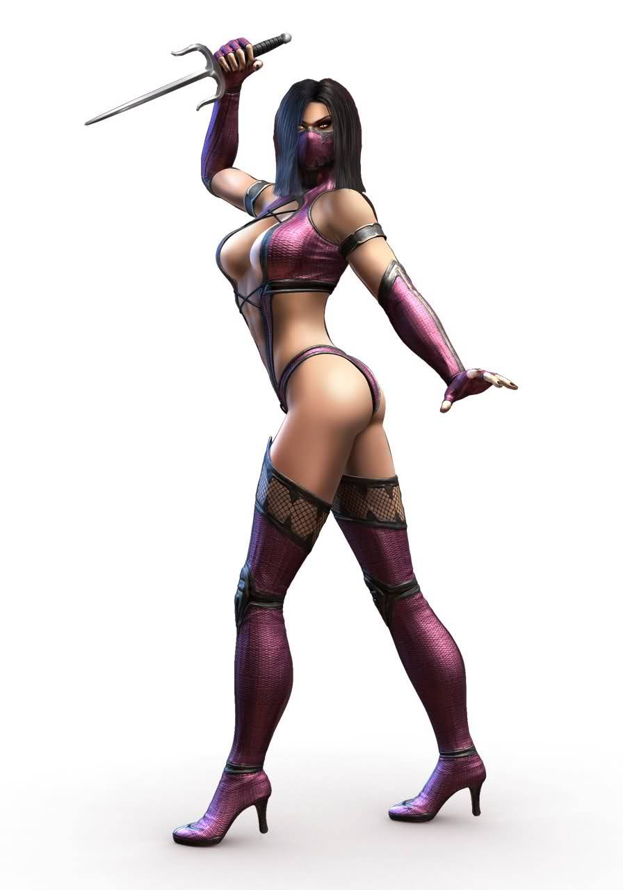
The shoes are stolen from this edgelordy Mileena concept art from MKX, which we bingo’d before

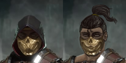
The last fix was, of course, giving Scorpion an attractive face. Since the hood concealed most of his head, the look had to be redone from scratch. I went with Icy’s suggestion of stylish wolf’s tail as a hairstyle and paired it up with bold eye makeup, to give him a striking gaze. 

image

I’m quite happy with the result and how much of his original costume’s silhouette and color scheme I managed to preserve. 

Let’s hope this satisfies the boner culture ? 

~Ozzie

See also: Havik, the Pink Pecninja by @judgmentfist

Mortal Kombat Pre-11 Fix, Part 2

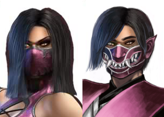
Mileena, the Pink Titninja

Welp, I struggled with this one. This is Mileena, an evil (?) clone of Kitana, a princess of some place, which was then conquered and absorbed into another place, and thus adopted by the warmonger who conquered her initial homeland, becoming the princess of the imperialist land. Was that confusing? Don’t worry about it, it doesn’t play into either of the ladies’ designs in MK9.

The main takeaway is that, because of the cloning thing, she has monster teeth, hence the mask. That’s about all the “personality” we get out of this particular design.

Step 0 for this stream was to fix her poor spine, which is why her legs are shorter in the redraw.

For the actual redesign, I decided to take inspiration from MK11′s male designs, and use references of samurai and, later, ninja. I also thought it would be cool to give her an oni mask, as an act of rebellion. Like, she hides her scary teeth because “she has to,” but it’s with a mask that has the same teeth on it. (I also changed her face a bit, and took her eyeshadow away.)

I tried to give her slightly more variation in her (awful) color scheme, too. I made black the main color, with pink and white as accents. I gave her a combination samurai/ninja outfit, cause she seems like the “strike from the shadows” type, from what I read about her backstory. I initially had different ideas, but we all know by now how well those work out.

Overall, I’m pretty happy with it. I inserted the white shirt to break up the black shaped, but I’m still not a huge fan of how it looks. And yet, I feel like I put more thought and effort into my concept than the original artist.

-Icy

PS – The lack of shading in the black of the outfit is on purpose.

Mortal Kombat Pre-11 Fix, Part 1

This particular stream was inspired by the fact that Mortal Kombat waited until game 11 to take even a step back from portraying its women as progressively draftier titninjas.
We concluded that while we generally enjoy the official fixes many female characters got in MK11, we could look into the worst designs from earlier games and put our own spin on them. 

Skarlet, the Red Titninja 

content warning: blood mention 

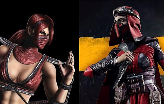
Since all MK ninja ladies are color-coded, of course the red one turned out to be a vampire master of blood magic. And, of course, when you mention anything about her original outfit design, the furious fappers Capital G Gamers would insist that her skin needs to be exposed, so that she can absorb blood of her defeated enemies through her skin, for power. Very valid, totally not contrived reason for oversexualized costume! Poor MK11!Skarlet, she will starve!

image

[sidenote: googling for image comparison of the two designs without coming across anti-SJW whining and islamophobic memes is downright impossible

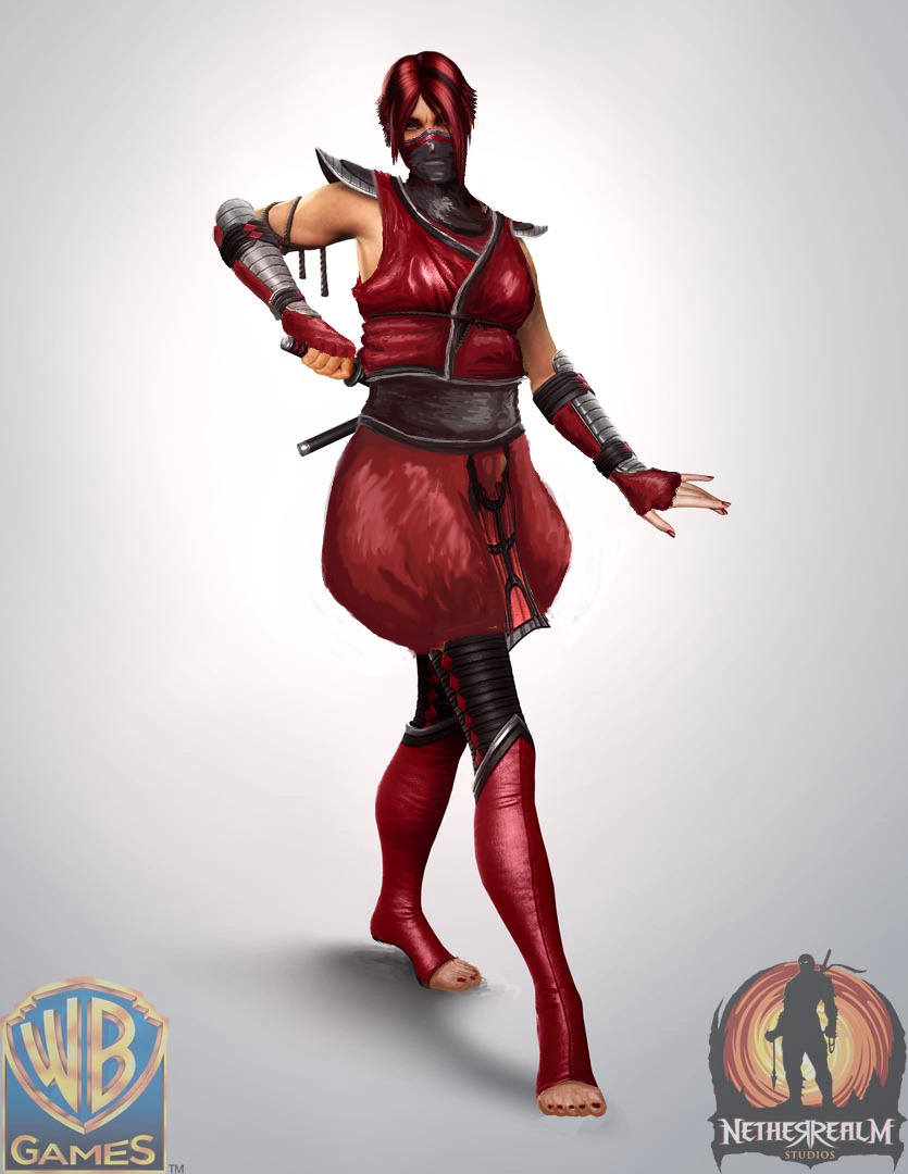
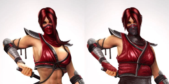
So, on to my own fix of MK9!Skarlet. Her original aesthetic was basically just “tiddy and ass out, with random ninja bits”, so I tried committing better to the ninja aesthetic. Plus much poofier pants, to stay on brand ? 

Extending her top made it blend in with facial covering and with her red hair, so I had to reverse the mask’s colors for proper contrast. It looks so much better in dark gray.
Pro tip: bare skin shouldn’t substitute for color and shape breaks in costume design. 

image

I don’t even know why someone thought that wearing arm guards straight on bare skin was a good look. Adding long fingerless gloves under them makes both for practical padding and matches the shoes, especially after I converted them from knee-reaching high heels into toeless stockings. 

Other minor fixes: short hair, so that ponytail doesn’t get in the way, torso girth that would fit internal organs inside, a hint of red tint in her eye. 

Also, while you can’t see her kunai arsenal anymore, I assure you she’s no longer storing unsheathed sharp knives in a way that stabs her leg. That would be dangerous even if ninjas didn’t dip their blades in poison and/or excrement! ? 

I am really proud of the color- and shape-breaking in this design. I think it’s as decent job as could be done without completely rehashing her look, like MK11 did. One of my rougher fixes, painting technique-wise, but it has some aesthetic appeal. Hope you enjoy it too!

~Ozzie

Dragalia Lost Some Clothes, Part 2 

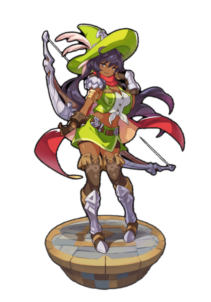
While Icy took on a character with obviously exotified outfit, I picked one whose sexualization was prooobably not meant to relate to racial coding. Her name is Malora… and judging by her clothes, she’s cowgirl mage? ¯_(ツ)_/¯ 

She just looks bad. 

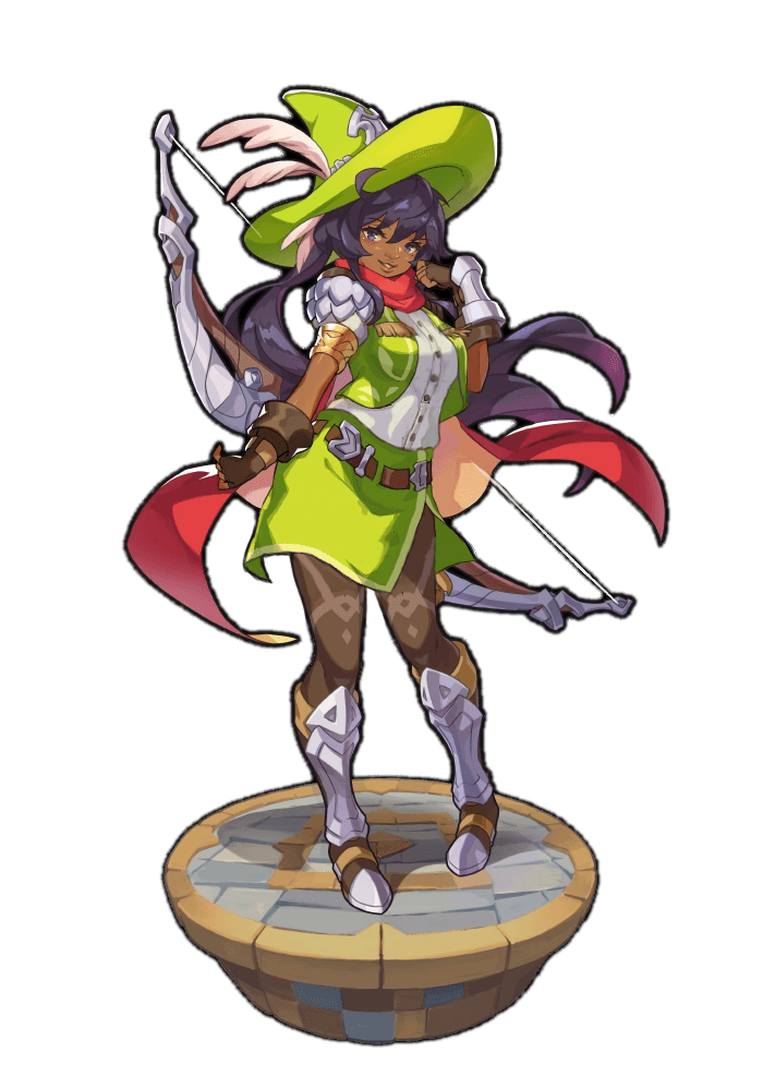
Actually, the biggest thing to fix was her face. Dragalia Lost artstyle promotes some fucked up facial proportions, yo! 
Not only was her kittyface mouth waay too small and placed on her right cheek, the highlight representing her nose was so teeny tiny and high up that all I could do was to use it as a guide to bridge of her new nose. Including human nostrils. 

image

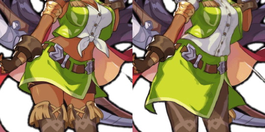
Costume fix was pretty unintrusive in comparison to facial changes. I just didn’t want her to look so drafty. While I appreciated reasonable shorts under the mini skirt, I decided that a longer skirt fits my plans better, as I reworked her thigh high… boots? stockings? Did she wear shoes inside shorter shoes, and greaves on top? I liked their decorative design, so I changed the ‘inner shoes’ to tights. 

image

Reworking the top part was a bit more challenging, not because of some original idea (I literally just gave her a non-crop shirt), but because between her boobs and her spine there was some subtle @eschergirls​ anatomy going on and it took a couple takes to make that vest work according to laws of physics on her chest. Hopefully with success. 

Not my best or most radical redesign, I still hoped it helped. 

~Ozzie

Dragalia Lost Some Clothes, Part 1

It’s quite unfortunate that Dragalia Lost ended up being another waifu collector mobile game, cause the gameplay mechanics were fun and interesting (before I got bored, as usual). We picked some of these ladies to give them clothes more appropriate for their station/role.

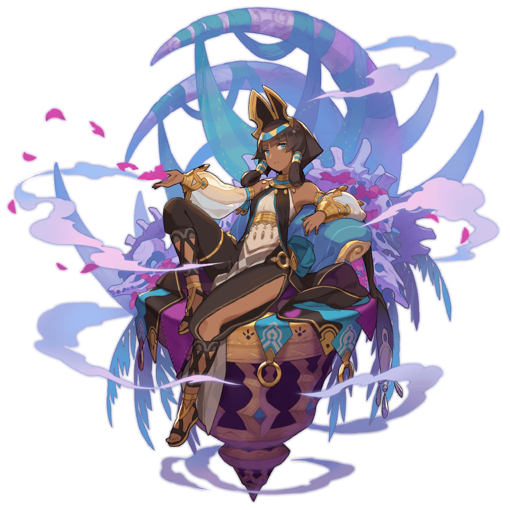
I personally found this image of Nefaria, who’s described as “a beautiful woman clad in foreign garb.” Now, I’m not saying that I hate this because she’s a woman of color, but it certainly doesn’t help.

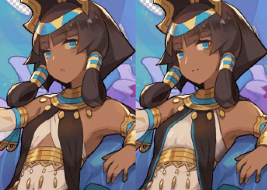
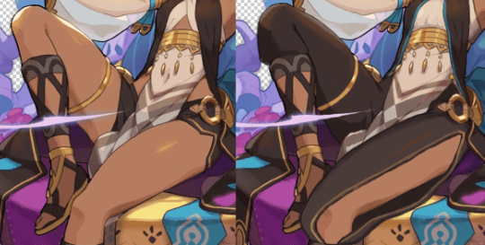
My work culminated in 3 significant changes: I changed her face slightly to be less generic, I gave her an actual logical top that connects to her little tabbard, and I gave her cool pants. This was another project where I was trying to make the point that you can have cool designs that aren’t too different from the “sexy” version. It wouldn’t have been too much effort for a higher-up to request the changes I made.

image

I stayed with the “subtle nose highlight” style but made it a larger highlight, implying a larger nose. Give girls noses! It’s 2019! 

Also, some pants.

image

They’re still fun, they still got a cut down the side, but now they’re waist-high pants. You don’t notice how low the shorts are on her hips in the original until you focus on it, and then it’s just ridiculous.

I also took her heels away, just for good measure. I love ruining the fun, as you all know.

-Icy