Boring LoL ladies redesign, Part 2

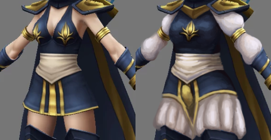
Unimaginative and pointless bikini armor? Clothes that don’t make sense? A two-color color scheme? We’re got it all, on this week’s League of Legends redesign feature.

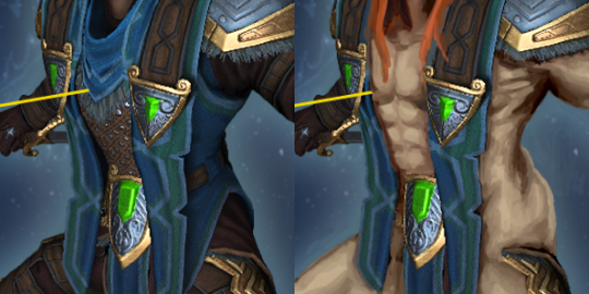
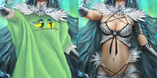
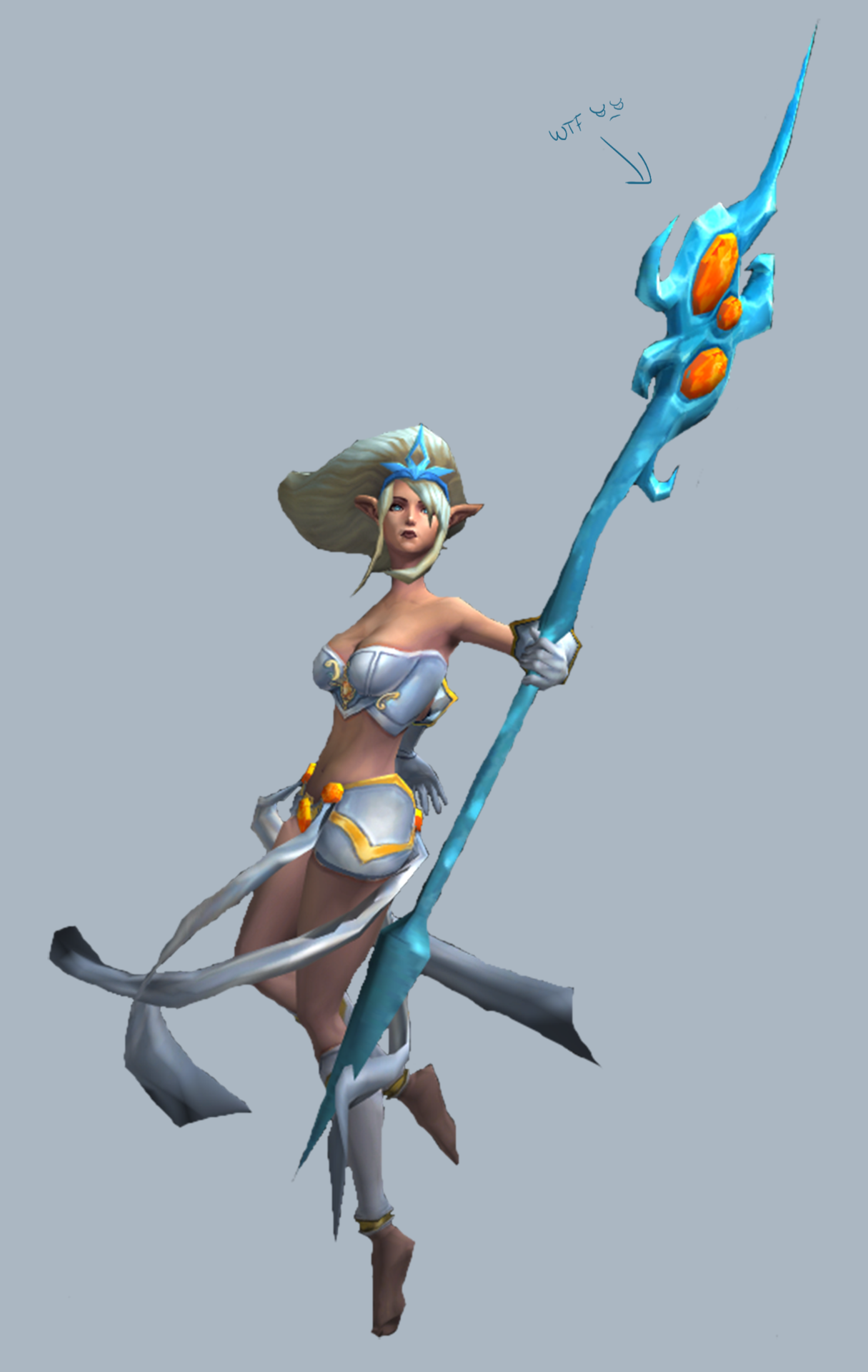
(We included a bonus image cause the redesign picture doesn’t show the full Generic-ness in all its glory. Enjoy!)

<part 1: Ashe>  <@leagueofsexism>
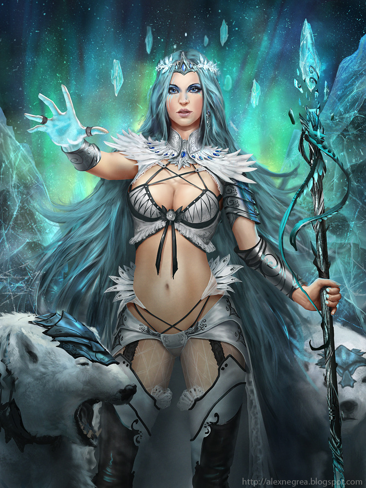
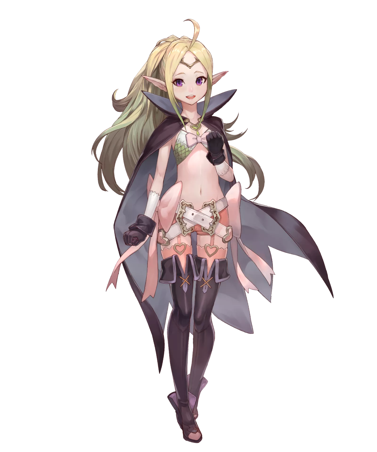

Janna

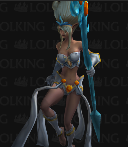
Boy, do I know how to pick the worst ones. So according to her (old) backstory blurb, Janna is an Extremely Talented wind sorceress, to the extent where she sort of became one with the wind. She’s aloof and fickle, focused entirely on her craft. Maybe that’s why the designers thought they could dress her in a swimsuit? “She doesn’t care what she’d wear, right? Just put her in underwear!” 

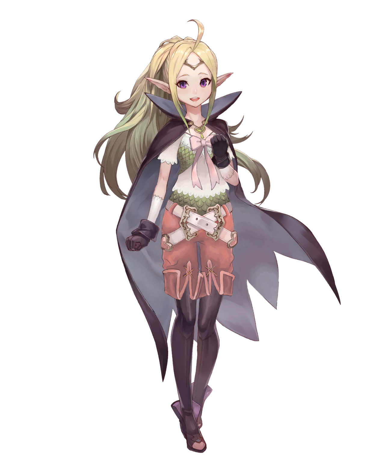
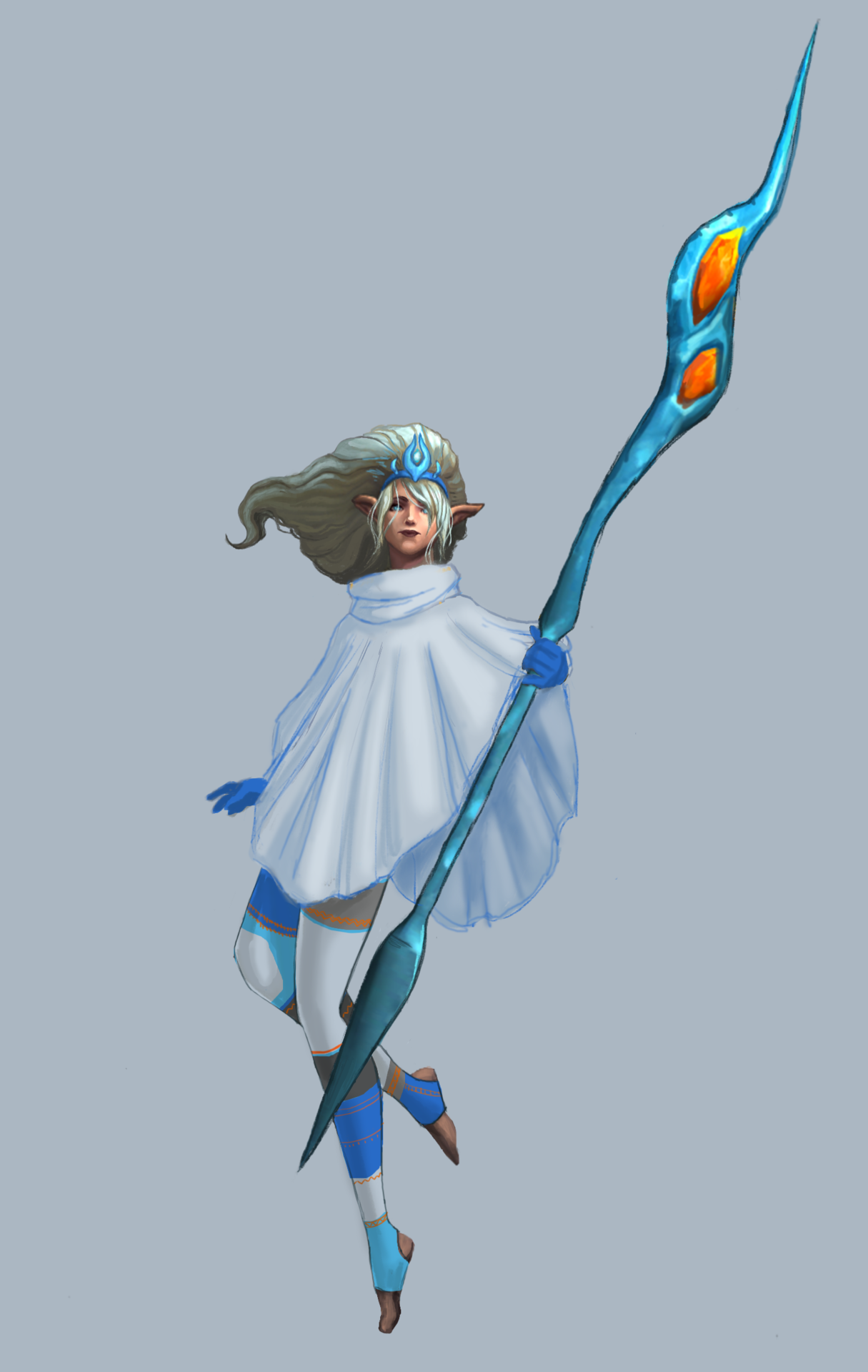
I figured the opposite: being surrounded by wind (she floats and everything), she’d probably want to be warm. I decided on a sleeved poncho so that she would be warm, while also wearing a loose cloth that can flutter in the wind, for the Aesthetic.

image

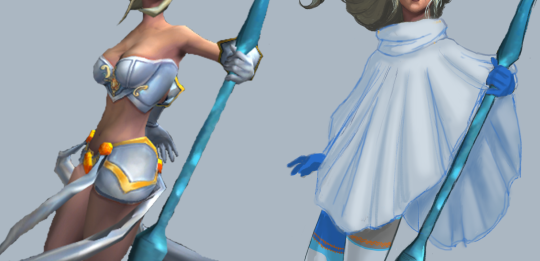
I made it a single, large, flowy shape, keeping the smaller shapes to frame it. I found some fun winter tights online that I used as reference. I made them asymmetrical because besides the staff, her design would end up perfectly symmetrical (hair doesn’t count), and I try to avoid that when I can. I kept the original color scheme to a simple light/dark greys and blue, colors that I associated with the wind and clouds.

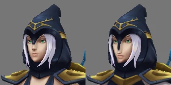
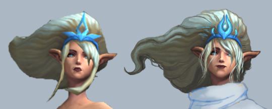
The blurb said her powers gave her an “otherworldly appearance,” but her face was just bland and generic, like most of the LoL ladies. I gave her a more elongated, narrow face, with wide narrow lips. The hair detail was mostly just me trying to work with the low-res original I had. I did shorten her bangs, to unify the hair shapes.

image

Finally, I changed her awful staff into a more simple wind-looking shape, and added some orange to her tights to tie the color of the gems in the staff to the rest of the design.

For people who keep up with the LoL lore (the LoLore, if you will), this design will not work for her new backstory as a wind spirit. Still, for the original concept, I’m pretty proud of this one. I feel like it’s one of my better full redesigns. It did take me longer to do than a single livestream, but I think it was worth it.

-Icy

Boring LoL ladies redesign, Part 1

League of Legends, despite having maybe two highlights and occasionally attempting to improve, generally SUCKS at female character design. For more details as to why, consult our related blog, @leagueofsexism


Ashe

LoL heroines were among the first stream redesigns by Icy, but this was my first attempt at redoing a lady champion. I chose Ashe, the archer.
While she has completely serviceable color scheme and some nice looking shapes in cape, hood and limb departments, her core costume is just a short dress with deep cleavage and fabric belt. Also nipple adornments ¯_( ͠° ͟ʖ ͠° )_/¯ 

Since LoL fails at giving most female characters distinct facial features, I felt obliged to change this generic oval face with tiny nose and pouty lips into something more interesting. Now her face and nose are longer, with sharper jawline and cheekbones.

image

I decided that instead of her ghastly pale skin, the design should be broken up white elements that will compliment her hair and belt.
You can never go wrong with Elizabethan pants. I’m especially proud of the matching poofy sleeves broken up by golden arm braceletes that were already there.
Obviously, I wouldn’t leave ornaments on each of her boobs, so I reduced it to a single one at the center of her chest. And her pauldrons no longer just hover on her shoulders, they (and presumably, the cape) are connected now at the sternum.

image

Last change, suggested by Icy, was a codpiece, matching the period fashion of her pants. Yes, my redo of Ashe is an openly trans lady, because why not? 

All in all, I’m quite satisfied with how I managed to keep the silhouette and shape language relatively unchanged, while adding some more interesting stuff where gratuitous skin displays were before. 

~Ozzie 

Return of the Sexy SMITE Gentlemen 

After the last time we sexyfied SMITE’s male gods, it was time to get back to it. After all, there was such an inequality among the character designs: the men were almost never allowed to be hot! We couldn’t have that.


Hercules

I decided to go for the easy choice, Hercules (not Heracles, for some reason?), mostly cause I hated almost everything about his original design. Not even from a not-sexy-enough standpoint, just in general. That ugly face, the weird proportions (that lion head is like 4 times bigger than his), even the colors. So I changed all of that crap.

I made his head bigger and made him look younger, more innocent. I took away all of his ugly clothes. There isn’t even a loincloth there. I moved the lion’s head into his hand instead to cover his uh… lion, as it were. I decided to give him a furry little cape in its place on his shoulder so that his beautiful face wouldn’t be literally overshadowed.

In the end, I was trying to shade the lion so that it contrasted against Hercules’ skin, but I should have just made the mane dark brown instead of sticking to the original color scheme. But I think now he’s worthy of his Roman depictions.

-Icy 


Loki 

The Norse god of mischief was always plenty intriguing, even before Tom Hiddleston made Sexy Loki a thing. So I decided to very unsubtly make it clear with my redesign – by showing as much skin as possible short of making it porn. 

In real bikini armor fashion, I got rid of almost all the clothes Loki had other than the sash, loincloth and armoring on his limbs. Made his skin a bit lighter and less sickly colored, because while we’re all for Norse characters being more than just white, it’s less problematic to sexualize a white dude than a man of color. Hope you all like those lovingly rendered muscles, I spent a lot of time painting them! 

image

I also replaced his edgy hood with long fiery red hair, more traditional for the depictions of this character. Another, more subtle touch was the scar on his lips, from the time he was punished by having his mouth sewn shut. 

A god who can get himself in and out of almost any trouble by shapeshifting and seducing whoever, including a horse, should really wear his sexuality on his sleeve!

~Ozzie 

If You Hate It, Then You Should Have Put a Sweater on It (and we did)

We wanted to do a silly stream where we put sweaters on a few poor ladies drawn for Applibot’s ridiculous requests. We apologize in advance for any discomfort caused by looking at the originals.


Hoo boy. The Rain Goddess, as she is called, from the Totally-Not-Collectible-Cheesecake-Game Legend of the Cryptids. (Although I couldn’t find her page on their wiki, maybe she was removed.) I have mixed feelings about this one, because on the one hand, I’m glad I could give her a sweater, but on the other, I end up scrolling past her original picture every time I look through my BABD image folder. It’s like looking into the Void. Or as the young’ins are calling it, a Cursed Image.

Since she’s a rain goddess (I guess? that’s what the artist called her), I googled “rain sweater” for inspiration, and found this lovely children’s sweater design.

image

It was perfect, really. Most of the stream time was spent rendering this out so that it would somewhat match the original style. If nothing else, the artist had a great technique. It’s a shame about the subject matter, is all.

The final touches were on her face, where I gave her more of a smirk instead of a pout, and made her mascara/eyeliner run a little. 

May the Rain Goddess be comfy and warm in her bright rain sweater. While kneeling in the ocean. I couldn’t fix that part. Or her evolved form.

-Icy


There’s no-one who needs a cozy sweater more than Arctic Permafrost Empress (also from Legend of the Cryptids), both due to her icy domain and one of the most eyes-melting (:P) costumes. 

I referenced some batwing sweaters for this, and since one-color garment looked a tiny bit bare, I decided to paint great tits similar to the ones from the Sadira redo post and made them into a fun puntastic print on the sweater. (Edit on the left)

image

I also changed her facial features to be more distinct and replaced her boring makeup with some blue face paint (which I only hope doesn’t appropriate any culture), just to make her tad more interesting than Random Supermodel #05867 

Here’s the original artist’s blog post, with some references he used for the Empress’ design. Amazingly,  seems like he came up with the weird lingerie shapes almost entirely on his own (or at Applibot’s request?). 

~Ozzie 

Fire Emblem Gals Part 1

We are assured that Fire Emblem is great game franchise with engaging characters. We have to take the readers’ word for that, because we always find a distinct dissonance between how FE female characters look and what their bios tell us about their stories and personalities. This week, my take on Nowi, the loli dragon.


Nowi 

Nowi of Fire Emblem Awakening embodies the “beloved” trope of a centuries-old being taking on the appearance of an underage girl… Who is open as a romance option to the player character. Never forget that Awkward Zombie comic which makes fun of it

image

She chose to wear that!” is a bullshit excuse for a grown woman character running around a battlefield in a bikini, let alone for a thousand year old magical creature who also chooses to have the body and face of a child.

Since she’s really a dragon and probably needs no armor, the goal of redesign was to give her clothes that would look appropriate (rather than protective) for someone who takes form of roughly a 12-year old. 

I actually found the color scheme and many shapes in Nowi’s costume very good, just wasted because the focus was on showing skin and adding too many decorations. 

I decided that her teeny tiny scaly bra would make a good vest, if put on top of a crop t-shirt with the same lace finish as those white gloves… which she wears under the black gloves?
Then, since I liked the scale pattern a lot, I recreated it also on her belly. Is that a matching undershirt or her real dragon skin? Who knows! It looks cool. 

image

The area between her belly and knees was made of pure visual noise. It was sexualized and overdesigned at the same time.
The only ridiculous thing I decided to leave in were the crossing belts, because they look cool enough and aren’t implausible… Provided that I added belt loops to her pants. Speaking of which, fetishy short shorts connected to stockings with garter belts had to go, for obvious reasons. 
Since her shoes had such a strange shape, I decided to turn them from thigh-highs with inexplicable ankle boots bottom into tights and ankle boots. All it took was to reverse and change the hem of the boots into that of short pants. 

image

Ribbons weren’t a bad idea on their own, but they just completely didn’t belong as decoration on her sides, so I got rid of them and just transplanted the long tails onto her chest ribbon, making it both cuter and a more prominent splash of pink on her upper half.

All in all, it’s one of my favorite, while most subtle, redesigns. Probably also my best simulation of the original’s coloring style. I really hope it managed to turn creepyness of a sexualized childlike character into cuteness.

~Ozzie 

Saint Seiya Online SWITCHEROO Part 2: Empowering the gentlemen! 

In the latter part of our Saint Seiya redesign stream (or, for Ozzie, out of technical difficulties, last Saturday >_>), we doubled down on the switcheroo aspect and swapped armors around. Icy did the sexy male version of the blue knight, while Ozzie took on the male bronze knight. 


Well, considering the blue lady’s… creative design, I had no shortage of material to work with. Besides transplanting the boob window breastplate and giving him the same mankini-adjacent undergarment, I decided to switch the original boring stockings out for more interesting ones, with lace! Premium stockings.

I gave him a softer facial expression, to match our lady’s pout, and made his right hand less aggressive. I decided not to give him heels, but I gave him a booty. And last but not least, I gave him glorious mustache-shaped body hair! Thank you to the person who suggested it! 

image

Does every sexy boy I redesign for this blog have very defined junk? … The answer is probably yes. I definitely had a lot of fun with this one, despite this shading style that I had a hard time emulating.

-Icy 


Despite the ugly “muscular wide-shouldered male is equivalent to a lady with big boobs and wide hips” motif, the bronze knights had one thing in their favor… the dude has his oblique muscles exposed equally to the female version! Now all I had to do is to recreate all the other weirdly exposed spots from her costume on his. 

First thing I decided to do was to make his pose more equal to hers without just straight-up copypasting her legs onto him. Instead, I switched his leg position to simulate her sexy strut, then slightly changed forearm position to be closer to hers. Then I allowed myself to replace his right hand with hers, which is posed less aggresively. And of course, I left the long nails on 😉 

His pants are now just underpants and thigh-high stockings. He also acquired high heels. I wondered for a while how to turn his breastplate into something similar to the boobplate with window for each breasts, and finally decided just to copy her piece and reshape it to match his pecs. 

Major negative (other than double standard, that is), was the armor’s color scheme that blends with their skin tone. If it wasn’t against the idea of our exercise, I’d probably slightly adjust those colors to contrast better, then the pec windows would be more obvious. Oh well.

~Ozzie 

Saint Seiya Online SWITCHEROO Part 1: Armoring the ladies!

This stream redraw session was heavily inspired by this reblog we did from @amusing-saint-seiya and the exercise @costumecommunityservice proposed in the post we reblogged ages ago

The idea is to take two gender disparate version of the same costume and make them equal to one another, by either basing male version on female’s or the other way round. 

We concluded that Saint Seiya Online, which we bingoed twice since, is a perfect material to try this out on, as their concept art (credit to @saintseiya-zone for posting them!) includes most armors in both male and female version, which are basically always textbook examples of double standard in costume design.

Prepare for this being a double feature. Today we’re posting female knights equalized with their male counterparts. On Friday come the same male knights sexified to be as empowered as original forms of their female equivalents.


First thing I noticed about the blue-white knights is that since the dude one happens to be rather androgynous and strikes a flamboyant pose, designers doubled down on “feminizing” the lady one with pigeon-toed pose and super bingo-able version of the outfit. The two share very similar body type, so I concluded that pasting his parts onto her verbatim would work perfectly. 

First thing to do was to give her his legs and right hand, so she can strike a power pose instead of generic dainty passive body language completely disparate from her male counterpart’s. 

image

Then the task was relatively easy: paint over all those completely out of place holes in her outfit, give her waist a little more plausible girth and shrink her high heels to be exactly the same size as the guy’s. 

It’s actually quite upsetting how the developers put in an active effort into ruining perfectly fine costume just to communicate that the lady version is different

~Ozzie 


I will fully admit that I probably? cheated by cutting the red guy’s chest right off of him (misandry?) and pasting it onto the lady, but I have good reason! We so often see strong women characters who are supposed to have a more “masculine” muscled look, but it never actually gets to the part where they don’t have an hourglass figure with the same old narrow shoulders. (See Overwatch’s Zarya and her most narrow shoulders.) So I wanted this lady to be beefy as heck

To me, it seems like the artists’ definition of “beefy” for women was just a bigger rack and thiccer hips, and that wasn’t doing it for me. I made her shoulders way wider, stole the guy’s entire torso, and narrowed her hips. You also can’t ever have too much biceps. There are women who look like this, believe it or not.

image

(A minor thing, but I shortened her nails as well.)

For people who may not like this one because she looks too much like a dude… sometimes people do look like that. And maybe the problem is with our definitions of “manly” and “girly.” Why even cisnormativity.

-Icy 

Cool for the Summer Skins (NSFW)

Our first (and definitely not last) foray into redrawing Overwatch. Their summer 2017 skins were a strange mix of bland and safe, cosplay, and a single actually good idea (grill dad 76). We decided that wouldn’t do, and so picked two of the more unsatisfactory skins in the collection to redesign and actually have some fun with!

Widowmaker 

When I first saw Widow’s boring, predictable summer skin, I was mildly annoyed. But after giving it some thought, I became hugely disappointed that they didn’t make her into a fisherman! The fishing rod that looks like a sniper rifle? She even has a grappling hook that could be made to look like she’s throwing a fishing line. What a missed opportunity.

So I made try-explaining-those-tanlines Widow into fishing-day Widow, complete with plaid shirt and huge rubber boots. Because her legs are so fricking long, I should probably have given her hip waders, which are rubber boots that go up to your thighs or higher. They’re actually appropriate thigh-high boots, for once! Given more time, I could have also given her more accessories on her belt, like a bunch of lures and containers with bait.

This is one of those ideas that I may come back to and actually design properly

in the future.

-Icy

Mercy

I found the “Nike” Mercy skin utterly uninteresting and kinda overdesigned. to fight that, I changed her tunic to have a shorter “tabbard”, expose one breast (because why not?) and cover up more of her butt. 

Got rid of those sandals with weird, borderline impossible to wear straps, and replaced them with winged Nike sneakers. 

And to make more serious attempt at portraying her as Nike, the goddess of victory, I put the laurel in her hand, instead of head, which is this mythical figure’s most basic attribute, right after the wings. And one more in her mouth, to make her more cheeky.

~Ozzie

khfanforall:

enecola:

@fingersareoptional replied to your post“I’ll be done with my damn term paper later today. So… What armor needs…”

Athena from Smite! All she’s wearing is some kind of dress thing with boob plates stuck to it somehow? Anyways, a goddess of war deserves more.

I don’t know what that tiddy armor is even supposed to protect. I was tempted to fix the amazon armor but honestly that would work better with Artemis than Athena.

I never played Smite so I hope I got it right!

@bikiniarmorbattledamage

We had some technical difficulties with our stream this weekend, fret not! We got a great SMITE goddess redesign right now.

This really is a lovely armor fix that actually uses the original’s shapes and motifs effectively! I like the breastplate and collar in particular. The headgear looks better as well, and I’m so glad her WoW-esque pauldron got shrunk to a reasonable size.

The only change I would make is to either give her a white tabbard or something else under the belt, just to break up the 2 different browns. 

Even though we’ve featured @enecola on the blog before, I will continue to recommend that you check out their blog for more cool redesigns and original character designs~

-Icy

In case anyone forgot that Paladins comes from the same developer as SMITE (if you couldn’t tell by their absolutely “creative” designs), here’s original costume of Furia, one of their newest champions. 

Somehow even people at HiRez concluded that visible panties and completely out-of place garter belts are too ridiculous combination, because apparently after some fan feedback she received a slight redesign that includes pants under those garters.

image

Fret not, perverts! Her original look is preserved through red recolor “Iron Maiden” skin! 

image

And just in case you wondered whether some actually creative designs got discarded during Furia’s development, don’t worry! No matter how many revisions she went through, there was always at least one “beloved” Female Armor Bingo element in there, like boobplate, cleavage/boob window or otherwise uncovered skin! 

image

~Ozzie

h/t: @randomrobin