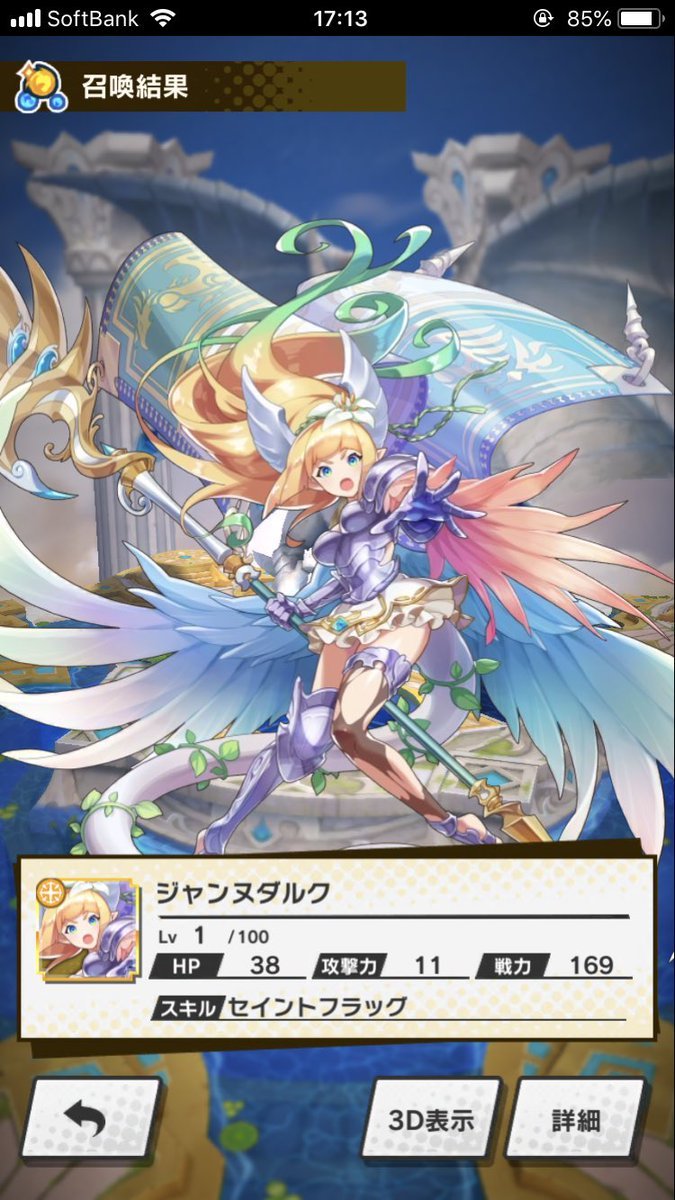

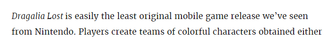
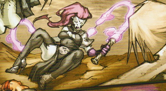
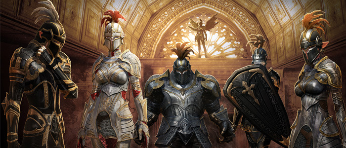
So… this latest version of Jeanne D’Arc (aka Joan of Arc) is apparently a dragon (hence the tail) but seems to also have incredibly ridiculous armor. Why does she look like a generic waifu? Um… honestly I have no idea, and I think I’m happiest not knowing – this is what the “main” dragons look like:

And for those of you rushing to tell us, yes Luca is wonderful but he does not redeem Dragalia Lost.
– wincenworks
I’ve been trying to play the game since it came out, but the ridiculous outfits the ladies have are very distracting, and not in a “battle tactic” way; in a really off-putting way. And that’s without even talking about the game’s depiction of the protagonist’s sister.
-Icy
Quote taken from a Kotaku article

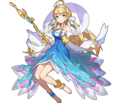
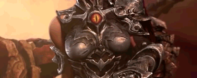
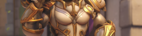
So, Darksiders III is coming out in November and of course we’re getting the promo videos and Fury looks… well the kindest thing that can be said is that she looks better than the comic indicated she would.
Naturally this has led to a certain demographic deciding that her appearance is… unsatisfactory and they last year they needed to declare their discontent and declare it representative of “gamers” and alleges that the design above makes her “armored up to the point of being unfeminine and almost no more clearly recognizable as woman.” (actual quote, after having a year to edit it)

I mean…
– wincenworks
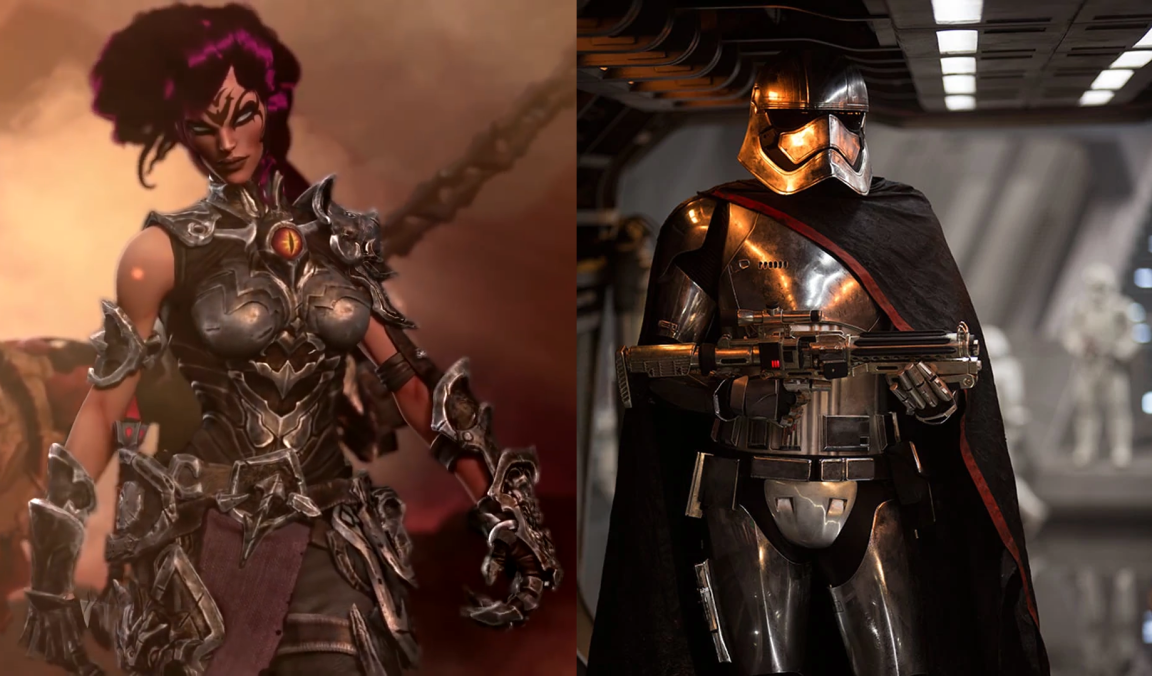
When I first watched that trailer, what struck me most is how SERIOUSLY it takes itself, while having a heroine who looks just. that. silly.
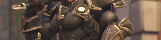
And gamer dudebros apparently think that THIS is “SJW pandering”, REALLY? Being encased in skin-tight metal, including a boobplate so ridiculous and badly designed it doesn’t even warrant breast support of a basic bra?
So now, in salty dudebro terms, both this and this is a “politically correct” armor “too unfeminine and no longer recognizable as a woman”:
~Ozzie
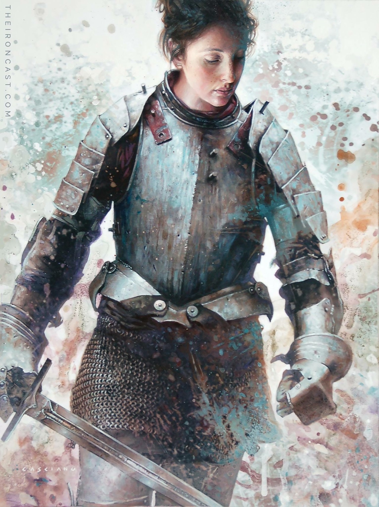
“Unsung Hero #1″ by Chris Casciano
Do you love the rough, painterly metal aesthetic, and illustrations of people in armor? Well, then do I have the art series for you!
This definitely looks like a realistic armor, which means that while it may not be designed with aesthetics first, this piece feels real. It definitely looks like a portrait of an actual knight. I love these kinds of works because they normalize women in armor. She looks like just another knight, and wouldn’t that be nice, if woman fighters were seen as normal and mundane as men. Not to mention, the style is wonderful.
I definitely recommend checking out the Iron Cast series.
-Icy


So far the most requested armor fix – Female Corrin in her Nohr Noble armor!
Not gonna lie, I’m not sure why they keep designing those chafing hazards. That honestly bothers me more than the huge boob windows by now.
What a lovely fix! I realize that not a lot had to be changed from the original, but I really like the top of the breastplate, the longer sleeves and the chainmail. There are a lot of strange holes in the armor in the original, so it’s nice to see them gone. And I actually like that the pauldron was made smaller, just because it looks so out-of-place in the original. One thing I would personally change is add a gold accent to the bottom edge of her breastplate. Overall, I think this is a great armor fix.
According to lore, the character does have to be barefoot, but the excuse that it’s because she turns into a dragon is Not Good. I’m not mad about it, in any case. She can still wear socks.
-Icy

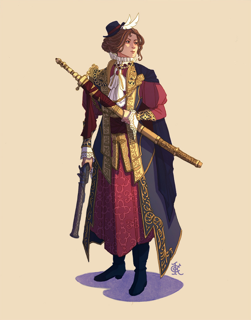
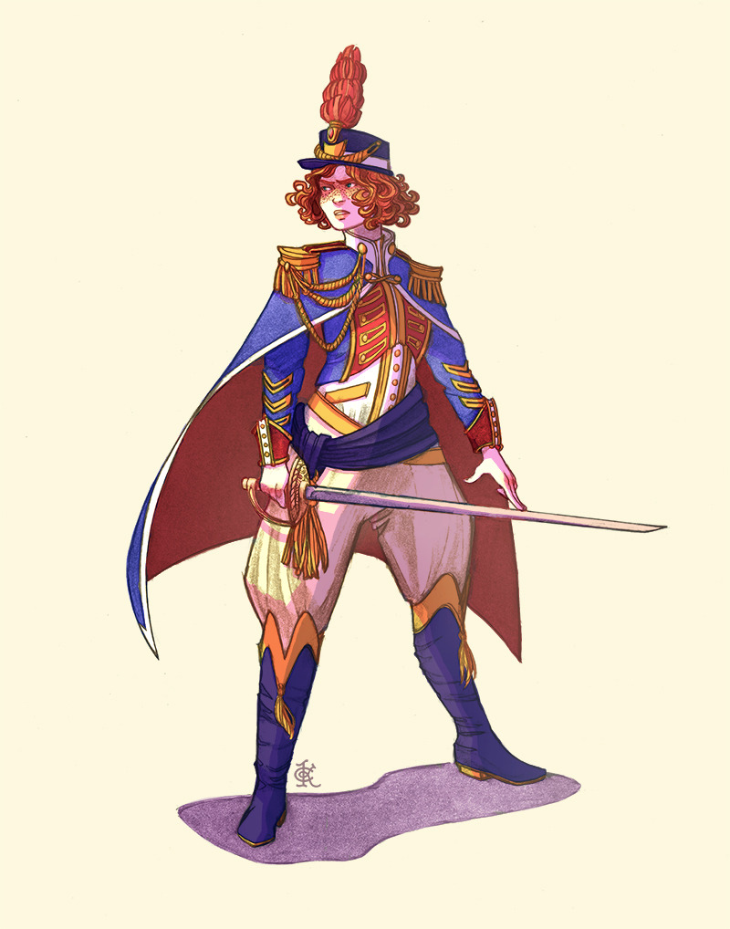


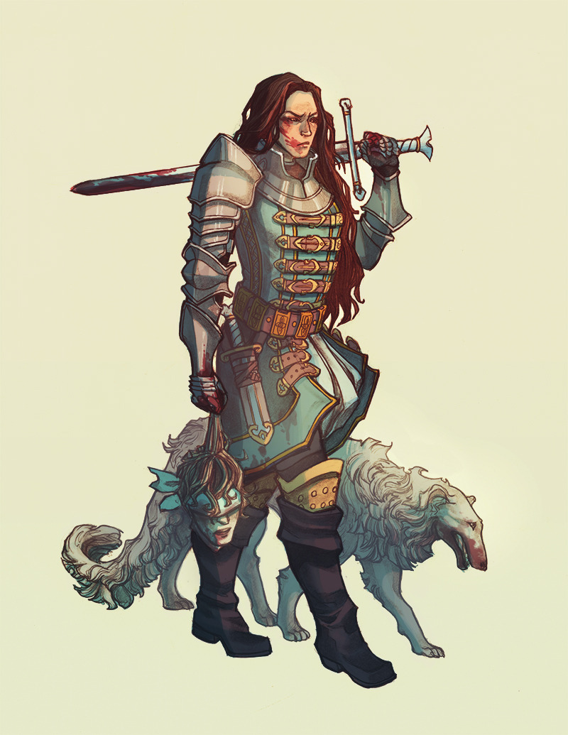
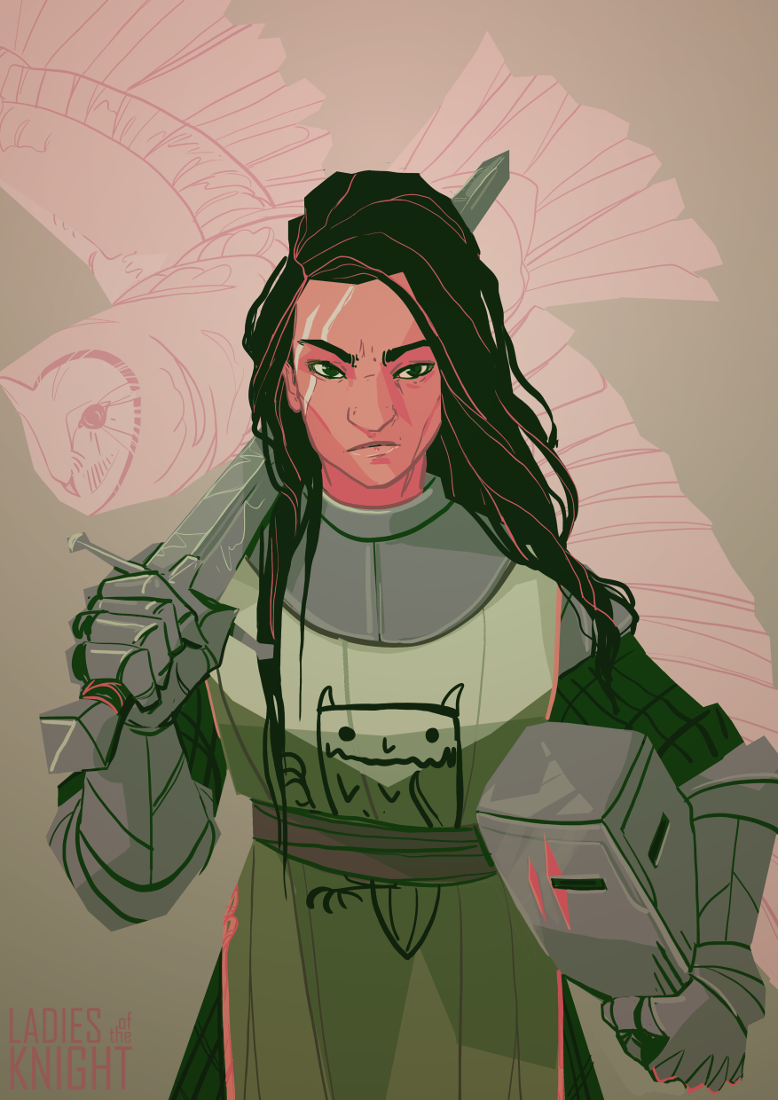
A collection of Ladyknights, for anyone feeling particularly chivalrous.
Now this is an awesome range of designs and concepts to showcase all kinds of approaches and personalities.
I also particularly like how every one of them has a weapon that matches to the kinds of armor they’re wearing.
– wincenworks
(submitted by Jury)
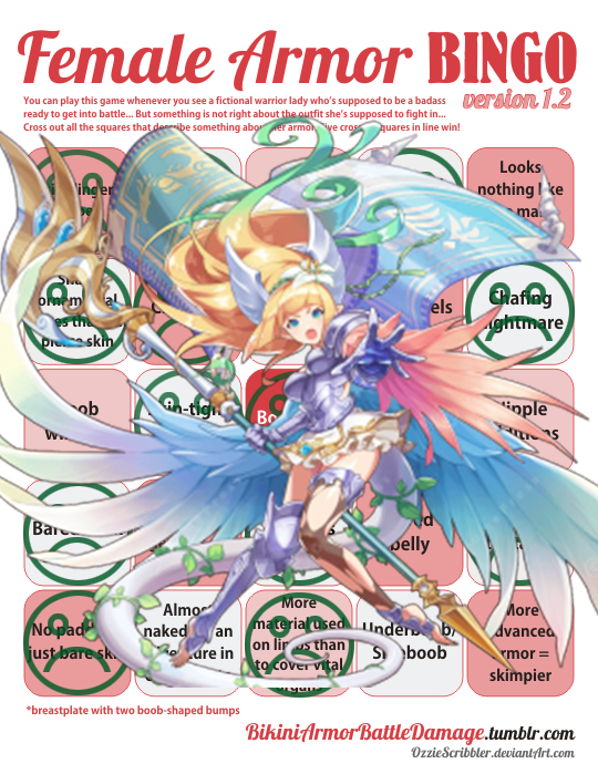
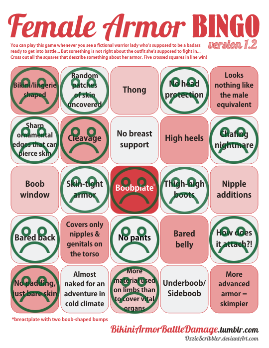
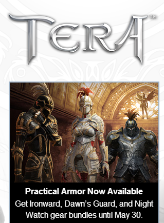
Whoah. The absurd of Tera, the universal example of logic-defying female battle outfits, advertising itself to have “practical armor”… that is skin-tight and boobsock-y on women leaves me astonished.
This armor is so totally practical that even Erik Larsen, the devoted anti-practicality in women’s costumes guy, probably wouldn’t mind it.
Dear Tera’s Creepy Maketing Guy: Just because boobplate and figure-hugging metal cover more than what you usually call “armor”, it doesn’t mean you should label it as “practical”.
~Ozzie
I feel it’s time to bring this back, not just because laughing at Tera’s idea of quality armor never gets old, there’s a funny thing I noticed. I feel like I’ve seen this… somewhere recently…
Yes to everyone assuring us that Blizzard is really trying… we have confirmation they are trying about as hard as Tera was last year.
Hooray.
– wincenworks

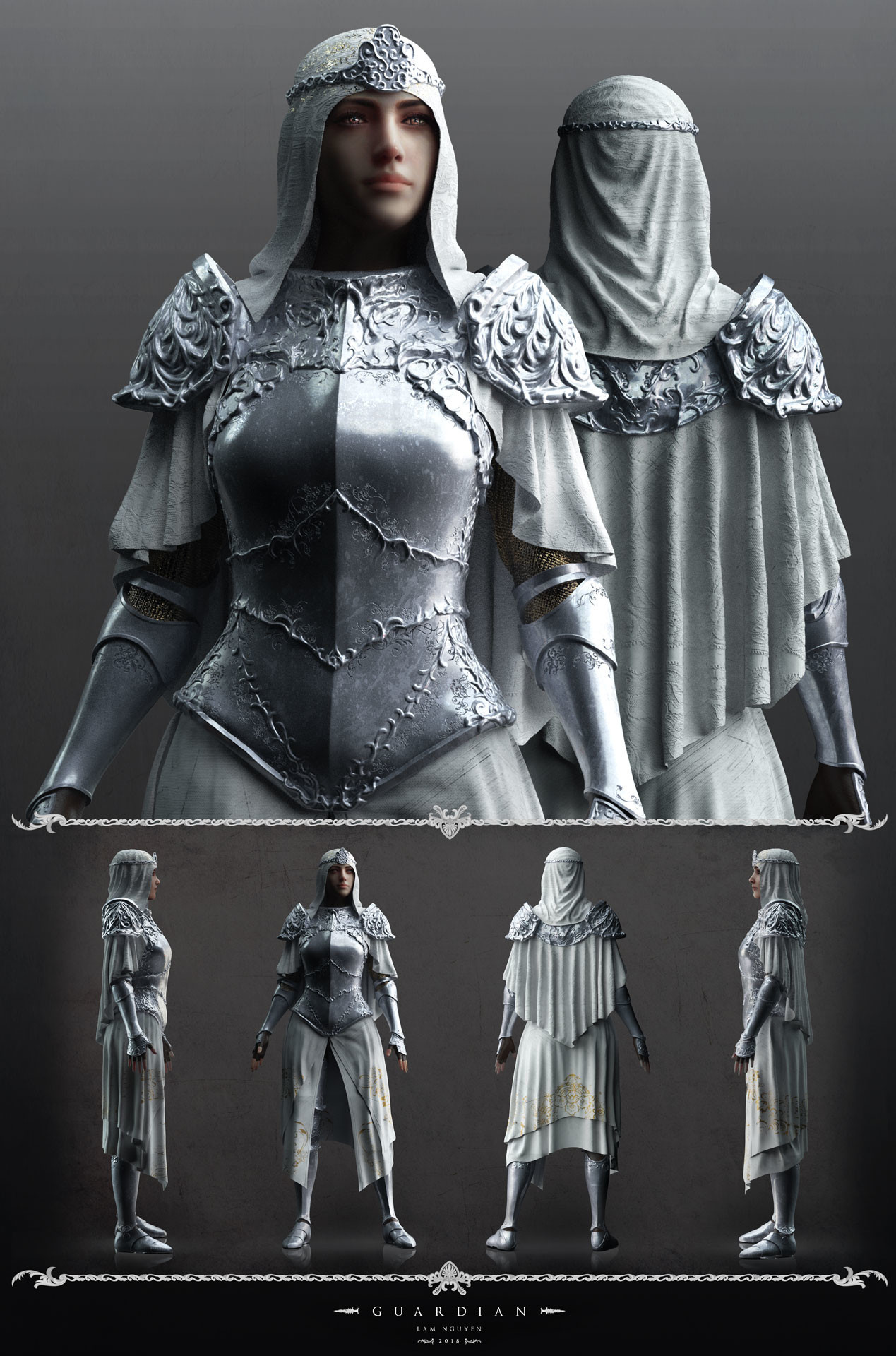
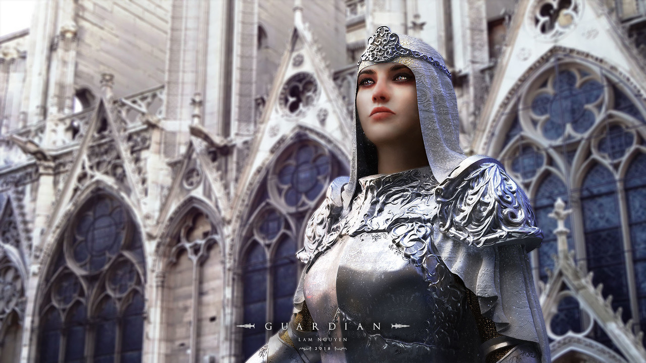

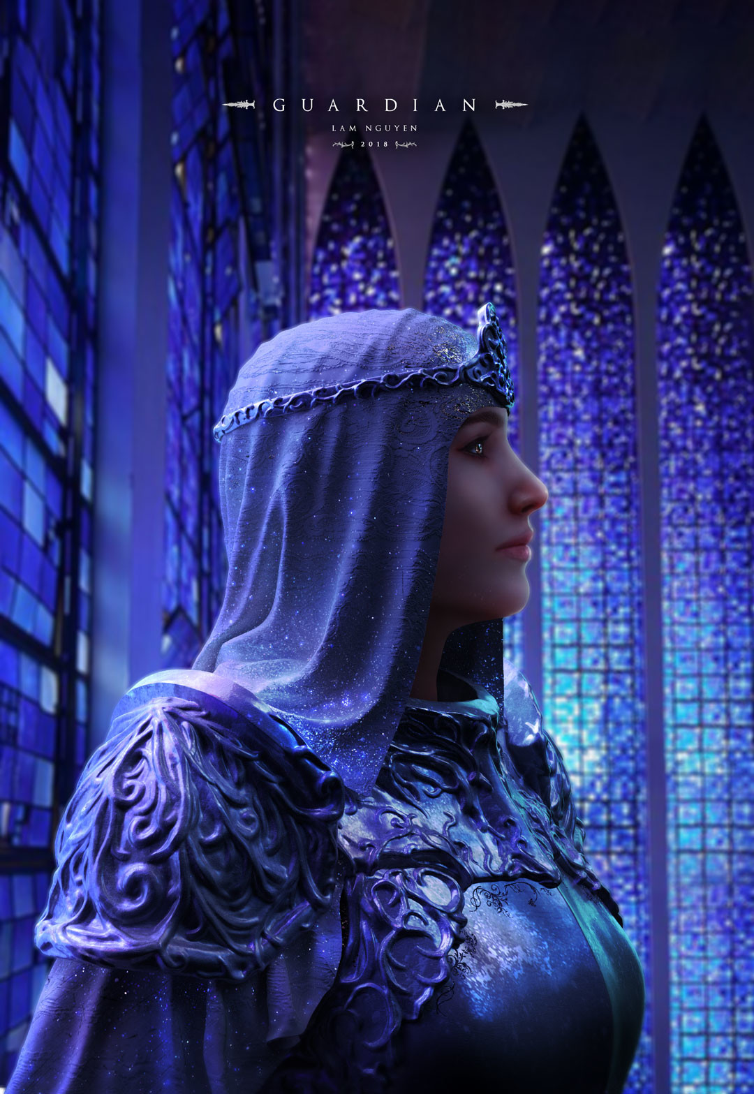
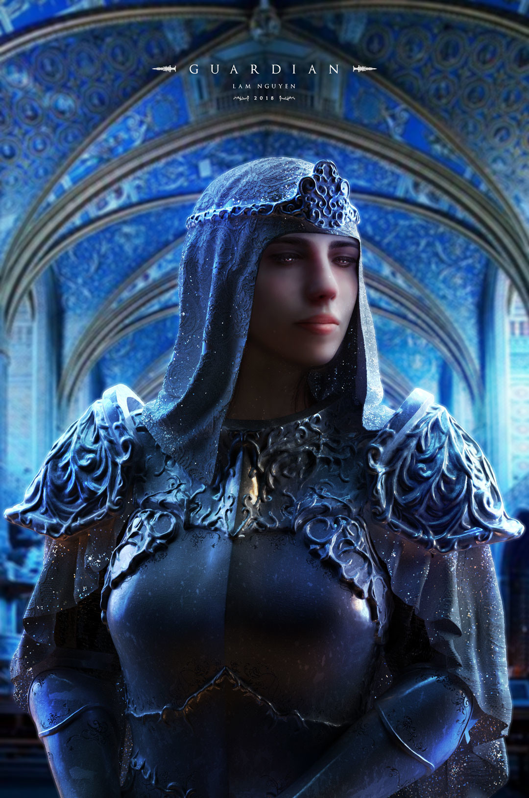
The Guardian by
This is obviously not a functional armor design, but it’s a cool concept for an idolized historical figure, or perhaps even a parade armor. The shapes work really well together, and I’m glad that the artist didn’t engrave the entirety of her breastplate. It’s hard to tell apart the metal from the cloth textures in some of the shots, but I like the contrast of the materials against each other. I do wish the color scheme was more than just 90% white and grey, but that would suit a depiction of a saint or similar figure.
My big gripe is that cincher-shaped detailing on her breastplate.
I thought to showcase this as a good example of how one can design even a nonfunctional feminine armor without having to expose the Tiddy, or give her 4 square inches of fabric.
The link to the artist’s gallery above is broken, so here is a new one. They’ve got some interesting costume designs, and they include their process, which is really interesting.
-Icy