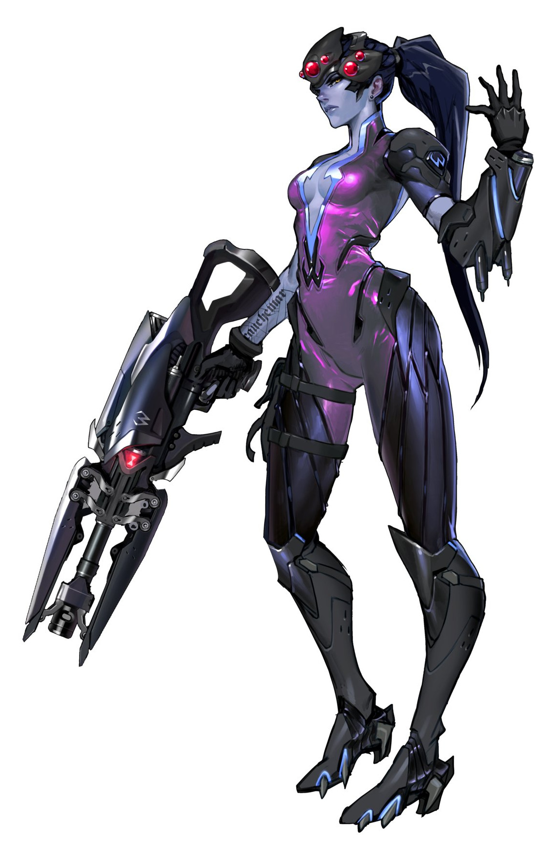
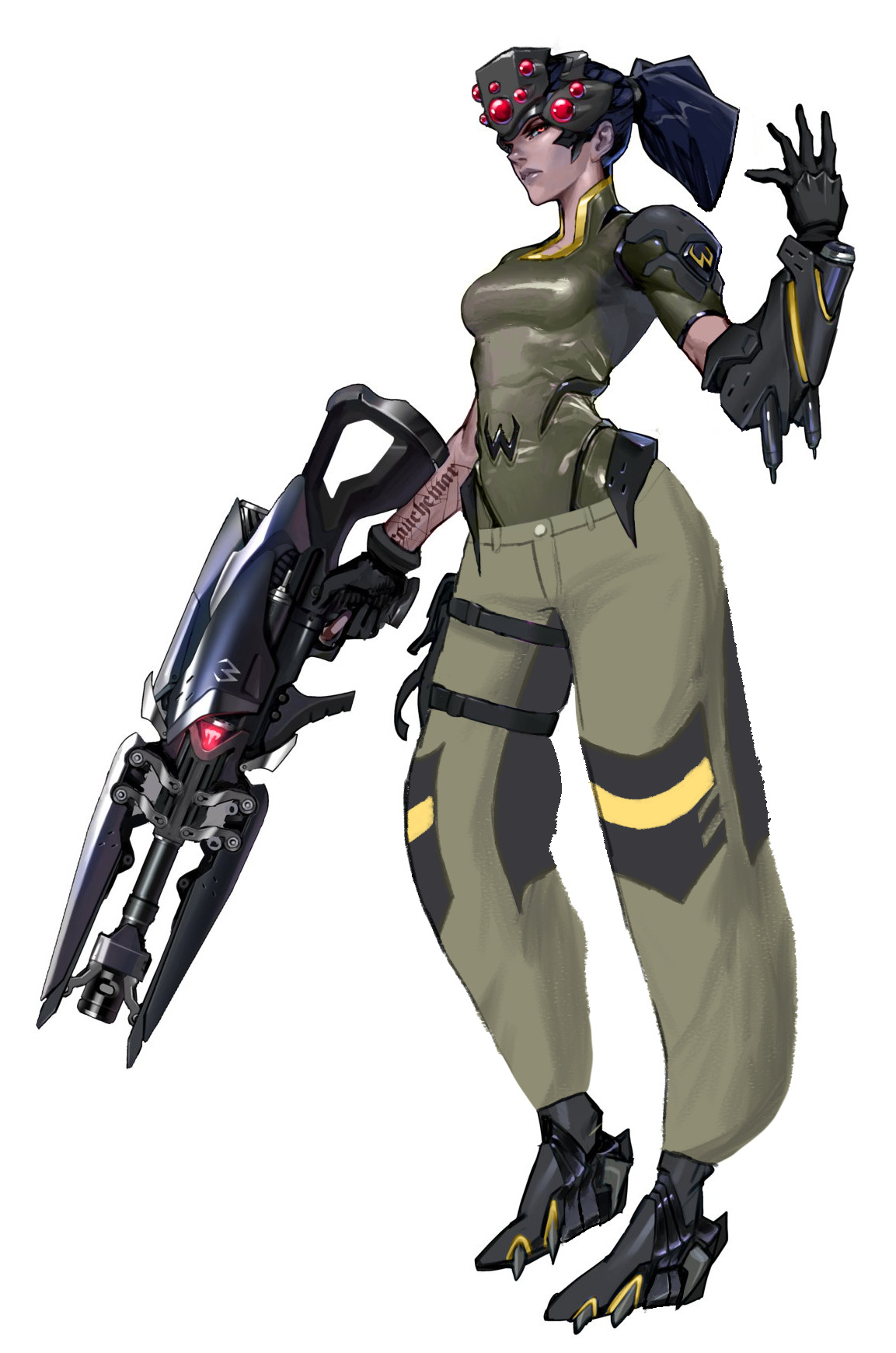
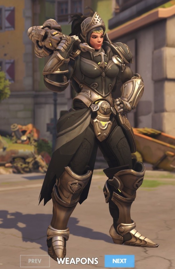
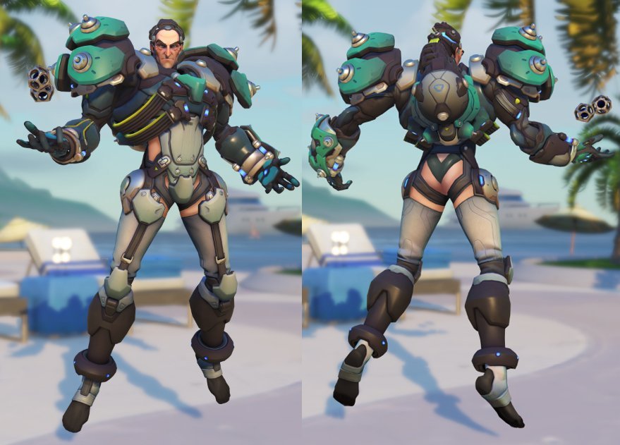
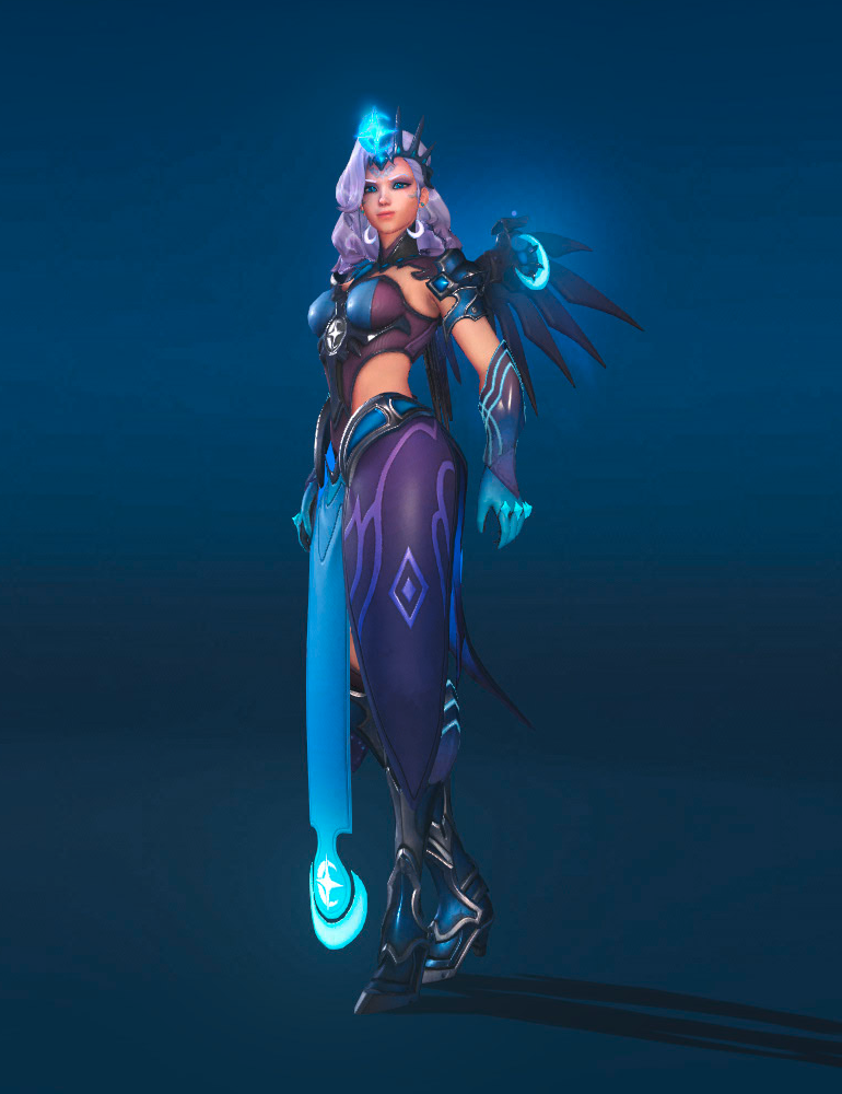
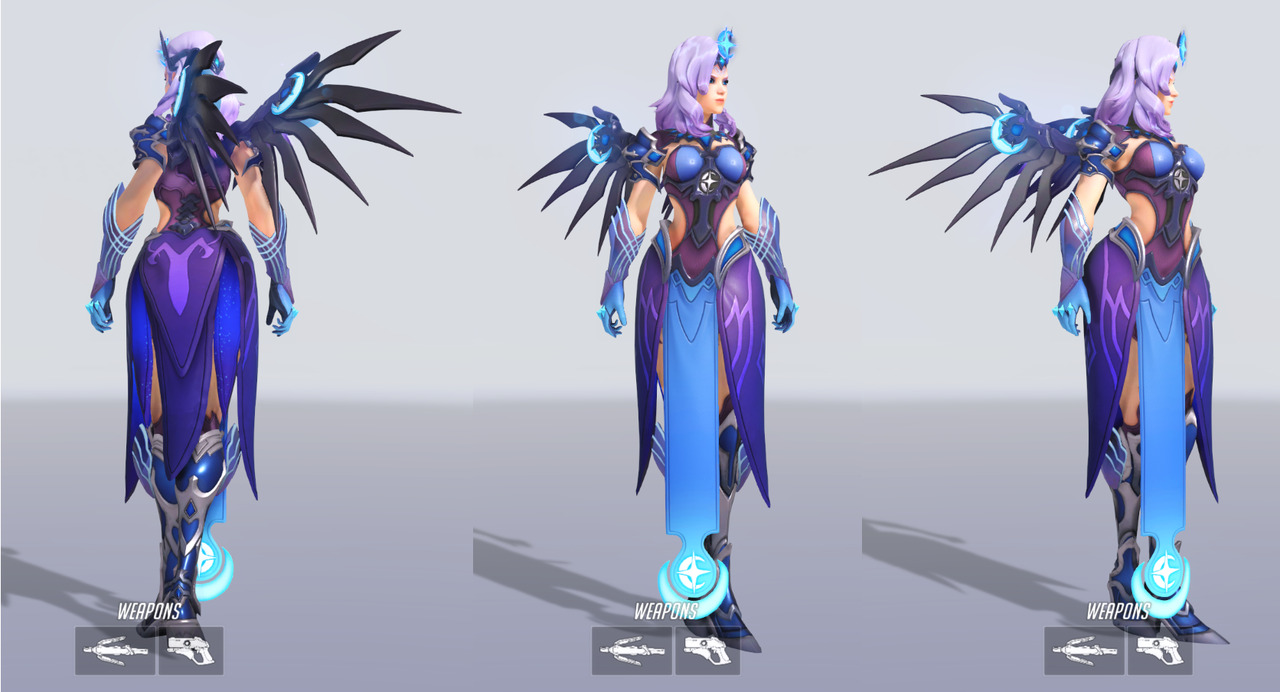
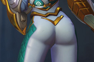
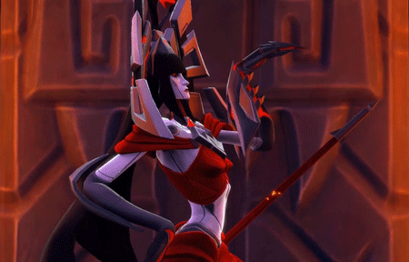
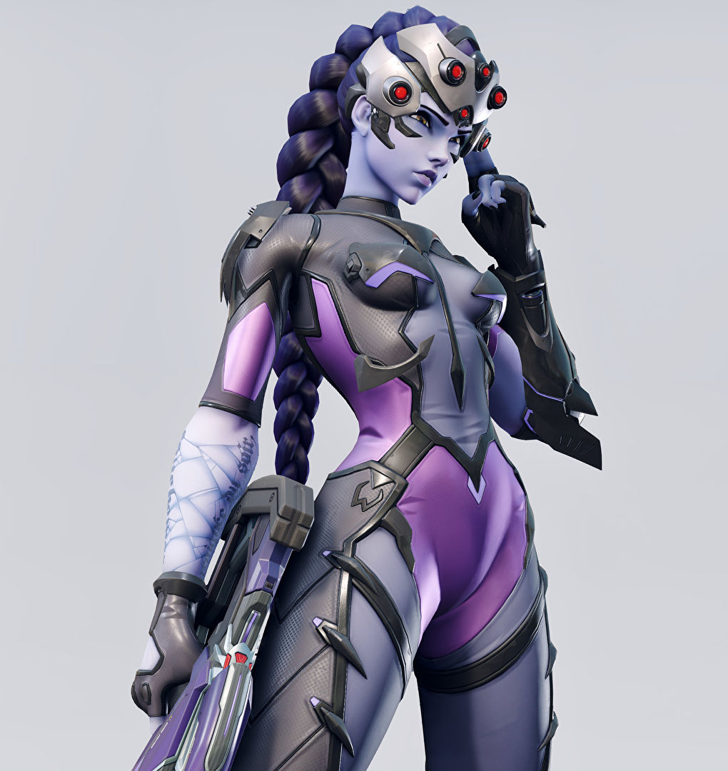
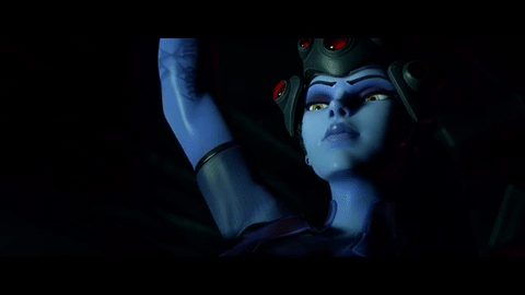
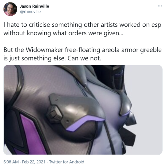
So, incredibly, Blizzard has managed to come up for yet another outfit for Widowmaker that makes less sense than her original outfit – and it works as a pretty iconic example of a costume as the sort of complete nonsense when you get cis men trying to design sexy lady fashion without taking the time to study actual fashion and clothing design.

Bayonetta is beloved by many women, because while her outfits are ridiculous they also scream “fashion” and thus convey a sort of narrative that she looks like that because she wants to has the power to. It’s not unlike how Duke Nukem runs around in an ultra manly sleeveless top… except that well, it only got signed off on because it appealed to horny cishet men.

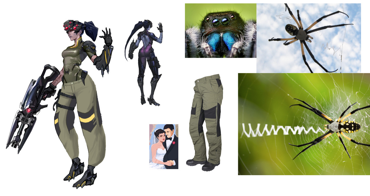
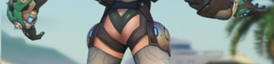
This outfit conveys that the artist likes naked (skinny, conventionally attractive) women and has tried to obfuscate it by adding random accessories and design quirks until it looks “unique” (in the same way a randomly generated hash code is unique).  How it fits into fashion or even just clothing is secondary to how many extra polygons it has.

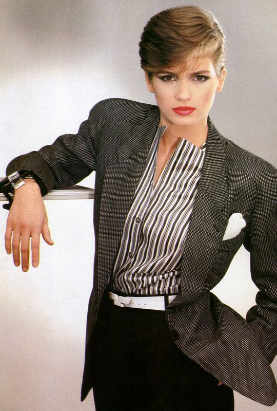
Now I know what you’re thinking, “Kim, you just want her to wear a suit.” and that is not incorrect, but more importantly I want Blizzard to look at how real fashion designers make real woman look powerful.  More like, say, how Giorgio Armani dressed Gia Carangi:

image

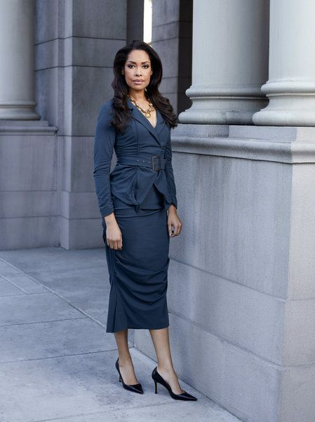
Or Gina Torres was dressed in suits:

image

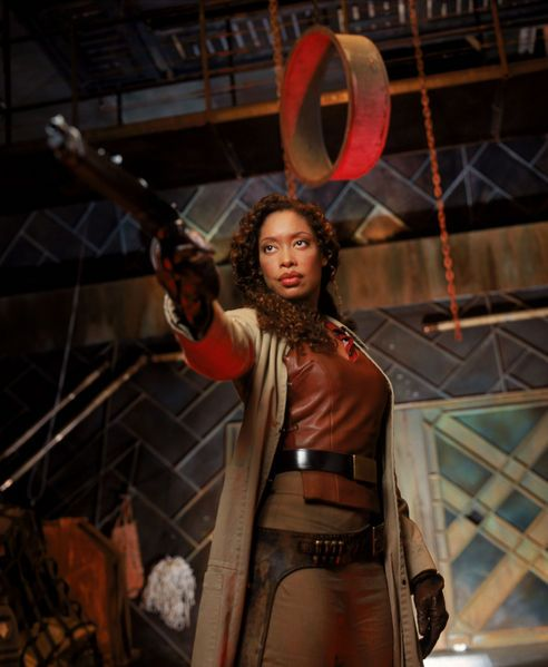
And how Gina Torres was dressed in Firefly:

image

And learn how to mix it up into functional, aesthetically pleasing designs that convey power and story and character.

And we could avoid… so many problems

image

(tweet here)

– wincenworks

maispace:

Inspired by going on one of my classic Overwatch character design rants the other day and binging @bikiniarmorbattledamage yesterday, I took it upon myself to try to make Widowmaker’s design… less worse. Here’s what I changed:

  • I gave her pants. Widowmaker is a victim of the weirdly common Overwatch character design trope of “armor from the knees down, skin-tight from the knees up”. (Well, the armor is also somehow skin-tight, but.) Since Widowmaker is a sniper and Talon is supposed to be paramilitary, I decided to put her in some actual tactical pants. …Of course, I still forgot to draw pockets. Pretend they’re there.
  • I decided not to shorten her legs or widen her waist, despite how ridiculous both of those features are, because Widowmaker actually has a reason to look like that – her spider motif. On any other character, I wouldn’t stand for it.
  • I closed up her ridiculous cleavage window. Again, she’s a sniper. Lay down on a roof in that and you’ll get your chest absolutely cut up. While I was in the area, I gave her bodysuit some subtle segmentation for a “carapace” look.
  • I think the way I changed her shoes she’d still have her feet in the high-heel position, but I at least wanted to made them flat on the bottom so Widow doesn’t catch her foot on a gutter and faceplant into an alley while doing her whole parkour thing.
  • Purple isn’t a very “spidery” color, so I changed her to a dull greenish-brown with yellow accents to evoke an orb weaver’s color scheme.
  • I shortened her hair so it doesn’t get in the way while she’s fighting, and so it’s the almost exact shape of a spider abdomen, thus making her whole head a big spider design.
  • I made her skin a normal human color, with some subtle purplish tones on her nose, lips, ears, and cheeks. I also removed her earring.
  • I made her visor boxier both to look like a jumping spider and for a more realistic “tactical” look, which also gave me room to pop some more eyes on there. Plus I think it just looks better; the original looks like they were going for Giger and gave up.
  • Black widows are overplayed. I changed the hourglass light on her gun to the Talon logo, so she’s actually representing her organization somewhere on her design.

Thank you for @-ing us, @maispace​! 

It’s a second fan redesign of Widowmaker we share that adds roomy pants to her costume, so it probably tell us something about what’s the next most glaringly inadequate part of her design, right after the navel-deep cleavage. 

Not sure if I’m personally into the proposed color scheme, at least without invoking orb weaver’s interesting patterns in some ways. That would also add some much needed segmentation and contrast in her outfit. 
I agree, though, that the original colors were completely out of nowhere and should be revised. 

The ponytail combined with helmet creating a spider-like shape is definitely much better evoked than in Blizzard’s design and shoes being somewhat wearable are appreciated. 

All in all, good reminder that Overwatch, while it comes with many interesting ideas and motifs for character designs, seems to abandon committing to them halfway through, to sell something more generic and palatable to their presumed audience, as per Creepy Marketing Guy’s request. Same reason it often fits the “concept art POC turns into a pale white Barbie in the final product” problem that @otherwindow noted.

~Ozzie 

bikiniarmorbattledamage:

Brigitte and Overwatch’s continous female design problem

We talked already about Brigitte’s costume, but there’s a whole lot of other issues about her character design that shouldn’t be overlooked. Again, it’s a nice idea to have a new lady in actual armor in the game, though we wouldn’t be BABD if we didn’t point out some obvious and less obvious problems that can be spotted with her. 

She’s, after Moira, another white European lady in a row, while still the closest to black female representation among playable heroes is Orisa, a robot (and before anyone says it – nope, none of the dark-skinned female characters are black).
For a game that prides itself in having diverse international cast, Overwatch can not imagine people of color color coming from places that wouldn’t be POC-dominant already (also lots of their heroes of color somehow happen to be morally dubious compared to white ones). And just because Brigitte is a pre-established character doesn’t yet excuse prioritizing adding her to the game over someone with different background. 

It’s kind of funny how after being unnamed for no reason in her last major media appearance, the Reinhardt animated short, now Brigitte got elevated from a supporting lore character to one of main heroes. This, paired with ridiculous lack of consistency in her cross-media appearances gives us a strong feeling that no-one at Blizzard is overseeing writing and art direction of Overwatch as a franchise. Fans who spot constant retcons in the story would agree.

Speaking of no visual consistency, seems like from comics to the animated short to the actual game Brigitte finished her long journey from a unique-looking person to another standard issue pretty face. 

image

And no, different artists working on each of those appearances isn’t an excuse for how only her hair and skintone remain relatively consistent. Her crucial features like jawline, freckles, nose shape and size, how big her eyes are and how strong her chin is shouldn’t alter so widely just because of art style change. Blizzard is perfectly capable of making and using style guides – and when they don’t, it’s either by choice or negligence.

And if you wondered what we meant by “standard issue pretty face”, this pic, for obvious reasons, has gained some major mileage around the Internet: 

image

Congrats, Blizzard! You officially care about diverse female appearances as little Disney does! (image sources: [x] & [x]) 

image
image

Or maybe the jokes are true and the (weak) excuse for looking like clones is the same as for the Frozen ladies? Mercy is Brigitte’s real mom!

Not to mention that Blizzard can’t make up their mind on what Brigitte’s body type is supposed to be. Is she thin and curvy as virtually every other Overwatch lady? Is she almost as buff as Zarya? Something inbetween? Who knows.

I saw some fans trying to excuse her twig arms from Christmas comic as being possibly earliest in the timeline, but no official channel would confirm or deny any speculation. Overwatch is pretty satisfied with fans using their headcanons to justify whatever information the story canon won’t commit to. Why make an effort when fans can do your job for you? 

~Ozzie

“Brigitte Lindholm, squire to Reinhardt Wilhelm, is a former mechanical engineer who has decided to take up arms and fight on the front lines to protect those in need.”

If I didn’t know anything about this character and was just reading her background blurb, I would be imagining a character design more akin to this:

image

Why build a regular armor and shield when I can pilot a 12-foot-tall exoskeleton? Her father builds turrets during combat, it would have been cool if she had skills related to building and adjusting her own armor in-combat.

Her design doesn’t inform me of her character at all, which is a problem with several of the Overwatch cast (mostly ladies, I wonder why that is). She wears armor, but so does Pharah; is she also a soldier? She has no welding mask or a tool belt that would indicate that she’s a mechanic type. I get that she doesn’t want to just fix things on the sidelines, but she does throw out armor for her allies. It isn’t a stretch to flavor it as her fixing her team’s equipment in the heat of battle, and she does get a welding mask in a different skin but not the primary one?

Her color scheme is almost the same as Mercy’s, with silver (instead of white), yellow and black being the core, which really isn’t helping that same-face problem, Blizzard. Not to mention the shapes are very similar to Pharah’s. There’s just nothing new here design-wise, and I am disappointed.

-Icy

So since the screaming baby rage machine is still going full throttle, it’s probably worth bringing this back to highlight how this issue goes and the general expectations regarding fictional buff ladies.

After decades of pandering, capital-G gamers will accept buff ladies if:

  • They’re clearly in the service of a manly (cishet) man
  • They have some cute costuming to make them non-threatening
  • They are easily Disneyfied

They will lose their shit if the lady:

It’s never really about what they say it is – it’s always about “does this clearly prioritize me above everyone else, to the extent of excluding others”.

– wincenworks

ronaaz:

feministgamingmatters:

feministgamingmatters:

flamingtrashcans:

feministgamingmatters:

Whilst Overwatch does have some diversity in its female cast, I find myself incredulous that people can’t see the sexism in the predominant tropes: skin tight outfits; boob plates; and very skinny women are the most commonly occuring design choices. There are no conventionally unattractive female heroes, whereas there are male heroes like Winston, Junkrat, and Roadhog. There are good elements to Overwatch’s character design too, but plenty to critique.

THANK YOU and THANK YOU for the tag about the racism

The pants aren’t just tight, either, they’re so tight they practically go up into their assholes, like a reverse camel toe (I wouldn’t be surprised if they made versions with camel toe, just like the artists kept naughty drawings of Jessica Rabbit on their cubical walls). I won’t get into the sexism too much except to add that the combination of infantilizing and sexualising women at the same time disturbs the fuck outta me, and Blizzard did it unashamedly. You can make a character sexy without turning them into a sexual object but apparently Blizzard didn’t get that memo.

And then there’s the racism. What I find absolutely outstanding is that this game was Blizzard’s attempt at diversity and being less sexist. And people (mostly white people, I’ve noticed) have just lapped it the fuck up. As a non-white, non-American I’d like to tell Blizzard to stay in its fucking lane because it’s so painfully obvious that they looked at other cultures and races through a white ‘murican lens that I want to break something. But of course, the fans are very quick to jump on anyone who claims or even mentions it. Nah, there’s nooo problem with the offensive skins, no problem with the white-washing of characters, no problem with the fact that some skins are from the wrong fucking culture to the character it’s on! We’re just being over sensitive! It’s just a fun game! It’s just a stereotype! Eat my entire ass. People would rather bury their heads in the sand than admit that they like something racist. Fun fact, we have an Indigenous tv show here called Cleverman and the writers and producers are Indigenous and had to ask their elders for permission to show the world parts of their culture/history/knowledge before they could begin the project. They had to earn the right to make a tv show like this. Because funnily enough, just having diversity doesn’t get you a get out of jail free card on racism. If the characters and their culture aren’t treated with respect, it means dick all.

In particular, Symmetra broke my fucking heart. My dad is from India, I get a lot of news from India. I grew up with a lot of stories. I have Indian friends. The rape culture is – bad. Very bad. Worse than you can imagine. And I stand with the women of India, who have to fight tooth and nail to be treated like human beings not their fathers/husband’s possessions. Who have to fight even outside of the country. So when I saw her design and broken-doll pose, I felt my heart sink. And when I saw the pathetic attempt at a Kali skin I felt my face get hot with anger. Kali is supposed to be like this:

Kali is represented with perhaps the fiercest features amongst all the world’s deities. She has four arms, with a sword in one hand and the head of a demon in another. The other two hands bless her worshippers, and say, “fear not”! She has two dead heads for her earrings, a string of skulls as necklace, and a girdle made of human hands as her clothing. Her tongue protrudes from her mouth, her eyes are red, and her face and breasts are sullied with blood. She stands with one foot on the thigh, and another on the chest of her husband, Shiva.
 –

Subhamoy Das

She’s ferocious power, she’s terrifying, she’s empowering – and what did Blizzard do? Ignore all that (like most men do) and turn the skin into an utterly incorrect, utterly ignorant pinup costume. A sexual object yet again, one of the many things Indian women are fighting against. Her skulls aren’t even on her neck! She only has two arms! They moved her skulls to her hip so they didn’t cover her breasts! The fact that people are going around calling it “the devi skin” says volumes about the utter ignorance surrounding this. Ignorance might not be done maliciously, but it doesn’t excuse people or make it less racist. It just proves that the majority of people don’t care about the cultures that Blizzard is using for profit. 

Thank you for this really important addition.

This post has picked up almost 5,000 notes since the addition which I’m super glad about because the added detail deserves all the attention; but I just want to point out that this is the post where the first thousand reblogs (and my inbox) are full of people telling me that no one cares, or that it’s just a game.

Well, clearly, we care. Don’t let anyone tell you you shouldn’t.

Hey, @bikiniarmorbattledamage, what are your thoughts on this?

Anyone who followed us for extended amount of time would know that we agree entirely. We’re sick of Overwatch being given all the credit for doing diversity right/doing women better when at best it’s just the minimal token effort, sprinkled generously with overt sexism and racism on top. 

All the while competing games with comparably more care about representation fall into obscurity, by the virtue of not being made by a huge studio with big marketing budget and overzealous fanbase. 

Speaking of which, Blizzard fandom is easily one of the most belligerent ones, consistently replying to any post we make about their games with defiance, trolling and abuse. And often insisting that their headcanons should be accounted for in judging the quality of OW’s designs, story and characters. 

@feministgamingmatters‘ and @flamingtrashcans’ posts above are almost 4 years old and no less topical than they were back in 2016. If anything, the amount of problems with Overwatch piled on since then and we have an archive of posts to prove it. 

Further BABD reading on the game’s problems with representation and diversity

(Note that vast majority of the links here are dated after the original publication of the above post. And it’s by no means a complete list of all the problems with sexism/racism the game has.) 

~Ozzie 

Some stats, counting out of 30 heroes, since Bastion doesn’t have gendered pronouns:

Total female-coded characters: 14

Women of color (robots don’t count): 6

Lady characters who are not human: 1 (counting the robot) (vs 3 men)

Lady characters whose entire face is hidden: big fat 0 (not counting the robot) (vs 5 men, also no robots) 

-Icy 

So, new Overwatch hero Sigma – aside from looking like he wandered in from a Capcom game has had a problematic issue in that he’s been bare foot due to some very negative and misleading stereotypes about mental illness (articles here, here and here).  Also he has a worrying but probably not legally actionable resemblence to a fanmade female character from two years ago…

image

Given all of this, the least that Blizzard could do is cover his feet – and if there isn’t enough fabric to go around, well Loudwindow has found the perfect solution.  Perfect.

image

In summary: Give. Sigma. Socks. You. Cowards.

Also stop being shitty to people living with mental illness and stop supporting harmful stereotypes in general (especially after claiming you were challenging them at the 2017 DICE Summit).  Classic Blizzard.

– wincenworks

(Original tweet here)

In relation to an Overwatch League event two new exclusive skins were released, and one of them is an off-brand Camilla from Fire Emblem… I mean generic JRPG waifu… I mean Atlantic Mercy >_> CREATIVITY

image

Unlike Camilla’s, her boobs might be all covered, but the shape and color contrast of the chest piece make sure that our attention goes to them first! 

So, how is your “doing women better” going, Blizzard? 

For those curious, here’s what the last season’s All-Star skins looked like: 

image

Of course Tracer’s Atlantic costume wasn’t designed all around her tiddies (we know she’s all about that ass)… So, what’s that thong-resembling golden bar for, exactly? ( ͠° ͟ʖ ͡°)

image

And even then, the weird butt ornamentation wasn’t as egregious as the boobplate on wannabe Camilla… 

Also, both the Pacific skins should prooobably reconsider the appropriation of vaguely native Pacific Islander imagery

~Ozzie 

h/t: @amozzarellastick

PS: I discourage looking up fanart of Atlantic Mercy without safe search on, at the very least not while in public. 

PPS: A pic I found on a fan forum, very reminiscent of this parody we posted three years ago

image

Sexy Overwatch Guys Part 2: Hard Daddy Torbjörn

For our Overwatch man meat week, I decided to empower Torbjörn, whom Blizzard has kind of been ignoring in the sexiness department. I thought this skin was a good start, and gave me some fun elements to work with.

Although as time went on during the stream, I decided that I actually just wanted to make a male character version of this comic (series is NSFW):

image

So here we are.

image

The biggest changes I did are to his face and his now-phallic mechanical accessories. I wanted to make him look like the loving daddy we all want him to be (probably?) so I gave him a more gentle gaze and slightly smaller chin. I also gave him the soft, loving lips he deserved.

image

I made him shirtless, added some male-presenting nipples with piercing, and some chest hair. And then I spent an obscene amount of time rendering out some phallic machinery. You might notice the one on the left is much more in-line with the original art style, and that’s cause I ran out of time! As I always do.

I also gave him a bottle of lube in his tool belt (from Google images). I’m surprised the original design didn’t have that, actually, since keeping your equipment lubed is very important.

What was I talking about again?

-Icy

Sexy Overwatch Guys Part 1: Soft Boi Junkrat 

Time for a sexy male redesign post and this week it’s prooobably my hunky magnum opus so far: shamelessly stripping Overwatch’s Junkrat of almost anything quirky, fun and interesting about him for the sake of maximizing TEH SEXY. 

While he definitely has a cult following among the fandom (have you seen the last week’s reblog?), Junkrat is clearly not designed with sexual/romantic appeal in mind. He’s one of many examples of male characters in the game with pretty extreme appearance and out-there personality. You know, those features which none of the female characters* are allowed to have. So I decided to remedy that and redesign him into a more conventionally attractive boyfriend material. Hope Roadhog doesn’t mind!

Of course the most important part was the face. The sharp jawline, wicked smile, receding hairline and bulging eyes couldn’t stay! With more or less subtle edits I changed them, most importantly giving him a dreamy gaze of a romantic interest. I let him keep his bushy eyebrows, just changed the expression. Also added some attractive facial hair, to soften the face shape. 

image

The cherry on top, which I’m pretty sure Icy suggested, was the blushing, which nicely ties everything together.

The body went through some changes too. Most importantly, those shapeless raggy pants are out, making place for short shorts with a codpiece that matches his belt buckle! Now he can show off those amazing muscular thighs that happen to match the newly sculpted abs!  

image

Also, bonus enlarged male-presenting nipples!

Final, less important changes were to his left leg (the position and a stereotypically Australian flip-flop instead of an ugly shoe) and the RIP-Tire on his back, which now instead of being big and sharp is small and soft, matching his new aesthetic. 

I kinda regret not repainting his lower half in a boobs-and-butt pose, but otherwise I’m very pleased with the results, especially the expression. Hope now he’ll enter some of our readers’ fantasies… And also Roadhog’s. You’re welcome!

~Ozzie


*Yes, it’s an old is post and doesn’t feature Ana, Sombra, Orisa, Moira, Brigitte and Ashe who were introduced since and who collectively changed little to nothing about the narrow conventional beauty standards in OW’s female design. 

Tidy Up #86

More notices that wouldn’t make up individual posts, but are worth sharing wholesale here!


We’re sorry to inform our alleged readers that the previous Tidy Up Tuesday post requires to come in with basic reading comprehension. As does the entirety of our blog. Keep that in mind next time before responding.


We were sad to learn that not just Battleborn, but every other game we mentioned as a positive in our last throwback, is either dead (Gigantic), discontinued from further development (Dirty Bomb) or practically dead due to near-zero player engagement (Battleborn). 

Makes it even worse that the only successful diverse mainstream hero shooter multiplayer out there is Overwatch, which seems to have concluded that they already met their melanin and body type variety quota

Overwatch fans, please push Blizzard to actually do women better and to stop releasing more

white

skinny conventionally attractive female characters! Have Overwatch take responsibility for what it set out to do!


Praising media creators for doing things they should have been doing for a long time, let alone the bare minimum of it, won’t get us anywhere. There’s a difference between actual progress and finally getting to something that should be a given, like decent representation

There’s a reason we have both an “improvement” and “improvement?” tags.


Addressed before: 


~Ozzie, – wincenworks & -Icy

bikiniarmorbattledamage:

@lauraelyse submitted:

Same character class, same style of game, three different takes on it.
Stylistic choices don’t exist in a vacuum.

Dirty Bomb really doesn’t get enough credit for it’s walking the walk when it comes to egalitarian character designs and commitment to diversity.  Every mercenary has a story, a personality and gear that is suitable to them – on top of that, they’re not afraid to let things get ugly.  Have a look at how Proxy (basically their equivalent of Tracer in terms of personality) looks lately:

image

Needless to say Sparks as a white-clad medic who’s only thoughts on her profession is “Call me Sparks. I heal. I kill. Is ironic paradox. Yadda Yadda.” is a wonderful breath of fresh air in games.

Ambra from Battleborn is certainly not ideal, but as we’ve discussed before her design reeks of the Creepy Marketing Guy influence – but they at least made her a unique character and worked in no small amount of entertaining quirk.

image

Mercy… oh Mercy.

– wincenworks

Before anyone comes to say we’re taking things out of context or comparing apples to oranges, yes, all those games have their own aesthetic and we should should judge how each character looks within it.
Dirty Bomb is quite realistic, Battleborn is very cartoony and Overwatch lies somewhere in the middle.

Overwatch, out of the three, is the one which suffers from disparate stylization:

image

And with female cast already less diverse than male, boobplates, the staple of unrealistic ignorant female costume design, look jarrigly cartoony there.

And we’re still not okay with boobplate on Galilea, even though Battleborn is more heavily stylized.

Speaking of ensemble games with cartoony aesthetic, let’s not forget about Gigantic, which while not boobplate-free (on their healer character, no less), does really good with gender and age balance among their cast.

~Ozzie 

This week’s throwback: a reminder that Blizzard’s bland approach to female character design really pales in comparison to competition.

Also that Battleborn never had to be asked to deliver Black (or Black-coded, considering the sci-fi fantasy setting) playable women.

image

R.I.P. Battleborn, a potentially great game that committed a pre-emptive suicide by getting released shortly before very similar product from Blizzard while having barely a fraction of huge marketing power and none of religious fanbase devotion that Blizzard both has.

~Ozzie