Marvel Villainesses: Hulk-stomping edition! 

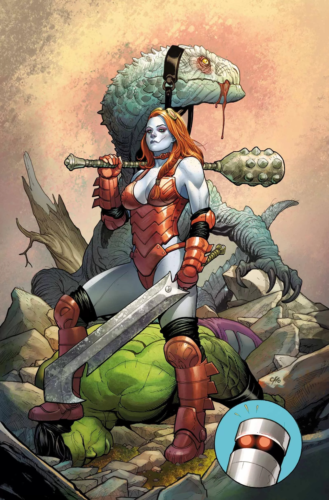
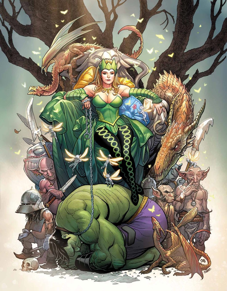
Not long after our last take on DC evil sexy ladies, we decided to balance things out with some Marvel characters as well. And by complete coincidence, we both chose artwork in which they stomp on Amadeus Cho! Clearly, that means they’re dating.


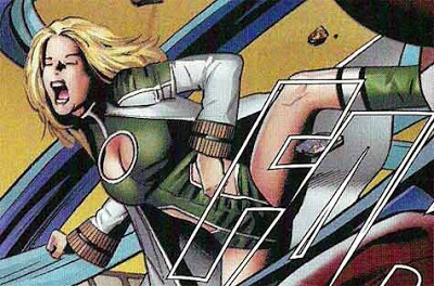
Lady Hellbender 

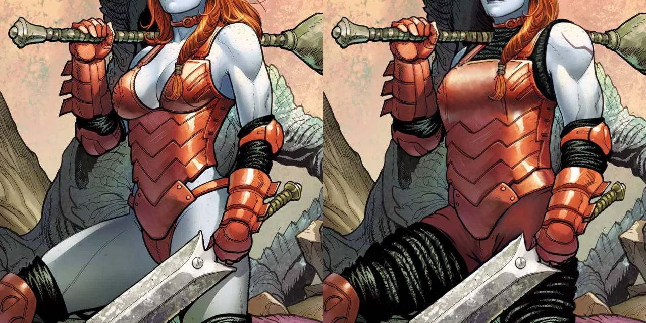
While Frank Cho is a human dildo, I will admit that unlike most other whiny dudebro artists he has actual skill and grasp of human anatomy (when he wants to, at least). This is a technically good drawing, with Hellbender’s bizarrely sexualized costume as the only real flaw

(again, those panty-line bars! (ノಠ_ಠ)ノ). 

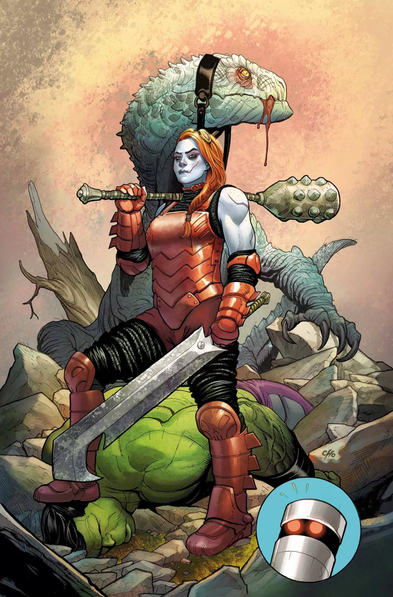
Obviously I started the fix by getting rid of the cleavage, boob cups and pinched waist from her metal leotard. It no longer looks skin-tight, especially since I’ve added some padding in the form of the same black fabric she wears under her boots and gauntlets. I liked that material enough to extend it into faux-pantlegs that cover what her new shorts (replacing what seemed like a thong) don’t reach. 
Along with her armor, I reshaped her upper body. The suggestion of muscular arms was nice, so now they’re bigger, with solid thick torso to match. And a brand new arm scar, fitting the facial one.
image

One last thing about her costume that needed fixing was her left foot, which inexplicably is drawn as if the boot was a wedge heel, asymmetrical to right foot’s flat sole. 

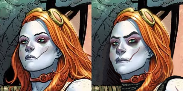
After I was done with the outfit, her face called for some un-genericking. There is a promise of unique features in there (mainly the visible scar), but it falls short, quite obviously due to Cho’s cowardice at making her *too* far from conventionally attractive. As we mentioned before, the color scheme makes her look quite close to Harley Quinn (and arguably also Poison Ivy), which is just bad character design. 

I started by changing the hairstyle into more practical one – the braid was already there, so why not make all the hair be part of it instead of flying loosely? It’s also not visible at this angle, but I decided that her right temple has some undercut action going. 
image

Next I made her scar more prominent with color change. Then very subtly turned her features a little more square, gave her a bigger nose, thick natural eyebrows and a tiny bit of facial hair that so much mainstream media denies to depict on women. Also extended the dark lower eyeshadow. 

Final touch was, of course, the expression – no more vacant supermodel stare.  Someone stomping the Hulk to the ground deserves to make an intimidating face at the camera

It’s one of the most satisfying redesigns for me. Hope you guys enjoy it too! 

~Ozzie 


Enchantress

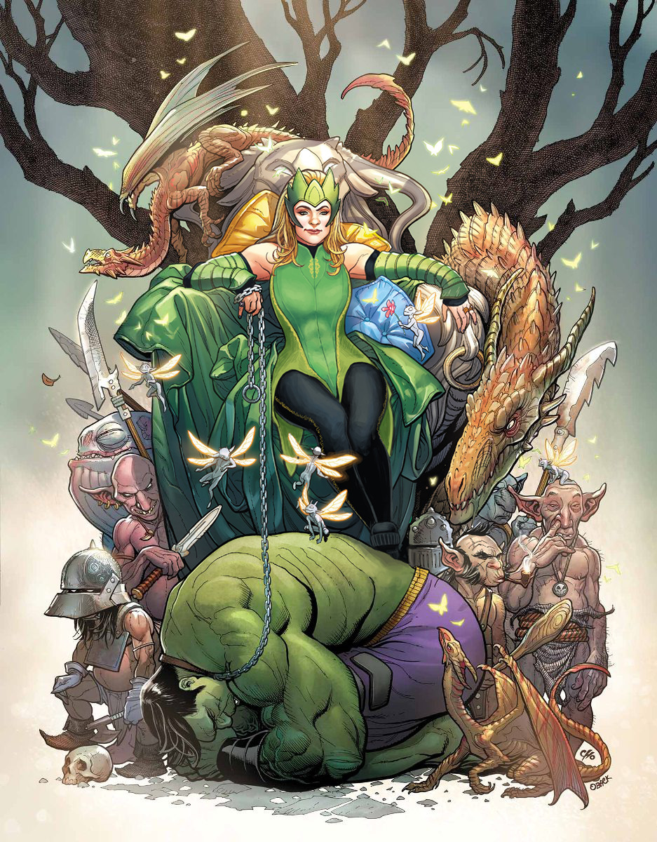
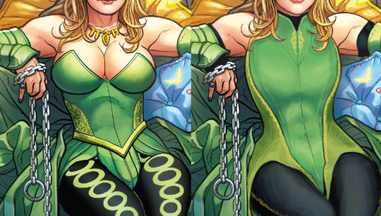
Another Hot Chick who was supposed to look intimidating but does not at all; is this a redesign type I have? All of my design choices centered on this one around making Enchantress into someone to take seriously. Most of the changes were small, outside of her tiddy situation.
image

I gave her a leotard-type of thing with some nice lines to break up the big shape, and some small details in strategic places. I also made her weird side embroidery into a larger part of the color scheme. I gave her some sick abs under that costume, as well as bigger shoulder and arm muscles. To finish off the upper body, I gave her spots of black to tie her color scheme together. It’s honestly kind of jarring how only her legs have the black in the original.

Next, the leggies! I got rid of the big circles that were Bad, and gave her some stitching down the side of the leggings instead. And I gave her platform shoes to really stomp on that Hulk, rather than… daintily breaking perspective with how the Hulk’s got no shadows on him, but the chain and foot are in front of him….?

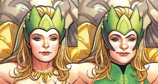
Finally, I changed her face and headpiece. I wanted her to actually look menacing, rather than like a beauty queen wearing a tacky green crown.
image

And yeah, I guess I got a thing for one-sided smirks, but she’s still hot. She’s just got more attitude and control and a more interesting face than… nothing. Y’all really have no idea how I hate the White Girl Nose so many lady characters get in comics.

This was definitely a fun one and I like what I ended up with. I personally think Ozzie and I did super well with faces this time around. Give us more Intimidating Looking Ladies!

-Icy 
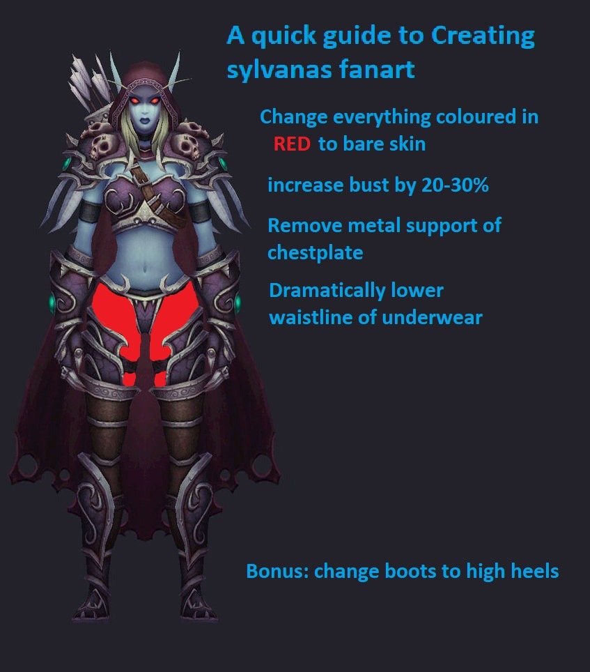
Soul Calibur – please put some clothes on!

This was our first attempt at fixing some of the most egregious excuses for costumes we could find in Soul Calibur games. Both those heroines would return to our streams on other occasions (including a special, already released post).


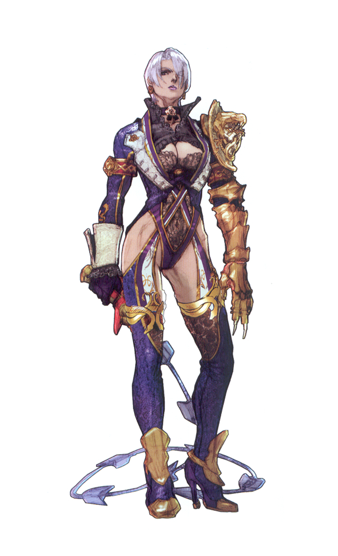
Ivy

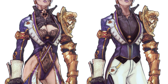
My mortal enemy, Ivy Valentine’s declining standard in outfits. Ugh. I chose her because I love to play her when I do get to play SC (not often these days), and because she’s supposed to be a Machiavellian Immortal Super Villain (sort of), and boy, do none of the lingerie designs communicate any of this.

So anyway.

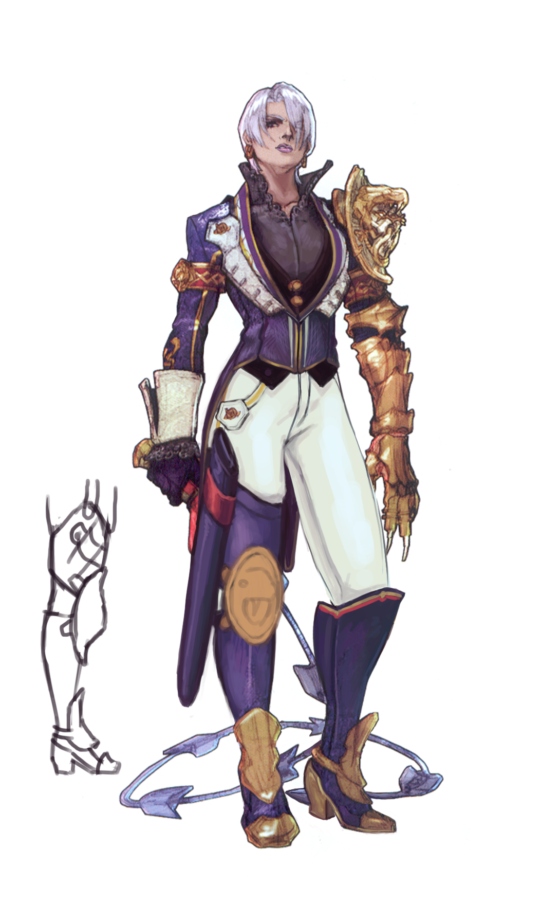
I picked this concept art from SC5 cause at least it’s redeemable. I always liked her more suit-like designs, because that shows off her personality better, I think. So I went with that and gave her a functional, high-class (cause her fam’s rich) kind of suit. Due to a personal preference for 3-piece suits, I gave her a vest to go with it. I mean, she’s still hot as hell.

image

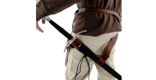
I gave her pants, obviously, and of course, actual shoes with thick, sturdy riding heels. My last addition was this thigh sword sheath thing, because I didn’t want to break the lines on her waist and hips with a belt, but it might have been better to give her a belt sheath that hangs in the back. Like this:

image

It’s not as silly and I could hide the belts under her suit or something. I also wanted to incorporate the snake motif more, so I did a derpy sketchy one on her knee there.

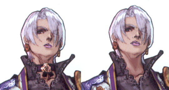
Oh, and the face!

image

I hope Cassandra is proud.

-Icy


Tira

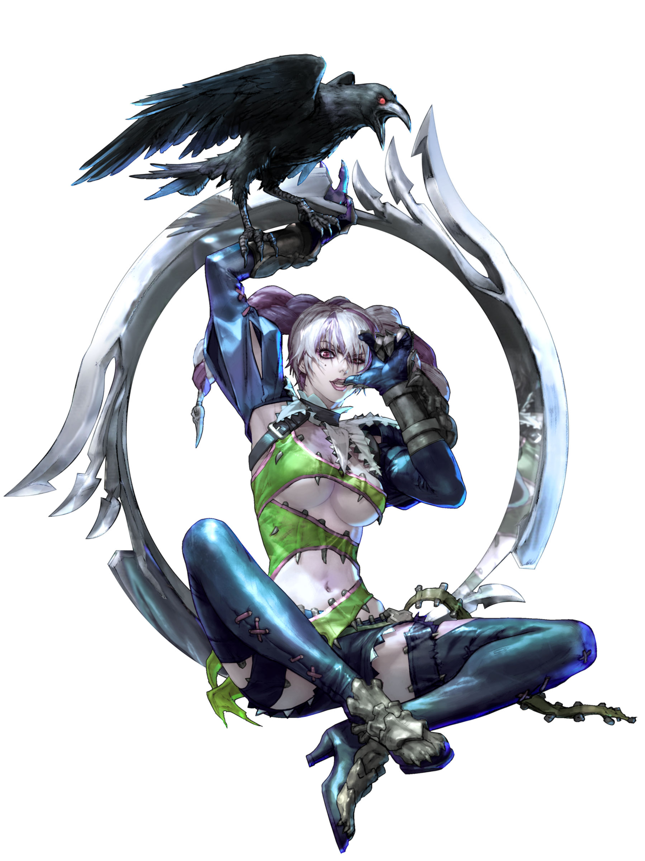
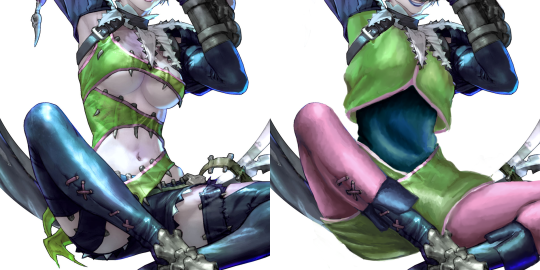
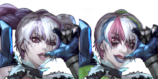
Tira’s aesthetic not only is “poor man’s Harley Quinn”, it’s also clothes so incredibly tattered, there’s no way they’d stay up under any circumstances. 

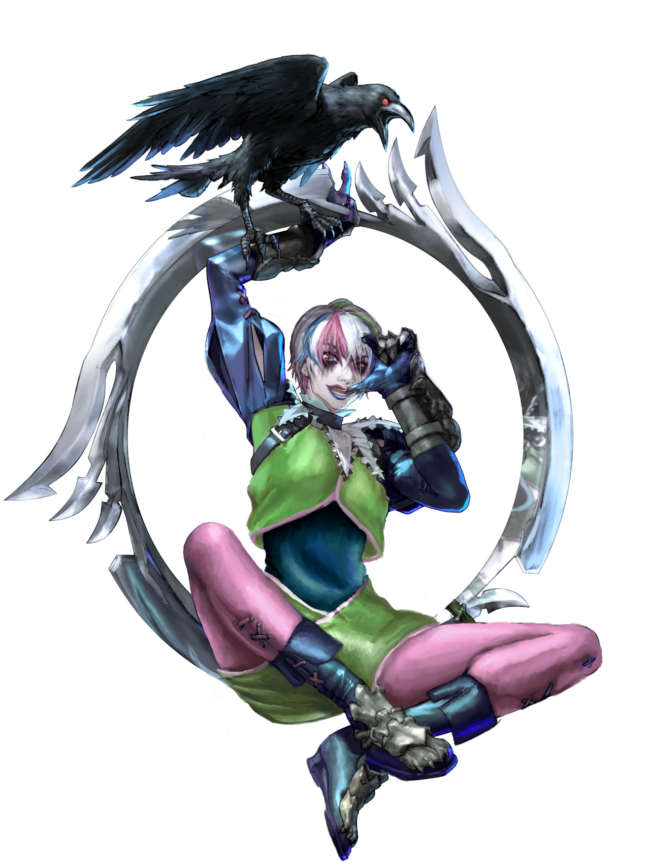
I wasn’t particularly inspired during that streaming session, so I concluded that as long as her clothes look wearable, it counts as improvement. 

image

Can’t say I’m all that proud of overall design, especially the cut of her blouse and pants, but they came out of desperation to save her from chilly winds and to layer the tights and undershirt I gave her. I guess it’s supposed to be a vaguely clown-like outfit without resembling Harley’s. Got the pink for the tights from her eye color and super faded pink-ish highlights in her hair…

image

…speaking of which, since her weird pigtails looked detached from the rest of the hairstyle, I got rid of them altogether and left her with a bob. Then recolored (and added some more) highlights matching her overall color scheme. 

While the clothes I gave her are a big meh, I’m quite proud of the changes to her face, expression and makeup. Tira is supposed to be super unstable, so a runny mascara matches her personality much better and gives her more intense gaze.
Also two-colored lipstick, to compliment the highlights. And I gave her much bigger mouth with more wicked smile, a bulbous nose and a unique jawline – now you can recognize this lady by her facial features, not just color scheme. You’re welcome.

~Ozzie

@emissaryofwind submitted: 

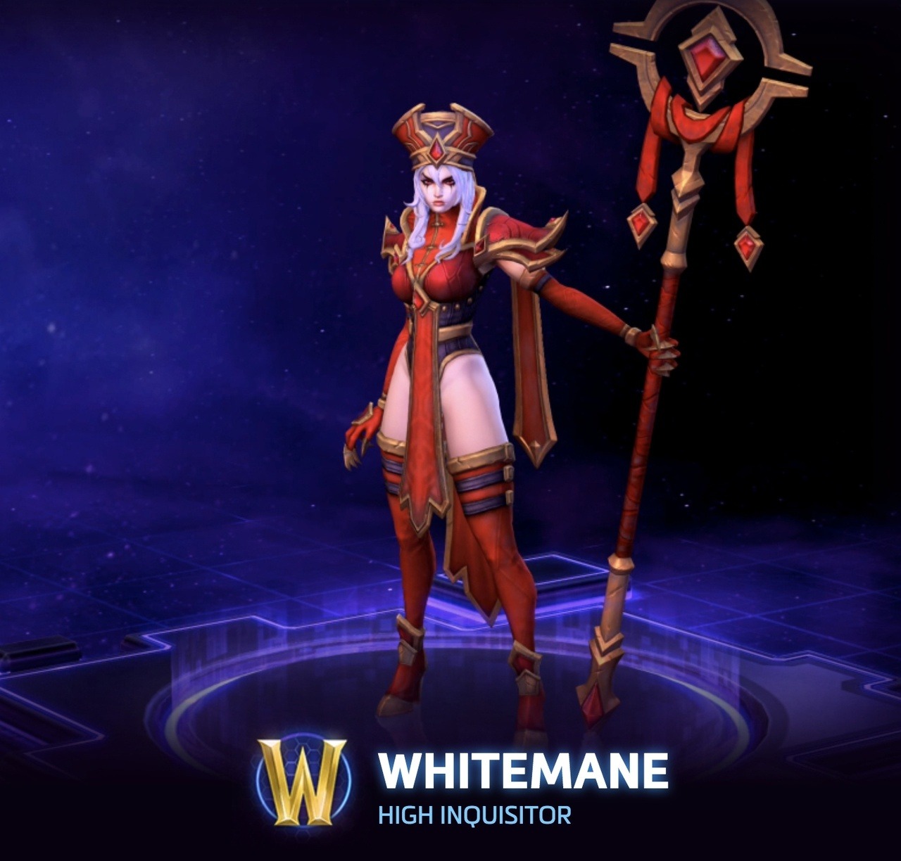
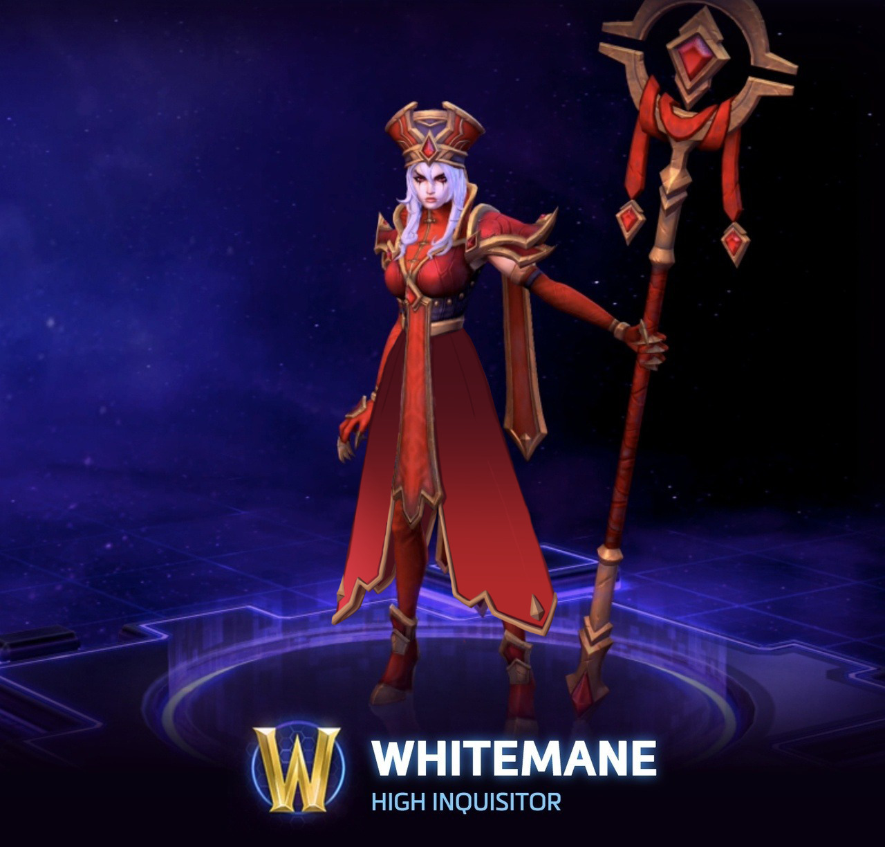
With Sally Whitemane’s High Inquisitor skin, I didn’t want to change much, as her design has some really cool elements and style. Rather, I chose to turn her leotard thing into a coat, keeping the style of her hanging banners. After all, the idea of an inquisitor is much more closely associated with flowing robes and coats, and a leotard isn’t usually considered appropriate attire for religious leaders. 

Such a small change in the overall design, and suddenly she looks like a religious leader! I would love to see a skin similar to this one in-game, instead of what we ended up getting.

This isn’t the fault of the redesign, but covering her legs really highlights how the original artist considered Whitemane’s skin to be a color in her palette; without it, she just has red and gold, basically (the black is barely present). The original design just keeps disappointing, really.

One small thing, and granted, it’s hard to see in the picture, but I’d get rid of her ridiculous stiletto heels. I think overall, this redesign really showcases how inadequate the original is in its intent. Thank you so much for the submission!

-Icy

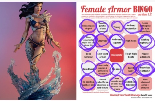
HOLY UNDERBOOB, BATMAN! 

image

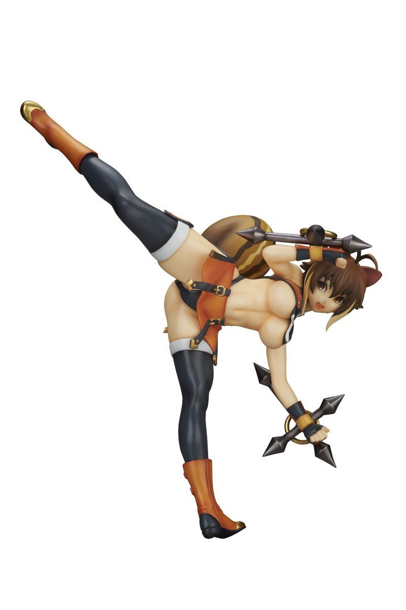
WHAT THE FUCK AM I LOOKING AT?! Icy, why did you show it to me?! T^T 

So this figure is supposedly from a fighting game with PEGI 12 rating, not a hentai… I doubt Tumblr bot will agree, but I’m willing to file an appeal, if necessary. 

Setting aside the objectively terribad costume, maybe if it was just a screenshot I could believe that this is supposed to be a dynamic fighting stance… But having this be a figure that can be ogled from every angle, I know we’re supposed to always land our eyes on her crotch and/or underboob.
That pose looks so borderline porny that I can’t help but be reminded of Greg Land’s drawings literally traced from adult movies and magazines: 

image

~Ozzie

Uprooting the Sexy Flower Warriors

[We’re not sure how a draft gets posted without our permission, but Tumblr might as well start collapsing from all sides at this point. Here’s the actual full post!]

This stream we decided to devote to Flower Knight Girl, another game that, much like Kanpani Girls, seems to be an endless depository of really generic moe warrior girls in creepily skimpy “armors”. With the added gimmick of each character being flower plant-themed.


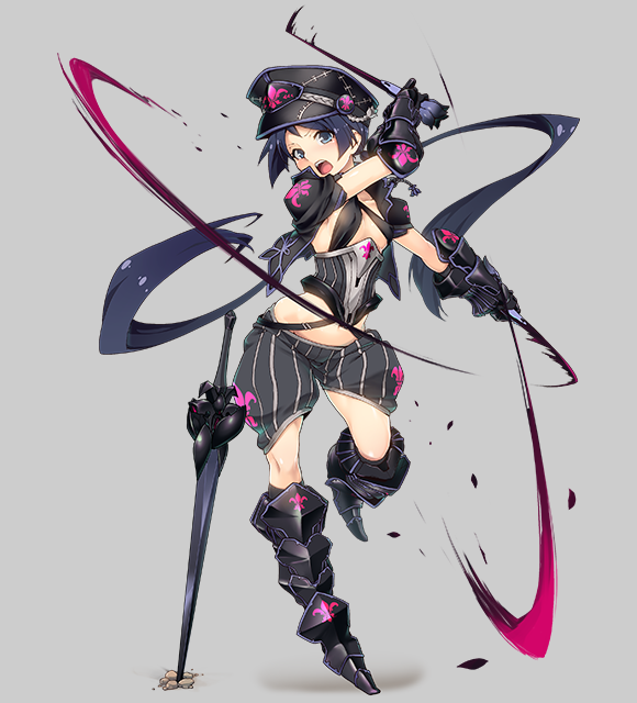
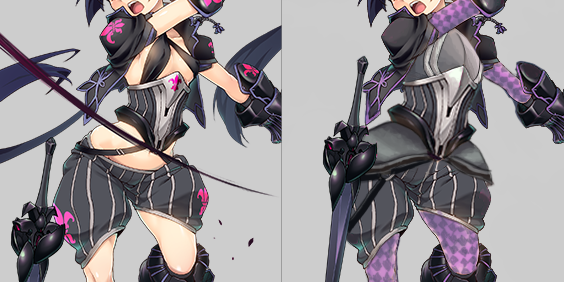
Fritillaria/Chocolate Lily/Chessboard Lily (Evolved) 

This dominatrix-looking lady apparently “evolved” by exchanging a short dress and no pants for short pants and two ribbons. Her previous form, for comparison: 

image

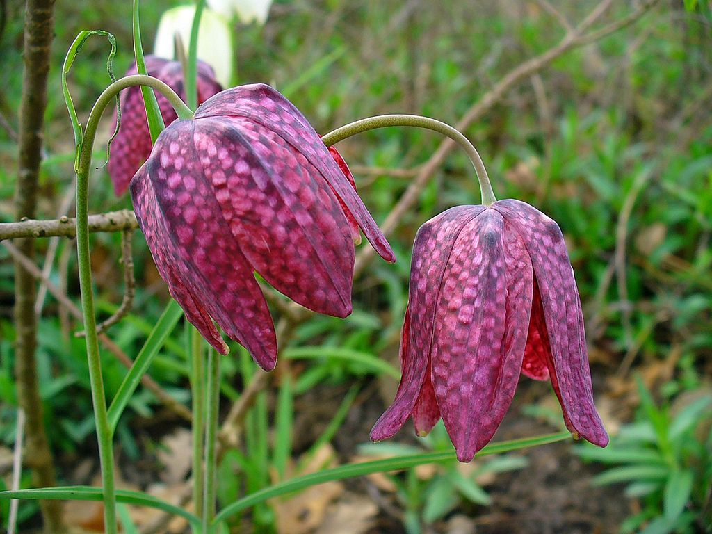
Looking for inspiration, I just googled “fritillaria” and I learned that in Polish we call this kind of lily a “chessboard flower”, for pretty obvious reasons, once you look at its petals

image

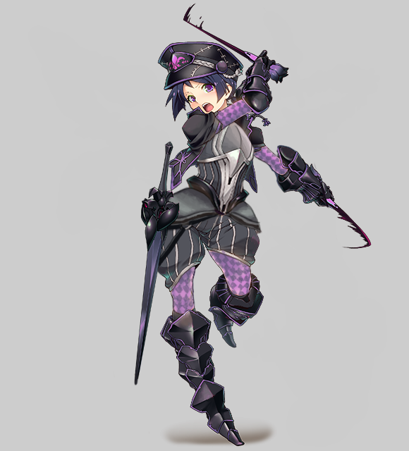
I decided that though this character seems based different species, fritillaria camschatcensis (there was no info on her being “chocolate lily” back then), fritillaria meleagris is much more striking visually, so I included its colors and chessboard pattern in my redesign. She doesn’t resemble her actual flower in the first place anyway. 

While the costume is amazingly skimpy and objectifying (especially that excuse for a “bra”), it’s not without a potential. There’s promising metal cincher, which I decided to enlarge and turn into full breastplate, and she comes with POOFY PANTS, a staple of BABD redesign streams, which I adorned with tassets that compliment their shape and match the breastplate. 

image

I got rid

of her long-ass pigtails and of all the action lines, which collectively made the composition more chaotic than dynamic. Minor thing that bothered me was her sword being stuck in the ground for some reason instead of fastened to her belt, so I quickly fixed that too. The final touch were, of course, sleeves and tights with purple chessboard pattern, which tie the whole thing together.

I found the abundance of fleur-de-lis symbols on her to be hilariously excessive, to the point I erased all of them during the stream. After some deliberation I figured that maybe the one on her hat fits, so I just muted its color, because magenta doesn’t fit the new scheme I gave her. 

All in all, I find Fritillaria to be one of my most inspired redesigns, which makes me doubly disappointed in her creators, considering they could have just googled a flower photo to get some non-boring ideas. 

~Ozzie 


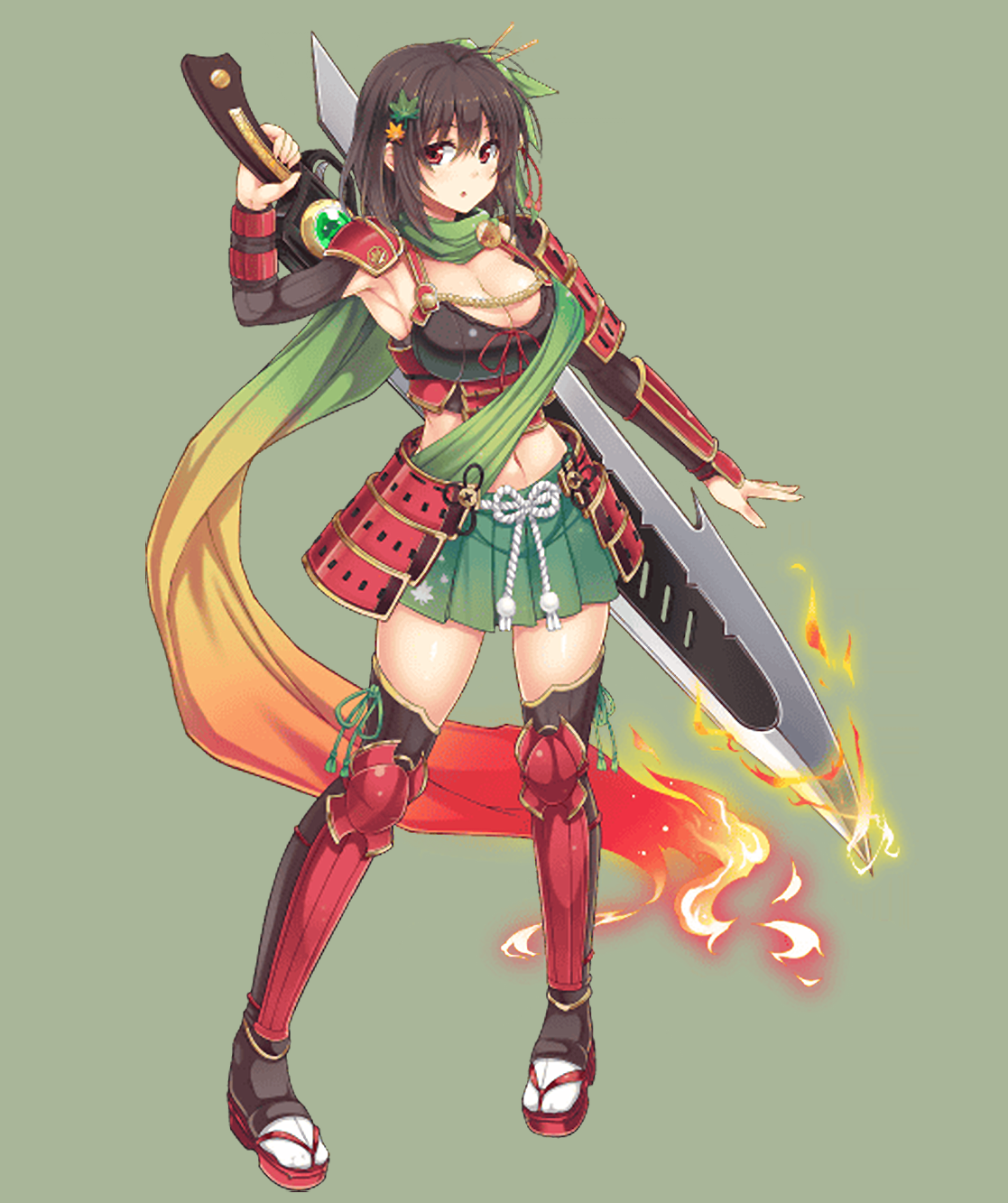
Maple

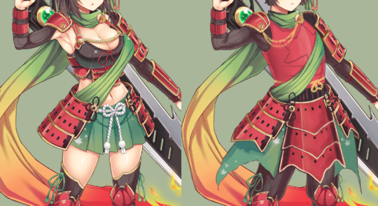
Love how she’s apparently Maple by the fact that she has some maple leaf hair clips and a bit of a maple leaf pattern on one small part of her mini skirt. So for this one, I channeled my inner Blizzard character artist, in that I wanted to way overdo the whole maple leaf theme. (I used samurai armor as reference.)

I ended up redoing almost her entire torso, since I needed to give her an actual breastplate, instead of… I guess it’s a crop top camisole? (Do those exist?) Then I gave her actual kusazuri (the plates hanging down her legs), and made them maple leaf shaped!

image

I did give her a less traditional chest piece, but there are so many small shapes in the design that we needed the main armor pieces to be bigger, I think. I did break it up with a huge maple leaf on it though. 

I also hated everything about her face and hair, so I gave her a more traditional hairstyle to match her more determined expression. There were also a lot of smaller edits, like flipping her foot around so she’s not standing as awkwardly, and adding some volume and muscle to her sword arm.

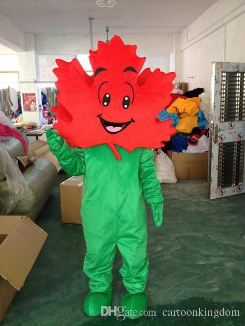
And finally, I added a few more small maple leafs to her “skirt,” to really reinforce that maple leaf theme. I’d hate for people to miss it. Though, honestly, after finishing this redesign, I think she should just wear a maple leaf costume.

image

-Icy 
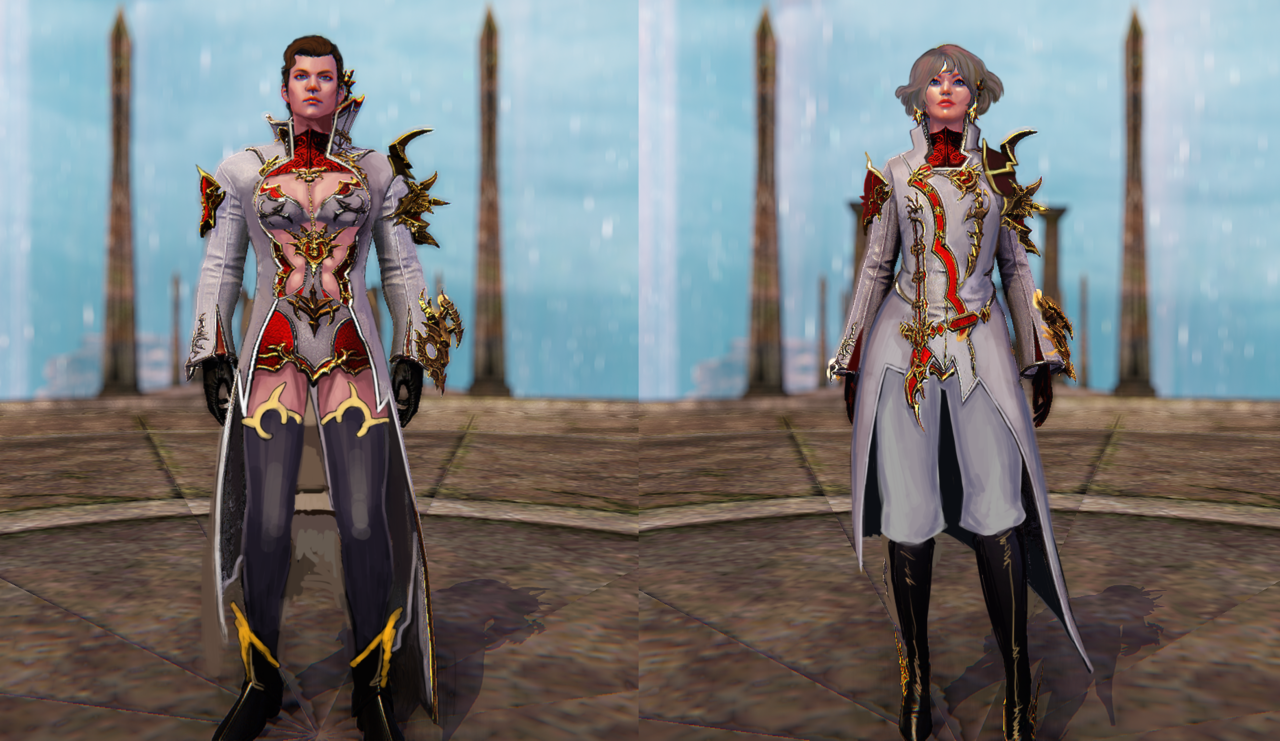
A while ago, we got a submission of an Aspen Matthews figurine where she only had 2 1/5 pieces of bone armor on. Tumblr flagged the post as adult content, so here’s a picture:

image

Turns out, there’s another bone armor version of Aspen! This one has more bones, though I would still call this 2 1/5 pieces of armor collectively, since that torso piece is not a full piece of anything, besides Disappointment. 

At least she has biceps? Though they seem to be coming out of her boobs.

-Icy
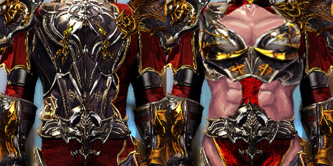
Riders of Icarus Switch 

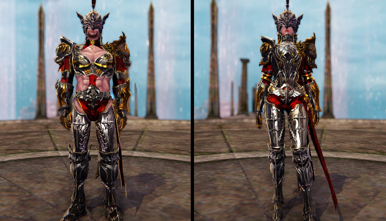
Another victims recipients of our switch treatment, after Saint Seiya Online, were costumes from Riders of Icarus


Guardian 

The change was a pretty simple copypaste job, I only adjusted details to better fit other gender’s figure. The lady’s weird incomplete underwear became full pants, the dude’s chin got exposed, so I gave him some lip gloss and goatee to flaunt it more. 

As for most crucial difference, the exposed belly and cleavage – in the original the skin looks jarringly different from the armor, as if literally rendered with different engine settings. I decided to preserve the plastic-y look of the flesh to accentuate the guardian’s masculine body. Which, BTW, probably features my best painted abs so far.

image

~Ozzie 


Wizard

This one, too, was basically a copypaste job, except that I hated the shiny pants texture, so I drew them in real quick. I also changed both of their hair to not look like Absolute Garbage. The weird… leotard? lingerie? cloth coverings do end up covering basically all of the fun parts of the dude’s torso, and unfortunately, I didn’t give him my patented Semi-Translucent Bulge™. Especially with that sharp ornament pointing right at his crotch. Believe me when I say, I will not make the same mistake in future streams. At least I made sure his coattails didn’t cover his ass.

Overall, it was a fun and laid-back redesign, I think.

-Icy

A Quick Return to Heroes of Newerth 

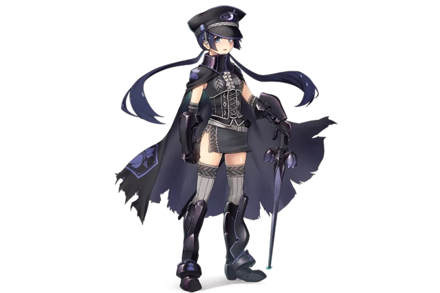
While Icy was working on her list of WIPs (some judgment, mostly from Icy herself), Ozzie trekked beyond the usual Heroes of Newerth gallery and found some officially posted concepts on Art Station. And they were all great, right? …. Right?
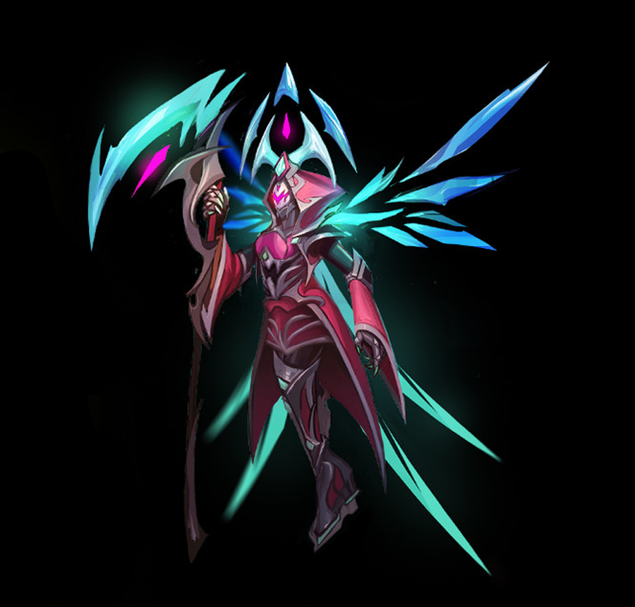
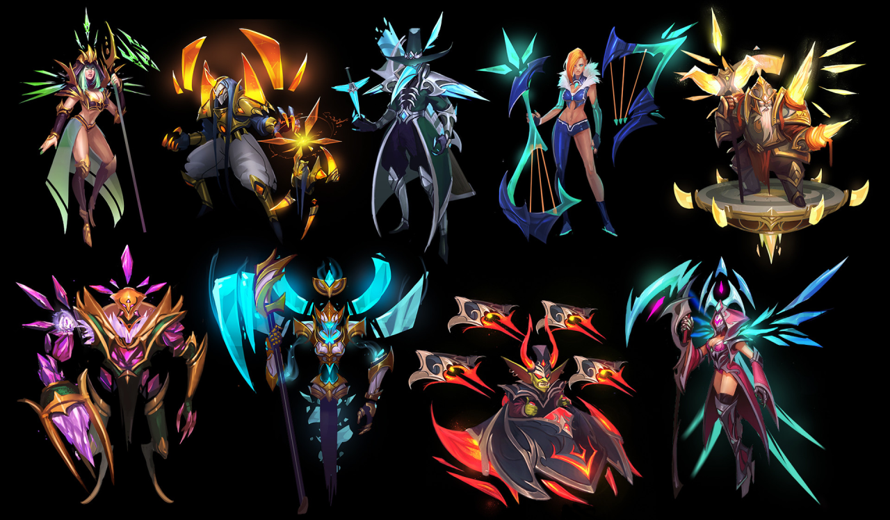

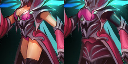
Looking at this set of character concepts I noticed certain… discrepancy between male and female-coded ones. It seems that the designs are pretty nice and geometrical, and work pretty well overall. Until a woman is being designed, where the priorities seemed to be cleavage and leg over a cohesive overall look.

image

I believe it was one of the technical difficulty/limited time streams (also the pics were relatively low-res), so I opted to do very simple, minimal changes – just by covering up this pink/teal Grim Reaper-y (?) lady’s bare skin and giving her wearable shoes. 

image

Bonus for no more “eye” designs on her boobs. I kinda like the skirt I gave her. Not much to say beyond that.

~Ozzie 

PLACEHOLDER

BattleWrong – We’re sure that Joke hasn’t been done before! 

Battlerite’s a bit of a disappointment in its character design. They seem to have cool ideas (for the male characters and Iva), and their art style is cute and colorful… and yet. So why not try to fix some of their more uninspired designs?


Blossom

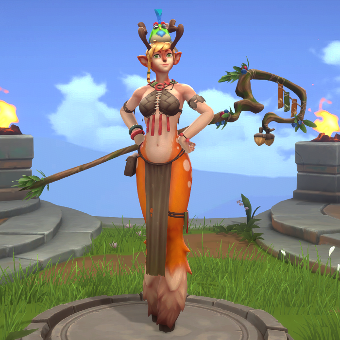
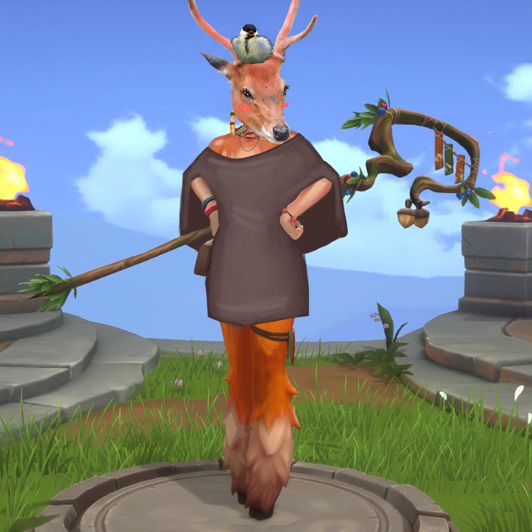
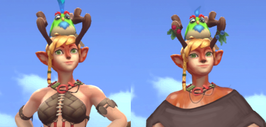
To be honest, my desire to redesign Blossom was from my deep-seated frustration with animal-looking characters having a humanoid body shape. Why couldn’t she just be like Puss in Boots from the Shrek movies? Just a deer that stands on her back legs, without breasts and a skinny waist and hips. I realize that she’s a “faun” according to the wiki, which means human/animal hybrid, but the fact that she has both hair and fur on her head/face makes it look like they just slapped some tits on an upright deer. Maybe they were going for something new, but boy did it not work.

I tried to give her more clothes at first, but then decided…. screw it. She’s a deer now. Why does she wear clothes? So in the end, I just gave her a simple poncho. I did want to show off her deer-ness, so I left her shoulders uncovered and gave her upper body some fur, so it’s not weird that she has the same on her face.

I also changed her face to be less Generic Cute Girl.

image

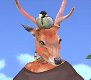
After I finished the edits, we started making jokes about just Photoshopping a deer head on her instead, so I did that. Got some images of a deer and a birb off the internet, and so Blossom’s True Form came to be. (You can still see the lines from the stock image watermark.)

image

[She’s beauty, she’s grace, she’ll throw an acorn at your face.]

The result is fairly simple and could probably use some embroidery or patches of different-colored cloth, and some people might say this was an easy cop-out on my part. But I just want her to be a deer, not a deer with boobs; is that too much to ask for?

-Icy


Freya 

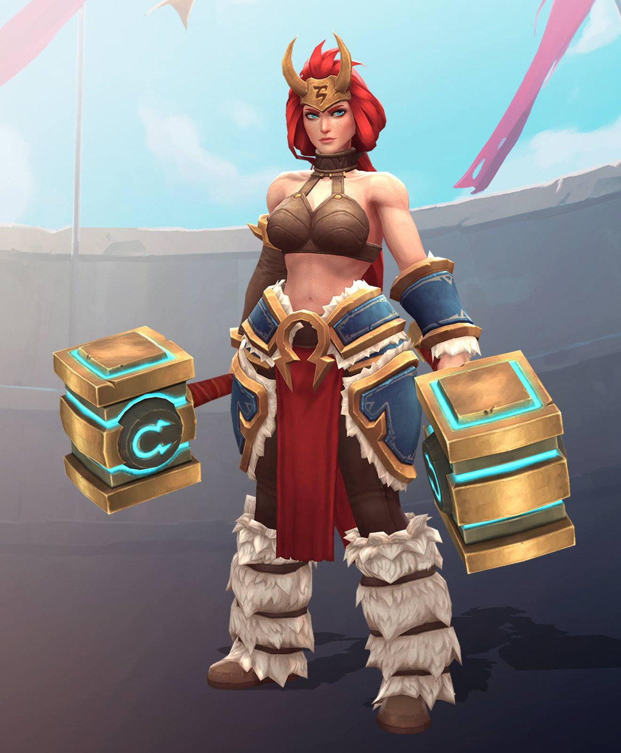
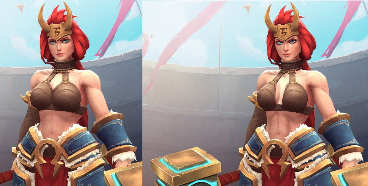
Thing about Freya’s original design is that I don’t actually find it overall bad – the random bikini top that looks like coconut shells strapped to a choker is the only thing that ruins it.
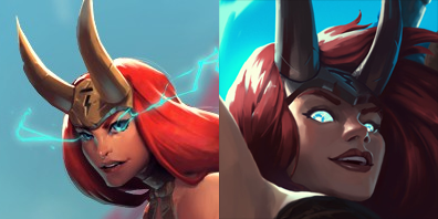
As mentioned back when we bingo’d her pre-update design (with even worse, sideboob-y bikini top!), she looks pretty great from waist down. Also, while far from unique, her face shape is allowed to be a tiny bit more angular… when viewed from certain angles, at least. 

image

(basically it’s Zarya level of safe approach to diversity in female facial features – still conveniently attractive and wears makeup, but allowed to have square-ish jawline, given that you tilt your head and squint)

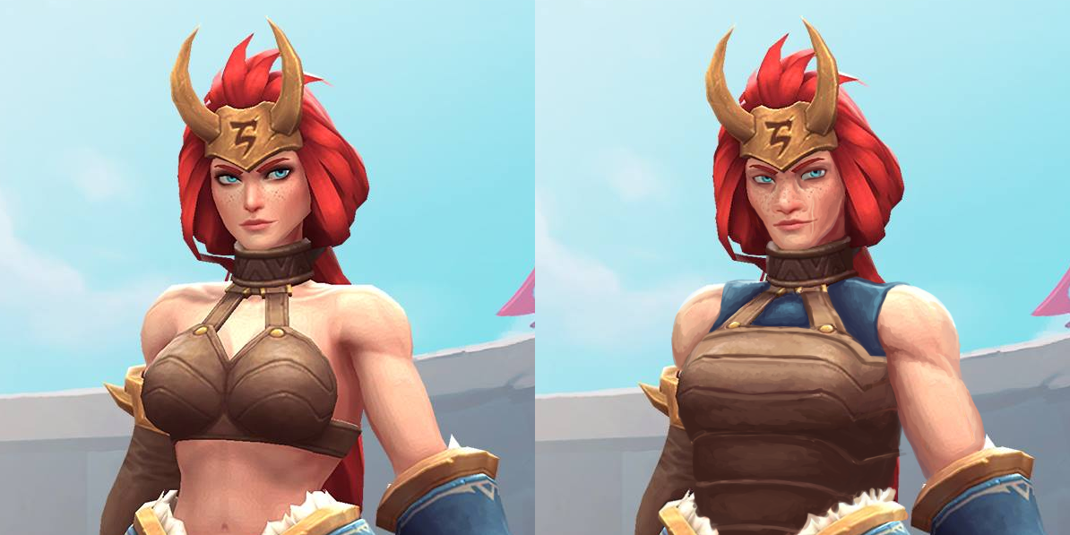
But since I couldn’t spend 2 hours of stream only painting her a decent top, I decided to build upon what’s there and add some more actually distinct features.

image

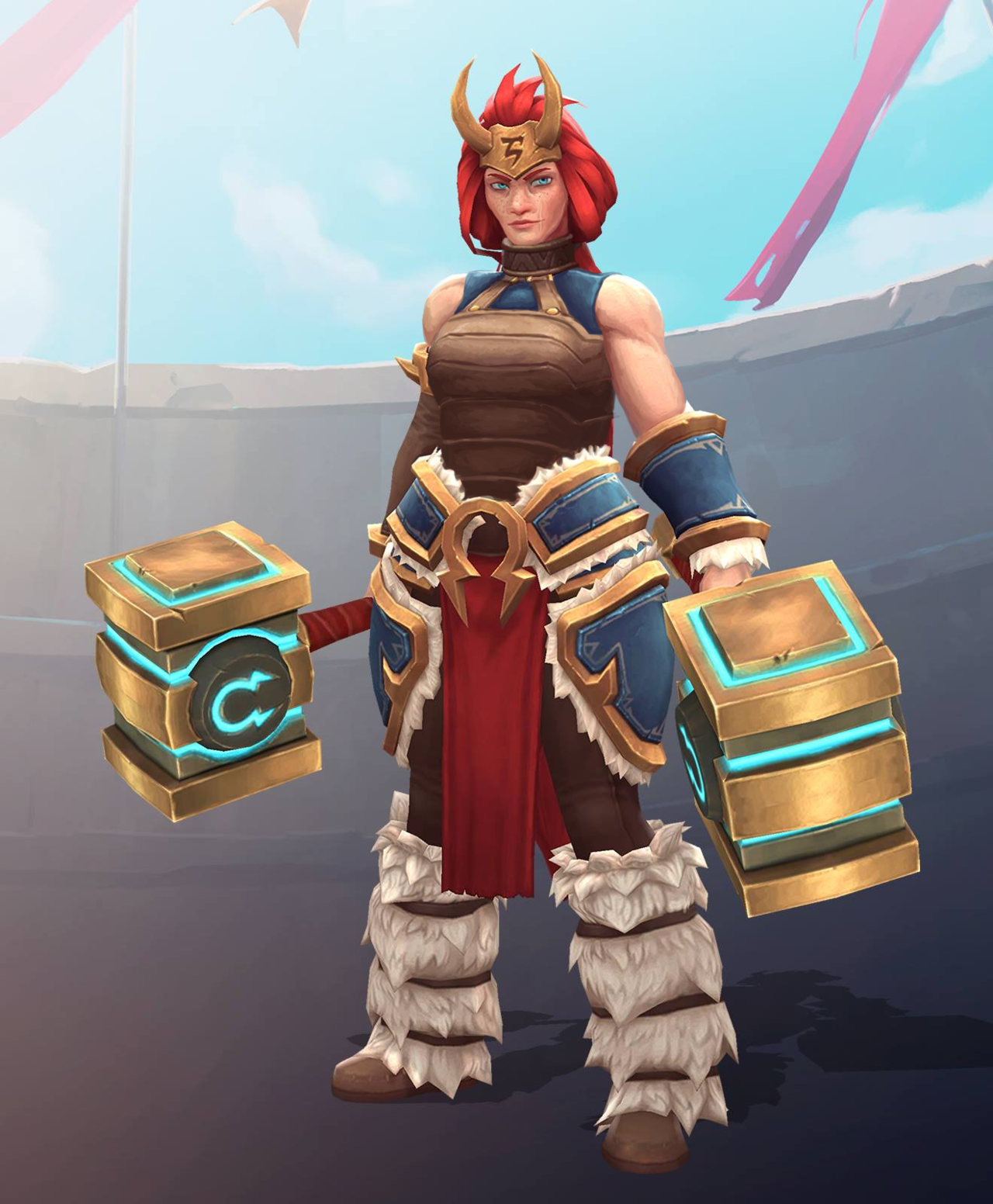
Of course, the boobplate had to go first. Since it bore some resemblance to Angela’s (coincidentally, also character associated with Norse mythology), I decided to base Freya’s new breastplate on my earlier Angela redesign. Also a blue tank top matching her bracer and tassets, for minimal layering. Left her shoulders bare, just gave them a tiny bit more heft. 

I approached tweaking her face to create a more believable character. No makeup (which, unfortunately made her blue eyes with orange eyebrows stand out less), more prominent freckles, bigger nose, more sunken cheeks… All to create an image of a warrior who’s more concerned with surviving battles than spending hours in front of the mirror. 

I’m rather pleased with the subtle changes to this design and my painting technique in this piece. Hope you guys like it too. 

~Ozzie 

PS: I didn’t know that while doing this redesign, but apparently some genius on Reddit, upon seeing slightly more boob coverage on Freya’s official updated design decided to “fix” her back to her original bikini. (╯°□°)╯︵ ┻━┻ 

image