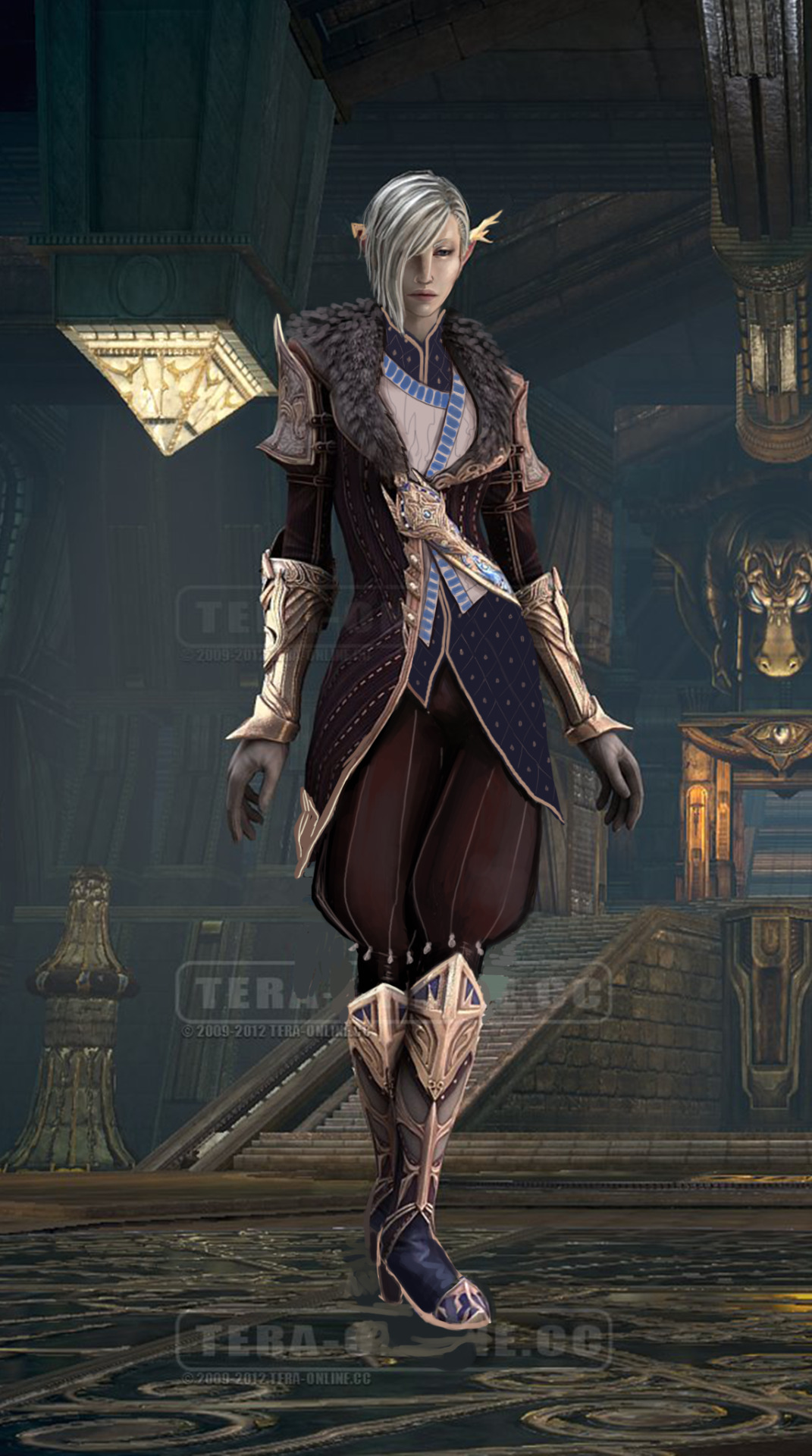
Wrestling with TERA’s anti-fashion Part 2

Yikes.

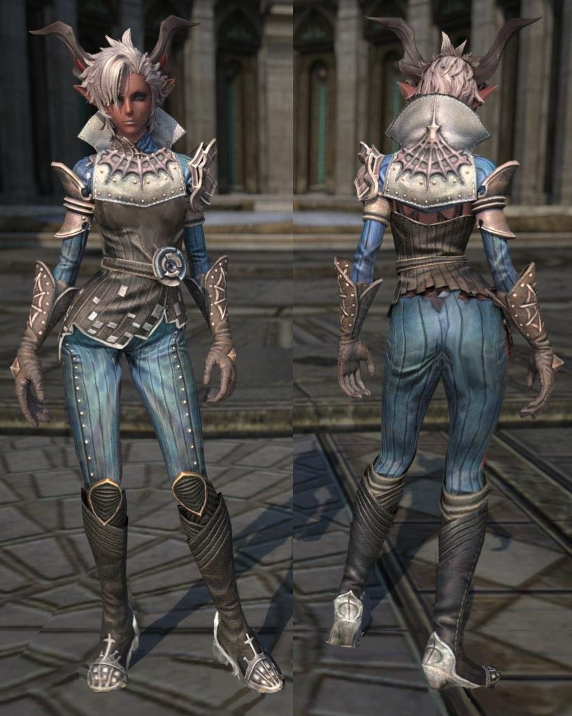
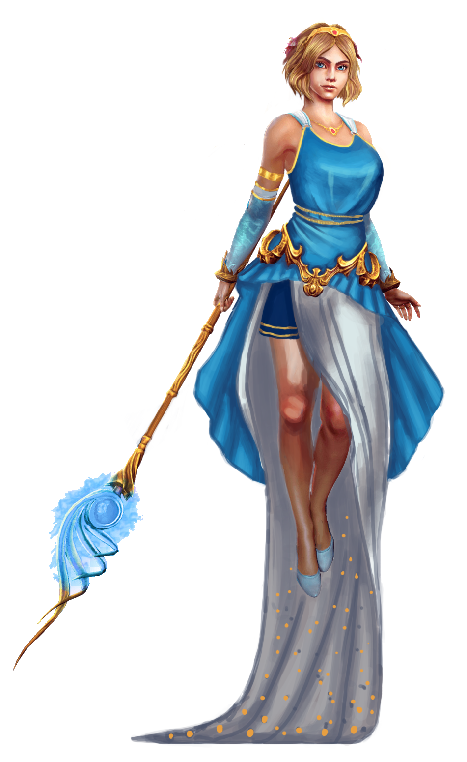
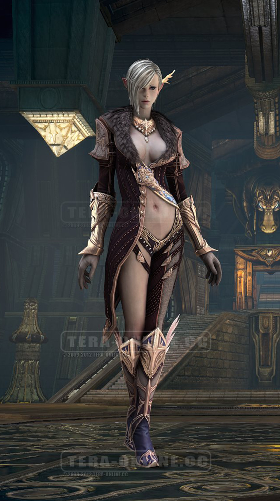
So I decided to challenge myself yet again by picking this number. Back in an older post on TERA, I talked about how some of the armor designs are good designs for runway fashion, and I think the high elves, which is what this lady is, embody that most of all. I think each race has their, like… fashion niche? Like the demons are all Victoria’s Secret angels, ironically. And we don’t talk about the children with animal ears.

(And because I needed to fill in all those little details, I didn’t have time to do the back of her :(. )

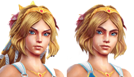
I started with the face as usual, because I honestly hate the original in this regard… Like, what is with this Stock 3D Model face?? I tried to make it less human-looking since, you know… she’s not a human. (I kind of ripped off Dragon Age 2 in this regard, I guess.)
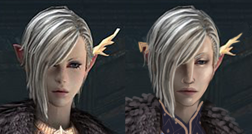
image

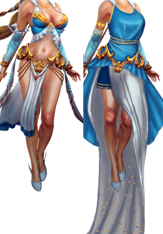
And then I changed…. everything else, as usual. Poofy pants, a whole 3 layers of shirts, and shoes you can actually walk in, we’ve got the whole package. I tried to make the shirt patterns work together, but I think I was a little overzealous… I also ran out of ideas. Oh well.
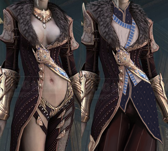
image

Hopefully my redesign still looks more like actual cloth armor than that big empty void of skin.

-Icy
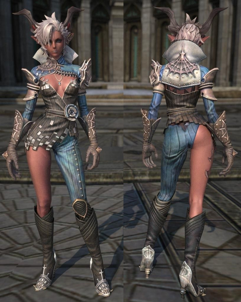
 Wrestling with TERA’s anti-fashion Part 1

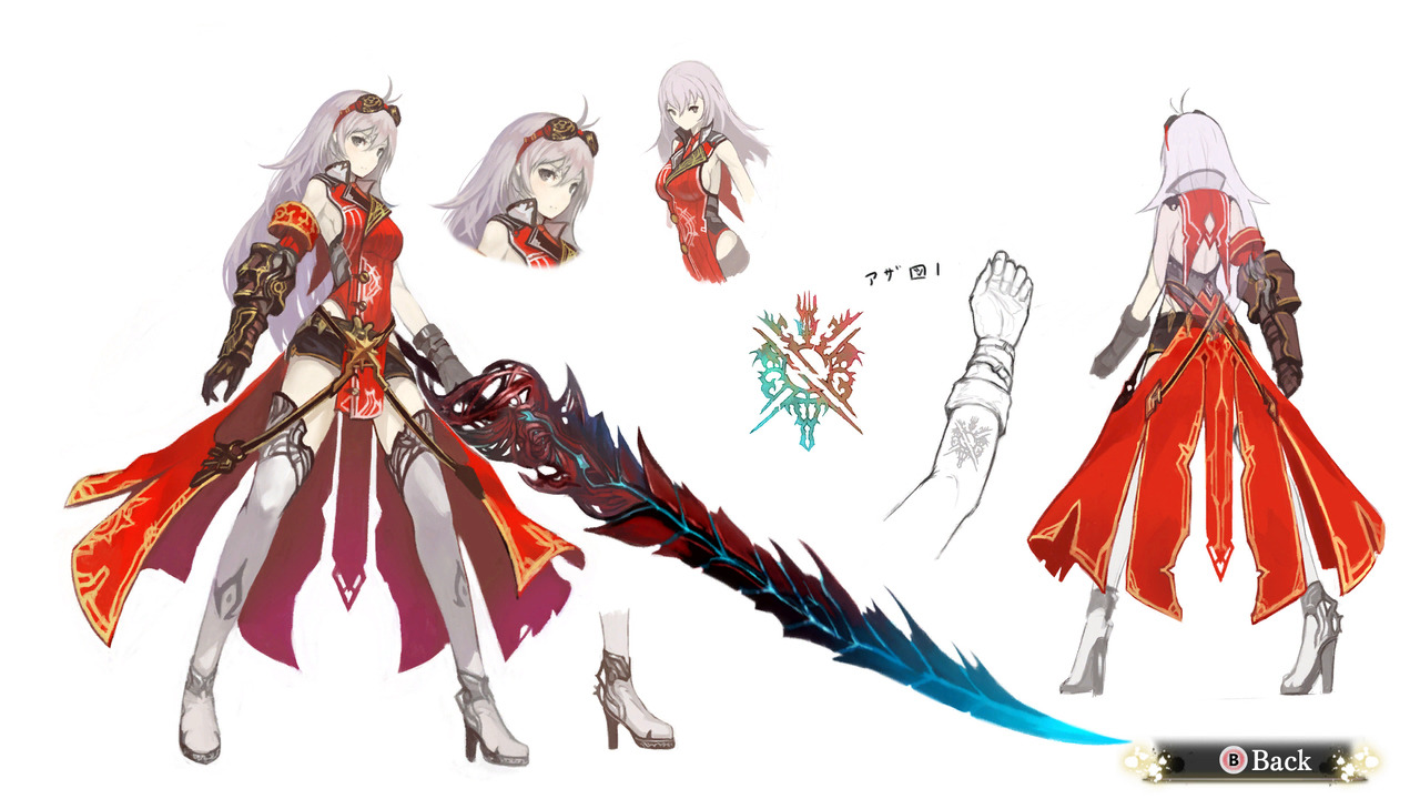
It’s no secret that TERA Online is the quintessential of gratuitous skimpyness and double standard in character and costume design in video games. As Icy pointed out before, some of the costumes would work fine as pieces of high fashion, but definitely not a believable wear for a fantasy warrior. So we devoted a livestream to maybe try fixing that. 

Not my most inspired of redesigns, though I concluded that it’s a win as long as I make it wearable. Maybe with more time to think it through I’d give her a different colored second pant leg, but she had to do with just symmetrical jeans this time. 

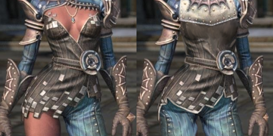
As usual, one of the most important things to do was getting rid of this absurd cleavage that clings to her boobs. I shamelessly copypasted her metal (?) back piece and adjusted it slightly to now be a matching front collar. then just painted over the excessive fleshy parts. 
Copypasting pant leg also required adjusting the hem of her top, so I gave it a slightly different shape, with white trim to make it stand out better. Also, spikes on her gloves aren’t as ridiculously spiky anymore.

image

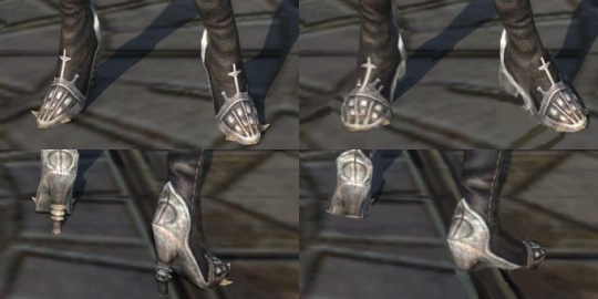
The part I’m actually pretty satisfied with are the shoes, which I managed to turn into a lot flatter heels, without making the design completely unfamiliar. Also got rid of completely pointless (ha!) spikes at the sides. Now that’s wearable and can fit a human foot inside without liquefying it. 

image

I admit, overall that’s far from my best, but with TERA you can’t go any more wrong than the original.

~Ozzie

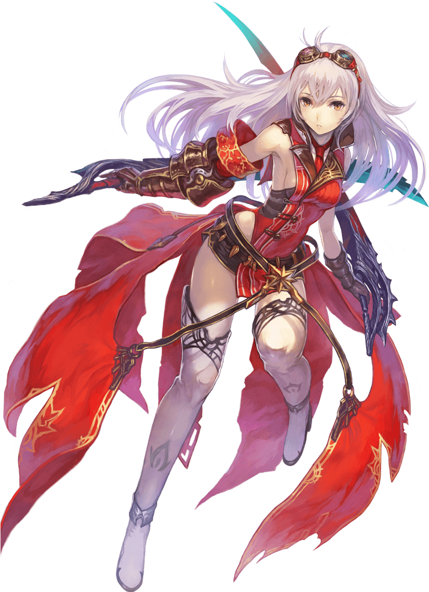
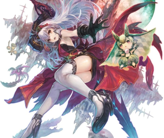
Contrary to her appearance, Arnice here is not in fact another card from Granblue Fantasy; she is actually the protagonist of a real RPG, Nights of Azure, where she transforms into various demon forms to fight things. This post is only about her main look, because each of her 5 alternate forms can warrant its own bingo.

Her design reminds me a bit of Velvet from Tales of Berseria, except they have the opposite problem in the front: Velvet has a bare stomach, and Arnice has bare sides and back. I suppose that putting them together will make one good design, at least from the waist-up.

Also, I checked whether that tiny piece of black fabric on her hips is a skirt or shorts, and it’s a skirt, because of course.

image

It seems we also have another attack of the Samus Piss Shoes

image

-Icy

Aphrodite in Lingerie, How Original ?

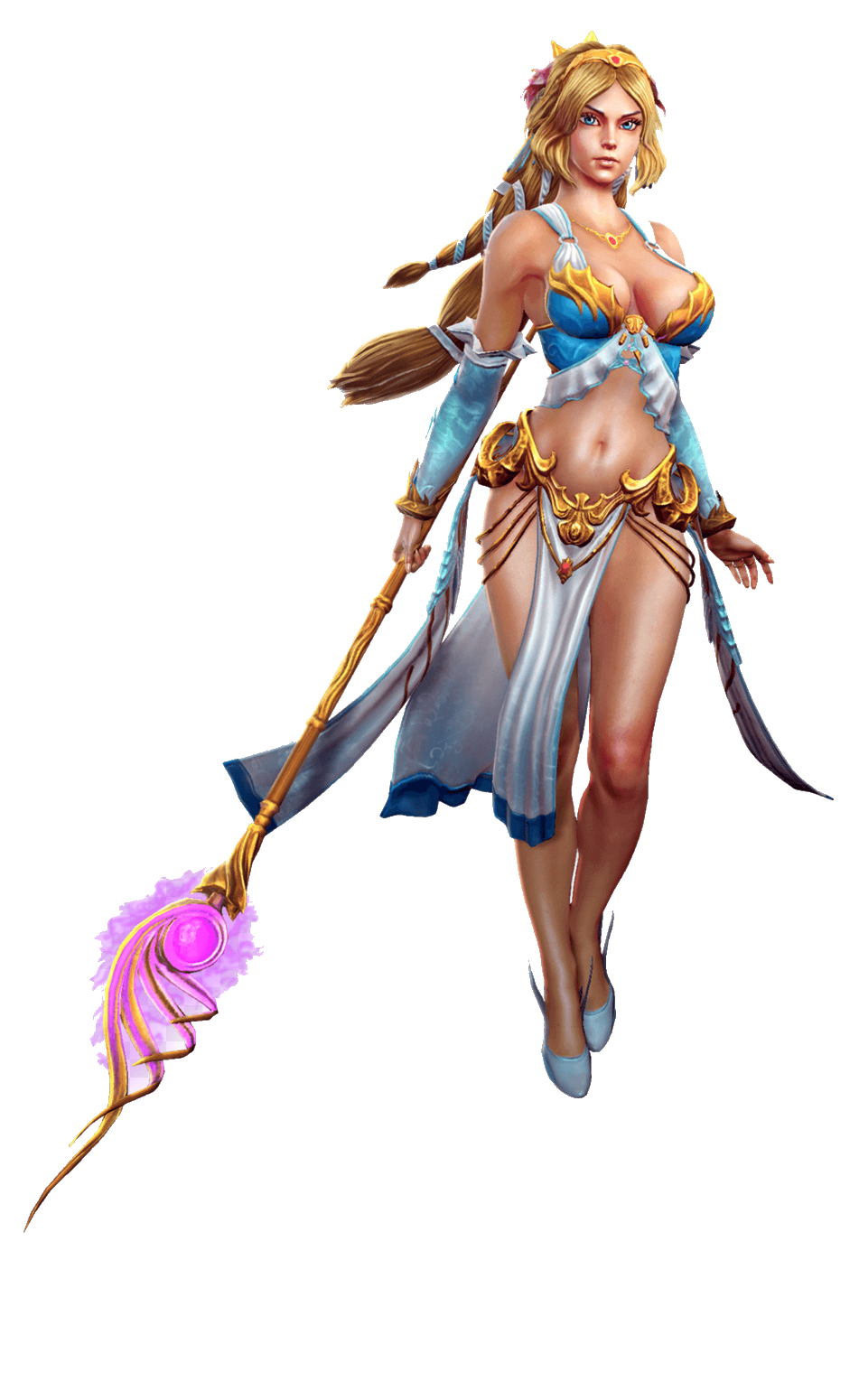
When picking out a goddess out of the SMITE pantheon to redo this time, I decided I wanted to try to make a “sexy” design that doesn’t rely on the Victoria’s Secret catalog. So here we are.

I didn’t change her body proportions at all, I only took the “in bra cup” shape out of her boobs. I gave her a draping shirt that’s more similar to ancient Greek attire. Isn’t it weird that the male Greek gods are designed to look more inspired by ancient Greek styles…. hmmmmm.

I did not give her pants, due to the ancient Greek influences, but I decided to make something out of the fact that she floats (for whatever reason). I ended up giving her a weighted skirt that would drag behind her when she moves. I imagine she could use it to great effect to look sexy or intimidating.

image

I left the belt in-place mostly because I didn’t have anything better to replace it with, but it’s definitely a bit much for the redesigned version. I think my shapes ended up being all over the place, but it’s still more interesting than the original. And I didn’t have to rely on lingerie for my design, what a shocker.

And last but not least, I changed her face to have more of an attitude and confidence.

image

Being beautiful and sexy doesn’t mean only having a specific type of face.

-Icy

A random game ad I found long ago… somewhere. I don’t really think this deserves any actual credit or research, considering this seems like a generic asset flip-type game web ad, including a cringy, vaguely sexual tagline!

The outfit, though, I think, justified doing a bingo. It’s basically a one big “don’t” in dos and don’ts of costume design

She’s clearly a magic user, though, why would she need clothes that make any sort of sense or keep her warm? Maximal skin exposure, with complete disregard for functionality and physics, is all that matters!

? </sarcasm>

~Ozzie

One of these things is not like the other~

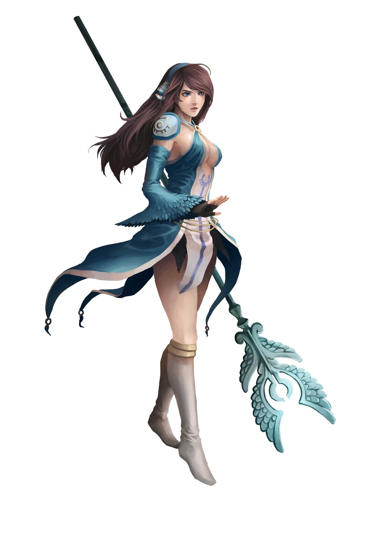
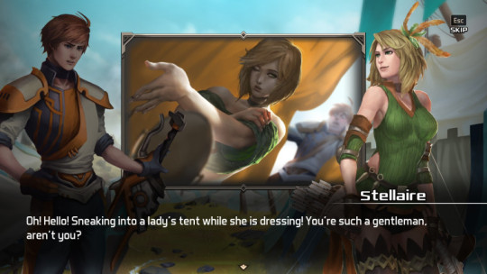
Definitely not a high-scoring design, but it’s still baffling enough that I wanted to showcase it. This is Clery the cleric high priestess from a recently-released JRPG named Azure Saga: Pathfinder (as the logo says). 

Besides the lack of pants, or even a skirt really, and the top ripped off from another franchise with Pathfinder in the name… it’s just not cohesive as a design? It isn’t even an aesthetically-pleasing excuse for cleavage. 

We seem to have feathers as a motif, but it’s like it got forgotten halfway through. There’s no consistent shapes aside from the (apparently) holy symbol, except then there is a different symbol on her shoulder. And the “how does it attach” square is marked specifically for that pauldron being hot-glued to her skin, presumably. (In her in-game sprite, her sleeve is attached to it and it looks better, even though it still wouldn’t be useful as armor without further support.)

At least she’s not wearing heels, but her boots look like the last thing to be designed, when they had no ideas left.

On a positive note, this might make good livestream material, along with one of the other lady characters in this game:

image

Oh no, is that a Green Archer Lady??

-Icy
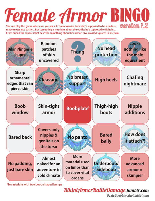
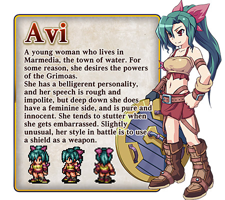
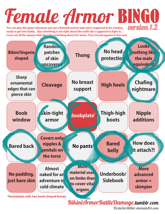
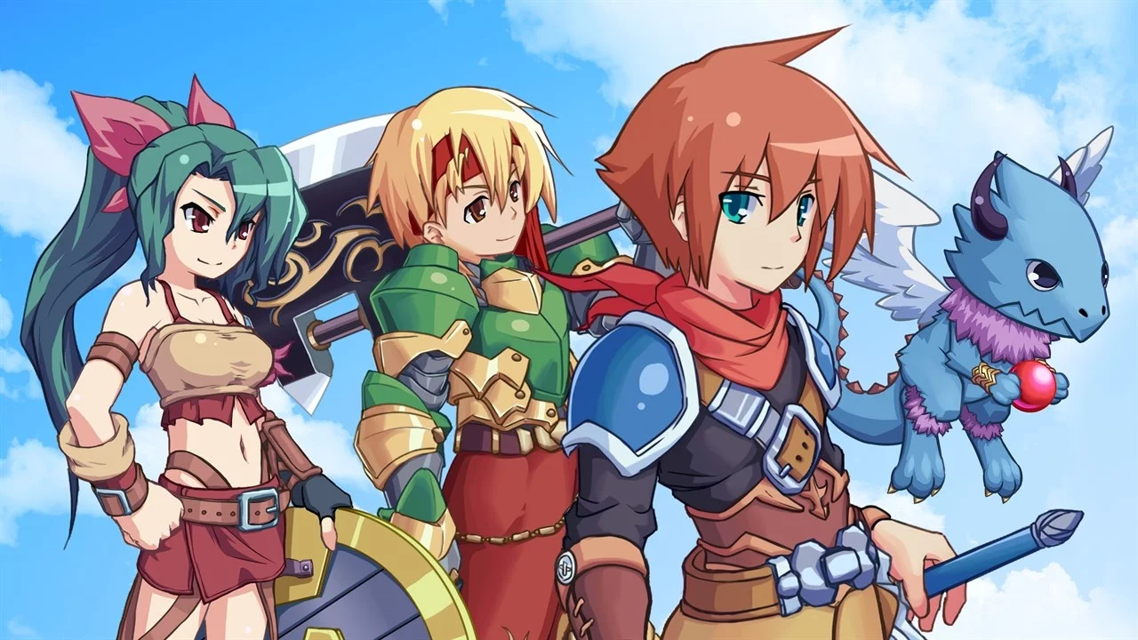
Avi is the only main female character in Generic Looking JRPG Bonds of the Skies and there’s a noticeable difference between how she and her fully-armored male teammates’ costume look, hmmm… ( ͠° ͟ʖ ͡°). 

image

Her shoes looks stylish and comfy, I’ll give her that. Other parts not only serve zero protection against weather and battle damage, they also look like they’d slip off from her body within minutes of moving around. 

And before dudebros start flooding us again with their arguments that this is neither armor, nor the worst thing we ever bingoed or that shield is all the protection she needs for combat – Please read whatever you’re furiously typing again, delete it and rethink your life choices. Double standards is double standards, plain and simple. 

~Ozzie 

h/t: our own Icy for suggesting this for a bingo 

image

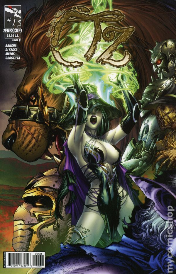
I feel ya, Dorothy, I am also appalled at what passes for clothing in Zenescope’s Oz. Are clothes taxed per inch of fabric in the West?

image

Have you ever looked at L. Frank Baum’s books about a land ruled and influenced by strong, complicated women, and thought “man, I wish these characters were drawn like plastic dolls by J. Scott Campbell so I could masturbate to them”? Well then, do we have the series for you!

image

(We also recommend you find actual people to interact with, we’re worried.)

Not technically armor, but I know 0 people who would wear this fabric scrap in real life. I guess J. Scott Campbell* knows more people than me… who are imaginary. At least Dorothy over there is wearing what might pass for clothes. I don’t even know what to call the Wicked Witch’s…. bodily coverings.

At least the series doesn’t fall into the Evil is Sexy trope, since everyone is barely allowed clothes? Yay?? ?

-Icy 
My eyes, upon seeing Zenescope’s idea of what “Kansas Farmgirl” and “Powerful Evil Witch” look like: 

image

~Ozzie 

* I realize Campbell may not have had any input on these character designs, but it’s just the sort of thing he would design, so he still gets 0 points.

@vertiga submitted:

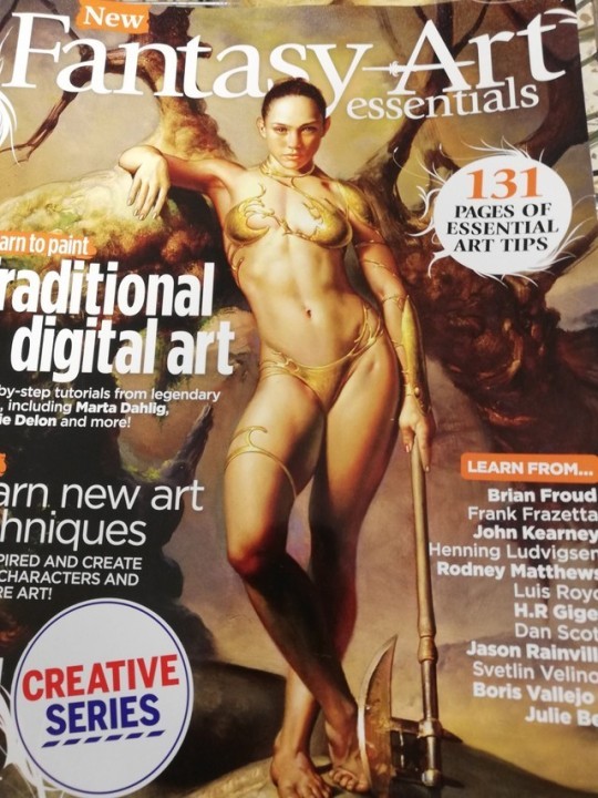
I saw this magazine in tesco and stared at it for a good minute just going ??? This is the cover image they chose for a magazine about the *essential* things for fantasy artists to learn, and doesn’t that just say it all?

image

We featured this magazine on the blog before, but it never got bingo’ed! Now that’s been rectified.

This design honestly looks like when you’re drawing the figure to figure out pose and what not, and end up putting way too much detail into it that you like. And then you feel bad for having to put clothes on top of your hard work, so you just kinda… stick some liquid metal to the essential areas, add some small decorative pieces, and call it good.

“Create better characters” indeed.

But worry not, everyone, their standards for the actual in-magazine content is the same:

image

She’s supposed to be a ranger.

image

-Icy

More Bad Drawing Guides on BABD

Fire Emblem: Pantsening, Part 1

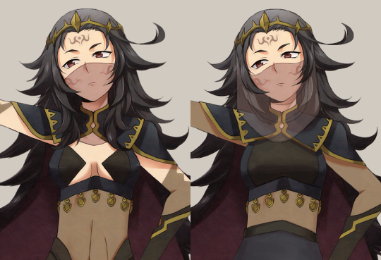
(The title is not a joke on Awakening, I know Nyx is not from that game.)

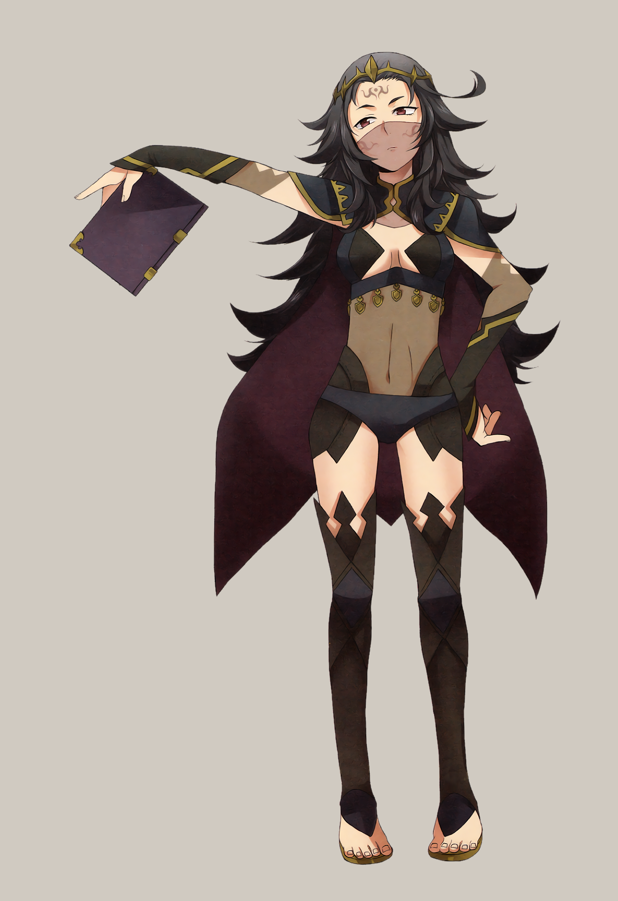
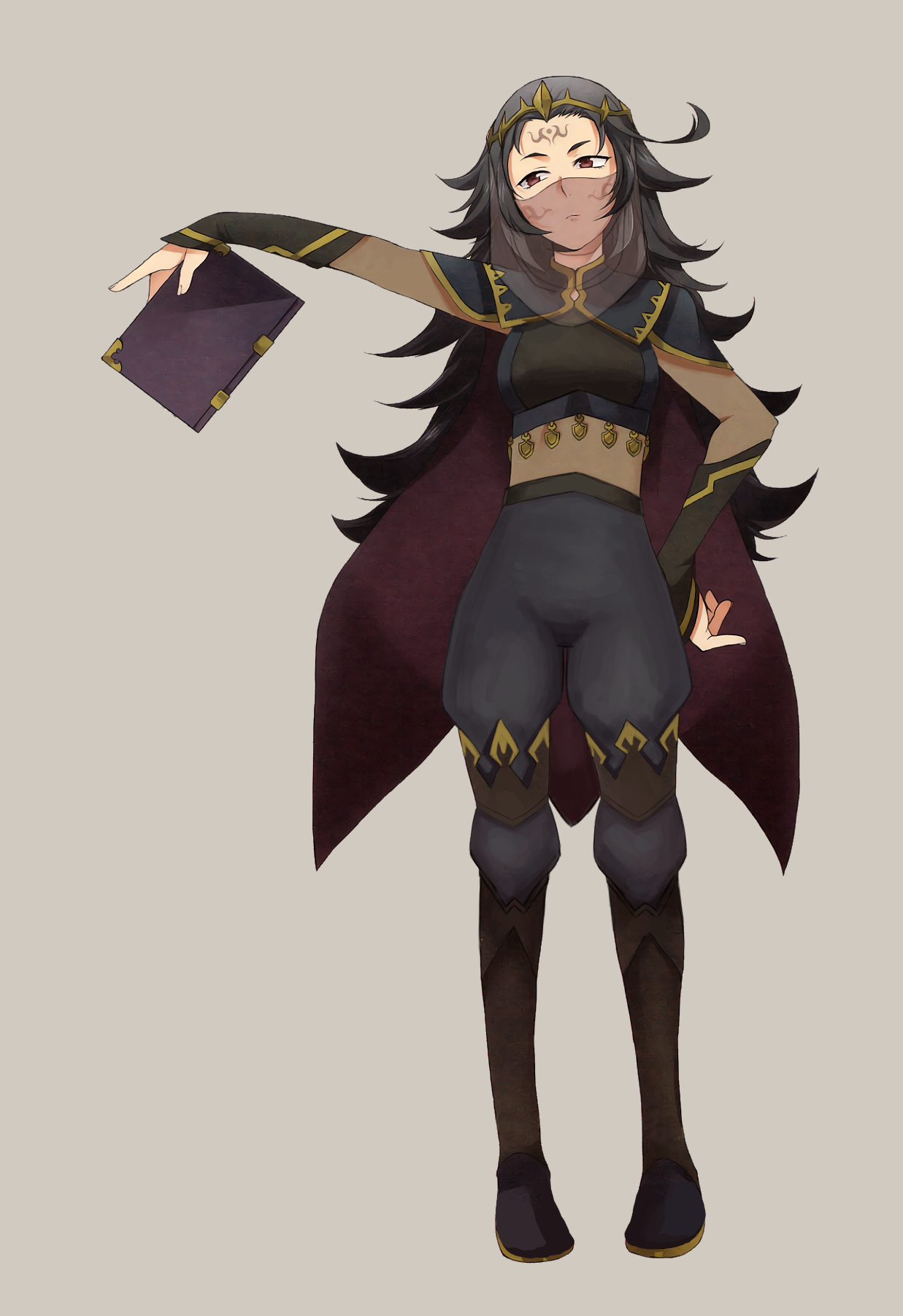
So, doing redesigns for the game series that keeps on giving… its lady characters no pants. I don’t even care if they’re garbage pants, can they please have something, so that they’re not riding frigging scaley wyverns with bARE LEGS-

Ahem. Anyway, Fire Emblem. I decided to redesign Nyx. I don’t know what it is with me and FE dark mage types. Mostly, what caught my eye was that this was another FE woman who looks way younger than her age, while wearing strangely revealing clothes.

image

Most of the edits I did involved giving her an actual shirt, rather than…. uhh?? … as well as some PANTS. I also broke up her shoes into two parts mostly for the design aspect. Such tall thigh-highs make any non-leggings look weird. The last big change was her veil, which I tried to make a little more realistic-looking. I’m not sure how, in the original, the veil is supposed to be hanging down, but then be behind her long bangs that fall close to her face??

The dark skin-tone parts on her clothes are opaque, by the way. I was just too lazy to come up with another color for them, to be honest. This was definitely one of those streams where I was struggling to work with what I had… I probably could have done a better job given more time, but I’m fairly happy with it as it is now. I promise I’ll do a non-mage the next time we redesign Fire Emblem ladies.

-Icy